3 Tips for Improving Busy Mixed Media Pieces
This week, I have a revamped old piece, and share three tips about making busy mixed media pieces more attractive for the viewer.
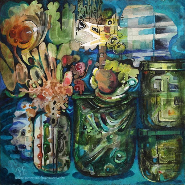
The image above is a revamped version of the busy mixed media piece below. It’s 12 by 12 inches, and I originally made it back in 2014 for a blog post about how to paint glass.
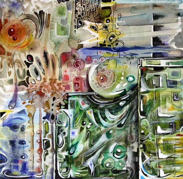
I visited the Finnish Glass Museum a couple of weeks ago, so this piece felt really inspiring again! Let’s dive deeper into how I changed it.
Tip #1 – Cure the White Spot Fever
Back in 2014, I had fallen in love with all kinds of white pens, paints, and correction fluids. A little dot here, another there, and the element looked prettier. But adding dots and spots also make the piece busier. For the viewer, it’s like trying to find its way through crowded streets where everyone is trying to get the attention: “Hey, hey, hey, you there, look at me!”
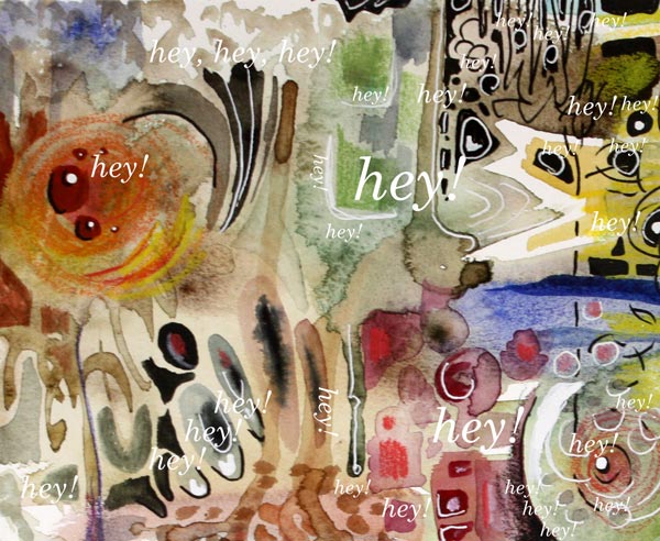
When you are a doctor for the white spot fever, start by toning down all the spots that are located near the edges. We want to steer the eye to the middle first, so the edges don’t have to be so eye-catching. If this is the first time you work on this job, watercolors can be a good choice. Even if the pigment wouldn’t stick on all the surfaces, you get the impression of how the piece looks if you make the edges less noticeable. Turn the piece upside down, so that it’s easier to focus on the task, and not look at the big picture.
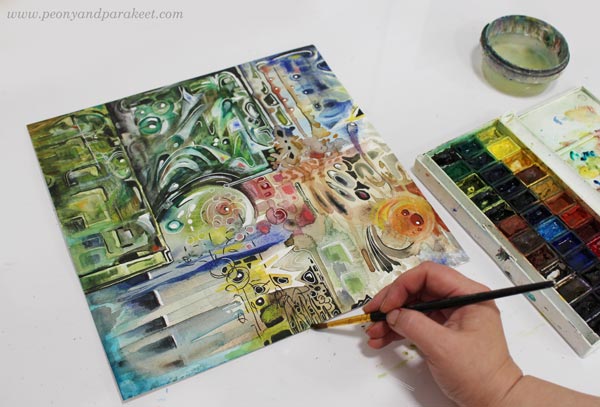
Of course, your pieces can have fever, even if it’s not the white spot fever. The general advice for any fever is to remove all the eye-catching small elements that are located near the edges.
Tip #2 – Form Friendships between Elements
Often when we don’t feel connected with the image, the image itself doesn’t express connection. When the elements are floating separately, there can be a lonely undertone in the whole piece. On the other hand, if there is no contrast between the elements, the image can look busy no matter how connected the elements are.
Here are my two versions side by side. In the old version, there are big glass jars, but the contrast between them is not very clear. There are a lot of small shapes that are floating lonely.
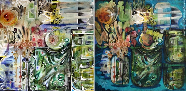
At best, adding connections make the image to deliver a message. When I looked at my piece, it was unclear to me what it was about. In the old blog post, I had written: “It’s about parents trying to protect their children. The parents have good intentions, and they do their best, but in the end, they have to let the child step into the world. I have painted two glass vases to represent the parents. The child sees the world through the parents, and even if they want to protect the child, they are fragile too.”
But now, I found the element that looked like jaws most intriguing. It seemed to be a rising spirit, a small but powerful baby dragon, which only needed a neck to become a central element.
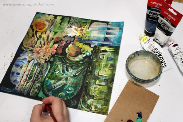
I used dark india inks and black pen to quickly sketch how I would connect the elements, and then continued the work with acrylics and lighter colors. I broke the biggest jar near the edge to two jars so that they won’t compete with the focal point so much.
Tip #3 – Make a Highway for the Viewer
Busy pieces often have so many paths for the eye that it’s not clear where to start and how to continue. The best thing is to be clear and make a highway that goes around the image. The viewer can then take smaller scenic routes around the details, but there’s always the big safe road to return to that leads to the main attractions.
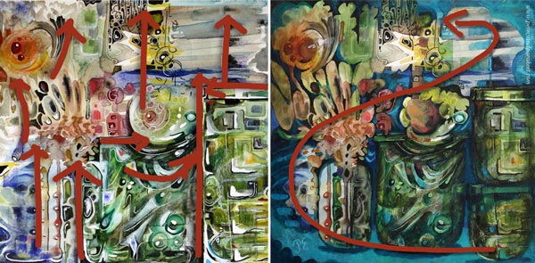
Building a highway requires that you know what your main elements are. After finding the spirit of the jar, I made the red circle communicate with it. Now I added a couple of white spots so that it looks like there’s a voice or a reflection flying between the two. So there’s use for those white dots, just use them sparingly and near the places where you want to lead the eye!
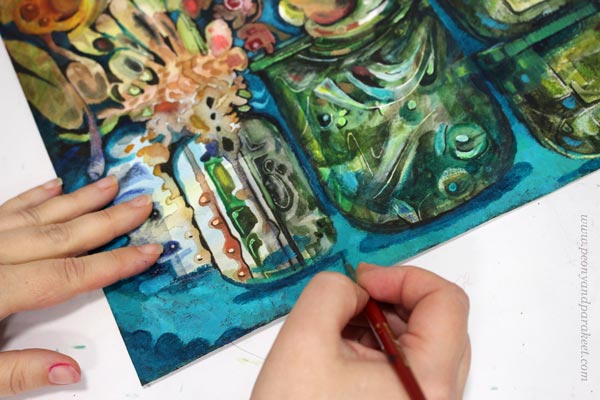
With turquoise tones, I painted a route from the right bottom corner to the two central elements. I also added more depth to the image by painting shadows. Shadows would be my fourth tip, but it’s worth a separate post, so I will get back to it sometimes later.
No More Busy Mixed Media!
I named the revamped version as “Song of Glass” because it’s now about finding the singing spirit of the silent jars.

I hope you found this post helpful for busy mixed media pieces. See my classes for more handy tips and advice!
14 thoughts on “3 Tips for Improving Busy Mixed Media Pieces”
Comments are closed.
I forced myself to not read your new interpretations until I was clear with my own. I’m amazed that we are so close therefore you were successful in conveying meaning to the pieces. I enjoyed the first version since I love gazing into that world and letting my mind play with ideas. It was clean and sparkly and fragile but the centerpiece drew me in as it was so obviously different, I think because of the black inking. It confused me compared to the sparkly bits. I’m in the middle of canning from the summer harvest and I thought of noisy birds outside my window arguing over seeds from my garden. Then I looked at the next version and I’m with your husband – I like them both but realized that you had given my mind more direction to play – a theme. The canning jars were in full glory but something more was going on – a story was building. The yellow barking dog or birds outside my window were still a thing of mystery but more noisy even without their black marks. I clearly saw my jars filled with mysterious garden delights but also saw more. A woman’s painted fingernails were placing blossoms into a vase, the larger vase was a ferment with the pounding tool still inside and splashing brine out. The jars weren’t as fragile but sturdier and stacked, filled with harvest,for winter. I can see my ghostly self above the stacked jars looking at all the beauty and bubbling up with happy songs filled with hope for a brighter future while staying prepared. Thank you for this wonderful time spent with your art today. You never cease to amaze me in your ideas and strong art work.
Thank you so much, Mary! It seems that your activity with canning and my piece went well together!
I actually prefer the first one because you have captured the essence of “glass” without having to paint actual “glass.” Don’t you hate it when husbands try to be diplomatic instead of just giving an opinion?😄 But he’s correct: they are both beautiful.
Thanks, Lynn! I often ask him: is it true or do you say just because you want to be nice!
Beautiful! I can’t stop looking at the jars and their mysterious contents. This piece is captivating!
Thank you, Melinda!!
Wow, I really love the new painting! I think it shows off the glass so much more, and it’s become like a mysterious still life. The name is great, “Song of Glass” and the colors are really singing. I could just stare at it for hours. this inspires me to try to paint glass sometime.
Thanks so much, Cheryl! Painting glass is fun, and the linked instructions are still valid even if they led to a busy piece!
The painting on the left is flatter than the one on the right which is more three dimensional. Both are very exciting to view. It’s hard to compare as they are two totally different styles of execution. I love them both! They are highly individual in character. I feel it’s the interpretation you have at the moment of viewing. One is more organic than the other. Your husband is correct. I, too, like them both.
Thank you, Phyllis! A great analysis!
I love the revamped piece! It definitely leads the eye to clear focal points, and tells a story. I haven’t done any home-canning, but have made many batches of preserves each summer from the wild berries I love to harvest. Beautiful work Paivi!
Thank you, Jacquie!! I wish I could be more active with berries because I love to eat them!
Thanks for all of your tips Paivi, very helpful! I think your changes really accentuate the painting, and love the end result! 💜
Thank you, Lisa!!