Expressive Abstract Style Tutorial – Paint a Beautiful Mess!
This week I have a video about painting in an expressive abstract style. It’s a very contemporary style which many artists have nowadays. It’s based on loose strokes, and I guess it’s the style that many who are not so much into art say that even a child can do it, but it’s not quite like that! Watch the video!
Are you interested in creating abstract art? Do you wish to learn more about abstract art in my blog and in my classes? Leave a comment!
14 thoughts on “Expressive Abstract Style Tutorial – Paint a Beautiful Mess!”
Comments are closed.
I would love to take an abstract class. This is beautiful.
Thanks so much, Andrea! Good to know!
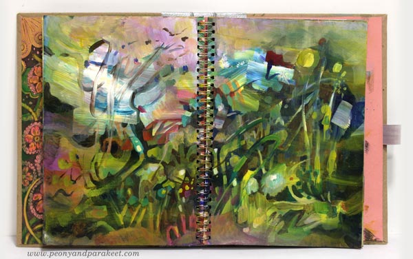
This is an absolutely stunning painting and (I think) it would make anyone want to try abstract! You seem to have achieved a lot of negative spaces without even trying. I have just been watching the beautiful Japanese animated film “The Wind Rises” and you are mentioning the wind while painting here–a lovely synchronicity! This is so impressive–thank you!
Thanks so much, Louisa, I appreciate it! I looked up The Wind Rises, and it looks likes a wonderful movie. I seem to love everything you love, we have very similar tastes!
I’m very interested in being able to create abstract art.
I love your painting and style. So incredibly beautiful
Thank you so much, Jennifer!
thanks paivi…………..always inspiring………….would love abstract class……….love the music also……………
Thanks, Joanne – about complimenting the music too!
This is so beautiful! I would be interested in taking an abstract painting class.
Thanks so much, Natasa!
I love what you did here. Wish I could come up with something so beautiful in such a short time. Yes to more abstract blogs and an abstract class.
Thank you, Cheryl! Your comment and the messages that I have got are very helpful!
As usual an inspiring video. Question. Normally painting over a dark background with a yellow does not make such a bright contrast-what color are you actually using (I want a tube of that color). Yellowing colors are one of my favorite but often don’t show up well. Another question. What art journal do you suggest? I started out with art journals, then began using watercolor paper and canvas, but am considering going to journals because I am running out of wall space. (lol). Thank you for sharing your videos and your wonderful art.
Thanks, Gloria! The answer to your first question: I used two yellows for this painting: Schminke Primacryl Yellow Green and Golden Heavybody Hansa Yellow Light. Yellow Green is more opaque than Hansa Yellow, and I think you refer to the part where I used that. If you have artist quality paints, only the most transparent colors may lead to problems with coverage. If your paints are not artist quality, there’s less pigment and more mediums and/or cheap whites mixed with the color. Artist quality paints always have the information of how transparent each of the color is, so look for opaque tones!
The second question – the journal. The best that I currently know are Dylusions Creative Journals. I have several, and their paper is so thick that it’s nice for acrylics, and these books are extremely durable. I also like spiral bound paper pads which has thick paper, they are easy to browse too, and available in larger sizes than Dylusions Creative Journals.
Let’s keep painting!!