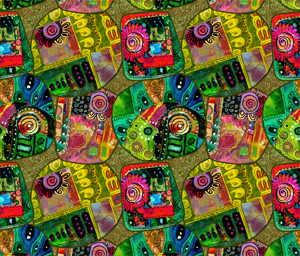
Were you ready for the color bomb? I just could not resist creating this design with the vibrancy that is almost inappropriate. Hopefully, you are like me and need to get your overdose of colors and patterns now and then!
Collage Elements
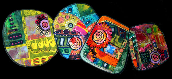
I have created this surface pattern from handmade collage elements. I often mention how I create single decorative elements which I use in collage art or art journaling later. This time, I made a pattern that is based on those odd elements. These elements are like mini collages. They were made by cutting handmade decorated papers and adding some doodling with markers.
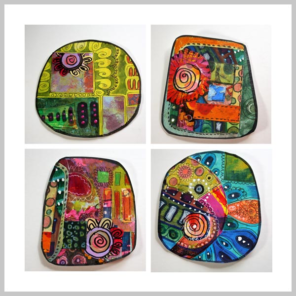
The elements might look complicated but are super simple to make:
1) Combine few paper pieces.
2) Add details with markers.
3) Cut the combined piece in half.
4) Repeat the previous steps changing some of the pieces as you go.
Cutting and combining the cut pieces repetitively is fun, and the result is like a mini quilt. Especially if you add seams with markers like I have done.
Surface Pattern
When creating a surface pattern, you also need something in the background unless you will put the elements tightly together. I wanted to add the background to make the design more interesting. The plain black background was something that I considered first. But it looked too separate from the pieces.
Luckily I save all kinds of doodles, even the ugly ones. I found a file called “blue mess,” a scanned image of the paper which I made a long time ago.
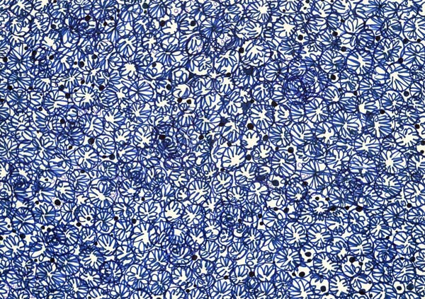
At the time I had thought this doodle was horrible, but now it would be just fine!
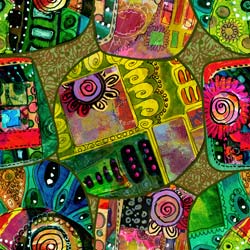 I processed my scanned images at Photoshop image processing software. At Photoshop I created a solid colored background, added the blue mess as the second layer and changed its color. Then I removed the white background from each of the four decorative elements and added a stroke to each element.
The repeat was created so that one decorative element is in the middle, two at sides and the fourth one at the corners. It takes some accuracy to place the elements so that they match when the design is repeated. It would have been easier to have each element separate, but I wanted to create a sort of appliqued look.
If you do not make a commercial pattern, you can just create an artwork manually instead of composing a repeatable pattern on the computer.
Here’s the design again, with more muted colors. This design reminds me of an old quilt, colors faded a bit unevenly but still suitable to be the centerpiece of any room.
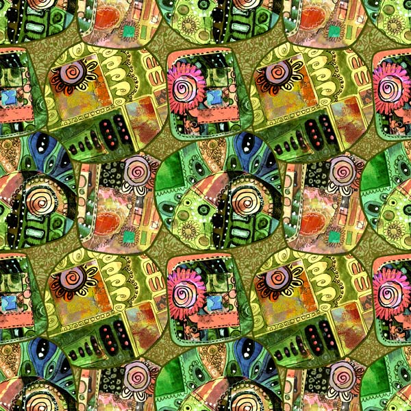
I call this pattern Kira.
Create more hand-drawn collages: Buy Doodled Luxury!

There can’t be too much color – love this. It’s not inappropriate – unless beautiful is inappropriate. I guess I just love color and admire how you put this piece together.
Thanks, Gina!