This time it’s all cute! I had the feeling that this blog is getting too serious. Don’t get me wrong! I want serious, I love serious and hope that you do too! Still, behind all good art, there’s a big portion of imagination. And the best way to embark that imagination is to play a little!
Pastel Colors in Teddy Bears

So I asked my teddy bears if they were willing to help me with this post. And they responded: “Yes, sure!” When I interviewed them, they reminded me that there are two big factors in cuteness: softness and pastel colors. “My friend is a black teddy and he does not get so many hugs as I do”, said Apple Blossom. Pink Princess continued: “It’s not just the color, but it’s the fluffy softness that’s important too!” And then they both agreed that the huge nose and strong eye contact make a teddy even more successful.
Pastel Colors in Old Scrap Pictures
Then I showed them the old scrap pictures that I had found from an antique flea market some years ago.

“Oh yes!”, they giggled. “If you want to create something cute, these sure are good examples! Round shapes make them look reaaaaally soft!”
India Ink and Circles
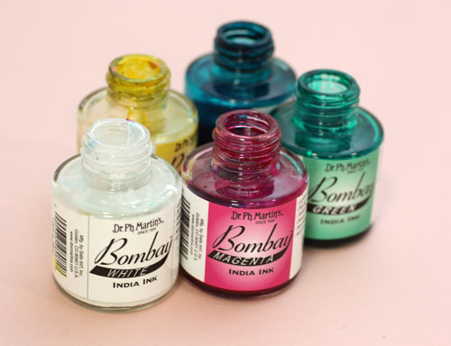
I picked up my India ink bottles (used also in the video blog post last week) and tried to think about what kind of soft and cute to create with them.

Then I remembered the round shapes. That could be the start.

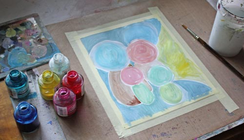
So I painted some round shapes with pastel colors on a thin watercolor paper. While painting, I noticed that to get beautiful pastels you need to use a lot of white. Sometimes adding a lot of white can create hues that lack softness if the base color is cold. You can fix that by adding some yellow or a tiny portion of black. Speaking of soft and white, meet another teddy of mine called Niamh …

I am not a big fan of white but who could not love the color after seeing her!
Clustered Shapes
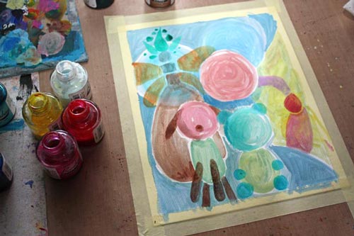
Back to the painting: Small shapes were added near the large ones to create cute creatures. I made some large shapes form the part of the background. More shapes were painted to made creatures more interesting.

I made the shapes look dimensional and detailed with colored pencils.

Finishing
I finished the painting by adding more details and sharpening them with a white gel pen and a thin tip black marker. As a final touch, I added white acrylic paint on the face of the biggest creature. It lightens up the work and makes a great contrast with the black. Namely, if you look at the scrap pictures and the teddy bears, the black color makes pastels look so soft and bright. Small black dots here and there on a pastel colored circles can be enough to create a page that’s all soft and cute.

So, why not have a go: create a pastel colored art journal page to soften the hard world!
Let me be your mentor in art: Subscribe to my weekly emails!

What a fun post! I love your suggestions with the inks and I adore your teddy bear collection. I have a coterie of stuffed animals also who are adorable.
Thanks, Janet! Stuffed animals rule!
Voi kuinka suloinen lopputulos! Aivan tulee hyvälle tuulelle!
Kiitos, Jaana! Thanks!
I made a birthday card for my one daughter of 4 who loves soft cuddly cute, oh and pink.. It was so much fun and such a relief that I have left over energy to do more! And your sweet soft drawing encourages me that this is supreme and necessary play. Thank you!
Thanks, Nea! There are never too many pink cards in the world!
What a wonderfully fun post! I love the advice from your Teddy Bears, too. Such a cheerful painting. I rarely use pastel colors – now you have inspired me! Thanks!
Thanks, Mrs E! Have fun creating pastel softness!
Beautiful!!
Thanks, Maye!
Love what you did with the pastels, and love the teddybears too! I also collect bears. Thanks for sharing.
Thanks, Beth! Teddy bears need good homes, don’t they 🙂
So pretty! Hope I can try it. Thanks!
Thanks, Lou! Have fun!
I love how varied your art is. Thanks for sharing.
Thank you, Muriel! There are so many sides in all of us and we should show it in our art too!