This spring, I have seen gorgeous pieces of art made from the mini-course Doodled Luxury and I want to share some of them with you. There were so many great pieces that choosing was difficult but this time I thought to share pieces that are very idea-driven. You can never have too many collage ideas, especially if you process several at the same time!
1) Many Variations of One Shape
Gina Meadows shows beautifully how hand-drawn elements are all like from the same family when created by the same person. I also love how it’s full of feather-like shapes. They repeat the idea of a free, observing bird.

2) Solid Ground
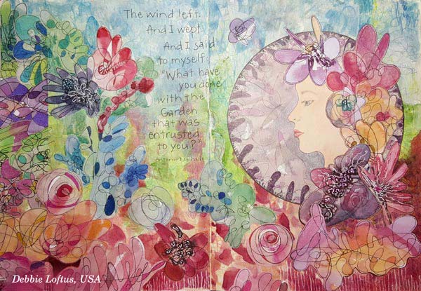
The second art journal spread that I want to show you is by Debbie Loftus. Her work is a wonderful illustration of the quote she has picked. This piece also reminds me of how we can create very free-flowing, beautiful mess that still speaks harmony. This can be done by simply making the bottom of the page strong and solid. This piece communicates how we as humans see nature. It’s full of weeds and still so beautiful!
3) Mystery That Can Be Revealed
Mary Werner’s lady looks a bit mysterious here – but wait until you see the second picture!
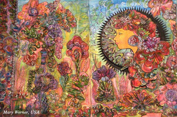
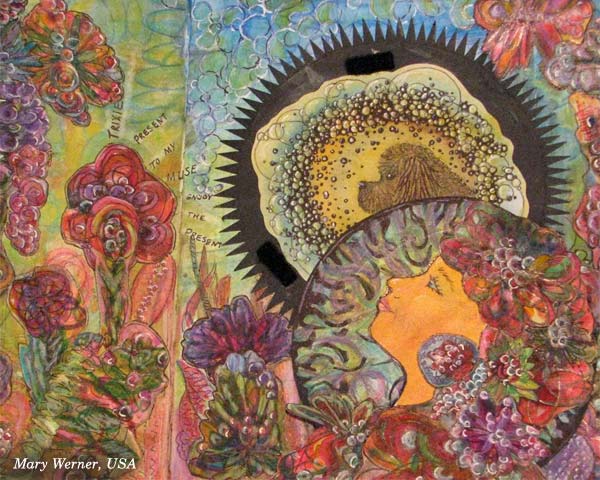
The lady has a secret, a dog who is her muse, making her to relax and take in much more than when walking outside alone. Mary has used velcro to attach the lady above the muse. Isn’t it a great idea to include a hidden mystery!
4) Spiritual Softness
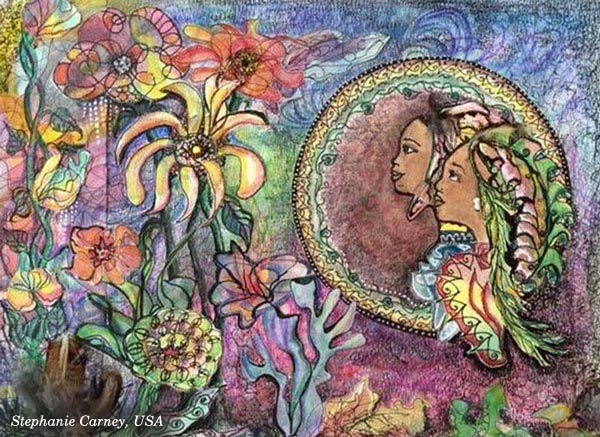
Speaking of true friends, Stephanie Carney has illustrated two sisters. I love the way they look at the flowers, sharing the same experience. Examine how softly the round frame has been decorated and compare it to others! These kinds of little nuances can communicate a lot visually!
5) Real Person in a Fantasy
Terry Whyte made her granddaughter the central person. Isn’t this spread a treasure? Combine your hand drawing with the photos and start building your own fantasies!

6) Many Sides of One Personality
Satu Kontuvuori included her cat who is a very wild character. Even if she stays still in the image, it’s like the wildly flying bird is one of her many lives. If you are expressing a personality or any subject that has many sides, you can scatter it into various elements of the same piece. That way you will focus on one theme but still express it in a free-flowing and rich manner.

7) Focal Point Balances Richness
Speaking of focus … Christie Juhasz has a trick for creating a clear focal point. See how her mermaid is sitting on a white frame! Even if the work has full of details, white circle makes sure that the main character gets noticed.

8) Movement + Space to Breathe
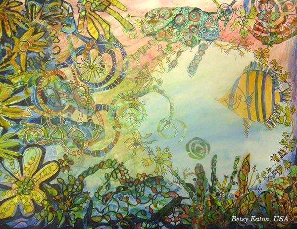
Another great example of using circles: look at Betsy Eaton’s fish and how there’s a circular space around it. Brilliant! Another thing which makes this so appealing is the movement of elements. That dynamic feel has been created by adding swirly shapes.
9) Rainbow Softness
Kathy Lewis (a.k.a KjAllison) made a gorgeous spread full of multicolored elements, like mini-rainbows. This makes me think about macro photography and dew drops! Soft transitions of colors – why not use them in your next art journal page?

Doodled Luxury
This mini-course, Doodled Luxury, was published as a part of Imagine Monthly Spring 2016 art journaling class. It’s now available individually as a self-study class – Buy here!
You can also buy all the 6 monthly classes as a bundle. I will also release the other 5 classes individually one by one later this summer, and show more ideas on how to apply them.
Start doodling and collaging, right now!

I’m so happy for you Paivi – all the excitement and inspiration that you instigated for us. Each month a new artist to draw and learn from, enriching our own ideas and presentation. You are a fantastic teacher and I loved seeing all these reminders of what was produced through your class. It was a deeply rewarding time for me.
Thanks, Mary! Looking forward to seeing what you create at Imagine Monthly Fall!
Loved this project Paivi! Your wonderful teaching has me looking at art in so many new ways. It is a joy to learn from you and to see these fruits of your amazing course. I am excited for the next one!
Thanks, Kathy! There’s a certain boldness in your work that always looks appealing. Looking forward to seeing more during the fall!
I don’t understand what part of these pictures is collage. They are beautiful.
Leone, that is fascination in this technique: that you can integrate the pieces so that they look very coherent!
These are absolutely beautiful! Enjoyed looking at the techniques each artist used.
Thanks, Peg!
I really enjoyed this one, Paivi. Before this I hadn’t even thought of creating my own collage papers. Lots of fun! ?
Thanks, Sue!
Beautiful pages by your students!!
Thank you, June!
Paivi . . . I am fairly new to art journaling. While I enjoy looking at the beautiful work of your students, I need step-by-step instructions. How do I get these–in general, of course, as each one is unique to the artist.
Thank you.
Hi Patty,
you can purchase the class here:
http://www.peonyandparakeet.com/doodledluxury/
Love your Art Paivi, and you always surprise me in everyone of your post, and this one! love all your students work. they are so beautiful!
Thanks for sharing.
Thank you, Alejandra!
Hi, Paivi. I just finished the Doodled Luxury project. Would you like me to email a photo of it? It was fun, although it took me about nine hours over three days to do it. I am pretty slow at everything. It does not look quite like yours, I seem to have trouble deciding how to put darker colors and shading in the right places. Mine is rather bright, even after going over with a light grey marker to tone it down. Thank you for offering this class. I will try to start the next one next week.