Pointillism – A Quick Way, Step by Step!
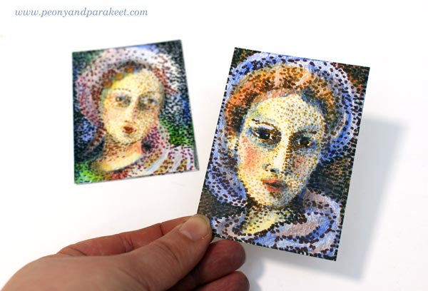
I am honored to be one of the guest artists in Documented Life Project this month. I was given a theme (pointillism) and a project type (artist trading card, ATC). As long as I followed those, I could do anything with any supplies. These kind of challenges are fun because you get such enough restrictions to get started but can still create freely. However, I have one fixation with artistic trading cards. I like them to be portraits, either humans or animals.(See ATCs in this post, for example!) So I chose a very traditional subject, women from the past.
Pointillism Can Be Tedious!
Like most of us, I have always admired Georges Seurat‘s paintings. In the 1980s, a Finnish illustrator made images that were composed of small points. It might have been an artist called Osmo Omenamäki. As a teenager, inspired by him and Seurat, I decided to be a pointillist artist too. I picked my felt-tipped pens and started to draw dots. Oh my! I was barely able to finish a postcard size drawing. I couldn’t believe how many small dots are needed to fill even a small blank area! I was almost traumatized by that experience!
So now, over 30 years later, I didn’t even think about creating the project with felt-tipped pens only. ATCs are small, but not that small! However, with felt-tipped pens, it is easy to make intentional tiny dots in a variety of colors. But I also needed something else to make the coloring faster. Colored pencils leave the spots visible, and they are easy to control. So I chose them to fill the blanks between the dots.
Practicing – Spots with Many Colors
Before the actual project, I practiced my ideas. I made the dots using a variety of colors and then added more colors with colored pencils.

Because the colors in dots weren’t as important as coloring with colored pencils, I got an idea of using brown shades only. It would be like an underpainting, a technique that old masters often used in portraits. They painted shadows with umber and then applied the rest of the colors so that the shadows showed through. So I will show you how you can do a similar kind of “under-dotting” and then apply the actual colors with colored pencils!
1) Under-Dotting with Felt-Tipped Pens
You will need four shades of felt-tipped pens for this step. I use Faber-Castell PITT Artist Pens in colors “Light Flesh”, “Green Gold”, “Raw Umber” and “Caput Mortuum”. I didn’t use any model like a photo but just created intuitively, making the features more accurate color by color.
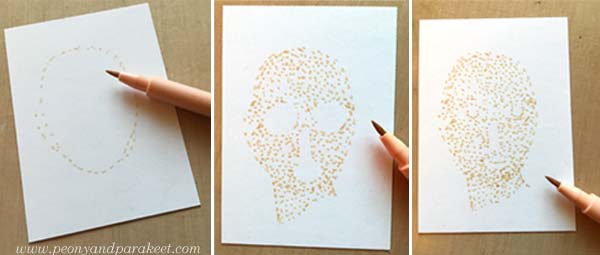
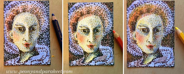
With the palest of color, sketch an oval using small dots. The liberating thing here is that when you start with a pale color and make little dots, you can make many “mistakes” and correct them as you go. One spot in a wrong place can be easily changed! Fill the oval with dots so that you leave blank space where you plan mouth, eyes, and nose to be. When they seem to be in place, add some dots for details. Don’t worry if your woman looks pretty ugly. This is just the first layer!
Change to darker shades and add shadows to the face. Then sketch the hair and clothes using little dots only.
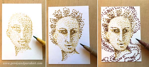
Every shade adds a little bit more to the image.
2) Basic Coloring with Black and Colored Pencils
Now add black spots to the darkest of details. Old portraits often had a dark background, so I added black spots there too.
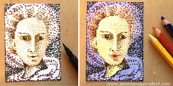
Using colored pencils, color the card so that white shows only where you want to have it in the end. I used Caran d’Ache Pablo pencils in blue, red and yellow. Remember that you can mix colors by layering. You can get many beautiful tones from the primary colors.
3) More Liveliness with Colored Pencils
Finally, add shadows so that the details look 3-dimensional. If you only have primary colors like I had, you can get a dark background by adding blue, red and yellow layers there. If your portrait looks too dark, use an eraser to lighten and soften the colors.
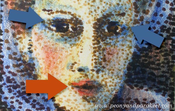
In the end, check the facial features of your woman. Add small lines where you want to turn the attention. Don’t draw the lines near the nose but on the lips and the eyes.
Celebrating Blurriness
Here are my finished cards again. I think they look delightfully blurry!
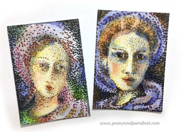
The more I want to reduce stiffness in my art, the more I feel the need to embrace blurriness. With blurriness, I also feel more self-acceptance, more ease with errors, more open to possibilities.
Reducing stiffness is one of the main themes in my newest class too. The class is called Inspirational Drawing 2.0 and it’s about drawing from imagination and inspiration. Watch the introductory video below!
Inspirational Drawing 2.0: Liberate your line and sign up now!
8 thoughts on “Pointillism – A Quick Way, Step by Step!”
Comments are closed.
Paivi, what gorgeous examples of pointillism! I loved that you started with felt tip pens. What a great idea! Thank you so much for joining us in our final days of DLP 2016.
Thank you, Sandy!
Great tutorial and love your ARCs. Thanks so much.
Thanks, Christina!
this is such an amazing lesson on pointillism. I am so thrilled that you shared so much with us! Your lessons are so inspiring and you made it seem so easy – just wonderful! Thank you for joining us – you rock!
Thank you, Rae!
Oh Paivi, you looked so happy and pretty and excited – love your hair cut! You were making me feel inspired just watching you and your lines. I also noticed you picked a necklace and blouse to match your pointillist perspective. You always make me feel like I can achieve anything and I know I usually go much further than I thought I could when taking your classes. Can’t wait to began again.
Thanks, Mary, I am looking forward to seeing what you will create during Inspirational Drawing 2.0!