Using White as a Color in Painting and Drawing
In this post, we explore the color white and find ideas on how we could change the way we use it in art-making.
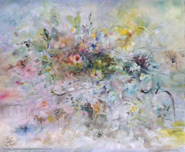
I posted this painting about a month ago, but I still had to fix it! You might not notice the difference, but it matters to me. I have changed the center of the painting so that it is more abstract.
A long time ago I thought that it doesn’t matter if I don’t like some detail of my work or if I don’t like some of my work in general. I thought there would always be someone who would like it.
But the longer I’ve been painting, the more important it has become that I have to be a fan of my own work. When you are a beginner, quantity is more important than quality. But I’ve been working for a long time and the equation has thus turned the other way.
I know some would prefer the more realistic flowers, but I don’t! I have too much reality around me, especially now when the weather has been too cold to be spring.
Living in a White Country
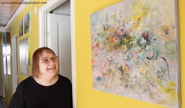
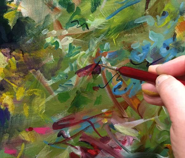
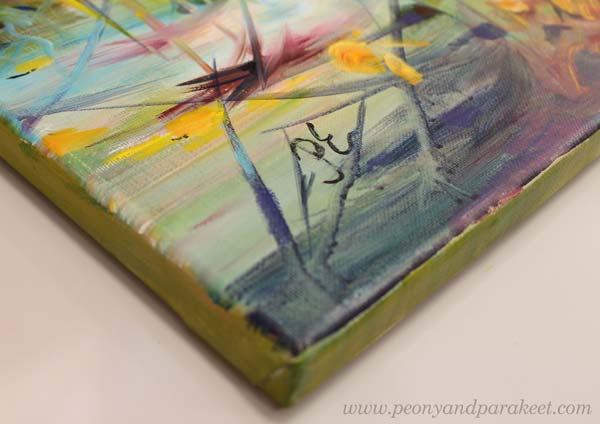
This painting is also special because it has so much color that is difficult for me – white! There is far too much white here in Finland. Even if now is the end of April, we got a lot of snow a couple of days ago!
I think white is a terrible color because it is full of emptiness.
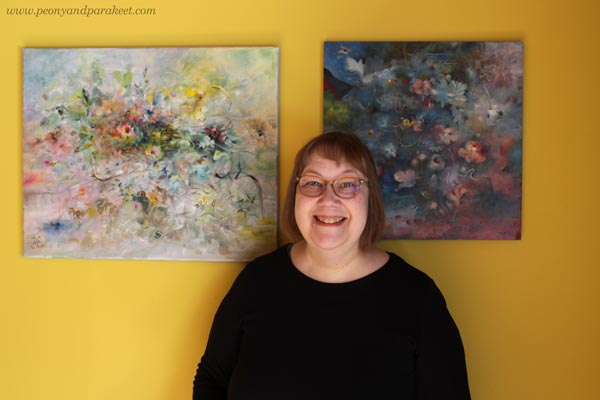
Finnish people usually have white walls and white furniture, but our home is full of colors. I love to display my paintings on this yellow wall.
Not One White But Many Whites
In the recent painting, I wanted to play with pastels and show the side of white that is often not talked about.
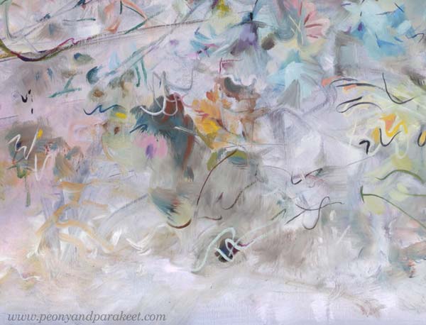
For an artist, there is not just one white. There is a warm white that holds the promise of the sun. There is a purple-toned white that falls in love when it sees a deep cold red. There is a white that allures you with a hint of sweet mint. So, many whites, not just one Finnish white!
It’s exciting to mix various whites and then see how the pastel colors slowly begin to appear. You need a lot of white and just a little bit of color to get the toned whites and pale pastels.
Titanium or Zinc White?
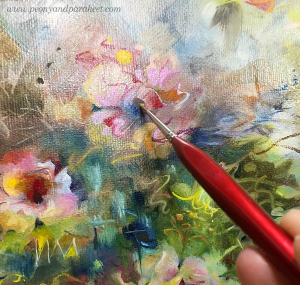
The most common white in paint tubes are Titanium White and Zinc White. In oils, you have to be careful with zinc white because it can cause crackles. I mostly use only Titanium White. I would love to use Zinc White because it’s more transparent. In this painting, I have tried my best to bring the soft transparent effects mostly with Titanium White, but it’s not easy!
In acrylics and gouache paints, you can use Zinc White more freely.
When White is Not Needed
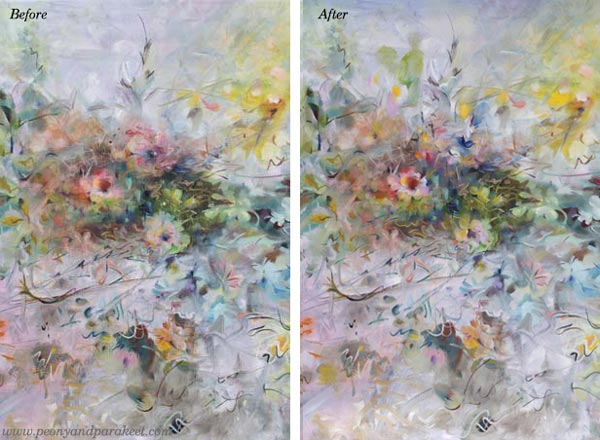
Beginners think that adding white on top can fix everything. Ten years ago, I was madly doodling with a white gel pen. What went wrong, got covered with white circles. But white also can make the piece busy and destroy depth. Here’s a quick example of the small collage piece that I made in 2014 (here’s the old blog post with the video too). The first is the old piece and the second is a photoshopped version showing how I would fix it now.
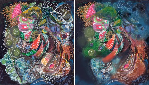
When I tone down the white, the image gets clearer and the depth grows. The highlights in the central parts get more attention and it’s easier to know where to look. I wish someone would have pointed this out to me back then. It took a lot of time to realize this!
If White Were a Person …
I am pretty sure that if White were a person she would say: “I have much more potential than you think. Stop seeing me as a blank background or a quick fix to a piece that lacks contrasts!”
What’s your relationship with White?
From Painting to Digital 3D Art
This week I have a video that is made for all who love art and love creating art. It’s about my artistic journey from painting to digital 3D art. My new digital creations move and change color on screen and in virtual reality.
3D Art – Watch the Video!
I am currently making digital artwork in a three-dimensional world. I have received a grant for it from The Finnish Cultural Foundation. The project will continue until September 2024, but it has progressed to the extent that it is good to gather thoughts and show some results on a video.
The main programs I mentioned in the video are Nomad Sculpt, Blender, and Unity. My virtual glasses are Meta Quest 3.
The artwork is not finished yet. The most important thing that I need to do is the interaction with the viewer. I will also include sounds. Fortunately, the project still has five months left. The project is part-time, but on the other hand, breaks are good, because the ideas have time to grow.
Traditional 2D Meets Digital 3D
I understand that I am only at the beginning of everything that technologies make possible and where my artistic thinking can go. It’s exciting. For a long time, I have envied how the students of my painting and drawing courses have great enthusiasm to learn new things. Now I have this situation with digital art.
I am grateful to have been born in an era where all this is possible. With digital art, we have something Rubens and Kandinsky would envy. It would be wonderful to show them all this, even if it would be only just this video. I think a certain da Vinci would like to join Rubens and Kandinsky! There have always been artists who have wanted to see into the future and go on a journey to an unknown land. I think this attitude doesn’t break the tradition but keeps it alive.
What do you think?
Belonging Somewhere as an Artist
This week, I share my word for 2024 and thoughts about the good and bad in the sense of belonging. I also have a new finished painting!
See more pics at the Taiko art store!
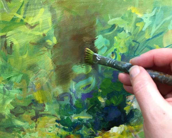
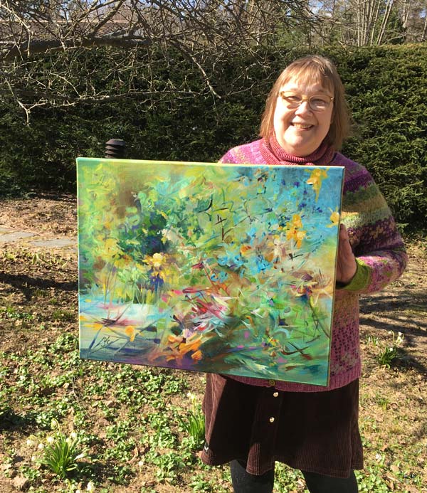
I haven’t used acrylic paints on a canvas for a long time. But now I wanted to paint faster and not wait for the layers to dry.
Painting Freely
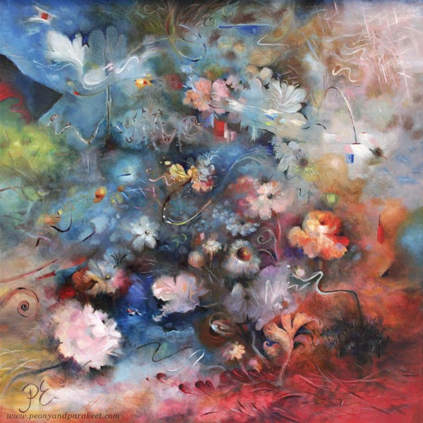
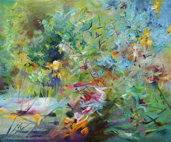
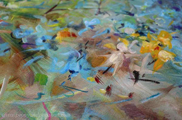
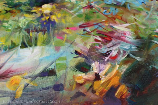
This painting took me a couple of long evenings and I deliberately left it abstract, because the subject of the painting is not about the flowers, but about the power rising from the ground.
Here’s how the painting started: loose strokes and juicy colors.
It’s easy to fall in love with colors, but when you want depth, you also need muddy colors: browns and greys.
I like to use several different brushes in one painting, and my favorite brushes are very thin.
The title “Muutosvoima – Driving Force” sums up what I want to tell with this painting. Muutosvoima could also be translated as “power of change.”
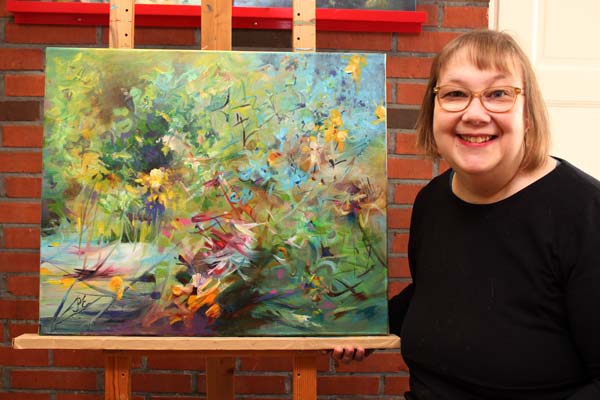
I believe that the best power of change is not the hype created by others, but the inner enthusiasm that has a grounded tone. Because isn’t it so that flowers only bloom when the earth warms up? Sunlight alone is not enough.
Belonging Somewhere – The Good and The Bad
I’ve been thinking about togetherness lately. It’s a wonderful feeling. For example, last week when many people commented on my post, I felt happy that this blog brings us together. One of the best things that has come with the internet is that you can be pretty weird and still find like-minded people.
However, the sense of belonging has its danger. Art is about walking your own path. Encounters are important, but you also need to go in the other direction to create something unique. As a teacher, I have often thought about how I could better guide people in their own direction.
Art is like a pot that you have to break first and then put together again. The pot can be broken in many ways and at best, you find your own way to put it together. You need a driving force to break the pot and then persistence to rebuild it.
Finding Your Places in the Art World
In my career as an artist, I have often wanted to be like someone else. I have envied popular artists and then later realized that I wouldn’t want to create the kind of art that they do. I realized that I would like to be popular in creating something else and somewhere else.
With experience, the art world opens up. Instead of one hall, you begin to see numerous smaller rooms. What is popular in one room can be overlooked in another. Being an artist requires a lot of self-esteem and the power to move from one room to another.
When you find one room that feels like your own, the sense of belonging is at its greatest. However, it’s better to move between several rooms and find many groups. At best, the artist acts as a bridge between different things.
My Word of the Year – Do You Have One?
My word for 2024 is Integrate. This year I have allowed myself to do more diverse things, but on the other hand, I have tied all the pieces together so that one benefits the other.
Have you chosen a word for this year? How has it been realized?
Designing Cross Stitch Patterns
This week, I have something very different than before: cross stitch!
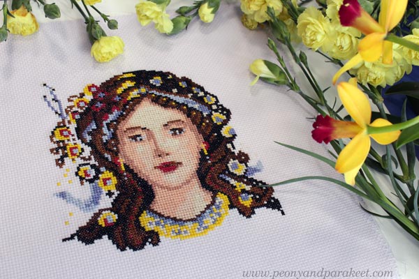
Buy my first commercial design Primavera from my Etsy shop called Needle and Peony!
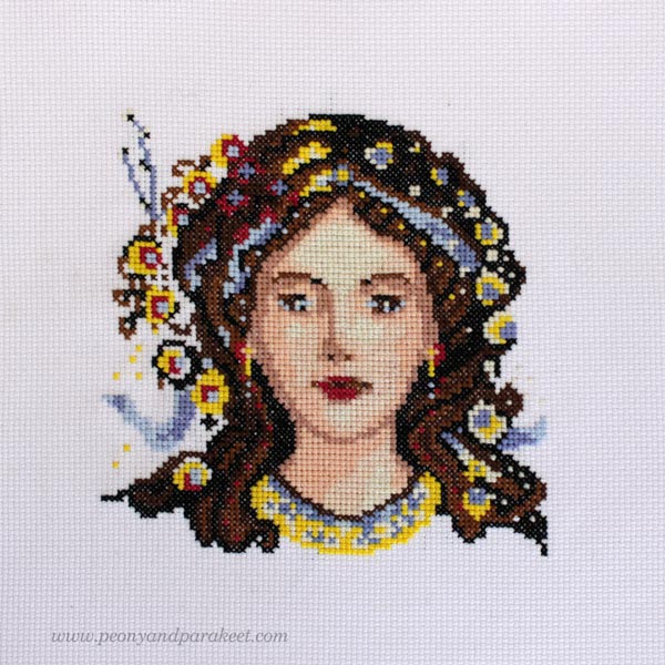
There are two main reasons for designing this pattern. The first is the need for creative play and the second that I couldn’t find anything like this from other designers: a fantasy woman’s facial portrait that wouldn’t be a huge project.
Playing and Drawing in the Stitchly App
My need for creative play comes from being very serious with art this year. I have spent a lot of time in programming computer art and I have been painting a bit too. It’s all great but I started to miss drawing, and especially, making something that is purely illustrative and not so abstract and artistically challenging.
So because I have had cross stitching as a hobby almost all my life, I bought an app called Stitchly and started drawing there – on lunch breaks and such, a few stitches at time. First I just doodled freely with the Apple pen to get to know the app.
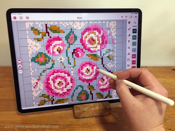
Stitchly is easy to use and with the pen, drawing is fun and the squares get filled nicely. Of course, you can also import a photo and let the app create the chart automatically. But to make the image look realistic enough, the stitch count needs to be high and the design … well I don’t think it would be a design anymore, just a pixelated photo. So, when I design, I like to draw with the pen and if I use references, I only use them as inspiration and draw every square myself.
I also like that you can have a custom palette in Stitchly. I have made a palette that has all the DMC colors from my stash, so I can also check the real color when designing.
Drawing and Stitching Faces
When people begin drawing in adulthood, they often start with faces. Eyes, mouth, nose too. Facial features create a connection to the person born on paper. It’s also fun to draw hair and add decorations there.
So, one day it hit me that even when doing cross stitches, I can get company from the character I am stitching. However, couldn’t find a cross-stitch pattern that was a reasonable size and where the character was naturally asymmetrical, but still sparked the imagination.
My stitching time is lonely time in the evening. I clean the studio if I have been painting, and then pick extra glasses and while stitching, watch other cross stitchers’ videos on Youtube, so Flosstube as we cross stitchers call the channels.
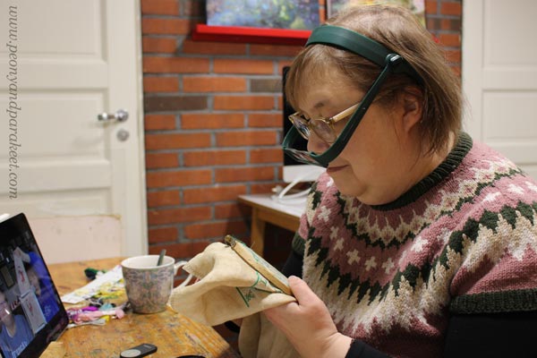
So when I wanted to stitch a facial portrait of an imaginary person, I decided to draw it in Stitchly. After making the chart, the fun started – I was stitching my own pattern!
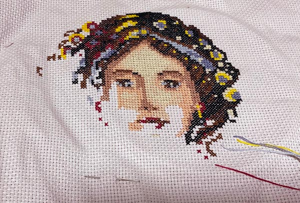
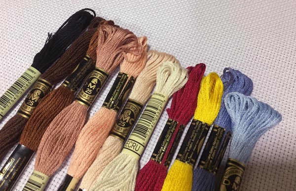
Primavera can be stitched in the colors I suggest in the pattern, but since there are only 11 colors, it’s easy to change them as you like.
Although Primavera means spring, by changing the colors you can associate a different season or different theme with the character. The decorations are designed to be so general that they don’t limit the character you create.
The hair has three colors of different darkness, the skin has four. The hair band has two colors close to each other. It is easy to change the accent colors of the mouth and eyes, and also the colors of the decorations.
You can buy the pattern for Primavera in my Etsy shop!
Needle and Peony
It feels nostalgic to have something on sale at Etsy again! Long before I became a full-time artist, I opened the Etsy shop called Kukkilintu, then later changed the name to Peony and Parakeet. That little shop had a major impact on my career and life. Most of my customers lived outside Finland and I started communicating more and more in English.
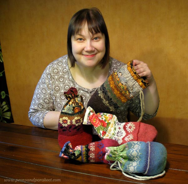
Maybe some of the current readers of this blog were my customers over ten years ago when I sold folk bags (currently available as a knitting pattern), handknitted doll clothes, hand-decorated papers and cards!
Now I changed the shop name to Needle and Peony and intend to add some charts over time. Maybe some slow stitching ideas also, as I have some of them too. Last week, I set up an Instagram account called @needleandpeony to show my cross stitch projects – also what I have stitched from other designers.
My other instagram accounts are @peonyandparakeet for fine art, @paivipeony for quilting, and @paivipioni for knitting.
Which Design Should I Do Next?
While designing Primavera, it hit me that I have a pile of drawings that I have made for classes and that could be turned into cross stitch patterns. When I browsed them, I couldn’t decide what to choose next, so I now ask you – what would you like me to design next? I have picked 5 drawings to choose from, leave a comment and let me know which one is your favorite! Which one of these would make a great cross stitch design?
A) Angel
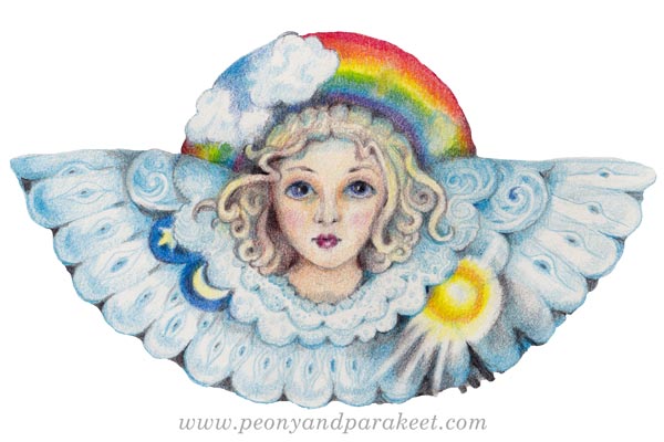
See how I drew the angel in 2022: Angel Drawing for the Inner Child
B) Girl
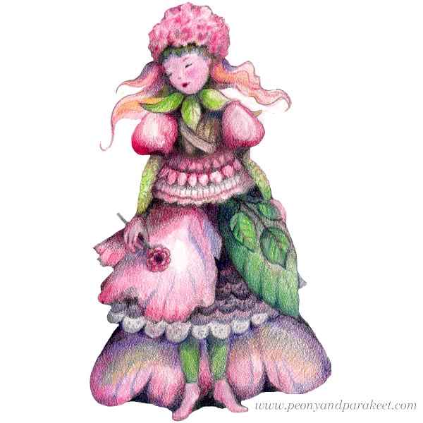
This flowel girl was drawn for the course Doll World.
C) Cat
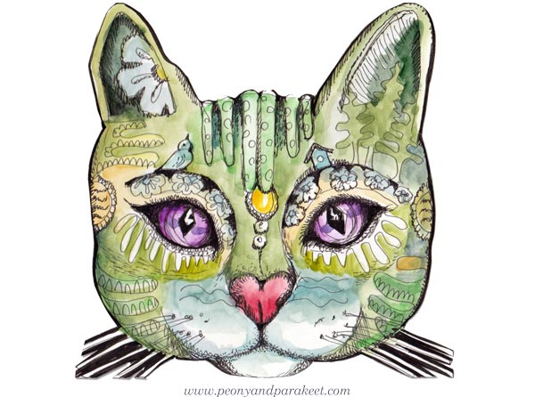
This cat was drawn for the course Magical Inkdom.
D) Leaf
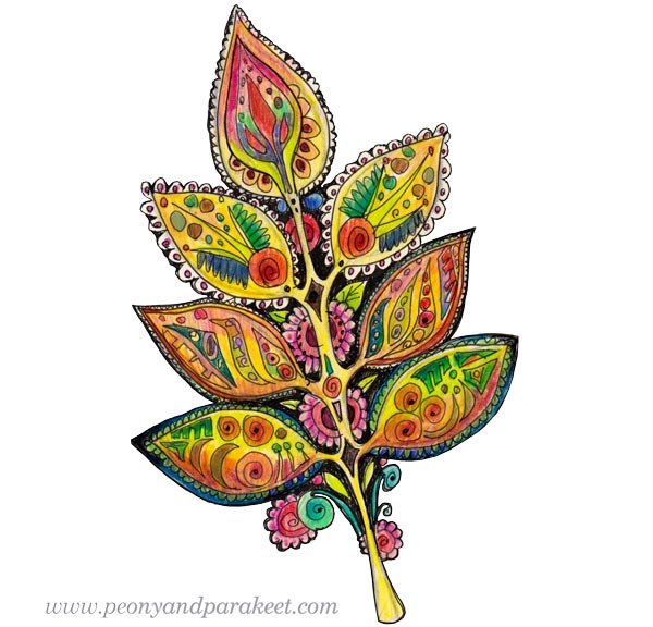
This folk leaf is an older design, from 2015. See more: Art Quilts in a Modern Way
E) Horse
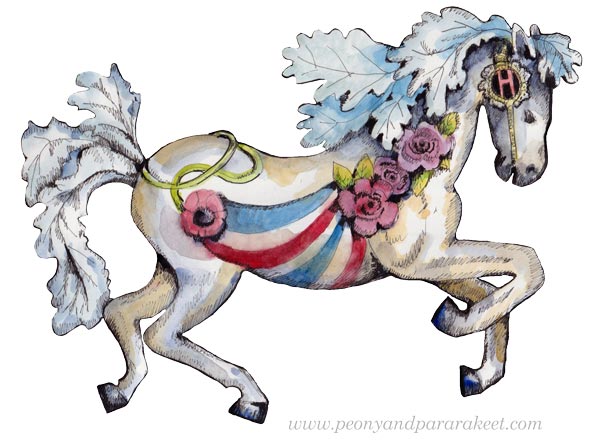
This fantasy horse was drawn for the course Magical Inkdom.
Tell me your favorite of the five – A) Angel, B) Girl, C) Cat, D) Leaf, or E) Horse?
Support me in the cross stitch design journey, here’s the link to purchase Primavera!