Making of a Miniature Painting
This week, I have a new miniature painting and share tips for making small-sized paintings in general.
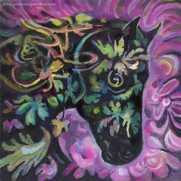
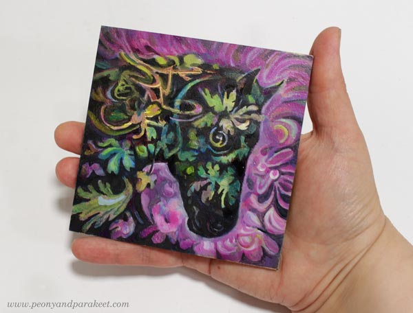
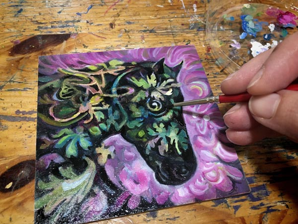
Let me introduce Ebony, my newest miniature painting! It’s only 10 cm x 10 cm (4 inches x 4 inches). The size shows better in the photo below.
This is an oil painting, and it took over a month from start to finish, but just because I let each layer dry properly. There’s about a week drying time between each layer. If you use acrylic paints or watercolors, the process is much quicker!
The Beginning – Making Not So Beautiful Mess
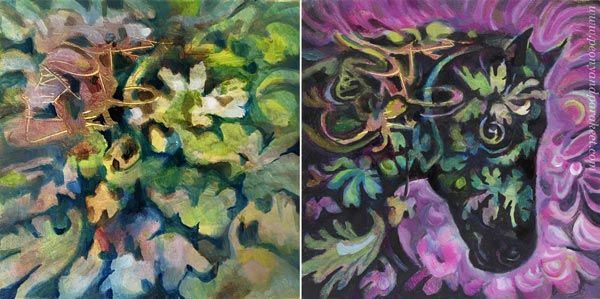
As usual, I didn’t have any particular idea for the painting when I started. Here’s how the painting looked after a couple of layers.
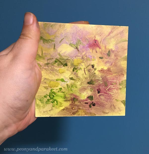
My surface here is Ampersand Gessoboard Panel. It’s very smooth and thus suitable for small details. I had bought a pack of four over a year ago. I finished the first one last year, see this blog post!
When making an abstract mess, I don’t usually settle for pretty little messes, but make the mess more layered. When the mess is as ugly as I can bare, it begins to talk to me. It came to my mind, that the random strokes could be mane, and there could be a horse coming up.
Using Negative Painting to Dig Out the Spirit
I like to use negative painting a lot. So here, I painted the background first so that it defined the head of the horse. When painting the surroundings, you slowly get closer to the actual spirit. It’s like taming a wild animal!
Ebony is now a gentle soul, and she reminds me of Black Beauty, the television series in the 1970s. I watched every episode and it inspired me to play with plastic horses.
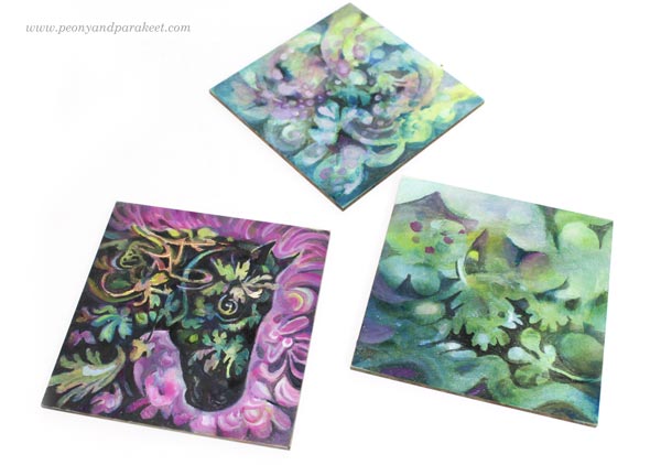
I still have two more panels to finish. I think I will dig out horses or other animals from their messes so that I get a small series of miniature paintings.
My Four Tips for Painting in Miniature
- Start boldly and enjoy all kinds of mark-making and color play. If you are painting on paper, you can start with a bigger piece, and then cut it into smaller ones.
- Make a few big shapes that contain smaller ones. In my painting, the horse is one big shape, the background another. Let smaller shapes break the borders of the bigger shapes so that the image doesn’t look stiff.
- The negative painting technique where you paint the surroundings of the shape enables you to paint delicate shapes easily. Magical Forest is the class to take for mastering this technique!
- We hold miniature pieces quite close when looking at them, so the quality of brushwork matters. Use thin paint, small brushes and even magnifiers if needed. Taking photos and zooming them helps to see the details too. Decodashery is the class to take for making the best out of every stroke!
Drawing Small
Of course, your miniature artwork doesn’t have to be a painting, but a drawing! For me, drawing has been in a significant role in becoming a better painter. It can be just free drawing like in Inspirational Drawing, or more intentional practice like in Animal Inkdom and Magical Inkdom. I use both approaches in painting too.
I hope you enjoyed this week’s project. Do you like painting or drawing in small size?
3 Tips for Improving Busy Mixed Media Pieces
This week, I have a revamped old piece, and share three tips about making busy mixed media pieces more attractive for the viewer.
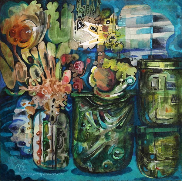
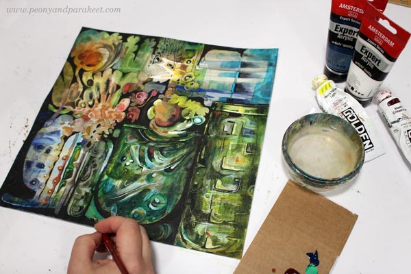
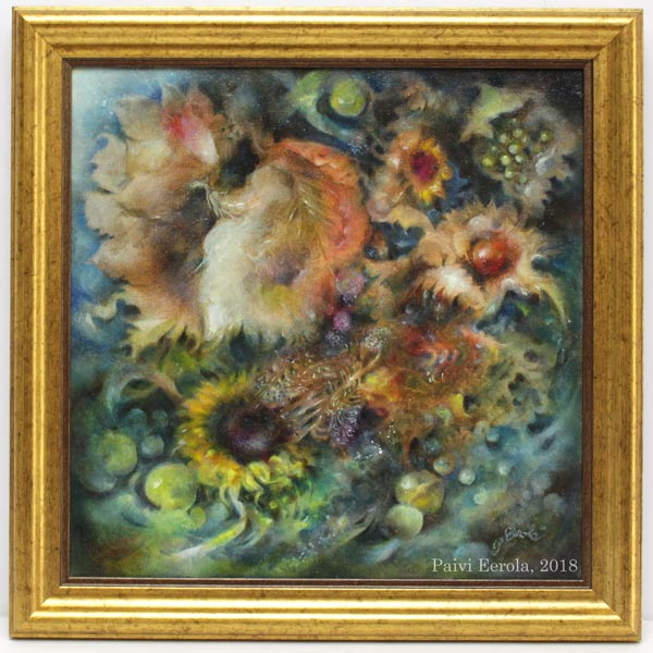
The image above is a revamped version of the busy mixed media piece below. It’s 12 by 12 inches, and I originally made it back in 2014 for a blog post about how to paint glass.
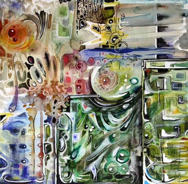
I visited the Finnish Glass Museum a couple of weeks ago, so this piece felt really inspiring again! Let’s dive deeper into how I changed it.
Tip #1 – Cure the White Spot Fever
Back in 2014, I had fallen in love with all kinds of white pens, paints, and correction fluids. A little dot here, another there, and the element looked prettier. But adding dots and spots also make the piece busier. For the viewer, it’s like trying to find its way through crowded streets where everyone is trying to get the attention: “Hey, hey, hey, you there, look at me!”
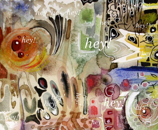
When you are a doctor for the white spot fever, start by toning down all the spots that are located near the edges. We want to steer the eye to the middle first, so the edges don’t have to be so eye-catching. If this is the first time you work on this job, watercolors can be a good choice. Even if the pigment wouldn’t stick on all the surfaces, you get the impression of how the piece looks if you make the edges less noticeable. Turn the piece upside down, so that it’s easier to focus on the task, and not look at the big picture.
Of course, your pieces can have fever, even if it’s not the white spot fever. The general advice for any fever is to remove all the eye-catching small elements that are located near the edges.
Tip #2 – Form Friendships between Elements
Often when we don’t feel connected with the image, the image itself doesn’t express connection. When the elements are floating separately, there can be a lonely undertone in the whole piece. On the other hand, if there is no contrast between the elements, the image can look busy no matter how connected the elements are.
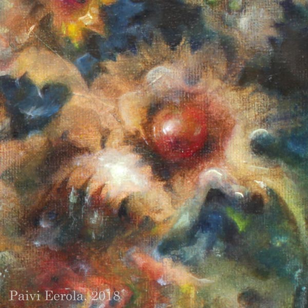
Here are my two versions side by side. In the old version, there are big glass jars, but the contrast between them is not very clear. There are a lot of small shapes that are floating lonely.
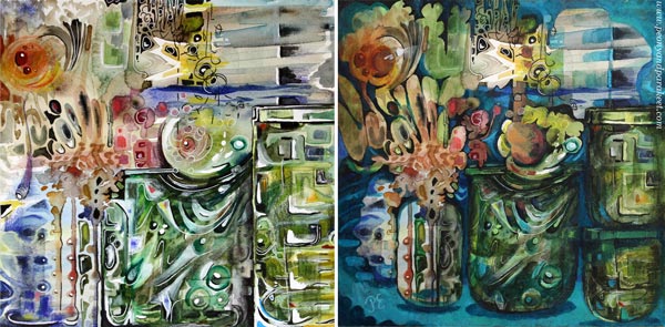
At best, adding connections make the image to deliver a message. When I looked at my piece, it was unclear to me what it was about. In the old blog post, I had written: “It’s about parents trying to protect their children. The parents have good intentions, and they do their best, but in the end, they have to let the child step into the world. I have painted two glass vases to represent the parents. The child sees the world through the parents, and even if they want to protect the child, they are fragile too.”
But now, I found the element that looked like jaws most intriguing. It seemed to be a rising spirit, a small but powerful baby dragon, which only needed a neck to become a central element.
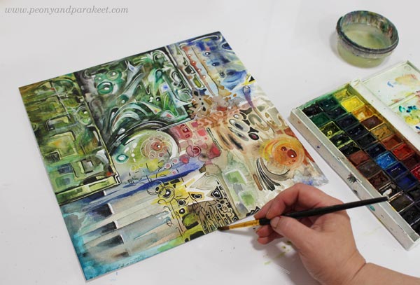
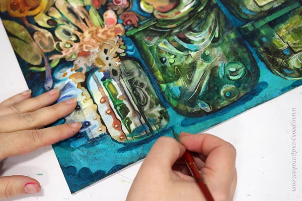
I used dark india inks and black pen to quickly sketch how I would connect the elements, and then continued the work with acrylics and lighter colors. I broke the biggest jar near the edge to two jars so that they won’t compete with the focal point so much.
Tip #3 – Make a Highway for the Viewer
Busy pieces often have so many paths for the eye that it’s not clear where to start and how to continue. The best thing is to be clear and make a highway that goes around the image. The viewer can then take smaller scenic routes around the details, but there’s always the big safe road to return to that leads to the main attractions.
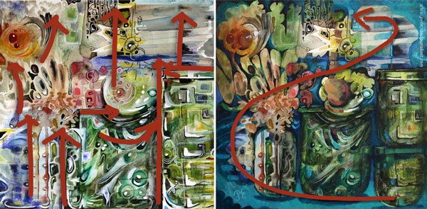
Building a highway requires that you know what your main elements are. After finding the spirit of the jar, I made the red circle communicate with it. Now I added a couple of white spots so that it looks like there’s a voice or a reflection flying between the two. So there’s use for those white dots, just use them sparingly and near the places where you want to lead the eye!
With turquoise tones, I painted a route from the right bottom corner to the two central elements. I also added more depth to the image by painting shadows. Shadows would be my fourth tip, but it’s worth a separate post, so I will get back to it sometimes later.
No More Busy Mixed Media!
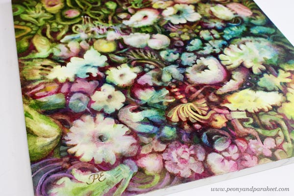
I named the revamped version as “Song of Glass” because it’s now about finding the singing spirit of the silent jars.
I hope you found this post helpful for busy mixed media pieces. See my classes for more handy tips and advice!
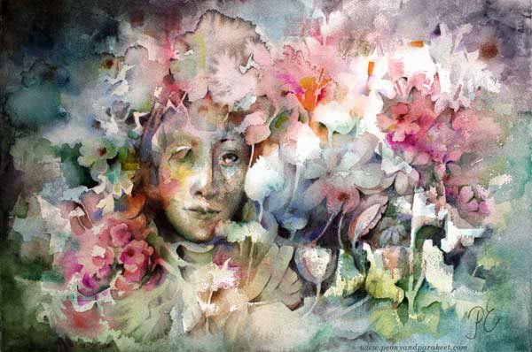
Why I Paint White Flowers – How Your Artistic Voice is Influenced by Others
There’s a lot of talk about finding your artistic voice, but very little about how other people affect it. So this week, I share a story about my mother and her influence on my art.
Painting the Same Thing Again and Again
A couple of days ago, I was on a morning walk near my home in Southern Finland. The air was fresh as well as the view, dominated by the blue sky and white clouds. My beagles’ busy noses and a glimmering brook followed a sown field that had already started to green. Both birds and earphones fed entertaining listening. But all I could think of was my painting. Was it finished? Should I add more color to the flowers? What else did I need to adjust to make most of the tens of hours? I was alone with my dogs, but the inner critic kept me company: what kind of artist doesn’t even know the meaning of her images?
Yes, I am no artist at all. I paint white flowers, the easiest anyone can imagine, and the worst that my mother knew. “No white flowers,” she repeated to my father when her wedding anniversary came close, and he was about to buy a bouquet. “White flowers mean death.” And now, long after she has passed away, all I want to paint is white flowers.
Commenters are Your Art Coaches
Rebelling had no place in my upbringing during the 1970s and 1980s. As a teenager, I tried to respond to my mother’s corrections and criticism with an ignorant smile. Not for long. She didn’t hesitate to tell that it wasn’t a proper reaction. She was both a direct and shy person. Her presence was almost invisible in public gatherings, but at home, in her empire, she was the master of rights and wrongs. So when I showed drawings to her, she either approved or disapproved. She didn’t talk to me as directly as to my father – what to do or what not – but her words and facial expressions told everything.
My mother was like a strict gymnastic coach with high expectations, but she lacked one essential skill – the ability to show how the tricks could be done. She was as honest to herself as to anyone in this matter and put her energy for finding time, supplies, and art education for me. Time to create was the easiest part. My mother was a housewife. She had left her job at a young age right after she got married. She didn’t want her daughters to have the same destiny, so she did her best to keep me out of the kitchen and constantly reminded me how children would prohibit me from doing what I love.
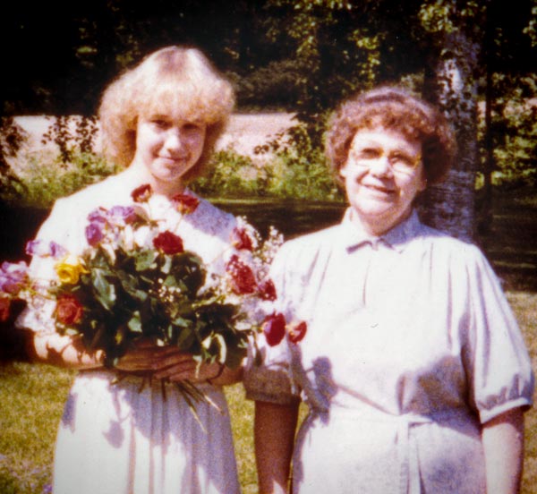
We lived in a small town near the Russian border, and our family wasn’t wealthy. The only income came from my father’s pension. In the evenings, my mother wrote all the expenses on a small black book. But purchasing pens and paper was mandatory. To her, it was the lowest level of civilization, more important than books. Our town had one bookshop that sold some supplies, but after we got more knowledge from local art groups and competitions, it became evident that I needed a better and broader selection. So every month, when my parents drove to a bigger town, I was often with them, selecting paper, paint boards, crayons, and acrylic paints from a real art supply store.
A Praised Piece Sticks into Your Mind
When I was some years over ten, in one spring morning, I decided to try out a new set of crayons. It was just a warm-up, a quick landscape without using any reference. “Look, mother, what do you think,” I said like so many times before. She looked at the image, tightened her lips, but unlike her, she didn’t say much. Later, when I opened a narrow kitchen closet to pick an iron, I stopped. The landscape was taped inside the wooden door. “I like to look at it,” she said after seeing my puzzled face.
I was devastated. That little landscape didn’t deserve the place. So many times I had poured my heart out on paper and soon found out that it wasn’t to her liking. And now – I didn’t even color all the paper!
Finding the Why Behind Your Artistic Voice – Connecting the Appraisals and Repetitions
Fortunately, my mother was not the only one commenting on my art. My two big sisters had different opinions, and my teachers and friends as well. One piece didn’t satisfy them all, but there were always kind words from someone. It encouraged me to keep painting and drawing, as everyone, especially my mother, expected.
After my mother’s death, one stormy weekend, I traveled to the childhood home to pick things that I wanted to keep before we would sell it. The house was cold, but I knew it was the last time when I would see it like it used to be. Everything was clean and tidy. Performing tasks effectively with high quality had always fascinated my mother. “If I could choose what my profession was, it would be a researcher of work – if such a profession existed.”
When I got up the stairs to an attic, the sight would surprise anyone but me. The attic had always been nearly empty. In one corner, under a sloped sealing, my father had built a small closet for safe storage. I opened its little door, and there they were, neatly in a big cardboard box – my paintings and drawings. Not all, but a collection that my mother had curated over the years, the little crayon drawing included.
So a few days ago, when I was walking by the field and looking up in the sky, my mother came to me in the form of the freshly colored landscape. I now knew that my urge to paint white flowers hadn’t been an act against my mother, but a yearn for her acceptance that blank white blobs had once given to me. Now my question is: can I let go of them, or do I want to keep her in my art forever.
Who has influenced your art? Can you recognize how?
P.S. I also teach drawing and painting flowers in the class Floral Fantasies.
Varnishing, Framing, and Celebrating Your Best Paintings
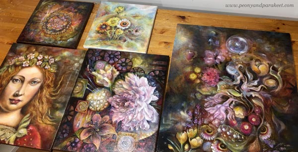
I have finished an oil painting called “Temptation.” I started it at the beginning of this year and after tens of painting sessions and weeks of drying time, I finally got it finished, varnished, and framed. So it’s time for celebration! So, the theme for this blog post is our best work, and especially our best paintings.
I have been planning this post for well over a year to get all the images I want to show you, and the experiences that I want to share with you, so I am happy that with the latest painting, the time has come for this article too!
Best Work – How to Know?
In art, there are very few absolute rights and wrongs, so this question can have many answers. But here’s how I know when I have produced my best work:
1) Time: I have worked on the painting for tens of hours and tens of sessions. Even if some artists work quickly, in general, most people underestimate the time that professional artists spend with their pieces. Overworking is rarer than underworking!
2) Message: I know why the painting exists. I can start a painting without a specific idea in mind, but when the painting progresses, I need to find a connection and a story to be able to make all the decisions needed.
3) Details: I have paid attention to every area of the painting. Some areas can be freer or less detailed than others but they have to be aligned with the overall message of the painting, supporting the most important areas.
Best Work – Test!
I have a couple of tests that I always use for my best work. Try these!
A) Do you want to hang your painting on your wall?
Here, I mean your painting, on your wall in your home. When I use this test, I don’t imagine anyone else’s home or anyone else’s wall. If I don’t want the painting on the wall, it’s likely that no one else will either.
B) Do you see your painting as a treasure?
Place the painting on the table, walk away from the room, and then come back and glance at it. If your instant reaction is that there’s a valuable item on the table, the painting is close to the finish. Here, the difficult thing is that you need to recognize your reaction quickly and glance at the painting from a distance. The further away you can be and get the impression of a treasure, the better. When I use this test, I try to alienate myself from the painting before entering the room.

When you have produced a painting that meets your criteria, why not varnish, frame and celebrate it?! These are all important steps to me. Let’s start with varnishing!
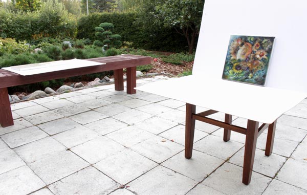
Before Varnishing – Take Photos!
Varnishing makes the painting harder to photograph because it will have glares more easily. If you have produced your best work, you will also want to get good photos of them! I use a tripod when taking photos, and if the weather is good, I take the photos in natural light.
Varnishing an Oil Painting – The Traditional Way
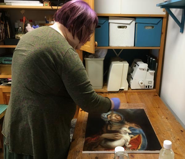
Oil paintings are tricky to varnish because they dry slowly. The drying time depends on how thick the layers are and how much drying time there has been between them. In any case, it’s months, and it can be more than a year! With “Gypsy Madonna,” I waited for nine looooong months. Every layer had dried a week or more, and they were very thin, so based on the advice that I got, that would be enough.
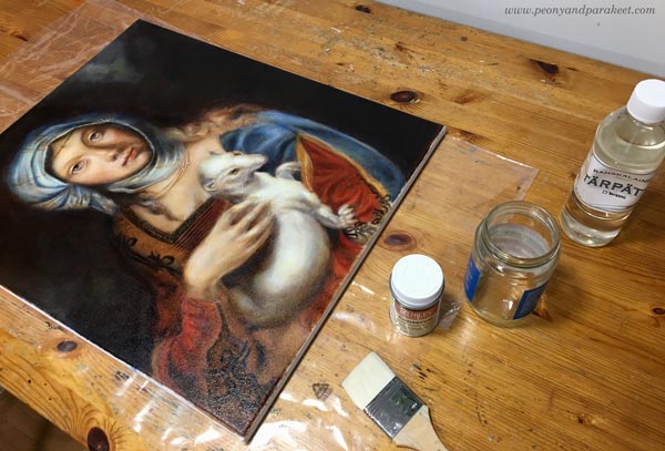
I bought Rublev Conservar Dammar Gloss Varnish with UV protection and applied it with a broad and soft goat bristle brush.
Always when varnishing, it’s good to:
1) double-check and follow the instructions of the specific product that you use. Don’t rely on the instructions that come with the bottle but go to the manufacturer’s website to see if there’s more advice.
2) apply a small amount of varnish and keep the layer thin.
3) let the previous varnishing layer dry properly before adding a new layer. Usually, a couple of layers are needed.
4) if possible, reserve a brush for varnishing only
Varnishing an Oil Painting – A Quick Solution
Luckily, there’s an alternative for traditional oil varnishes. It’s called Gamvar Picture Varnish. I got to know about it from my artist friend Eeva Nikunen. She has also made a process video about using Gamvar.
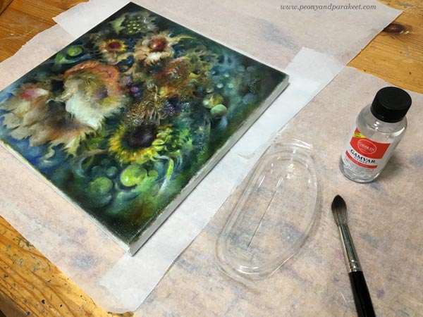
This medium only requires the surface to feel dry. So it can be applied after a few weeks after finishing the oil painting. I used Gamvar for the first time now, and because it’s thicker, it’s much easier to handle than the traditional varnish. Spreading Gamvar is more like rubbing with small strokes than painting with long strokes. A little sturdier brush works better here. I used a watercolor brush.
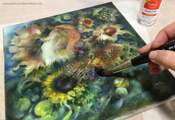
The pleasure of varnishing is the same regardless of the medium. The colors become more vibrant, and the painting begins to shine. I prefer using glossy to matte varnishes because I love the extra glow!
Varnishing an Acrylic Painting
Varnishing is not just for oil paintings! You can varnish acrylic paintings as well, just remember that they have their own products. I mostly use Golden acrylic paints, so when varnishing acrylic paintings, I have also used products of the same brand.

First, I add a layer or two of gel medium (Golden Soft Gel Gloss) before I begin the varnishing. Gel medium separates the paint layers from the varnishing layer. I mix some water with the gel medium to make it more fluid so that the brush strokes don’t show so well. I use a broad and flat brush and let every layer dry before adding a new one. It’s good to wait at least a day because polymer products can feel dry even if they haven’t dried properly yet.
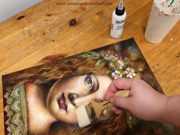
Then I add 1-3 layers of Golden’s glossy polymer varnish. It has to be mixed with water, and every layer has to dry 3-6 hours before adding a new one. I try not to put too much pressure on the brush so that the brush strokes won’t show.
I think that after varnishing, the increase of the vibrancy is as visible as with oil paintings. Definitely worth the effort!
Celebrating the Finished Painting – Framing
If my opinion, the best way to celebrate the finished painting is to get it framed. If varnishing is the makeup, framing is the dress. The impact of the frame is incredible when it fits well and continues the personality of the painting. Sorry about the glare in the sample images!
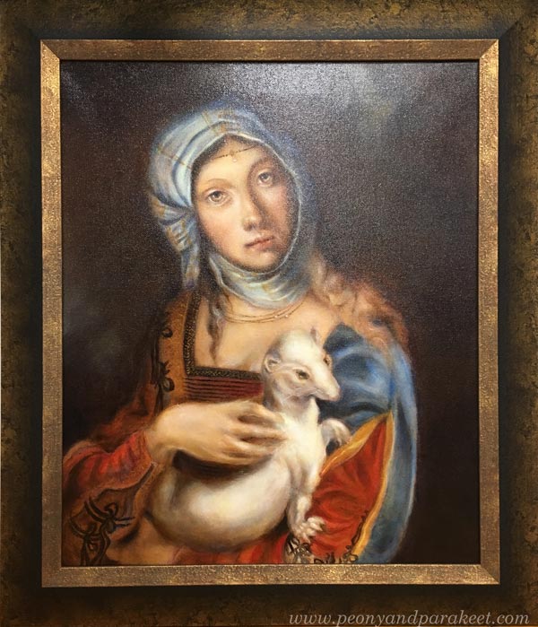
I use a local professional framer because I love the quality. I chose an old-fashioned and heavy frame for the Renaissance-style painting, and it made it look like an old masterpiece. Without frames, the image was much more modest.
For this acrylic painting, I chose a dark frame that makes the colors shine.
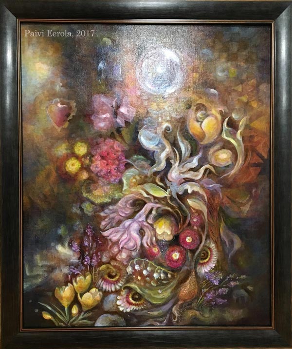
If the frame were lighter, the dark colors of the background would have got more attention, and the result wouldn’t be as harmonic.
Today, I got “Temptation” from the framer. Because this painting is like a collection of treasures, I wanted the frame to be luxurious too.
Celebrating the Finished Painting – Music!
I also like to celebrate my best pieces by listening to some music when admiring them. I try to find a song that is aligned with the painting and it’s often a song that I have already listened when working on the piece. For “Temptation”, the song is Musetta’s aria from Puccini’s opera “La Boheme”. After exposing the painting to the critical eye for so long, it’s time to forget the struggles and enjoy the accomplishment. I find this combination of musical and visual pleasure one of the best joys in life.
I hope you too will celebrate your best work!
P.S. “Temptation” is now available in my art store, see more detailed photos there!