Varnishing, Framing, and Celebrating Your Best Paintings
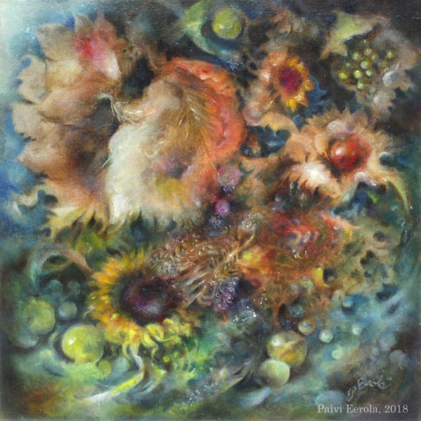
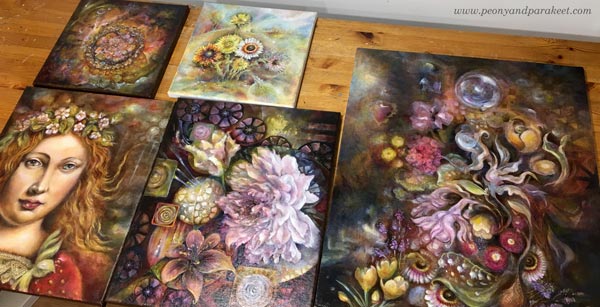
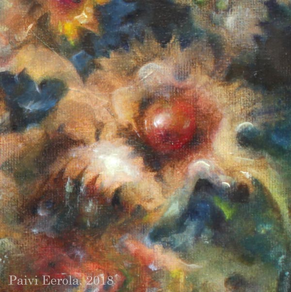
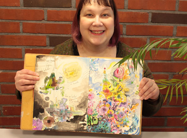
I have finished an oil painting called “Temptation.” I started it at the beginning of this year and after tens of painting sessions and weeks of drying time, I finally got it finished, varnished, and framed. So it’s time for celebration! So, the theme for this blog post is our best work, and especially our best paintings.
I have been planning this post for well over a year to get all the images I want to show you, and the experiences that I want to share with you, so I am happy that with the latest painting, the time has come for this article too!
Best Work – How to Know?
In art, there are very few absolute rights and wrongs, so this question can have many answers. But here’s how I know when I have produced my best work:
1) Time: I have worked on the painting for tens of hours and tens of sessions. Even if some artists work quickly, in general, most people underestimate the time that professional artists spend with their pieces. Overworking is rarer than underworking!
2) Message: I know why the painting exists. I can start a painting without a specific idea in mind, but when the painting progresses, I need to find a connection and a story to be able to make all the decisions needed.
3) Details: I have paid attention to every area of the painting. Some areas can be freer or less detailed than others but they have to be aligned with the overall message of the painting, supporting the most important areas.
Best Work – Test!
I have a couple of tests that I always use for my best work. Try these!
A) Do you want to hang your painting on your wall?
Here, I mean your painting, on your wall in your home. When I use this test, I don’t imagine anyone else’s home or anyone else’s wall. If I don’t want the painting on the wall, it’s likely that no one else will either.
B) Do you see your painting as a treasure?
Place the painting on the table, walk away from the room, and then come back and glance at it. If your instant reaction is that there’s a valuable item on the table, the painting is close to the finish. Here, the difficult thing is that you need to recognize your reaction quickly and glance at the painting from a distance. The further away you can be and get the impression of a treasure, the better. When I use this test, I try to alienate myself from the painting before entering the room.

When you have produced a painting that meets your criteria, why not varnish, frame and celebrate it?! These are all important steps to me. Let’s start with varnishing!
Before Varnishing – Take Photos!
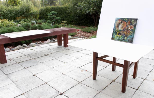
Varnishing makes the painting harder to photograph because it will have glares more easily. If you have produced your best work, you will also want to get good photos of them! I use a tripod when taking photos, and if the weather is good, I take the photos in natural light.
Varnishing an Oil Painting – The Traditional Way
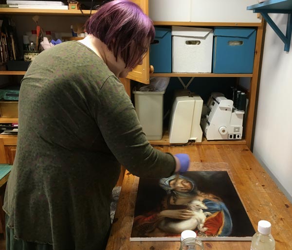
Oil paintings are tricky to varnish because they dry slowly. The drying time depends on how thick the layers are and how much drying time there has been between them. In any case, it’s months, and it can be more than a year! With “Gypsy Madonna,” I waited for nine looooong months. Every layer had dried a week or more, and they were very thin, so based on the advice that I got, that would be enough.
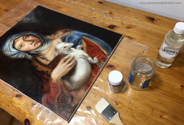
I bought Rublev Conservar Dammar Gloss Varnish with UV protection and applied it with a broad and soft goat bristle brush.
Always when varnishing, it’s good to:
1) double-check and follow the instructions of the specific product that you use. Don’t rely on the instructions that come with the bottle but go to the manufacturer’s website to see if there’s more advice.
2) apply a small amount of varnish and keep the layer thin.
3) let the previous varnishing layer dry properly before adding a new layer. Usually, a couple of layers are needed.
4) if possible, reserve a brush for varnishing only
Varnishing an Oil Painting – A Quick Solution
Luckily, there’s an alternative for traditional oil varnishes. It’s called Gamvar Picture Varnish. I got to know about it from my artist friend Eeva Nikunen. She has also made a process video about using Gamvar.
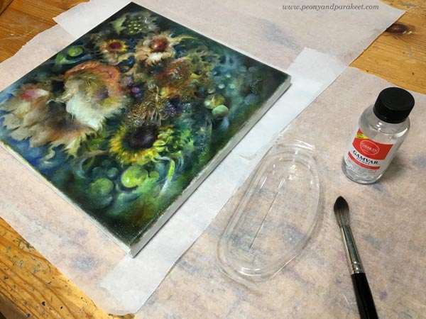
This medium only requires the surface to feel dry. So it can be applied after a few weeks after finishing the oil painting. I used Gamvar for the first time now, and because it’s thicker, it’s much easier to handle than the traditional varnish. Spreading Gamvar is more like rubbing with small strokes than painting with long strokes. A little sturdier brush works better here. I used a watercolor brush.
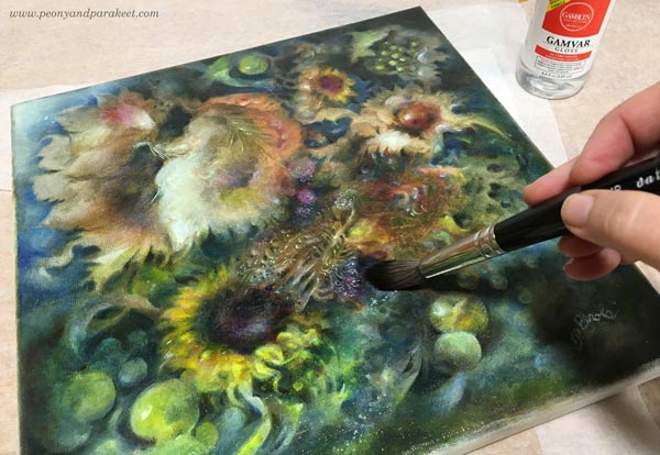
The pleasure of varnishing is the same regardless of the medium. The colors become more vibrant, and the painting begins to shine. I prefer using glossy to matte varnishes because I love the extra glow!
Varnishing an Acrylic Painting
Varnishing is not just for oil paintings! You can varnish acrylic paintings as well, just remember that they have their own products. I mostly use Golden acrylic paints, so when varnishing acrylic paintings, I have also used products of the same brand.

First, I add a layer or two of gel medium (Golden Soft Gel Gloss) before I begin the varnishing. Gel medium separates the paint layers from the varnishing layer. I mix some water with the gel medium to make it more fluid so that the brush strokes don’t show so well. I use a broad and flat brush and let every layer dry before adding a new one. It’s good to wait at least a day because polymer products can feel dry even if they haven’t dried properly yet.
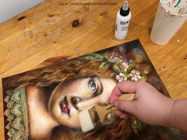
Then I add 1-3 layers of Golden’s glossy polymer varnish. It has to be mixed with water, and every layer has to dry 3-6 hours before adding a new one. I try not to put too much pressure on the brush so that the brush strokes won’t show.
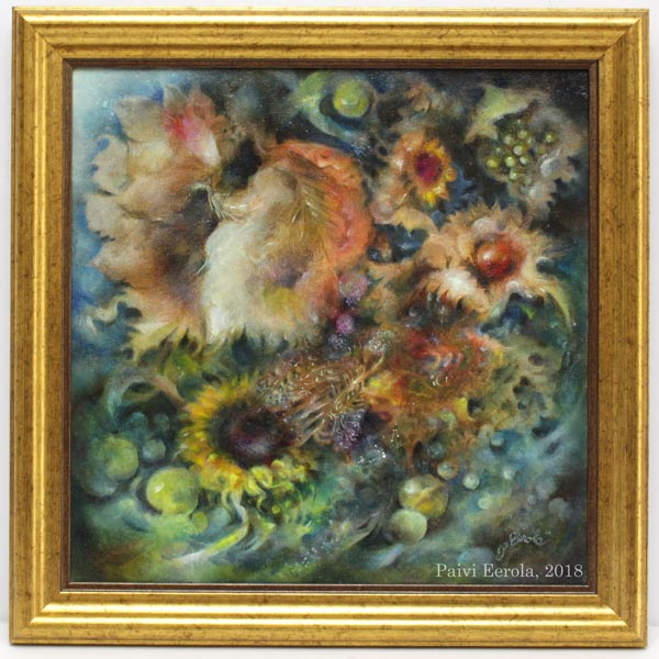
I think that after varnishing, the increase of the vibrancy is as visible as with oil paintings. Definitely worth the effort!
Celebrating the Finished Painting – Framing
If my opinion, the best way to celebrate the finished painting is to get it framed. If varnishing is the makeup, framing is the dress. The impact of the frame is incredible when it fits well and continues the personality of the painting. Sorry about the glare in the sample images!
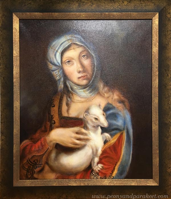
I use a local professional framer because I love the quality. I chose an old-fashioned and heavy frame for the Renaissance-style painting, and it made it look like an old masterpiece. Without frames, the image was much more modest.
For this acrylic painting, I chose a dark frame that makes the colors shine.
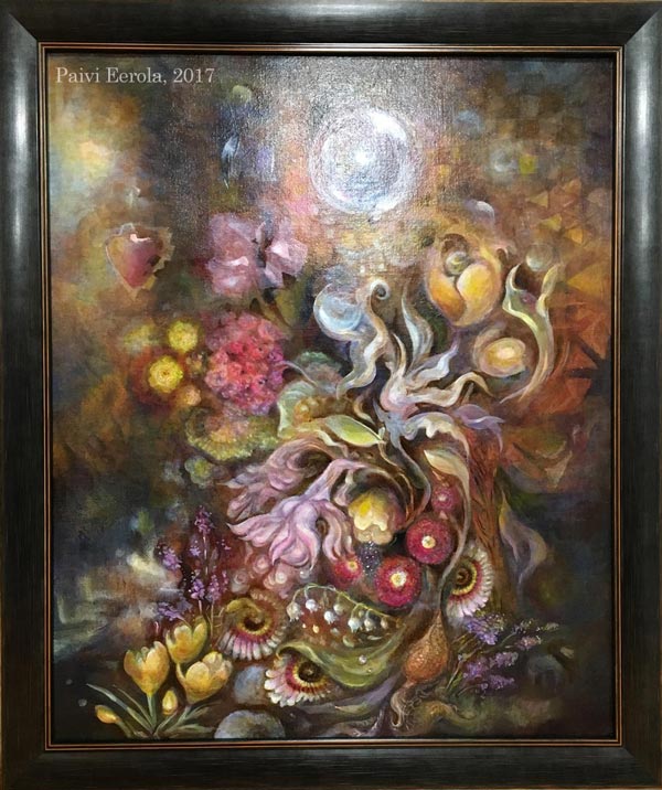
If the frame were lighter, the dark colors of the background would have got more attention, and the result wouldn’t be as harmonic.
Today, I got “Temptation” from the framer. Because this painting is like a collection of treasures, I wanted the frame to be luxurious too.
Celebrating the Finished Painting – Music!
I also like to celebrate my best pieces by listening to some music when admiring them. I try to find a song that is aligned with the painting and it’s often a song that I have already listened when working on the piece. For “Temptation”, the song is Musetta’s aria from Puccini’s opera “La Boheme”. After exposing the painting to the critical eye for so long, it’s time to forget the struggles and enjoy the accomplishment. I find this combination of musical and visual pleasure one of the best joys in life.
I hope you too will celebrate your best work!
P.S. “Temptation” is now available in my art store, see more detailed photos there!
Consistency and How to Get Inspired by It

When artists say that they need to focus and find their style, a big part of the problem is the lack of consistency. To me, “consistent” used to be a negative word meaning “boring,” “predictable,” and even “unimaginative.” But during the recent years, I have realized that there can be a lot of freedom in the consistency.
Here’s an example. Last Sunday, I wanted to do some art journal pages inspired by my recent trip to Italy. I was already heading towards my paints and brushes when something else came to my mind. It hit me that I have art supplies I haven’t used for a long time. One of them was Faber-Castell Gelatos. They weren’t very cheap, but I had only used a little of them. They were too clumsy and creating with them felt like painting with lipsticks. These were definitely a wrong choice when thinking about old master paintings and the era of Renaissance.
But now the challenge of using Gelatos started to intrigue me. The idea of bringing those crafty sticks to the past felt like turning on a time machine. For some artists, it would be a sign of inconsistency not to stick with particular art supplies only. But when my goals are to bring people with different skill levels together, reveal the treasures of art history, and regularly offer new ideas for creating art, it’s very consistent. So I didn’t unnaturally have to limit myself but was able to enthusiastically create the art journal pages and write this blog post.
Inspiration: Palazzo Doria Pamphilj, Rome

My favorite place in Rome was a private art museum Palazzo Doria Pamphilj. It was located in the busy center, but after entering there, I was in a peaceful and beautiful world. There were a lot of inspiring paintings, but Jan Brueghel was a new artist to me, and his landscapes were unbelievably detailed. These paintings could have been huge, and they would still look detailed. But they weren’t very big; the length was under 1 meter in the painting below.

Another interesting thing was that Jan Brueghel collaborated with another artist Hendrick van Balen, who was specialized in painting figures. No wonder, the quality of these paintings is amazing! The painting above belongs to the series of four allegorical paintings, expressing the elements of water, fire, earth, and air. What a great theme for today’s artists too! And speaking of consistency: painting a series can also enforce that.
Abstract Landscape with Faber-Castell-Gelatos
I usually create art journal pages when my ideas are not mature enough for bigger paintings. Documenting these ideas in an art journal keeps the creative process flowing and maintains one aspect of consistency: the regularity of creating.
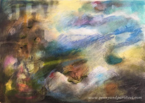
Experimenting with Gelatos was fun, and I especially enjoyed inventing ways to add details with those clumsy sticks. By building layers, I was also able to achieve a color scheme that brings old paintings in mind. The consistent inspiration from the many styles seen in the history of art sets me free. It goes so deep into what I ponder the most: how things change all the time and how timelessness can still be present.
3 Technique Tips for Art Journaling with Faber-Castell Gelatos
One way to be consistent is to develop techniques that are reusable. Often when I invent a technique for a specific media, it can also be applied to a variety of supplies. I will now show you some ideas for working with Faber-Castell Gelatos. You can adjust these for many other art supplies as well. I begin a second art journal page to demonstrate the techniques.
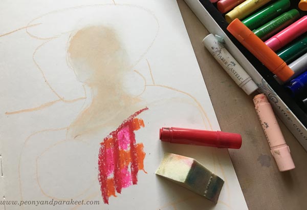
1) Blending and Softening
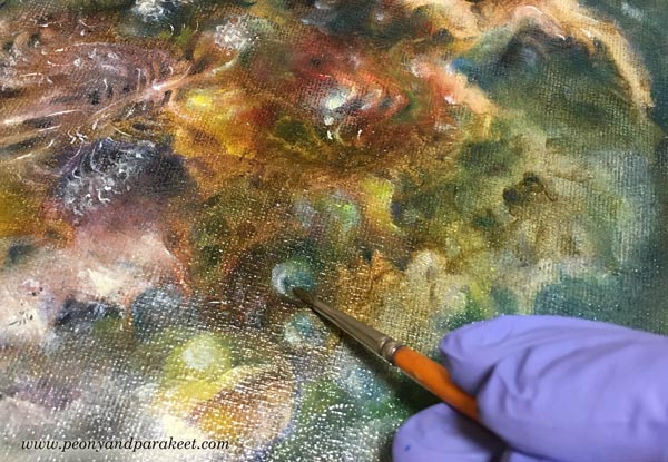
The more I have studied Renaissance art, the more I have been into creating soft color transitions and muted colors. When beginning a new painting, I like to blend and soften a lot. With Gelatos, the best way to mix the colors is to use a sponge. In the photo below, you see that I have mixed white and pale pink for the face but haven’t blended reds and oranges together yet.
2) Adding Details
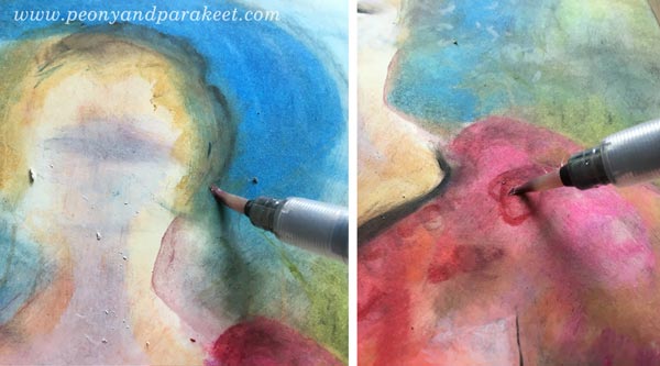
Thick sticks don’t work very well for details. You can use the edge of the stick and get fairly thin lines, but to me, they weren’t thin enough!

However, I discovered that by using water, it’s possible to draw thinner lines with a brush. By adding water and rubbing gently, you can also remove some color and make tiny decorative spots that way.
When painting with watercolors or acrylics, I like to work similarly: add a splotch of paint in one area and then quickly use it for details in other areas. It’s a fast and handy way to color details that need only a tiny portion of color each.
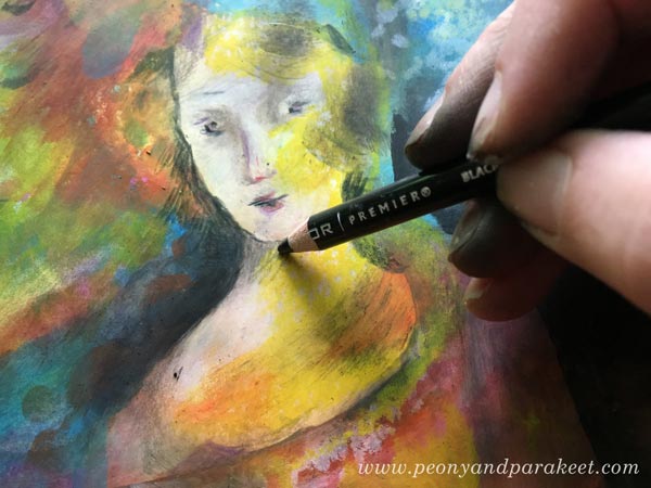
When finishing the face, I used colored pencils to draw the tiniest details. When keeping the Gelatos layers thin and smooth, it’s easy to add other media on the top.
3) Keep on Adding Layers!
When I started making the art journal page, I only had an idea of a lady or a Madonna because that would complement the landscape. I rarely use reference photos when creating art journal pages. To me, it’s more about getting in touch with vague ideas and then process them to express something that’s deeper and more defined. When I was in the middle of making the page, I was pretty clueless about what to express. But I kept on adding layers and slowly improving the image. One way to practice consistency is to keep on working with the same piece even if it looks like crap. See how much my page changed – examine the phase photos below!

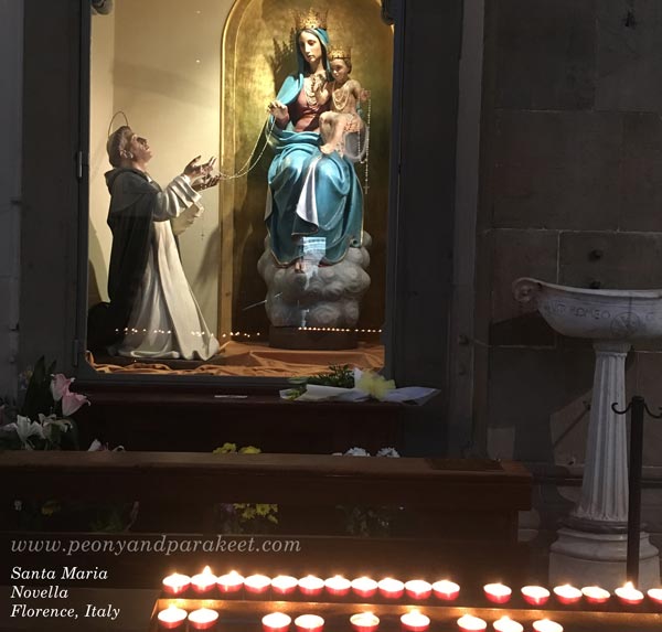
In phase two, I remembered the atmosphere and the candles of Santa Maria Novella, a huge church in Florence. After finishing the page, I went to my photo archive and found an image that looks very similar to my page. It’s so surprising how many of its elements exist on the page even if I didn’t look at the photo at all!
Regularly taking photos and browsing them is one way to add more consistency to the creative process.
Consistency is In the Way You Adjust the Nuances
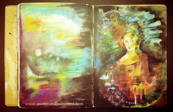
After I had created the page, I felt that the opposite page should continue the same atmosphere. So I quickly made an abstract landscape there. Now when I open the spread of the journal, it feels more intense.

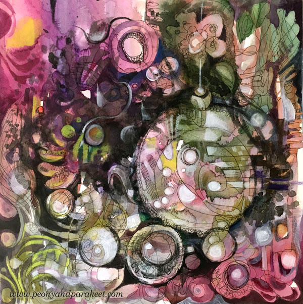
However, there are many things in these two pages that I don’t like. First and foremost, I don’t like the color scheme. It has too many bright colors and too few muted colors, and thus, it looks more modern that I would like it to look. I would like a color scheme that would be more like this:
Also, if my art journal spread would be a big painting instead, I would make the face much more detailed. It’s simplicity, and the 2-dimensional look bothers me! By self-evaluating your work, you can also increase the awareness of the nuances you like. Adjusting the nuances, in turn, results in more consistency. Because many times consistency is more in the way you work with the nuances than how you select the themes and choose the supplies.
Let me be your mentor in art: Subscribe to my weekly emails!
Begin Like a Crafter, Finish Like an Artist
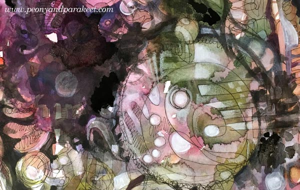
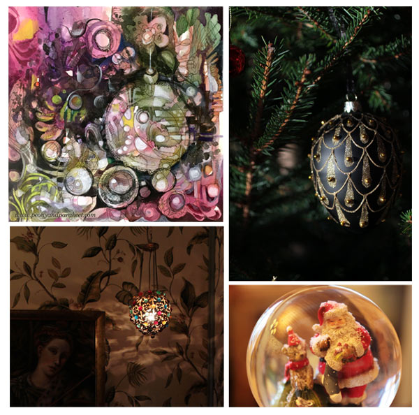
Here’s what I made today: a mixed media painting with a Christmas theme. When I began creating, I had no idea that this will express the season. I didn’t even start with a blank paper but cut a piece of a big pre-painted watercolor paper. It had just careless splotches of color, and I had painted it months before to wait for the right moment. I had just enjoyed knitting some old sock yarn into socks, so I thought to use up that paper with the same mindset: using what I already have and making that more inspirational.
Begin Like a Crafter
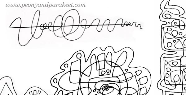
I picked a black Zig drawing pen and started doodling without any idea in my mind. I often think about knitting or crocheting when I doodle. I feel more like a crafter than an artist at the beginning of the process. Exploring the paper with a pen is like crocheting with a hook and yarn. It’s much more relaxing than trying to find a grand idea first. When you start as a crafter, you are ready to do the work. You don’t expect miracles to happen, you know you just have to keep on going, and it will get easier after a while.

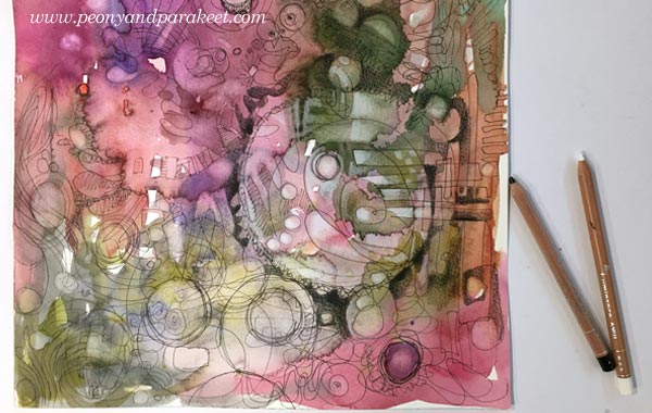
After filling most of the paper with crossing lines, I felt that there was a lack of connection between the drawing and the background painting. They looked like they were two separate layers, each made by a different person. But because I had used a good quality watercolor paper, I was able to add water and wipe off color here and there so that the layers began to interact.
Again, I felt like a crafter adding stitches that would tie the two layers together. I also used white and black colored pencils to enhance the effect.
Find Routines that Start the Change
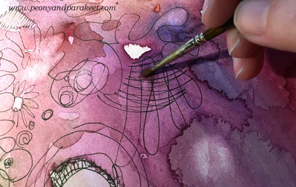
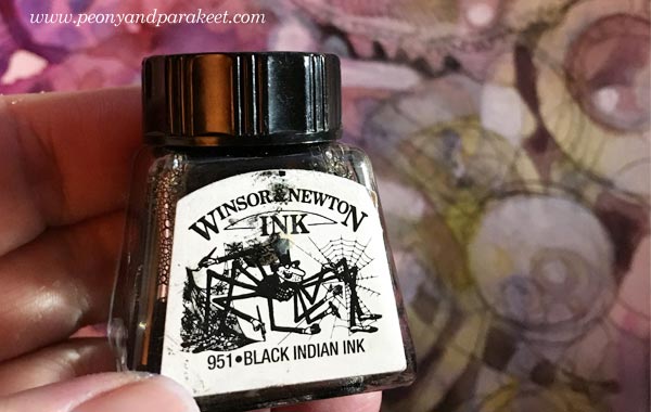
Working with black is my thing. It always brings in more excitement, more drama, and my identity begins to change from a crafter to an artist. This time, just holding a black pencil, made me want to start painting. I picked few bottles of India ink first.
My brush felt stiff, and the shapes that I painted were controlled and modest. But I knew I just had to keep going. There were times when I stopped too soon, and I have seen that happening to many people too. When you stop too soon, you are still too much of a crafter. You try to focus, and you don’t feel like doing anything risky.
I changed to white acrylic paint to get more ideas and contrasts. There were some round shapes on the paper, but I had no idea what they could be.

Finish Like an Artist – a) Do Something Risky
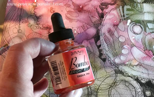
After spending some time painting, I was ready to take risks. All I needed was to choose a little black ink bottle and turn on Jean-Michel Jarre’s Stardust, a song that always gets me into the flow. Uncontrollable black brush strokes felt scary, and of course, there’s a risk of “ruining everything”. I often set an area, where I don’t go. This time I decided to be as wild as I want but leave the center of the biggest bubble alone.
Before doing this phase, I convince myself that my subconscious knows what I could bring up from the mess because I have been staring that for a while already. I often repeat the words “trust” and “knowledge” before I turn to the music. I try to be as quick as I can and focus on adding more speed to my brush. This short phase where I leave the crafter behind is the most enjoyable thing in creating. I feel free while pushing the limits of my creativity.
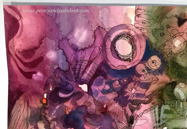
Finish Like an Artist – b) Bring in the Intention
After adding those black strokes and splotches, I knew what I was expressing: holiday decorations on this black Christmas. In the southern Finland where I live, all the snow melt away just before Christmas Eve. I had taken photos just a couple of days ago that connect well with the painting. In this last phase, I try to find the fastest and most natural route to finishing the painting and focus more on composition and clarity than trying to make the image other than what it seems to be already. Accepting that my image can go to the area that is unknown to me at the beginning of the process, allows me to be less stiff.
I find it so fascinating that art is a combination of knowledge and letting go. There are clear guidelines for communicating visually such as how to set your composition. And still, it’s also about taking all that knowledge and jumping into the unknown. Every day, I want to know more and then, relax more!

First Lesson of Inspirational Drawing 2.0 – Start with a Mood, Finish with an Image!
Like knitting starts from the first stitch, drawing starts from the first line. Somewhere between the lines the transformation happens and the crafter changes to an artist. The ideas grow with the imagination. Moods turn to motifs, motifs to modules, modules to streams, streams to images.
The first lesson of Inspirational Drawing 2.0 will be published on January 1st. This is the class you don’t want to miss! Every lesson takes you further in enjoying drawing from inspiration and imagination! I will help you create unique art in unique ways that will make you absorb the knowledge and then let your ideas grow.
Enjoy drawing from inspiration and imagination!
>> Sign up for Inspirational Drawing 2.0
What’s in a Good Composition?
Quick question:
When you create art, how much time do you spend for composition?
I mean: trying to make it work, trying to balance it, trying to make it look more eye-catching?
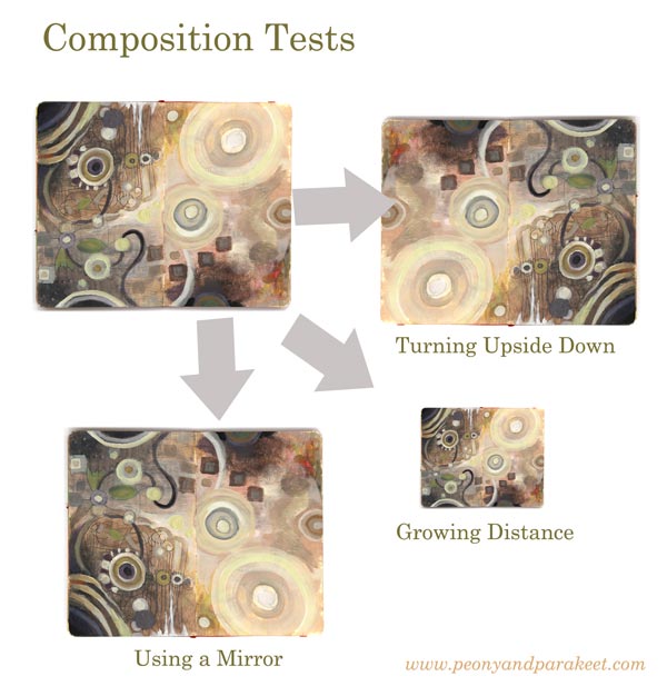
For me, finishing the composition can take as much as 50% of my creating time! Some years ago, it was easily 75 % … I don’t find adjusting the details particularly relaxing. I take photos, use a mirror, and change the orientation of the piece to see if I have missed something. Sometimes I sleep overnight and make the last adjustments in the morning.
But teaching art has had some benefits here. I get to help people to make better compositions and thus, I have become faster. Namely, the two top requests that I get in my classes are: 1) How can I make this look finished? 2) What more could I add here?
So when I created a new class, Planet Color, I wanted to build a step-by-step creative process so that when you add elements, you don’t have to worry about the composition so much. I wanted to find ways that support you so that you can release your mind and fully enjoy working with colors.
What’s in a Good Composition?
Here’s my conclusion. A good composition has elements that a great party has:
1) concierges who invite the viewer to the painting
2) a star singer who takes the viewer’s attention
3) clear routes and breathing space which make wondering around easy
4) good food and good company which makes the viewer stay in the party
I have built all these elements in one 7-step process. It doesn’t mean that this process produces identical paintings. It means that when you enter the finishing phase, you have already done most of the work you should do anyway. But without all the agony and with all the creative enjoyment! That’s why my workshop Planet Color is as much about composing elements as about releasing your mind with colors.
And again, if you have problems in making the final adjustments, I am there to help for all the 14 days.
See you there!