Preparing for Sales Events
This week’s post is about something that I have been doing lately: preparing for sales events!
I participate in four events:
- A curated group show organized by the big gallery Gumbostrand Konst & Form
- A winter-themed group show organized by the local artist association where I am presenting Talviyön runoelma – Winter Night’s Poem
- 2-day Christmas sales event organized by the local artist association Vantaan taiteilijaseura
- Black Friday course sales event organized by me on this website!
For me, this is a lot! Fortunately, I have had time to prepare. For example, I got the deadline for the suggestions for the curated group show on Sept 1st. I was then able to apply and have new work specifically painted for the gallery.
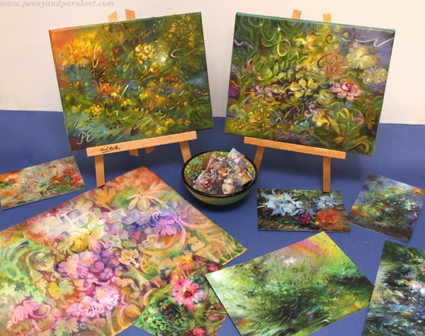
Of these four, I am most anxious about the 2-day Christmas sales event even if it’s the smallest one! I have a sales table there, and I haven’t been preparing one for ages. I enjoy selling face-to-face, so it’s also something that I look forward to. It’s also great to see all kinds of sales items on one table and make a nice selection.
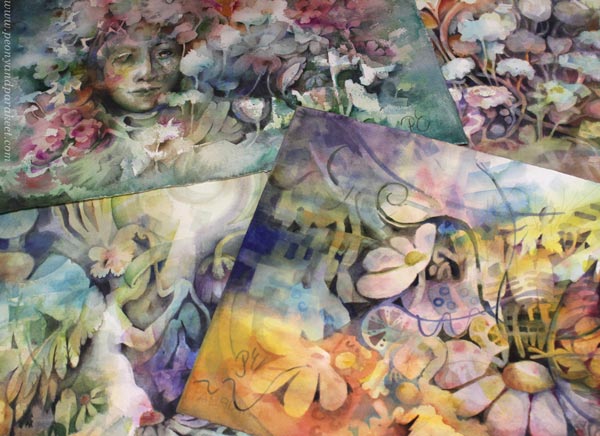
Selecting Sales Items – Delivering the Experience of an Original
Even the smallest sales table is a chance to strengthen your artistic voice and communicate your art brand. Most customers may buy postcards and other affordable items only, but still – we want to give them the whole experience. People have come back to me saying: “I remember you. I bought one card from you a couple of years ago, and I look at it every day.” I like to think that with the card, they also buy a piece of the world I am presenting to them. That’s why I always try to include original art as well.
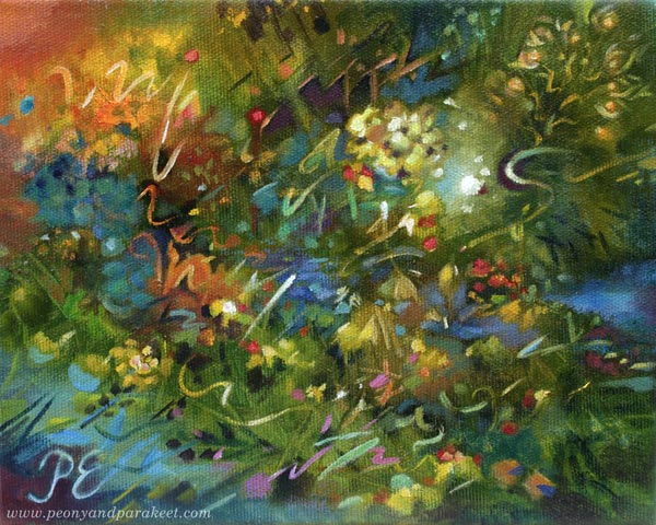
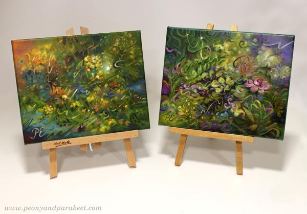
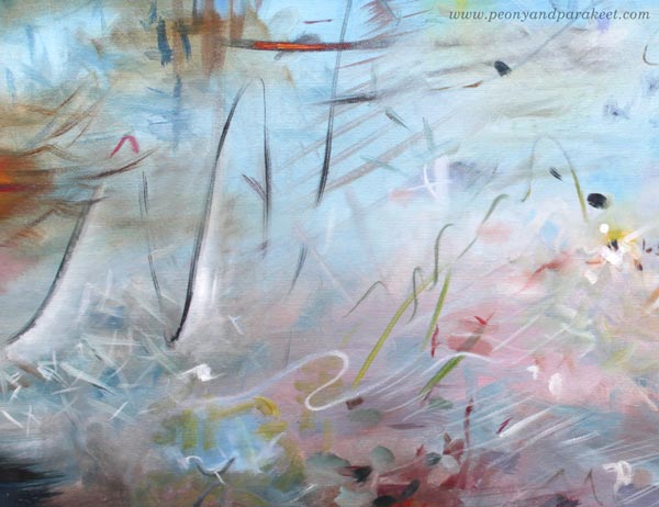
Here’s one of the small paintings that I just finished. It’s called Samettikukan sointi – The Sound of the Marigold.
The Sound of the Marigold is a sister to a piece that I showed you earlier called Ruusun henki – The Spirit of the Rose. But when I placed the paintings side by side, I wanted to make adjustments to the rose painting so that its’ color scheme is less similar. So here’s the new version of The Spirit of the Rose:
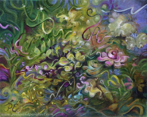
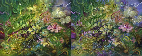
Here are the two versions together so that you can compare the changes.
I am going to have small stands for them so that they will stand out from the rest of the selection.
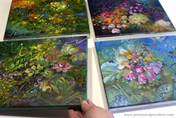
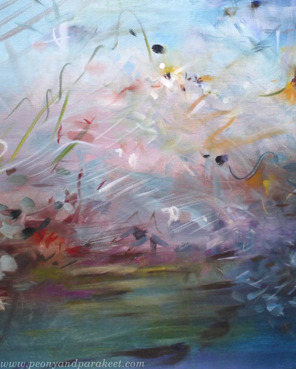
There are also a couple more small oil paintings. They are still in progress, but I hope to finish them soon so that they have time to dry.
I have noticed that people who don’t regularly go to art events forget the difference between a photo and an actual painting. – like it would be the same browsing the feed or picking a postcard as watching an original.
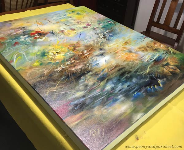
On my sales table, prints will dominate in quantity. And because most of them are pictures of oil paintings, I also want to deliver the experience of an original oil painting. With the four small ones, I can hopefully present one medium-sized original, maybe Forest of Wishes.
What A Part of Your Audience Expects to See
In my experience, some people are interested in a specific art technique. Previously, when I had the sales table at a similar event, there were some who wanted to talk about watercolor painting and were disappointed that I only had one example or so. These are people who are art hobbyists themselves and who are potential customers for my classes.
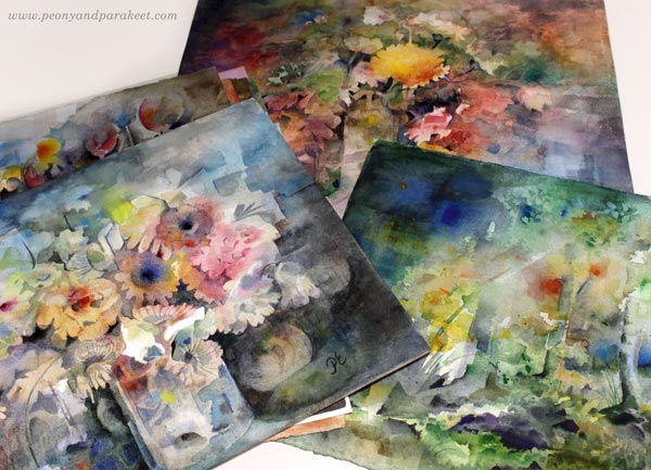
I used to paint a lot in watercolor, but lately, not so much because they don’t sell as well as oil paintings and have a low price point. Because I need to make a living and because I enjoy creating big paintings, I have focused on oils. But this time, I thought I would take a bunch of watercolor paintings with me and set the price lower than expected. If I still actively sold watercolor paintings, I wouldn’t do that, but now I see the chance to reach this part of the audience and show my watercolor work.
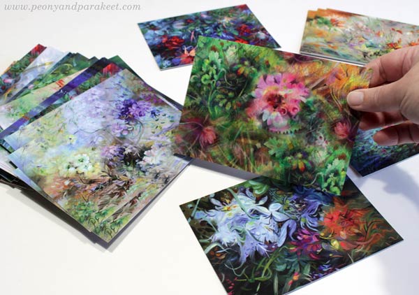
Because most elements of my style were developed in watercolor first, these pieces fit well with cards that have oil paintings.
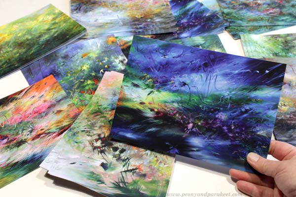
These cards came out gorgeous! They have a satin finish and are bigger and thicker than standard postcards. I ordered them as well as the cards from Moo.com (affiliate link, but I would recommend them without one too!)
What to Leave Out
Many times, I have put everything I have on the sales table, and that’s never been a good thing. You might have potential best sellers, but bringing items that don’t make sense to them will ruin the sales. For example, I brought fabrics with my designs and some craft items to an event focused on fine art. And vice versa, I took some original art to a craft show. Yes, you might get some sales from the odd items, but confuse most of the audience.
Price can be a reason to exclude some too. For example, if the organizer takes a percentage of the sales or if the price of the sales table is high, selling the most affordable items doesn’t necessarily make sense. And vice versa: when people come for good finds on their way to the shopping center, selling the biggest and most expensive pieces can be hard.
This painting – Tiger’s Eye – has been waiting to get to a curated exhibition that interests art collectors. Now I am happy to pack it and two other paintings for a big gallery show.
My oil paintings always get a varnish and a hanging wire so that they are ready for hanging on the wall.
In my experience, original art that is ready to hang is more tempting to buy than pieces that require, for example, framing. However, if the price point is very low, it doesn’t always make sense to frame the pieces. Whatever the case, it’s always good to present a unified collection and leave out some that are too different in size, style, or frame than others.
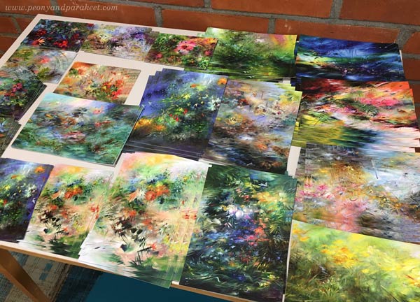
When selecting work for the small postcards, I left out many paintings I like and value. For example, many of my big paintings are not so great for postcards. Their details get lost in the tiny size, and their subject is more suitable for decorating interiors than sending wishes.
And then some paintings are quicker but more suitable; for example, Kukkiva maa – Flowering Earth that I painted in acrylics for the class Floral Freedom.
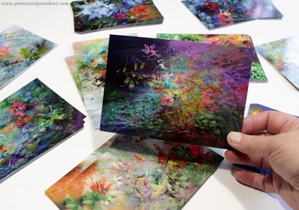
I think it’s perfect for a postcard – full of colors and flowers!
How You Will Be Remembered
Many times when I have been preparing for the events, my behavior has been on my mind: Am I able to show my enthusiasm? How could I not only make sales but be remembered afterward too?
But the best answer here is quite technical. You should have something to give that has your contact information on it. And all your products should have your name and website – or at least an email – on them. I use the same tactics, the same generosity that is, that I have used with selling online courses. I give something for free and invite people to see if I am suitable for them. On the sales events, I have small cards that have different pictures – details of my art – and I invite people to pick one that they like.
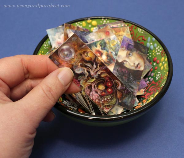
This begins a conversation about their likings about them, and when they have the mini card, I can serve them better and be remembered too.
The postcards also have contact information printed on the back.
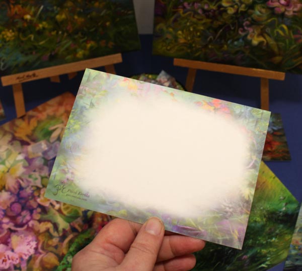
There’s also another artwork as a frame.
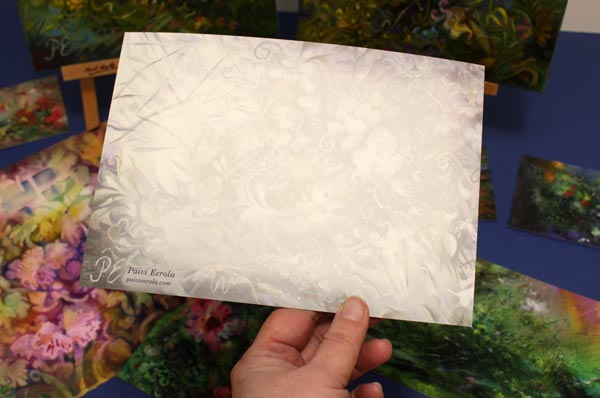
I think about these features as generosity as well. I have taken the time to design the back to make the cards even more valuable.
Sales Events Are the Opportunity to Test
Even if it’s good to have a unified style and selection, the sales event is also an opportunity to test new ideas and approaches. I like to do tests that are not big new things but hidden in the small stuff. This time, I made a postcard of my colored pencil work to see how many people can recognize the medium and how many are interested in this style of drawing.
This postcard is composed digitally of many colored pencil pieces.

As you know, I am not just an oil painter, but also love colored pencils. It would be fun to talk about them too.
This leads us to my course sales event on Black Friday weekend. All classes will be on sale and registration for the new class Doll World will open. Doll World will begin at the beginning of January.
During the years, I have learned that if I love the class, there’s a possibility that you will love it too. The same goes for all art really. We have to pamper it and give attention to its needs. And when the course or the painting asks: “Will there be anyone for me?” we must say: “Yes, my dear – kyllä kultaseni – sometimes it will just take a little bit of time.” We both feel vulnerable about this.
P.S. The engineer in me says that this is not a comprehensive article about setting a sales table. But I intend to share some pics when I set the actual table on December 3-4 at Galleria K, Vantaa, Finland. So stay tuned for Black Friday sales and future blog posts!
Expressing Winter Memories
This week, I have a new winter-themed painting, and we talk about the many approaches for expressing winter and memories of any season.
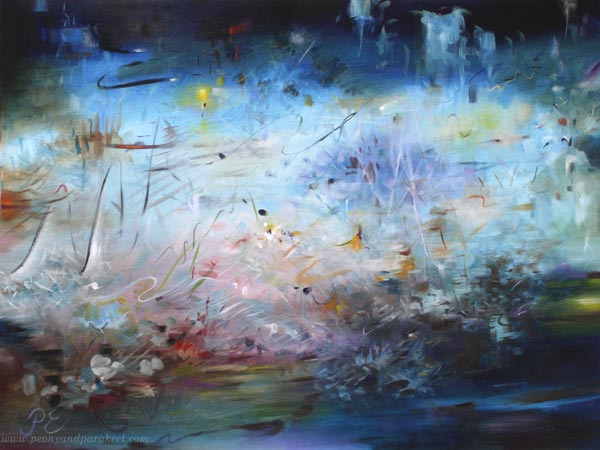
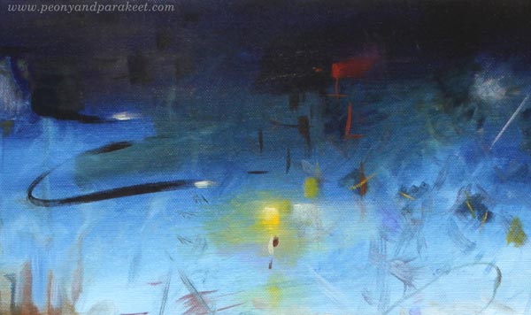
Here’s my newest painting called Winter Night’s Poem. This time, the Finnish name is much more beautiful: Talviyön runoelma. I wanted to give the painting a poetic name – like Shakespeare’s play “A Midsummer Night’s Dream – Kesäyön unelma” but something more wintery. So I come up with the Finnish name, which sounds so romantic (if you know Finnish that is!), and then translated it to English as accurately as possible.
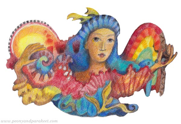
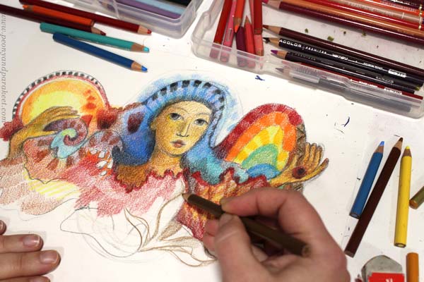
I painted this piece for the local artist association’s winter-themed art exhibition. Winter sceneries aren’t really my thing, but I wanted to take the challenge. I started by exploring Japanese woodblock prints and made a small colored pencil study that is more like a fall scenery, but that has similar abstract elements than in the final painting.

I talked more about this colored pencil piece in October’s video blog post.
Winter Memories
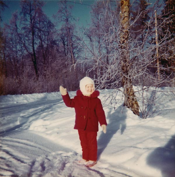
I found it challenging to get emotionally connected with the theme. As Finn, I do know winters. They are cold and dark, and there’s not much that I enjoy about them. As a child, I lived further north, and winters were even colder and darker. Here’s a picture of me in 1974 when I was 5 years old.
However, I have one special winter memory. Earlier this year, in one of the weekly emails, I wrote about Avicii‘s music and how it brings the memory to my mind:
When I hear A Sky Full of Stars, I am a little girl on a cold Tuesday evening in Eastern Finland. After participating in an icon painting group, I walked down the snowy hill looking up. The starry sky was blue-black, I realized. Not black like for those who glance carelessly or blue like for those whose skies were always blue. Working with colors had made the world look more beautiful.
I also remember getting an idea for a poem that I later wrote down. It was something about the starry sky. And there was a melody too. The sight, the words, and the sounds all formed this beautiful winter memory. And isn’t it so that memories are full of sensations of all kinds? Why should we then paint only what we see?
But then I heard myself saying: “Paivi, remember that it’s a winter-themed exhibition. It has to look like winter!”
How Does Winter Look Like?
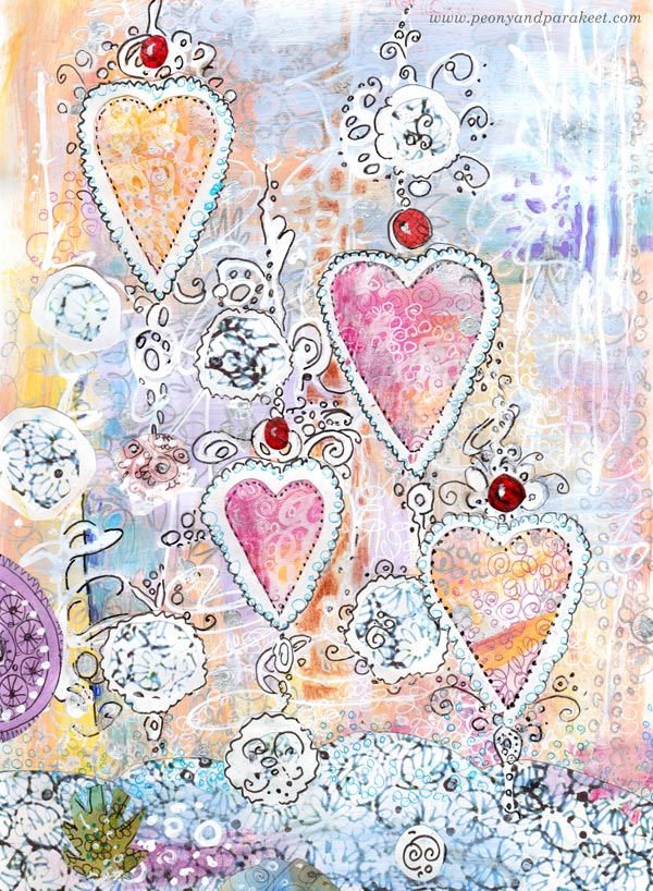
In 2013, I made this hand-drawn collage for Christmas cards. It has a decorative approach to winter. Snow, hearts, berries, pastel colors – they all form a light-hearted and entertaining take on winter.
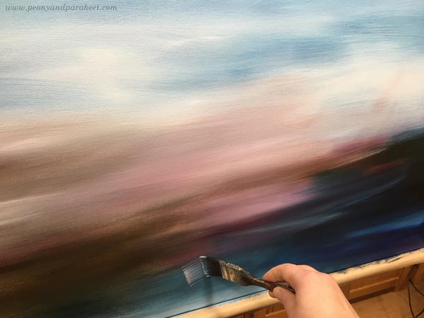
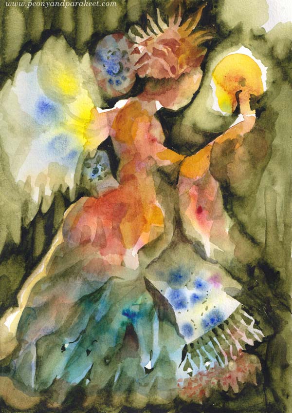
An even more obvious choice would be to paint a realistic winter scenery with snow, trees, and such. Here’s a watercolor painting from 2018:

My idea was to paint both fall and winter into the same piece. This is a class project from Watercolor Journey where we paint all kinds of sceneries in watercolor.
Winter in a Poem
But the more I thought about winter, the more connection I felt with the abstract side of it. I didn’t want to just paint an empty-looking scenery in black and white. I wanted the lights and darks to have a rhythm.
My favorite poet Eeva-Liisa Manner has a winter poem that I have read hundreds of times because it was in a little poem book my family had. For a small child, the content felt strange, but the more I read it and the more I grew, I fell in love with its rhythm. The poem doesn’t rhyme, it’s free verse, very modern. But still, when I read it, I feel the rhythm, and when it ends, it feels like you have listened to a song, not read a poem. The words have been thrown into the air, carelessly, and yet, it feels like everything has a purpose. It’s like every word would have fought to get into to poem, and after accepted, they are ready to fly beautifully, each on their turn, and then to get mixed up even more elegantly in the reader’s mind.
Maybe you too, love poetry and have experienced the same. The words glow like jewels and have a long effect even if the time spend on the reading, is just a minute or two. Isn’t that what we aim for in visual art too?
Wonders of a Winter Night
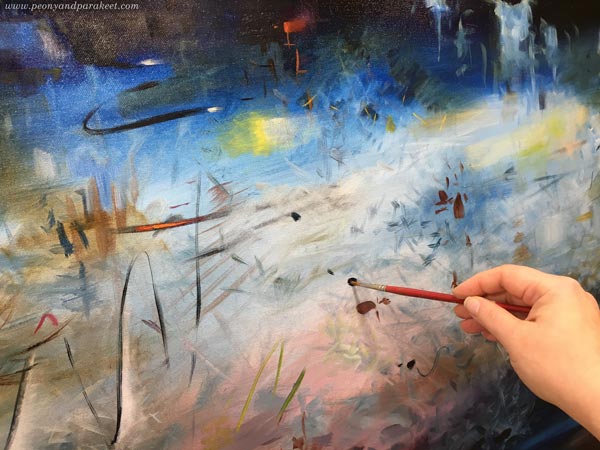
More than thinking about realistic scenery, I approached the painting with a poetic mindset. I imagined the sounds and rhythm of a winter night and visualized those. I trusted that the result will look wintery even if the painting is abstract.
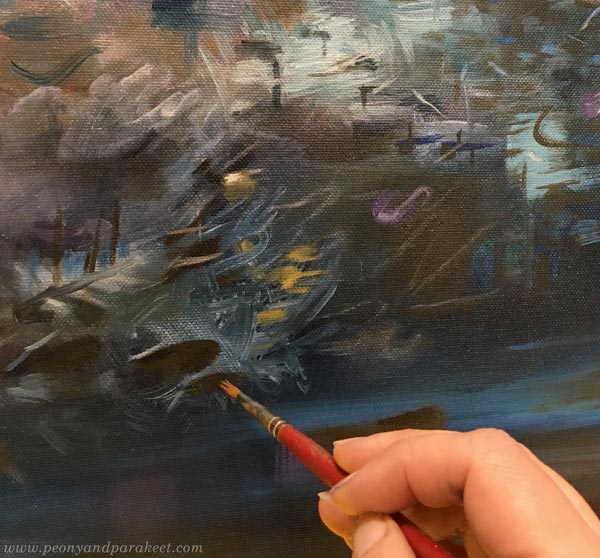
I also thought about how things move, and one of my favorite details is the curvy black wind that blows snow.
Carelessly painted ice-like objects are on the top, and the sound of ice is visualized below them.
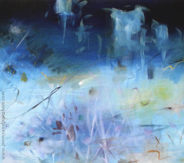
Probably the childhood memory of the winter night has stayed with me because it’s a little bit scary to walk alone in the cold and in the dark, under a few street lights only.
The color scheme was one of the challenges. I didn’t want the painting to look off-puttingly cold. Instead of only using blue and white, I brought a wide variety of tones but so that most of them are quite dark or pale.
Fortunately, winter is not here yet, but usually, we have the first snow in November. So the garden scenery will change soon!

I hope this blog post inspired you to express winter or any season that you have fond memories of!
Creating a Protector of Good
This week we get inspired by spiritual and ornamental art and create a protector of good.
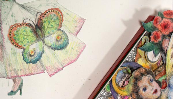
Protector of Butterflies in Colored Pencils
Halloween is not an official holiday in Finland, but we have All Saints’ day soon. I started gathering images for this blog post in the spirit of All Saints’ day, but soon realized that this kind of art has a special role in my life in general. There are times when I want to create art to protect all the good things in life.
In the small colored pencil drawing, I was thinking about the beauty of butterflies and created a protector for them.

At the same time, I created a protector for my sensitivity, and it feels good to have one in my box of joy as I call the collection of hand-drawn paper reliefs.
Protector of Everything Sacred in Collage
Back in 2011, when I wasn’t a full-time artist yet, I made this paper collage from hand-decorated papers.
I wanted to express the atmosphere of a sacred space. My hand-drawn lines were clumsy, but I cut the papers so that they look decorative. I painted icons as a child, so I made the woman’s face in that style. I still like this!
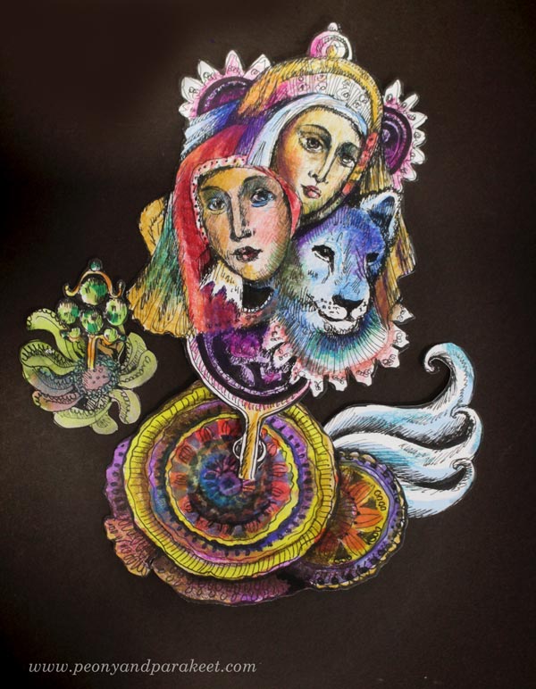
Protector of Flowers and Plants in Oil
In 2018, I was practicing oil painting and explored all kinds of organic shapes. I first painted all kinds of plants and then changed the orientation, and added the madonna. (More about the process in this blog post.)
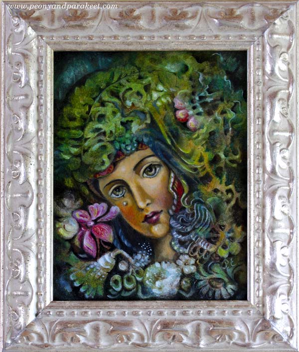
The frame of the painting has a real silver coating, and I think it fits the image beautifully.
Painting and Drawing Precious Artifacts
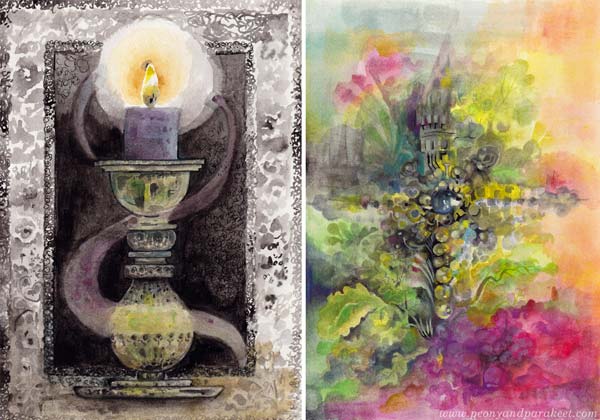
We can paint and draw precious things that make us feel protected, like candles and crosses. I found these two gouache paintings from my archives today.
Ornaments can also be more imaginative, like these hand-drawn collage pieces.
You can compose paper pieces together so that they look like a talisman.
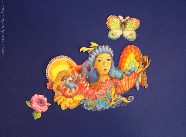
Protector of Light in Watercolor
Now when we are entering dark days in Finland, I feel the need to have a protector of light.
This watercolor angel was painted for the class Magical Forest. I developed a method for it so that you first paint the angel figure freely by splashing colors and then add more definition by painting the dark background.
Protector of the Child in Us
I think one of the most important protectors is the one who protects the child in us. I painted this icon in the early 1980s when I was about 10 years old. It was my second, and as you can see, I wasn’t very good at varnishing back then – too much linseed oil!
The teacher of the icon painting group, Irke Petterberg, helped me with the details of the faces. I wasn’t eastern-orthodox; I just happened to live very near the church and love art-making. It was wonderful to be accepted as a part of the group which consisted of adult painters. For me, religion felt like a gate to the world of imagination.
No matter the religion, let’s cherish the child in us and protect the good through art-making.
Autumn Colorings – Video Blog post!
This week, I have a video blog post for you. I talk about this journal spread that I made for my colored pencil diary, but there are also more autumn colorings, art ideas, and inspiration for creating in the middle of life’s small happenings.
In the video, I am talking about colored pencils, the upcoming class about paper dolls and human figures, my friend’s artistic success, blooming orchids, Japanese woodblock print style and style development, and I also draw a Halloween pumpkin from start to finish. There are all kinds of autumn news and autumn colorings!
Autumn Colorings – Watch the Video!
I hope this video inspires you to create and give some extra TLC to your colored pencils!
Links to Related Blog Posts
- The previous video blog post
- The journal spread of Vanda and how she looked a couple of years ago
- Posts about the paintings: The Spirit of the Rose, The Echo of Moss, Forest of Wishes
Links to Other Related Sources
- Eeva Nikunen’s website
- Alice in Wonderland Special at Colouring Heaven’s website
Related Online Classes
- Color intuitively without references: Intuitive Coloring
- Start a colored pencil journal: Fun Botanicum
- Draw scrap reliefs and paper dolls: Animal Inkdom, Magical Inkdom, Decodashery, Doll World is coming soon!
- Paint floral abstracts: Floral Fantasies, Floral Freedom