Painting by Programming – Modern Vanitas
Happy Halloween! This year’s Halloween artwork combines painting and programming.
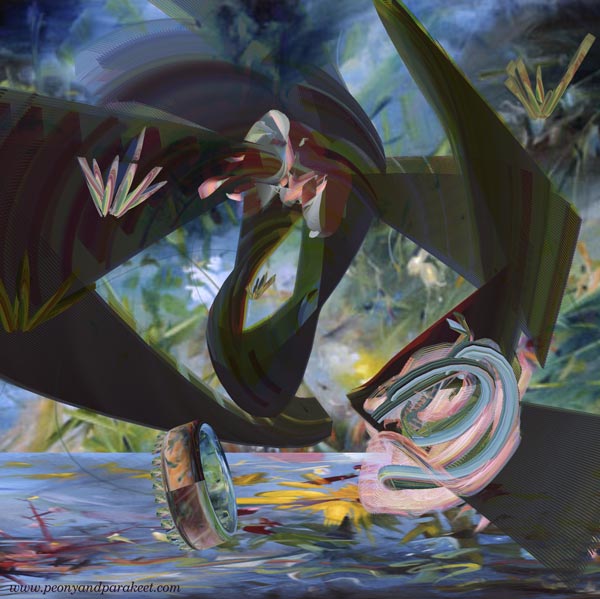
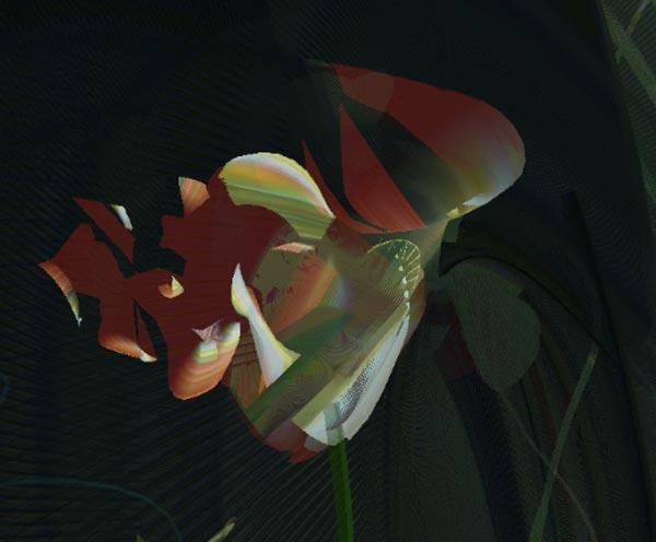
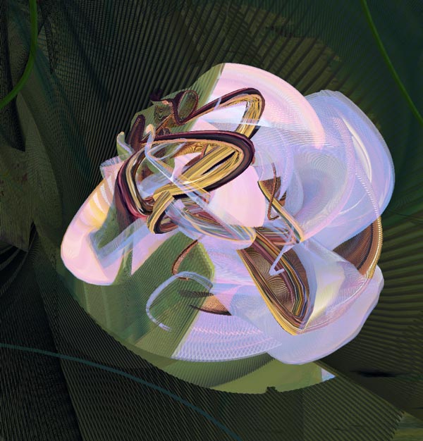
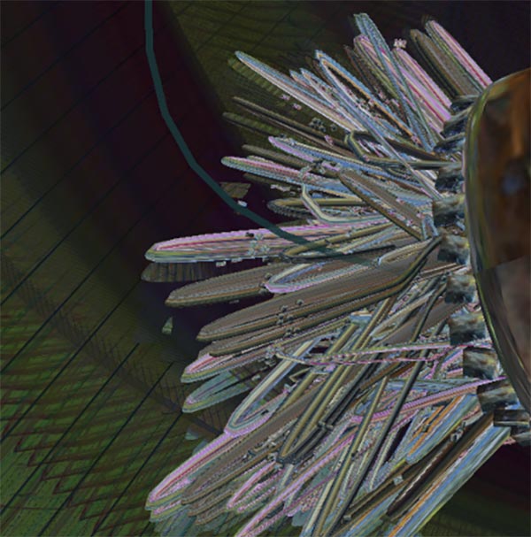
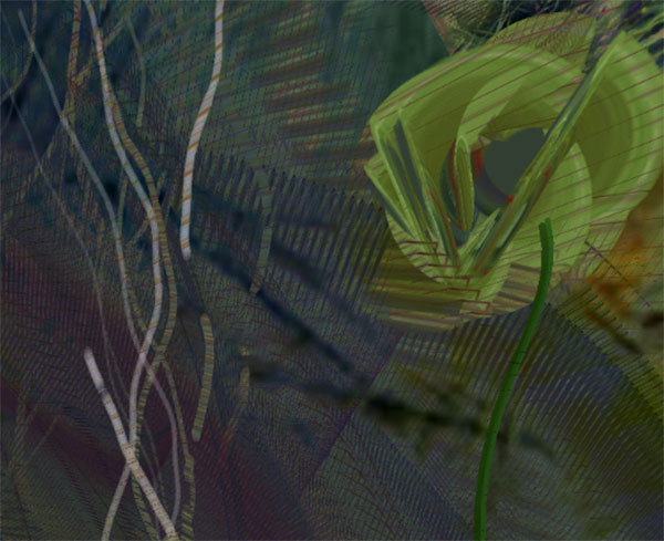
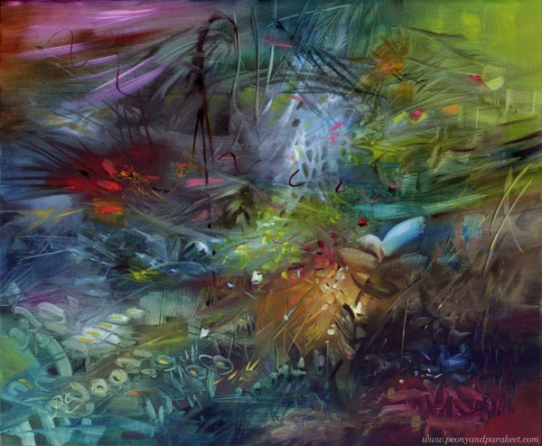
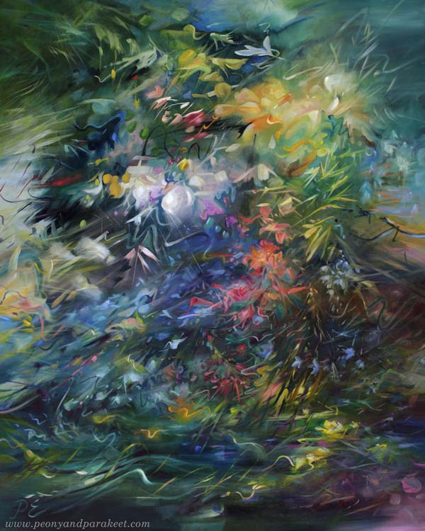
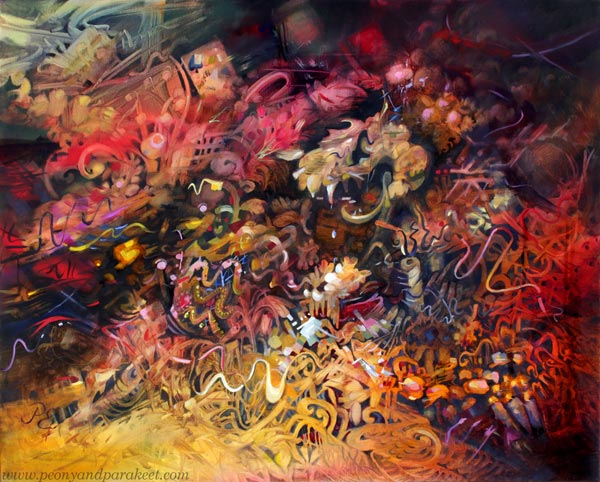
This week, I have a video that has excerpts from the artwork I programmed. The program picks four of my paintings at a time and forms a Vanitas-type arrangement with a skull, fallen crown, extinguished candles, and withering flowers – symbols of our transience. The program has 50 paintings from 2021-2024 to choose from. The music for the video is composed by me, representing a conversation about the temporary nature of life.
You can watch the video bigger by pressing the last icon on the menubar.
If you are interested in seeing more of this artwork, here’s a longer video that explains the Vanitas concept and shows more samples.
I designed the 3-dimensional shapes and then blended the paintings on them by programming.
Painting by Programming
One of my oil paintings is also Vanitas, so the theme is very familiar to me. The transience of life has both horror and beauty, maybe emptiness too that goes well with the machines. The way the computer paints with me produces fascinating details.
We can continue the tradition of Vanitas paintings and use any technique to make our own versions.
What kind of version would you create?
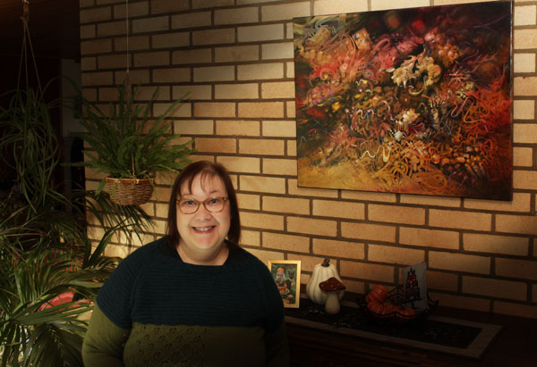
P.S. This month there was a digital art exhibition “Deform and re-form” on the screens of the Helsinki Central Library Oodi. The exhibition called “Deform and Re-Form” was organized by the Finnish National Gallery’s digital team. Oodi is a very popular big library building, with lots of visitors every day. It felt great to see my artwork “Queen of the Night” there.
Even if a part of this year’s art is digital and painted by programming, I still keep creating traditional art as well.
Art On the Wall – Displaying Canvas Paintings
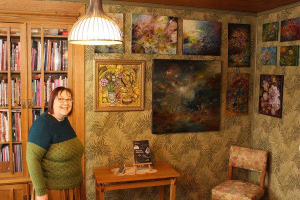
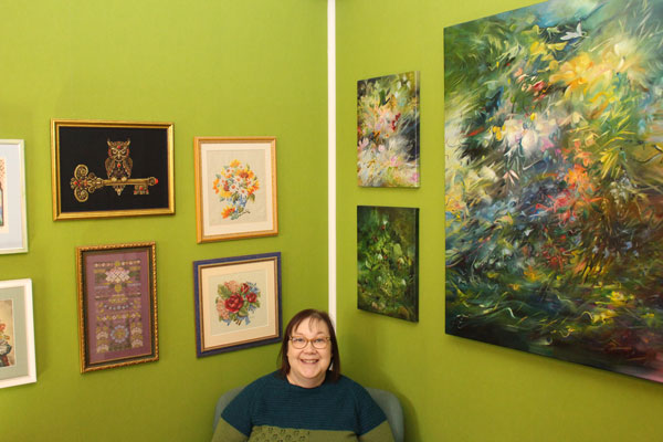
Our home is full of art. Almost all my canvas paintings are displayed on the walls. The arrangements change when old ones are sold and new ones are born. In this blog post, I show some of the paintings and how they are displayed at the moment.
When using stretched canvases, framing is not necessary. I hope this inspires you to create some canvas art. Check out my acrylic painting course Floral Freedom and see more of my paintings at paivieerola.com/gallery!
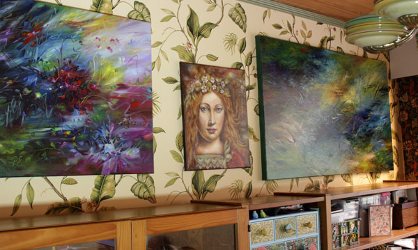
In the Gallery Corner
Our library room is on the darker side of our house, but I think that the lack of daylight and a heavy atmosphere goes well with the books and nostalgic-style paintings.
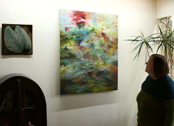
Displaying different sizes of canvas paintings on the same wall looks great but needs planning. I made a plan in Photoshop first, and then we hung them all at once.
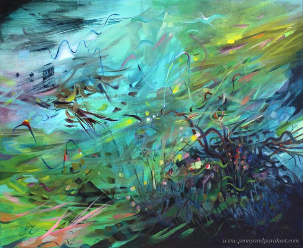
Above the Aquarium
People often say that all my canvas paintings express the underwater world. That hasn’t been intentional because I am actually afraid of deep waters. But my husband has had aquariums for decades, and they must have affected my art.
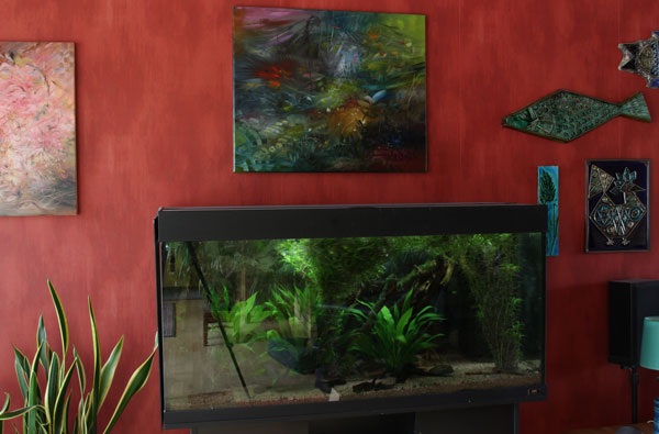
The painting continues the aquarium view. And it was not planned at all!
Best Lit
Our dining area has special lighting for a big painting – LED strips in two directions that have adjustable color and intensity.
The colors of any painting are highly affected by the amount and color of light.
When I Wake Up
The bedroom is our darkest room, but every morning when I wake up, I look at the wall that is filled with my paintings.
There is also a collection of my cross-stitch projects. Stitching is just a hobby but I like the combination.
In the Hallway Gallery
I love our yellow hallway and how the color unifies a mixed collection of paintings. Displaying canvas paintings can be this easy!
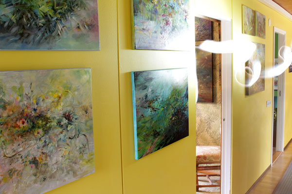
This narrow hallway was super boring before we painted it and added art on the walls.
Entrance Art
Our house has a space right after the entrance where I often change a painting to one that feels current. I also decorate the top of the sideboard cabinet that’s under the painting. Now it’s time for some darker art.
Happy Halloween!
Weekly Art – Creating Regularly in Any Mood
This week, I talk about making weekly art and the feelings behind creating regularly.

I feel that although artists talk a lot about techniques and creative process, something gets left out. It’s a time perspective. I don’t mean how much time it takes to make one piece, but what it’s like to make art week after week. If you create art, you will surely recognize this: sometimes you feel excited, sometimes you don’t. People’s moods vary and you can’t always choose the best day.
Not the Ideal Mood
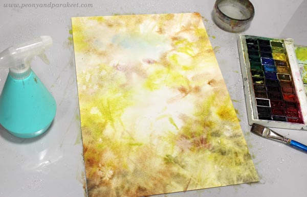
I felt nervous when I started doing this watercolor. The best part of the morning was already over and I was splashing color very fast. My weekly art session had a messy start.
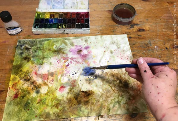
I found an unopened bottle of granulating medium in my stash and thought it might speed things up.

But I found the medium a useless acquisition. Some of the pigments are naturally spreadable and the spray bottle works better for them. All this took time, and my nervousness was still present and there was a new feeling too: self-doubt.
Not Feeling Confident
When you make art week after week, success is based on self-confidence more than mood. It’s easier to be confident at the beginning than later.

I usually paint with intuition and don’t use any models, so I often end up feeling hopeless. All I can say then is something like: “Keep going!” with a fake smile, and I don’t know if that helps at all.
Different Mood – Different Ideas
But art doesn’t put one mood above the other. Different mood brings different ideas. For example, if I am feeling nervous, there is an opportunity to be less conventional and express something that I would not otherwise come to mind.

The idea of this painting culminated in the Finnish expression “alavilla mailla hallanvaara.” It means “the danger of frost in the lowlands” in English, but the beauty of the statement is not in its content, but in how it sounds in Finnish. While painting, I began to think about those lowlands that suffer from rain and cold. Similarly, as painters paint week after week, flowers bloom constantly there, also in bad weather.

For me, in art, it’s not important in which mood it’s started, but that the end result contains both a trigger and a solution. Here, wind and rain bend the grass and break flower petals, but at the same time they make room for light.
Who Are You Creating Art For?
Within time, the mood evens out and focus is on the finishing. Then I also change who I think as a recipient.
I often start the weekly art by saying that “this piece is for me,” but when I finish I try to reach “for us.” There “we” includes all who like my art, both old and new friends in art. I don’t want to make art only “for you”, because then I lose myself while doing it, and not ” for them”, because it’s hopeless to hope that maybe someone would like the work even if we wouldn’t.

So, weekly, this happens again: the wrong moment, the wrong mood, the choice of brushes and colors, calming down, “I’m just doing it for myself”, uncertainty, slowly emerging ideas, concentration, triggers and solutions, happiness, and a feeling of gratitude that I can do this again for us.
Do you too create art regularly?
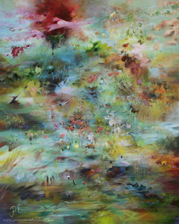
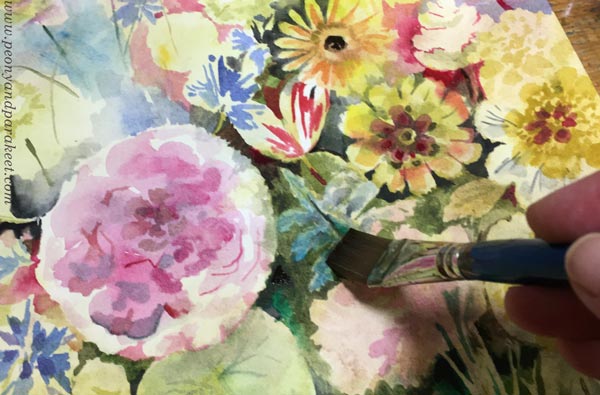
Autumn Watercolor Flowers
This week I share an autumnal painting and talk about how dreams and everyday events get mixed in my art.

- In this project, I made the autumn watercolor flowers freely like in the course Freely Grown.
- The title “Satokauden kuulas” is a bit difficult to translate, but I explained it in the last paragraph.
- This piece is for sale at the online art store Taiko.art!
Autumn Moments
Although I usually aim for a grandiose atmosphere, my art is a lot about insignificant everyday moments.
For example, when I …
- … gathered apples from our apple trees
- … walked in a rainy storm with the dogs
- … admired autumn colors from the car window.

Or when I smiled at the hopefulness of the roses in the front yard and promised to give them a home from a painting before winter would surprise them.
Floral Watercolor Dreams
When I paint in my small studio, my mind tells me that I am a flower painter in 17th or 18th century Holland. I imagine lovely high windows, old costumes, and the clatter of shoes on the street. I imagine the flower market and how I will assemble a bouquet from the best finds.

But in reality, I’m just an ordinary Finn whose everyday life pushes through the brush.
There is a huge gulf between me and the master painter of the 18th century and yet I still jump into it again and again. Every once in a while, I decide to stop painting flowers because there’s so much more to paint. And yes, if I look at my oil paintings, my favorites don’t have many flowers. Nevertheless, the flowerless period never lasts very long.

When I go to the garden, the Flemish master is waiting for me there. He says: “It’s time to practice again, Päivi” I answer: “Yes,” and then assure him: “One day I will master this art of painting flowers.”

Still, I know that life can be far too short and far too mundane for me to ever reach that level. But like a rose facing winter, I take out my button and wet the paper again.

This piece was painted on Arches Hot Press watercolor paper. It has a very smooth surface so it’s great for a detailed painting, but I also find it a bit challenging because every stroke shows!
What’s Behind the Title?
Even if I painted autumn watercolor flowers, can you also spot the apples?
This piece is called “Satokauden kuulas” and I think it’s a beautiful title in Finnish but a bit complicated to translate. “Satokausi” means harvest time and “kuulas” is a romantic word for translucent. But there’s more. “Valkea kuulas” is an apple variety that is called White Transparent in English. So I think that the suitable English name is “Harvest’s Transparent” even if it doesn’t quite have the same romantic sound as the Finnish version.

This piece has a strong autumnal feel: bright colors meet more muted tones on a dark background.
Does the weather also appear in your art?