Using Leftover Paint – Messy Backgrounds and Beyond
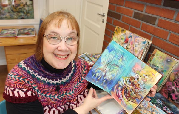
This week, I show one of my art journals in the video and share ideas for what to create from messy backgrounds.
After a painting session, there’s usually some leftover paint on a palette. I try to squeeze the tubes carefully, and sometimes I put the paint in a box with a lid, but most often, I grab an art journal and wipe off the extra paint from the brushes and palette. If I am tired, I just spread the paint carelessly. If I still have energy, I add details to a page that already has some color. When I don’t like something in the next session, I paint new strokes over it.
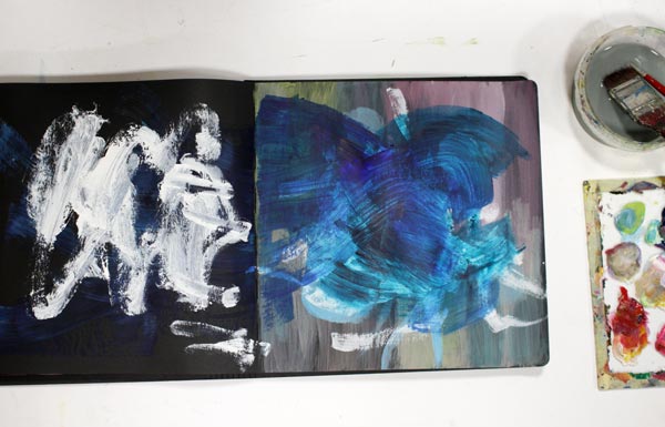
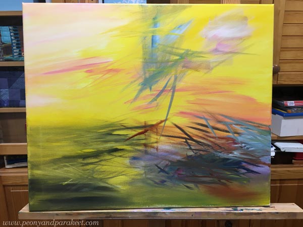
Many Rounds – Some Quicker than Others
I rarely make a page at one go. This spread has oil paints, and it took ages to finish it. But it didn’t matter, because I was practicing for the class Decodashery, and I needed time to dig into the heart of decorative painting style.
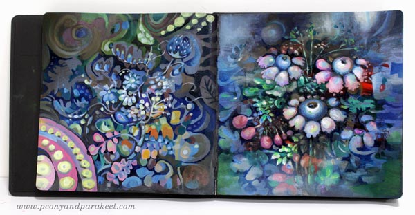
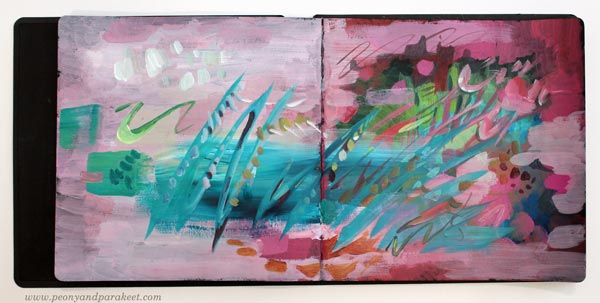
However, the one below is more abstract, and it was really quick!
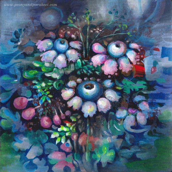
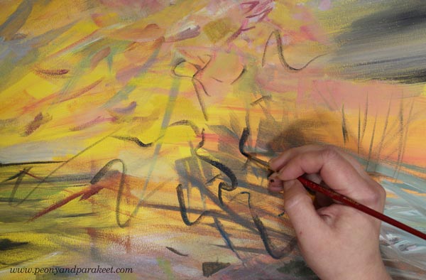
Messy Backgrounds and Beyond – Watch the Video!
In the video, I show messy pages and not so messy pages of my current art journal and how I finished the spread above. Watch the video!
Even if bigger paintings are my main work, art journal pages are an important part of my creative process. It’s like yin and yang! I need the mess-making to find joy in working with details.
Art Inspired by Music
In the video, I mentioned the idea of visualizing a musical landscape and a melody. Music is the theme in my mini-course for Gratitude Junk Journal 2020 as well. This online workshop has 12 instructors, and it begins on Nov 1st, 2020. Register in October to get 20% off. Enter JOY2020 at checkout. >> Buy Here!
Paint a Poem!
This week, we’ll talk about poems and how to turn them into paintings!

This acrylic painting is called “Terät liitävät kirsikkapuista,” and it’s my interpretation of Valter Juva’s poem from 1902.
The Finnish name is a bit difficult to translate. Terät liitävät have a double meaning: 1) blades flying in the air 2) petals falling freely. Namely, a petal – terälehti – is a compound word in Finnish. Terä is a tip or a blade. Lehti means a leaf.
This is not the only language-related thing in the poem, and I struggled with the translation. But here’s the best I could do!
English Translation of Valter Juva’s Poem
| Terät liitävät kirsikkapuista, ja virta vieno ne vie. Se tyynine suvantoineen mun onneni kymi lie. | Edges fall from cherry trees and are caught by a gentle stream. The river and its pools are the well of my serene. |
| Suviyössä, mi tuoksuu ja värjyy, veet kultahan sulautuu; se lekkuu lännessä päivä ja idässä kuultaa kuu. | In the summer night, that smells and glows, waters melt in gold; in the west, the day is stirring, and in the east, shines the moon. |
| Niin hiljaist’ on ja tyyntä! Ja koskien alla veet ne ahtaassa piirissä viipyy, mut siinä on syvenneet. | It’s so quiet and calm! And under the rapids, waters dwell in a tight round but have become deeper and deeper. |
Passion for Poetry
When I was a teenager, poems were my passion in the same way drawing and painting have been. I used to read poetry, and almost daily, wrote my own. I even entered competitions, and some poems have been published. Later, this love for poems have reappeared occasionally: I have read or written some. In 2014, I even wrote a blog post about illustrating poems in art journaling.
But now, it feels that poetry has come to stay. Every time I open a big book (Runojen kirja – Book of Poems) that I won in a poem-writing competition in 1981, I see something that I want to paint. The book has over 800 pages filled with four centuries of Finnish poetry, but it’s not just that. With the book, I remember many poets that I used to read. My mind is blowing, and my brushes are jumping! “Paint paint paint,” they cry!
Valter Juva’s poem was new to me, but I got inspired right away. This painting has a lot of yellow in the background!
It was a joy to paint those sharp petals and curvy cherry trees that so willingly release the flowers. The size of this painting is 50 x 60 cm (about 19,5 x 23,5 inches) so I was able to paint the details more roughly and quite quickly.
Paint a Poem – Trust the Inspiration!
Painting a poem doesn’t have to be about illustrating every word. It can be more about finding a personal view – how the poem loosely explains your current life and often past experiences too.
In Valter Juva’s poem, the connection between Japan (cherry trees) and Finland (bright summer nights) blew my mind. You who have read my blog for a long time, know that both my husband and I love everything Japanese, and we also have a Japanese garden.
White nights were magical last summer! East and west meet like in the poem!
Paint a Poem – Color the Words!
Poems are filled with interesting words that can have a double meaning or a specific nuance. We don’t even have to know what strange words actually mean. It can still have a certain feeling to us, and we can express that with colors and shapes.

In Valter Juva’s poem, there’s a Karelian word lekkuu which means moving or stirring. To me, it has a relaxed undertone which makes me think about yellow-orange curves floating in the air, just above the water.
Paint a Poem – Break Borders!
In art, whether it’s poetry or painting, we can break borders. We don’t have to stick with one geographic location but create one that has characteristics of several places. Similarly, we are allowed to freely travel in time, from childhood to ancient history, and from the current moment to fantasy.
By changing the rules of reality, we can make representational elements symbolize more abstract things. They can be inanimate objects or nature’s elements, for example. In Valter Juva’s poem, waters have deep knowledge, In my painting, static trees take off and timid flowers jump from the plane.
Also, we can be magicians and make any material change its state. In the poem, water becomes gold, and in my painting, light is less immaterial and more touchable and concrete.
Poems are filled with metaphors, so why not let them in your paintings too!
Which poem would you like to paint?
Paint the Emotion – New Free Mini-Course!
Here’s a teaser, do subscribe!
If you have already subscribed, check your inbox, I have sent the course to you today!
Making of a Miniature Painting
This week, I have a new miniature painting and share tips for making small-sized paintings in general.
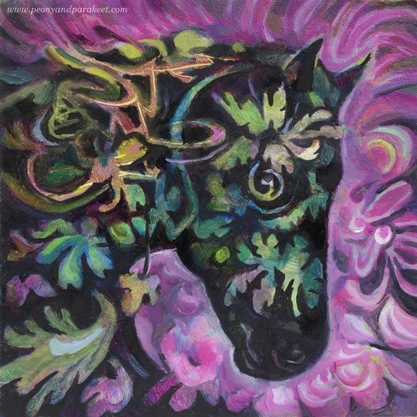
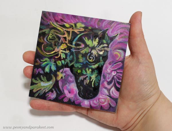
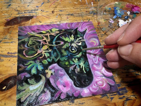
Let me introduce Ebony, my newest miniature painting! It’s only 10 cm x 10 cm (4 inches x 4 inches). The size shows better in the photo below.
This is an oil painting, and it took over a month from start to finish, but just because I let each layer dry properly. There’s about a week drying time between each layer. If you use acrylic paints or watercolors, the process is much quicker!
The Beginning – Making Not So Beautiful Mess
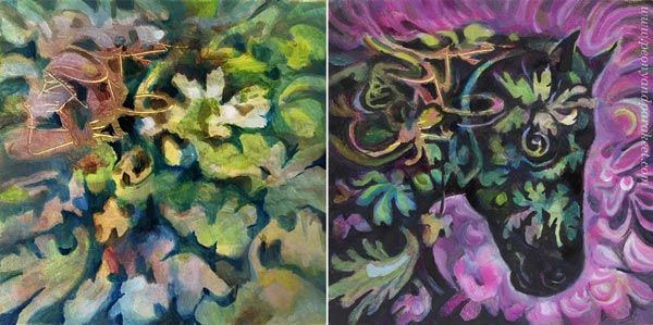
As usual, I didn’t have any particular idea for the painting when I started. Here’s how the painting looked after a couple of layers.
My surface here is Ampersand Gessoboard Panel. It’s very smooth and thus suitable for small details. I had bought a pack of four over a year ago. I finished the first one last year, see this blog post!
When making an abstract mess, I don’t usually settle for pretty little messes, but make the mess more layered. When the mess is as ugly as I can bare, it begins to talk to me. It came to my mind, that the random strokes could be mane, and there could be a horse coming up.
Using Negative Painting to Dig Out the Spirit
I like to use negative painting a lot. So here, I painted the background first so that it defined the head of the horse. When painting the surroundings, you slowly get closer to the actual spirit. It’s like taming a wild animal!
Ebony is now a gentle soul, and she reminds me of Black Beauty, the television series in the 1970s. I watched every episode and it inspired me to play with plastic horses.
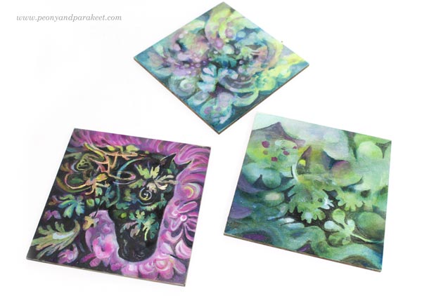
I still have two more panels to finish. I think I will dig out horses or other animals from their messes so that I get a small series of miniature paintings.
My Four Tips for Painting in Miniature
- Start boldly and enjoy all kinds of mark-making and color play. If you are painting on paper, you can start with a bigger piece, and then cut it into smaller ones.
- Make a few big shapes that contain smaller ones. In my painting, the horse is one big shape, the background another. Let smaller shapes break the borders of the bigger shapes so that the image doesn’t look stiff.
- The negative painting technique where you paint the surroundings of the shape enables you to paint delicate shapes easily. Magical Forest is the class to take for mastering this technique!
- We hold miniature pieces quite close when looking at them, so the quality of brushwork matters. Use thin paint, small brushes and even magnifiers if needed. Taking photos and zooming them helps to see the details too. Decodashery is the class to take for making the best out of every stroke!
Drawing Small
Of course, your miniature artwork doesn’t have to be a painting, but a drawing! For me, drawing has been in a significant role in becoming a better painter. It can be just free drawing like in Inspirational Drawing, or more intentional practice like in Animal Inkdom and Magical Inkdom. I use both approaches in painting too.
I hope you enjoyed this week’s project. Do you like painting or drawing in small size?