3 Tips for Improving Busy Mixed Media Pieces
This week, I have a revamped old piece, and share three tips about making busy mixed media pieces more attractive for the viewer.
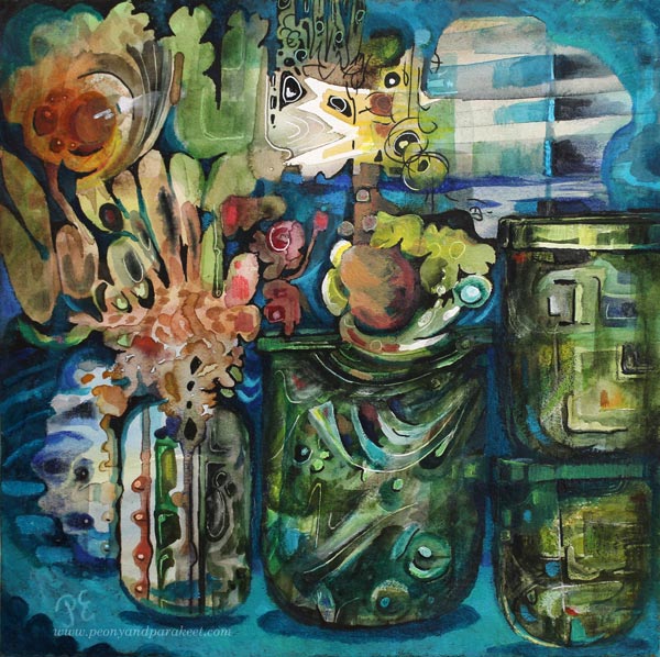
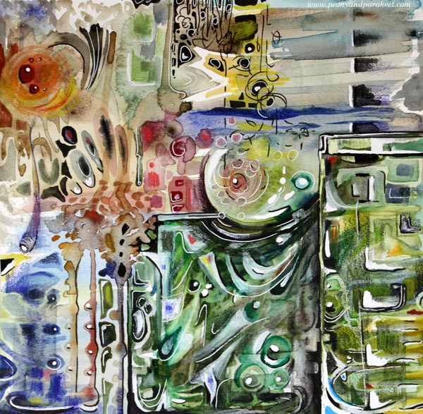
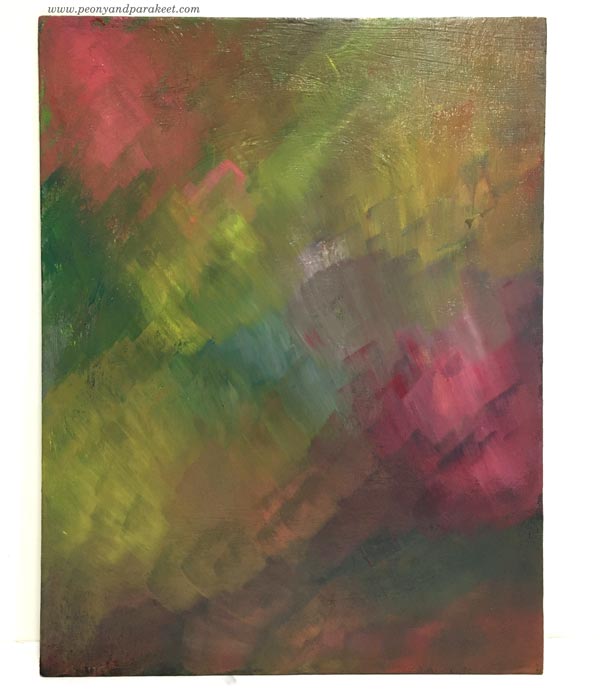
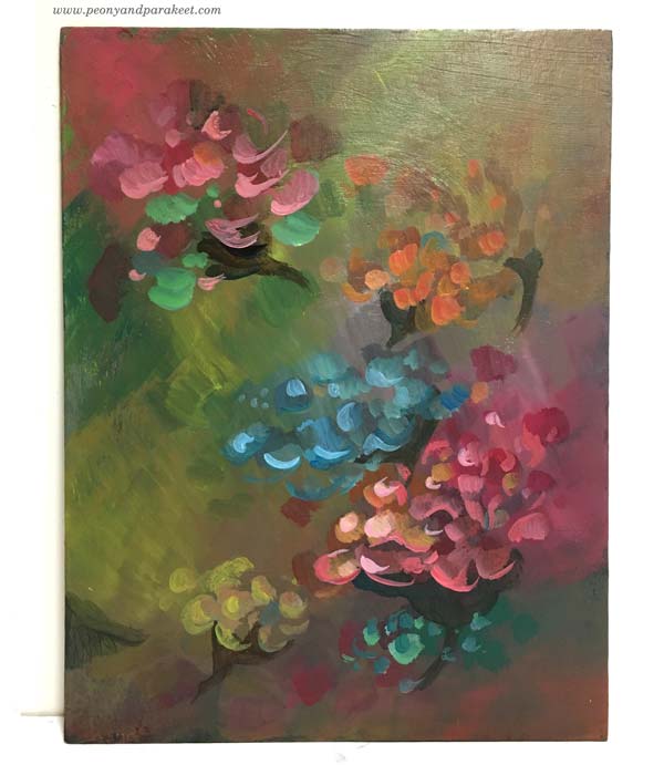
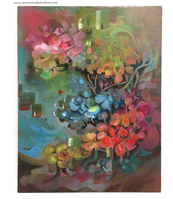
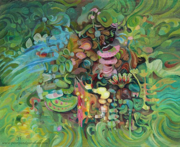
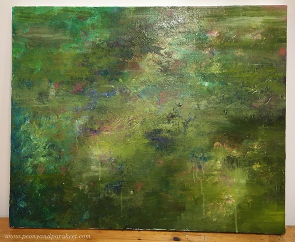
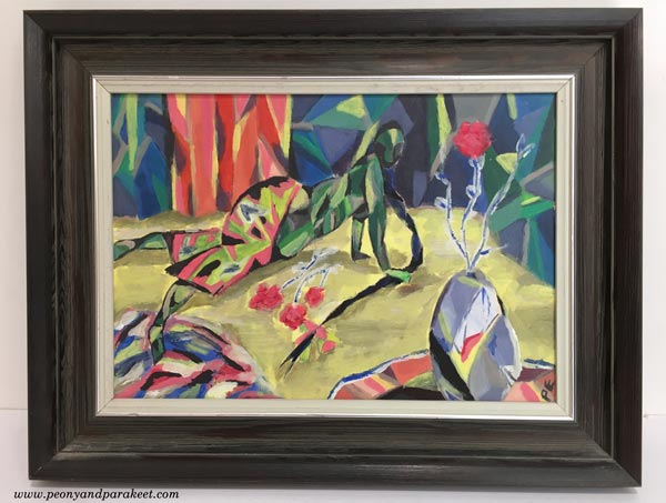
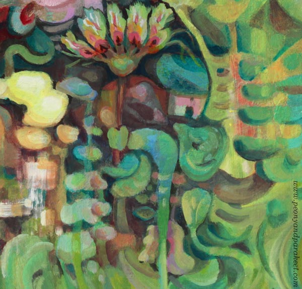
The image above is a revamped version of the busy mixed media piece below. It’s 12 by 12 inches, and I originally made it back in 2014 for a blog post about how to paint glass.
I visited the Finnish Glass Museum a couple of weeks ago, so this piece felt really inspiring again! Let’s dive deeper into how I changed it.
Tip #1 – Cure the White Spot Fever
Back in 2014, I had fallen in love with all kinds of white pens, paints, and correction fluids. A little dot here, another there, and the element looked prettier. But adding dots and spots also make the piece busier. For the viewer, it’s like trying to find its way through crowded streets where everyone is trying to get the attention: “Hey, hey, hey, you there, look at me!”
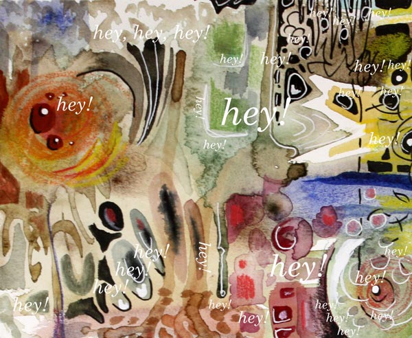
When you are a doctor for the white spot fever, start by toning down all the spots that are located near the edges. We want to steer the eye to the middle first, so the edges don’t have to be so eye-catching. If this is the first time you work on this job, watercolors can be a good choice. Even if the pigment wouldn’t stick on all the surfaces, you get the impression of how the piece looks if you make the edges less noticeable. Turn the piece upside down, so that it’s easier to focus on the task, and not look at the big picture.
Of course, your pieces can have fever, even if it’s not the white spot fever. The general advice for any fever is to remove all the eye-catching small elements that are located near the edges.
Tip #2 – Form Friendships between Elements
Often when we don’t feel connected with the image, the image itself doesn’t express connection. When the elements are floating separately, there can be a lonely undertone in the whole piece. On the other hand, if there is no contrast between the elements, the image can look busy no matter how connected the elements are.
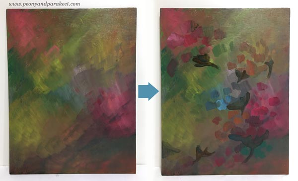
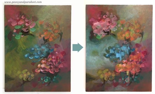
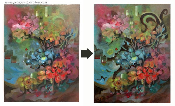
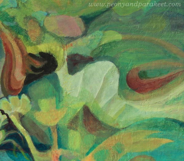
Here are my two versions side by side. In the old version, there are big glass jars, but the contrast between them is not very clear. There are a lot of small shapes that are floating lonely.
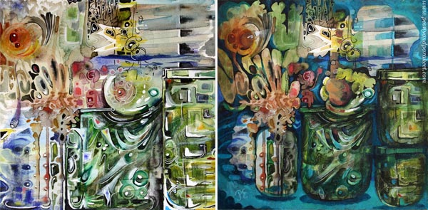
At best, adding connections make the image to deliver a message. When I looked at my piece, it was unclear to me what it was about. In the old blog post, I had written: “It’s about parents trying to protect their children. The parents have good intentions, and they do their best, but in the end, they have to let the child step into the world. I have painted two glass vases to represent the parents. The child sees the world through the parents, and even if they want to protect the child, they are fragile too.”
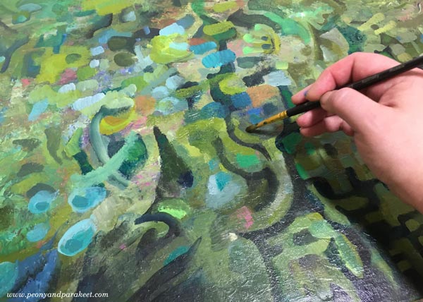
But now, I found the element that looked like jaws most intriguing. It seemed to be a rising spirit, a small but powerful baby dragon, which only needed a neck to become a central element.
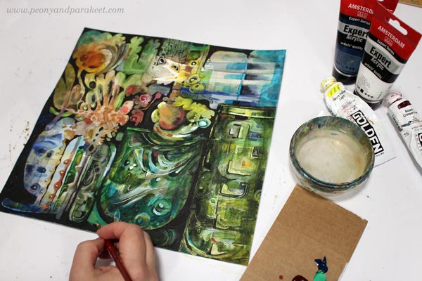
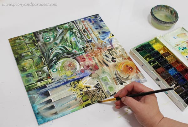
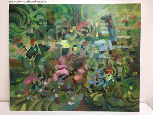
I used dark india inks and black pen to quickly sketch how I would connect the elements, and then continued the work with acrylics and lighter colors. I broke the biggest jar near the edge to two jars so that they won’t compete with the focal point so much.
Tip #3 – Make a Highway for the Viewer
Busy pieces often have so many paths for the eye that it’s not clear where to start and how to continue. The best thing is to be clear and make a highway that goes around the image. The viewer can then take smaller scenic routes around the details, but there’s always the big safe road to return to that leads to the main attractions.
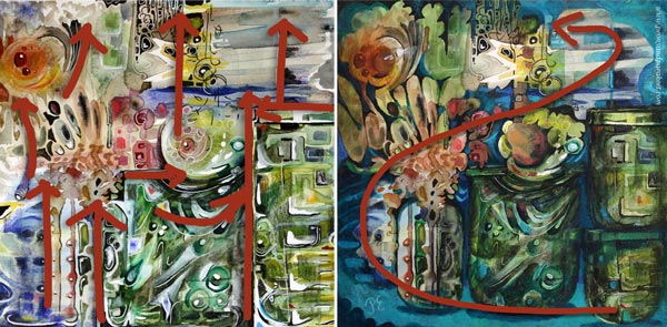
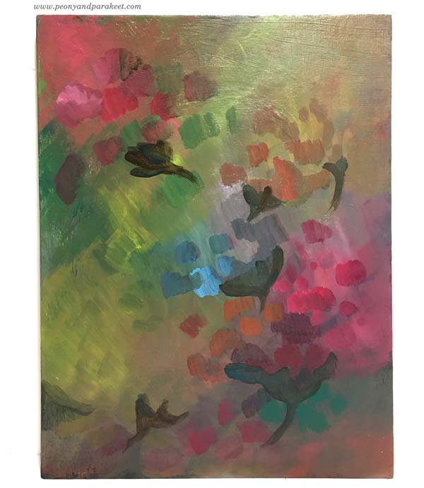
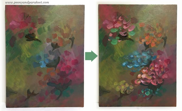
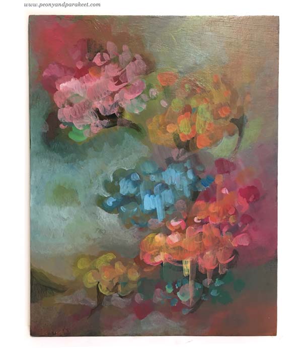
Building a highway requires that you know what your main elements are. After finding the spirit of the jar, I made the red circle communicate with it. Now I added a couple of white spots so that it looks like there’s a voice or a reflection flying between the two. So there’s use for those white dots, just use them sparingly and near the places where you want to lead the eye!
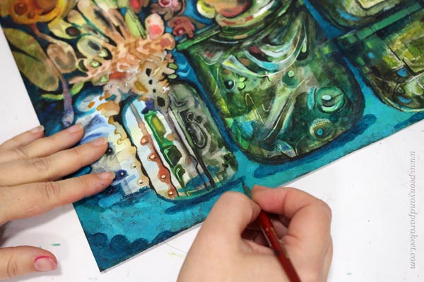
With turquoise tones, I painted a route from the right bottom corner to the two central elements. I also added more depth to the image by painting shadows. Shadows would be my fourth tip, but it’s worth a separate post, so I will get back to it sometimes later.
No More Busy Mixed Media!
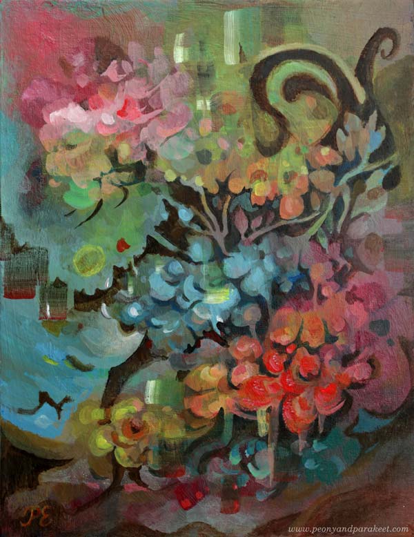
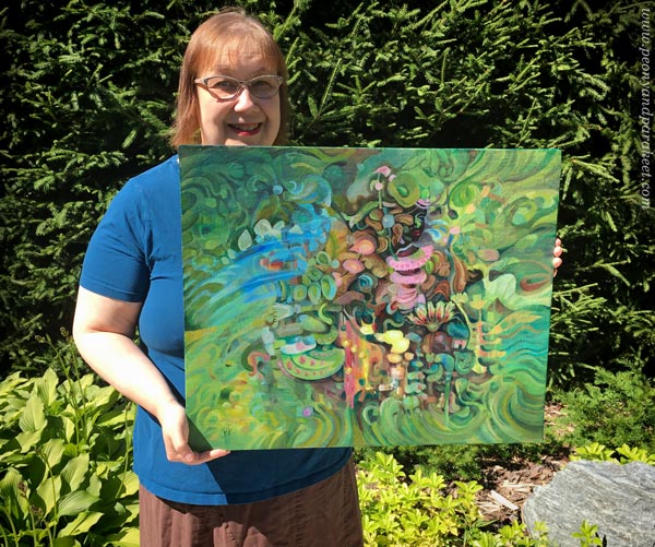
I named the revamped version as “Song of Glass” because it’s now about finding the singing spirit of the silent jars.
I hope you found this post helpful for busy mixed media pieces. See my classes for more handy tips and advice!
Intuitive Painting Step by Step
This week, we are creating an intuitive painting step by step. This project is more about following a process and mindset than trying to replicate my example.

I call this “Deer to Dream” because if you look at it from a distance, it looks like a bunch of flowers the view is more interesting when you find the deer. This is a small acrylic painting, 35 x 27 cm (about 13,5 x 10,5 inches).
Step 1 – Explore Mud – Paint a Background
Pick a few tubes and mix colors freely. Allow mud to be born!
Don’t expect clarity right from the beginning, but trust that the painting process will purify your mind. The muddy start will make you grounded.
Step 2 – Take a Flight – Paint a Flock
With a bit brighter tones, add strokes so that they make a stream across the painting. Paint dark shapes so that they group the strokes.
Keep the focus on expressing the movement rather than trying to create something accurate and realistic. The groups can be flowers or birds or anything that comes to your mind.
Your spirit has raised from the mud and begun a journey to a new world.
Step 3 – Land Towards the Light – Add Bright Pastels to the Flock
Mix white to the colors, and add bright strokes to the elements. They are now exposed to light, and the flight is getting closer to its destination.
You can leave the painting like this, but for me, intuitive painting is an adventure rather than a safe performance, something that includes risk and excitement, and we haven’t gone far enough yet. So, let’s keep painting!
Step 4 – Become Adventurous – Paint over the Elements
When we want to deepen the process, disruption is needed. Use a little bit more water and make brush strokes that partly cover what you have painted so far.
New layer is like an emotion that takes over. It makes the painting messier, but also freer and more open to new ideas.
Step 5 – Explore the Wilderness – Paint Details
The painting is now like a wilderness, and you need to know its every corner. Slowly go through every small area and forget the big picture. Make paths from one element to another, allow some parts to become more intense than others, and add little spots and strokes where you want the eye to stop and admire the view.
Imagine that every shape has a personality and that it’s your mission to make the shapes interact with each other. Connections can be built so that they share a line, a color, or form.
In this step, you begin to experience creative freedom. At first, it’s like a smell that you become slowly aware of. It’s a possibility to take a new direction and follow your instinct. So again, let’s keep painting!
Step 6 – Dare to Dream – Meet a Spirit
Dare to dream further than what you would expect in the beginning! Every painting has a spirit and your mission as an intuitive painter is to recognize it. Even if it’s you who created the painting, the spirit is free.
Feeling the presence of the painting’s spirit is often enough, but recently, I have dared to look at it to the eye and paint it too.
You may also want to read my previous post about artistic spirit!
Intuitive Painting Step by Step with Watercolors?
I used acrylic paints for the project but it’s possible to follow the process for watercolors too. Here are my additional tips for watercolors:
- Start with lots of water and very light tones.
- Let the painting dry between every step.
- Slowly darken the color palette of the painting towards the last step.
More to Come – A Big Intuitive Painting in Progress
I hope that you enjoyed this project! I also have a big intuitive painting in progress, and I am excited about how it has taken off. I will talk more about it in upcoming posts.
Artistic Spirit between Abstract and Realistic
This week’s theme is the artistic spirit. I share a new painting, glimpses of my painting fever, and inspire you to explore the zone between abstract and realistic art.
Here’s an acrylic painting that I just finished yesterday. It’s called “Paradise” and it’s quite big: 61 x 50 cm, about 24 x 19,5 inches.
Painting at Late Evenings and Wee Hours
I like to paint in the late evenings when the world quiets down. Now when it’s summer, Finland floods in light, and nights are short. When the blackbirds begin to sign at 3 am, I know it’s time to wash the brushes.
After a long night, I rush to the studio in the morning: “What have you done! You’ll never be able to finish it!”
But with this painting, I decided to accept whatever comes up. And with that, I have a little story to tell. I shared it on Peony and Parakeet’s Facebook page recently, but if you missed the post, here it is, with one of the paintings from the teenage years.
My Story about Artistic Spirit
As a teenager, I browsed big art books at the local library. I started hanging around with Matisse and Picasso and they said: “Hey Paivi, take this obsession from us, and make the most of it.” First, their inspiration was like a fever: mustpaint…mustpaint… mustpaint. Then, after too many matissepicassos, it became a burden and I went to study engineering.
During the past five years as a full-time artist, I have been hanging around with other guys – like Da Vinci, Caravaggio, and Rubens. Even if I first thought so, they are not much different. After too many rubenscaravaggios, the empty feeling takes over again.
But recently, I went to my studio secretly, picked the brushes, squeezed the paints, and in silence, I met a spirit. It was not me or any of my masters, but the spirit that arrives when we are ready to let go of the ego.
To paint like me, I need to let go of me. I am pretty sure Matisse and Picasso already told this, I was just so impressed by their names that I didn’t listen.
Abstract, Realistic, or Stylish?
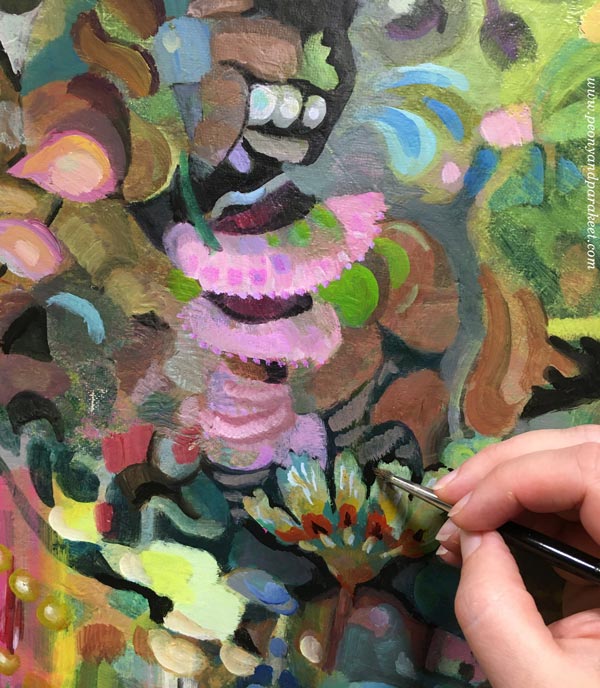
Every time I make a class, I don’t only teach but also learn new things. The newest class Decodashery boosted my confidence to paint decorative motifs right from my imagination. Between “abstract” and “realistic,” there’s a zone that’s “stylish.” Then you simplify what’s real, and complicate what’s not. By simplifying, you dig the artistic spirit out of tangible things, and by complicating geometric shapes, you make the spiritual things more tangible.
I really like this painting, and hope that you enjoy these close-up pics too.
Wishing you many happy moments with painting and drawing!
Imaginary People – How to Paint Their Soul?
This week, the theme is painting imaginary people and how to find their soul. There’s plenty of examples in this blog post!
One of the wonders of painting and drawing is that we can give birth to an imaginary person – that we can create someone who breathes, talks, and has a life of her own. However, many times the doll that I have on paper hasn’t come alive. Or she has taken just a few breaths, and after the creative spark has gone, she just stares with empty eyes. So no wonder that I have had a love-hate relationship for painting imaginary people. I want to experience the miracle, but it can also be too much of a struggle.
References – Working with a Soul that Breathes Already
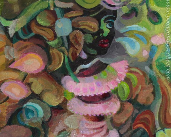
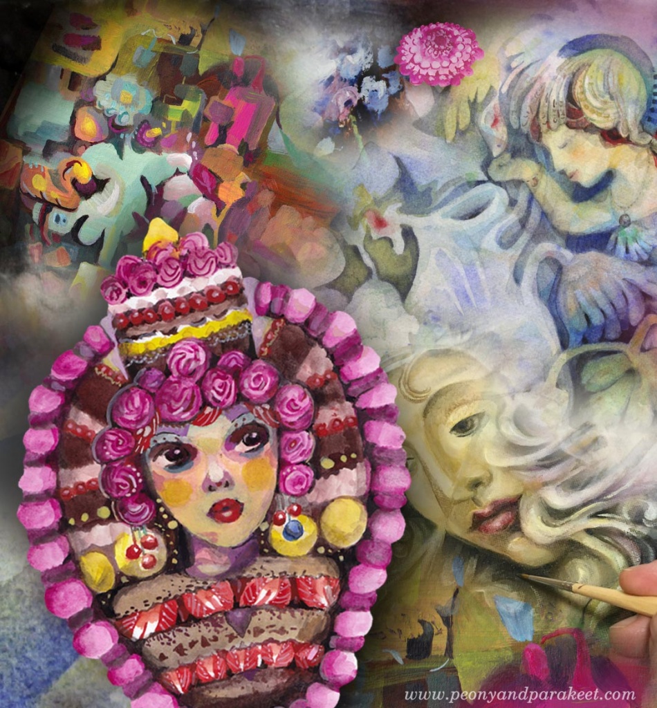
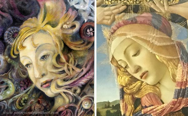
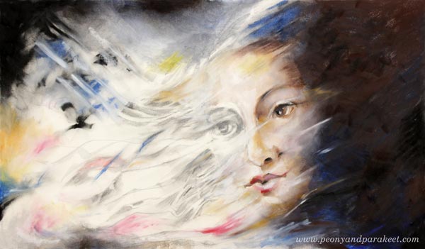
Using a reference may be the least innovative solution but if you find an image that really speaks to you, it can be a good one. Tiny changes in facial features lead to a whole new person so if you don’t follow the reference in the smallest detail, yours is like distant relative to the original – familiar features but still unique. For this oil painting called “Heaven and Earth“, I used a detail of Sandro Botticelli’s painting “Madonna of the Magnificat” (1483) as a reference.
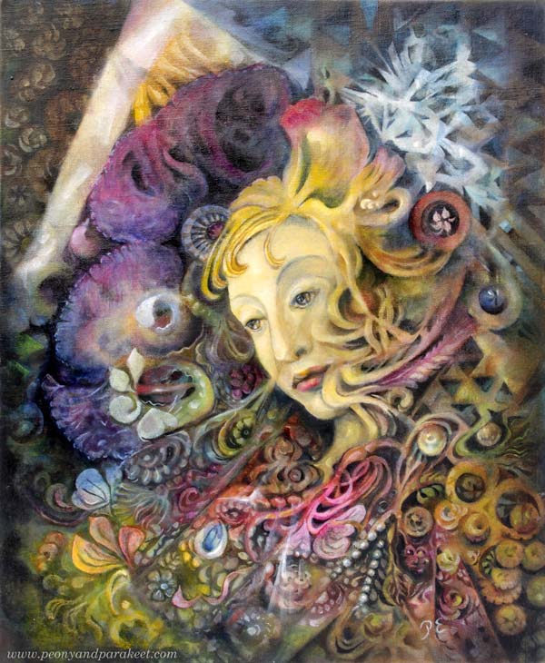
Here’s a close-up of the faces. I changed the angle of the face, opened the eyes more, and made the mouth look more determined.
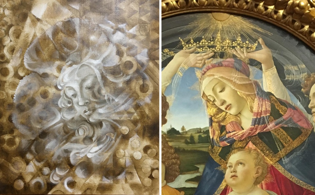
Sounds easy, but I often struggle with finding the soul when using references. With this painting, I tried to slowly work towards an individual personality, but creating a connection took a lot of time. Botticelli painted his soul, and it’s not the same as mine.
Here the work was in the early stage so that you can see how she has changed.
From the struggles of this painting and many others, I have learned this:
Working on the face alone never brings up the soul.
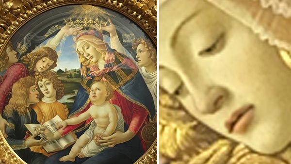
With the Madonna, as soon as I figured out the purpose and the style of the surroundings, I was able to finish the face.
The Soul Spreads Over the Painting
Even if a person is usually the focal point of the painting, the soul is not focused but spread.
The soul is in the setting, in the things, in the atmosphere. Even Botticelli’s Madonna can look just like a bored person without the crown, the light, the child, the book, etc.
So no matter if you paint intuitively without pre-defined ideas, sketches, or references, or more intentionally with a clear idea of how you want your imaginary people to look like, seek for the soul in everything you paint.
Flowers have soul.

Pots have soul.

Hair and hats have soul.

Inanimate and organic things also give the soul to the imaginary people.
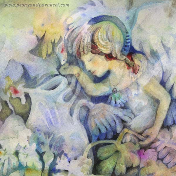
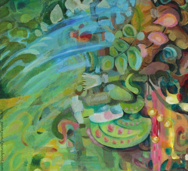
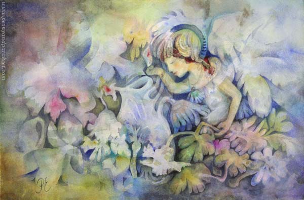
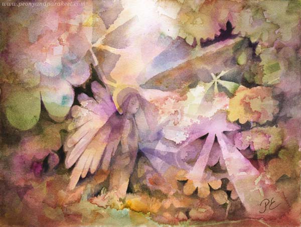
In this watercolor painting called “Mirimer“, the fairy is the focal point, but her soul is spread all over the paper.
Imaginary People Exist in Shapes and Colors As Well
The painting doesn’t even need to have a face. Your imaginary people can be abstract, like in this small acrylic painting that I recently painted on a sketchbook.
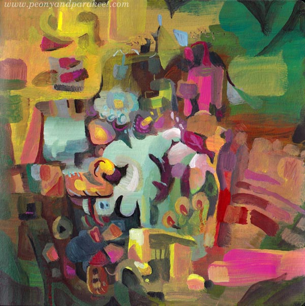
Shapes and colors have soul.
Imaginary People – First or Last?
The idea for this post came from the question that I received a couple of days ago:
“I like your little people peeking out from within your art. I would like to learn more about that. Do you draw them first and paint around them or paint and then save a spot for them?”
I have many approaches.
In Innovative Portraits, we use references and make a sketch. The soul begins with the plan.
In Magical Forest, we lure fairies to appear intuitively from the watercolor background. The soul begins with the feeling.
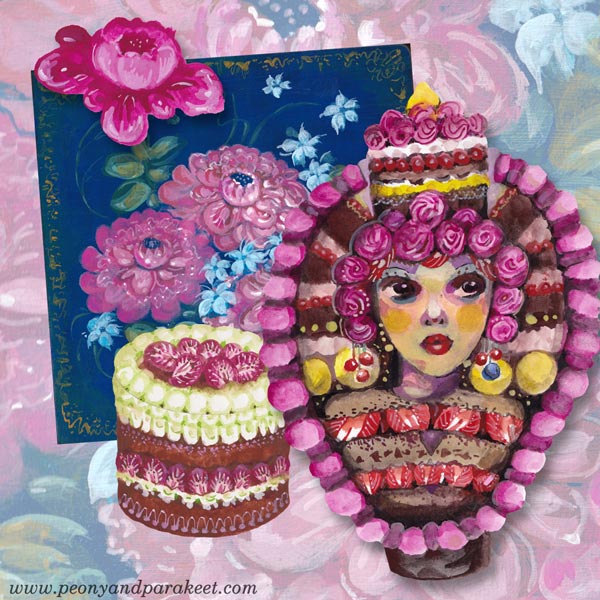
In the new class, Decodashery, we start by building a visual world and then make the dollies to fit with it. So the soul is first just a small flower, then it expands to floral paintings, cakes, lace, and finally, the imaginary people are born. By gradually setting the style and the spirit is the best intentional way to add soul to your work.
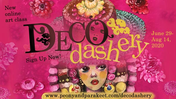
Decodashery will begin on June 29, 2020. >> Sign up now!