
Building and Breaking – Revealing Artistic Potential
This week, I talk about the hidden potential behind artworks and how we can reveal that by not only building but also breaking.
Modern Maximalist
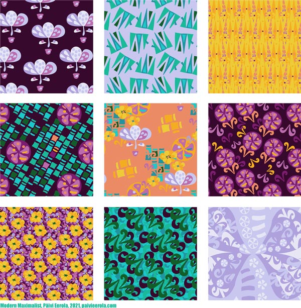
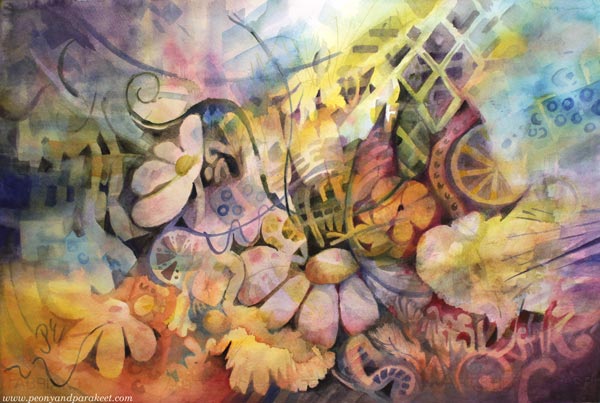
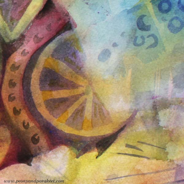
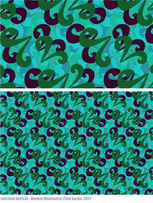
I have just designed a collection of surface patterns called Modern Maximalist. It’s drawn digitally in Adobe Illustrator and more modern than my work usually is. However, I love modern, especially the 1960s and 1970s styles. I was born at the end of the 1960s, live in a house built in the same era, and my love for retro has been too hidden in my art. But still, I didn’t want to design the collection based only on the images of others, but to build a bridge from my art to design. So, most of the motifs were based on this watercolor painting that I made a couple of weeks ago!
More Artistic Potential by Building and Breaking
Often when we create art, we build. We communicate the big picture and compose bits and pieces so that they work together. We get happy accidents (and sometimes some not-so-happy ones) and aim to make an image where the overall atmosphere takes over the details.
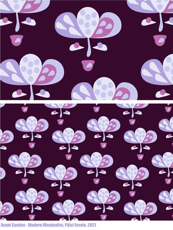
But to reveal more, we also need to break. Then the romantic flower that was painted to represent a dreamer, becomes a more stylish and symbolic figure.
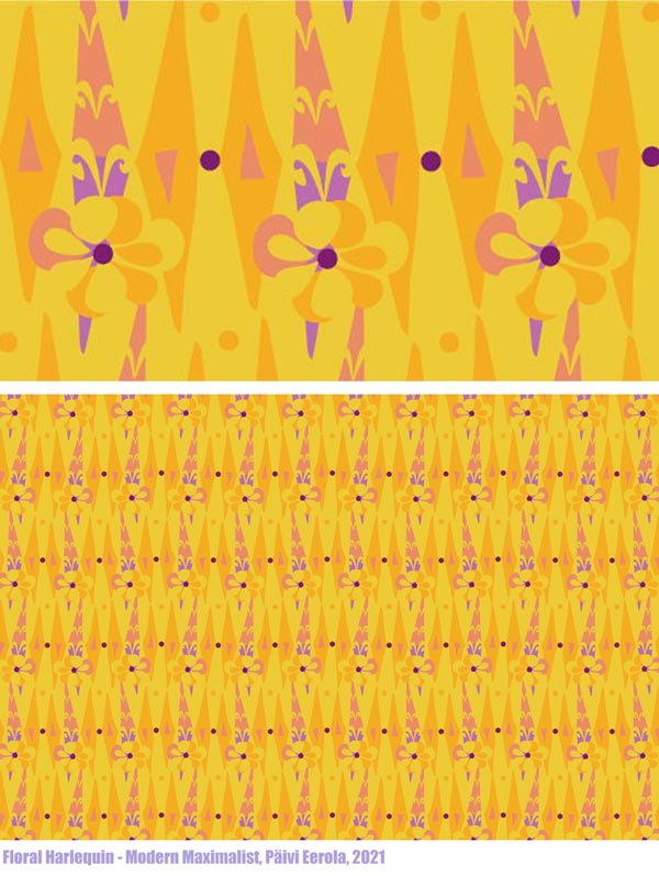
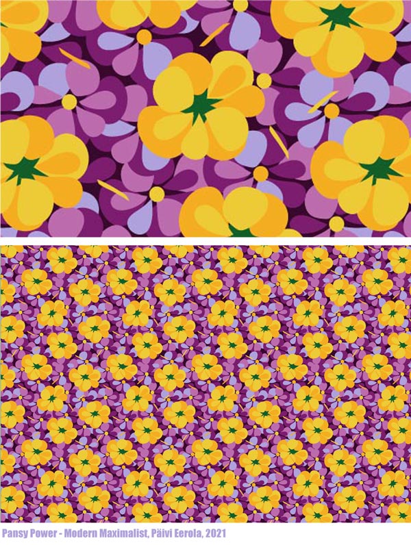
Yellow flowers and all the yellow washes can be more geometric when they are away from the big picture.

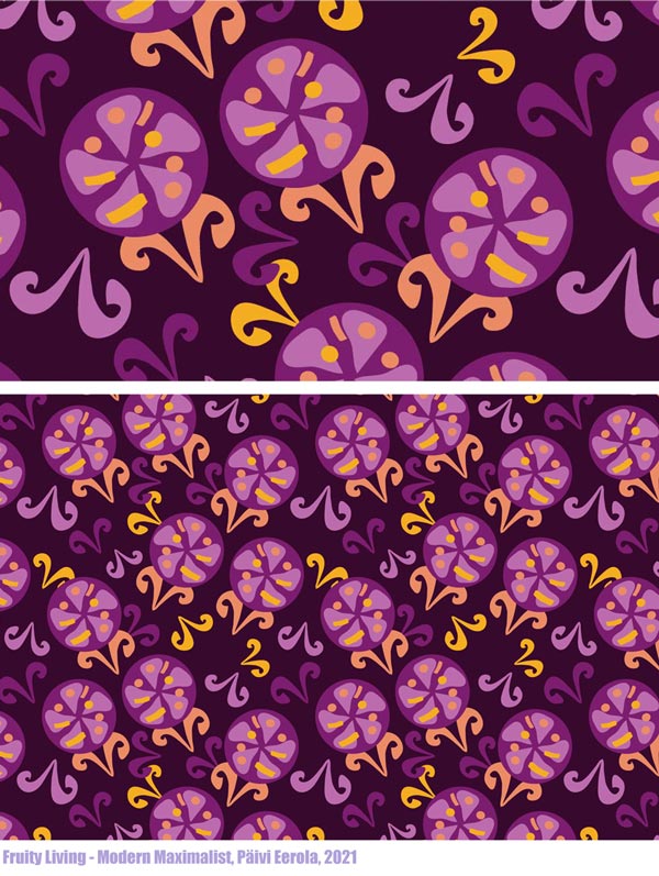
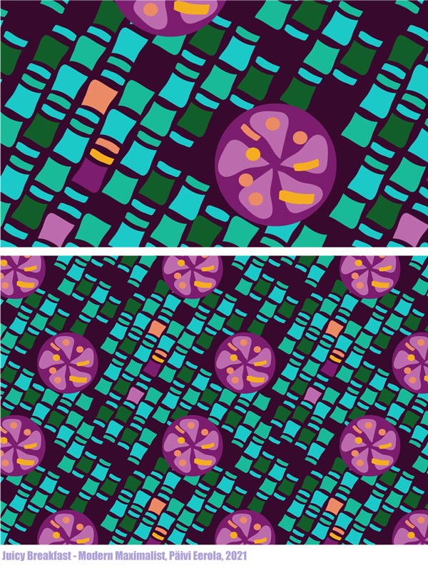
The juicyness of the fruits and other decorative details can be reorganized.
Picking Ideas from Other Images
We can also add more fuel, and break and pick from other images. This design called “List Maxima” uses motifs from the painting, but also the idea of a list that came from playing with the name of the collection, and fashion pictures that showed puffy and full dresses of the maximalist style.
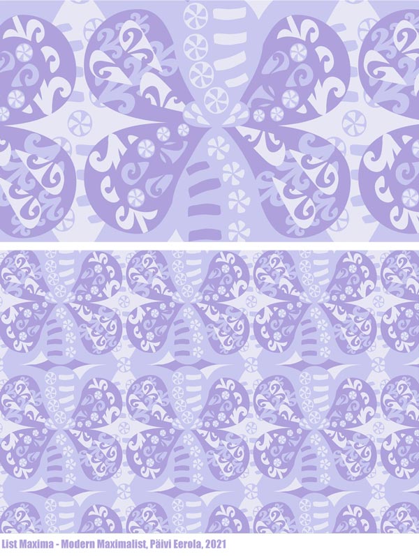
By breaking and picking, we also develop our ability to curate – to see which inspiration suits what we have already done. It’s an essential part of a style-development and and growing artistic vision.
I saw a pleated skirt on Prince Charles’s wife Camilla Parker-Bowles, not a maximalist style at all, but wonderfully modern so I broke and picked the image and got creative from that.
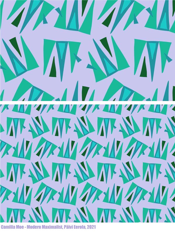
Artists often say to me: “I need to focus!” But by focusing on narrowing, we non-creatively force ourselves to do one thing. By breaking and picking, we can curate all kinds of inspiration and be creative so that it grows our artistic vision.
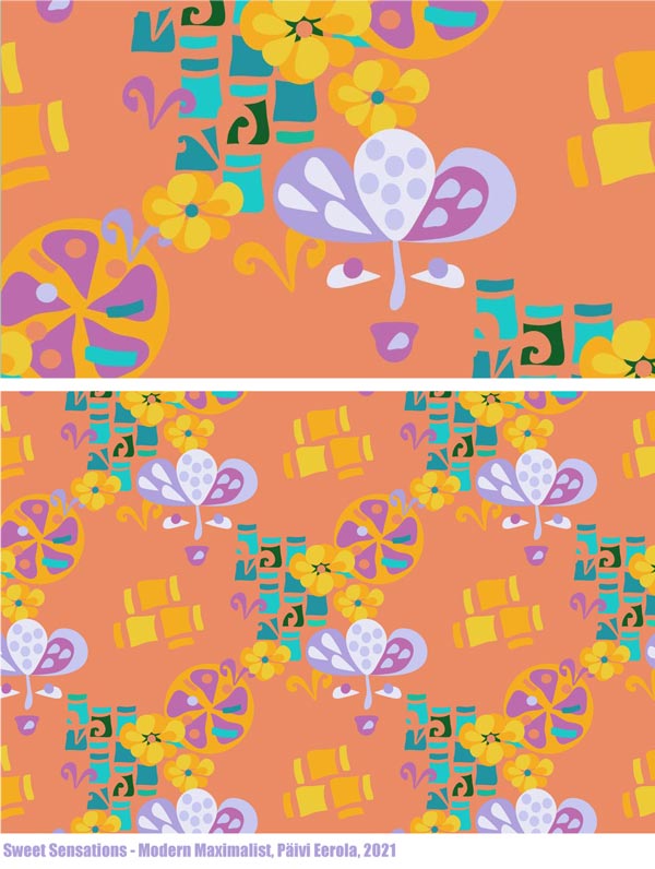
Revealing the Artistic Potential
No matter where you are in your artistic journey, your art benefits from the idea of building and breaking. Build to go deeper into the experience and break to reveal more ideas and potential! In practice, building often means painting, and breaking is often connected to drawing – even if, of course, you can use any techniques that suit you.
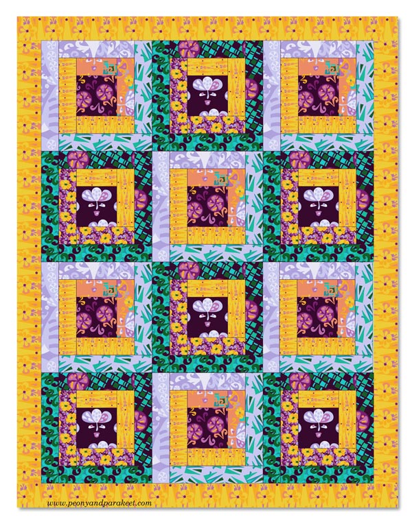
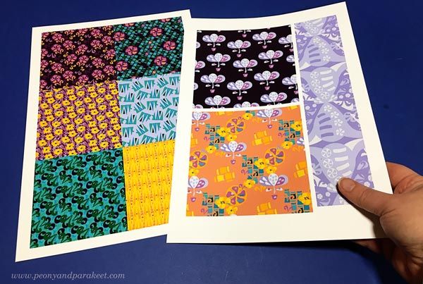
What was first a watercolor painting, could now be a quilt!
Building and breaking can alternate endlessly when we combine new ideas and results with old ones.
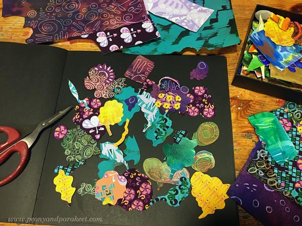
Here I am breaking and picking to create something new into my art journal.
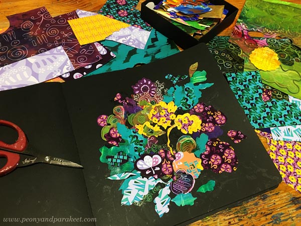
Here’s what I built by cutting and glueing new prints and old hand-decorated papers.
And I couldn’t resist checking if this could work as a repeat too!
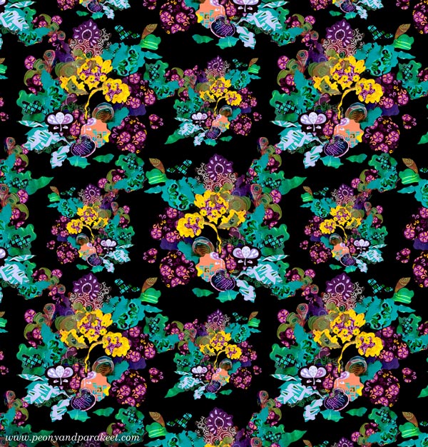
I hope you found this post about building and breaking inspiring!
Need help for finding your artistic potential and building artistic vision? Sign up for my coaching program called Artistic Vision!
Painting Poems – Watch the Video!
This week, we’ll continue the theme of painting poems from a couple of weeks ago. I create a small painting from a poem in a video and also talk about overcoming perfectionism.
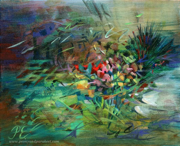
Here’s the acrylic painting that I created from Saima Harmaja‘s old poem “Olkoon niin!” I also include some examples from the class Floral Freedom at the end of this post.
Painting Poems – Watch the Video!
In the video, I show how a poem can make a painting more finished and meaningful. I also talk about why I thought I can’t paint Finnish poems and how I have realized that aiming for perfection doesn’t always help.
More Poetic Paintings
I created these two paintings for the class Floral Freedom. The first one is inspired by Anna-Maija Raittila’s poem Ruiskukkaehtoo (Cornflower Night).
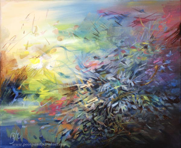
And the one below is inspired by Katri Vala’s poem Kukkiva maa (Flowering Earth).
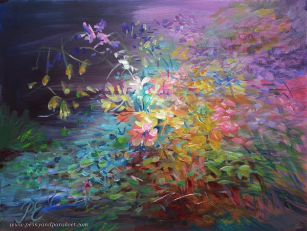
Paint Dreamy Florals to Free Your Spirit!
Floral Freedom – the abstract floral class based on Paul Klee’s and Wassily Kandinsky’s insights – will begin on Dec 4, 2021. In this class flowers are not just passive decorations, but they fly, sing, and dream! >> Sign up Now!
Floral Freedom is 20% off for the rest of November, so now is a good time to sign up!
>> Sign up now!
Art Inspiration from Flowering Trees
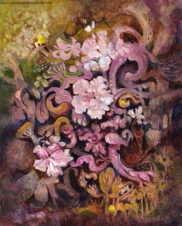
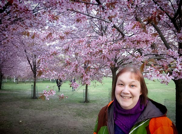
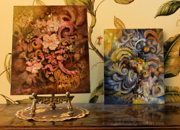
Here’s my latest painting, “Dulciana.” It’s inspired by flowering trees and their power to bloom year after year. This spring was special because I got to see blossoming cherry trees in a park that was filled with them.
Embracing the Decorative Side of Art
This spring has also been different concerning my artistic endeavors. I have been building a new class, but a little slowlier than what I usually do. I have been really intentional about what I include in the class and how the class is structured. It’s has felt like it’s my life’s work even if it’s still a very light-hearted and fun class.

The class is called Decodashery, and it dives deep into the decorative side of art. The projects that I have made for the class have given me new skills and ideas about including decorative elements in my intuitive paintings too.
Light Paints the Flowering Trees
Now when summer has come to Finland, I have also spent more time in the garden. I wouldn’t really have to because my husband is crazy about gardening. He has found his passion, and I am so happy for him.
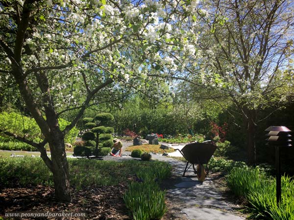
But when I look out of the window, and the sun is shining, I can’t help going there, walking and weeding, taking photos, and admiring how light paints the view.
And when I start a painting, I can’t help thinking about light, and how essential it is for the magical atmosphere.
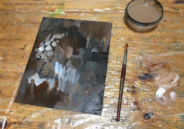
So most times, when I paint freely, I start with random strokes expressing light and shadows.
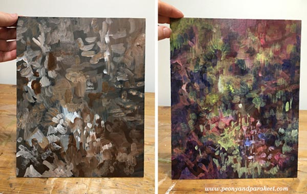
Art, Cembalos, and Flowering Trees
To make the painting shine softly, I like to add washes whether I paint with acrylics, watercolors, or oils. Washes have just a small amount of pigment and plenty of painting medium. For washes, I use water in watercolors, water and glazing gloss in acrylic paints, and the mixture of dammar varnish, french turpentine, and linseed oil in oils. This one is an acrylic painting.
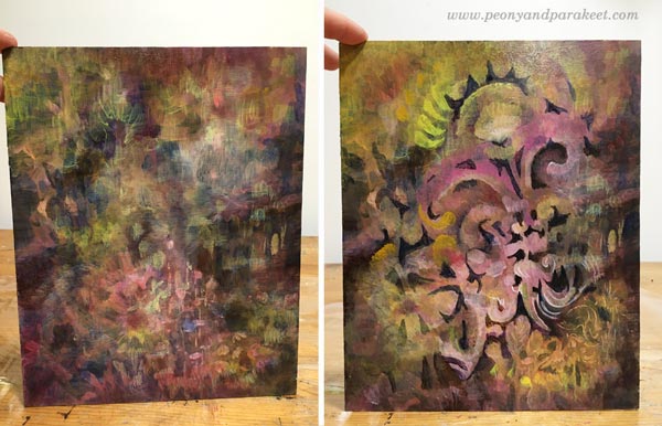
When I paint without any assignment, I usually do it late at night. I listen to cembalo music when I start digging out the elements from the mess. Cembalos sound like the light I want to capture in my paintings. The sound is pompous and full of energy, and still, there’s something so delicate and vulnerable that it almost shatters.
The vulnerability is also in the flowering trees. They seem sturdy and unapologetic, but they know how bypassing the blossoming is. It looks like they miss the flowers already, and the dark trunks feel heavy and burdened by the upcoming work of making fruits of them.
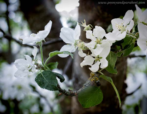
I try not to make one painting at one go but take several sessions. Like trees, the painting also has seasons. It needs time to grow, and time to rest.
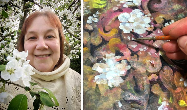
Often it feels that when I am not painting, the painting progresses best. Ideas come when I get out of the studio and talk to the trees.
Endless Flow of Swirls and Ruffles
After making the projects for the new class, Decodashery, I have enjoyed painting decorative shapes than ever before. I especially like swirls and ruffles.
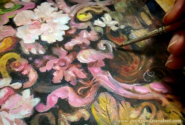
Similarly than old cembalo music sounds like a melody that never ends, all kinds of little curves can make even a small painting feel like it’s a world of its own. The eye travels from one place to another so that there seems always to be something to discover.
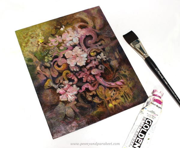
Here’s “Dulciana” with the last week’s painting “Ceruleana.”
Decodashery – Registration Will Open Next Week!
The registration for the new class Decodashery will open next week, and the class begins on June 29.
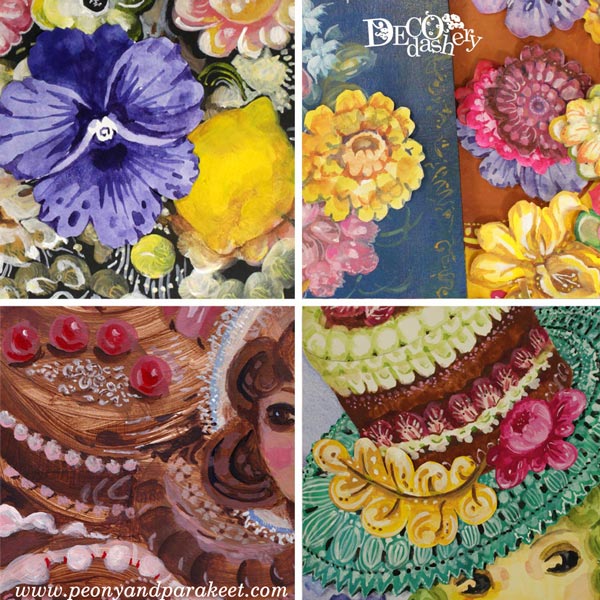
In Decodashery, we will create a beautiful and comforting world that has some jazz too. We will enjoy painting flowers, lace, cakes, dollies, and break the border between vintage and modern art. When building it, I have been inspired by Jane Austen movies, old jazz clubs, Russian handpainted floral plates, and skillful crocheters and cake makers around the world. I hope you will join us! Until next week!
Art Makeover – Revamp Your Old Paintings!
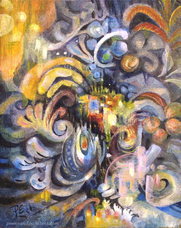
Let’s give an art makeover for an old painting! The idea for this blog post came last month when I was running out of paper. Instead of traveling to an art supply store, I stayed home as was advised, and found another solution: reusing old paintings!
My starting point was practical, but the benefits were spiritual – the journey that had ended, started again. I picked pieces that were made about 30 years ago – when I was in my 20s. At that time, I studied software engineering but still felt partly an artist.
Makeover Tip #1 – Change the Subject
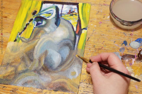
The paintings from the 1990s look very different from my current work, but after examining old paint strokes, I did recognize myself. Although the strokes were rougher and the shapes simpler, they were still very much the same. The subject has changed, but my love for playing with shapes never went away.
Makeover Tip #2 – Save Something Old
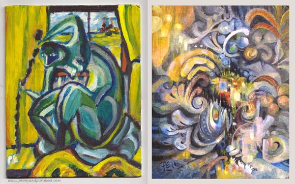
When revamping the painting, I like to save something from the original one. So here, I kept a part of the yellow curtain but altered its color with a thin layer of paint so that it fits with the new color scheme. Old curtain, new home.
Makeover Tip #3 – Change the Colors
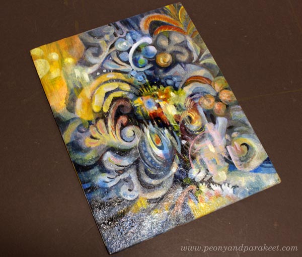
The old painting has screaming colors, but I wanted something more sophisticated for the revamped version, called “Ceruleana.” As the name suggests, the new painting is a tribute to Cerulean Blue.
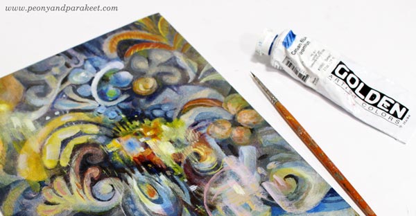
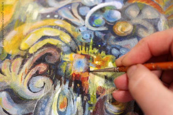
Cerulean Blue is an expensive but lovely color, especially when mixed with white. It makes every engineer a romantic and looks heavenly with ochre and yellow tones.
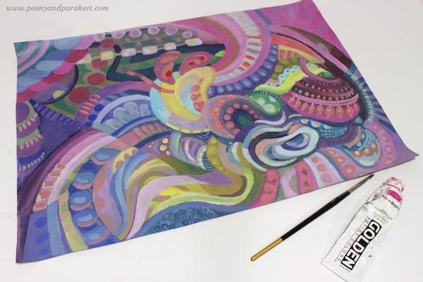
But this post is not only about blues and its hues, I have another example too! This one has a lot of Magenta (“Medium Magenta” of Golden Acrylics), and the colors are very different from the original muddy version.
Art Makeover Tip #4 – Change the Orientation
The original was an artistic self-portrait like the first one. I did those a lot back then, and in every picture, I tried to look a bit different. But my imagination never got this far! The revamped version is horizontal but here they are side by side so that you can compare.
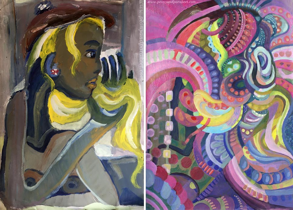
I like how the original version is still present in the new one!
Makeover Tip #5 – Use the Old Painting as a Foundation
This magenta abstract was so much fun to make. The old painting was like a map that had roads and towns, and when trusting them to lead me to one place to another, I didn’t have to worry about composition or such. I picked the easy abstract painting style from my class Planet Color. The whole process was relaxing, and the painting is called “Cosytopia.” A place to escape the big bad world.
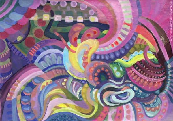
Extreme Art Makeover – Polish and Varnish!
Like in any makeover, why not do it to the very end! Take care that the brushstrokes are smooth where they need to be, and shapes stylish enough for a party.
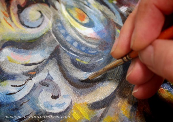
If the painting has a sturdy background, varnish it too! Ceruleana was painted on a cardboard canvas, so I used a polymer varnish on it. Before the varnish, I added a layer of glossy gel medium. (A detailed post about varnishing)
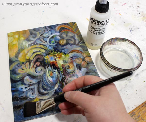
Glossy varnish makes colors glow beautifully. Even if this is an old revamped acrylic painting on cardboard, it may happen that someone someday says: “Oo-oh, it’s an oil painting, isn’t it?”
I hope this post inspired you to make the most of your supplies and past artistic endeavors!
Planet Color – Weekend Sale!
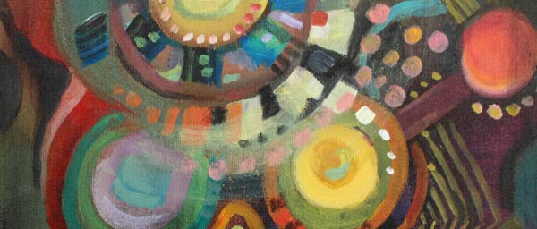
My beginner painting class Planet Color is for sale between May 28th to 31st! The normal price is 35 EUR, now only 25 EUR. >> Buy here!