Painting an Intuitive Fantasy
This week, I have a new fantasy painting, and I also share tips about selecting colors.
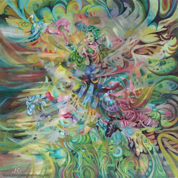
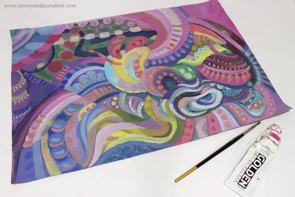
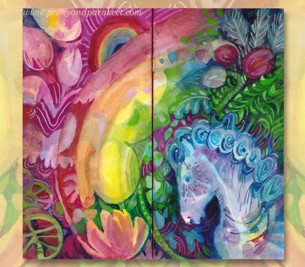
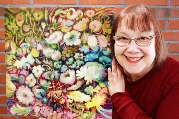
This painting is called “Arotuuli,” which is “Steppe Wind” in English. “Aro” must be one of the few words that are shorter in Finnish than in English, as Finnish words are often very long. We write compound words without space, so it makes words look even longer.
Intuitive Fantasy Painting – Two Tips for the Beginning
I like to paint intuitively, and even if this painting has horses and a woman, it started with random strokes and abstract blocks, and I had no other idea than a secret wish to be able to include a horse at some point.
Tip 1 – Dark and Light
When filling the canvas with color, I like to make dark and light color mixes so that the 3-dimensional effect tickles my imagination.
Tip 2 – Less Can Be More
I also like to pick a narrow selection of colors so that the elements look like they are exposed to the same light. In this painting, I mostly used Phthalo Turquoise, Alizarin Crimson, Yellowish Green, and Titanium White. When mixing colors, less can be more!
A Couple of My Favorite Colors
I am especially fond of Yellowish Green and Alizarin Crimson, and I recommend them warmly. Let’s talk about them a bit more.
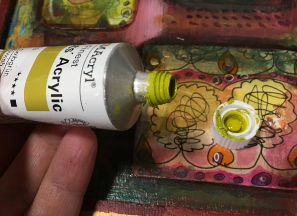
Color 1 – Yellowish Green
Yellowish Green is a color mix manufactured by Schminke Primacryl. I bought this tube because I love Daniel Smith’s Rich Green Gold in watercolors, and I wanted to have a similar tone in acrylics. I like colors that remind me of lemons and lime fruits – one of the most beautiful things in the world – and I always find use for yellows. This color is like two colors in one tube: it works very well with the mixes that require yellow, but it also produces beautiful greens with blues.
Color 2 – Alizarin Crimson
Alizarin Crimson is an ugly red. I don’t think you would buy it if you didn’t know more about it. It looks like dried blood but works very well with color mixes. White reveals its gentler side, and when mixed with blues, you can get beautiful blacks, browns, and dark purples. It produces a pleasant and quite sunny orange with yellows, and in general, it’s a workhorse, always willing to step in.
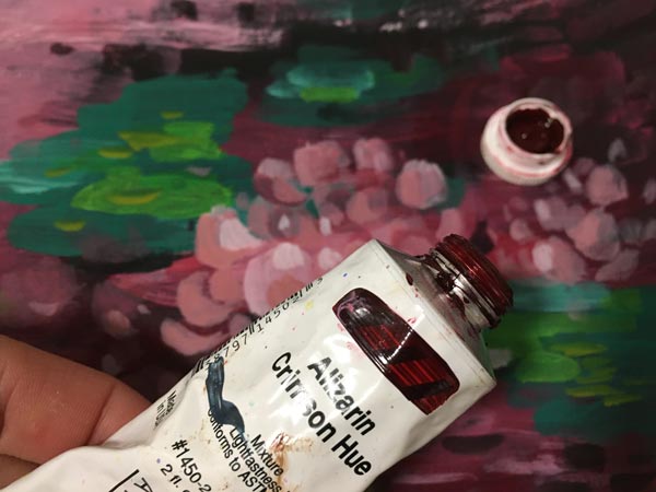
Alizarin Crimson was originally manufactured from madder, but these old organic dyes faded or changed within time, so nowadays we use synthetic substitutes. I found this color in oils first. Schminke’s oil paint is called “Alizarin Madder Lake”. My tube, manufactured by Golden, is “Alizarin Crimson Hue”. Alizarin Crimson is sometimes called “Madder Lake” or “Alizarin Red,” and the tone may vary. Pick the darkest and ugliest one!
If you are a color nerd, Bright Earth by Philip Ball is a comprehensive book about pigments and their origin.
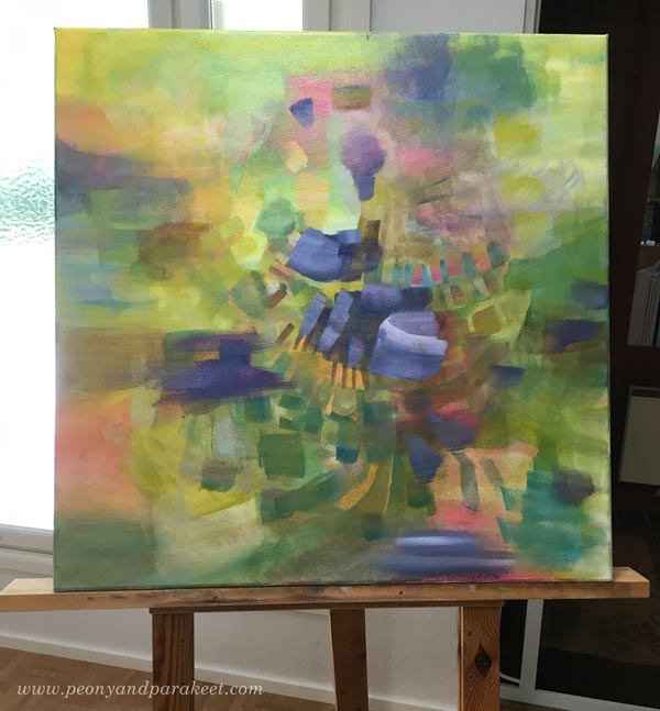
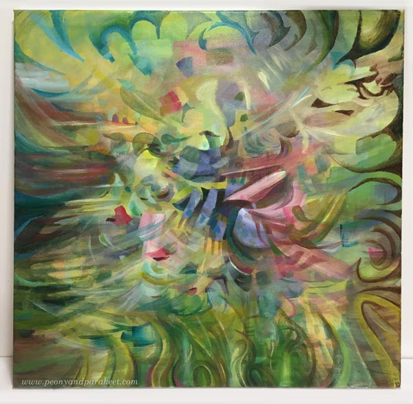
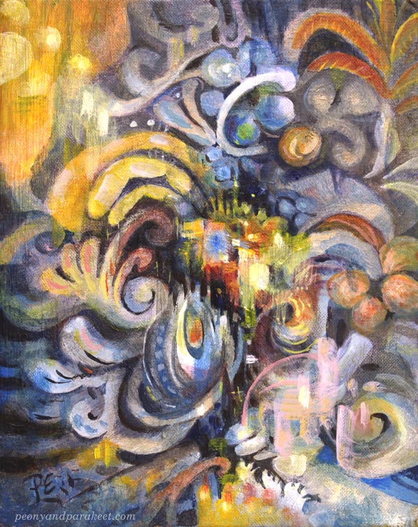
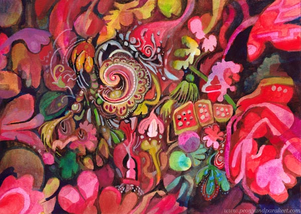
Here’s the painting before I started adding the figures. The image shows well how Yellowish Green and Alizarin Crimson work in color mixes.
Intuitive Fantasy Shape by Shape
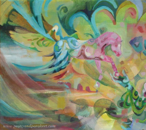
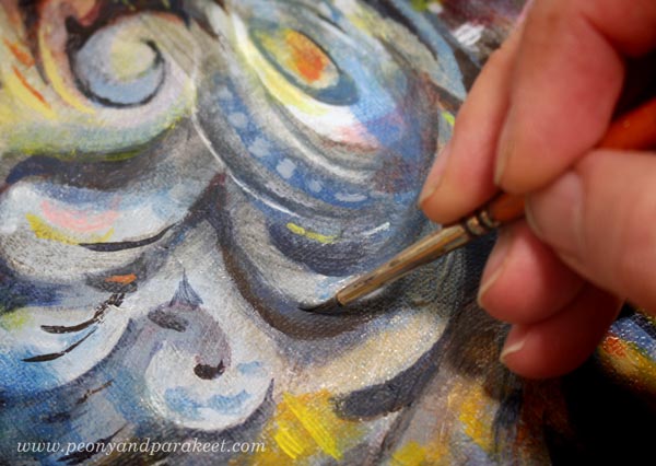
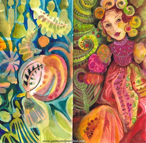
I painted the woman and the horses so that they are partly abstract and partly realistic. Some shapes exist just because they look beautiful, others because they are building blocks for the figures.
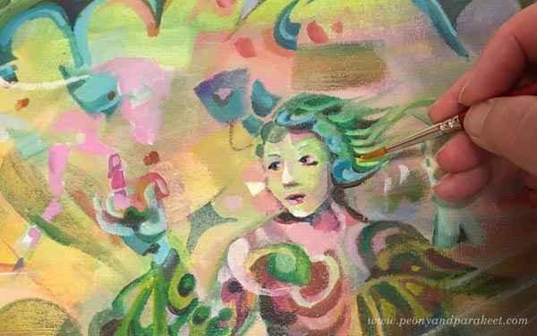
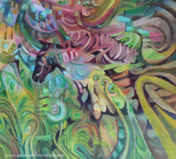
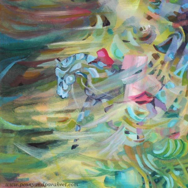
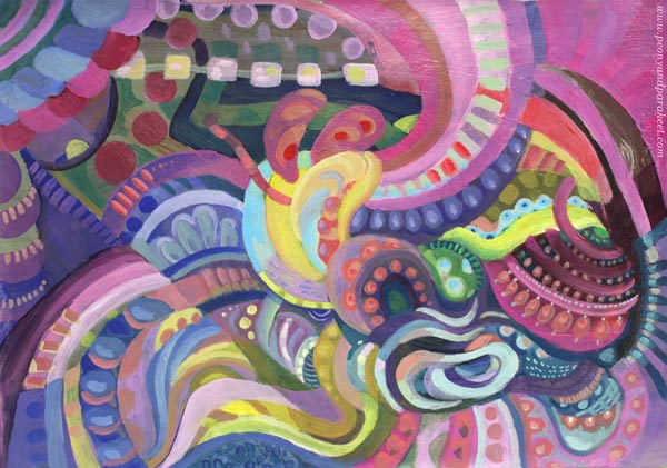
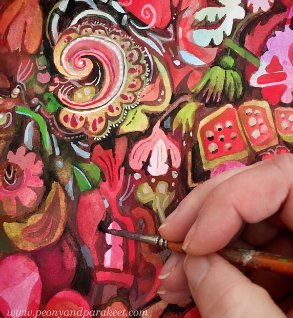
Here are some details of the finished painting. The more you zoom in, the more abstract the painting looks.
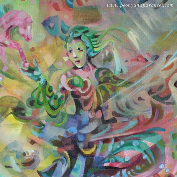
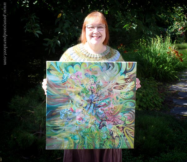
Here’s the whole painting again.
I wanted to keep the colors light and bright to create an airy impression.
Intuitive Fantasy Painting – Big or Small?
“Arotuuli” is one of my biggest paintings. It’s 60 x 60 cm (about 23,5 x 23,5 inches) and painted on a stretched, fairly thick canvas. I like painting on smooth surfaces. My style is detailed, and the coarse structure doesn’t go well with it. The painting was started about a month ago, and I took few-hour sessions now and then. It’s not as slow as you would think, because the small strokes aren’t as tiny as with small pieces. Sometimes we produce clumsy just because we select a small size. For me, the bigger size has helped to create dynamic scenes rather than static portraits. “Arotuuli” continues the previous bigger painting “Paratiisi / Paradise.”
But next week, something much smaller, even if I do have a new big canvas waiting!
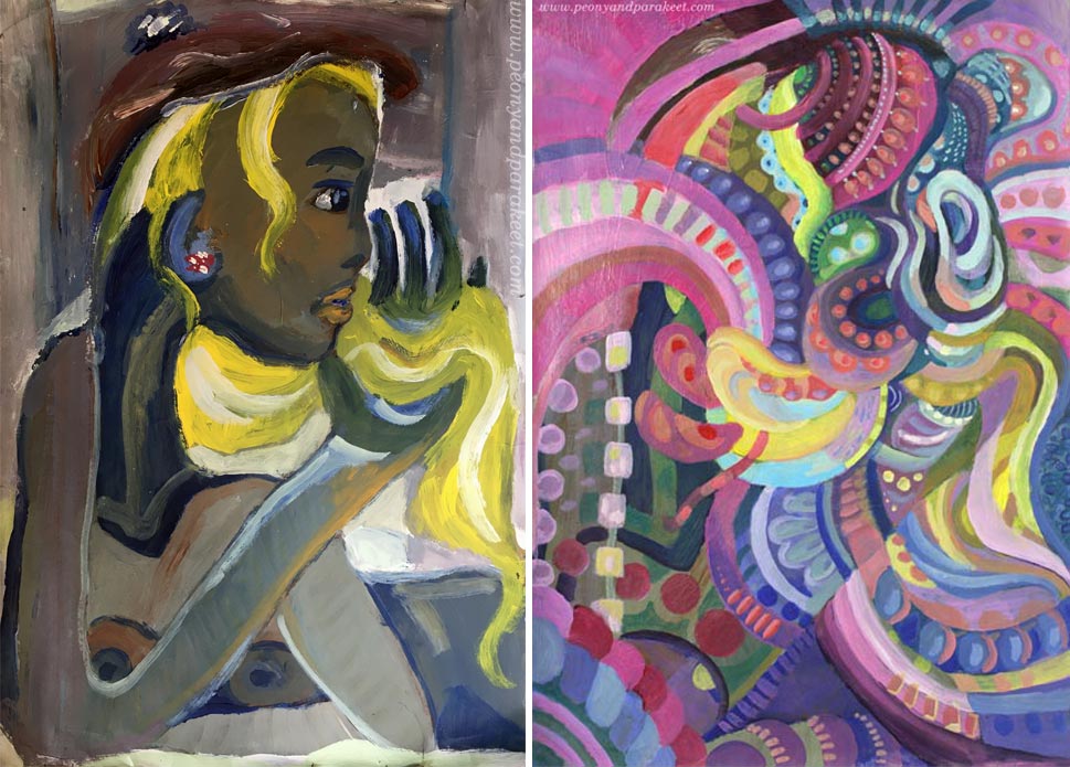
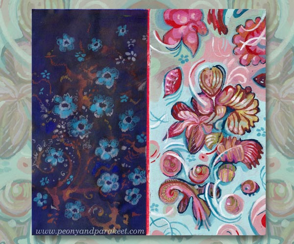
Art Makeover – Revamp Your Old Paintings!
Let’s give an art makeover for an old painting! The idea for this blog post came last month when I was running out of paper. Instead of traveling to an art supply store, I stayed home as was advised, and found another solution: reusing old paintings!
My starting point was practical, but the benefits were spiritual – the journey that had ended, started again. I picked pieces that were made about 30 years ago – when I was in my 20s. At that time, I studied software engineering but still felt partly an artist.
Makeover Tip #1 – Change the Subject
The paintings from the 1990s look very different from my current work, but after examining old paint strokes, I did recognize myself. Although the strokes were rougher and the shapes simpler, they were still very much the same. The subject has changed, but my love for playing with shapes never went away.
Makeover Tip #2 – Save Something Old
When revamping the painting, I like to save something from the original one. So here, I kept a part of the yellow curtain but altered its color with a thin layer of paint so that it fits with the new color scheme. Old curtain, new home.
Makeover Tip #3 – Change the Colors
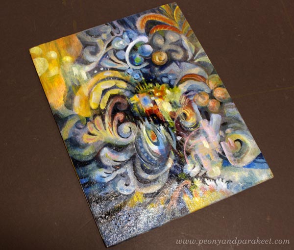
The old painting has screaming colors, but I wanted something more sophisticated for the revamped version, called “Ceruleana.” As the name suggests, the new painting is a tribute to Cerulean Blue.
Cerulean Blue is an expensive but lovely color, especially when mixed with white. It makes every engineer a romantic and looks heavenly with ochre and yellow tones.
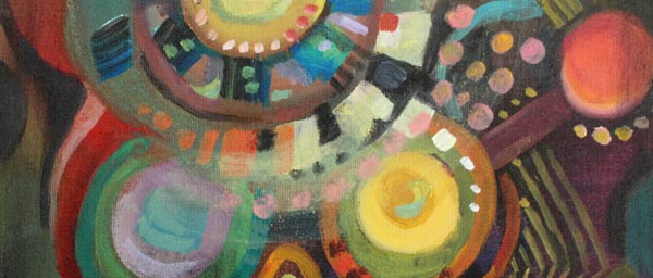
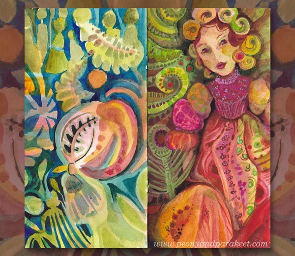
But this post is not only about blues and its hues, I have another example too! This one has a lot of Magenta (“Medium Magenta” of Golden Acrylics), and the colors are very different from the original muddy version.
Art Makeover Tip #4 – Change the Orientation
The original was an artistic self-portrait like the first one. I did those a lot back then, and in every picture, I tried to look a bit different. But my imagination never got this far! The revamped version is horizontal but here they are side by side so that you can compare.
I like how the original version is still present in the new one!
Makeover Tip #5 – Use the Old Painting as a Foundation
This magenta abstract was so much fun to make. The old painting was like a map that had roads and towns, and when trusting them to lead me to one place to another, I didn’t have to worry about composition or such. I picked the easy abstract painting style from my class Planet Color. The whole process was relaxing, and the painting is called “Cosytopia.” A place to escape the big bad world.
Extreme Art Makeover – Polish and Varnish!
Like in any makeover, why not do it to the very end! Take care that the brushstrokes are smooth where they need to be, and shapes stylish enough for a party.
If the painting has a sturdy background, varnish it too! Ceruleana was painted on a cardboard canvas, so I used a polymer varnish on it. Before the varnish, I added a layer of glossy gel medium. (A detailed post about varnishing)
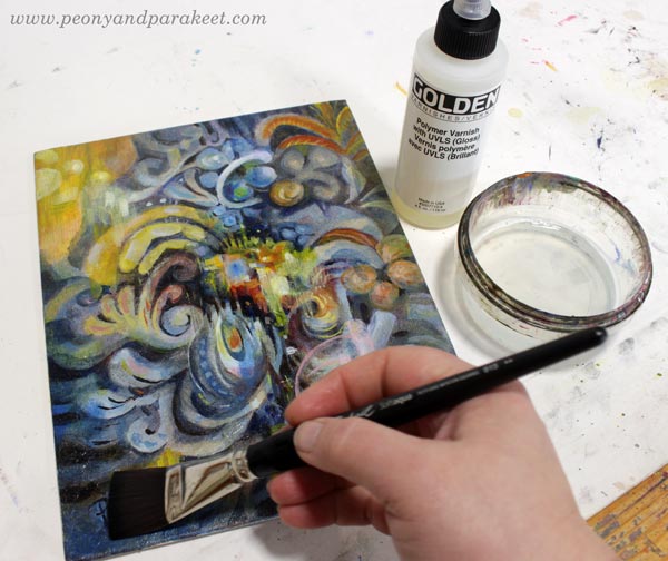
Glossy varnish makes colors glow beautifully. Even if this is an old revamped acrylic painting on cardboard, it may happen that someone someday says: “Oo-oh, it’s an oil painting, isn’t it?”
I hope this post inspired you to make the most of your supplies and past artistic endeavors!
Planet Color – Weekend Sale!
My beginner painting class Planet Color is for sale between May 28th to 31st! The normal price is 35 EUR, now only 25 EUR. >> Buy here!
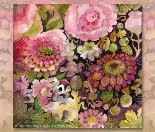
Rainbow Journal – Fill a Small Notebook with Happy Art!
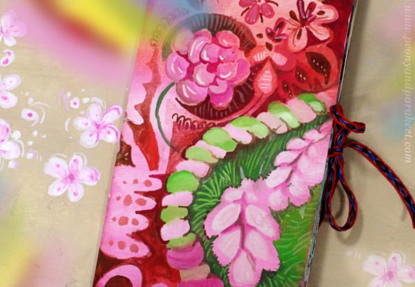
This week, I get back to the project that I started earlier this spring. It’s a small notebook that I have filled with happy art. I call it Rainbow Journal because it has brought me both joy and hope. Here’s a quote from the video below:
“When working on this journal, I have been able to live inside a happy bubble momentarily. It’s been refreshing, and my inner critic has got gentler. I have gained new inspiration for my paintings and classes.”
Watch the video to get inspiration for yours!
Creative Prompts for Your Rainbow Journal
Use the following prompts to make yours!
Cover – Make It as Decorative as You Can!
Use a limited color palette and let the colors and shapes flow.
Spread #1 – Get Inspired by Happy Interiors!
Think about textiles, wallpapers, and painted motifs on wooden furnitures and dishes.
Spread #2 – Embrace the Good and the Innocence!
Once you have set the style of the world you are building, who could be wandering there, full of happy thoughts with an innocent mind?

Spread #3 – Paint Something Juicy!
Show how it feels when the glass is full, even overflowing.
Spread #4 – Grow the Flowers of Imagination!
The dark soil makes flowers grow and shine.
Spread #5 – Show the Bright Future!
Get creative with rainbows, how many can you fit in?
I hope this lifted your spirit and inspired you to keep creating!
Get a free mini-course when you subscribe to my inspirational weekly emails!
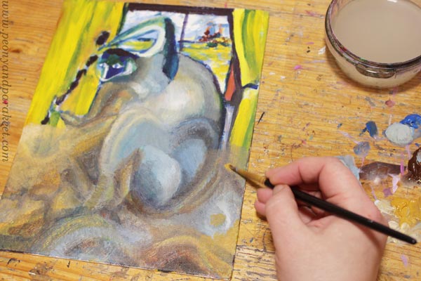
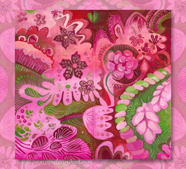
Delicious Colors – Salvage Them!
I have never been overly enthusiastic about bright reds, but now seems to be the time. I feel that in this black world, we need to salvage the delicious colors and amplify them with sugary decorations!
Finding Comfort from Delicious Colors
In the evenings, while waiting for the news around the world to be gathered, I paint in my little studio room. The more I think about the sad statistics, the more I want to create the opposite – a careless world with deliciously tasty and juicy colors.
My studio is now like a sweet bakery, and as the main cook, I have lots of motivation to create!
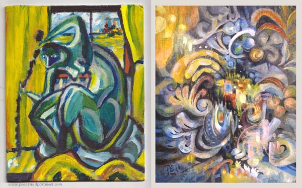
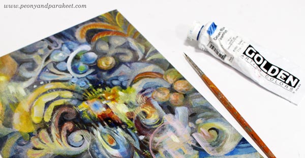
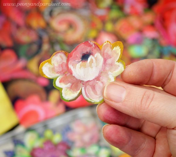
Delicacies from DecoDashery!
What first was just one little painting, has now grown to resemble a series that expresses an imaginary world. I call this world as DecoDashery, inspired by the old haberdashery from the movie Emma. DecoDashery will also be the next class that I am building, hoping to release it within a couple of months!
You Can Always Start Small!
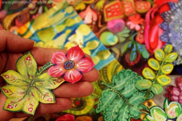
As usual, I haven’t made paintings only, but also collage pieces to my boxes of joy.
Delicious Meringues, Lace, and Porcelain
Now when my husband is working from home too, we eat together more than ever. Fortunately, he can cook! I have never been into that so much. But my specialties are side dishes and desserts, and it’s been fun to make one good meal in a day and combine our skills.
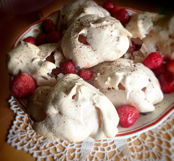
I had never made strawberry meringues, but a recipe from a knitting magazine caught my eye. Strawberries, an old plate, and a hand-crocheted lace doily were all as essential as the meringues themselves.
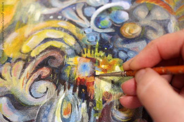
My current oil painting has progressed well too. Even if there’s a lot of work left, I get a lot of pleasure from working on it. Salvaging all the deliciousness of the random shapes feels so good.
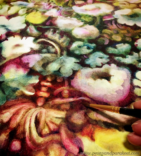
Doesn’t the painting look strangely similar to the meringues, lace, and porcelain? The world of Decodashery is expanding!
Meaningless Has Given Me a New Meaning
It’s kind of funny that when I decided to remove deeper meaning from my work for a while, I feel that my art the overall creative process has become more meaningful than ever.
It’s like I have released the beast that I have always quietly carried with me, and once I have seen it eye to eye, it has become my angel in the crisis.