What Any Artist Can Learn from Old Masters
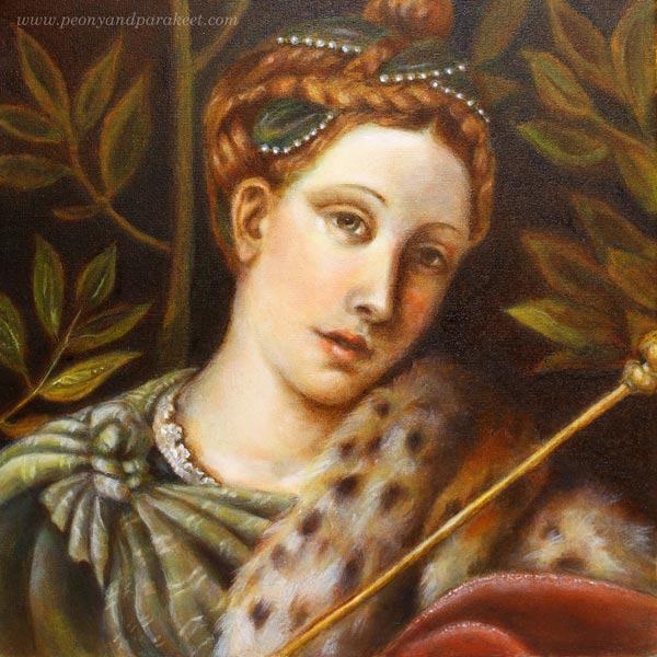
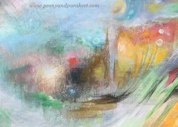
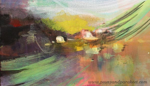
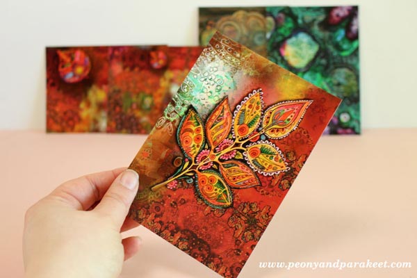
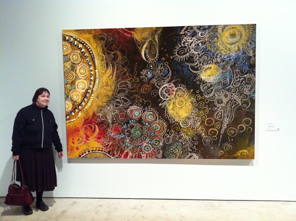
If you have followed me on Instagram or Facebook, you’ve already seen that I have had a special project in November. I have been painting a replica of an old painting and learning techniques that artists used already hundreds of years ago. These are called old master painting techniques. Famous old masters like Leonardo da Vinci and Johannes Vermeer used them when creating their masterpieces. My painting is a copy of a detail from Moretto da Brescia‘s painting “Portrait of a Lady as Salome.” I call mine “Dreaming Salome” because I gave her a more dreamy look and different meaning. The portrait was painted in the course organized by The National Museum of Finland. The teacher of the course was Emmi Mustonen.
5 Tips You Can Learn from Old Masters
After painting my first oil painting, and the first one that uses these techniques, I feel that there is still a lot to learn. So I will be painting another one with these techniques during the spring. However, I have already found out a lot of things that can be used with any supplies, and I wanted to write a blog post about what you can take from my experience. These tips can be applied to any themes, even to abstract art. At the end of this post, there’s also a short video (watch it on YouTube) that shows more images from the process.
1) Don’t Get Discouraged in The Beginning!
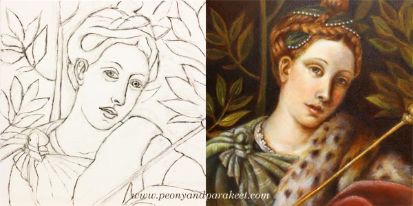
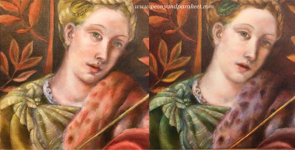
My process of making the painting started with a charcoal sketch. While sketching, I felt I was just making a big mess. I pressed too hard, and the drawing wasn’t detailed enough. The image shows the sketch once it was cleaned with an eraser – just before the first layer of paint. If you compare it with the finished painting, there’s a huge difference between the two. The expression of the lady looked sad in the drawing, but she has a half-smile in the finished version. I understood that the facial features and characteristics are so subtle that it takes a long time to get them right.
When sketching, I hadn’t the persistence to finish her hair and shawl, but still, I was able to make them quite detailed during the painting process. If I had made the original sketch without attending the course, I would have called it a failure and lost my hope of achieving something that would look like an old painting.
I often talk about raw ideas (see this blog post) and that applies to realistic art too. The first lines are just the beginning of understanding what the final work will be. When I was sketching, I only had a rough idea of how my lady should differ from the original version. But once I continued the painting process, my vision got clearer. So, stay curious about the insights that you will get during creating, and don’t get discouraged in the beginning!
2) Before Diving Deeper, Limit Your Supplies!
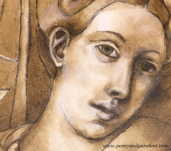
In my painting, the first layers were made with just two colors: burnt umber and zinc white. These first layers form a so-called underpainting that shows where the shadows and lighted areas are. It enforces the painter to look for contrasts, and on the other hand, it enables working with details without making color choices. The philosophy of underpainting can be applied to any media and style when it’s seen as a phase where you limit your supplies and add more content to the piece. When you go through every area in your work and make sure that it connects well with the next one, you will control the big picture through details. I find this much more enjoyable than trying to see everything at one glance all the time.
3) Slow Down to Maintain a Gentle Focus!
I was surprised by the positive feelings I went through while painting with old masters’ techniques. I thought that there would be a lot of demanding voices in my head, but the process surprised me. Even if I was stretched out from my comfort zone, I realized that there could be “a gentle focus,” where you put all your energy into work so that it improves your self-image too. I believe that this kind of new self-acceptance was based on two things.
First, I knew that it would take a long time to finish the painting. Six sessions in the classroom weren’t enough. I also had to do homework. Each of the layers had to dry before adding a new one, and drying took several days. This slow pace felt old fashioned but good too. It made me think how much gentler we would be in general if weren’t so busy all the time. I also noticed how I became less worried about mistakes. When the progress is slow, mistakes start small, and it’s easier to correct them.
The second thing that helped me was that we were using a finger to remove the brush strokes. When I gently caressed the canvas with paint, it affected my whole thinking. It felt like the beauty created and seen by Moretto da Brescia caressed my brain.
4) Don’t Try to Make Your Middle Look Like the End
Before attending the course, I made one decision: I would do my best to follow the teacher’s advice. Because I was not familiar with the techniques, I didn’t know beforehand how the painting should look after each layer. When I teach art, I often see people worry over details that will look gorgeous once they just move on to the next steps. It’s human to compare your middle to the desired end. But if you can set your criteria according to each phase, it will lead to better quality.
So, when laying the colors one by one, I tried to quench my worries about how yellow the dress looked or how red the fur was. When using old masters techniques, colors are not mixed on a palette. The pigments from the tubes are laid in thin layers as they are. So if you want green, you will start with yellow, let it dry for few days and then move on to blue. The transparent layers with soft edges result in mixed color and a realistic look.
When painting these thin layers of color, I couldn’t help thinking that the skin was too uneven. But my teacher advised me to continue creating color differences to get the painting ready for “a white wash.” A thin layer of zinc white made the skin more even, and all the previous layers made sense. Try this approach of seeing layers and elements as building blocks to new ones!
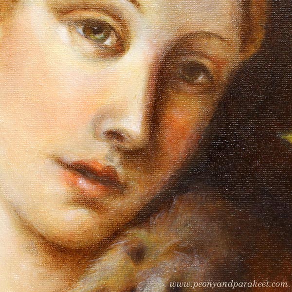
5) Sharpen The Soft, Not Vice Versa!
I was often reminded to make every area and detail softer. Even most of the tiny spots were softened with a finger to make them more translucent and blurry without sharp edges. As a result of that, the painting looked blurry and untidy. But when finishing, sparingly added sharp lines and dots did the trick. It felt magical how suddenly the whole painting looked accurate. I learned that it’s very easy to sharpen the softness. Adding few strokes finished the fur. Adding a tiny sharp dot finished the eye. The nose didn’t need sharpening at all because I wanted to bring the eye to the mouth where I added a small white spot.
When you add softness, you will also make your work look more dimensional. Leonardo da Vinci has said:
“The beginnings and ends of shadow lie between the light and darkness and may be infinitely diminished and infinitely increased. Shadow is the means by which bodies display their form. The forms of bodies could not be understood in detail but for shadow.”
After painting my “Dreaming Salome,” I have become fascinated by watching the edges of items and how soft they are. I know that today’s world is sharp. We aim for sharp photos, a clean graphic look, and turn on the fluorescent lighting. The things we use are industrially made and as perfect as they have been designed on a computer. But try visiting Leonardo’s softer world! Light a candle and observe the lights and shadows. Let everything soft inspire you when you are creating art and reflect that softness towards yourself too!
Bonus: Make it Meaningful – Watch the Video!
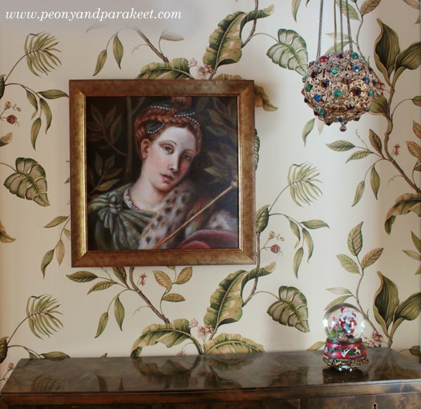
My “Dreaming Salome” is now framed and she has a special place in our library room. I was so happy to be able to finish her before Christmas.
This painting is my first exercise when learning from old masters, but it also has other symbolic meanings. I have made a short video showing the images from the class and how she was painted layer by layer. At the same time, I also explain what Dreaming Salome symbolizes to me.
Learn old masters’ techniques and more!
>> Sign up for Floral Fantasies!
5 Lessons Learned When Painting on a Big Canvas
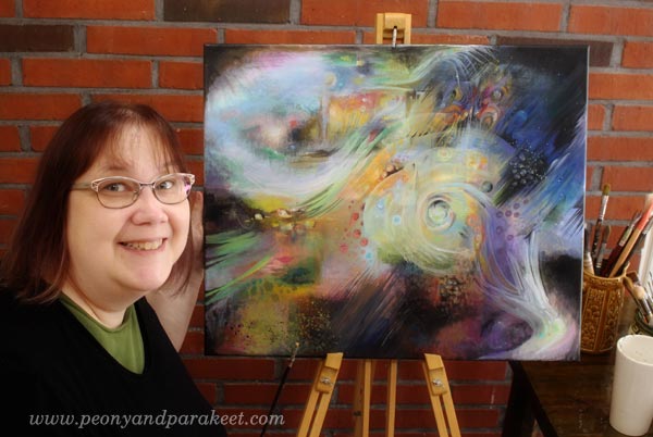
I have now finished my first big canvas painting. It is called “Human Nature.”
1) Smaller Paintings Can Take As Much Time
About two years ago, when I left my day job, I had a dream about creating a big painting. But my job is to teach art, and I don’t have much spare time, so it felt impossible to fit in the schedule. Now when I think about that, I kind of feel that the lack of time was an excuse. I think I was intimidated even by the thought of painting on a big canvas. The usual question raised: “What should I paint?” And then: “How could I maintain my focus for such a long time?” I exaggerated the time that painting would take. I thought it would take months and months. But when I started painting, I realized that I could use broader brushes and be less detailed. If you have ever tried to make small paintings as finished and polished as possible, it takes a long time. Adjusting the details on a big canvas is much easier.
2) Use an Easel, at Least in the Beginning and Finishing Phases
My canvas was not huge. It’s 60 cm x 50 cm (appr. 23.5 x 19.5 inches) Still, it was hard to see the whole painting when it was laid down on the table. I painted parts of the canvas so that it was on the table but set the foundation and finished the final details with the help of the easel.
My easel also has sentimental value. My father who passed away a long time ago has made it. He was a skilled woodworker. We didn’t talk much, but I think that making the easel was his way to encourage me to paint.
3) Eat the Elephant One Bite at a Time
I got the courage to start the painting when I realized that I could combine painting with building an art class. My upcoming workshop Nature in Your Mind (do sign up!) has instructions for the techniques that I used. I treated the canvas as my sketching board for the class.
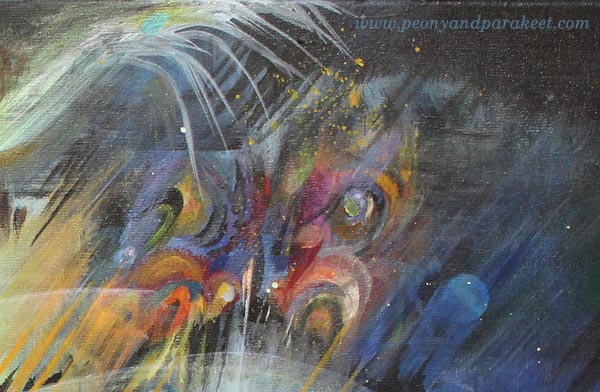
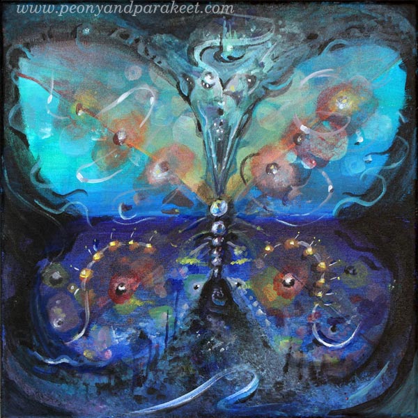
For example, the project for the first week of the class is “Rising Butterfly.” I practiced the techniques on a big canvas and then sought for the easiest and most enjoyable way to create a butterfly on a smaller canvas.
This kind of experimenting transformed the big canvas to my playground. The size was no longer intimidating.
4) Big Brushes are Great for Details
Thin lines, little dots, all look so much better when working with a big brush! It has changed my attitude towards broader brushes. I have started to use them on smaller paintings too.

It was surprising that sharp lines can be so easy with a big brush!

5) Big Canvas, Big Story
If you have been following my blog for a while, you know that my style is detailed. I know now why I wanted so badly to create a big painting and why I was so intimidated by it. You can express a much greater story on a big canvas. It’s much easier to create images that are like events or scenes on a big canvas. When one detail connects with another, it’s like moving from one chapter of a book to the next one.
My story is about human nature: how we are spiritual beings, have imagination and ideas and are conscious about the circle of life. I doubt if I could have expressed all this on a smaller canvas.
Let me be your mentor in art: Subscribe to my weekly emails!
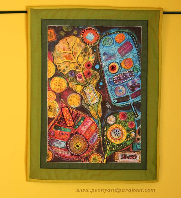
Art Quilts in a Modern Way

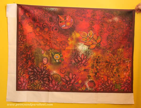
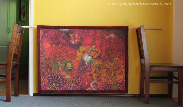
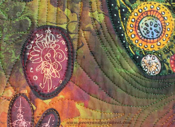
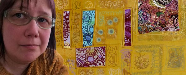
Here’s something that I have wanted to show you for a long time! I have been working with a custom order which made me think of a new idea: to create fabric prints and make quilted wall hangings from them. This idea is very versatile as you don’t have to be a quilter, you can print your art on fabric and use it for bags, purses, clothes – anything!
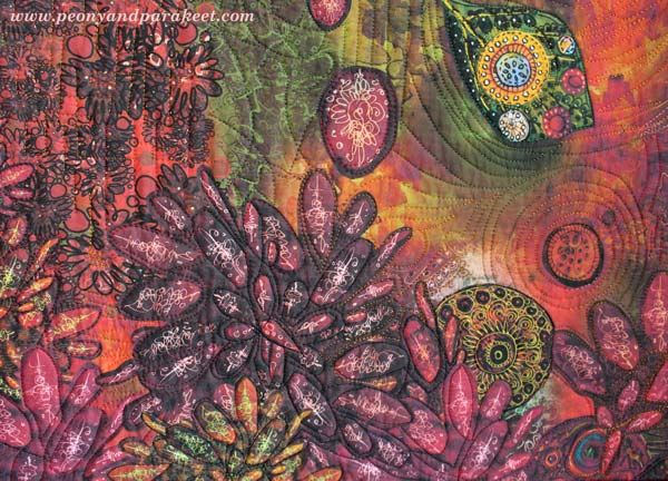
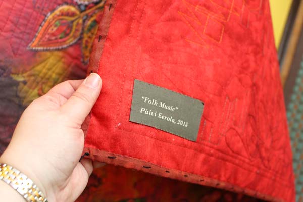
The artwork above has been composed digitally of various art pieces that I have made. The person who ordered the wall hanging is a fan of modern folk music and the color red. (If you have not listened to modern folk songs, try Hanneke Cassel for example!)

I created one new collage piece for the artwork. All the other details are picked from my archives.
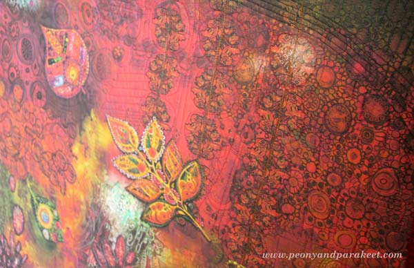
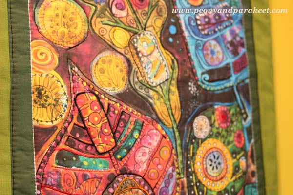
It was pretty exciting to send the artwork to Spoonflower. When I received the fabric, the print quality was really sharp and detailed! I already knew from the previous experiences that big areas of black don’t print well, so I avoided those.
If you are a quilter, you know that the fabric will look so much better when quilted! I sandwiched cotton wadding, two layers of fusible interfacing and backing fabric and took out my sewing machine.
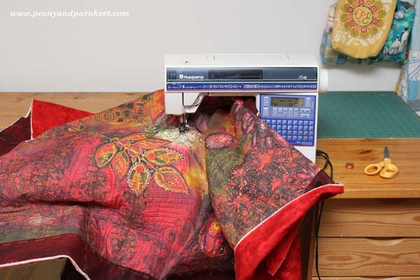
I am not very experienced with free-motion quilting using the free-motion foot, so I used even-feed foot instead. But with patience, I was able to create quilting that enhanced my brush strokes.
The finished quilt is about 45 x 39 inches.
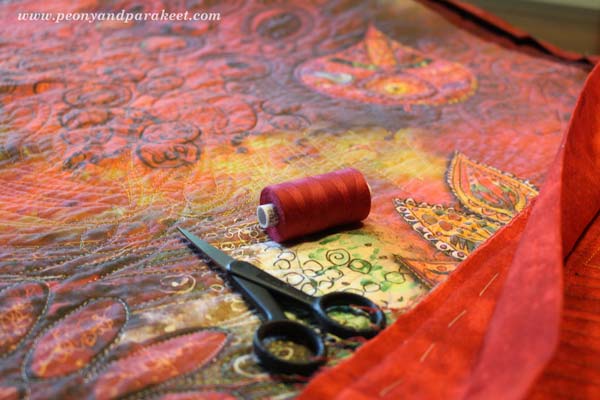
I used various colors of shiny embroidery threads for quilting. Using black thread brings the real black that was not produced by digital printing.
Quilting on watercolor!
Entering the flow state when playing modern folk was in the center of my inspiration.
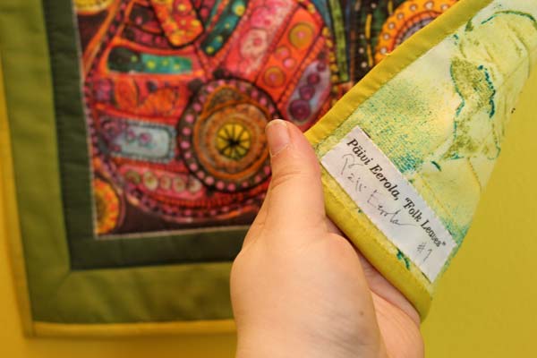
I added the label to the printing file too.
Here’s another project that I actually made earlier to test the idea. This one does not contain much digital processing, I only took a good photo of the original art and enhanced it a little bit.
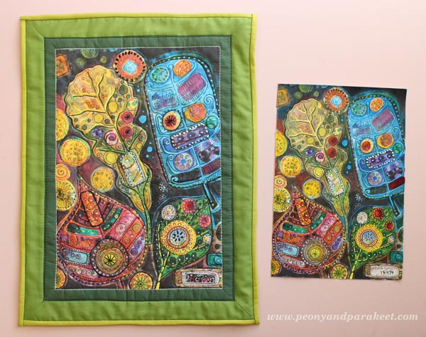
I think this artwork looks really good on fabric! The actual idea when creating the original was to mimic hand embroidery! Read about creating the original artwork: When Pens Replace Needles
I added some embroidery before quilting but found out that quilting works well as decoration.
A printed fabric label can be found from here too.
I also have more fabric prints waiting to be transferred into art quilts!

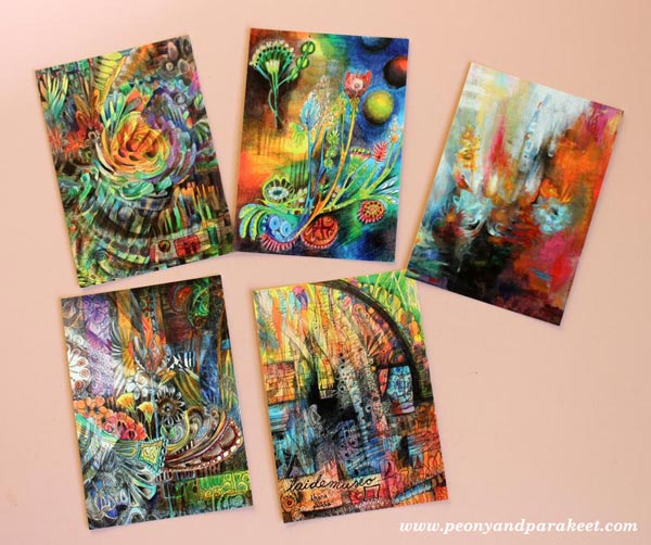
Paper prints news: New card sets have arrived at my Etsy shop.
Life can never be too colorful!
Stella and Cosmo send their greetings to all artists and quilters: Have a relaxing weekend!
Let me be your art teacher: Subscribe to my weekly emails!
I Dream to Create …
I have big creative dreams: to create something that makes a huge impact – I mean HUGE!
1) Interiors
I dream about people entering the room and feeling that they almost faint. Colors, patterns everywhere! The best thing would be to see their reaction: “OMG! You must be kidding!”
2) Exteriors
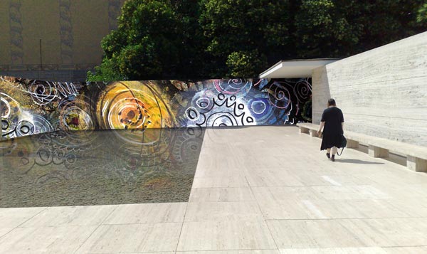
I dream about painting street art for buildings and great architectural places. I would change all those white boxes to something overwhelmingly colorful. It did not matter if it would be a temporary mask. At least the building could say: “There was a time when I was alive!”
3) Huge Paintings
I dream about people sitting on the bench nearby staring at them. A big company could have them in their lobby area. What a wealth of colors!
4) Big Quilts
I dream about designing every single fabric piece which is sewn in them. All original, all full of patterns!
5) Stage Backgrounds

My ultimate creative dream: Creating a stage background for a concert – a picture show which visualizes the music! I dream about the steps to design the backgrounds: how I would listen to the music, again and again, create sketches for evaluation and work with a big team to make it all happen.
Obviously, all the photos here are trick photos created in Photoshop by combining my own photos. These creative dreams might never come true but dreaming is kind of playing. And playing is a key factor in creativity, so let’s keep on dreaming – BIG!
Let’s keep on dreaming: Subscribe to my weekly emails!