Vermeer Girl With Heart – Draw With Me!
Draw a Vermeer girl by following my formula!

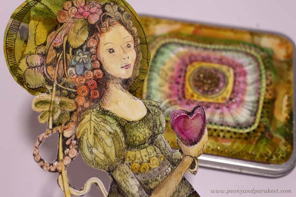
This drawing is a modern version of the painting “Girl with a Pearl Earring” by Johannes Vermeer. Here, the earring is not the center of the attention, but a heart and flowers steal the show. I have made a simple formula to draw and color the girl’s face, and then you can put your own twist on the head and add whatever decorations you want there.
Supplies
You can use colored pencils, watercolor pencils, watercolors, acrylic paints, oil paints – or any medium that has a possibility to create color mixes. My example uses colored pencils. For the face, you need three browns: one dark, one middle, and one very light brown. You also need a little bit red for the lips and black for some small details. White is optional. When working on white or almost white background, you can just leave the white areas uncolored as I do in my example. I do use a little bit white to blend the red of the lips into paper white.

I created my Vermeer girl directly on an art journal page. My art journal is Dylusions Creative Journal Square. Pick a journal or a paper that works well with your supplies.
Vermeer Girl – Shape by Shape Formula
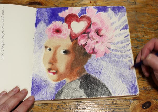
To succeed you have to trust this formula. Don’t look at the original painting, follow the picture below only. Copy the shapes as accurately as you can, and don’t think about drawing a face. The girl will appear when you have all the puzzle pieces in place!
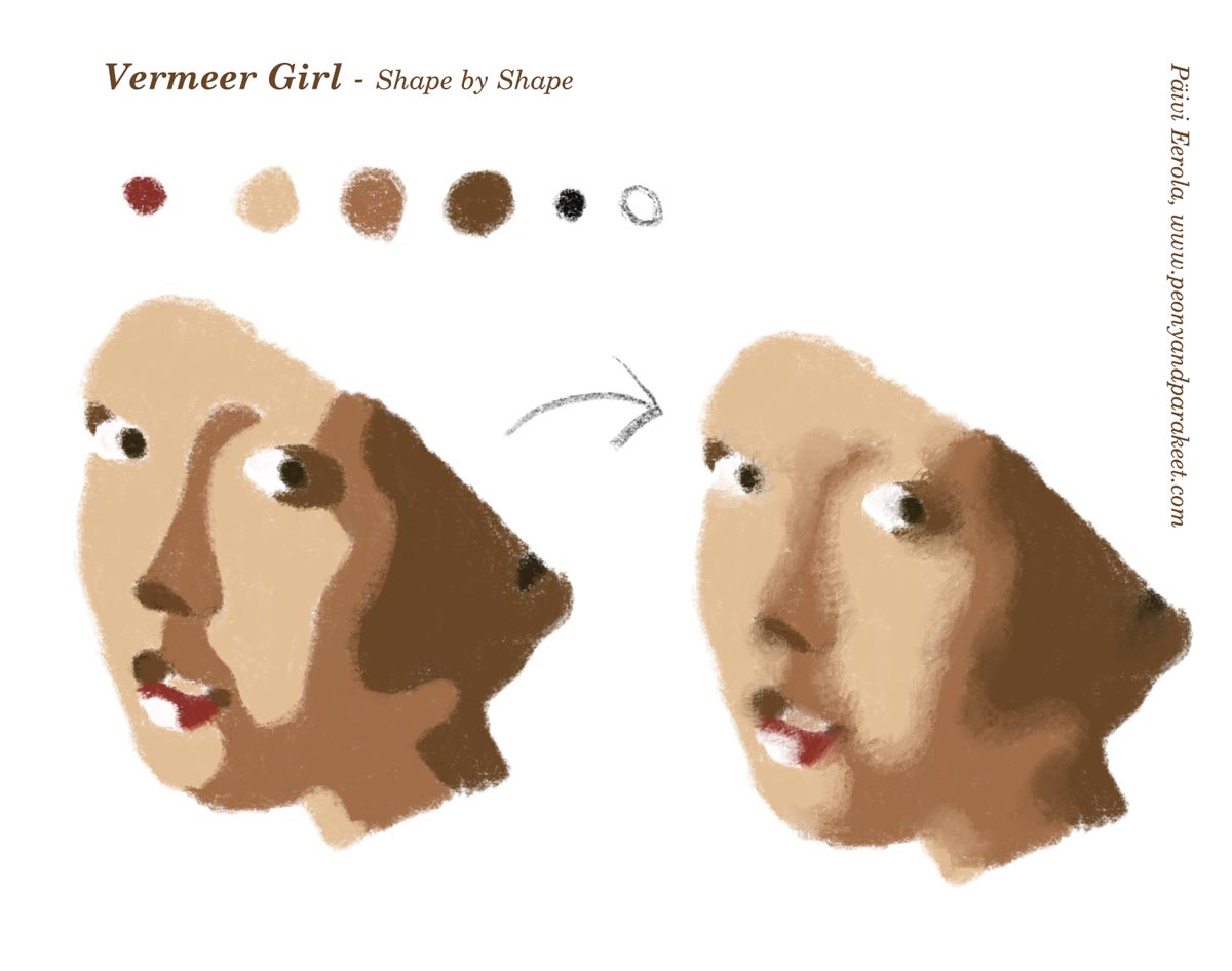
Start from the first picture and color the shapes so that they have sharp outline edges. Then blend the skin colors so that the transition from one shape to another is softer.
Starting the Drawing
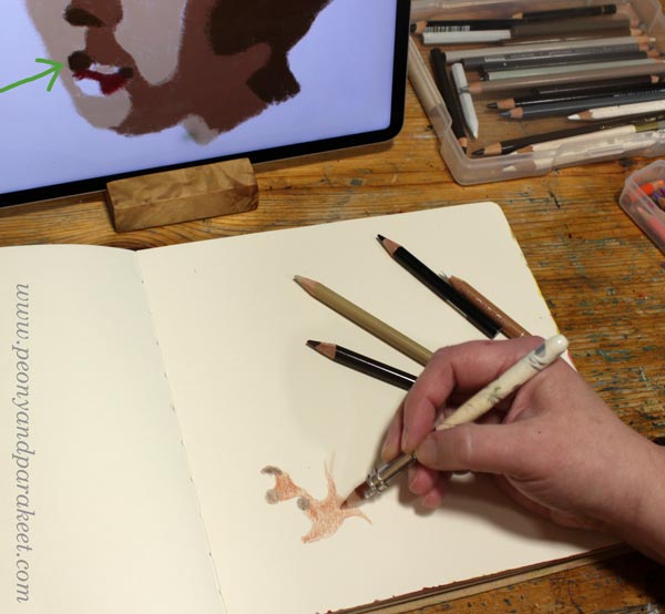
If you want to put all kinds of fun stuff on the girl’s head, place the face on the left bottom corner. I marked the spot where I started the drawing with a green arrow on the photo below.
At first, the face doesn’t look like one at all. But this kind of abstraction will bring out the realistic look. Reality is always more abstract than we think.
Drawing Sharp Shapes
Human faces are very organic, so the shapes are too. Examine the curves of the formula in detail, and avoid straight lines. The more beginner you are, the more you are tempted to draw too straight, avoid that!
Once all the pieces are in place, the face makes sense. Take the image in front of the mirror to see if there are any distortions. If the mirror image looks wrong in some way, get back to the formula and check your shapes!

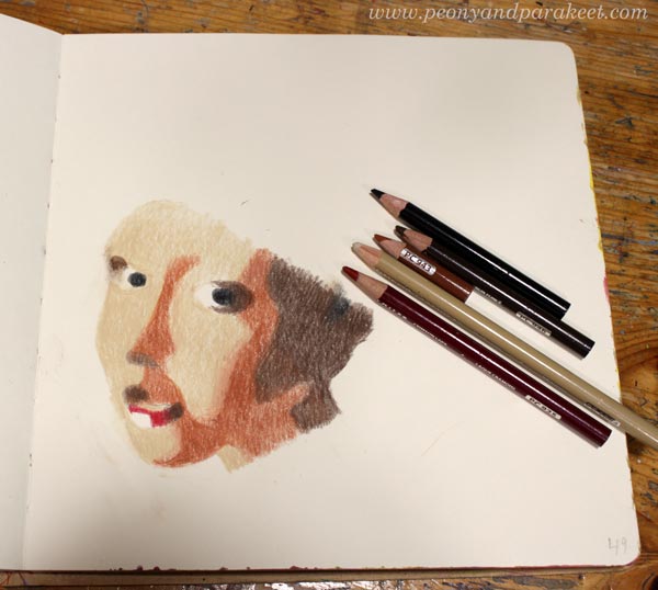
When you are satisfied with the sharp shapes, go to the second step of the formula: blending.
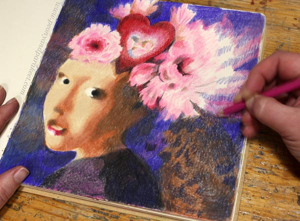
Vermeer Girl – Achieving the Old World Look
Old paintings have softness that our photo-oriented era doesn’t often express. We prefer sharpness over blurry. However, life is often blurry and your Vermeer Girl will look much more alive if you soften the edges of shapes, especially on the skin.

Color on the top of the shape with the neighbor color so that the shapes integrate and look less separate. Now you can also adjust the shapes a bit more freely. I lengthened the big dark brown shadow because my face became a bit longer than in the formula.
Small changes in faces can change the personality quite a lot. I think that’s fascinating! You can start from the Vermeer girl, but then end up with a character of your own.
Drawing Decorations
First, think about the size of the decorations: do you want plenty of small ones or only a few large ones. Beginners easily draw something between, but I think this portrait will look better if the decorations are either a bunch of small ones or a few large ones. I chose the latter and placed a couple of big flowers and a heart on her head.
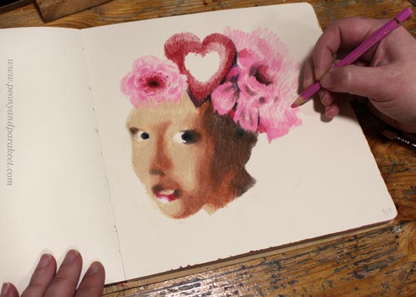
I colored the decorations freely and used no references for these. I like the contrast between the face’s carefully constructed softness and the free coloring of the flowers.
I move on to color the background just before I am finished with decorations. This way I can still change them a bit if needed. The background often gives life to the whole image and brings in more ideas for the drawing.
Starting the Background
Not only the girl’s face is composed of shapes, the background can be like that too. The only difference is that now you can freely improvise the shapes. Start with one color and sketch by coloring!
Think about the streams of air and imagine how the girl moves when she is posing in front of you.
Building the Color Scheme
To make the portrait look unified, you need to repeat the colors. My background started as blue, but in the picture below, it has started to get more brown tones. The pinks of the flowers also blend into blue. Color several layers and use a lot of blending near the edges.
I added the surrounding colors to the center of the heart like it would be a mirror. This also helps in harmonizing the atmosphere.
You can also play with patterns: color small shapes inside a bigger one! When located in the background, the patterns can be subtle and muted, so that they don’t steal the whole show.
Finishing the Vermeer Girl
When you are close to finishing, look at the original Vermeer painting and see how she partly disappears in the background. Especially the dark brown in the neck area can be blended with the background.

Dark background looks great with the lit face. Vermeer girl with a heart makes a wonderful Valentine’s day page in any art journal!

I hope this project made you grab your pencils and other art supplies!
Hearts and Stories – Sign up Now!
Come to play with hearts and other simple shapes! We use colored pencils, felt-tipped pens, and watercolors. Sign up for Hearts and Stories!
Watercolor Flower Obsession
This week, I have a fun video for you. In the video, I create a watercolor greeting card and talk about my obsession of painting flowers.

The card is A5 in size, so about 6 x 8 inches and I have painted it on watercolor paper.
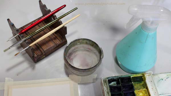
My smallest brush is very narrow and I could have coped with two brushes. In the course Freely Grown, we use the similar process, but finish with colored pencils, so it’s much easier than working with tiny brush strokes.
Watercolor Flower Obsession – Watch the Video!
In this video I confess how goal-oriented I am about painting flowers but also talk about the importance of play.
This video has a lot of material, you may want to watch it more than once to see them all! Also, here’s the link to last year’s greeting card, watch that video too!
Boutique of the Heart
In the video I talk about a boutique that’s not a commercial thing at all, vice versa:
“I believe that we can create the best boutique out of our own art. Imagine your workspace as a paper shop where you sell hand-painted cards, bookmarks, hand-drawn stickers, patterned papers – everything that is already art as such, but from which you can look for inspiration for bigger works. I have even come up with a name for this kind of personal shop. It’s Boutique of the Heart. There’s only one customer in the Boutique of the Heart – you, and one seller and manufacturer – you! The longer you keep the shop, the more you learn to love the things you draw and paint yourself.”
My message is that the essence of art is in play. Thus no matter how high you want to reach, you can still create art with a playful attitude and have your Boutique of the Heart. I know there are art instructors that solely focus on the techniques and those who are about fairytales and imagination, but I feel I am something between. I want to create art with people who want to move forward in art-making, but who also love imagination and free expression.

We can have obsessions, but there should always be time to play too.
What do you think?
Painting by Programming – Modern Vanitas
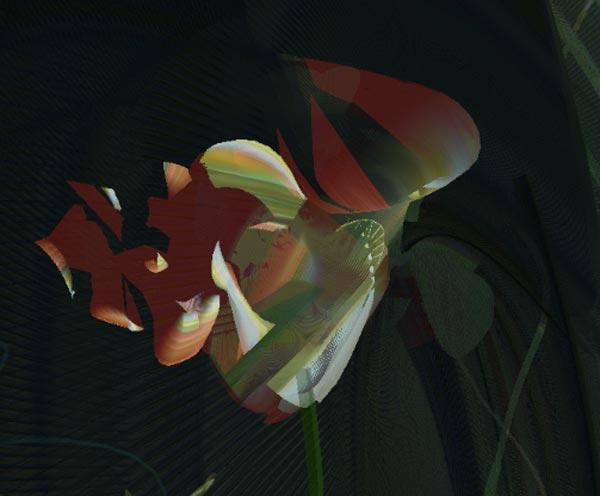
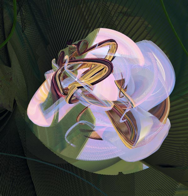
Happy Halloween! This year’s Halloween artwork combines painting and programming.
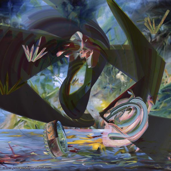
This week, I have a video that has excerpts from the artwork I programmed. The program picks four of my paintings at a time and forms a Vanitas-type arrangement with a skull, fallen crown, extinguished candles, and withering flowers – symbols of our transience. The program has 50 paintings from 2021-2024 to choose from. The music for the video is composed by me, representing a conversation about the temporary nature of life.
You can watch the video bigger by pressing the last icon on the menubar.
If you are interested in seeing more of this artwork, here’s a longer video that explains the Vanitas concept and shows more samples.
I designed the 3-dimensional shapes and then blended the paintings on them by programming.
Painting by Programming
One of my oil paintings is also Vanitas, so the theme is very familiar to me. The transience of life has both horror and beauty, maybe emptiness too that goes well with the machines. The way the computer paints with me produces fascinating details.
We can continue the tradition of Vanitas paintings and use any technique to make our own versions.
What kind of version would you create?
P.S. This month there was a digital art exhibition “Deform and re-form” on the screens of the Helsinki Central Library Oodi. The exhibition called “Deform and Re-Form” was organized by the Finnish National Gallery’s digital team. Oodi is a very popular big library building, with lots of visitors every day. It felt great to see my artwork “Queen of the Night” there.
Even if a part of this year’s art is digital and painted by programming, I still keep creating traditional art as well.
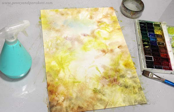
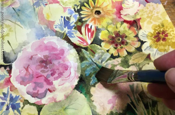
Autumn Watercolor Flowers
This week I share an autumnal painting and talk about how dreams and everyday events get mixed in my art.

- In this project, I made the autumn watercolor flowers freely like in the course Freely Grown.
- The title “Satokauden kuulas” is a bit difficult to translate, but I explained it in the last paragraph.
- This piece is for sale at the online art store Taiko.art!
Autumn Moments
Although I usually aim for a grandiose atmosphere, my art is a lot about insignificant everyday moments.
For example, when I …
- … gathered apples from our apple trees
- … walked in a rainy storm with the dogs
- … admired autumn colors from the car window.

Or when I smiled at the hopefulness of the roses in the front yard and promised to give them a home from a painting before winter would surprise them.
Floral Watercolor Dreams
When I paint in my small studio, my mind tells me that I am a flower painter in 17th or 18th century Holland. I imagine lovely high windows, old costumes, and the clatter of shoes on the street. I imagine the flower market and how I will assemble a bouquet from the best finds.

But in reality, I’m just an ordinary Finn whose everyday life pushes through the brush.
There is a huge gulf between me and the master painter of the 18th century and yet I still jump into it again and again. Every once in a while, I decide to stop painting flowers because there’s so much more to paint. And yes, if I look at my oil paintings, my favorites don’t have many flowers. Nevertheless, the flowerless period never lasts very long.

When I go to the garden, the Flemish master is waiting for me there. He says: “It’s time to practice again, Päivi” I answer: “Yes,” and then assure him: “One day I will master this art of painting flowers.”

Still, I know that life can be far too short and far too mundane for me to ever reach that level. But like a rose facing winter, I take out my button and wet the paper again.

This piece was painted on Arches Hot Press watercolor paper. It has a very smooth surface so it’s great for a detailed painting, but I also find it a bit challenging because every stroke shows!
What’s Behind the Title?
Even if I painted autumn watercolor flowers, can you also spot the apples?
This piece is called “Satokauden kuulas” and I think it’s a beautiful title in Finnish but a bit complicated to translate. “Satokausi” means harvest time and “kuulas” is a romantic word for translucent. But there’s more. “Valkea kuulas” is an apple variety that is called White Transparent in English. So I think that the suitable English name is “Harvest’s Transparent” even if it doesn’t quite have the same romantic sound as the Finnish version.

This piece has a strong autumnal feel: bright colors meet more muted tones on a dark background.
Does the weather also appear in your art?