Using Color Schemes from Home Decor
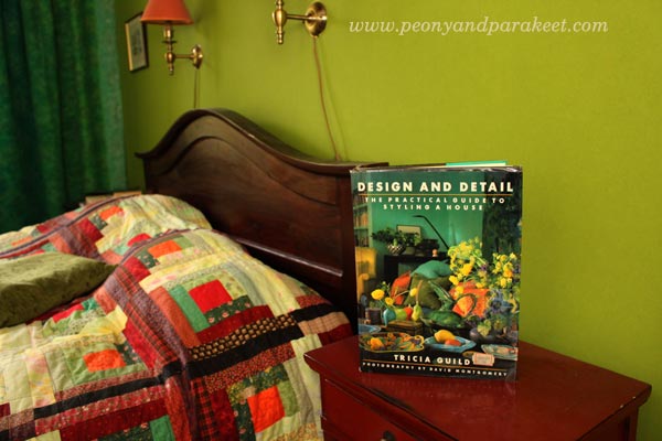
In the early 1990s, I bought an interior design book from the UK. It’s called “Design and Detail” and it’s written by a famous designer Tricia Guild. She was not as well-known as she currently is back then, and I hadn’t known her before I saw the book.
Creating Art by Using Color Schemes from Home Decor
I felt drawn to the interior color schemes and the decorating style presented in Tricia Guild’s book. Never before had I felt such a strong appeal to home decor. I knew I liked to be surrounded by strong colors, but I had never seen them used in such a powerful way. Since then, my every home has had elements and spaces inspired by the book. Whether I lived in a small single room as a student, in a flat or a house, I have always browsed the book when I’ve needed inspiration for interior color schemes.
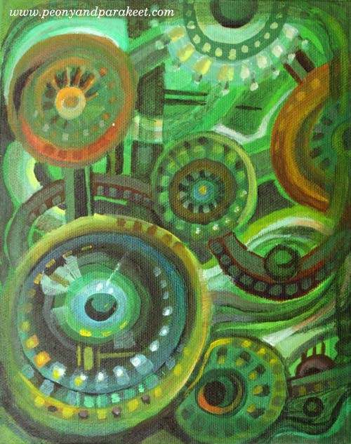
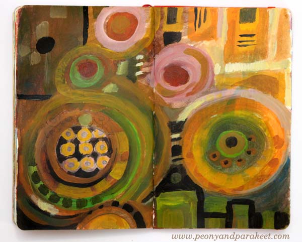
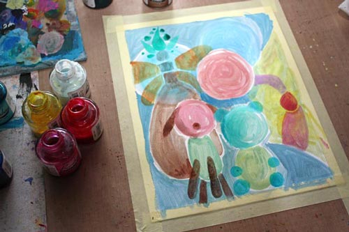
Last week, I saw a picture that had one of the color selections that are presented in “Design and Detail.” It was the combination of green and black including a little bit off-white, yellow and muted orange-red. We already have that color scheme in our bedroom but at that moment, I wanted to play with those colors again. So I started a painting that has green and black and followed the instructions from my upcoming class Planet Color!
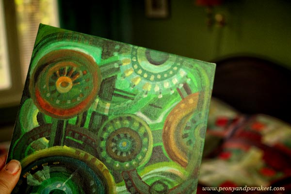
Once it was finished, I painted more interior color schemes from the book. Again, I used the 7-step method from Planet Color. I had so much fun creating these!
Warm and Inviting Colors
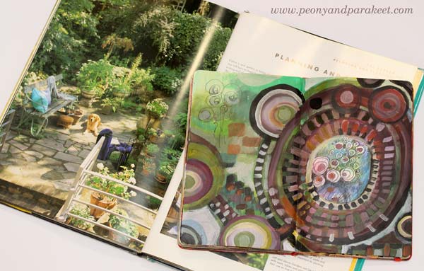
The dining area in Tricia Guild’s book looks very cozy. The striking combination of yellow and black is balanced with earthy colors and then brightened with a few warm, bright spots.
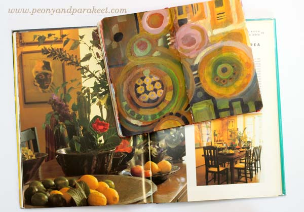
My art journal spread is inspired by the flowers and vases. It also plays with angled and round shapes as seen in the dining room.
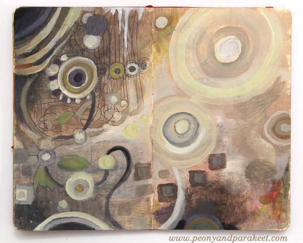
Whites and Neutrals
I am definitely out of my comfort zone when using pale colors in larger quantities whether it’s creating art or home decor. But I wanted to try to get inspired by Tricia’s master bathroom. It was surprisingly easy when I focused on expressing the textures shown in the photo. The narrow color scheme also made me focus on adjusting the colors only slightly.
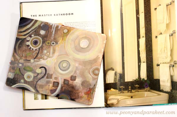
It is surprising how many tones can be created from a very restricted color palette. I also quite like the red/orange spot on the right and how it balances the upper left corner. When using neutral colors, even the smallest colorful detail can make a difference.
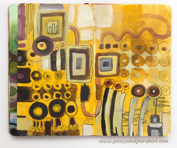
Many Shades of Yellow
I had a bedroom that had quite a lot of warm yellows when I was a child. But before “Design and Detail,” I never thought I could have bright yellow walls. But during the years, I fell in love with the warm yellow shade that I call “Tricia Guild’s yellow.”
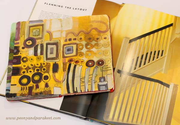
In the art journal spread, I played with various shades but six years ago, when we moved to our current house, I wanted to have that particular “Tricia Guild’s yellow” on a wall.
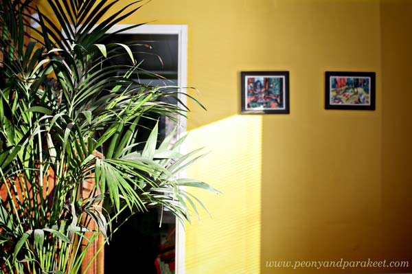
Even if there were tens of yellows available as paint, “Tricia Guild’s yellow” wasn’t found in the color charts. I thought people must think I am mad being surrounded by all the yellows and shaking my head. Then I just picked one that was closest and we started painting. But it wasn’t the right shade and after one layer, it felt too warm. After carefully analyzing the yellow in the book and comparing it with the wall, I decided to add warm black to adjust the tone. And so we got “Tricia Guild’s yellow”, just the perfect tone on the wall!
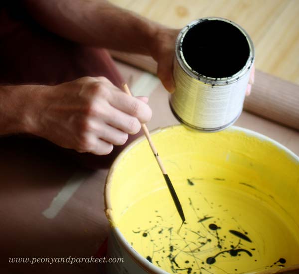
This story shows how many colors there are in the world and how little you experiment with if you are using only ready-made colors. Start mixing your colors! It is a reason why I built Planet Color, my color-oriented workshop!
Colors from Potted Garden Using Leftover Paint
After creating so many paintings, I ended up having some leftover paint on the palette. I decided to use the paint by getting inspired by exteriors too.
Expressing a potted garden with circles is easy. Angular tiles are also easy to add to the picture.

Sign up for Planet Color!
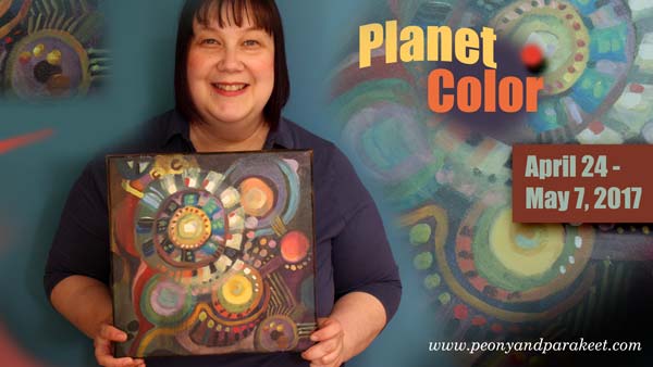
Take your favorite interior design book, or Pinterest board, or any source that inspires you with color, and sign up for Planet Color! I’ll show you how to experiment with colors so that your painting is more than just a selection of color samples. I’ll show how you can make colors interact and how to enjoy adding more instead of just making a mess! And if you are more of a minimalist, you can omit some steps of the process and create a simple yet eye-catching painting! Reserve your spot now!
What Acrylic Colors to Buy?
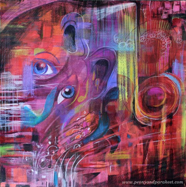
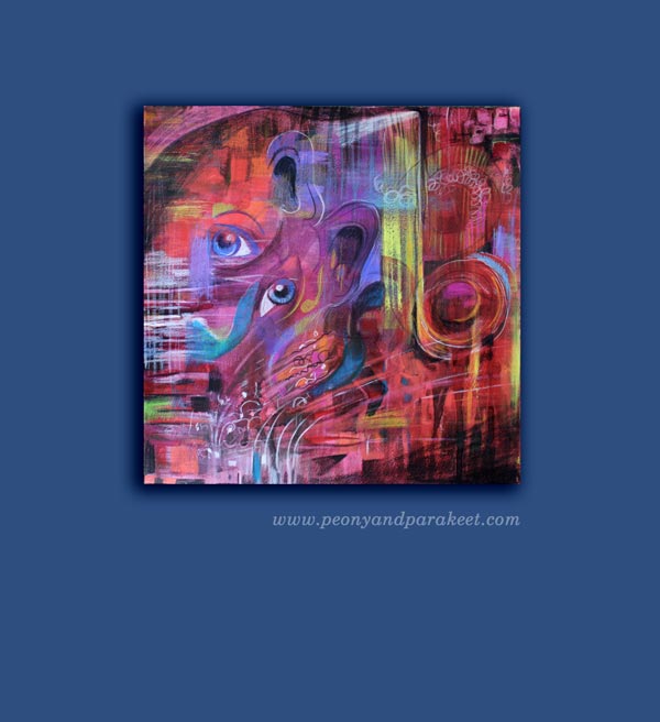
This is a very practical blog post but let’s start it with my recent artwork, called “Tosca.” It is inspired by Giacomo Puccini’s opera. I went to see the opera last week and it was an experience that I wanted to communicate visually. The drama has always appealed to me and the contrast between the most beautiful sounds and the big emotions, often agony, was unforgettable.
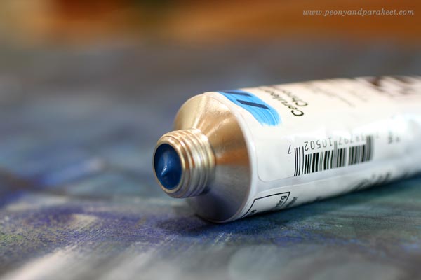
Before the evening at the opera, I had just realized that I need to buy some more acrylic paints. I had run out of almost all the basic colors. I love Golden Heady Body Artist Acrylics, so I went to a local art supply store to get some. I know there are lists of what colors you should buy when buying the basics, but as my selection is a bit different, I thought I might not only share it but also give some general guidelines of what acrylic colors to buy. These can be applied to colored pencils and watercolors as well.
Guidelines that I Follow when Choosing Acrylic Colors
1) Always buy basic white and black. They give contrasts and are great for color mixes.
2) Never underestimate the number of yellows you need. I use yellows for everything. I love the color itself, and use it a lot for color mixes as well. I often make a mistake of adding too much another color with yellow and then I need to add some more yellow to get the right tone. So I need a lot of yellows!
3) Warm and cold tones of each primary color are usually enough. I don’t buy browns and greens unless I find a specific tone that I fall in love with.
4) Always include some personal favorites. When I open the box where I store the tubes, I want to become happy. Cerulean blue reminds me of the time when I painted icons. I think of the sky when I see it and it makes me feel creative and happy. Whatever the current color trends are, cerulean blue always feels great. When I buy colors, I think about creating as an experience and don’t just focus on what is generally recommended.
My Basic Collection of Acrylic Paint Colors
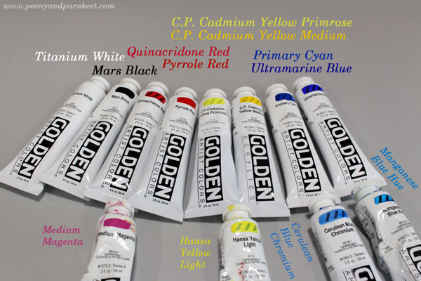
Basic Colors:
1) Titanium White – because it’s basic white
2) Mars Black – because it’s basic black
3) Quinacridone Red – because it is great for mixing pinks and purples
4) Pyrrole Red– because it’s fiery and pure warm red
5) C.P. Cadmium Yellow Primrose – because it’s ideal to get beautiful greens but it is still a strong pigment, not a mix
6) C.P. Cadmium Yellow Medium – because it’s the most beautiful warm yellow I know
7) Primary Cyan – because it’s basic and more affordable than many other blues
8) Ultramarine Blue – because I have used to using it for decades
Extra Colors:
1) Medium Magenta – because I like pinks
2) Hansa Yellow Light – because it is an affordable extra yellow
3) Cerulean Blue Chromium – because it makes me happy
4) Manganese Blue Hue – because I like turquoises
I also have some special effect tubes, for example, gold and silver and some odds and ends. The more I paint, the more I rely on basic pigments and don’t like to spend money buying color mixes in tubes or jars.
A Red Day
Sometimes one color seems to be more appealing than the others. This happened to me last week; it was “red red red” that I thought all morning.
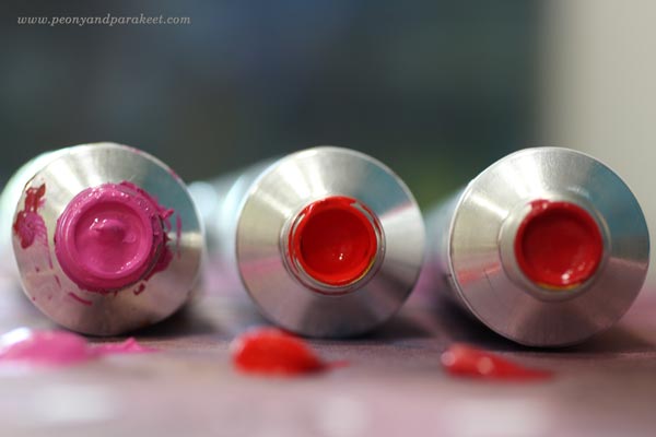
Even if I had the new tubes and all, I started with watercolors and 12-by-12 inch watercolor paper. Playing with water is so liberating!
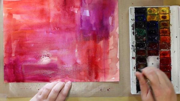
Then I changed watercolors to acrylic paints and turned the music on.
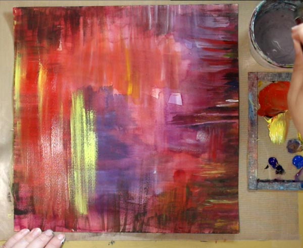
Puccini’s Tosca was playing in the background but as I had not visited the real performance yet. So I put this away to wait for the more detailed insight.
Colored Pencils Make the Details
A couple of days after seeing the opera, I was ready. I continued with colored pencils. They are wonderful art supplies. They are brilliant with watercolors, but they are ok with acrylics too of you create thin and even layers.
Subscribe to my weekly emails! Get a free mini-course Loosen Up!
Draw Your Own Coloring Page
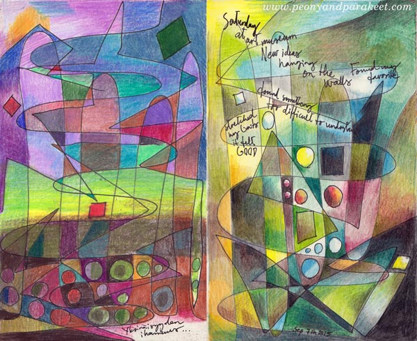
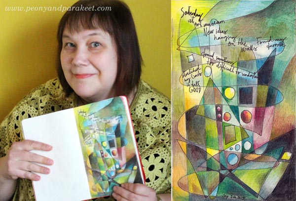
These two art journal pages have been made in the same way: drawing simple lines and shapes and then coloring them with colored pencils. This is a fun exercise especially for those who like abstract art and want to show it in their art journals, and for those who are into coloring but want to create more personal images.
A) Draw a Coloring Page!
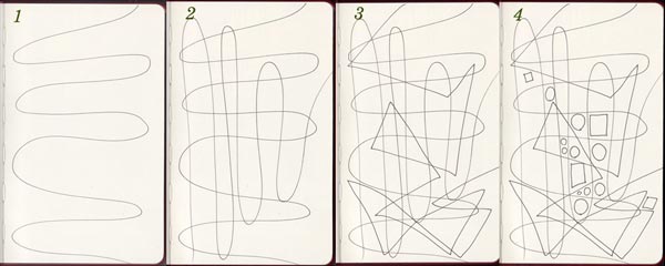
With a thin-tipped drawing pen, create lines and shapes:
1. Draw a wavy line across the page.
2. Draw another wavy line in the opposite direction.
3. Add 1-2 angular lines on the top. The example above has only one long angular line.
4. Add some circles and squares in an area where you want to turn the focus.
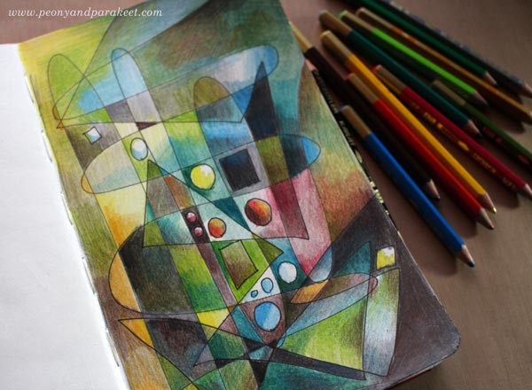
B) Color Freely!
Choose your color scheme and add layers of color.
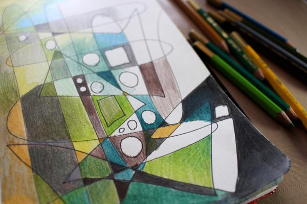
Add even more layers …
C) Add Journaling!
With a drawing pen, add your thoughts on the page. You can erase lighter areas for the journaling.
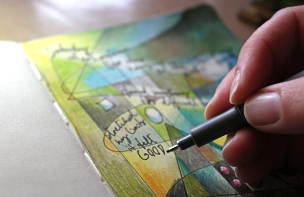
My page is about my latest visit to an art museum. They are such inspiring places!
Get more coloring instructions: Buy Coloring Freely!
Create Pastel Softness!

This time it’s all cute! I had the feeling that this blog is getting too serious. Don’t get me wrong! I want serious, I love serious and hope that you do too! Still, behind all good art, there’s a big portion of imagination. And the best way to embark that imagination is to play a little!
Pastel Colors in Teddy Bears

So I asked my teddy bears if they were willing to help me with this post. And they responded: “Yes, sure!” When I interviewed them, they reminded me that there are two big factors in cuteness: softness and pastel colors. “My friend is a black teddy and he does not get so many hugs as I do”, said Apple Blossom. Pink Princess continued: “It’s not just the color, but it’s the fluffy softness that’s important too!” And then they both agreed that the huge nose and strong eye contact make a teddy even more successful.
Pastel Colors in Old Scrap Pictures
Then I showed them the old scrap pictures that I had found from an antique flea market some years ago.

“Oh yes!”, they giggled. “If you want to create something cute, these sure are good examples! Round shapes make them look reaaaaally soft!”
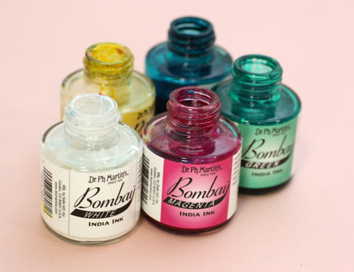
India Ink and Circles
I picked up my India ink bottles (used also in the video blog post last week) and tried to think about what kind of soft and cute to create with them.
Then I remembered the round shapes. That could be the start.
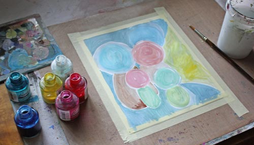
So I painted some round shapes with pastel colors on a thin watercolor paper. While painting, I noticed that to get beautiful pastels you need to use a lot of white. Sometimes adding a lot of white can create hues that lack softness if the base color is cold. You can fix that by adding some yellow or a tiny portion of black. Speaking of soft and white, meet another teddy of mine called Niamh …

I am not a big fan of white but who could not love the color after seeing her!
Clustered Shapes
Back to the painting: Small shapes were added near the large ones to create cute creatures. I made some large shapes form the part of the background. More shapes were painted to made creatures more interesting.
I made the shapes look dimensional and detailed with colored pencils.

Finishing
I finished the painting by adding more details and sharpening them with a white gel pen and a thin tip black marker. As a final touch, I added white acrylic paint on the face of the biggest creature. It lightens up the work and makes a great contrast with the black. Namely, if you look at the scrap pictures and the teddy bears, the black color makes pastels look so soft and bright. Small black dots here and there on a pastel colored circles can be enough to create a page that’s all soft and cute.

So, why not have a go: create a pastel colored art journal page to soften the hard world!
Let me be your mentor in art: Subscribe to my weekly emails!