Out in the Open – Feelings from the First Solo Show
This week I talk about my first solo show called Linnunrata (The Milky Way)
and share thoughts and feelings that being out in the open has evoked in me.
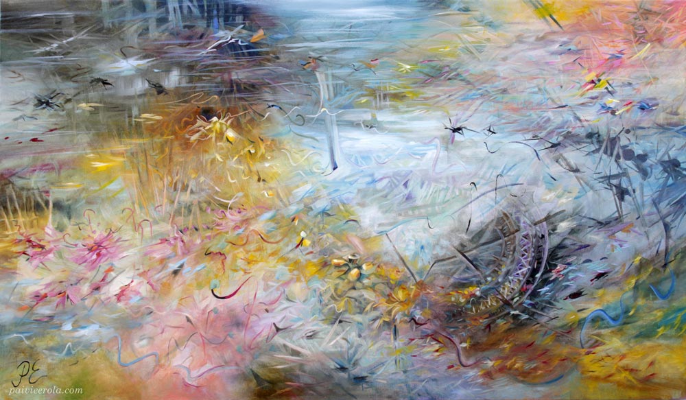
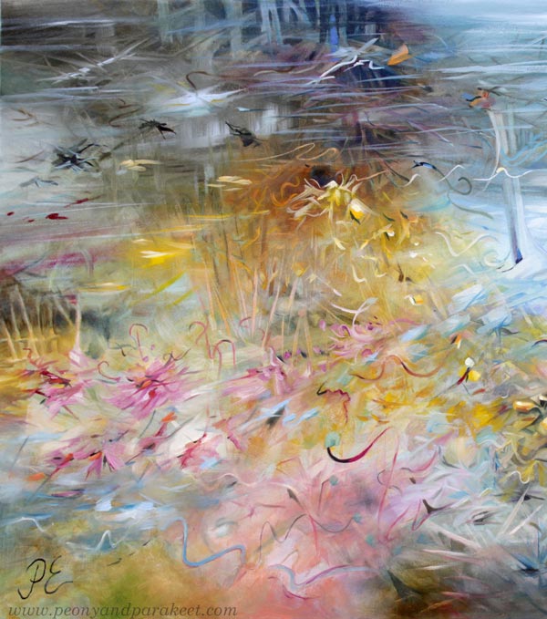
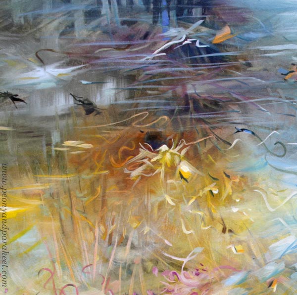
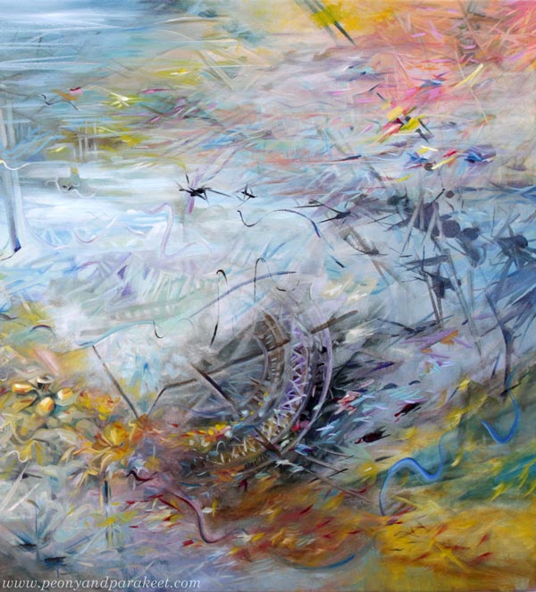
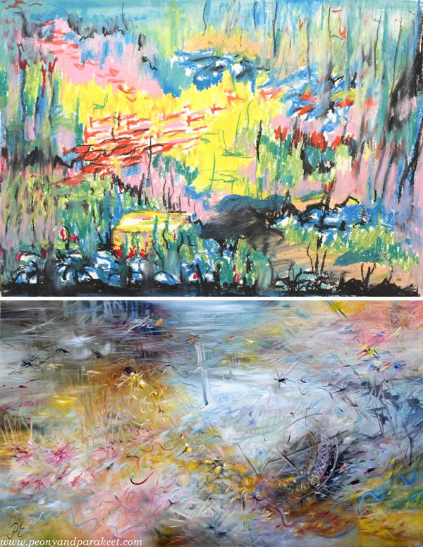
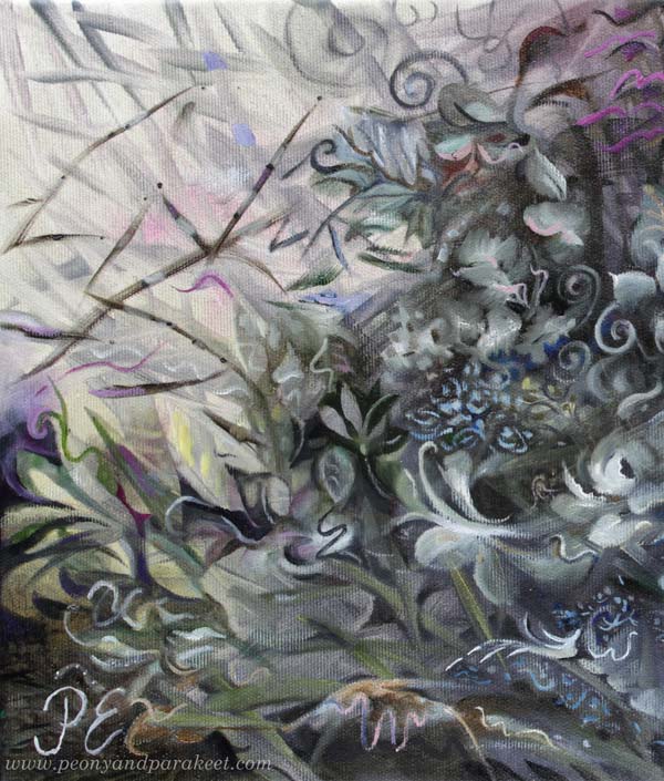
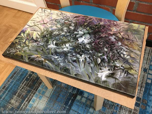
Here’s one of the last paintings that got finished for the solo show.
Click the image to see it bigger!
I started it in April when there were too many water puddles in Finland.
Water World
Water blocked roads and filled fields. It was frustrating and ugly and at the same time, magical and beautiful! I realized that I could watch the mud or look further and see the sky and the trees. Their reflections created a miraculous underwater world.

Just like the planet Uranus, this imaginary world had no solid matter – only gas and water!
Pressure Rises
Because I wanted to present my best work at the show, the pressure for bringing out the best of my skills was high. When I started the painting, its identity and colors were weak and the composition weird. I was worried if I get it finished in time.

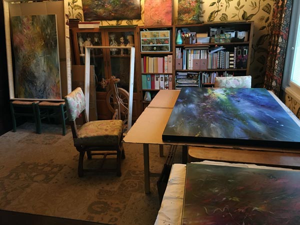
It took many layers before the painting was finished. Because I like to keep the layers thin and fairly separate, lots of time was spent on drying between the sessions. My studio got too small, and there were paintings drying everywhere!
I find it quite nerve-wracking to handle wet paintings!
Unexpected Turn
I usually never change the orientation of the painting in the middle of the process, but this time I did. I felt that I could open the space more by doing that. However, I think this piece works in both ways, what do you think?


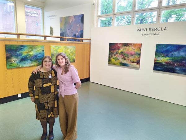
Hanging Plan for the First Solo Show
One of the most challenging things when painting for the show is to keep the overall selection coherent. I had a hanging plan right from the beginning, and I updated the plan after each painting. Here’s how the plan looked before the actual hanging.
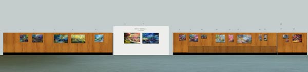
The problem with the last paintings was not only to create unique artworks but ones that would also complement the overall collection. I formed small groups from the paintings to give visual rhythm to the exhibition.
We mostly stuck with the plan.

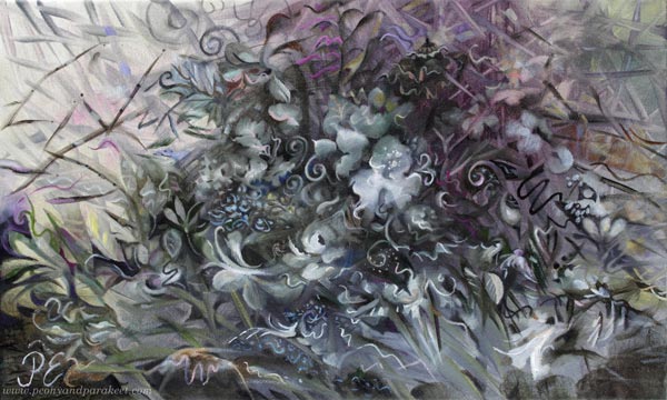
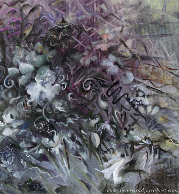
I wanted it to be noticed as a main piece of the right side wall. But Court of Uranus was such a strong piece that I wanted to move it to a more central place.
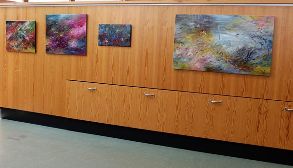
I left some space around it so that it stands out. This painting causes bittersweet feelings in me, being both beautiful and spooky at the same time. It has been interesting to hear how people see it.
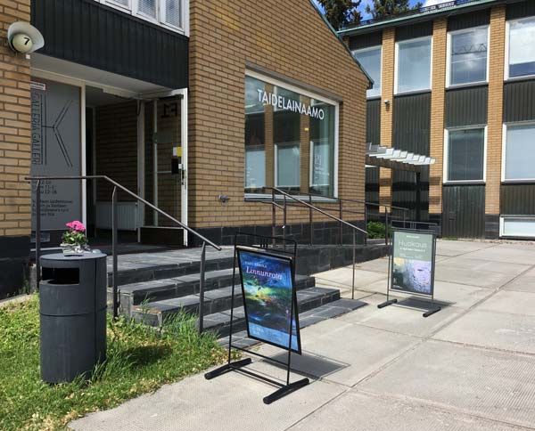
Gallery Space
My show had four walls on the lower level. The building is from 1957 and the walls and the floors are protected. The wooden walls did not bother me, I think my art goes well with them. Here’s a better picture of the gallery space.

The two big paintings on the white back wall At Home in Pluto and Jubilee in Neptune were painted when I was middle of the series. I think it’s best to paint some smaller pieces first before making the largest ones. I used Neptune for the poster of the show.
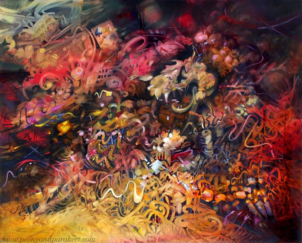
When the main pieces are done, there’s more room for something unexpected. That’s how Court of Uranus was born.
Court of Uranus feels like the painting defines me rather than I would define the painting. It seems to display my future and show what more I could do.
The big yellow flower is perhaps the most beautiful thing I have ever painted, and still, it makes me uncomfortable, like I have gone too far, revealed too much.
I like how light-weighted the flower is. Like she has no worries at all!
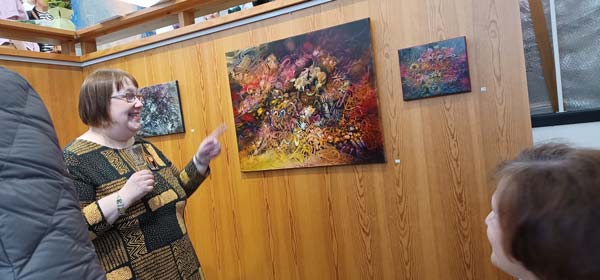
At the Opening of the First Solo Show
Riika Anundi‘s show was also her first, and we had an opening together. I gave a speech, we had nice sparkling wine and delicacies, tens of guests, and a very enjoyable atmosphere.
I had invited both relatives and old friends from the past decades. It was wonderful to relax and enjoy after the hard work that the show required.
Every series has a painting that looks forward. In the picture above, I am talking about Vanitas, the painting that I made last year.
This painting, especially the top left corner, led my thoughts to outer space and thus, it was essential to display it at the Milky Way show. I don’t know where the court of Uranus is leading me, but it definitely sets a new direction.
Even if the colors are dreamy and pastel, there are also technology-inspired details in the painting.
Life After the Solo Show – Open Question
Lastly, I want to show you an old crayon drawing, made as a teenager at school. The subject was the underwater world. Even if I have always hated swimming, never been diving, and never liked water, the drawing came out naturally. Like I had known what I was made to paint already back then.
This post is perhaps more like an open question than an answer that closes everything. Time will tell where my journey goes next! Thank you for walking (or swimming) with me!
Linnunrata – The Milky Way is open from June 3 to June 19, 2022.
Last week! Thursday-Friday 11-17, Saturday-Sunday 12-16
Galleria K, Asematie 7, 01300 Vantaa, Finland
Expressing Moonlight Magic
This week is about the moon and expressing the magic!
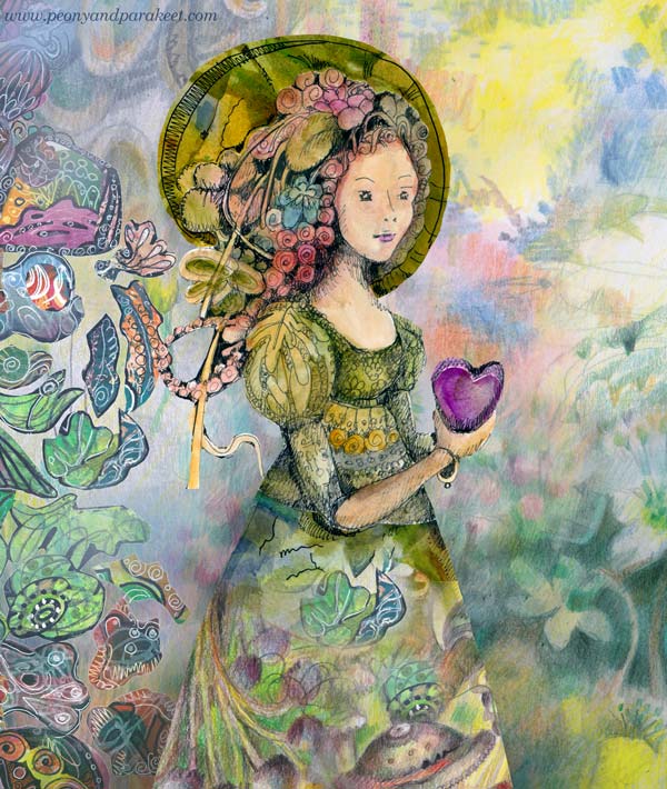
Here’s one of my newest paintings called Kuutamon Taika – Moonlight Magic. This oil painting is a part of my series Linnunrata – Milky Way, where I explore planets and outer space. (See previous work: Mercury here, Neptune here, Pluto here, the Earth here, Venus here, and the Sun here!)
Experiencing Moonlight Magic
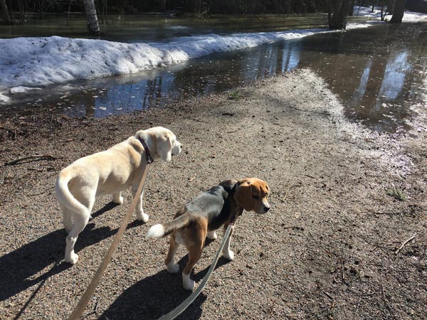
One night in April, after a long workday, my spirit was low, and I felt tired. But after stepping outside to take the dogs out one more time, I saw a beautiful moonlight. I even took a picture but just with my phone camera, and the photo doesn’t do justice to the sight.
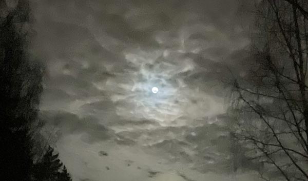
Everything looked black and white at first, but after a while, my eye saw a subtle variety of tones. It was like a message from the moon: “Paint me next! Let me be a part of your galaxy!”
Fantasy Art Connects Imagination and Past
This was not the first time expressing the moonlight magic. A few years ago, I started to feel that my art needed more fantasy. I had begun to follow many fantasy artists, for example, Jasmine Beckett-Griffith and Annie Stegg. Imaginative realism – as the genre is called – felt inviting. In 2018, I participated first time in the Inktober challenge, and in 2019 I made a class called Magical Inkdom.
The world of Magical Inkdom is playful and colorful, but so that some elements look historical, just like in imaginative realism, where the story often happens in the past.
I wanted fantasy art to be present in my upcoming show too. So I wanted to make a painting with a similar historical yet fantasy-oriented look. My goal was to create a traditional floral but still include something that would tickle the imagination and feel magical.
A slightly extraordinary composition and a combination of both decorative and more abstract elements make this painting stand out.
I am also surprisingly fond of the color scheme and it was much more fun to paint than I expected.
Expressing Magic and the Ability to Disappear
A part of the magic is that something almost disappears and then appears again, just like the moon in a cloudy sky. There are lots of blurry elements in this painting, even if you might not notice them right away. A sharp line and some dots on a blurry spot make the flower.
Old master painters of the 16th to 18th centuries used this technique a lot.
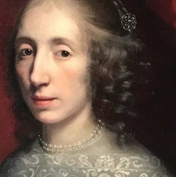
For example, look at the hair and the pearls in this portrait. Just blurry spots that have been sharpened with lighter and sharper strokes and dots. Don’t they look magical!
Preparing for the Show
This painting is small, 30 x 50 cm. Here’s a quick snapshot where you can see the size better.
I am currently varnishing paintings for my upcoming solo show in June. All the tabletops are full and the not-so-pleasant odor is in the air. I hope to have photos of the show next week.
P.S. Magical Inkdom is for sale until June 16th! >> Buy here!
Art Inspiration from Period Dramas
This week, I am sharing art inspiration impacted by period dramas.
Visual Deliciousness of Period Dramas
I am a fan of period dramas. Recently, I have been watching Gilded Age and Bridgerton. Both of them have beautiful outdoor and indoor scenes, and dresses too, of course! My eyes like the delicious visual world they illustrate and my heart always feels a bit lighter after an episode or two.
Even if the dramas have historical settings, their colors are not dull at all. A picnic in the forest looks vibrant and is full of sunlight.
I like how flowery everything is, and how the jewelry frames the faces of young ladies.
Being so inspired by period dramas, it’s no wonder that my art is full of romantic and old-fashioned elements. They speak fantasy to me.
Fantastic Old-World Impact
I think that every artist needs to find their approach to fantasy and fairytales – how to use imagination and what to express with it?

I am fascinated by the power of the inner world and all my pieces are inner sceneries in one way or another.
Pablo Picasso has said: “Art is a lie that tells the truth.” Similarly, I would say that art is a fantasy that gives us what we need.
Bringing Fantasy to Life
I often talk about seeing art as a story or a collection rather than a single piece. In the new class, Fun Botanicum, we create a set of illustrations that are all unique but still a part of the series. This is a great project for setting a style and bringing different coloring techniques together.
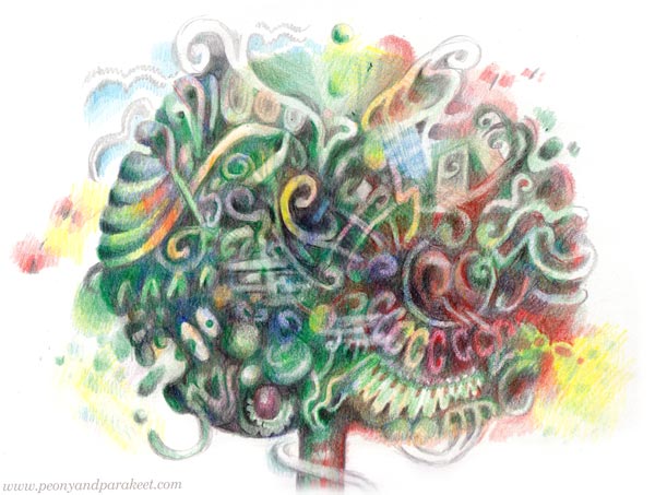
Plants are a fun theme to explore what you can do with colored pencils and imagination!
>> Sign up here!
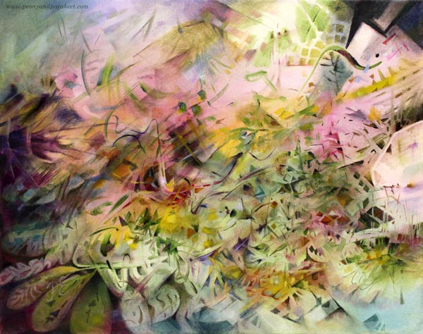
Pink Inspiration
This week is full of pink art inspiration. I hope that this post will get you to find your pinks and start creating sweetness!
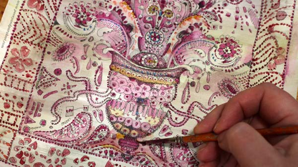
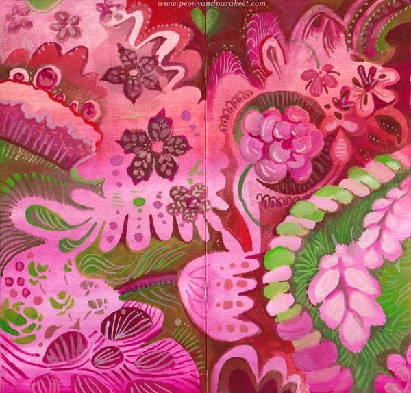
Dreamy Pinks in Colored Pencils
First, one of the journal spreads that we will create at Fun Botanicum, the newest class.
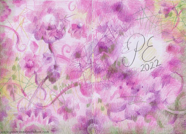
The softness that you can create with colored pencils is divine and you can highlight that with sharp strokes. The versatility of colored pencils always amazes me. With one pencil you can create the whole value range from light to dark so a few pencils go a long way. I like those shelves of individual pencils in art supply stores because it’s like picking candies!
Pink Handdrawn Playing Cards
These cards are from the class Magical Inkdom. They are drawn with a black pen and then colored with watercolors.
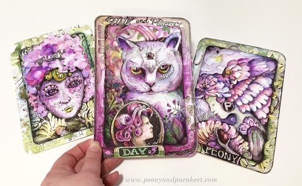
My husband asked when he saw me drawing these:
– “Playing cards? What’s the game?”
– Well, these are like collector’s items! And you can invent the game yourself!
Because if you make more than one, isn’t that like a little oracle deck? You can ask yourself how you feel by picking a card that reflects your mood.
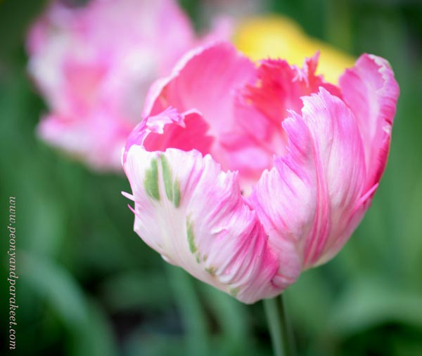
Lots of Pink Petals
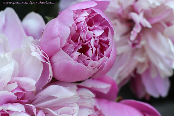
I am already waiting for summer and see my pink peonies bloom in June. If I was a small fairy, I could live in those petals!
Petals, petals, more pink petals – that’s how the flowers are constructed! These are from the class Decodashery.
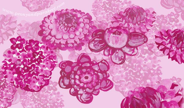
Pick a small brush, some pink gouache paints or watercolors, and paint small spots in layers!
Red and Green are Pink’s Best Pals
Here’s more pink gouache art – a small journal cover that also has reds and greens.
I love this color combination. Each color makes the other shine brighter. I can almost taste the colors when I look at them.
Pink Glow in the Dark
Pink is also a wonderful color with darks. You can paint a pink glow that makes the image look romantic.
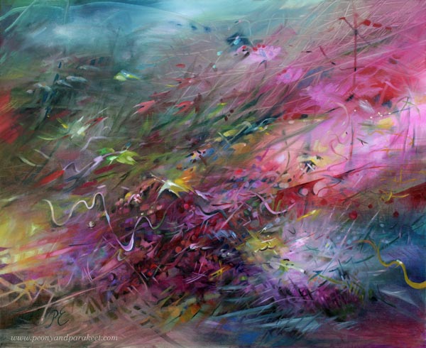
Here’s a blog post where you can see process pictures of this painting.
Powder Pink Inspiration
One night my husband showed me new Swatch watches. I wasn’t so interested at first, but when I saw the photos and got the concept, I got so inspired that I am using that inspiration for the new series of oil paintings!
Here’s the new pink Swatch called Mission to Venus. I am definitely going to somehow incorporate all this into a painting! Not literally, but conceptually.
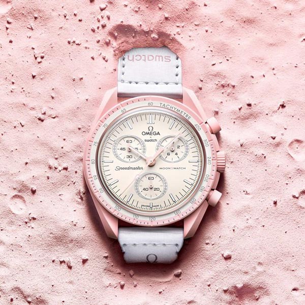
The powder pink with decorative details speaks of a beautiful adventure to me.
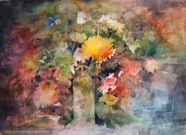
This watercolor painting has powder pinks too.
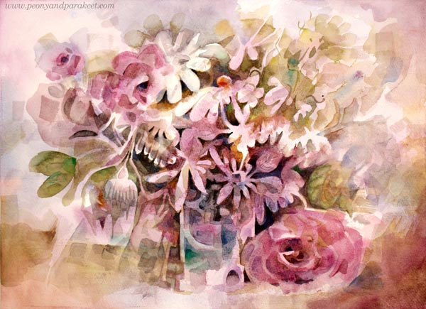
I painted this one a few years ago when my mission was to find the best way to paint flowers freely in watercolors without using a reference. I have a class about it too Floral Fantasies – Watercolor Edition!
Pinks and Other Pastels
What about selecting some acrylic paints and going wild on an art journal?
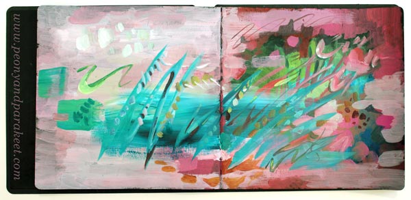
Add darks on the bottom and let dry. Then mix white to the colors and have fun with pastels. Use different brushes to have some variety in strokes as well.
You can be rough like above, or go in a more delicate direction with thinner brushes.
Black with pink is also a great color combination!
Pink Inspiration – How to Go Deeper
If you are a color-oriented artist as I am, pink is never just one pink. Challenge yourself to make all kinds of pinks from light to dark, from warm to cool, and use them all in one painting. Nature doesn’t select just one pink, so why would you?
The same goes for shapes, lines, and ideas. The more you embrace the variety, the more exciting the art-making becomes, and the more you create. Restrict supplies and increase imagination!
I hope you have an adventurous Pink Inspiration Day!
P.S. You can still sign up for Fun Botanicum and make wonderful colorings of plants!