Why Draw in the Ready-Made World?
Have you recently asked yourself: Why draw? Here’s why we need to keep drawing no matter what!

Writing This Blog Post Was Difficult
I enjoy writing about art, but this time the task seemed difficult. First, I thought I would write about how you get ideas for colored pencils when you paint a bottom layer with watercolors.
But it felt like something I’ve written about many times before. For example, see the posts Wild Botanical Art – Create with Colored Pencils and Watercolors and How to Combine Watercolors and Colored Pencils.

Then I thought about writing about the quality of watercolors and colored pencils, but that didn’t seem like a very inspiring topic.

At last, I started writing about how to make a visual voice stronger, but the text became too theoretical. And I have nice posts about the topic already. See, for example: How Inktober Strengthened My Visual Voice and Enrich Your Art – Play with Shapes!
In the end, I decided to write what I have really been thinking about recently: “Why draw in the ready-made world?”
Feeling Blue

Lately, I’ve had the feeling that I’m in an ancient profession and that I am ancient in all other ways too. It’s odd for me because I love technology and I’m always learning new things. But I’ve seen too many images produced by artificial intelligence and depressingly enough hype about how you don’t have to create anything yourself anymore.
In addition, all kinds of insecurity have increased in the world, and that’s also toxic to creativity.
Despite feeling blue, I don’t want to give in. I still want to believe in the basic human need to create something new. It has helped that the upcoming course that I have been finishing, feels like a safe and cozy place. I hope it will have the same comforting effect on you.
Why Draw and Believe in Visual Self-Expression
There has been a lot of talk about freedom of speech lately, but human expression is not just words. I deeply believe that drawing allows people to express themselves more directly than writing.

And at its best, a drawing offers an imaginary view to which not only the creator but also viewers can attach their memories and meanings.

If we don’t approach life with our imagination, we lose our inner harmony. When we put pen to paper, we open up a connection to our inner world.
Not everything that comes out is necessarily masterful, but it is authentic to ourselves, and through that, there is an opportunity to also find a connection with others.

That is why I have been making art almost every week for over 10 years. Even if art were to one day no longer be my profession, I would still maintain this connection in my life, which only requires pen and paper.
This is the reason why I want to be an advocate for drawing and imagination.
Hearts and Stories – Sign Up Now!
Let’s turn your art journal into a storybook and make the most out of simple shapes!
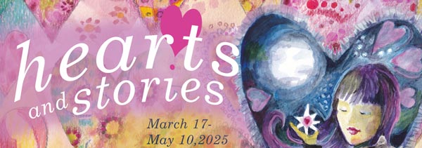
Hearts and Stories will begin on March 17, 2025. >> Sign Up Now!
Flower Painting Comes to Life – Watch the Video!
This week you get to paint with me in my little studio. We follow the birth of this flower painting from blank canvas to an exhibition.
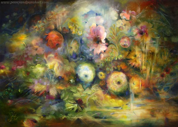
In the video, you see me painting and chatting, and also get to visit my current exhibition at the gallery Gumbostrand Konst & Form. The exhibition is from Feb 12 to March 9, 2025 in Sipoo, Finland.
From Blank Canvas to Exhibition Piece – Watch the Video!
While I paint the flower painting, I talk about making art, becoming an artist, and what it’s like to paint freely and not use any reference photos. This is a longer video than usually because I have collected the material for it many months.
In the video, I talk not only about painting but drawing too. I love to play by drawing, and that play affects my paintings. Never underestimate the effect of play, and always keep playing and drawing, no matter how high you want to reach!
Hearts and Stories – Sign Up Now!
Let’s draw for your inner child and make the most out of simple shapes!
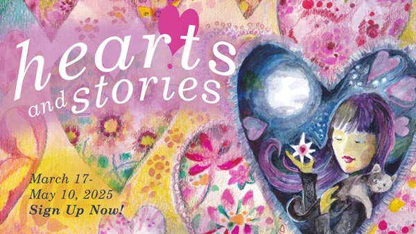
Hearts and Stories will begin on March 17, 2025. >> Sign Up Now!
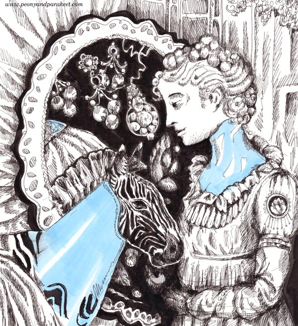
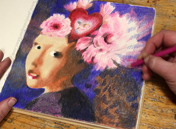
Vermeer Girl With Heart – Draw With Me!
Draw a Vermeer girl by following my formula!

This drawing is a modern version of the painting “Girl with a Pearl Earring” by Johannes Vermeer. Here, the earring is not the center of the attention, but a heart and flowers steal the show. I have made a simple formula to draw and color the girl’s face, and then you can put your own twist on the head and add whatever decorations you want there.
Supplies
You can use colored pencils, watercolor pencils, watercolors, acrylic paints, oil paints – or any medium that has a possibility to create color mixes. My example uses colored pencils. For the face, you need three browns: one dark, one middle, and one very light brown. You also need a little bit red for the lips and black for some small details. White is optional. When working on white or almost white background, you can just leave the white areas uncolored as I do in my example. I do use a little bit white to blend the red of the lips into paper white.

I created my Vermeer girl directly on an art journal page. My art journal is Dylusions Creative Journal Square. Pick a journal or a paper that works well with your supplies.
Vermeer Girl – Shape by Shape Formula
To succeed you have to trust this formula. Don’t look at the original painting, follow the picture below only. Copy the shapes as accurately as you can, and don’t think about drawing a face. The girl will appear when you have all the puzzle pieces in place!
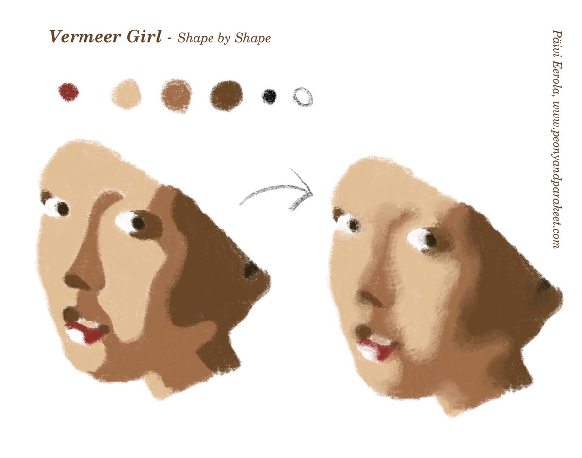
Start from the first picture and color the shapes so that they have sharp outline edges. Then blend the skin colors so that the transition from one shape to another is softer.
Starting the Drawing
If you want to put all kinds of fun stuff on the girl’s head, place the face on the left bottom corner. I marked the spot where I started the drawing with a green arrow on the photo below.
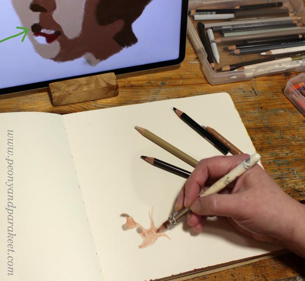
At first, the face doesn’t look like one at all. But this kind of abstraction will bring out the realistic look. Reality is always more abstract than we think.
Drawing Sharp Shapes
Human faces are very organic, so the shapes are too. Examine the curves of the formula in detail, and avoid straight lines. The more beginner you are, the more you are tempted to draw too straight, avoid that!
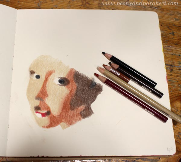
Once all the pieces are in place, the face makes sense. Take the image in front of the mirror to see if there are any distortions. If the mirror image looks wrong in some way, get back to the formula and check your shapes!

When you are satisfied with the sharp shapes, go to the second step of the formula: blending.
Vermeer Girl – Achieving the Old World Look
Old paintings have softness that our photo-oriented era doesn’t often express. We prefer sharpness over blurry. However, life is often blurry and your Vermeer Girl will look much more alive if you soften the edges of shapes, especially on the skin.

Color on the top of the shape with the neighbor color so that the shapes integrate and look less separate. Now you can also adjust the shapes a bit more freely. I lengthened the big dark brown shadow because my face became a bit longer than in the formula.
Small changes in faces can change the personality quite a lot. I think that’s fascinating! You can start from the Vermeer girl, but then end up with a character of your own.
Drawing Decorations
First, think about the size of the decorations: do you want plenty of small ones or only a few large ones. Beginners easily draw something between, but I think this portrait will look better if the decorations are either a bunch of small ones or a few large ones. I chose the latter and placed a couple of big flowers and a heart on her head.
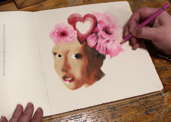
I colored the decorations freely and used no references for these. I like the contrast between the face’s carefully constructed softness and the free coloring of the flowers.
I move on to color the background just before I am finished with decorations. This way I can still change them a bit if needed. The background often gives life to the whole image and brings in more ideas for the drawing.
Starting the Background
Not only the girl’s face is composed of shapes, the background can be like that too. The only difference is that now you can freely improvise the shapes. Start with one color and sketch by coloring!
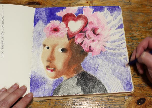
Think about the streams of air and imagine how the girl moves when she is posing in front of you.
Building the Color Scheme
To make the portrait look unified, you need to repeat the colors. My background started as blue, but in the picture below, it has started to get more brown tones. The pinks of the flowers also blend into blue. Color several layers and use a lot of blending near the edges.
I added the surrounding colors to the center of the heart like it would be a mirror. This also helps in harmonizing the atmosphere.
You can also play with patterns: color small shapes inside a bigger one! When located in the background, the patterns can be subtle and muted, so that they don’t steal the whole show.
Finishing the Vermeer Girl
When you are close to finishing, look at the original Vermeer painting and see how she partly disappears in the background. Especially the dark brown in the neck area can be blended with the background.

Dark background looks great with the lit face. Vermeer girl with a heart makes a wonderful Valentine’s day page in any art journal!

I hope this project made you grab your pencils and other art supplies!
Hearts and Stories – Sign up Now!
Come to play with hearts and other simple shapes! We use colored pencils, felt-tipped pens, and watercolors. Sign up for Hearts and Stories!
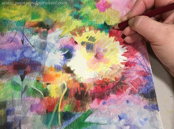
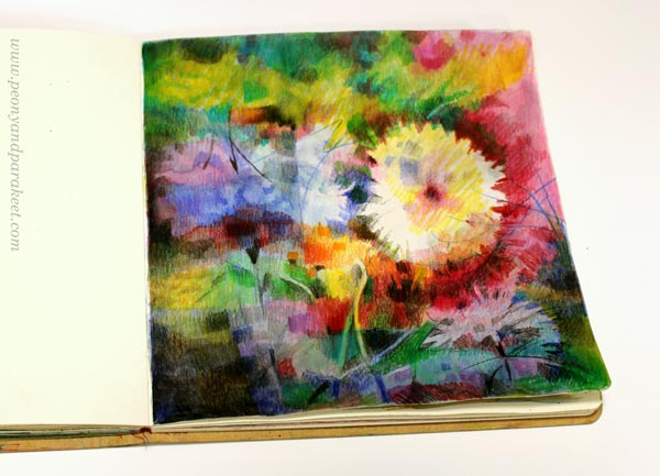
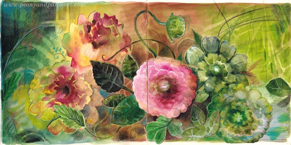
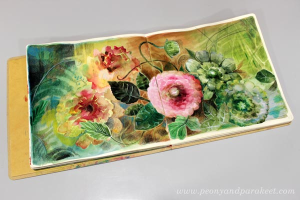
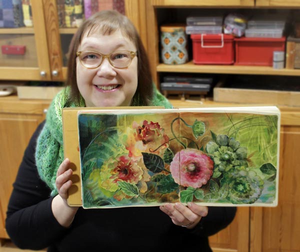
Expressive Watercolor Flower Collage
This is a sequel to the previous post “Flower for Your Art Journal” where we painted a watercolor flower step-by-step and used it as a collage piece for an art journal spread. This post has more ideas. Now we will paint more flowers and leaves. I also share some tips for artistic expression so that your collage will be more than just a stiff collection of flowers.
I have created this spread in Dylusions Creative Journal Square. The paper that I have used for collage flowers is Fabriano Accademia Drawing Paper (200 gsm/94 lbs). My watercolor set is a mix of artist quality pans from different brands. I have finished the spread with colored pencils. You can see these in action in the video of the previous blog post. The previous post also has the basic step-by-step instructions for painting a layered-looking watercolor flower. Let’s now look how you can do more and expand the basic idea!
Get More Variation – Grow Flowers More Naturally!
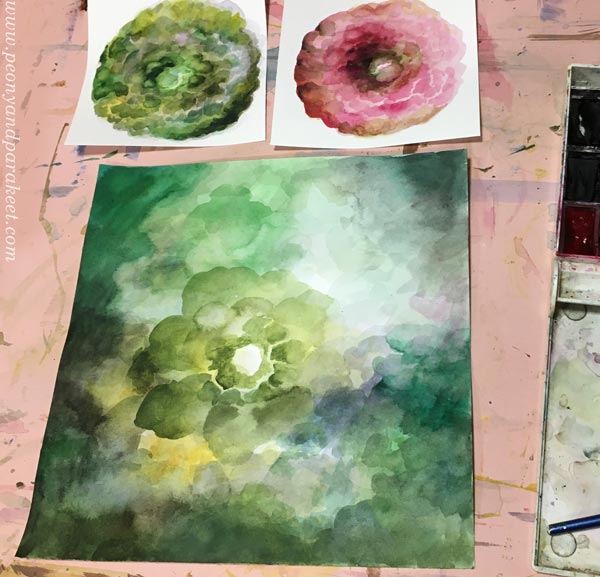
Instead of painting a separate flower by outlining it right in the beginning, grow a flower from the background!
Paint from the edges to the center.
Add more layers.
While you wait for each layer to dry, you can paint more basic flowers as instructed in the previous blog post.

When you can almost see a flower forming in the center, you can start painting petals on it.
Maybe you can also find smaller flowers near the big one, as I did.
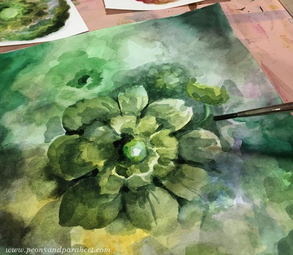
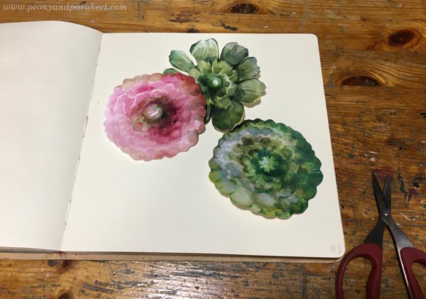
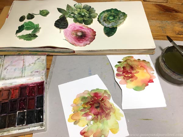
Cut out the big flower but keep the background too. We will use it for leaves.
Add finishing touches to cut flowers with colored pencils.
Get More Variation – Paint Leaves!
Use the background for leaves.
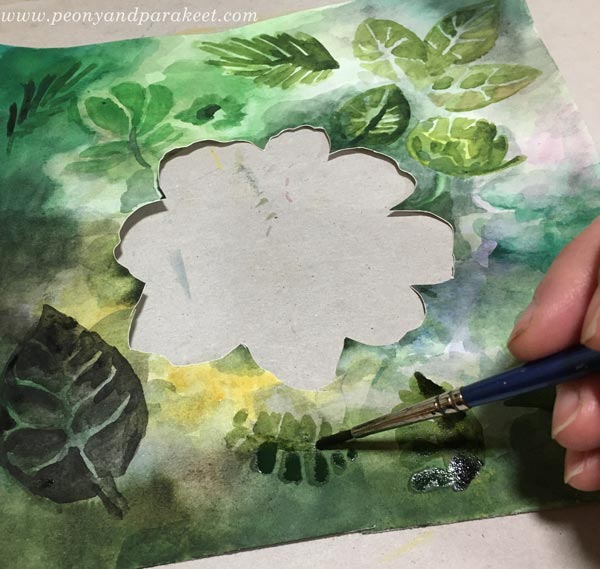
Leave some background visible between the brush strokes to get veins. The thinner the veins, the more elegant the leaf looks!
Let’s Pause and Talk About Colors
Ï only made one pink flower for my collage. Other flowers have different colors. If you look at the finished piece, the pink flower really pops up because it’s so different. The green flowers may look unnatural when you have them as collage pieces but in the final piece they look like cousins of the green leaves and the result is natural.
When you want to build expression, some flowers have to be less important than others. That’s why you can use any color for both flowers and leaves. For example, you can have blue flowers and blue leaves. These are secondary elements to the focal point.
Get More Loose – Let Watercolors Make Some Flowers!
Put most of your energy to make the main flower, as beautiful as you can. You can then paint other flowers very loosely. Namely, some flowers can be more in the background and because flowers are very 3-dimensional things, their outline is often asymmetric. Think about a peony, for example! It has many layers of petals and they point in different directions.
With a fairly broad brush and quite a lot of water, paint multicolored spots and call them flowers.
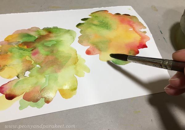
You can add some brush strokes on the spots to make the flowers a bit sharper. However, these loose flowers are much less detailed, see my selection below.
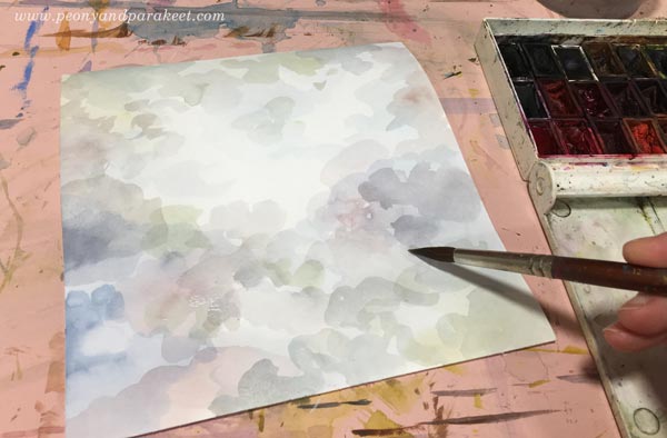
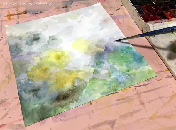
Before attaching the flowers and leaves, add color to the background.
Get More Expressive – Paint a Multicolored Backround!
Backgrounds with only one color are boring, and not only for the viewer but for the maker as well. Different colors form different areas and when attaching the flowers you have much more fun deciding where to put which flower.

I let my background guide me: yellow flowers in the yellow area, green flowers and leaves where the similar tones are, and the pink flower in the center that has the warmest tones. This creates the effect of lighting – the flowers and the background are exposed to the light of similar tone and that makes them look less separate.
Watercolor Flower Collage and Colored Pencils
With colored pencils, you can easily add curvy stems and other delicate lines and darken the surroundings of the focal point so that it catches the eye right away.

Notice that you can also push some flowers further back by coloring over them with background colors.

My blurry and loose flowers get green tones. And I also add yellow to the background to push it visually closer to the flower.

Drawing curvy stems makes the collage flowers look less stiff.

You can also add more subtle details to the background by coloring over it with very similar colors that it already has.
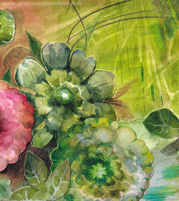
Some green details are a little lighter, some little darker, and that’s makes them visible but not too much – the pink center flower has no competitors.
Next-Level Watercolor Flower Collage with Tension
I know that using dark colors is hard for many. These times need light and you want to make bright art, I get it. But light needs darkness to shine. I always finish my work so that it has the tension between the so-called good and the so-called bad. It has sharp and bright details, traditional beauty, safe and tame areas. But also dark colors, unclear, sometimes even scary-looking wilder parts. This tension makes the collage natural because life is like that.
I hope this post inspired you to create more watercolor flower collages!