Enjoyable Floral Watercolor – Paint with Me!
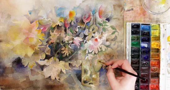
To celebrate the upcoming class Floral Fantasies in Three Styles, I have made a new free video. It is a tutorial for painting a layered floral watercolor painting. I love to paint this way – freely without reference photos and hope that you will enjoy this method too. It’s based on a negative painting technique where you paint more the areas around the flowers than the actual flowers.
Enjoyable Floral Watercolor – Watch the Video!
You only need a couple of brushes, watercolors, and watercolor paper. A spraying bottle is helpful also. Watch the video tutorial below!
More Floral Watercolor Projects
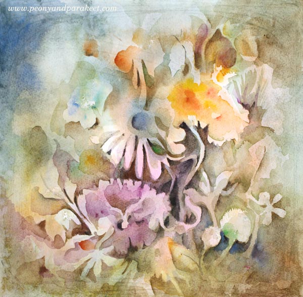
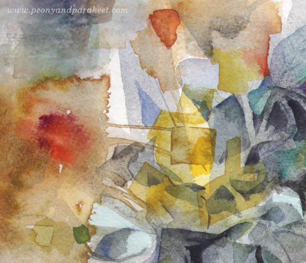
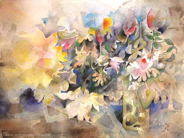
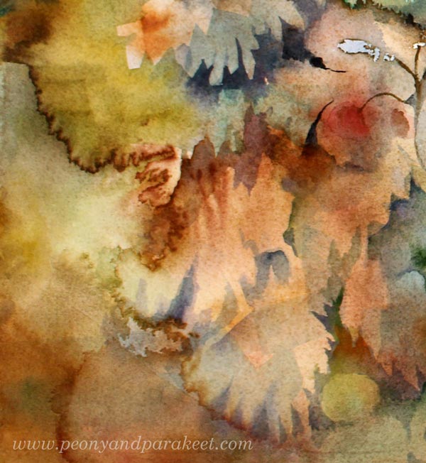
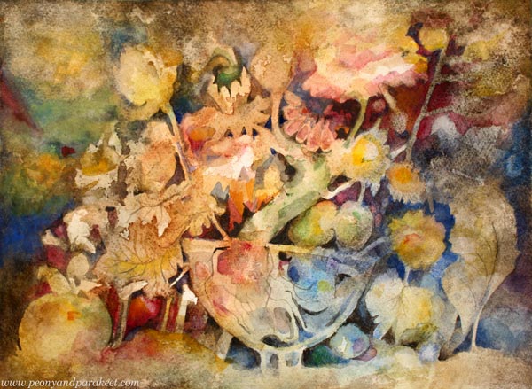
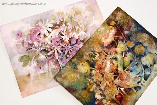
Here are some of the pieces from my floral watercolor series which I haven’t published in my blog before and which were showcased in the video. I link the title to my art shop where they are available with more descriptions. The first one is “Aamu – Morning”.
My favorite detail:
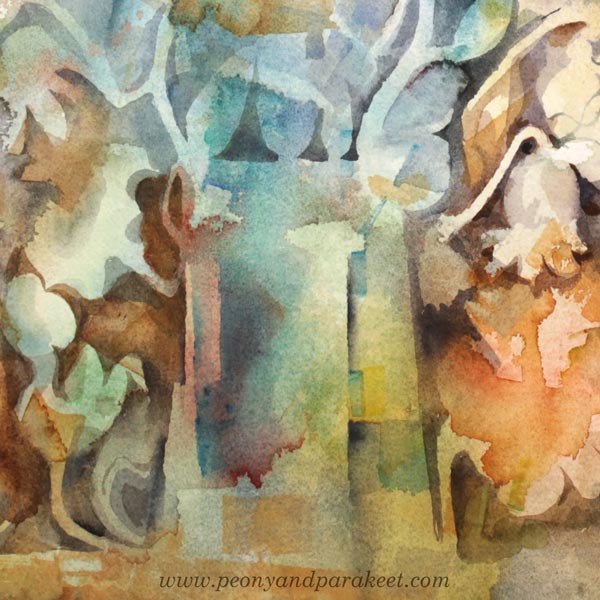
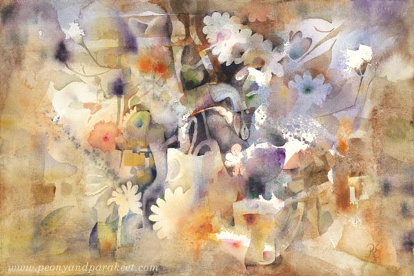
This one is called “Tahtoisin jäädä” – Would Like to Stay“.
My favorite detail:
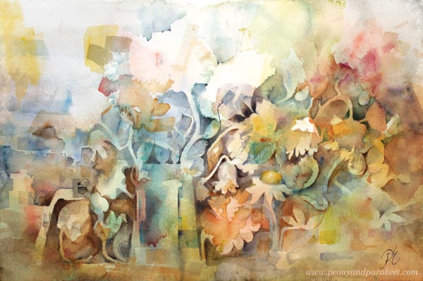
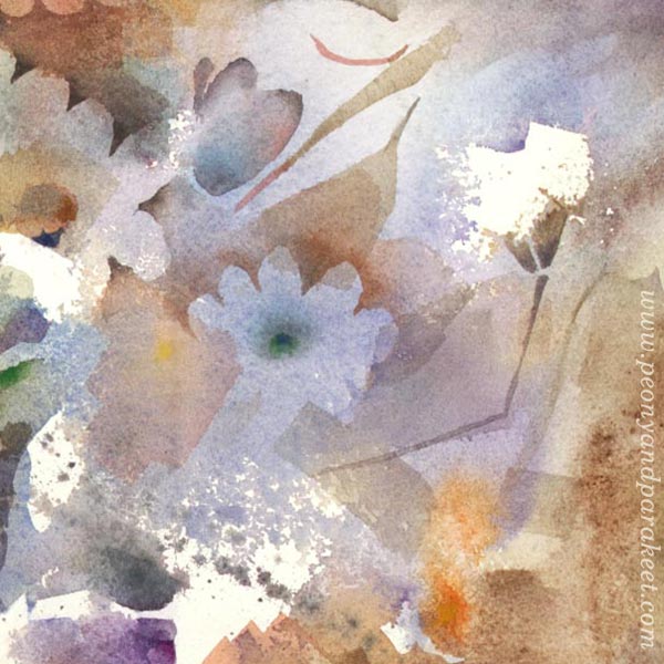
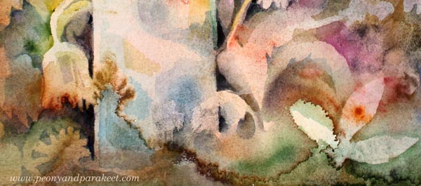
This painting is one of my favorite florals that I have painted so far. I saw the color scheme in an old painting and wanted to use it. This one is called “Saan elämältä paljon – Life Gives Me Plenty“
My favorite detail:
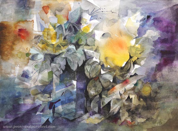
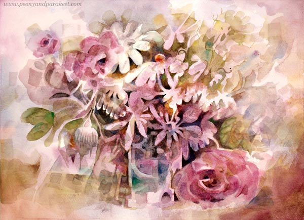
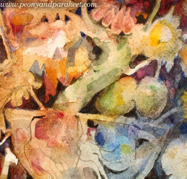
A lovely birthday bouquet that I received this year was an inspiration to “Syntymäpäivä – Birthday” I will show how this was made more in detail in Week 2 of Floral Fantasies.
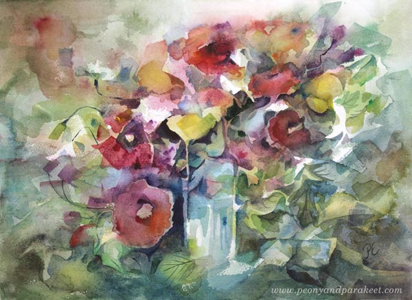
My favorite detail:

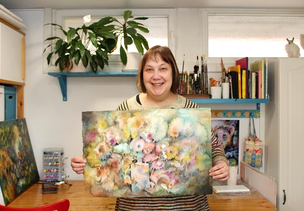
All the bigger paintings shown in the video are available in my art store too. See all the paintings here!
Floral Fantasies in Three Styles – Sign Up Now!
My comprehensive flower painting class Floral Fantasies in 3 Styles will begin on Monday, April 29! Don’t miss this!
Come to draw and paint flowers with me – Sign up for Floral Fantasies in 3 Styles!
Abracadabra – Magical Watercolor Effects

My latest painting called “Abracadabra” is a big one, 56 x 38 cm or 28 x 15 inches. It was a lot of fun to create so I want to dedicate this post to the magical effects that water creates when painting with watercolors.
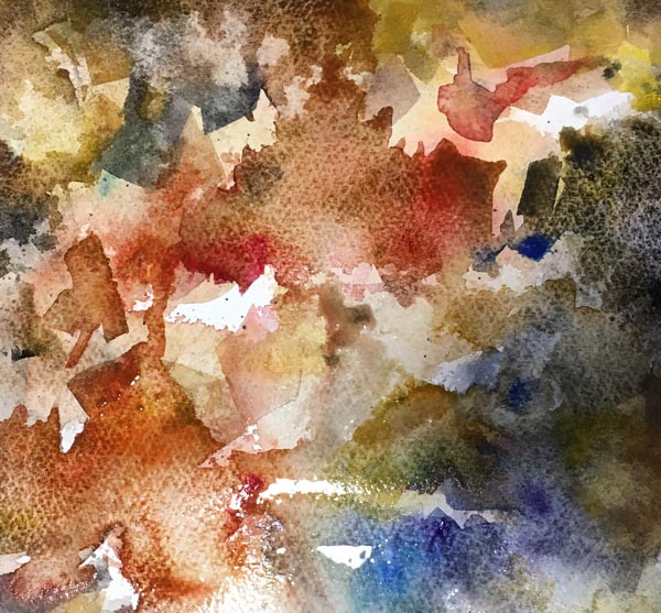
Magical Mess
Right from the beginning, this painting had a mind of its own. And as you can see from the photo, I also used a lot of water to make the process even more uncontrollable. The more I paint this way, the more boring all the other mediums feel. Watercolors are magical companions, introvert when in pans but extrovert on paper!
Tip: Start with a plenty of water!
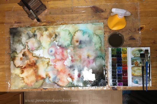
In this project, I was testing Arches Cold Press watercolor paper, new to me. It has a weird smell when it’s wet but other than that I quite like it!
Fun Appearances
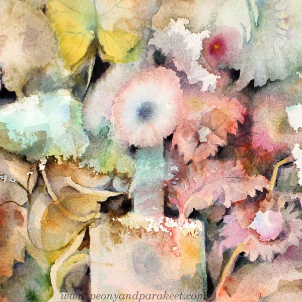
When I add some sharpness and control, I try to do that gently so that I don’t put too much burden on flowers that have born naturally. The idea is to bring out the best details.
Tip: Add dark shapes to bring out the magical watercolor effects!
Fascinating Translucency
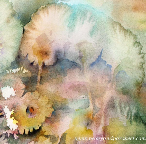
When painting with a lot of water, watercolor becomes magically transparent. I love how the colors get mixed when they are layered.
Tip: Let each layer dry properly!
Watercolors Can Draw!
I also like to think that watercolors can draw. When applying water, watercolor blooms with sharp frilly edges. These lines can be more than just lovely outlines. In the detail below, I used one to make a stem!
Tip: Use your imagination to make the most of what you have on paper!
Flow and Melody in the Safe Haven
I have had mixed emotions this spring. I have lost some old birds and my oldest dog has been sick. It’s been something that I have found difficult to share, it’s still so recent. But in the middle of all the worries, my studio has become a safe haven where I have been painting in the late evenings. The colors of the 16th-18th centuries and the pop songs of the 1980s have inspired me. Do you still remember Abracadabra by Steve Miller Band? A very superficial hit song but it has such a flow in the melody that it goes well with magical watercolor!
Come to draw and paint flowers with me – Sign up for Floral Fantasies in 3 Styles!
Painting Watercolor Still Lives
I usually have a lot to say but this time I can barely type any words. I am madly in love with painting watercolor still lives. They keep coming! It feels that any topic can be put in the form of
I think that art is this kind of a bonsai: even if it would be nourished very little, it keeps staying alive, producing flowers and fruit. It’s both ancient and fresh at the same time.
First a Mess, Then a Still Life!
I love how watercolors have a mind of their own. Especially, when painting without reference photos, the first brush strokes feel exciting and the possibilites seem endless.
The bonsai painting was just a mess after the first layers. I had a lot of fun making the mess!
But I even had more fun bringing out the bonsai.
I use an abstract approach, and it’s so exciting that it keeps me painting. What was first just a clumsy geometric shape is soon a delicate flower! I teach this technique in the upcoming class Floral Fantasies.

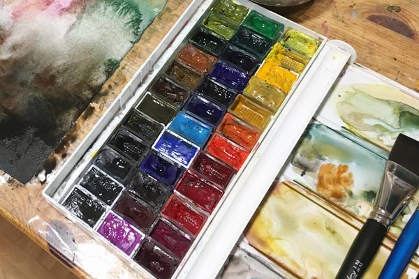
My Watercolor Set – A Mix of Brands
I like to use pans more than tubes because it’s much quicker to start painting right away, not wasting time for opening and cleaning the caps. But I also buy tubes because when a pan gets empty, I can use a tube to refill it.

My watercolor set of 36 pans is originally White Nights by St. Petersburg, but within
New Pans – Roman Szmall Aquarius
One of my latest purchases are pans manufactured by Roman
Drawing a Watercolor Chart
Always when I change the pans, I also draw a new chart in a notebook. This is how the chart looks currently (VG = Van Gogh, RS = Roman Szmal, DS = Daniel Smith, “Oma
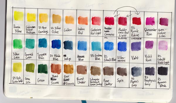
I love to curate my palette. When one color runs out, I consider carefully whether I buy more or change it! I also like to examine what the best order is for the pans, and as you see from the chart above, I often change the order a bit! This is my way to bond with the supplies, and every time I begin a new painting, I feel that they are my team, working with me!
Painting Watercolor Still Lives Together
Come to draw and paint flowers with me – Sign up for Floral Fantasies in 3 Styles!
Early-Bird Sale – Floral Fantasies
“Paivi likes flowers,” I have heard many say, and yes, I do! A couple of years ago I built a comprehensive floral art class calledFloral Fantasies in 3 Styles. I am running this class again between April 29 – May 24th. I am also building a new module for it that is about painting still lives in watercolor – loosely without reference photos and that’s a lot of fun!
If you sign up before March 31st midnight PDT, you will get the class for the early-bird price. Watch the video below and sign up!