Creative Take on Damask Motifs
This week, we look at damask motifs from a new perspective. I challenge you to make this traditional motif your own and use it in your art!
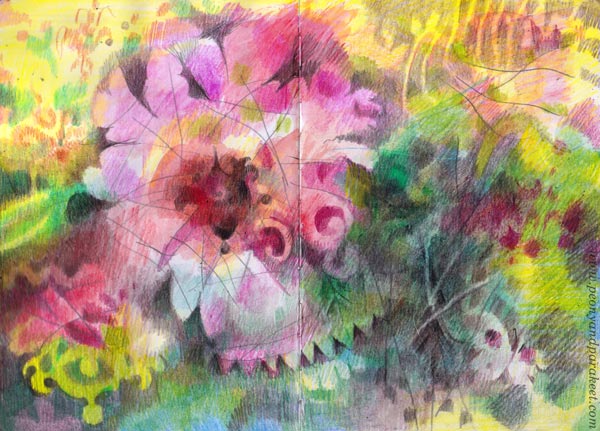
It all started from a dream I saw a few days ago. “You should wear more decorative clothes, Paivi,” I was telling myself. “Like the old historical dress that you had at a ball as a teenager.”
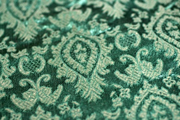
I still have the dress. It has damask motifs – woven ornamental patterns that seem to never go out of date (more about their history). The idea of perfecting not only the actual swirls but also the shapes between is a good drawing practice that doesn’t have to be boring at all!
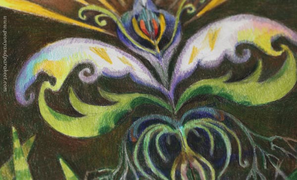
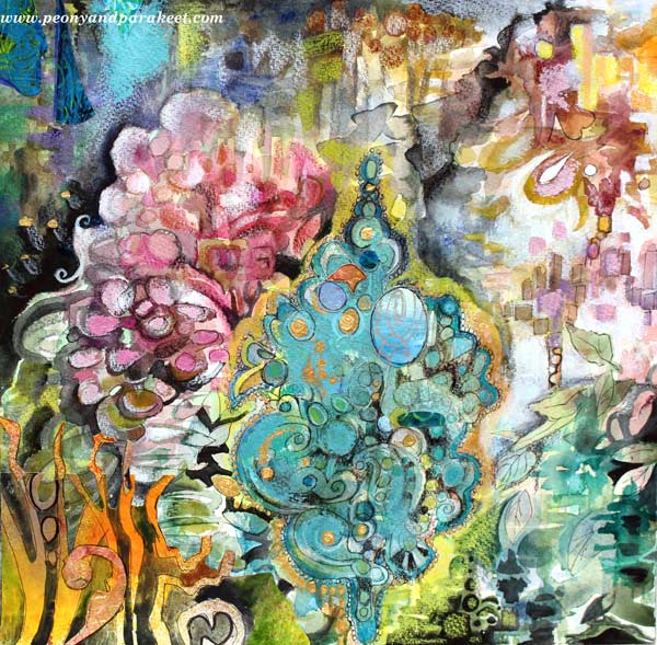
This week, I played with colored pencils mostly, but in 2015, I made a mixed media piece called Rococo. So check out this post too!
Damask Lady
The reason for my dream was an unfinished page in my colored pencil journal. I had started it at the end of last year but found it terribly uninspiring. I didn’t feel any connection with the figure, and she looked like someone had forced her to be there. In a way, that had happened. After a series of big paintings, I was knackered, as readers from the UK and Australia would describe. I had no motivation to take a brush and only a little to do something with colored pencils.
First, I added a bit of watercolor to cover white and then colored intuitively without any predefined ideas or models.
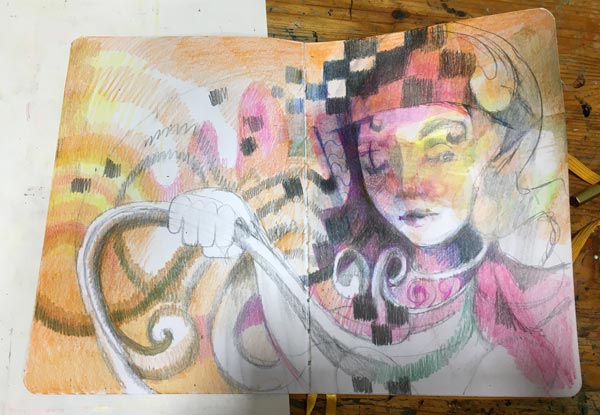
Sometimes it’s just that when you are tired, it’s best to leave the piece and come back later, even if it would be a tiny spread in a small journal. After the dream, I knew what to do: play with damask motifs!

I feel drawn to this damask lady. She looks both curious and self-confident – everything I would like to be in this new year!
Looser Damask Motifs – Nature
I got so inspired by coloring the swirly lady that the next spread was born quickly. Again, first some watercolor splashes, and then details with colored pencils.
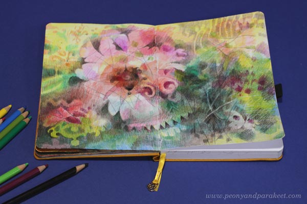
If you compare the flowery spread above with the portrait below, you see the change in looseness. The flower is much freer than the lady, but I like both. I like how damask motifs can be seen as a part of nature – snow on trees, water drops, butterfly wings and their spots. But I also like how they can be more architecture- and design-related and a part of human fantasies and mysteries.
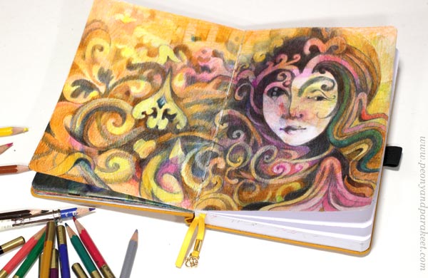
Which take do YOU like more?
Sketching a Damask Motif
Next, I wanted to go even further in stiffening the expression. I would design a damask-inspired motif so that there would be no looseness at all.
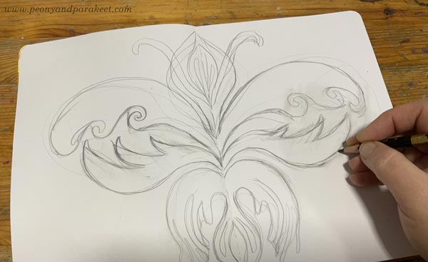
I started by sketching the motif in the middle of the spread, using the fold as a guide to achieving the required symmetry. In damask motifs, the negative – the shape of the background – is as important as the positive is. So after the careless sketch, I then went through the surrounding area and adjusted its swirls.
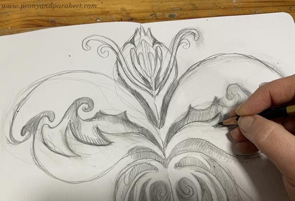
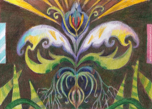
This motif felt like a forbidden fruit. I was surprised to hear myself saying: “You have crossed the line now, Paivi. Even if you always paint the inside, now it will be reverse – illustrating the outside world.” I didn’t get this first at all – I thought I was just drawing was a simple flowery ornament inspired by damask motifs!
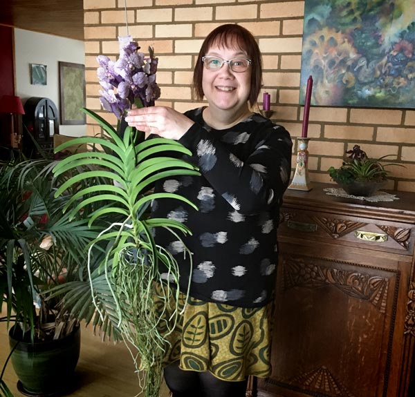
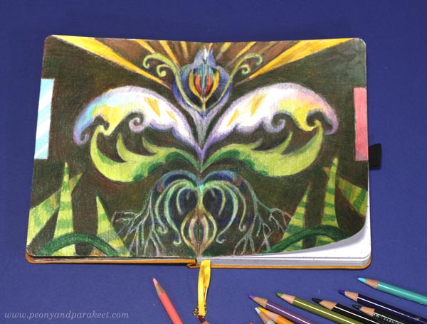
But when I was making the finishing touches, I realized that my drawing did illustrate the outside world – our living room: a wooden ceiling, windows on the left, a wall rug on the right, a vanda orchid hanging without a pot, and the snake plants growing lower.
Here’s a picture of my vanda when it was blooming in 2020!
This spread is not loosely made at all, and yet I find that the looseness is how I unconsciously picked and interpreted the subject.
Which of the pieces of this post inspire you the most?
Are you inspired by the stiffness or looseness?
How do you want your damasks to look?
Please leave a comment! It would be so interesting to know!
Building and Breaking – Revealing Artistic Potential
This week, I talk about the hidden potential behind artworks and how we can reveal that by not only building but also breaking.
Modern Maximalist
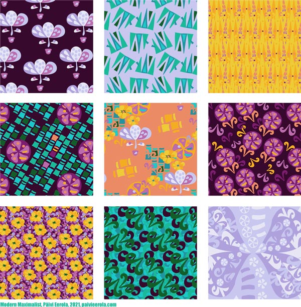
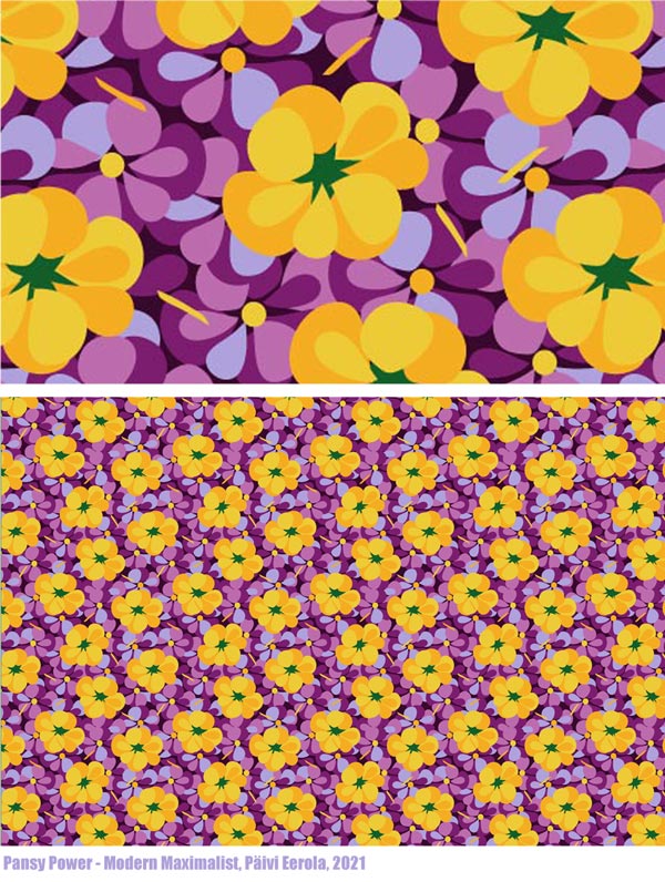
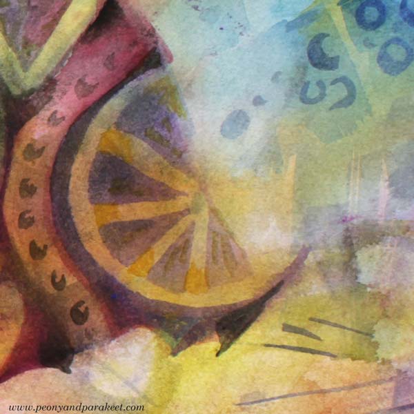
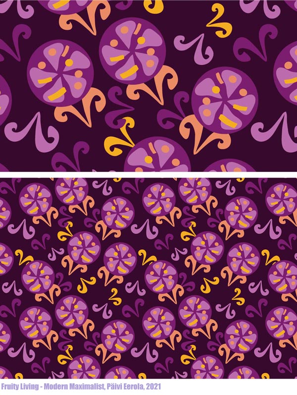
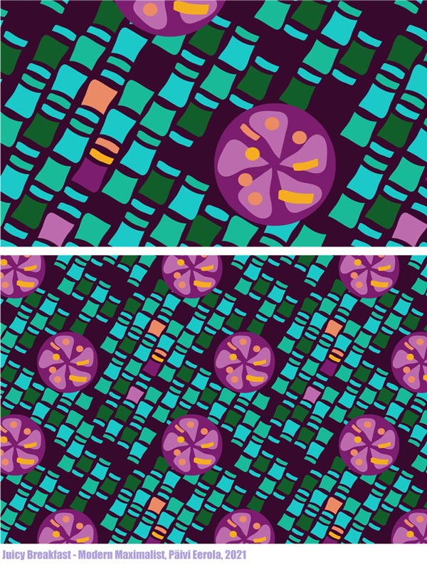
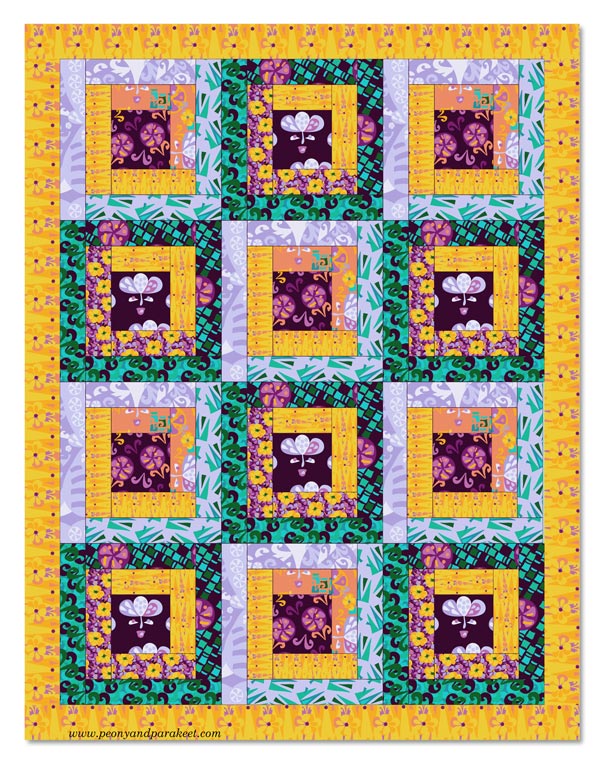
I have just designed a collection of surface patterns called Modern Maximalist. It’s drawn digitally in Adobe Illustrator and more modern than my work usually is. However, I love modern, especially the 1960s and 1970s styles. I was born at the end of the 1960s, live in a house built in the same era, and my love for retro has been too hidden in my art. But still, I didn’t want to design the collection based only on the images of others, but to build a bridge from my art to design. So, most of the motifs were based on this watercolor painting that I made a couple of weeks ago!
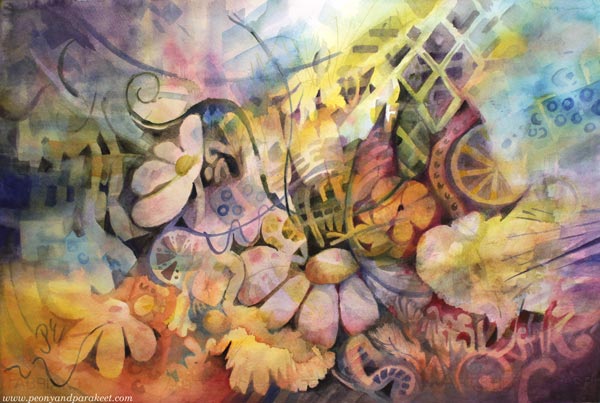
More Artistic Potential by Building and Breaking
Often when we create art, we build. We communicate the big picture and compose bits and pieces so that they work together. We get happy accidents (and sometimes some not-so-happy ones) and aim to make an image where the overall atmosphere takes over the details.
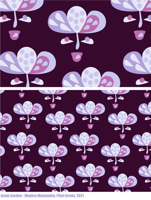
But to reveal more, we also need to break. Then the romantic flower that was painted to represent a dreamer, becomes a more stylish and symbolic figure.
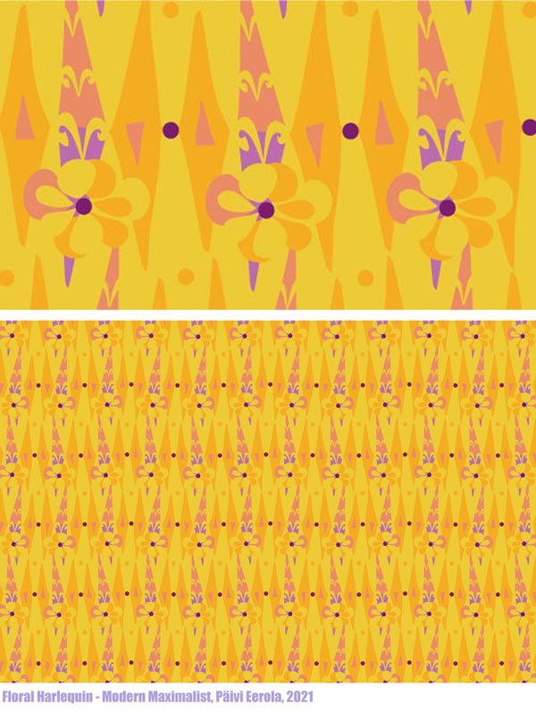
Yellow flowers and all the yellow washes can be more geometric when they are away from the big picture.

The juicyness of the fruits and other decorative details can be reorganized.
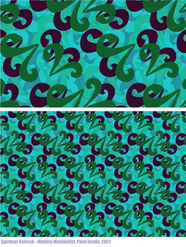
Picking Ideas from Other Images
We can also add more fuel, and break and pick from other images. This design called “List Maxima” uses motifs from the painting, but also the idea of a list that came from playing with the name of the collection, and fashion pictures that showed puffy and full dresses of the maximalist style.
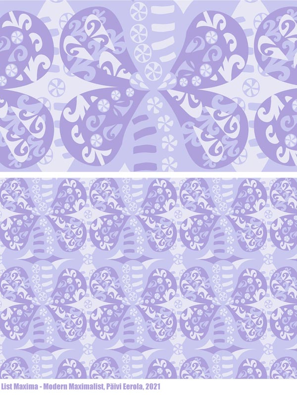
By breaking and picking, we also develop our ability to curate – to see which inspiration suits what we have already done. It’s an essential part of a style-development and and growing artistic vision.
I saw a pleated skirt on Prince Charles’s wife Camilla Parker-Bowles, not a maximalist style at all, but wonderfully modern so I broke and picked the image and got creative from that.
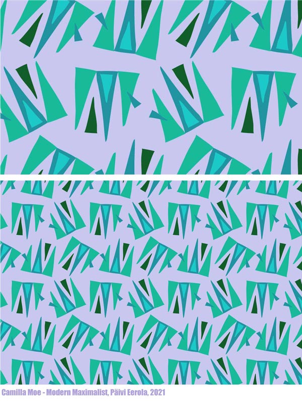
Artists often say to me: “I need to focus!” But by focusing on narrowing, we non-creatively force ourselves to do one thing. By breaking and picking, we can curate all kinds of inspiration and be creative so that it grows our artistic vision.
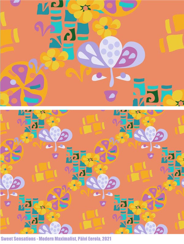
Revealing the Artistic Potential
No matter where you are in your artistic journey, your art benefits from the idea of building and breaking. Build to go deeper into the experience and break to reveal more ideas and potential! In practice, building often means painting, and breaking is often connected to drawing – even if, of course, you can use any techniques that suit you.
What was first a watercolor painting, could now be a quilt!
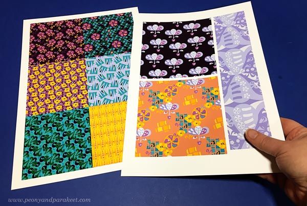
Building and breaking can alternate endlessly when we combine new ideas and results with old ones.
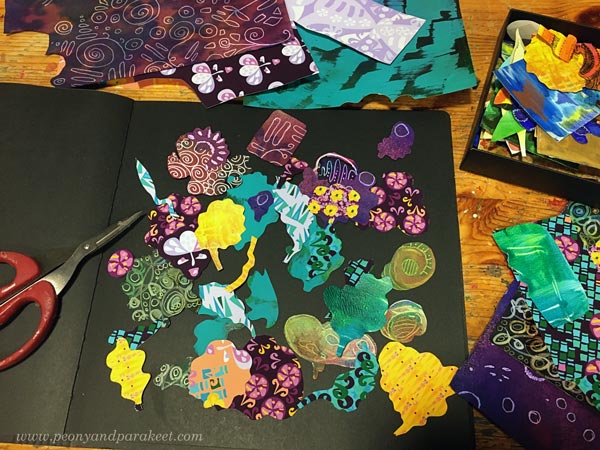
Here I am breaking and picking to create something new into my art journal.
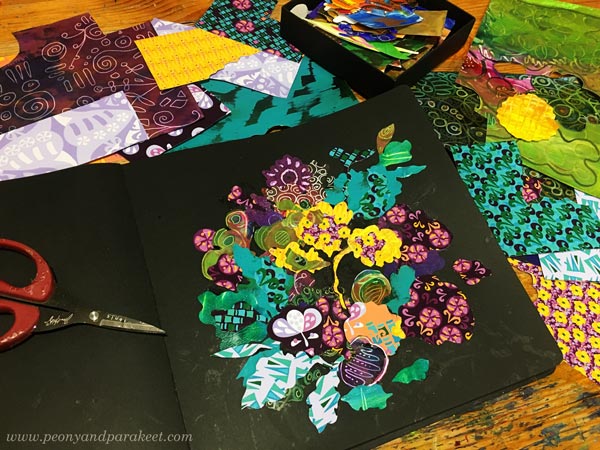
Here’s what I built by cutting and glueing new prints and old hand-decorated papers.
And I couldn’t resist checking if this could work as a repeat too!
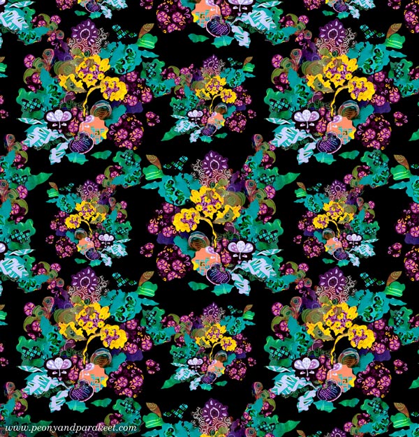
I hope you found this post about building and breaking inspiring!

Need help for finding your artistic potential and building artistic vision? Sign up for my coaching program called Artistic Vision!
Three Design Styles, a Gelli Plate, and a Brush
One of my goals for this year is to learn surface pattern design. I want to move back and forth between art and design, and add more design to this blog as well. This week, I picked three of my favorite designers and played with Gelli Plate to imitate their style. These don’t replicate any of their work, just their style.
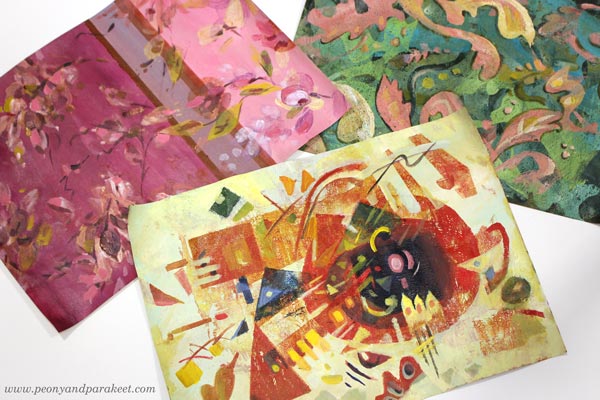
Three Designers from Three Centuries
My three favorite designers are Tricia Guild, William Morris, and Wassily Kandinsky.
Tricia Guild a designer from the UK, and she has a company Designer’s Guild, and I have been her fan since the 1990s when I discovered her book Design and Detail. It’s been my interior design guide for 30 years, and all my homes have got ideas from that book.
William Morris is also English, but he lived earlier, in the 19th century. Two rooms of our home have curtains designed by his company, and I regularly admire their clever repeats and ornamental shapes.
Wassily Kandinsky was more of an artist than a designer, but he taught designers in a famous Bauhaus art school in the early 20th century. For me, he is the father of modern design. I see his paintings in the works of most midcentury modern designers. Lately, he has felt even closer, when I have been built a class Floral Freedom that is based on his and Paul Klee’s teachings.
Who are your favorite designers?
Three Designers – Three Color Palettes
I have always liked making hand-decorated papers. Actually, my most popular blog post is this ancient one: How to Make Your Own Patterned Paper from 2010. So let’s get back to basics and make some!
First, I painted the backgrounds with acrylic paints and a flat brush. This set a color palette for each paper.
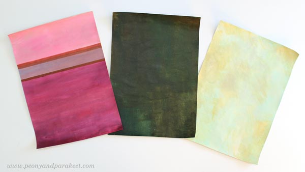
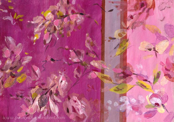
Muted pastels and rich darker tones remind me of Tricia Guild. She often uses stripes or checks too. William Morris has greyish colors and many of his designs have dark backgrounds. Wassily Kandinsky often had a very light background in his paintings.
Three Design Styles – Three Kinds of Shapes
I continued each of the papers by mono-printing motifs with a Gelli Plate. For Tricia Guild’s style, I used a small plate and painted the motifs with a brush on a plate, then pressed the plate on the paper. Because Tricia’s style is often quite relaxed, there was less pressure for perfect outlines.
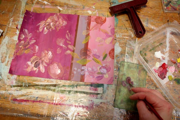
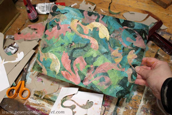
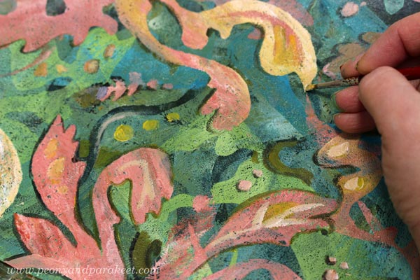
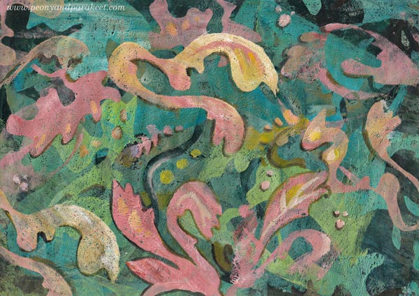
William Morris’s designs are very sharp and ornamental. I cut out ornaments freehand from paper and used both negative and positive shapes. I used both a big Gelli Plate and a small one.
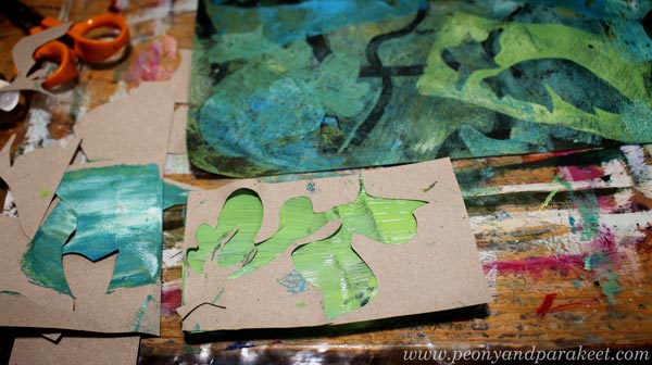
Here’s how the paper looked after mono-printing.
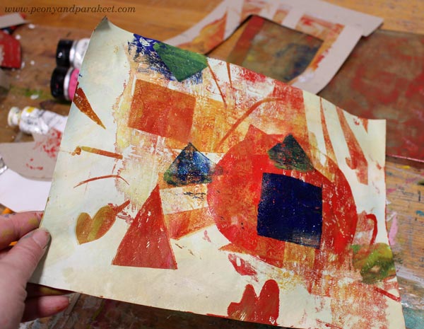
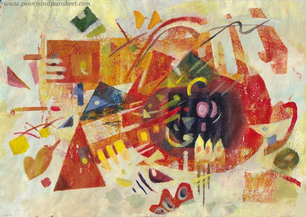
Wassily Kandinsky’s shapes are mostly geometric, so I cut templates that had circles, lines, squares and triangles.
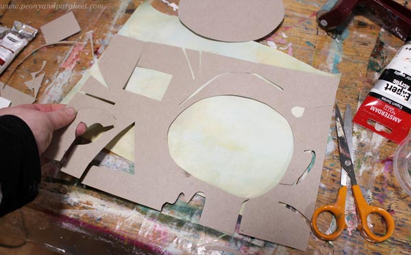
Here’s how the paper looked after mono-printing.
Three Design Styles – Three Levels of Detail
After mono-printing, I finished the papers by painting. I used a narrow brush and made small tweaks only.
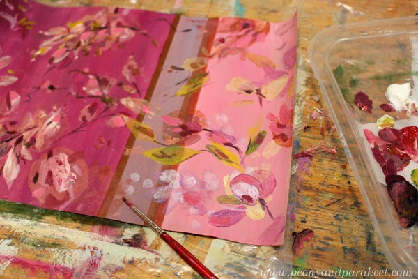
I like Tricia Guild’s designs because there modern meets classic and historical. They feel luxurious, but still comfortable. They don’t require similar perfection from the space than William Morris’s designs. So I didn’t perfect every shape or line, just added a bit more realism to the floral motifs. Here’s the finished paper.
William Morris’s designs are full of outlined motifs, and I connect them with books. “For people who have a library,” I wrote in a notebook that I keep for studying. But I quite liked my mono-print, and didn’t want to stiffen everything. So I only outlined a part of the motifs, and added some small dots and thin lines inside the shapes.
Here’s the finished paper. I really like the big yellow motif! Maybe that could be a part of my future designs.
Wassily Kandinsky’s work didn’t lack details either. But if William Morris is for bookworms, then maybe Wassily is for systematic thinkers – for more scientific than humanistic introverts, and for those who love mathematics.
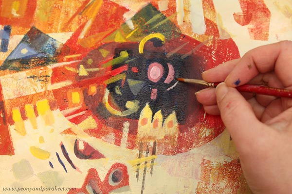
I used the monoprint as a foundation for the composition of shapes and followed Wassily’s advice and ideas from his book Point and Line to Plane, the book that I teach in the class Floral Freedom as well. Here’s the finished paper.
Three Wallpapers
I wanted to see how these papers could work as repeats. I didn’t have time to play with the repeats properly, but here are some quickly made images to demonstrate how the motifs would look in a smaller scale, for example, as a wallpaper.
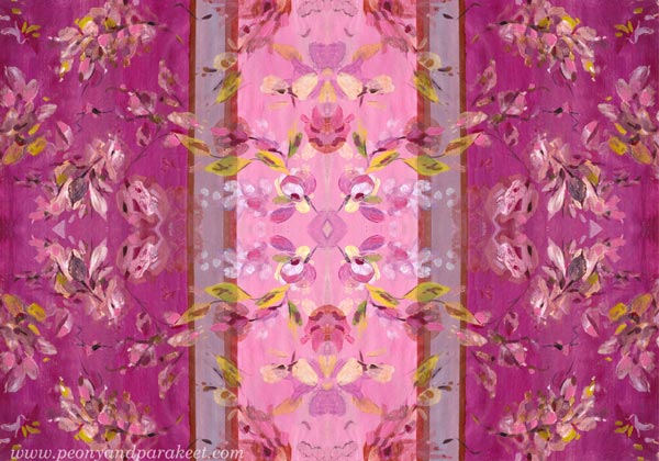
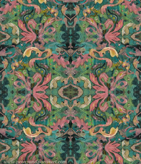
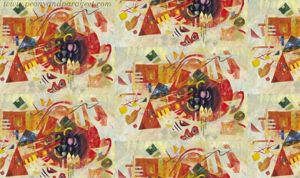
It was a full day, but I had fun making these! Tell me, which three designers would you pick?
Strawberries and Inspiration – Watch the Video!
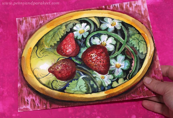
This week, I have a new free video for you. In the video, I create this small watercolor painting and inspire you to create art as well, even if all you can come up with would be just a few strawberries!
With this video, I invite you to join my new class Decodashery where we paint beautiful art with delicious colors.

Decodashery will begin on June 29, 2020. >> Sign up now!