Butterfly Art and Beyond
This week, I have some butterfly art, stories from the past, and plenty of inspiration for art-making.
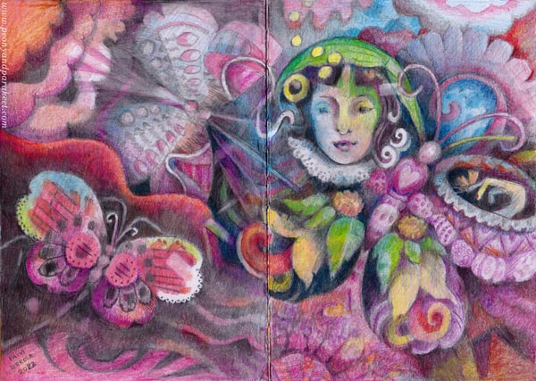
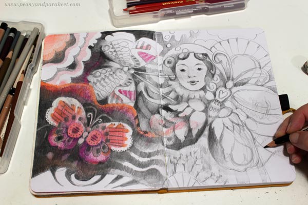
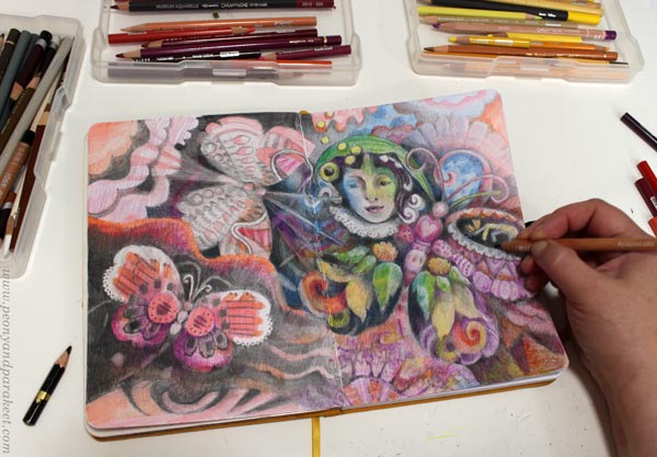
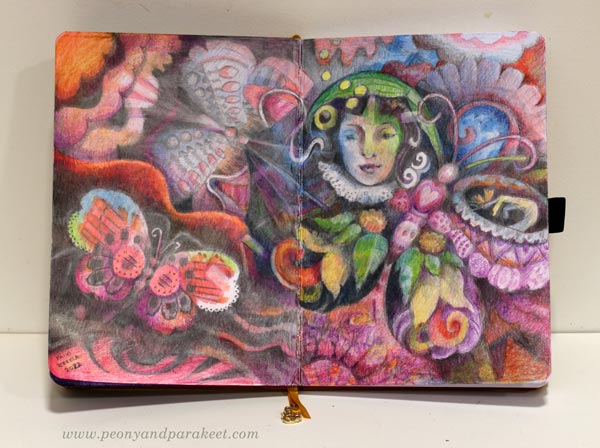
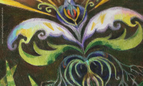
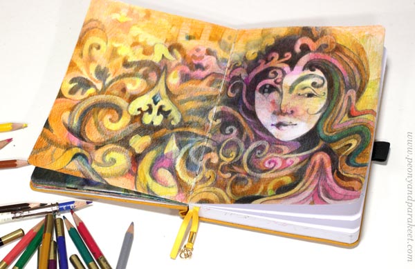
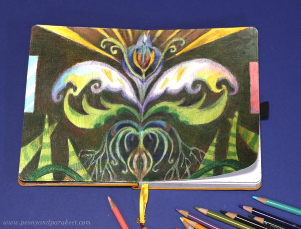
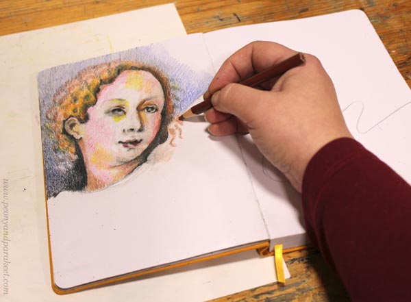
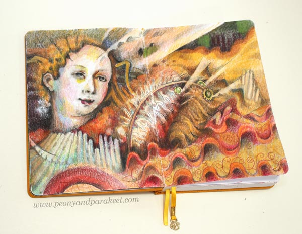
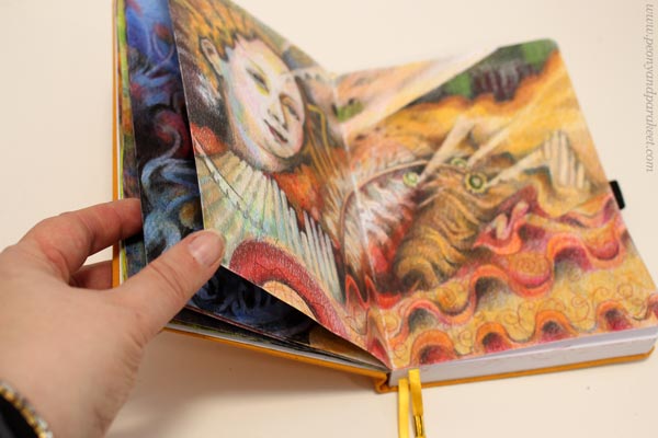
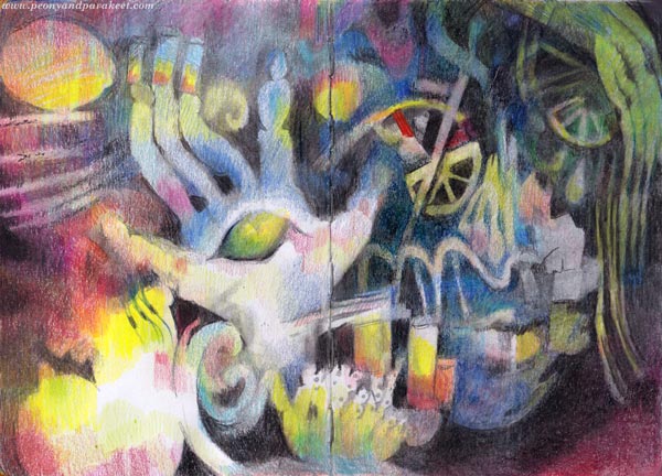
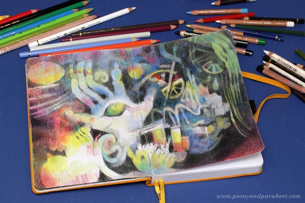
Here’s the newest spread of my colored pencil journal. I think it’s a little different than the pages so far – more detailed at least! You can see most of the previous spreads in this video; tell me what you think!
With this butterfly fantasy, I want to take you more than a hundred years back in time – to the end of the 19th century when a famous Finnish artist Helene Schjerfbeck (1862-1946) painted Violets in a Japanese Vase in 1890.
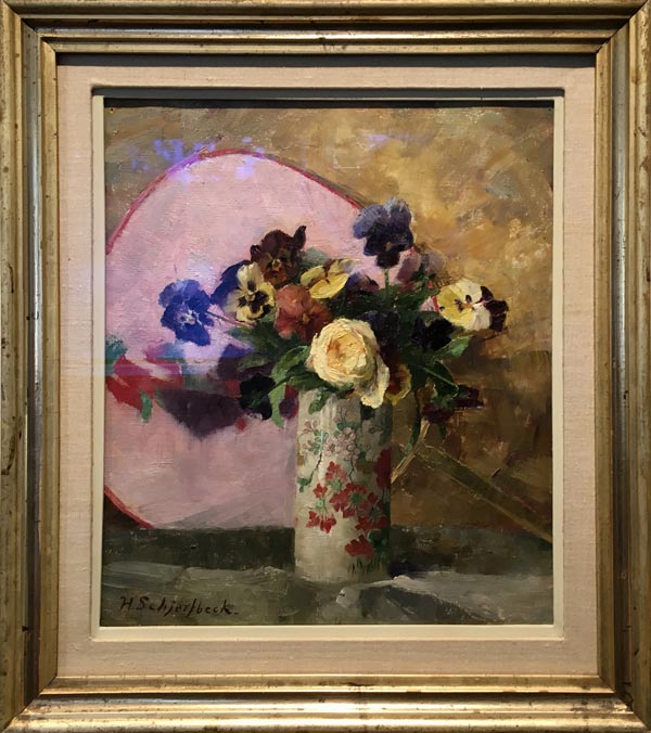
Although Helene wasn’t as famous back then, she had traveled and studied abroad. And now, she had just got back home after spending a year in Paris and England. After painting people, Helene was now drawn to make nature-themed pieces. It felt refreshing to change big and challenging portraits to small landscapes and still lives. Flowers became Helene’s consolation pieces. When she was sent to St. Petersburg to copy Russian masterpieces and thus bring educational reproductions to Finland (“here’s how the masters paint”), she painted flowers for her own joy in the evenings. (See Helene Schjerbeck’s later style and my adaptation for colored pencils in this blog post!)
I can relate to Helene. My main work is big oil paintings – abstract florals or landscapes – but I also make art that soothes and maintains rather than breaks through. While the first pieces of the new series are drying and waiting for their next layers, I feel drawn to the boxes of pencils.
At the beginning of the week, after painting the whole Sunday, I wanted to draw something just for me. “Butterflies!” my inner child asked.

Here’s how far I got in one evening. This was before I traveled back in time to meet Helene – and another artist called Torsten Wasastjerna!
Fantasy Art in Villa Gyllenberg
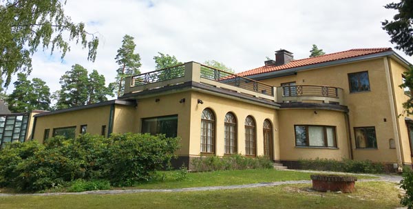
In the middle of the week, my husband and I visited Villa Gyllenberg in Helsinki. It’s a museum that used to be the home of Signe and Ane Gyllenberg in the 20th century. The house was built in 1938, and it has a wonderful location near the sea.
A part of the museum is a furnished old home with an extensive art collection, including Helene Schjerfbeck’s violet painting.
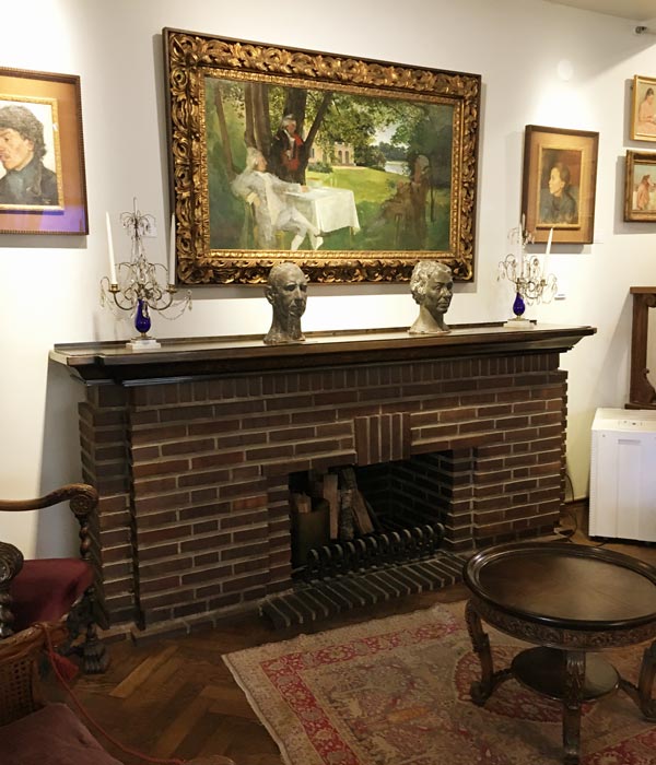
Just recently, Villa Gyllenberg got a new extension for art exhibitions. The new space has high walls and plenty of space, but still, there was something too big to fit there straight!
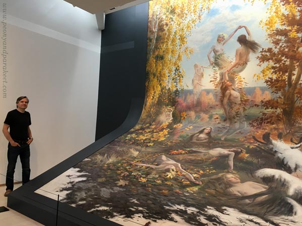
This is Torsten Wasastjerna’s oil painting Falling Leaves, made in 1897. It’s 550 cm high and 370 cm wide, one of the biggest Finnish paintings ever. My husband agreed to model beside it so that you get an idea of how big it is.
Inspired by Torsten Wasastjerna
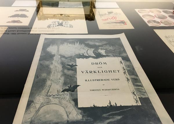
Like Helene Schjerbeck, Torsten Wasastjerna (1863-1924) got an education in fine art and studied abroad too. But his consolation was fantasy. He did commission portraits to pay the bills but loved illustrating fairies and angels. He even wrote books. The first one was called Dröm och Värklighet – Dream and Reality.
Torsten Wasastjerna’s fantasy world wasn’t as surreal as mine, but it felt close.
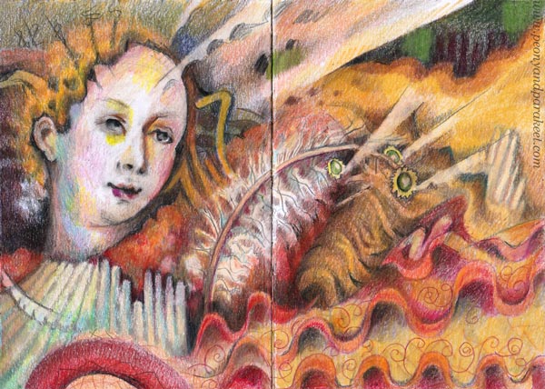
When I got back home, I was inspired to work on the butterfly piece with much more detail than I first had planned.
I added a person, a butterfly girl or a boy, to one of the wings.
Butterfly Art and Beyond
I am impressed by how dedicated Torsten was to his fantasy art, even if it was not valued by others.
It made me think that I, too, can create “butterfly art” that goes beyond the butterflies – that challenges both my imagination and dedication.
So, I spent more hours than normally with this spread, adding details and then adjusting their shapes and colors.
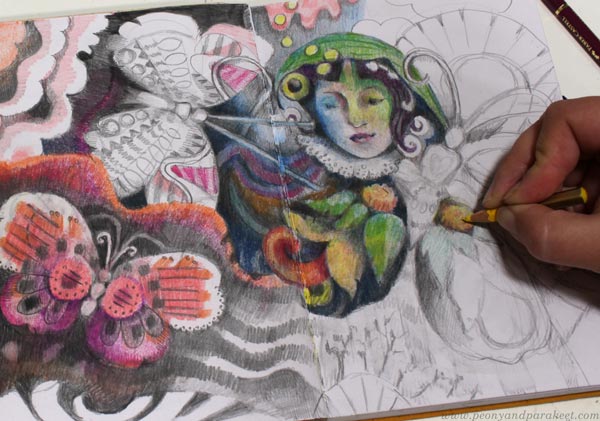
It felt like my pencils reached a new level, getting closer to my heart than before.
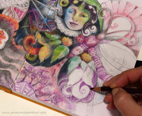
The world that is naturally and effortlessly born in my paintings fed the more illustrative work too.
All this makes me think about how important it is to go to see art and use that for inner discussions: how am I different, what are my consolation pieces, and how do I show my dedication to art? Then butterfly art can go beyond butterflies in the same way as Helene’s violets are not just “violet art.”
What do you think?
Creative Take on Damask Motifs
This week, we look at damask motifs from a new perspective. I challenge you to make this traditional motif your own and use it in your art!
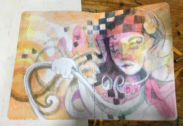
It all started from a dream I saw a few days ago. “You should wear more decorative clothes, Paivi,” I was telling myself. “Like the old historical dress that you had at a ball as a teenager.”
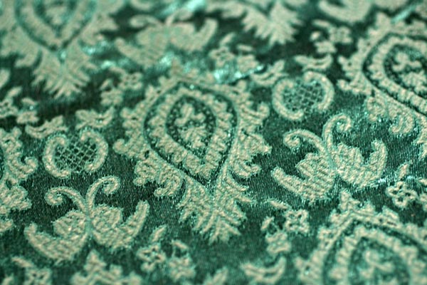
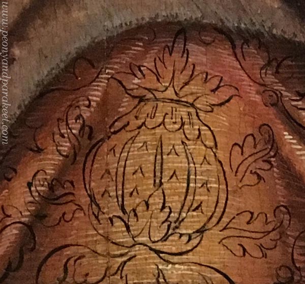
I still have the dress. It has damask motifs – woven ornamental patterns that seem to never go out of date (more about their history). The idea of perfecting not only the actual swirls but also the shapes between is a good drawing practice that doesn’t have to be boring at all!
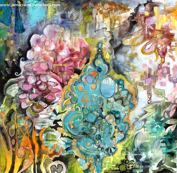
This week, I played with colored pencils mostly, but in 2015, I made a mixed media piece called Rococo. So check out this post too!
Damask Lady
The reason for my dream was an unfinished page in my colored pencil journal. I had started it at the end of last year but found it terribly uninspiring. I didn’t feel any connection with the figure, and she looked like someone had forced her to be there. In a way, that had happened. After a series of big paintings, I was knackered, as readers from the UK and Australia would describe. I had no motivation to take a brush and only a little to do something with colored pencils.
First, I added a bit of watercolor to cover white and then colored intuitively without any predefined ideas or models.
Sometimes it’s just that when you are tired, it’s best to leave the piece and come back later, even if it would be a tiny spread in a small journal. After the dream, I knew what to do: play with damask motifs!

I feel drawn to this damask lady. She looks both curious and self-confident – everything I would like to be in this new year!
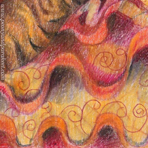
Looser Damask Motifs – Nature
I got so inspired by coloring the swirly lady that the next spread was born quickly. Again, first some watercolor splashes, and then details with colored pencils.
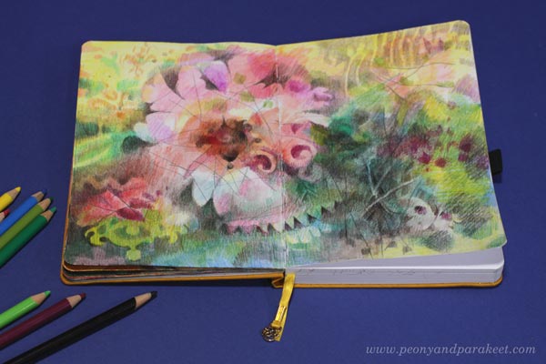
If you compare the flowery spread above with the portrait below, you see the change in looseness. The flower is much freer than the lady, but I like both. I like how damask motifs can be seen as a part of nature – snow on trees, water drops, butterfly wings and their spots. But I also like how they can be more architecture- and design-related and a part of human fantasies and mysteries.
Which take do YOU like more?
Sketching a Damask Motif
Next, I wanted to go even further in stiffening the expression. I would design a damask-inspired motif so that there would be no looseness at all.
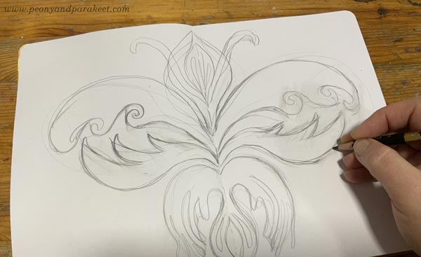
I started by sketching the motif in the middle of the spread, using the fold as a guide to achieving the required symmetry. In damask motifs, the negative – the shape of the background – is as important as the positive is. So after the careless sketch, I then went through the surrounding area and adjusted its swirls.
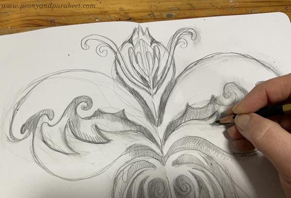
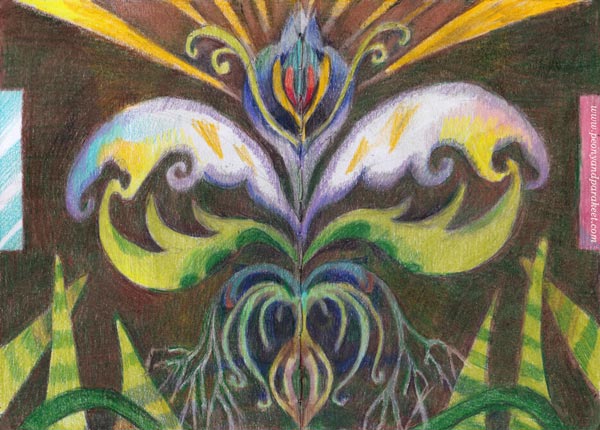
This motif felt like a forbidden fruit. I was surprised to hear myself saying: “You have crossed the line now, Paivi. Even if you always paint the inside, now it will be reverse – illustrating the outside world.” I didn’t get this first at all – I thought I was just drawing was a simple flowery ornament inspired by damask motifs!
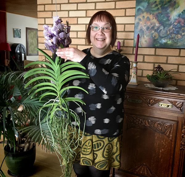
But when I was making the finishing touches, I realized that my drawing did illustrate the outside world – our living room: a wooden ceiling, windows on the left, a wall rug on the right, a vanda orchid hanging without a pot, and the snake plants growing lower.
Here’s a picture of my vanda when it was blooming in 2020!
This spread is not loosely made at all, and yet I find that the looseness is how I unconsciously picked and interpreted the subject.
Which of the pieces of this post inspire you the most?
Are you inspired by the stiffness or looseness?
How do you want your damasks to look?
Please leave a comment! It would be so interesting to know!
Art Inspiration from Lucas Cranach the Elder
This week, I gather inspiration for the next painting of a series, enabled by the grant that I got from Arts Promotion Centre Finland. This is the third blog post of this project, see the first one here and the second one here!
German Renaissance Portraits by Lucas Cranach
The first painting of my series (The Empire of Light) was inspired by Sandro Botticelli, Italy. Now I move further up in time and on a map and go to Germany to meet Lucas Cranach the Elder (1472-1553). Here’s a spread in my colored pencil journal inspired by Cranach’s style.
She is a weird-looking little woman but so are Lucas’s portraits too.
Their faces are small and not so pretty at all, at least according to today’s standards. Are these two even smiling at all? Is that boredom or irony?
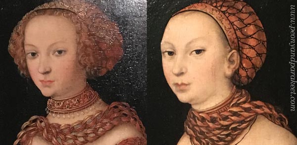
Cranach’s women seem so arrogantly materialistic that it doesn’t feel suitable for a series about spirituality at all. But because expressing light is impossible without painting the darkness, I have decided to explore spirituality’s ultimate opposites as well. Like insolence, materialism, and money.
Lucas Cranach’s Super Production
Lucas Cranach the Elder wasn’t just a painter. He was a businessman who ran a workshop and a pharmacy too. His unusually large workshop wasn’t just for fine art. Printing presses produced religious images for people who had less money.
Lucas Cranach surely knew how to run a business. When he needed pigments, he decided to found a pharmacy at the same go. He got friends with prestigious people like Martin Luther. I can imagine Lucas whispering to Martin at a dinner: “What kind of images does your religious movement need? I can produce thousands of them!”
He must have had a sense of humor too. And yet, his figures and the way he painted the clothing, are a bit stiff and clumsy.
From Cranach’s Bluntness To Sharp Pencils
When Botticelli made an elegant curve, Cranach added a straight like like saying: “That’ll do. They won’t notice it anyway.” So my Cranach imitation was built around similar angular lines and weird proportions.
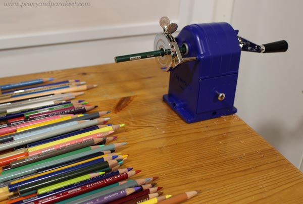
But the more I worked with the face, the more real it felt. The woman wasn’t just an angel but had vices as well. She felt so relatable and maybe because I was glancing at my new sharpener. In the middle of the spirituality project, I had become very materialistic and spent almost 150 EUR on it.
Botticelli’s goddesses wouldn’t be even willing to touch it. But Cranach’s women would grab the handle without hindrance. They would crank fast and smile quietly, and it would all look a little immodest.
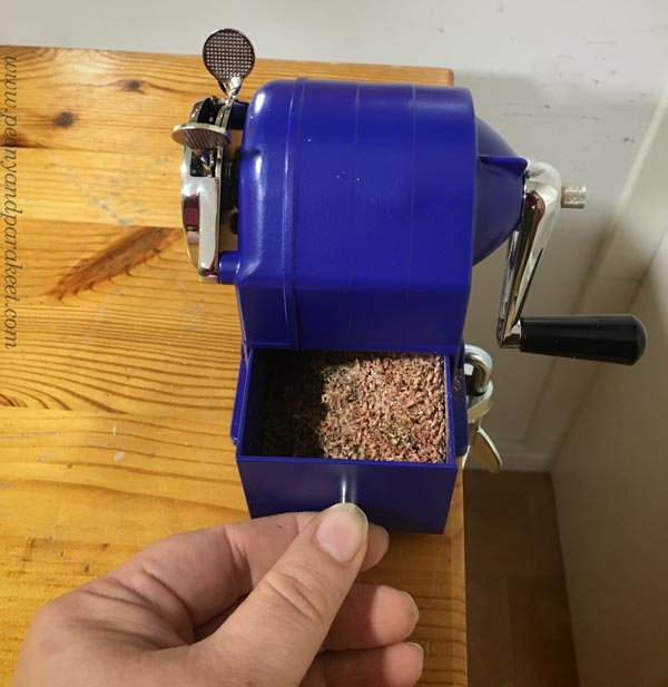
My workshop has produced a lot of pencil shavings lately.
I can assure you that all my pencils are sharp!
Long Live the Spirit of Lucas Cranach!
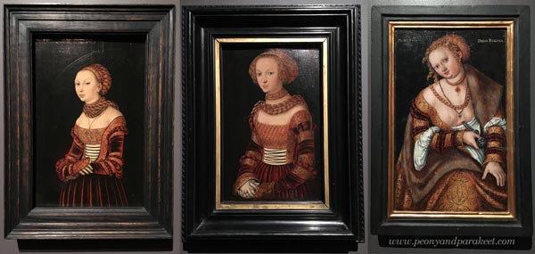
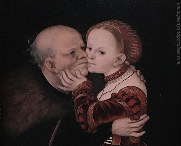
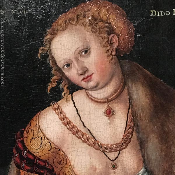
Queen Dido’s smile in Cranach’s painting is deceiving. She had made a decision to leave the materialistic world.
Her story goes like this: Dido founded the city of Carthago after her husband died. Then her lover, a Trojan hero Aineias was taken away and in agony, she killed herself.
Black and white always go together. Dido was not just a wealthy royal, but a sensitive woman too. Maybe Lucas Cranach and Martin Luther had deep discussions over dinner. Perhaps my sharpener will live longer than I do and serve many enthusiastic colorers after me.

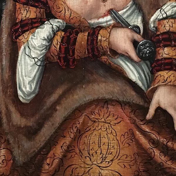
The most inspiring detail in Dido’s clothing is this carelessly painted ornament on the hem. It just floats there! It doesn’t follow the folds of the fabric at all. But its living line documents Cranach’s spirit.
No matter what the subject is, art always carries a spirit with the way we draw lines.
Like Cranach, I made two layers of lines, first x-shapes, then swirls.
Colored Pencil Journal
This journal spread will be my inspiration for a new abstract oil painting.
My little journal has quite many drawings already. I browse it often and it brings me joy.
Do you also have an art journal, a visual diary, or a sketchbook that you like to browse and fill? Can you find your living line there?
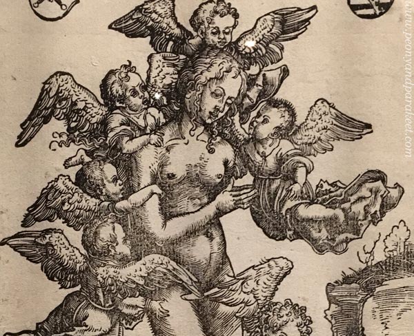
P.S. My photos of Lucas Cranach the Elder’s paintings are from an exhibition in 2019, see this blog post for more pics!
Art is a Lemon Tree – How’s Your Lemonade?
This week, I talk about art and lemonade and share some news about the rest of the year!
I was going to make a cheerful spread on my colored pencil diary, celebrating a beginning of a period that I have never experienced so far in my life. But I started the drawing intuitively, and here’s what came up: a murky image with a bittersweet impression!
“When life gives you lemons, make lemonade,” they say.
I have never been fond of that kind of forced optimism, but I guess there’s also a seed of truth. In art, you have to make most of what you have.
What Kinds of Lemons Does the Tree Produce?
In 2014, when I became a full-time artist, I thought about growing my skills and how that would naturally lead to something good. But nowadays, my leap has felt more like changing a long CV in technology and service design to a very short, almost non-existent, CV in art.
Art is like a lemon tree. You can nurture it, but you can’t change its variety. Over the years, I have learned not only to teach but also to illustrate, make surface designs, and even draw ornaments and logos. But my heart has always been in fine art, and especially in intuitive abstracts.
In my opinion, fine art makes the best lemons. But the weather is harsh, and the harvest becomes too small to be enough for the lemonade. So my passion for teaching has often been the lemonade maker, not the actual paintings.
But now, things change for a few months. I have got a grant from The Arts Promotion Centre Finland to create a series of paintings and write about the process. I will publish the art and most of the writings here in my blog, so you will also get to drink this lemonade!
The project has a set theme that also includes a background study. I will also continue the colored pencil diary and document a part of the process in colored pencils. Later posts will reveal more.
I hope that my project will also inspire you to create – grow more lemons and make your kind of lemonade!
P.S. You can still sign up for Intuitive Coloring! You will get the published lessons immediately after signing up, and can start having fun right away. >> Sign Up Now!