New Oil Painting and Pretty Art Journaling
This week, I have finished an oil painting and started an art journal that I want to make as pretty as possible. I also talk about my aspire to paint horses and ask how deep you have to know the subject to own it in your art. This post has lots of pics!
Wreath Maker – Painting with Oils Like They Would be Watercolors
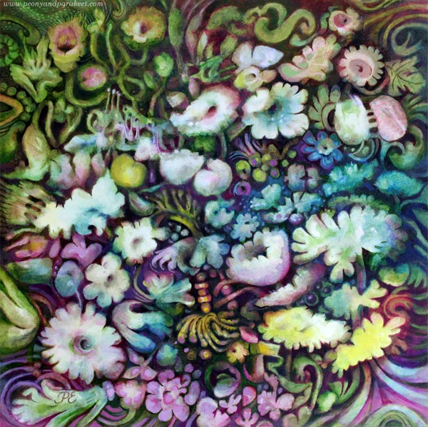
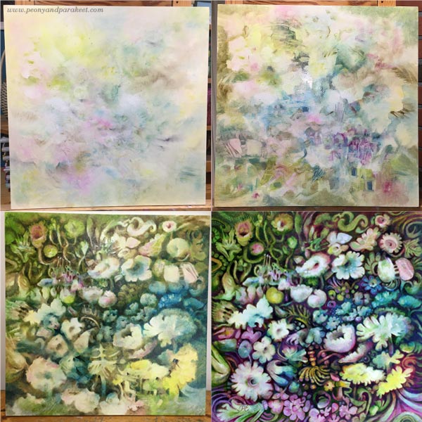
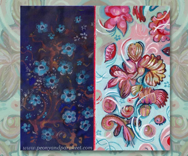
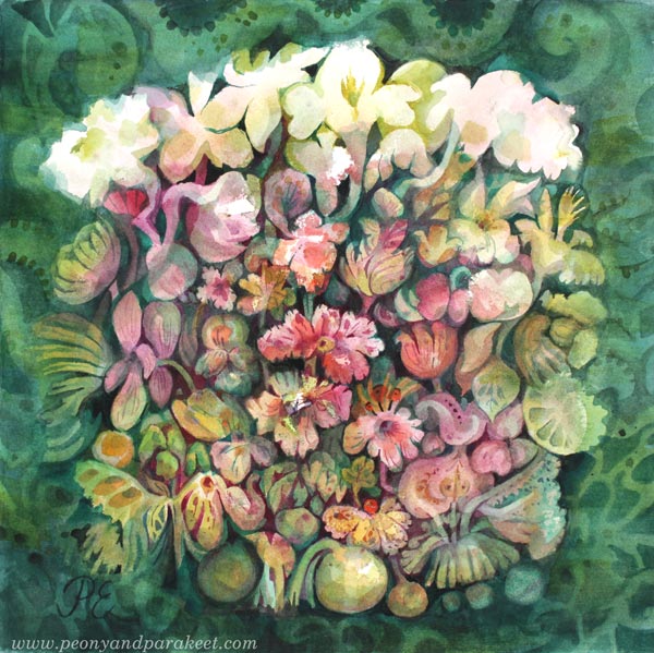
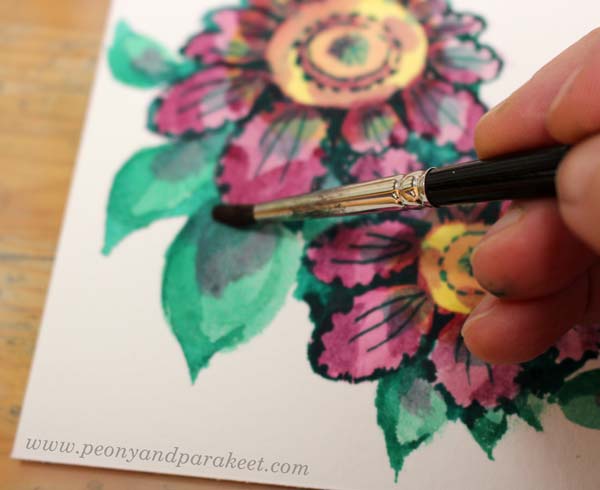
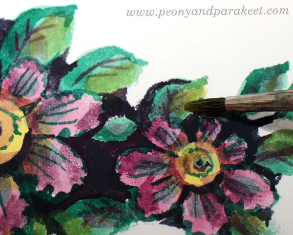
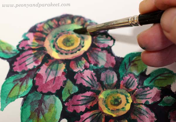
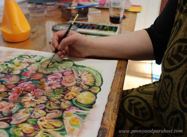
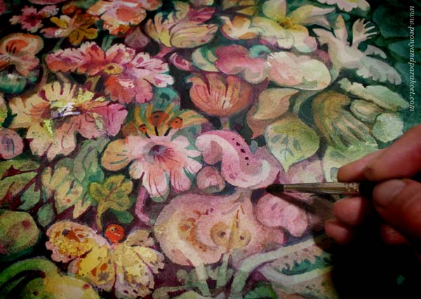
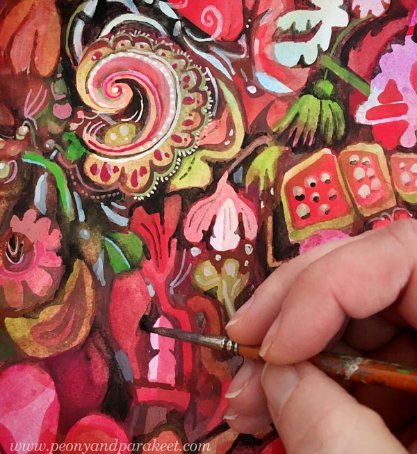
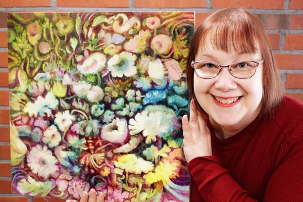
I started this painting in January, and I am so glad that it’s finally finished. Even if this is an oil painting, I used the approach that’s best for watercolors – I started with pale pastels and worked towards darker tones. I really like painting like this, and the result pleases my eye. The pictures below show the process and I have also blogged about this painting in May 2020.
The Series of Three Floral Paintings
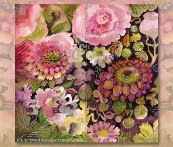
The painting is called “Seppeleentekijä – Wreath Maker”. It’s the last one for the series of three paintings. The two first ones are watercolor pieces called “Jäänmurtaja – Ice Breaker” and “Soihdunkantaja – Torch Bearer.” I made the paintings so that they could be seen as a triptych where the flowers of the two watercolor paintings lean towards the centerpiece. Click the image below to see the series as a bigger picture!

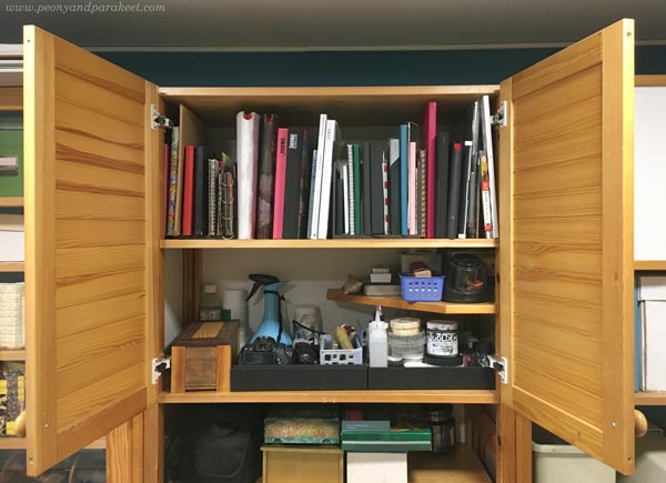
The Shelf of Art Journals – Re-Organizing the Studio
Making the three paintings was quite an accomplishment, and finishing the last piece made me feel empty. What to do next? Well, I don’t know about you, but if I need recreation, cleaning and organizing is the thing! While going through the stuff on the shelves of my little studio, I gathered the sketchbooks and art journals in one place.
Smash Books – Do You Still Remember Them?
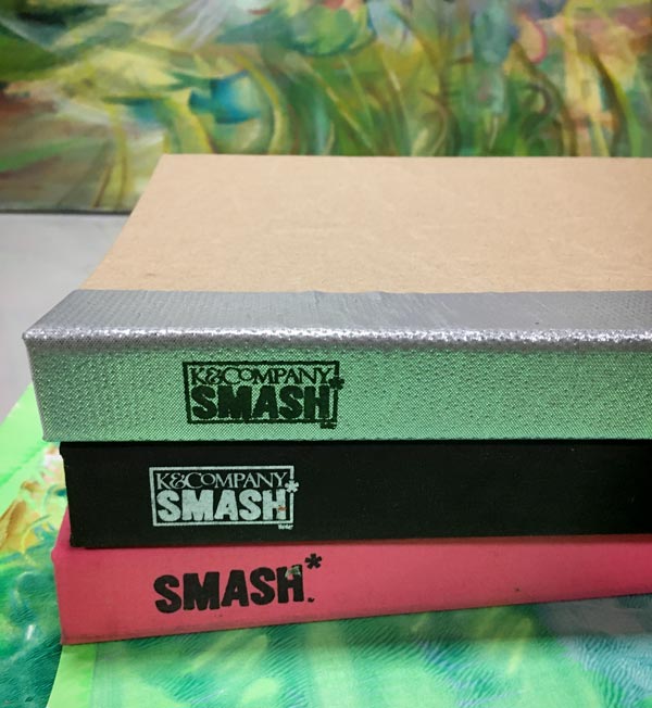
I found one almost empty old Smash Book – do you remember the time when everybody had them? See the flip-through videos of my two Smash Books here:
>> Pink Smash Book Flip-Through
>> Black Smash Book Flip-Through
The third Smash Book has a silver back and with that, I remembered how back then, all the art journals were more or less messy. In 2012, I daringly wrote a blog post that asked: “Can’t there be pretty art journaling?”
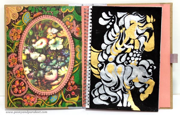
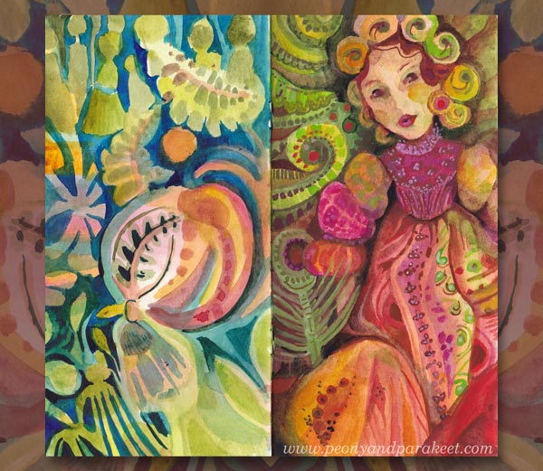
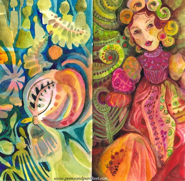
So it hit me, that the extra Smash Book could continue the tradition of the two past ones and be a pretty art journal. It could also be my tool for encouraging myself to paint what I really want, and not fall into the trap of trying to paint what seems more appropriate. Namely, I would like to paint things like … (gasping a bit)… ahem … HORSES! I tried to make a long list, but all I could think of was HORSES.
Horses – Can only an Expert Paint Them?
You see, I am no expert in horses, I have ridden on a horse only once, as a child, and I have never been living close to a stable. But I had toy horses, and I have always admired their beauty. I have tried to get rid of this disease by drawing zebras for the class Animal Inkdom, and horses for its independent sequel Magical Inkdom, but it hasn’t gone away.
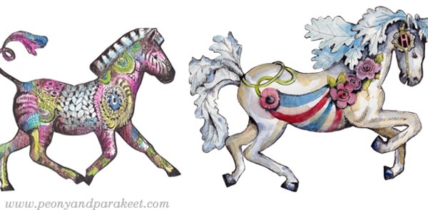
Can you paint something you are no expert in? Many years ago, I heard an interview with an artist who said that everything clicked when he started painting cows. He had been living with them most of his life, and he knew exactly how they are. You have to know what you paint, he claimed, as far as I can remember. It makes sense. I love plants and have always been growing some. I feel I know the soul of flowers and in the oil painting that I just finished, I wanted the flowers to reveal their soul, to be chatty and curious, just like they are if you silently observe them very, very closely.
But isn’t it possible to use the expertise for other things too – to transfer the soul of a flower to a horse, and thus, regain the mastery? To use the flowery language from Decodashery to express a moving thing?
It doesn’t have to be anything grand at first, just a small art journal page.
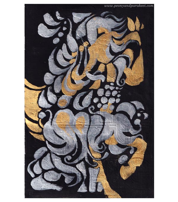
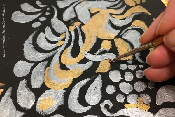
Pretty Art Journaling Can Be Reverse Creative Exploring
If I can paint a horse in the language of flowers, couldn’t it also be possible to revert the process? Could I make an art journal page from the painting, a sketch after a result?

I want to allow this free flow from one theme and one media to another happen again with this journal.
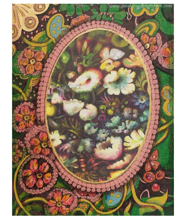
The image of the painting was printed on a sticky canvas bought ages ago. Then I drew and colored the floral frame, and added some gold and silver paint too. Here’s the first spread of the “new” Smash Book – the new beginning of pretty art journaling!
Handmade Picture Shelf Finishes the Display
A part of reorganizing was to get a picture shelf on the wall. My skillful husband made it, and I absolutely love it.
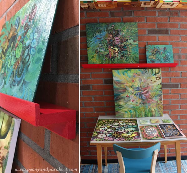
Finished paintings, paintings in progress, and art journal spreads can now be displayed together.
Tell me, what inspires you at the moment?
What do you put in your list of what to paint or draw?
Classes which inspired this post:
Animal Inkdom – Draw and decorate wild animals! – Buy here!
Magical Inkdom – Draw the magic of mysteries and fairytales! – Buy here!
Decodashery – Paint beautiful florals and more! – Buy here!
Flowers masterclass: Floral Fantasies – Buy here!
Rainbow Journal – Fill a Small Notebook with Happy Art!
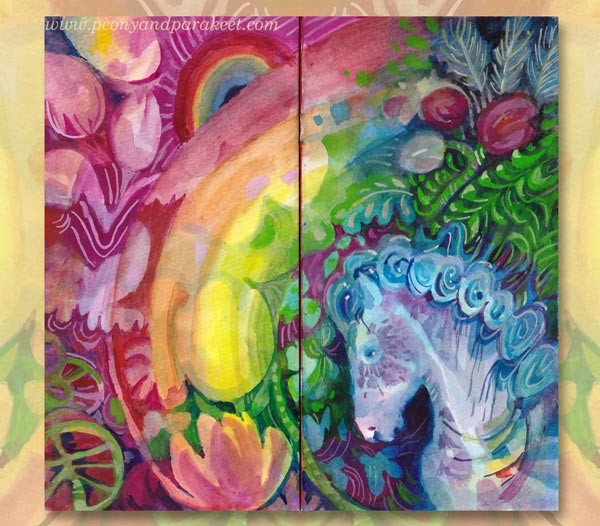
This week, I get back to the project that I started earlier this spring. It’s a small notebook that I have filled with happy art. I call it Rainbow Journal because it has brought me both joy and hope. Here’s a quote from the video below:
“When working on this journal, I have been able to live inside a happy bubble momentarily. It’s been refreshing, and my inner critic has got gentler. I have gained new inspiration for my paintings and classes.”
Watch the video to get inspiration for yours!
Creative Prompts for Your Rainbow Journal
Use the following prompts to make yours!
Cover – Make It as Decorative as You Can!
Use a limited color palette and let the colors and shapes flow.
Spread #1 – Get Inspired by Happy Interiors!
Think about textiles, wallpapers, and painted motifs on wooden furnitures and dishes.
Spread #2 – Embrace the Good and the Innocence!
Once you have set the style of the world you are building, who could be wandering there, full of happy thoughts with an innocent mind?

Spread #3 – Paint Something Juicy!
Show how it feels when the glass is full, even overflowing.
Spread #4 – Grow the Flowers of Imagination!
The dark soil makes flowers grow and shine.
Spread #5 – Show the Bright Future!
Get creative with rainbows, how many can you fit in?
I hope this lifted your spirit and inspired you to keep creating!
Get a free mini-course when you subscribe to my inspirational weekly emails!
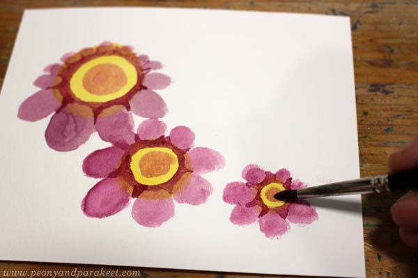
Vintage Style Flowers Step by Step
My latest watercolor painting has lots of vintage style flowers. I call it “Lemonietta,” and it’s inspired by home decor, afternoon tea, cream cakes, piano music, and of course, my favorite fruit – lemons!
Vintage Style Flowers in Three Colors
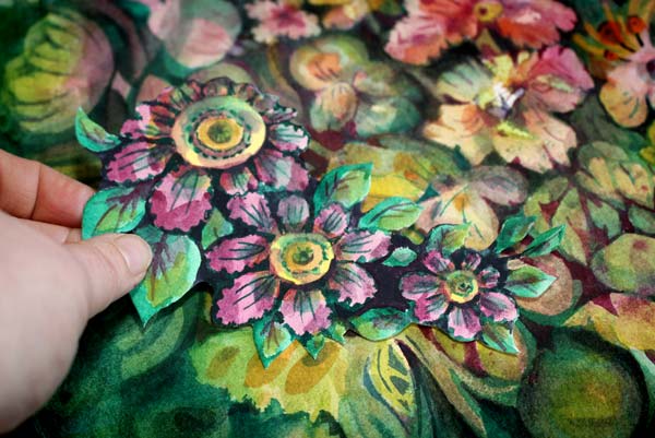
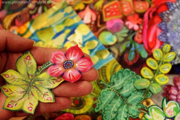
I have always liked old art and not just masterpieces, but decorative die cuts, vintage postcards, and all the more kitschy stuff too. So this post is dedicated to vintage style flowers, and I show how to make a cluster of vintage style flowers to your box of joy – any box that you fill with handpainted and hand-drawn collage pieces!
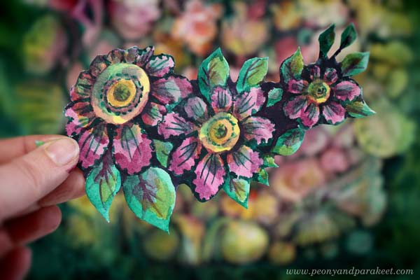
The tutorial is for watercolors, but you can use any paint for it. Just make sure to keep the color layers transparent. I use a piece of smooth watercolor paper, but almost any paper will do. And you only need three colors: yellow, pink, and green!
Step 1 – Three Yellow Circles
Start with yellow and paint three circles.
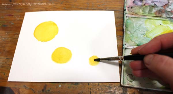
I painted the circles in three sizes: large, medium, and small. They form a curve rather than a straight line. This way, the composition will become more elegant than if you have similar sized flowers in a straight row.
Step 2 – Pink Petals
Add pink circles or ovals around the flowers.

Some petals can be smaller than others, so that the orientation of the flowers varies a bit. Compare my biggest flower to the medium-sized one!
Step 3 – Darken the Centers
Continue with pink, but use a little less water so that it’s darker. Make the centers and petals clearer by painting around the center and the top parts of the petals.
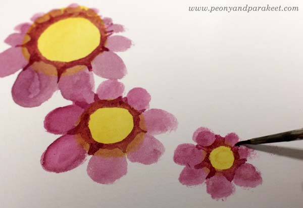
I use a thinner brush to get sharper points near the petals.
Then mix some more water to pink paint, and add small circles to the centers.
I use a bigger round brush for round shapes.
Step 4 – Green Leaves
Paint green ovals around the flowers.
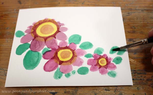
Again, my ovals have a variety of sizes so that the composition looks more lively.
Continue with green, but now use a thicker color. Make the leaves sharper and a bit more elegant. Only paint a part of a leaf with a darker green.

See how pointy my darker shapes are, and how they don’t cover the whole leaf!
Step 5 – More Details to Flowers
Start with thick green paint and a thin brush. First, add green triangles between the petals to make the flower look more three-dimensional.
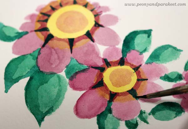
Second, paint around the petals so that they look more frilly.
Then change to a bigger brush and add more water to make the paint transparent. Paint pale green spots on petals and on the centers.

With a thinner brush, add green lines to the petals and centers. Finally, change to pink, and paint centers and petals so that they are partly darker.

The nostalgic look comes from the contrast colors and the color variation.
Step 6 – More Details to Leaves
Add pink shadows to the leaves.
With thicker green and the smaller brush, paint think lines on the leaves.

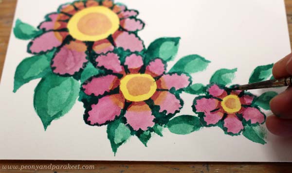
Step 7 – Dark Background
Mix thick paint from green and pink, and paint the background areas between the flowers.

I also check all the edges around the cluster so that it’s easy to cut.
Step 8 – More Color Variation
To make the flowers glow, add more color variation. Use thin paint, and add yellow to the leaves. Only paint each leaf partly.
Similarly, add green to the centers.
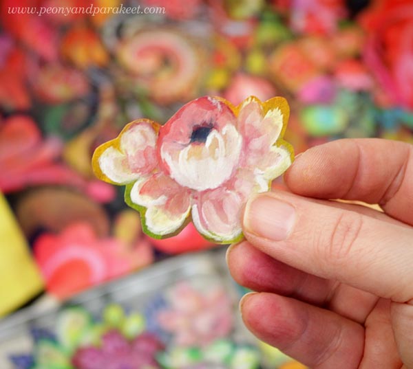
Here’s my finished cluster before cutting.

Step 9 – Cut It Out!
You can still change the shape of your cluster when cutting around it.

It’s so much fun to make and find backgrounds that come alive with these little flowers.
And of course, they bring more joy to the box of joy too!

Vintage Style Flowers – Starting More Intuitively
Painting small pieces is fun, but my bigger paintings are born more intuitively and they take a longer time.
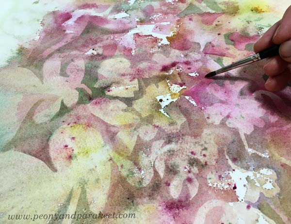
I love to dig out flowers of random blooms and spatters, and then move on to paint them more intentionally.
When the paper is full of details, it’s sometimes hard to decide which ones can take the central role and remain bright, and which ones get more background color so that they don’t stand out so much.
Here’s the finished piece again. It took about two days to complete.
Even the smallest single flowers are still part of the same world.
I hope this post inspired you to create, whether it’s a project of two hours or two days!
Inspiring projects for flower lovers: Buy my class Floral Fantasies!
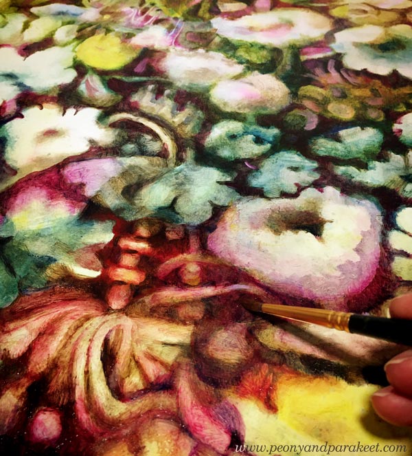
Delicious Colors – Salvage Them!
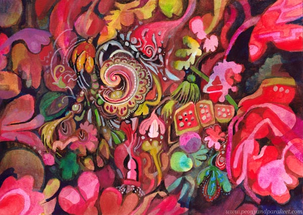
I have never been overly enthusiastic about bright reds, but now seems to be the time. I feel that in this black world, we need to salvage the delicious colors and amplify them with sugary decorations!
Finding Comfort from Delicious Colors
In the evenings, while waiting for the news around the world to be gathered, I paint in my little studio room. The more I think about the sad statistics, the more I want to create the opposite – a careless world with deliciously tasty and juicy colors.
My studio is now like a sweet bakery, and as the main cook, I have lots of motivation to create!
Delicacies from DecoDashery!
What first was just one little painting, has now grown to resemble a series that expresses an imaginary world. I call this world as DecoDashery, inspired by the old haberdashery from the movie Emma. DecoDashery will also be the next class that I am building, hoping to release it within a couple of months!
You Can Always Start Small!
As usual, I haven’t made paintings only, but also collage pieces to my boxes of joy.
Delicious Meringues, Lace, and Porcelain
Now when my husband is working from home too, we eat together more than ever. Fortunately, he can cook! I have never been into that so much. But my specialties are side dishes and desserts, and it’s been fun to make one good meal in a day and combine our skills.
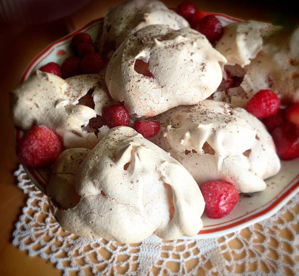
I had never made strawberry meringues, but a recipe from a knitting magazine caught my eye. Strawberries, an old plate, and a hand-crocheted lace doily were all as essential as the meringues themselves.
My current oil painting has progressed well too. Even if there’s a lot of work left, I get a lot of pleasure from working on it. Salvaging all the deliciousness of the random shapes feels so good.
Doesn’t the painting look strangely similar to the meringues, lace, and porcelain? The world of Decodashery is expanding!
Meaningless Has Given Me a New Meaning
It’s kind of funny that when I decided to remove deeper meaning from my work for a while, I feel that my art the overall creative process has become more meaningful than ever.
It’s like I have released the beast that I have always quietly carried with me, and once I have seen it eye to eye, it has become my angel in the crisis.