The Power of Boredom
When I was a child, my most prevalent feeling was boredom. It felt like childhood was a long wait for things to happen, life to start. I was at the mercy of others and dreamed of the time when I could do it all by myself.
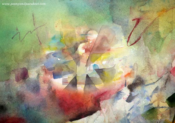
At that time, in the 1970s, there was no iPad to keep me company. Instead, I often grabbed the only picture book from the shelf where my parents kept their books. It was a softcover book about old paintings. I was staring at Monet and Manet while my mother cooked us dinner. The book wasn’t big, and the images were small. But this way, culture was introduced to me at a young age. Having this one book on the shelf, my parents unknowingly affected my life’s journey.
I was browsing the book in a colorful living room.
It had yellow, orange and red textiles and a grey sofa. Later, the colors were changed to warm green, and brown. It was all fine before my mother bought greyish mint green curtains. She was exhilarated about the color and kept talking about how well mint green fitted with the rest of the decoration. I, in turn, was in shock – cool green doesn’t fit with the warm tones! Every time I was in that room, the curtains made me feel uncomfortable. I waited for the day to pick my own palette!
My sisters were living in a red room. It also had white, so it was quite cheery, but I didn’t like the colors. Even the table had a red frame, and it bothered me quite a bit. When my sisters moved away, and the room became mine, my parents traveled to the nearest big town Joensuu to buy new wallpaper. And when they came back, surprisingly, my father, who never had anything to say about the colors, had chosen little yellow roses! “Aww … everything has to be changed to yellow now!” I cried. My mother agreed. They bought curtains that had yellow flowers, a yellow clock, a carpet that had yellow and brown, and sunny yellow bedcovers for the two beds that the room still had.
I was thinking about these colors all the time.
Did everything match? What I liked and what I didn’t like? I assumed that all people were similar, contemplating their color choices, walking around their homes, thinking about the tint of the curtains.
My first art book got abandoned when I started using the local library. It had huge books filled with master paintings. For years, I sat in the library and waited for my life to begin. I admired the colors, and Picasso and Matisse became my favorites.
At a young age, I knew that green is not only green. It could be muddy green or mint green or something between. And when I was accepted in the local icon-painting group, I also learned that there can be a strictly defined range of tones. It was so satisfying when my teacher told me that I had produced not only an acceptable but beautiful blue for the background. We all used the same amount of the same pigments, and still, every one of us had a slightly different blue. Amazing!
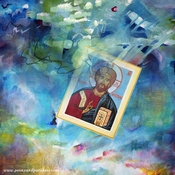
When walking to my home from a group session held at the cellar of the nearest church, I looked at the dark starry sky and admired its deep shade against the white snow. The number of colors that I was able to see was growing all the time.
All this seemed insignificant back then.
I was just filling the moments of boredom while waiting for my life to begin. And then, finally, I grew up, moved away, went to study, met my future husband, got a dog and a good job, built a career, bought a house.
But when I am creating, these events feel less important. Instead, I want to get back to those childhood years trying to remember every single dull moment and detail, including the tone of my yellow bedroom. I am dependable on that boredom. It defines me as an artist. Everything genuine and sincere in my art can be connected with my childhood, with the age of boredom.
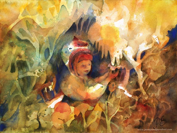
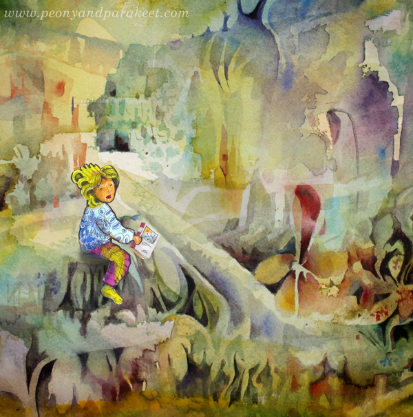
Does your childhood show in your art? Do you aim for the images that you see other people create, or are you geared to finding your own? This is one of the carrying themes in Lesson 2 of Magical Forest, starting on February 1st.
Hop along! The class ends at the end of April, and you will get Lesson 1 right after the registration. >> Sign up here!
Inktober Warm-Up Exercise
It’s soon October and with that – Inktober! Last year, I did all 31 prompts. Read about my previous experience here and here!
This year, I intend to make at least some drawings. And because Inktober was such a great experience for me last year, I want to support you to take it too. Here’s an Inktober warm-up exercise. I hope it inspires you to use inks and black felt-tipped pens to create black and white art. Follow the steps to keep going!
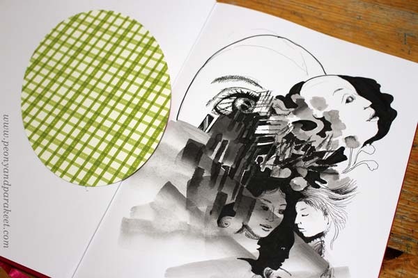
1) Paint an Abstract Composition
Let’s start by playing with liquid ink! Mine is Dr. Ph. Martin’s Bombay India Ink. I make the image on Leuchtturm 1917 Sketchbook.
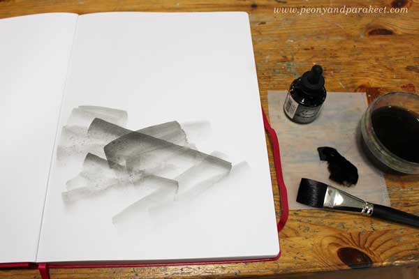
Put a few drops of black ink on a palette. Mix some water to the ink so that it’s grey rather than pitch black. Make some pale strokes with a flat brush. Then add new strokes on the top of previous ones. Work slowly! Enjoy each stroke and the translucency of it.
Turn the brush upward and make narrow strokes by using the tip of the flat brush. Experiment with both wet and dry brush.
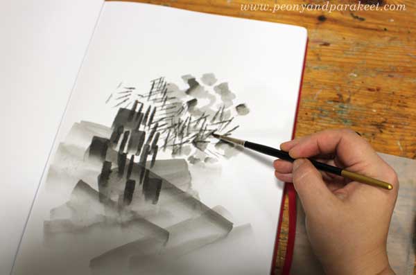
Pick a small round brush and add some ink on the top of the narrow strokes. Now you should have an abstract composition that has a variety of painted elements.
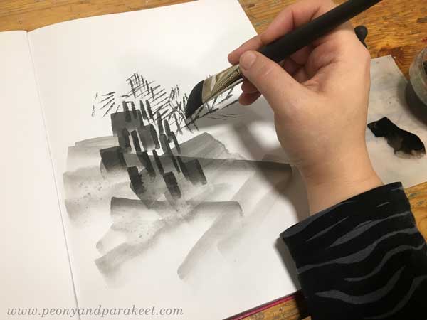
2) Fill Spaces Between the Painted Areas
Use a brush pen or black ink that hasn’t been watered down. Focus on the center of your composition.
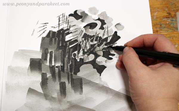
Fill most of the spaces between the painted areas with black ink. Leave some white to highlight the best parts. Black adds depth to the grey composition.
3) Draw Realistic Objects
Select black thin-tipped drawing pens of various thicknesses. I use Copic Multiliners from 0.05 to 1.0.
Choose a realistic object that you want to repeat in the image. My choice was women’s faces. For example, flowers or birds could be great too.
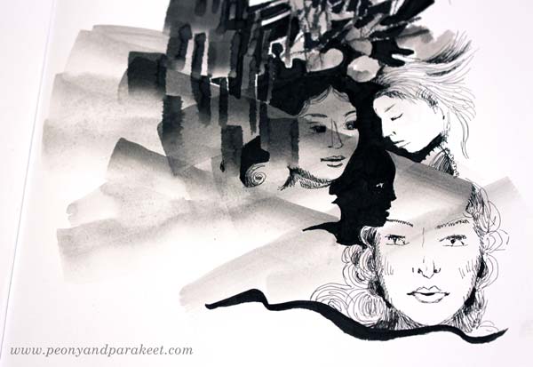
Look at the abstract composition and seek for places where you can add the objects. Add more black, and adjust the shape of the pale areas so that they partly outline the objects. When drawing the objects, play with the scale so that some are big and some small no matter where they are located in the image. All the objects don’t have to be fully visible. Some can hide partly behind the abstract elements.
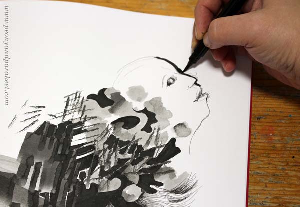
I like to draw faces so that I sketch it first with a thin ink pen, and then adjust it by adding a black element beside the face. (In my classes Animal Inkdom and Magical Inkdom, I show easy step-by-step methods for drawing all kinds of fun figures.)
4) Doodle Decorations
Continue with the black drawing pens, and doodle on the blank and pale areas. I also use a handmade oval template to get a big geometric shape that is fun to decorate.
For decoration, the sky is the limit, but I like jewels, frills, laces, waves, and flowers!
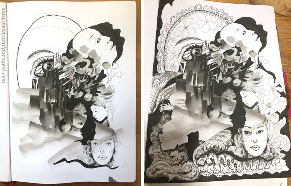
When doodling, I also add shadows to the elements by drawing thin lines side by side.
5) Finishing Touches: Shadows and Highlights
Squeeze your eyes and point all the white areas. Usually, there are too many and it makes the image look busy. Pick a brush and paint most of the white with diluted black ink.
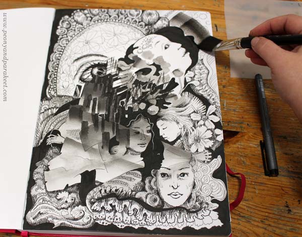
Especially the areas that are near the edges are worth toning down.
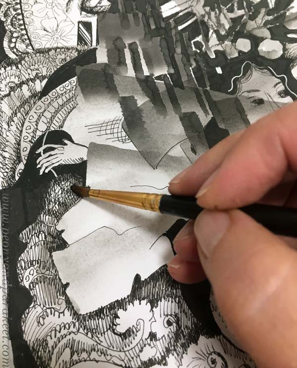
I also like to paint over the shadowed areas to give them a softer look.
White gel pen can be handy for those areas that need a little bit more white.
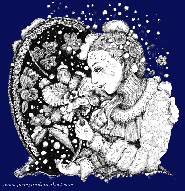
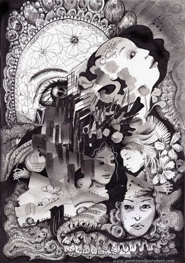
Inktober Warm-Up – Finished Piece
Here’s my finished piece again. See how limited the number of white areas is.
I hope you enjoyed this Inktober warm-up! Tell me – are you going to participate in Inktober?
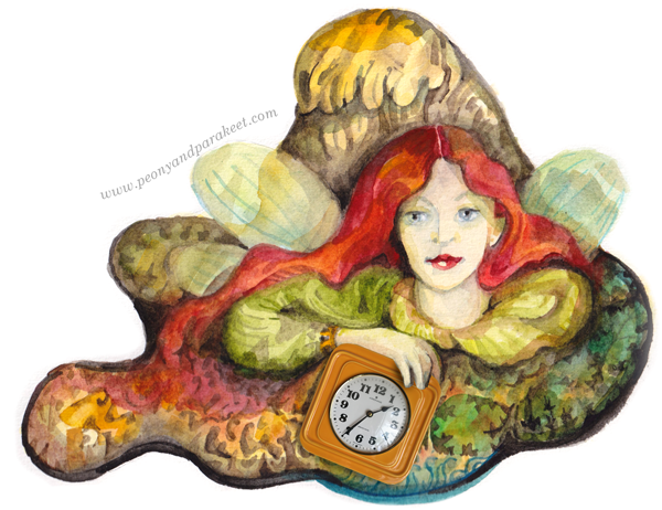
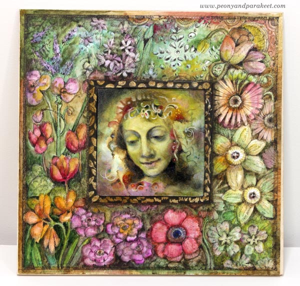
Between Fine Art and Illustration – Combining Both Into One Artwork
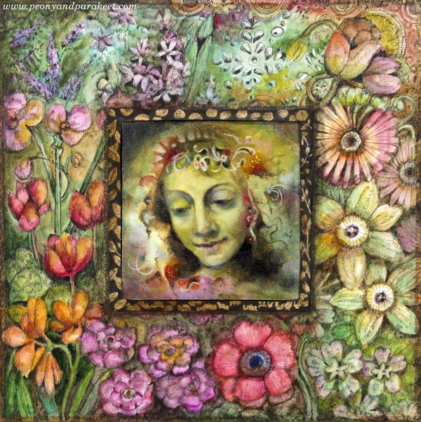
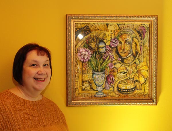
This week, I continue showing pieces that will be presented in the upcoming group exhibition “Flower Gardener’s Diary” (Kukkatarhurin päiväkirja, 9.- 22.9.2019, Hietsun Paviljonki, Helsinki). This one is called “Flower Fairy’s Year.” I will be presenting both paintings and drawings, so I wanted to create a piece that would build a bridge between fine art and illustration. I hope you find this project inspirational!
Inspiration Piece: Wheel of Fortune
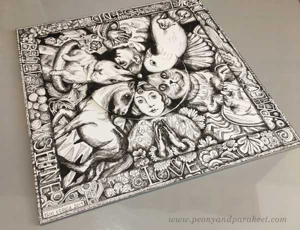
When building the class Magical Inkdom earlier this year, I made a fun drawing called Wheel of Fortune. It has a center that’s separate from the rest of the piece, and it can be rotated so that the heads of the figures change. The bigger drawing is attached on thick cardboard so that it feels like it’s a game board, not just a flimsy piece of paper.
I wanted to use the idea of a separate centerpiece and sturdy base for this project too.
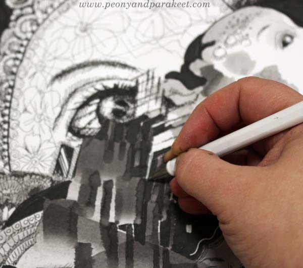
Fine Art Centerpiece: A Miniature Oil Painting
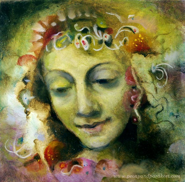
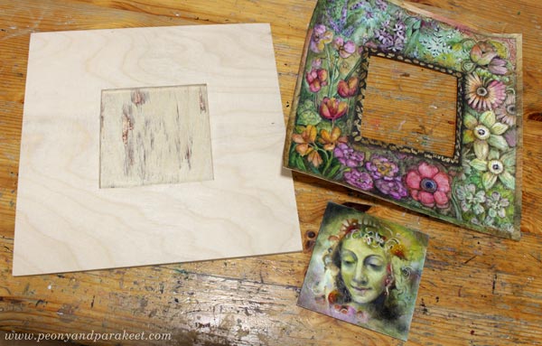
The project started by finishing a miniature oil painting that I suitably had in progress. It’s only 4 by 4 inches.
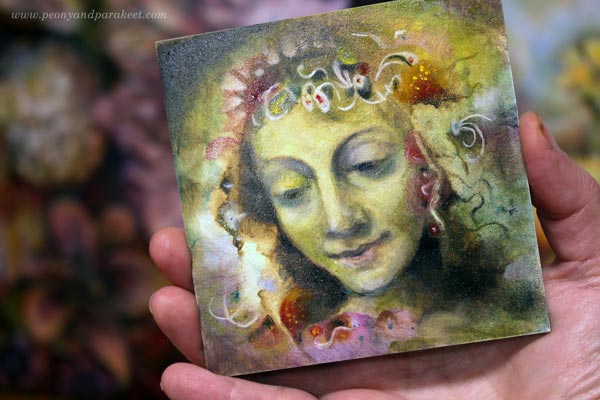
The painting was made very traditionally. I sketched the face with charcoal, and then made an underpainting with umber and white. I used Bernardino Luini’s portrait of Saint Catherine as a loose reference for the facial features.
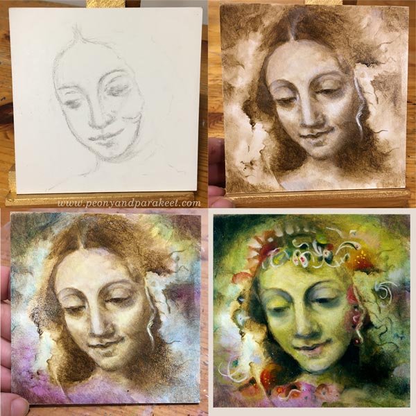
The color layers were thin so that the previous layers stayed visible too. It took a bit of courage to give a green wash to the face, but I really like the result. Decorations were easy and fun. They are quick lines and shapes that make the saint look like a floral fairy.
With oil, the most difficult thing is to wait for every layer to dry separately. Other than that, I find oil easier to handle than acrylic paint.
Illustration: Decorative Flower Frame
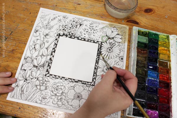
For the frame, I cut a piece of Bristol paper. It’s about 10 by 10 inches.
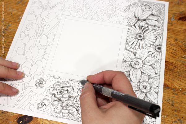
I wanted to include flowers from January to December so that the frame is like a clock that has months instead of hours. The drawing was made with Copic Multiliners (I mostly use 0.05 tip), and I colored it with watercolors.
Plywood Base
My original idea was to cut two layers of cardboard so that the topmost layer would have a 4-by-4-inch hole. But when I told my husband that “Ideally, the base would be wooden”, he went to his workshop and came back with a hand-carved plywood base!
Putting All The Pieces Together
I painted the plywood black near the surroundings of the miniature painting. It makes sure that the plywood won’t show if the piece is observed from different angles. I varnished the oil painting with Gamvar and let it dry overnight. I put a plastic plate over the frame to reduce the curviness of the paper after painting it with watercolors.
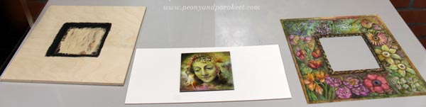
Then I glued the painting to the base with gel medium and attached the frame with double-sided tape. Finally, I marked a line of 0.5 cm from the edge of the base and made sure that the motifs extend there. This piece will be professionally framed, so I didn’t want to leave too much empty space around the edges.
Between Fine Art and Illustration
In the art world, there’s a lot of talk about choosing between fine art and illustration. Many define fine art so that it comes up solely from the artist’s own creative expression when illustration illustrates a story or can easily be used with the text. One way to separate them is the number of copies. Fine art pieces are often unique or manufactured in very limited quantities only when illustrations are more of everyday art, consumed by the masses. Some say that it requires talent to create a piece of fine art, and just art education to create a piece of illustration.
In my artistic path, I have found the definitions both helpful and destructive. It has been essential for me to expand to illustration – to learn how to visualize text and written ideas. It has made me more connected with the surrounding world, and it has also brought me more work. However, I feel that art is free, and without exploring that freedom, it’s also difficult to create insightful illustrations. So I have tried to keep up with both worlds.
However, I hate when people say that you have to choose between fine art and illustration. For me, bringing the two approaches as close as possible has been a working solution. I think this project shows really well how one is not the enemy for the other.
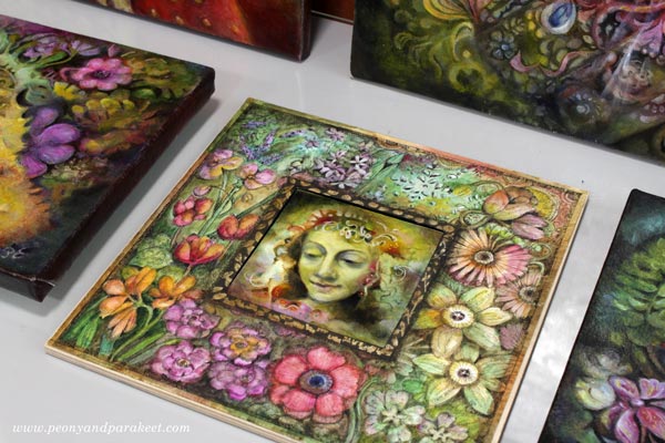
I can’t wait to show you more pieces that I have finished for the exhibition! I will also have many framed and will blog about how I selected the frames in the upcoming weeks. Stay tuned!
Come to draw fantastic art (+ fantastic frames) with me –
Sign up for Magical Inkdom!
Right after the registration, you will get all the lessons, and you are good to start drawing! >> Sign up here!
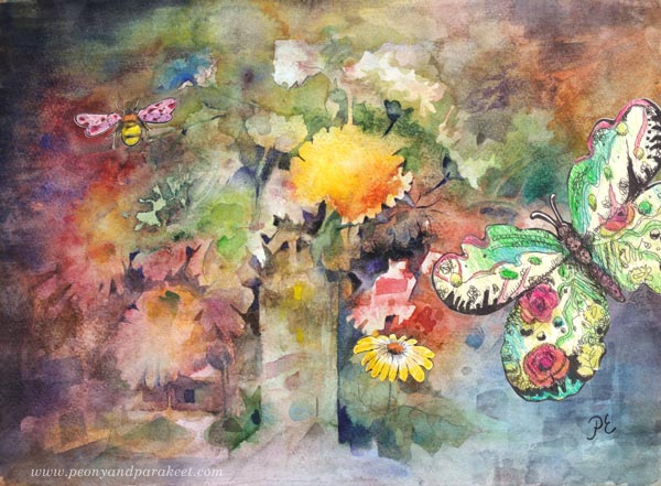
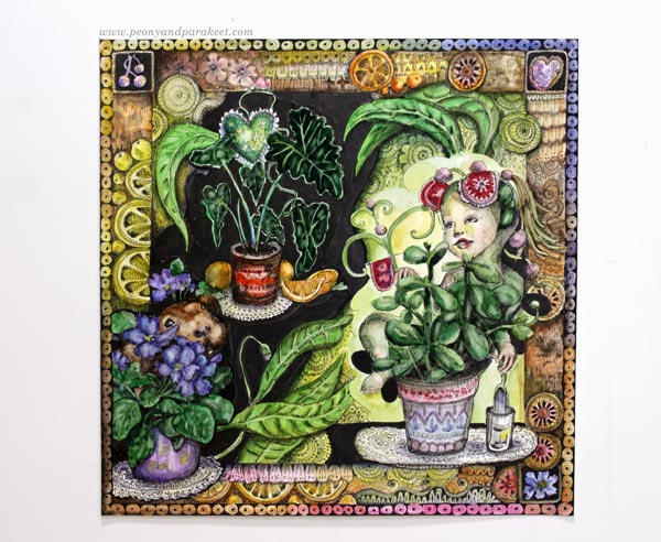
Get Closer to True Artistic Expression – Draw Your Innocent Little Secrets!
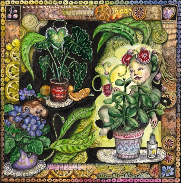
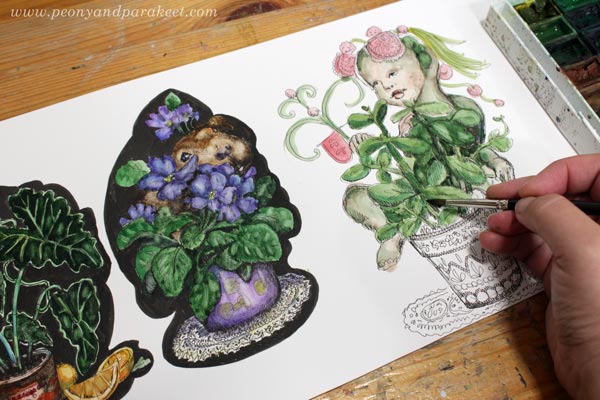
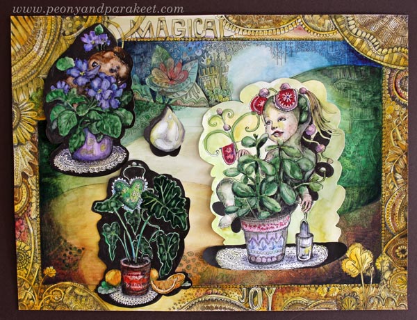
Here’s my latest art project, “The Secret Life of Pet Plants” – an illustration that I have composed of hand-drawn collage pieces. It’s about the love for house plants – the topic that’s close to my heart but that I haven’t touched much lately. I also wanted to include little secrets that I haven’t revealed in my art.
These little secrets are often pretty innocent stuff that we have labeled with words “too childish” or “too weird.” They can become creative blocks and drain our energy if we try to avoid them. Really, life is too short not to get them on paper! We can get more serious after they are out – if we ever want to get back, that is! I think I stay on this track for a while – making art that I have always secretly wanted to see. It feels good to be close to this kind of true artistic expression.
A Couple of My Innocent Little Secrets
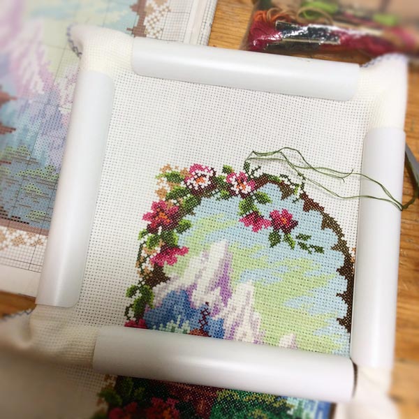
One of mine is my secret admiration for traditional (and often a little bit tacky) cross-stitch designs. They often have decorative borders and look more like a collection of motifs than a real scene.
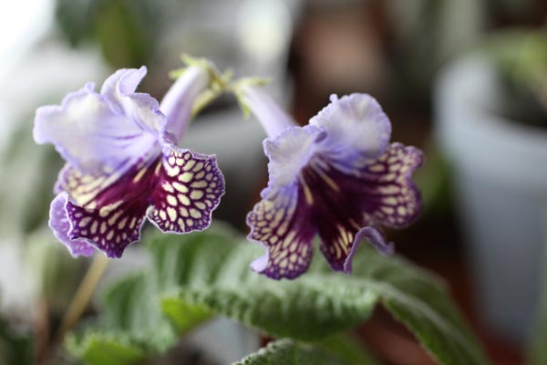
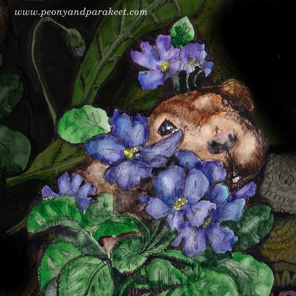
Another one is that, to me, plants are like pets with personalities. We have a lot of plants, both outdoors and indoors, and I feel a deep connection to many.
Here are the steps for an illustration made from hand-drawn collage pieces.
1) Make Small Drawings
I started the process by drawing and coloring the main elements separately.
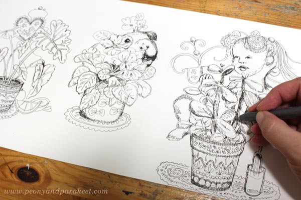
I love using watercolors with smooth Bristol paper. The color is easy to layer and also to wipe off if needed.
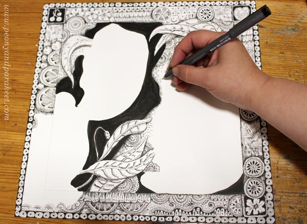
2) Draw the Background
I placed the colored collage pieces on a background that I had made for the class Magical Inkdom and tried how they would work as a composition. I also drew a water drop just in case I needed a small element for balance.
Then I drew a new background and marked the areas where the elements would go.
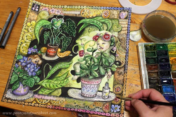
3) Attach the Collage Pieces to the Background
I usually attach collage pieces with gel medium, but this time, I used double-sided tape. It is easier to control, so I didn’t have to worry about having the medium in the areas where I wanted to add more watercolors.
4) Display the Little Secrets!
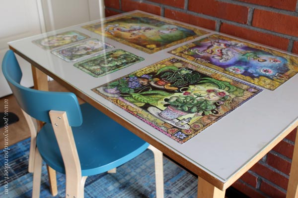
One wall of my studio is white so that I can photograph my work easily. But when I want to display the recent pieces, I don’t leave them on the wall but place them on the side table under a clear plastic plate. I love how this piece fits with the ones I have made for Magical Inkdom. It truly feels my true artistic expression at the moment.
With the African violet that looks like a cuddly guinea pig to me, I want to wish you a happy and creative weekend!
Come to draw fantastic art with me – Sign up for Magical Inkdom!
Right after the registration, you will get all the lessons published so far, and you are good to start drawing! >> Sign up here!