In the Spirit of Cassandra Tondro

This painting is a monotype print where I have added only few collage pieces and a couple of little details with pens. In this artwork, the rooster is waking us up to notice that in art, whether we are makers or viewers, we are always in the middle of an experience. Thus, if you want to become a better artist, you should not focus on the final results only, but also on the experience.
Cassandra Tondro
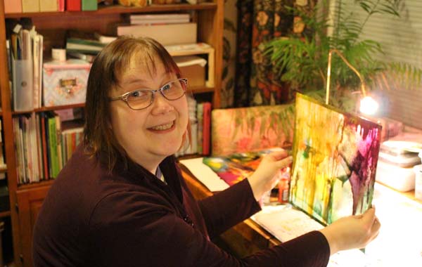
There’s a particular artist that I want to introduce for this subject. She is someone that I greatly admire, Cassandra Tondro. I am most honored to have Cassandra Tondro herself answering to my questions! I also got her permission to publish her photo and my favorite artwork of hers called “Illusion” in this post.

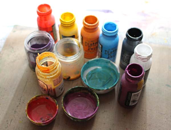
The Supplies
Cassandra Tondro has not only thought through about what kind of paintings she wants to create. She has dug deep into the whole creative process. The development of her current way of working has started steps back from what most of us would think. She wanted to find an environment-friendly solution and discovered a way to work with leftover house paint.
I did not have extra house paint but some odd jars of similar kind of fluid paint like Tim Holtz’s Distress Paint. I also diluted few old acrylic paints with water to get more fluid paint colors.
Working with Colors
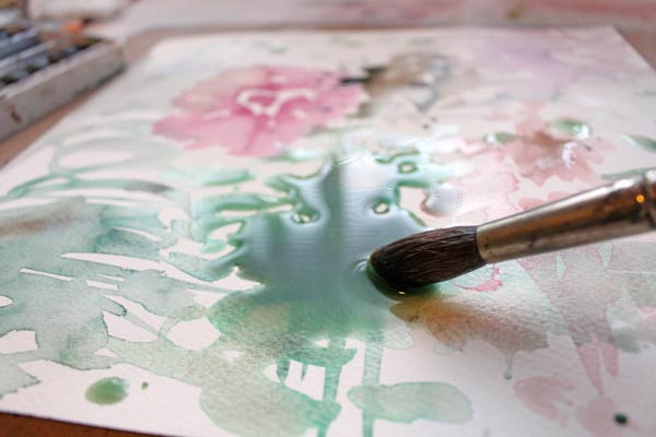
Cassandra Tondro has made videos of how she works with the paint. Instead of plastic sheet and canvas, I decided to use a glass plate with blank watercolor paper. My plate is about 12 by 12 inches.

While I poured colors on the plate, I thought about how suitable this process is when you want to forget the rest of the world and have a quality time with your favorite colors. Cassandra Tondro embraces quietness while working:
I like quiet when I work. My experience is that we are surrounded with so much noise all the time — traffic, cell phones, airplanes overhead, radio, videos, Musak in stores. My studio is my refuge from all of that. I like to be alone in the studio — no phone, no computer, no Internet connection — and I like it quiet.
I agree. This is a process where colors are the music players, and the painter is the maestro, fully focusing on how to make it all work together.
Unpredictability
One general characteristic of art is an unpredictable creating process. While you have to accept more unpredictability than usually, there’s a lot what you can control. Choosing the colors and creating color mixtures is one thing. Composing color areas is another. But as Cassandra says, this is an experimental process. Experimenting is also very freeing. As I was unable to repeat the strokes that I usually do, this process tweaked my style to an unpredictable direction.
Movement
When I pressed the watercolor paper against the glass plate, feeling colors crushing between the plate and paper, I felt like running. This process involves physical movement, even if you are working on the table, instead of laying the paint on the floor like Cassandra does. The action, combined with colors, lifts your spirit, forces you to concentrate and makes you curiously excited.
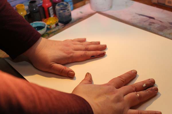
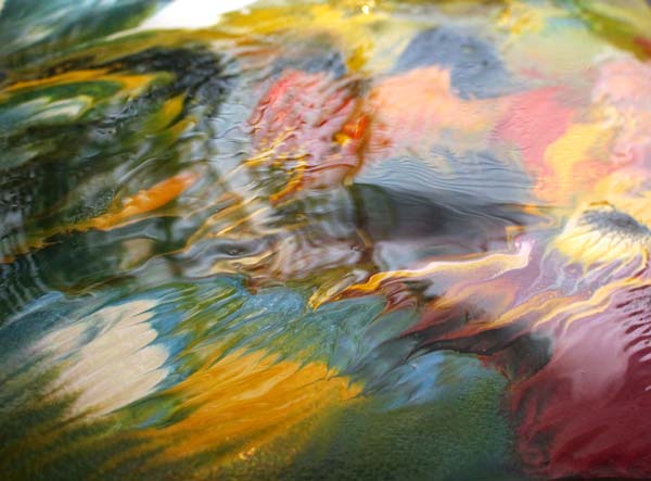
When the paper is turned over, and the artwork is revealed, there’s no quietness anymore! The colors have found their home. They have abandoned the hard glass, and now lie rearranged on the soft paper. A good 24 hours of dry air and they are there to stay!
A warning: Once you have made one, you won’t be able to stop!
I got fascinated by everything, including the cleaning of the glass plate!
Inspiration
I asked Cassandra where she gets her inspiration for painting:
My inspiration often comes from dreams or during meditation. I like to meditate before I start to paint. It sets the mood for creativity, and ideas often occur to me during meditation. Another good source of inspiration for me is taking a walk. Getting outside and walking frees up my mind, and I sometimes get ideas that way.
This kind of art thrives on the freedom. When I look at my pieces, I hear the colors thanking me: “You released us!” And as colors are so close to emotions, it feels like they have been released too.
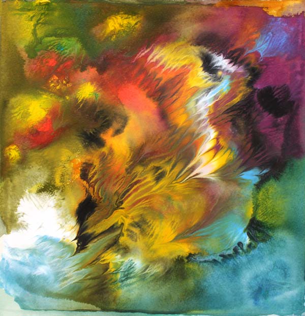
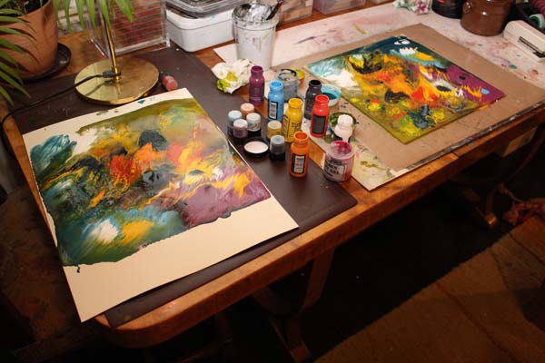
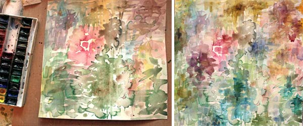
This is the next print after The Rooster.

This piece was made on canvas textured paper instead of watercolor paper. It is not quite as sharp as those made on watercolor paper. If you create small pieces, as I did, I recommend using thick watercolor paper.
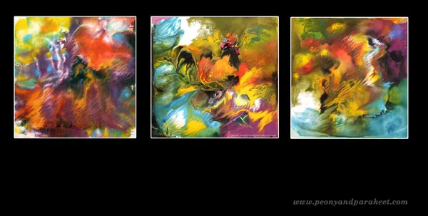
I composed the gallery-style image on a black background, but I think that Cassandra’s work would look beautiful on a brick wall. I like to imagine how the colors would have flown in the air and crashed against the hard blocks.
The more you experiment with this technique, the more you begin to appreciate Cassandra’s paintings. I see her art very powerful. Maybe because it is something totally different from my own, which often includes too much expression, too much explaining. Cassandra’s art is the art of listening. Watching her paintings makes me think: I am free to live, I am accepted, there’s no need for talking.
Let me be your mentor in art: Subscribe to my weekly emails!
More Time, Better Art?
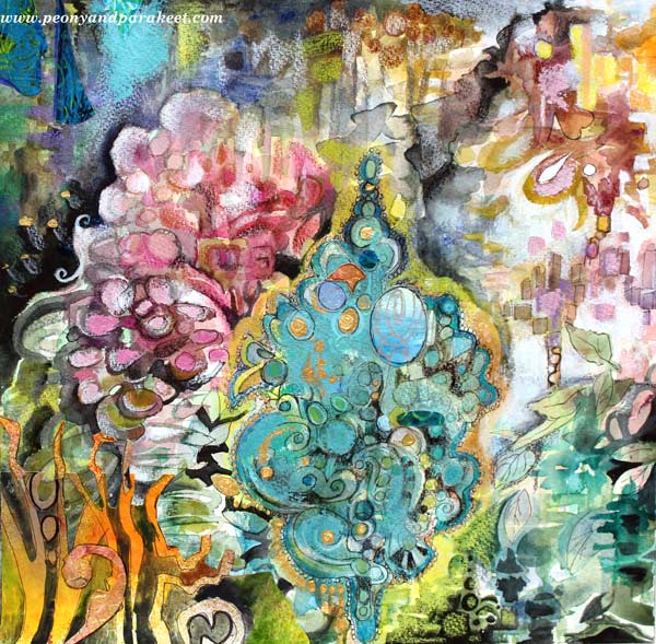
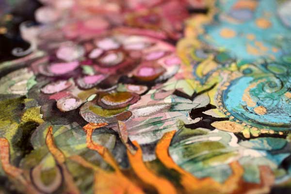
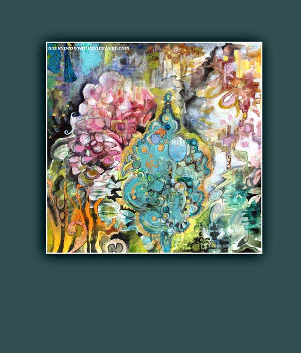
This artwork was inspired by Rococo, the 18th-century-period style with curves, asymmetry, gold, and ornaments. When I think of Rococo, I think of time. How long did it take to sew those elaborate women’s dresses? What about the porcelain table clocks, how many people, how many months did it take to get one finished and working?
The time we are living now is totally different. Not that I want to spend half of my life embroidering one chair. But I cannot help thinking: sometimes we create quantity but not quality. We get frustrated with our lacking skills and weak artistic vision, but often, there’s a simple solution: time. So, instead of creating three pages in a week for your art journal, make one!
Creativity needs time. The first thoughts are often the least innovative. When we take time to dig deeper, we reach not only frustrations but also new solutions.
Working in Short Periods of Time
I used to have a difficult time working in several sessions. I wanted my work to be finished in one go. Leonardo da Vinci certainly did not have problems like that! He spent over ten years painting Mona Lisa. Of course, he did not dedicate all of that time to one painting; he did other things too. But he let his subconscious work during the breaks. So I did da Vinci – while waiting for the watercolor to dry, I engaged myself in other activities.
I built the foundation for this work with several thin layers of watercolors. Then I worked with colored pencils and watercolors to add details. A small flat brush is my favorite when adding details with paint.
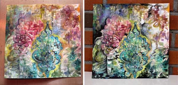
Some might call it finished at this point, but I wanted to add tension and interest. As this was about Rococo, some shimmer seemed appropriate!
Rococo Glitter!
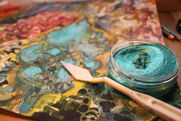
I have a few jars of Inka Gold, beeswax-based metal paint. They seemed just right for this artwork. And speaking of Rococo, some gold would be appropriate too. I love Golden brand’s gold acrylic paint.
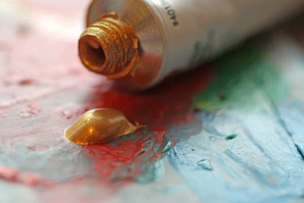
Finishing
Some hand-decorated papers added richness and variation. Then I continued completing the tiny details.
The size of the artwork is 12 inches by 12 inches. It took about three days from start to finish.
The quality of one artwork cannot be measured by the time the artist spent with it. Great art can be born quickly when skills and creativity meet. But on the other hand, if you want to improve your art and increase your creativity, why not focus on one artwork for a bit longer time.
What do you think? Can you make time work for you?
From Movie Posters to Art Journal Pages
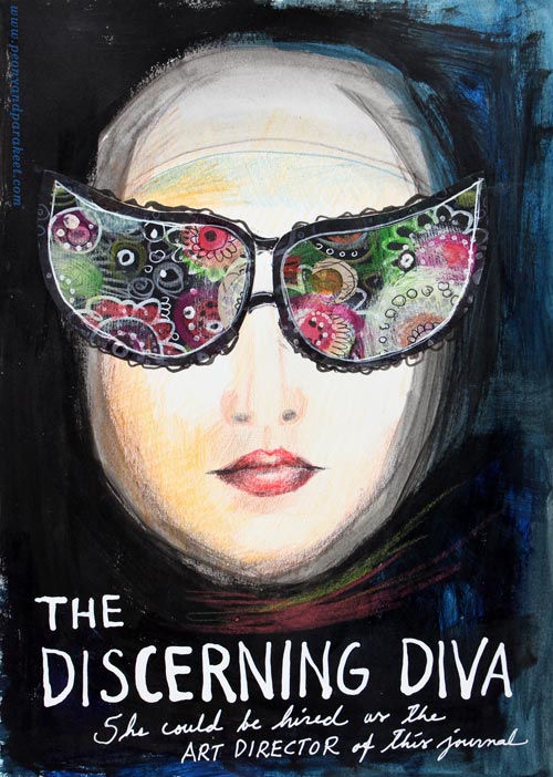
“The Discerning Diva – She could be hired as the art director of this journal.”
This page is my version of the poster for the movie “The Big Lebowski”. I have borrowed the concept of weird glasses and the composition from the poster, but it is still a separate artwork, not an exact copy.
The Discovery of Movie Posters
After learning that I like to use alphabet stamps in the art journal pages, I had been thinking about the next step in journaling. Last week I watched the poster artist James Victore‘s course Bold & Fearless Poster Design on Creative Live. His style has very little to do with mine, but I became fascinated by the visual concept of posters.
Last weekend I found a book about 1990’s movie posters at the local library. I became fascinated by the compositions used in the posters. Then it hit me: maybe I could replace the main elements with my own and apply the visual concept of the poster to my personal stories!
How to pick ideas from movie posters?
I will show you how to make your own “Discerning Diva” (very easy) but before that, I want to show you another poster-inspired page.

The page on the left is inspired by the poster for the movie “The Matrix”. I picked few main elements and the general atmosphere from the poster. The page on the right is made a long time ago, but I like how the two pages tell the story about being inside someone’s brain.
Four tips for picking ideas from the movie posters:
1) Composition: Examine the placement of the title, the grouping of the main elements and the most noticeable color contrasts.
2) Subject: Think about how your life could be applied to the movie.
3) Process: Examine the poster carefully but when you start creating, focus on your page and make it your own.
4) Imagine: Remember that you can replace the elements of the poster with whatever you like. For example, a person can be replaced with a vase of flowers.
Create Your Discerning Diva!
1) Paint the background of the page.
I used acrylic paints to make the background strong and heavy-looking. Leave an unpainted area for the face. Add water to the paint and gently brush the area around the face. Wet strokes create the impression of a thin scarf and add dimension.

2) Color the face.
I used colored pencils to maintain the big contrast between the background and the face. Add some color to the skin. Draw a mouth and a nose.

3) Add glasses.
Go to your box of hand drawn papers. Cut two lenses. Attach with glue or gel medium. Add frames with pens. Make the glasses as decorative as you like!

4) Add text.
Pick a color that has a high contrast with the background and journal on the bottom of the page. I have used a correction pen for the title and a white gel pen (Uni-Ball Signo) for the text below the title.

5) Add finishing strokes.
With colored pencils, add some strokes below the face to represent a scarf.
Add few strokes to outline the scarf near the forehead.
More Ideas for Compositions

Believe or not, this page is inspired by Austin Powers movie poster and hand embroidery! I think that hand embroidery has a lot in common with hand drawing.
Learn to draw from imagination and inspiration!
>> Buy Inspirational Drawing 2.0
Art Deco Journal Covers
My sisters will get empty handmade journals from me for Christmas. They both like writing and literature so I hope they will put the journals in use. My idea is to include some photos, decorative papers, scrap pictures and such – so that the journal is like a handmade version of Smash book more than a basic blank book. I have also chosen the themes for the journals. The older sister will get an art deco themed book and the younger sister will get flowers and fairies. Here’s a snapshot of the latter.
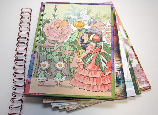
I had an old Elsa Beskow’s children’s book which I used for the cover image. There are plenty of pretty papers too! My other sister would not have this, it is much too cute for her. She likes something more artistic.
I chose art deco as I have been thinking a lot about that style lately. I love the muted, sliding color transitions combined with black and white. And I have been more and more into using graphic, sharp shapes.
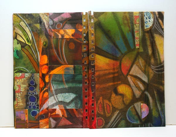
Art Deco Journal Covers
I will show you how I made the covers for the art deco themed journal. First, I picked some Sticky Canvas by Claudine Helmuth Studio. It is a canvas sheet that is like a huge sticker. You can attach it without glue after you have finished it. You do not need sticky canvas for this project. You can use a drawing paper or thin fabric instead.
1) Background Colors
I started with watercolors, then used some Dylusions ink sprays. As the canvas got all wet, it got wrinkled. I emphasized the wrinkles by brushing Distress ink pads against the canvas.
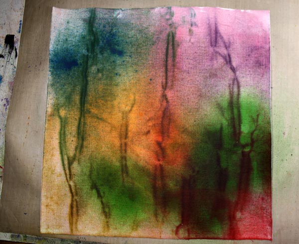
Now I got the muted, soft color transitions. Next task was to add contrasts and sharpness to it.
2) Background Motifs
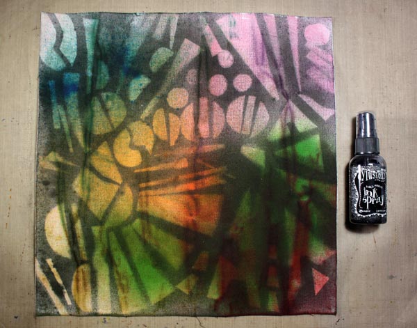
I cut art deco styled shapes from old cardboard boxes and arranged them on the canvas.
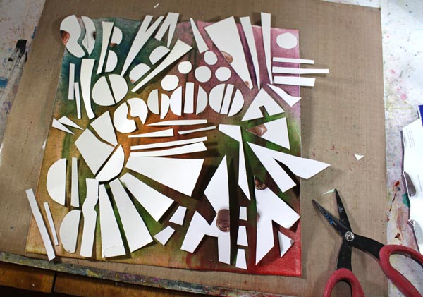
Then I sprayed with the black Dylusions ink spray over the shapes.
3) Finishing the Covers
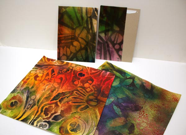
I cut two thick cardboard pieces for covers. Then I covered them with the sticky canvas. I had a couple of handmade decorated papers which I wanted to use too.
I added decorated papers to the covers. Colored pencils were used to highlight the muted tones. The holes were punched with Zutter Bind-It-All. It is amazing how thick it can cut!
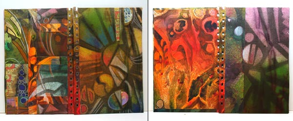
The front and back covers are shown on the left, and the inside covers on the right.
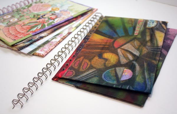
Now I just have to add pages, draw some art deco style ornaments to them and find a photo of my sister where she looks a bit like a beauty of that era!
Art Deco appeared first time in 1920-40s, just after Art Nouveau.
Leave a comment, what do you like in Art Deco or have you noticed it at all? Have you ever made anything Art Deco?