Using Up Old Crayons
This week, we use up those old crayons: oil pastels, soft pastels, Faber & Castell Gelatos, Derwent Artbars … whatever you happen to have!

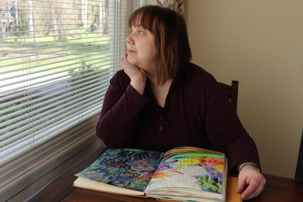
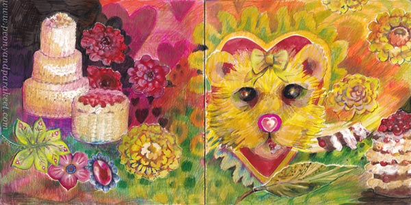
This piece is made of Faber & Castell Gelatos and oil pastels. I used oil pastels a little more than gelatos. The paper is thick mixed-media paper. You can see in-progress photos in the video.
In the video, I talk about old crayons and show several examples of how to use them.
Using Up Old Crayons – Watch the Video!
Here’s the link to the course that I mention in the video: Innovative Portraits
Let’s keep creating art!

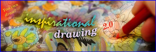
Inspirational Drawing Changed My Life
This week, I share a story about how drawing changed my life – how art can start from discovering your living line and then drawing it over and over again.

Now is also the last chance to buy my course Inspirational Drawing!
The course will go away on April 21st at midnight PDT. >> Buy Now!
Are You Waiting for Your Moment in Art?
10 years ago, I definitely was waiting for my moment. I had dreamed about art all my life. I wanted to find what kind of artist I am and wanted to do it in practice, by creating. So, not be the one who only dreams about art or who only buys art supplies and says: “one day”.
I didn’t want to be remembered as a creative stamper or any other kind of crafter. I wanted to find my way in art-making and art world – not by questioning if I could do it, but simply by drawing and painting so much that I would get my moment.
And I did find my way, and many moments have come. But when things happen for the first time, you don’t quite know it right away. You will recognize the moment that changed your life later. For me, it was when I got the idea of the course Inspirational Drawing.
Over time, the course has had three versions:
- A pilot in Finnish (2015)
- The first version in English (2015)
- The second and the current version in English (2017)
Inspirational Drawing has been my most popular course when counting all the versions together. You could say that my story as an artist started with this course. Now when it’s time to expire the last version, I want to celebrate it by telling its story, which also is a big part of how I found my artistic style and became a professional visual artist.
From Art Journaling To Drawing Freely
Before the deep dive into drawing, art journaling had been my hobby for many years. Here’s a spread from 2013 where I reflect on who I am. The title says: “Kehitä ja sä saat sen” – “Develop and you will get it!

Since my background was in design and IT, I didn’t think I would ever be accepted into art circles. But because I had previous experience in teaching adults, I knew that there are always people who are on your path, but little further behind. And I had many who read my blog. So I started creating online courses in 2014.
I had left my day job, and practiced drawing full-time. The more I drew, the more I noticed how I mostly created circles only.

After making a couple of short courses, I knew I wanted to teach myself to draw and others too. But how to break that habit of drawing closed lines?
I got the idea of long lines that wandered freely on the paper. Some call this method contour drawing, I learned later. But I don’t think contour drawing is quite the same thing, because my method breaks many of its principles. And most importantly, in my method you explore the inner world instead of the outer.

Glimpse into the Past – Watch the 2-minute Video!
In 2015, I held a pilot course on drawing for Finns. It was called “Inspiroidu piirtämisestä” – get inspired of drawing. Here’s some samples from that course in a 2-minute video. This was me 10 years ago – A glimpse into the past!
The Finnish pilot went well and there were also enthusiasm on my blog, so it was clear that I should make the next course in English and make available for art journalers around the world.
Develop and You Will Get It!
I started calling my method “inspirational drawing” because once you get started the drawing itself offers inspiration to draw more.

Even before the first English course was born, an American publishing company offered me a deal to write a book about my method with the title “Drawing Freely.” I declined. I don’t know if it was a wise decision, but I was extremely excited to teach courses and see how the method worked with the course participants.
The first Inspirational Drawing course was published at the end of 2015. Many people got excited about drawing – especially those who wanted to draw freely without models.
>> See this blog post of student work from 2015!
In the first version, I included decorative drawing, but in the second version, I wanted to go even more in an expressive direction. So, in 2017 the first version was archived and the second version, Inspirational Drawing 2.0, was introduced. The core idea of the free-flowing line remains the same, but all the projects were new.
The method of Inspirational Drawing also includes how to collect inspiration from pictures. Choosing images and being inspired by them is part of loving art, and I wanted to build a connection from drawing to it. In Inspirational Drawing, photos and other images are not used as direct references, but as a source of individual ideas such as colors, details, and concepts.
Drawing Changed My Life
You could say that although my current style is best visible in my paintings, it’s largely based on what I have found in the Inspirational Drawing method: the ornamentation of lines, dynamic expression, the freedom to break reality and build a new one.

And today I have been accepted into art circles. I belong to professional artist organizations, collaborate with galleries, and make a part of my living by selling my paintings. I have received grants and don’t feel like an outsider anymore. Drawing truly changed my life.

This change started with the urge to free my pen from drawing just closed circles. When my line opened up, so did my inner world, and finally, the outer world as well. The idea of Inspirational Drawing is summed up in the phrase “You can draw!” With this mindset and enthusiasm for drawing, you can break your mental boundaries. You can question the old answers about how and what to draw.
You Can Draw!
Since 2017, technology has developed, and I have grown as a teacher and artist. Every now and then I remove old courses, and now it’s time to archive Inspirational Drawing.
Inspirational Drawing will go away on April 21st at midnight PDT, but before that, you can purchase it at a sale price. The original price was 109 EUR, but now you can buy the course for only 49 EUR! >> Buy Now!
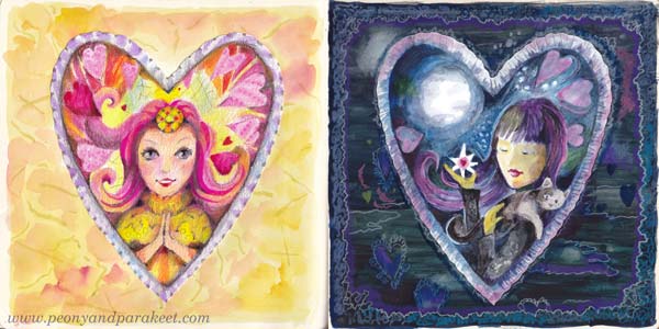
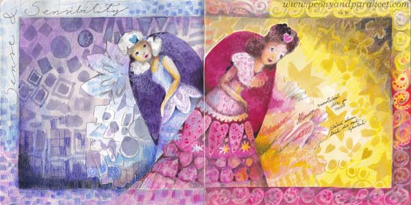
Poetry Girl and Bosom Friends – Start Drawing Again!
Let’s get you out of the creative rut and have quality time with your inner child – the poetry girl in you! Join us for a course that will get you excited about making art again! >> Sign up here!
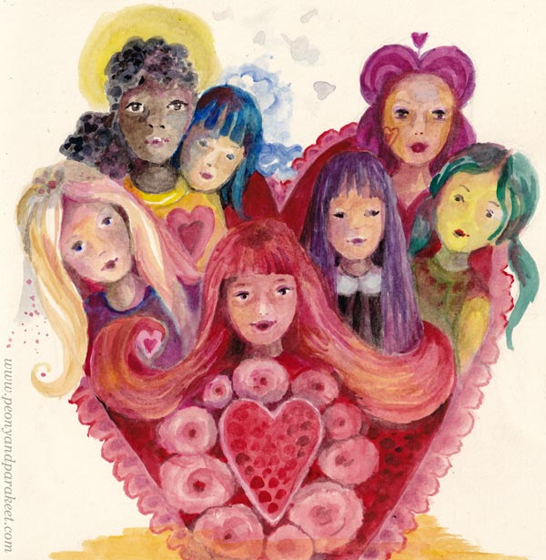
Poetry Girl and Bosom Friends
In Finland we have two lovely words: “runotyttö” and “sydänystävä” – “poem girl” and “heart friend”. Runotyttö means a dreamy young person – poetry girl – and sydänystävä means a close friend – a bosom friend. I think the best courses are like the bosom friends that bring out the poetry girl in you.
They make you see new possibilities, but they do it in a gentle and fun way.
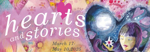
>> Sign up for Hearts and Stories!
Here’s how we get out of the creative rut in the course Hearts and Stories.
Out of the Creative Rut – Step 1
First, we will restore the joy of drawing simple shapes.
Out of the Creative Rut – Step 2
Second, we will go for an adventure that travels from one small picture to another.
Out of the Creative Rut – Step 3
Third, we will find a connection to fantasy through characters.
Out of the Creative Rut – Step 4
Finally, we put everything together so that we are excited to continue creating.
Art is a mood and a direction. It shows where you are, and suggests where you want to go.
Join us for a course that will get you excited about making art again!
>> Sign up for Hearts and Stories!
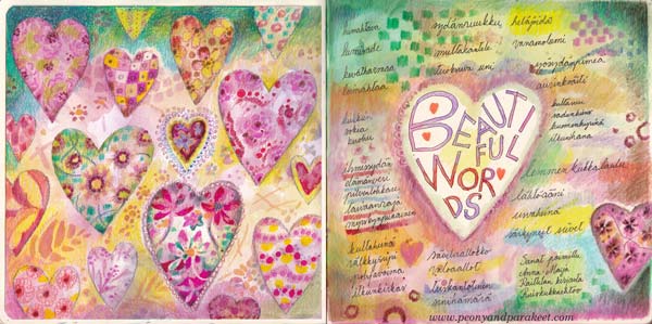
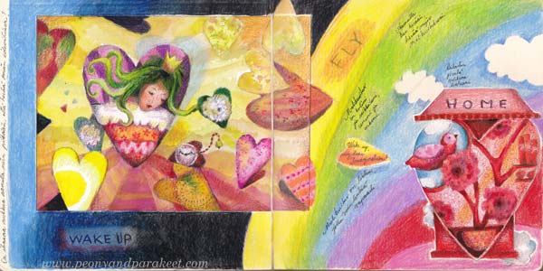
Art Journal as a Storybook
This week, we are looking at an art journal as a storybook, full of fairy tales that are not borrowed but our own.
With this video, I want to inspire you to create whimsical art journal pages that illustrate personal stories. In these pages, mundane things become more fantastical, and there’s no pressure to draw realistic sceneries, real persons, and such.
I say in the video: “As a child, I drew lions without thinking if they were realistic enough. I loved lions, so I drew them, it was that simple. When I cherish the inner child, I don’t expect realistic perfection, neither do I try to control the story.”
Creating a page in your storybook journal can be a creative adventure that gets you hooked on creating.
Art Journal as a Storybook – Watch the video!
In the video, I use watercolors, colored pencils, and fel-tip pens and create a spread in my Dylusions Creative Journal. I start with creating the central heart on a separate paper ( Fabriano Accademia drawing paper, thickness 200 gsm/94 lbs), and then pick one of my boxes of joy to find more hand-drawn collage pieces.
I don’t start with the background, but glue the pieces first, and then combine them by coloring. This vice-versa collage process is fun because we can make odd images work together by drawing and also make them to tell a story.
I also like to start with a simple shape and work from a small detail to a bigger picture. I think this way of creating is exciting and adventurous, and it’s always a joy to see what comes up.
Hearts and Stories – Sign Up Now!
Let’s turn your art journal into a storybook and make the most out of simple shapes!
Hearts and Stories will begin on March 17, 2025. >> Sign Up Now!