Draw Your Own Coloring Page
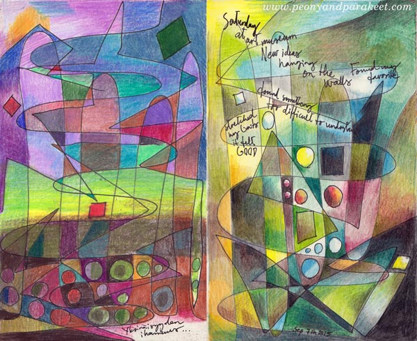
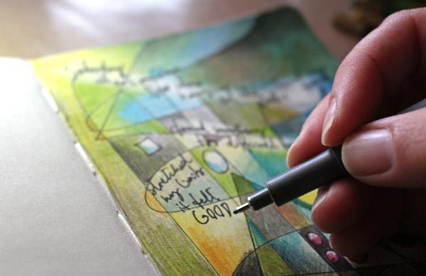
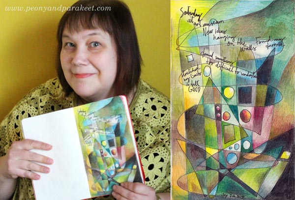
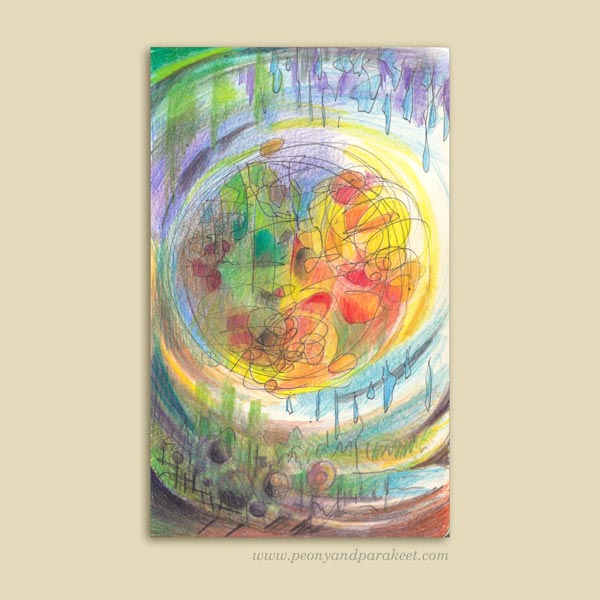
These two art journal pages have been made in the same way: drawing simple lines and shapes and then coloring them with colored pencils. This is a fun exercise especially for those who like abstract art and want to show it in their art journals, and for those who are into coloring but want to create more personal images.
A) Draw a Coloring Page!
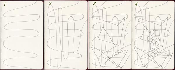
With a thin-tipped drawing pen, create lines and shapes:
1. Draw a wavy line across the page.
2. Draw another wavy line in the opposite direction.
3. Add 1-2 angular lines on the top. The example above has only one long angular line.
4. Add some circles and squares in an area where you want to turn the focus.
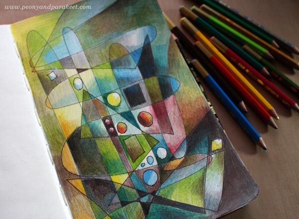
B) Color Freely!
Choose your color scheme and add layers of color.
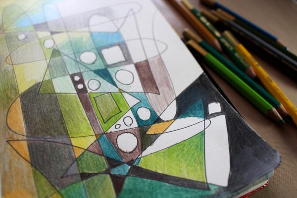
Add even more layers …
C) Add Journaling!
With a drawing pen, add your thoughts on the page. You can erase lighter areas for the journaling.
My page is about my latest visit to an art museum. They are such inspiring places!
Get more coloring instructions: Buy Coloring Freely!
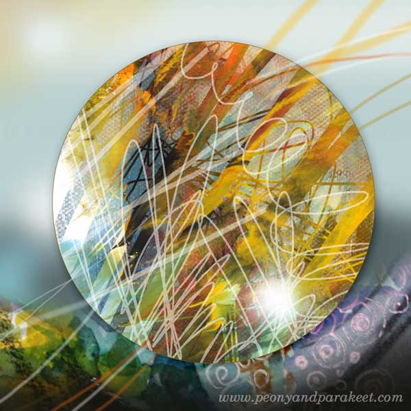
Simple Shape, Plenty of Expression
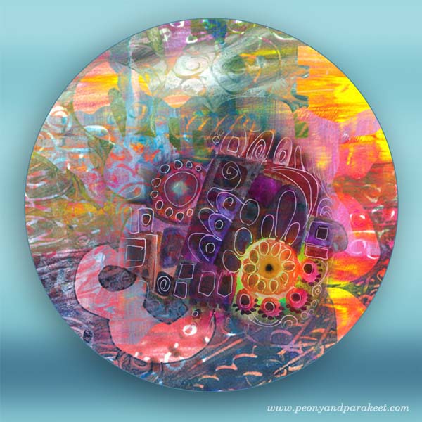
I began to create these circles a while ago. They have been created in Photoshop but they use scanned elements of my hand drawn art. The message here is: don’t wait for a major inspiration or grand idea! Your starting point can be one simple shape. Self-expression does not require complex sketching.
Simple Art Journal Page
Creating an art journal page is easy:
1) Draw a circle.
2) Doodle inside it.
3) Color the page. You can add more details while coloring.
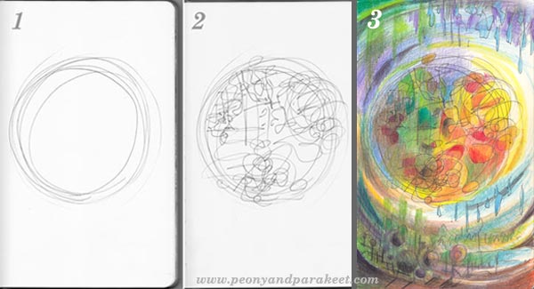
When creating this page, I was thinking about spring. It is amazing how the sun and rain take turns and make everything flourish.
More Inspiration


More fun projects with colored pencils – Buy Coloring Freely!
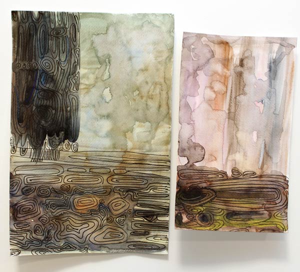
Intarsia in Watercolor
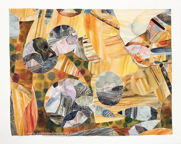
Last week I visited a fascinating exhibition. The gallery displayed Yoshinobu Nakamura’s wood intarsia art. Yoshinobu Nakamura is a Japanese artist living in Finland. He creates masterpieces by combining tiny wooden pieces. I was deeply impressed how the characteristics of various tree species and specimens showed in his work. I wanted to try the subtle color scheme and some kind of intarsia myself. And I did, only using watercolors and watercolor paper instead of natural wooden blocks!
Love for Tiny Pieces
Speaking of tiny pieces of paper, I have always loved them. When I was a teenager, I cut the pieces from magazines and made a mosaic type of work. Some of them never got finished as they were painfully slow to create!
Years later, I made a pen holder for my husband using paper scraps cut from magazines. I carefully covered every surface that could be reached and finished the penholder with gel medium. It has survived at least ten years!
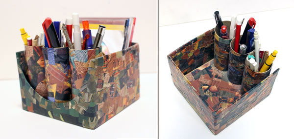
Watercolor Paper Intarsia
But this intarsia project was going to be different from mosaic work. I would not only cut the paper into small pieces but also adjust each piece in line with others! I started the project by painting the papers. For some of the painted areas, I also added lines resembling wood grains with a black drawing pen.
Next, I tried cutting the pieces. I discovered that they have to be put on top of each other, right side up. The cut line will then fit perfectly.
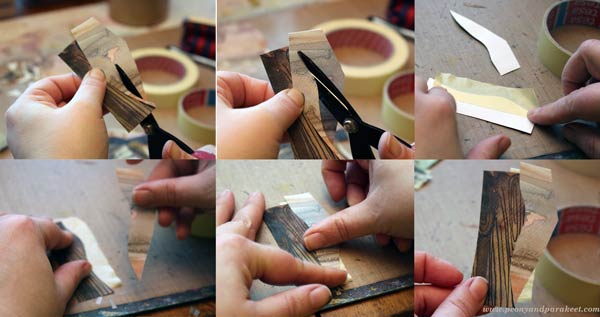
I used masking tape to attach the cut pieces together.
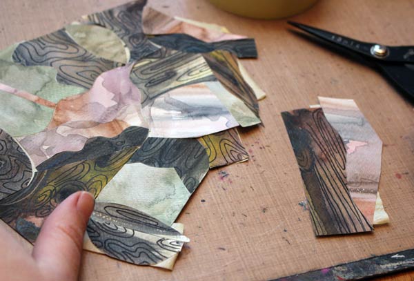
The big piece that I made looked pretty interesting. But it looked even better when the geometric shapes were cut out of it!
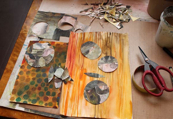
I painted one watercolor paper to look like pine wood. The spotty paper was found from the stash. After hours of cutting and adjusting, the artwork was finally finished. See, all the papers are on the same level, not on top of each other! With intarsia technique, you can use thick papers for collage art!
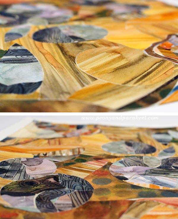
My belief in watercolors continues to stay strong. I love how easy it was to imitate wood with them!

Once the artwork was put together, I attached the piece, with masking tape background and all, onto a white watercolor paper using gel medium. I think I call it “Rolling Stones.” Have fun with this technique!
Let me be your mentor in art: Subscribe to my weekly emails!
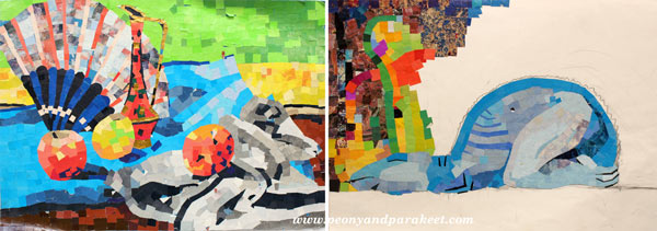
From Movie Posters to Art Journal Pages
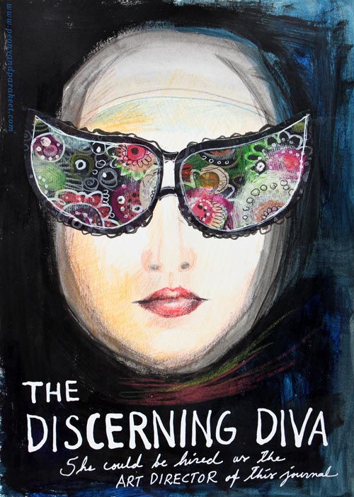
“The Discerning Diva – She could be hired as the art director of this journal.”
This page is my version of the poster for the movie “The Big Lebowski”. I have borrowed the concept of weird glasses and the composition from the poster, but it is still a separate artwork, not an exact copy.
The Discovery of Movie Posters
After learning that I like to use alphabet stamps in the art journal pages, I had been thinking about the next step in journaling. Last week I watched the poster artist James Victore‘s course Bold & Fearless Poster Design on Creative Live. His style has very little to do with mine, but I became fascinated by the visual concept of posters.
Last weekend I found a book about 1990’s movie posters at the local library. I became fascinated by the compositions used in the posters. Then it hit me: maybe I could replace the main elements with my own and apply the visual concept of the poster to my personal stories!
How to pick ideas from movie posters?
I will show you how to make your own “Discerning Diva” (very easy) but before that, I want to show you another poster-inspired page.

The page on the left is inspired by the poster for the movie “The Matrix”. I picked few main elements and the general atmosphere from the poster. The page on the right is made a long time ago, but I like how the two pages tell the story about being inside someone’s brain.
Four tips for picking ideas from the movie posters:
1) Composition: Examine the placement of the title, the grouping of the main elements and the most noticeable color contrasts.
2) Subject: Think about how your life could be applied to the movie.
3) Process: Examine the poster carefully but when you start creating, focus on your page and make it your own.
4) Imagine: Remember that you can replace the elements of the poster with whatever you like. For example, a person can be replaced with a vase of flowers.
Create Your Discerning Diva!
1) Paint the background of the page.
I used acrylic paints to make the background strong and heavy-looking. Leave an unpainted area for the face. Add water to the paint and gently brush the area around the face. Wet strokes create the impression of a thin scarf and add dimension.

2) Color the face.
I used colored pencils to maintain the big contrast between the background and the face. Add some color to the skin. Draw a mouth and a nose.

3) Add glasses.
Go to your box of hand drawn papers. Cut two lenses. Attach with glue or gel medium. Add frames with pens. Make the glasses as decorative as you like!

4) Add text.
Pick a color that has a high contrast with the background and journal on the bottom of the page. I have used a correction pen for the title and a white gel pen (Uni-Ball Signo) for the text below the title.

5) Add finishing strokes.
With colored pencils, add some strokes below the face to represent a scarf.
Add few strokes to outline the scarf near the forehead.
More Ideas for Compositions

Believe or not, this page is inspired by Austin Powers movie poster and hand embroidery! I think that hand embroidery has a lot in common with hand drawing.
Learn to draw from imagination and inspiration!
>> Buy Inspirational Drawing 2.0