New Free Mini-Course for Subscribers
Great news! I have updated the free mini-course “Paint the Emotion” and it’s now called “Color the Emotion.” I have added a new project with colored pencils and more talk about how to approach art-making. The mini-course is about 40-minutes long and it’s available for all the subscribers of my weekly emails.
Here I am talking about the free mini-course in a video:
P.S. If you are already subscribed, no worries! I will send you an email today with the link to the mini-course!
Joyful Flowers and Exploring Joy with Colored Pencils
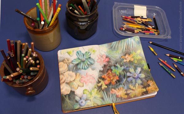
Let’s draw joyful flowers together, step by step! This post is enabled by the grant that I got from Arts Promotion Centre Finland. This is the fourth blog post of the project, see the first one here, the second one here, and the third one here!
Here’s what we will create: flowers that have joyfully gathered together and reach towards the light. No references, imagination only!
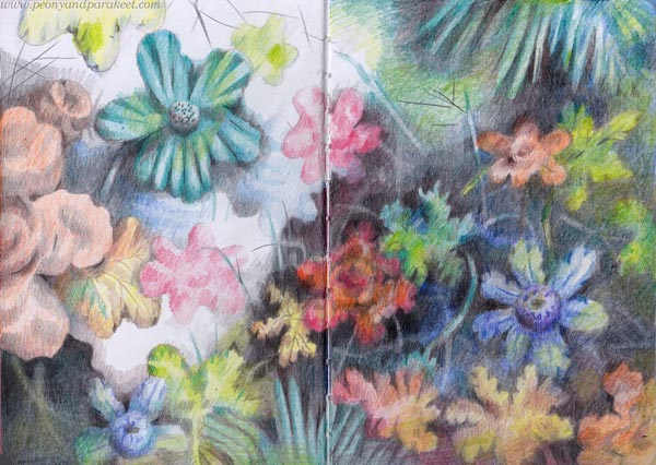
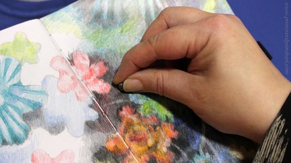
I made the drawing in my colored pencil journal and used colored pencils only. But these instructions can be easily applied to other mediums too.
Step 1 – Flowery Blobs
Pick a pencil of any color and draw blobs.
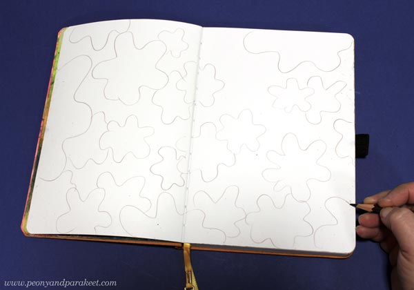
More than perfecting each flowery blob, make sure that the blobs are:
a) not similar in size – draw small, medium, and big blobs!
b) not separate – draw some only partly so that they go on the back of others!
c) not fully on the paper – draw some near the edges so that they are only partly visible!
d) not spread too evenly – leave some space too, but don’t place it in the middle!
This way, you set the foundation for joyful flowers so that you express diversity (a), togetherness (b), continuity (c), and freedom (d).
Step 2 – From a Blob to a Flower or a Leaf
Pick flowery colors and a black pencil for the background. Focus on the area in the low middle and work towards either side of the paper.
With black, color notches on the blobs so that they begin to look like flowers.
With bright and flowery colors, color some random shapes on the blobs.
Color a center for the blob to make it look more like a flower.
All the blobs don’t need the center; they can be leaves. You can also draw veins on them.
Add many colors so that the leaves and flowers look lively. Layer colors to get a variety of tones.
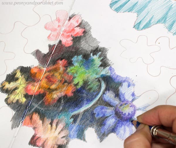
Step 3 – Background
Start with the black background, but gradually change to lighter tones. Leave a pitch-black area small, and add layers of other colors, like blue, on the top of the black, then gradually let the different colors take over. Leave a blank area too. Color softly and gently so that every layer adds intensity to the drawing.
One of the joys of coloring is to relax and not rush at all. Stay in a small area and work with a few flowers only (Step 1) before feeling confident enough to expand the working area and focus more on the background.
Step 3 – Setting the Colors for Joyful Flowers
You can mark the colors for each flower and leaf by coloring them carelessly first.
When some parts are more finished than others, there’s both joy of looking and joy of coloring!
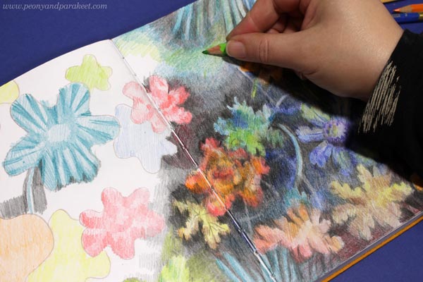
Step 4 – Changing Most Whites to Pastels
I assume that you now have white everywhere: between the strokes, near the edges, in the flowers, and in many places on the background. But let’s change that! Leave only one area in the background that’s pure white and color over other blank parts.
Add more color on the areas where careless coloring has left white stripes, and change the larger white areas to pastel colors. All this makes the image more joyful because the joy is in the nuances, not in the big changes.
Step 5 – The Joy of Cohesion
One of the greatest joys in art-making is to feel togetherness. So more than trying to achieve a particular style, I make changes to the image so that it feels like a place where I belong. I also want my flowers and leaves to look happy, but not so that I force them to smile by throwing “happy colors” but imagining that everyone has a friend in the scenery: someone to trust and lean on.
I also make some flowers look like me: who need to feel free to bloom. So they are less defined and almost disappear into the light, but their spirit still looks strong. So, the less realistic a flower is, the more room there’s for the expression.
At some point in art-making, I begin to question if other people will like the image. It’s comforting to know that if we manage to create the feeling of effortless belonging, the image will naturally resonate more widely. The joy of cohesion also allows something to go wrong and become different than we expected. If we make every element feel accepted and welcomed, joy will naturally appear.
I a flower or a leaf looks lonely, add a stem that connects it with others. Long lines can look commanding and stiffen the image, so erase a glimpse of a stem only. Stems also look more natural if they don’t start right from the flower but appear and disappear as softly as possible. Stems can also go across each other and form a connecting mesh.
When one flower leads to another, and the eye always finds a clue about where to look next, cohesion is present.
More Inspiration for Joyful Flowers
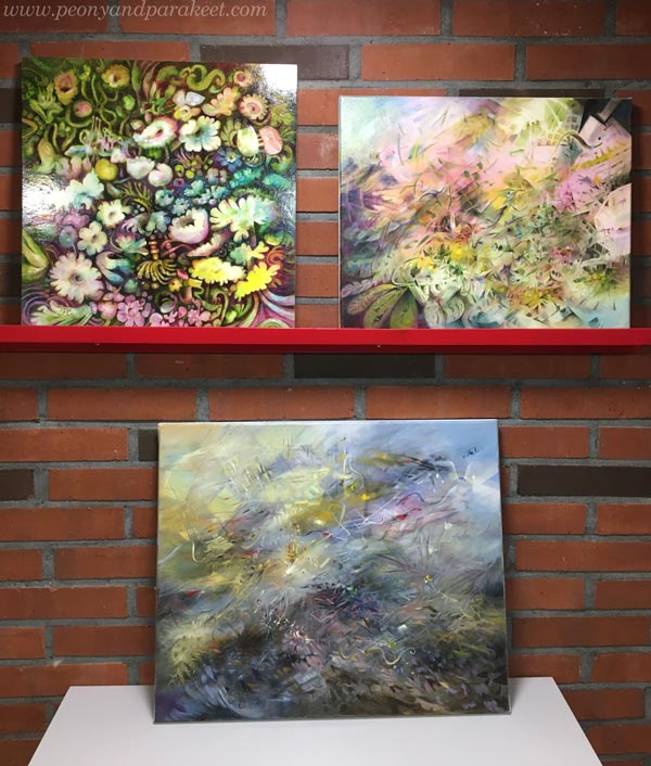
I have got so many ideas from flowers that even when I don’t create them, my visual language is very flowery.
This week, I started two big oil paintings. These are 120 x 100 cm – it’s the biggest size that I have ever painted!
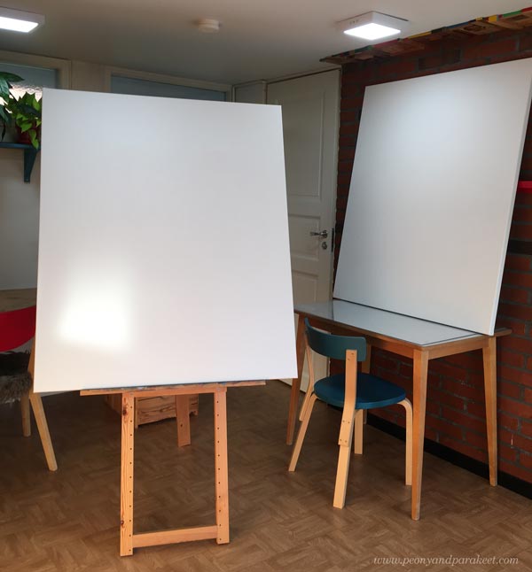
My first inspiration source for these is floral still lives from the 17th century. But these are just beginnings, and let’s see how they will progress in the upcoming weeks.
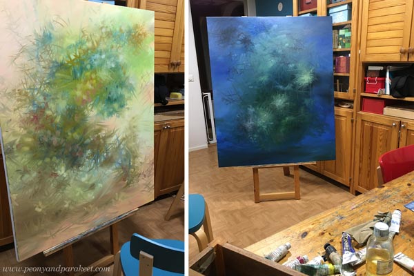
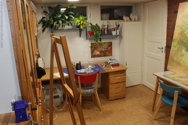
My little studio has been full of projects this week and will continue to be so!
I hope this blog post inspires you to create joyful flowers – big or small, pencils or paints!
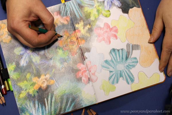
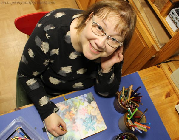
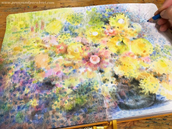
How to Color like Monet – Step by Step Instructions
This week, I share the newest spread in my colored pencil journal and show how to make pages in Claude Monet‘s style.
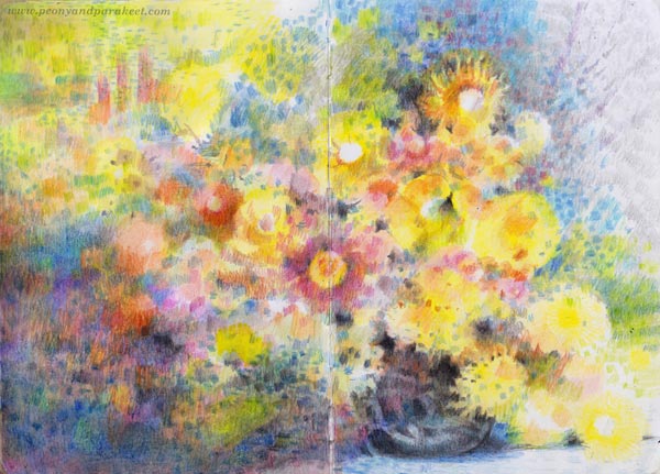
This project is just simple flowers in a vase, but the layering of colors in an impressionistic style makes it special.
Supplies – Colored Pencils and Paper
I used watercolor pencils but mostly dry, so you can have any colored pencils for this project. My selection has some fancy Caran d’Ache Museum Aquarelle pencils, but mostly old Staedler Karat watercolor pencils.
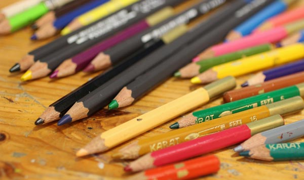
Karat pencils are getting so short that I need an extender for convenient coloring, but they look endearing and I want to give them a long life!
Step 1 – Color Circles Across the Page
Let’s begin with circles. Color a variety – full circles, half-circles, hollow and filled ones, big and small! Pick only a few colors first, and only fill a diagonal that goes across the paper.
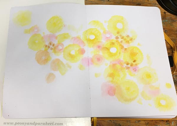
Color lightly so that you can add more layers on the top later. If you have watercolor pencils, you can spread the colors with water.
Step 2 – Color Short Stripes on the Top
Color short stripes over the circles. Now you can use a wider variety of colors and enlarge the size of the colored area.
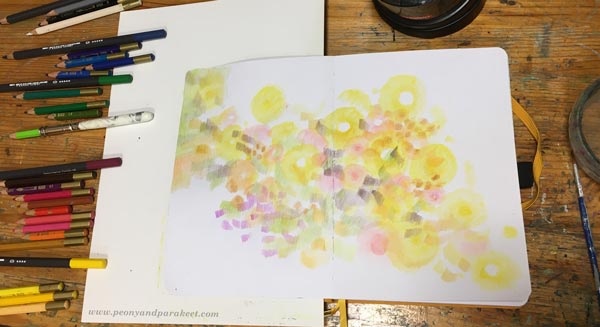
I arranged my pencils so that they are grouped by color families. It helped a lot in this project, especially for the color areas in the next step.
Step 3 – More is More!
Continue coloring circles and stripes in various sizes and colors so that they fill the paper.

You can have so short and tiny stripes that they are more like spots. Stripes can go in different directions. Change the orientation of the paper once in a while.
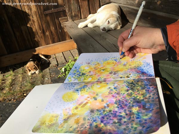
Even if you color tiny elements, divide the page into big areas. The diagonal in Step 1 is one of them. Each area can have many layers and colors but decide which color will dominate. For example, I have a blue area on the left bottom corner.
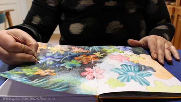
Step 4 – Color a Dark Vase
Color dark stripes on either side of the centerline to form a vase. Leave some space between the stripes so that it looks like it’s dark glass.
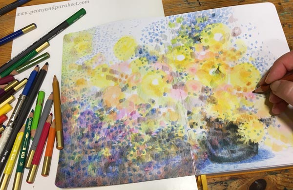
You can also add some shadows below the vase to make it look more like Monet’s work. I used blue for them.
Step 5 – Highlight the Best Flowers
Add more bright colors and details to make a few flowers that catch the eye more than others.

I don’t draw any outlines, but continue to color freely in short strokes.
Step 6 – Make Sure That You Have Enough Variety
Color more so that you have a wider variety of colors and shapes. See how I have used both vertical and horizontal stripes on the left top corner. They look a bit like windows or trees. Monet often had abstract elements like these in his work.
When you color more, make sure that blank paper isn’t visible everywhere. Color lightly over the areas that are less important. When they don’t have any bright white, the overall impression is less busy.
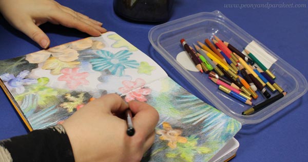
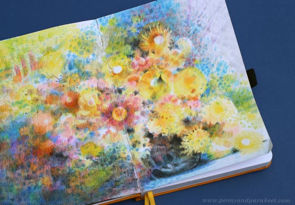
Step 7 – Finishing Like Monet
Go through your colorings one more time. Color lightly over large areas to make them look more unified and add dark spots near the best details so that they become more noticeable.
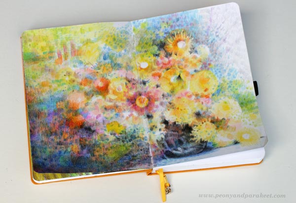
Here’s a closeup of the finished work – lots of small dots, stripes, and layers!

Colored pencils are very versatile. You can really color like Monet! I like this painterly look a lot.
P.S. For more colored pencil inspiration, sign up for Intuitive Coloring!
P.P.S. Thank you all who have signed up already, we will have a lot of fun!
Expressive Abstract Style Tutorial – Paint a Beautiful Mess!
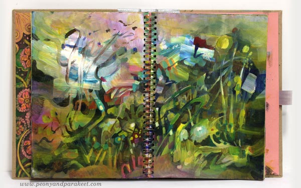
This week I have a video about painting in an expressive abstract style. It’s a very contemporary style which many artists have nowadays. It’s based on loose strokes, and I guess it’s the style that many who are not so much into art say that even a child can do it, but it’s not quite like that! Watch the video!
Are you interested in creating abstract art? Do you wish to learn more about abstract art in my blog and in my classes? Leave a comment!