Hearts and Stories - Sign Up Now!

Peony and Parakeet

Fly to Your Inner World and Color the Emotion

A Step by Step

Helene Schjerfbeck – Step-by-Step Formula for Her Style

Portraits in the style of Helene Scherfbeck, by Paivi Eerola from Peony and Parakeet. See her step-by-step instructions!

In this blog post, I will show you how to create a stylish portrait and learn from a Finnish artist Helene Schjerfbeck (1862-1946).

The Famous Helene Schjerfbeck

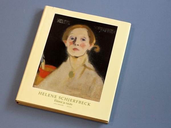
Helene Scherfbeck had an impressionistic and fairly detailed style. But during the years, she became a true expressionist, a master of expressing the most essential through simplifying. She painted a lot of portraits, and many of them have become very valuable. The Red Haired Girl II was sold for 1.5 million euros at Sotheby’s last year. One of my aunts admired Helene Schjerfbeck, and many years ago, she bought me a book about her paintings. The book is called “Helene Scherfbeck – Elämä ja taide” (Life and Art), and it’s written by Lena Holger. To be honest, I wasn’t a big fan of the style and didn’t even browse the book for years. But the more I have learned about art, the more enthusiastic I have become to study various styles. As I love to figure out a formula behind a style, it started to feel tempting to solve Helene’s secrets too.

Helene Scherfbeck - Elämä ja taide, a book about a famous Finnish artist, written by Lena Holger, published by Otava.

Independent Visions – Helene Schjerfbeck in New York!

There’s also another reason why I am writing this. Currently, there’s a rare opportunity to see Finnish female masters in New York, USA.   The Ateneum Art Museum, which is part of the Finnish National Gallery, displays an excellent exhibition at Scandinavia House from 29 April to 3 October 2017. The exhibition presents four early 20th-century Finnish artists from the Ateneum collection: Helene Schjerfbeck, Sigrid Schauman, Ellen Thesleff and Elga Sesemann. If you visit New York this summer, do go and see it, I promise you won’t be disappointed!

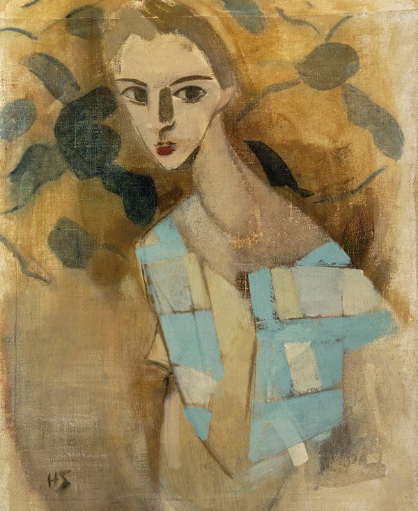
Here are a couple of Helene Scherfbeck’s paintings that you will see there.

Helene Schjerfbeck: Girl from California I (1919). Finnish National Gallery/Ateneum Art Museum, The Kaunisto Collection. Photo: Finnish National Gallery/Hannu Aaltonen.

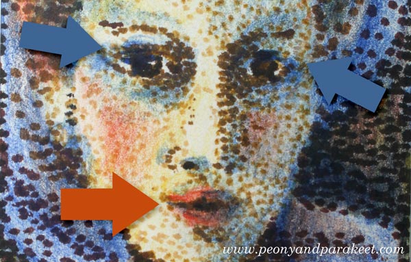
I find the abstract nature of Helene’s style especially fascinating. The way she simplifies the spots where the light hits or where a shadow is formed is like she is building an abstract composition instead of painting a face.

Furthermore, the girl below is wearing a shawl that is like an abstract painting!

Helene Schjerfbeck: Girl from Eydtkuhne II (1927). Finnish National Gallery/Ateneum Art Museum, The Kaunisto Collection. Photo: Finnish National Gallery/Hannu Aaltonen.

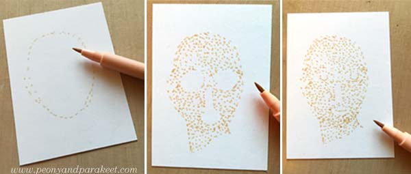
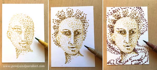
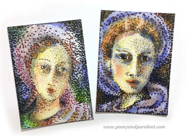
Mixing Helene Scherfbeck’s Style with My Personal Approach

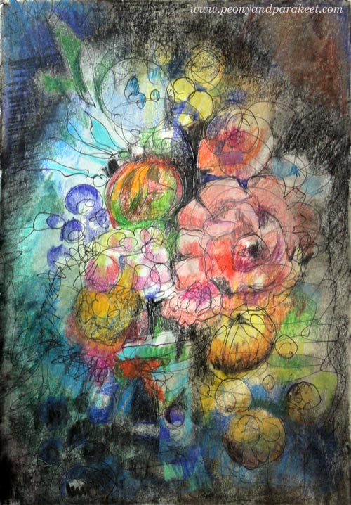
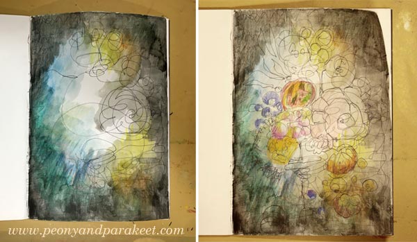
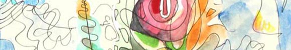
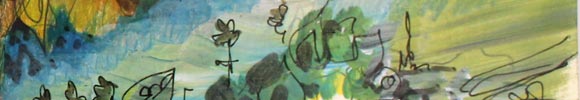
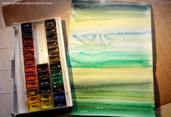
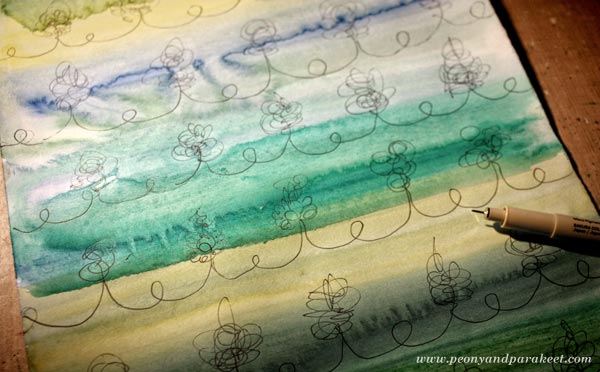
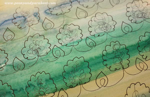
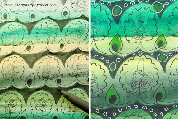
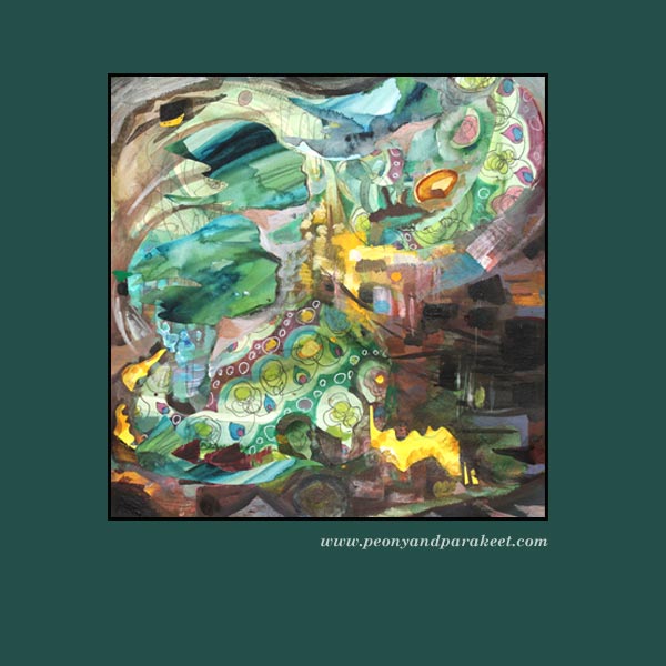
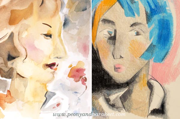
One primary factor in building a style is the shape of the elements. I for one love organic elements and flowing form. Simple rectangles are not as appealing to me as more complicated and diverse shapes. However, I wanted to add Helene’s twist to a couple of watercolor paintings. As Helene Scherfbeck also painted still-lifes, I decided to paint a woman with a flower or two. First, I made a tiny painting and played with layers to create angular shapes. Then I painted a bigger watercolor painting with familiar flowing shapes but using the insights that I had got by painting the first one.

Watercolor paintings by Paivi Eerola from Peony and Parakeet.

After these two paintings, I was ready to record a simple formula for achieving Helene Scherfbeck’s style.

The Formula for The Modern Woman – Step by Step!

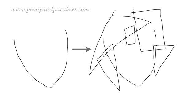
During this drawing process, improvise, but also check that your drawing is not symmetric. It makes the drawing dynamic and reduces stiffness.

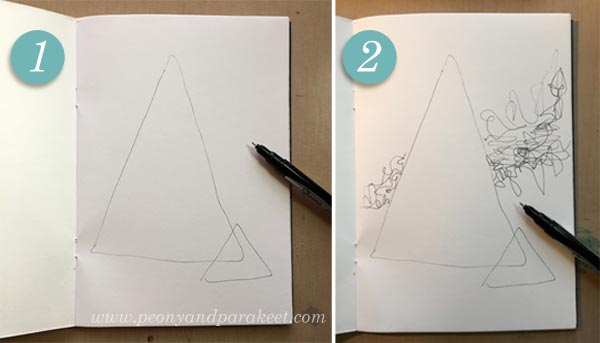
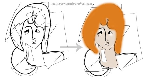
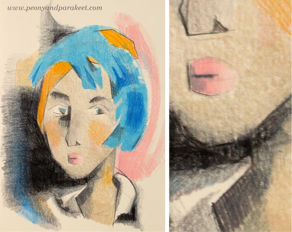
1) Draw a couple of arcs to create a face. Then add rectangles and triangles for hair. It is a fun and easy way to add hair without focusing on the shape of the head.

A step-by-step guide to drawing a portrait in Helene Schefbeck's style, by Paivi Eerola from Peony and Parakeet, step 1.

2) Add a neck and shoulders by drawing a rectangle and a couple of triangles that point to different directions. Then draw eyes, mouth, and other facial features. Use as many geometric shapes and simple lines as you can. After facial features, turn the work upside down and complement the drawing with geometric shapes so that it’s more like a balanced, asymmetric abstract painting than a portrait of a woman.

A step-by-step guide to drawing a portrait in Helene Schefbeck's style, by Paivi Eerola from Peony and Parakeet, step 2.

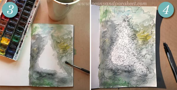
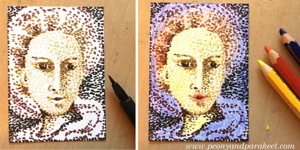
3) Soften the shape of the hair, the clothing, and some of the facial features. Then color the face, neck, and hair. Helene Scherfbeck often used grayish colors for the skin and a more striking color for the hair.

A step-by-step guide to drawing a portrait in Helene Schefbeck's style, by Paivi Eerola from Peony and Parakeet, step 3.

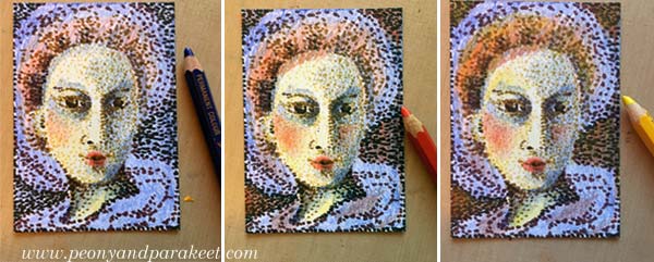
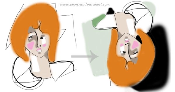
4) Add light and shadows on the face. Use mostly simple geometric elements.  Then turn the work upside down and finish the abstract composition by using color to balance the painting. Remember to maintain the asymmetry!

A step-by-step guide to drawing a portrait in Helene Schefbeck's style, by Paivi Eerola from Peony and Parakeet, step 4.

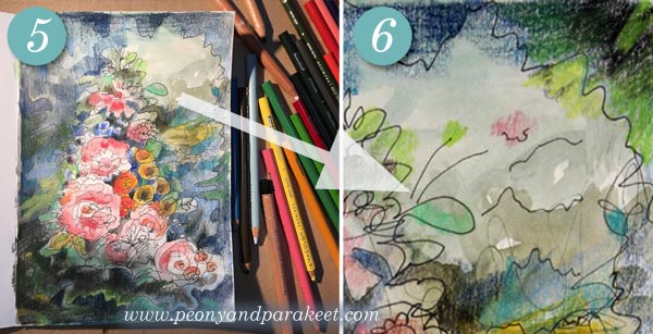
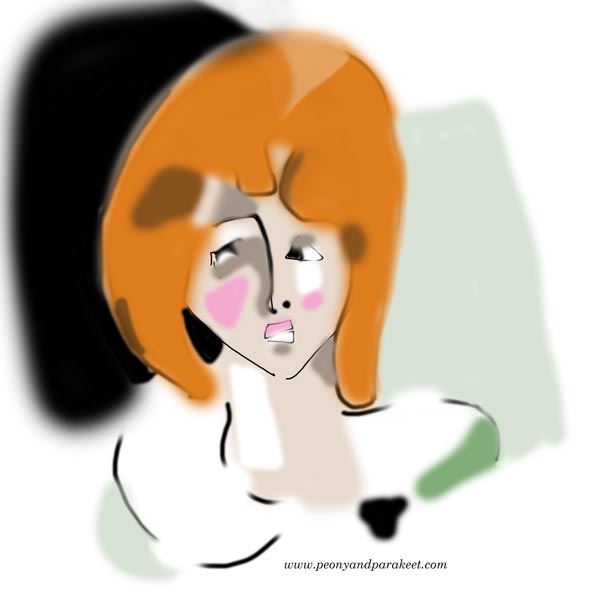
5) Remove some sketch lines and add more finishing details if needed. If you used long lines, make some of them shorter so that your drawing is not so stiff.

A step-by-step guide to drawing a portrait in Helene Schefbeck's style, by Paivi Eerola from Peony and Parakeet, step 5.

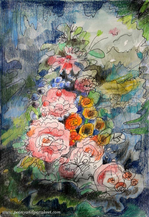
Helene Scherfbeck’s Style – The Combination of Simplicity and Softness

Even if Helene Scherfbeck’s style is very graphic, she also embraced uneven edges and soft color changes. This softness combined with distinct, even clumsy-looking geometric elements is the essence of her style.

A portrait in the style of Helene Scherfbeck, by Paivi Eerola from Peony and Parakeet. See her step-by-step instructions!

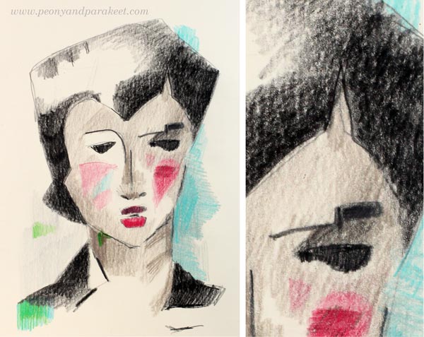
She also uses strong lines and bold colors to draw the viewer’s attention to the selected details. However, she does that very sparingly like there would be a limited storage of lines and pigments.

A portrait in the style of Helene Scherfbeck, by Paivi Eerola from Peony and Parakeet. See her step-by-step instructions!

Find The Passion Behind Your Many Styles

I often find it distracting when people talk about their personal style like it would be the final destination for their artistic journey. They say tat once they have found their style, it would be like coming home and they would never need to go back to explore. I think it can be a harmful mindset. It leads to thinking that artists could be divided into three categories: a) those who search their style, b) those who stick with their style, and c) those who are afraid of going deeper because they don’t want to stop playing. That kind of controversy is not good at all! Going deeper allows, not prohibits, playing! Creative people are meant to travel spiritually!

Portraits in the style of Helene Scherfbeck, by Paivi Eerola from Peony and Parakeet. See her step-by-step instructions!

Instead of searching for your perfect style, your final destination, connect with your passion! Your passion can be like a base camp for your explorations, energizing you to take up new challenges.

Paivi Eerola from Peony and Parakeet, a Finnish artist inspired by art history.

Sign up for The Exploring Artist to discover the passion behind your art
and to become more confident with the big word “artist”!

The Exploring Artist, a coaching program for building an artistic identity by Paivi Eerola from Peony and Parakeet.

Mixed Media Drawing Tutorial – Create Step by Step!

Intuitive mixed media drawing inspired by old still life paintings. By Paivi Eerola from Peony and Parakeet.

With this blog post, I want to encourage you to
… draw from imagination
… fall in love with the combination of water-soluble media and colored pencils
… find inspiration from art that has been created hundreds of years ago

Inspiration from Old Still Lives

A few weeks ago, I visited a small art museum called Sinebrychoff Art Museum in Helsinki. I have visited it many times because it’s a cozy old building and small art exhibitions are refreshing more than overwhelming. One more reason is that in Finland you can buy a museum card for about 65 EUR and it gives you free access to most of the Finnish museums for a year. It became available in 2015, and since then I have visited museums more than ever before in a year.

The exhibition at Sinebrychoff Art Museum was about old still lives, painted in the 16th to 18th centuries. I have admired those old, elegant paintings with beautiful flowers and fruits of all sorts for a long time. I have a Pinterest board dedicated to the most luxurious still lives, and I often bring up little things that I have learned from watching them in my classes. So no wonder, I was very inspired after seeing the exhibition, and I had to create a small drawing just to let my imagination play with the memories of beautiful paintings.

Mixed Media Drawing with Imaginative Fruits and Flowers

I picked one of my art journals, a Daler-Rowney’s Graduate Sketchbook, and a black thin-tipped drawing pen that has permanent ink. I prefer sketching with a permanent pen rather than with a pencil. Not being able to erase anything makes me more creative. Using permanent ink allows me to play with wet media as well.

First, I started doodling from the edges towards the center. Then I added some watercolors on the top of the doodling leaving the center blank.

Making of an intuitive mixed media drawing inspired by old still life paintings. By Paivi Eerola from Peony and Parakeet.

Once the watercolor was dry, I added more doodling in the center and finished the page with colored pencils. The dark background makes the colorful flowers and fruit stand out.

This process was so simple that I wanted to make a small tutorial for another page inspired by old still lives. So here it comes!

Mixed Media Drawing – A Tutorial

1) Set the composition with simple shapes. Draw a big shape and then a smaller one. The shapes can intersect.

A tutorial for an intuitive mixed media drawing inspired by old still life paintings. By Paivi Eerola from Peony and Parakeet.

2) Add the horizon by doodling. I wanted to make the drawing dynamic by giving the horizon a diagonal direction.

3) Paint the background leaving most of the shapes blank. I used watercolors, but you can use any water-soluble media like inks or watercolor pens. Just make sure that your lines will show through because it’s part of the visual appeal. Use more than just one color so that your painting inspires you in the next step. Let dry.

A tutorial for an intuitive mixed media drawing inspired by old still life paintings. By Paivi Eerola from Peony and Parakeet.

4) Doodle your heart out! Without raising your pen from the paper, doodle over the painted background and on the center too.

5) Color the drawing with bright colors and dark shadows. I used colored pencils, but you can use almost any media for coloring. For example, felt-tipped pens work great. You can also continue to use water-soluble media for coloring. Add dark colors between the flowers and the leaves. Leave some of the painting made in Step 3 visible so that your drawing breathes.

A tutorial for an intuitive mixed media drawing inspired by old still life paintings. By Paivi Eerola from Peony and Parakeet.

6) Add the final touches to balance the drawing. I added some lines to make the elements in the background more explanatory and a tiny flower that looks like it’s reaching them. I also made the top right corner look similar to the bottom right corner to highlight the diagonal composition in the background.

Intuitive mixed media drawing inspired by old still life paintings. See step by step instructions for making this! By Paivi Eerola from Peony and Parakeet.

Mixed Media Drawing – Say You Want to Explore More!

Sign up for Inspirational Drawing 2.0!
1) Enjoy Drawing from Imagination!
At Inspirational Drawing 2.0, you will quickly get in touch with you living line and lively imagination. You will also get personal help to finish your pieces so that they are meaningful and appealing to other people too.
>> Sign up for Inspirational Drawing 2.0!

Buy a mixed media self-study class Flowing Greenery!
2) Practice Merging Painting with Drawing!

Learn to merge drawn areas with painted areas and play with shadows! Flowing Greenery is a self-study class with two projects, a small still life, and a bigger landscape.
>> Buy Flowing Greenery!

Buy an e-book Coloring Freely!
3) Get Creative with Colored Pencils!

Coloring doesn’t have to be stiff or boring. Learn to color freely whether it’s coloring a drawing or creating intuitive art directly on a blank page!
>> Buy Coloring Freely!

Pointillism – A Quick Way, Step by Step!

ATCs that are like pointillistic paintings but made using colored pencils and felt-tipped pens. See the step-by-step instructions! By Peony and Parakeet.

I am honored to be one of the guest artists in Documented Life Project this month. I was given a theme (pointillism) and a project type (artist trading card, ATC). As long as I followed those, I could do anything with any supplies. These kind of challenges are fun because you get such enough restrictions to get started but can still create freely. However, I have one fixation with artistic trading cards. I like them to be portraits, either humans or animals.(See ATCs in this post, for example!) So I chose a very traditional subject, women from the past.

Pointillism Can Be Tedious!

Like most of us, I have always admired Georges Seurat‘s paintings. In the 1980s, a Finnish illustrator made images that were composed of small points. It might have been an artist called Osmo Omenamäki. As a teenager, inspired by him and Seurat, I decided to be a pointillist artist too. I picked my felt-tipped pens and started to draw dots. Oh my! I was barely able to finish a postcard size drawing. I couldn’t believe how many small dots are needed to fill even a small blank area! I was almost traumatized by that experience!

So now, over 30 years later, I didn’t even think about creating the project with felt-tipped pens only. ATCs are small, but not that small! However, with felt-tipped pens, it is easy to make intentional tiny dots in a variety of colors. But I also needed something else to make the coloring faster. Colored pencils leave the spots visible, and they are easy to control. So I chose them to fill the blanks between the dots.

Practicing – Spots with Many Colors

Before the actual project, I practiced my ideas. I made the dots using a variety of colors and then added more colors with colored pencils.

Pointillism in an artist trading card. See the step by step instructions. By Peony and Parakeet.

Because the colors in dots weren’t as important as coloring with colored pencils, I got an idea of using brown shades only. It would be like an underpainting, a technique that old masters often used in portraits. They painted shadows with umber and then applied the rest of the colors so that the shadows showed through. So I will show you how you can do a similar kind of “under-dotting” and then apply the actual colors with colored pencils!

1) Under-Dotting with Felt-Tipped Pens

You will need four shades of felt-tipped pens for this step. I use Faber-Castell PITT Artist Pens in colors “Light Flesh”, “Green Gold”, “Raw Umber” and “Caput Mortuum”.  I didn’t use any model like a photo but just created intuitively, making the features more accurate color by color.

Pointillism, step by step. Step 1 by Peony and Parakeet.

With the palest of color, sketch an oval using small dots. The liberating thing here is that when you start with a pale color and make little dots, you can make many “mistakes” and correct them as you go. One spot in a wrong place can be easily changed! Fill the oval with dots so that you leave blank space where you plan mouth, eyes, and nose to be. When they seem to be in place, add some dots for details. Don’t worry if your woman looks pretty ugly. This is just the first layer!

Change to darker shades and add shadows to the face. Then sketch the hair and clothes using little dots only.

Pointillism, step by step. Step 1, under-dotting. By Peony and Parakeet.

Every shade adds a little bit more to the image.

2) Basic Coloring with Black and Colored Pencils

Now add black spots to the darkest of details. Old portraits often had a dark background, so I added black spots there too.

Pointillism, step by step. Step 2 by Peony and Parakeet.

Using colored pencils, color the card so that white shows only where you want to have it in the end. I used Caran d’Ache Pablo pencils in blue, red and yellow. Remember that you can mix colors by layering. You can get many beautiful tones from the primary colors.

3) More Liveliness with Colored Pencils

Finally, add shadows so that the details look 3-dimensional. If you only have primary colors like I had, you can get a dark background by adding blue, red and yellow layers there. If your portrait looks too dark, use an eraser to lighten and soften the colors.

Pointillism, step by step. Step 3 by Peony and Parakeet.

In the end, check the facial features of your woman. Add small lines where you want to turn the attention. Don’t draw the lines near the nose but on the lips and the eyes.

Pointillism, step by step. Step 3 and facial features. By Peony and Parakeet.

Celebrating Blurriness

Here are my finished cards again. I think they look delightfully blurry!

Pointillism-themed artist trading cards. See the step-by-step instructions. By Peony and Parakeet.

The more I want to reduce stiffness in my art, the more I feel the need to embrace blurriness. With blurriness, I also feel more self-acceptance, more ease with errors, more open to possibilities.

Reducing stiffness is one of the main themes in my newest class too. The class is called Inspirational Drawing 2.0 and it’s about drawing from imagination and inspiration. Watch the introductory video below!

Inspirational Drawing 2.0: Liberate your line and sign up now!

A Decorative Pattern for Art Journals and Beyond

Step-by-step instructions for a decorative pattern that can be used as it is or for creating collage art. By Peony and Parakeet.

A couple of months ago, I made a flip-through video of a full art journal. Many noticed a spread that was made from decorative papers mostly. I remembered that I took some photos while making the papers and I will share step-by-step instructions here. This pattern is good practice for motoric skills and drawing, but it can also go beyond! I used it for a more expressive purpose, for a collage art piece.

1) Paint Stripes with Watercolors

Use a fairly thin paper and paint it with watercolors. Use a selection of colors to create stripes or curves.

Step-by-step instructions for a decorative pattern that can be used as it is or for creating collage art. By Peony and Parakeet.

You can add drops of water if you want to make the background more interesting with bleeds.

Step-by-step instructions for a decorative pattern that can be used as it is or for creating collage art. By Peony and Parakeet.

Let the paper dry properly.

2) Decorate the Stripes with a Simple Loop Pattern

Using a thin-tipped black drawing pen, draw a simple loop and end it with a curve upwards. Without lifting the pen off the paper, add a bunch of loops on the top of the curve. Then continued by drawing a curved line downwards. Repeat and draw the whole row on the same go. Work fast and don’t worry too much about the symmetry or similarity of the loops.

Step-by-step instructions for a decorative pattern that can be used as it is or for creating collage art. By Peony and Parakeet.

After drawing the rows, frame the loops to make them more distinct. I used simple shapes to create flowers and leaves.

Step-by-step instructions for a decorative pattern that can be used as it is or for creating collage art. By Peony and Parakeet.

3) Color the Background and Add More Decoration

To make the watercolored layer look more lively, use felt-tipped pens (marker pens) and color the background around the doodled shapes. You can also add more color to doodled details and use a white gel pen to add more decoration to colored areas.

Step-by-step instructions for a decorative pattern that can be used as it is or for creating collage art. By Peony and Parakeet.

Decorative Pattern in Many Colors

This pattern looks luxurious when you make many papers in many colors with slightly different decorations.

Step-by-step instructions for a decorative pattern that can be used as it is or for creating collage art. By Peony and Parakeet.

Here are some that I made!

Step-by-step instructions for a decorative pattern that can be used as it is or for creating collage art. By Peony and Parakeet. Step-by-step instructions for a decorative pattern that can be used as it is or for creating collage art. By Peony and Parakeet.

Decorative Pattern in Collage Art

I am fascinated by the interface between art, design, and crafts. The idea for the pattern came from knitting. I wanted to find a similar relaxing circular motion using a pen instead of a knitting needle. So that’s how a craft transformed into a design. But design can also be a part of a more expressive piece.

When Geese Fly Over, a mixed media painting by Paivi Eerola from Peony and Parakeet

In this collage, I use decorative paper pieces with paint. My starting point was a watercolor background, acrylic paint, and a piece of decorative paper.

Creating a mixed media painting using hand-decorated paper. By Peony and Parakeet.

I cut a couple of decorative shapes and glued them on the background with gel medium.

Glueing collage pieces. By Peony and Parakeet.

Then I continued with painting using acrylic paints. In the finishing phase, I also used some more paper pieces and few colored pencils. A week or two ago, I heard the geese flying over our house. They were leaving Finland, going to a warmer place for a winter. Their sounds made me think how limited we people are, not being able to fly so freely, not always being able to stick so tightly together. The screams of the geese felt bright yellow and for a short moment, I wanted to join them and not stay in Finland, waiting for snow …

When Geese Fly Over, a mixed media painting by Paivi Eerola from Peony and Parakeet

Get step-by-step instructions for doodled collage art – Buy Doodled Luxury!

Scroll to top