Using Color Schemes from Home Decor
In the early 1990s, I bought an interior design book from the UK. It’s called “Design and Detail” and it’s written by a famous designer Tricia Guild. She was not as well-known as she currently is back then, and I hadn’t known her before I saw the book.
Creating Art by Using Color Schemes from Home Decor
I felt drawn to the interior color schemes and the decorating style presented in Tricia Guild’s book. Never before had I felt such a strong appeal to home decor. I knew I liked to be surrounded by strong colors, but I had never seen them used in such a powerful way. Since then, my every home has had elements and spaces inspired by the book. Whether I lived in a small single room as a student, in a flat or a house, I have always browsed the book when I’ve needed inspiration for interior color schemes.
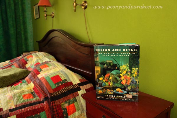
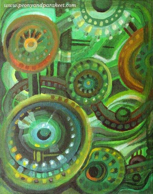
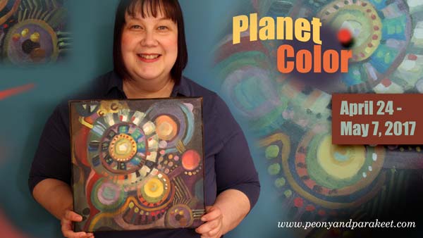
Last week, I saw a picture that had one of the color selections that are presented in “Design and Detail.” It was the combination of green and black including a little bit off-white, yellow and muted orange-red. We already have that color scheme in our bedroom but at that moment, I wanted to play with those colors again. So I started a painting that has green and black and followed the instructions from my upcoming class Planet Color!
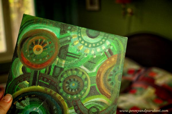
Once it was finished, I painted more interior color schemes from the book. Again, I used the 7-step method from Planet Color. I had so much fun creating these!
Warm and Inviting Colors
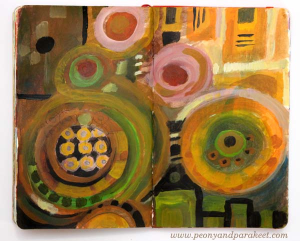
The dining area in Tricia Guild’s book looks very cozy. The striking combination of yellow and black is balanced with earthy colors and then brightened with a few warm, bright spots.
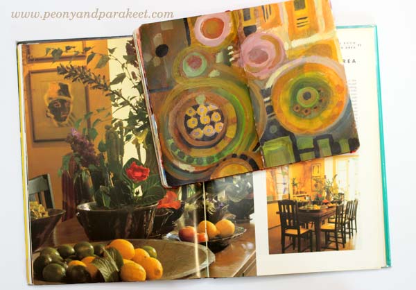
My art journal spread is inspired by the flowers and vases. It also plays with angled and round shapes as seen in the dining room.
Whites and Neutrals
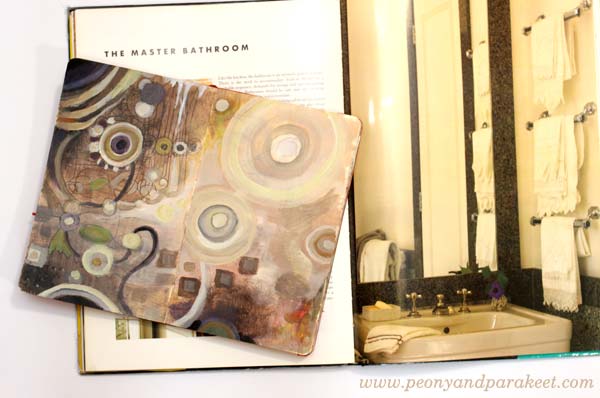
I am definitely out of my comfort zone when using pale colors in larger quantities whether it’s creating art or home decor. But I wanted to try to get inspired by Tricia’s master bathroom. It was surprisingly easy when I focused on expressing the textures shown in the photo. The narrow color scheme also made me focus on adjusting the colors only slightly.
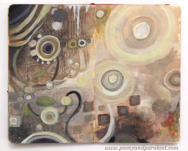
It is surprising how many tones can be created from a very restricted color palette. I also quite like the red/orange spot on the right and how it balances the upper left corner. When using neutral colors, even the smallest colorful detail can make a difference.
Many Shades of Yellow
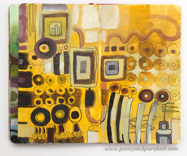
I had a bedroom that had quite a lot of warm yellows when I was a child. But before “Design and Detail,” I never thought I could have bright yellow walls. But during the years, I fell in love with the warm yellow shade that I call “Tricia Guild’s yellow.”
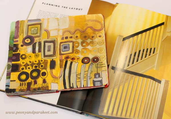
In the art journal spread, I played with various shades but six years ago, when we moved to our current house, I wanted to have that particular “Tricia Guild’s yellow” on a wall.
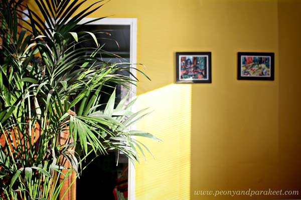
Even if there were tens of yellows available as paint, “Tricia Guild’s yellow” wasn’t found in the color charts. I thought people must think I am mad being surrounded by all the yellows and shaking my head. Then I just picked one that was closest and we started painting. But it wasn’t the right shade and after one layer, it felt too warm. After carefully analyzing the yellow in the book and comparing it with the wall, I decided to add warm black to adjust the tone. And so we got “Tricia Guild’s yellow”, just the perfect tone on the wall!
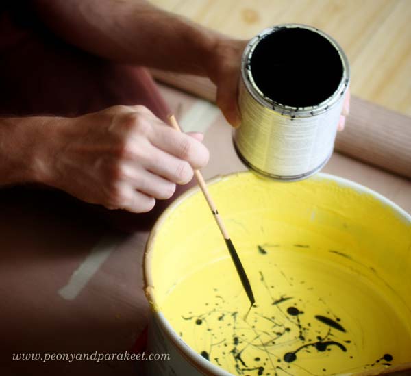
This story shows how many colors there are in the world and how little you experiment with if you are using only ready-made colors. Start mixing your colors! It is a reason why I built Planet Color, my color-oriented workshop!
Colors from Potted Garden Using Leftover Paint
After creating so many paintings, I ended up having some leftover paint on the palette. I decided to use the paint by getting inspired by exteriors too.
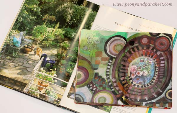
Expressing a potted garden with circles is easy. Angular tiles are also easy to add to the picture.

Sign up for Planet Color!
Take your favorite interior design book, or Pinterest board, or any source that inspires you with color, and sign up for Planet Color! I’ll show you how to experiment with colors so that your painting is more than just a selection of color samples. I’ll show how you can make colors interact and how to enjoy adding more instead of just making a mess! And if you are more of a minimalist, you can omit some steps of the process and create a simple yet eye-catching painting! Reserve your spot now!
6 thoughts on “Using Color Schemes from Home Decor”
Comments are closed.
This was interesting to me. For years, I would only paint walls an ivory white and never used bright color in the rooms. I love bright colors ordinarily, just not in my home. Then I turned 60 and suddenly thought why not go for a bright color. We moved into our present house two years ago and this time I went all out. My craft room is a wonderful orange with blues and reds. I got the idea from a magazine. I love it. So I say try what you like. It is just paint after all. Thanks for your encouragement!
Your story is interesting and your craft room sounds wonderful! Thanks for commenting!
Absolutely lovelyPaivi! I love your interpretation of colour from the book and have really enjoyed reading this article.
Thank you, Claire!!
Thank you for inspiration ????
Thanks for commenting!