Mixed Media Painting Idea – Revisiting Your Old Style
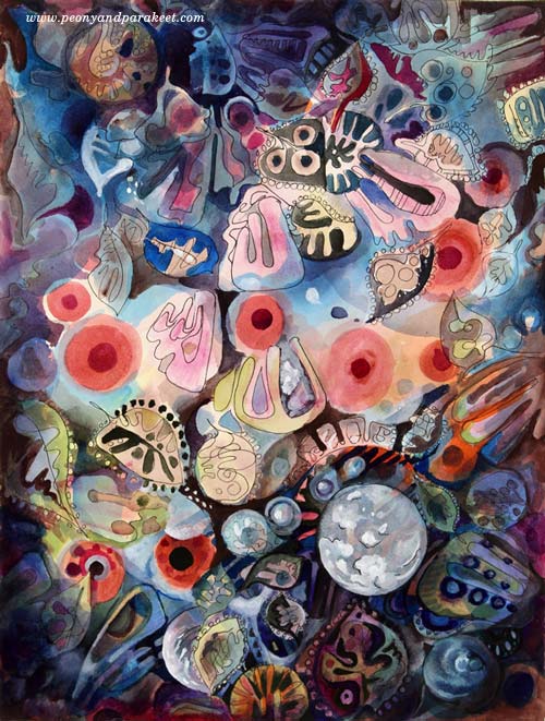
Between 2010-2014 I was enthusiastic about decorative art. I called myself as a “decorative artist” and saw myself more as a designer than as an artist who focuses on expression. My upcoming class Collageland (thank you, everyone, for the feedback you gave in the last blog post!), is a retrospective to that period in my life. While editing the videos, I have been pondering about what inspired me back then and how it’s different from what motivates me now.
Some themes and styles often feel too familiar to me. They don’t seem to challenge me anymore, so I have moved on. But now it hit me how harsh it sounds and how unnecessarily harsh it sometimes also is. So when creating the pieces shown in this blog post, I gave myself permission to take it easy and get decorative. I also became curious about comparing my past decorative work with the pieces that I would produce today.
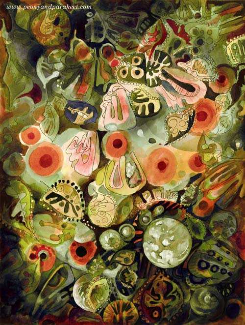
My comfort zone is getting inspired by design and translating that inspiration into art. So I made a mixed media painting that is inspired by the world of fashion, jewelry, lace, Renaissance murals, and botanical art. I call it “Lost and Found”. To embrace a designer’s approach to art, I also made two different color versions by processing the photo of the original artwork digitally in Photoshop.
Here’s Marine:

And here’s Botanical:
I don’t have many phase photos because I wanted to relax with that too but this is what I drew on my planner the previous day:

These quick sketches are the core of my creative process.
Another Painting with the Same Idea
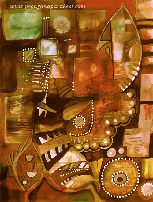
I also made another design-inspired painting. The idea came from the ceramic art of the 1960s.
The photo below shows how the piece looked like before adding the decorative layers. Glowing watercolors remind me of the glazing used in ceramics. When this happens, I feel like I am a ceramic artist, playing with colors.
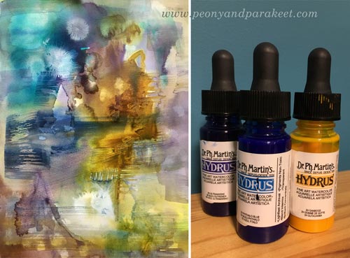
A student of mine kindly donated Dr. Ph. Martin’s Hydrus watercolors some time ago. First, I liked them, now I adore them. They are intensive and easy to use, and I especially love the coverage of white. I used Hydrus watercolors for “Lost and Found” too.
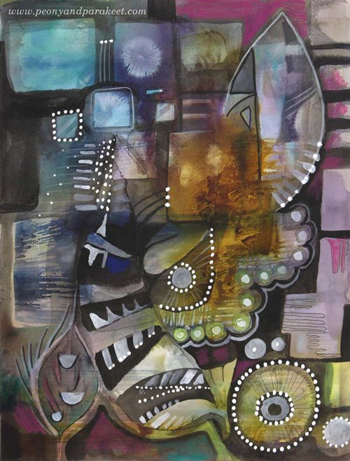
Here’s the finished painting called “Retro Living”. It is also a mixed media piece. I used colored pencils, PITT Artist Pens, and a correction pen for the last layers. I love these muted colors, so typical for the Finnish ceramics from the 60s. But then, I thought they might be too gloomy for many, so I made another version digitally that reminds me of furniture from that era:
Comparison
See my new gallery showing decorative art and designs from 2011 to this day. When I look at the newly-created pieces as a part of that collection, it looks to me like I have traveled a long journey in art. And I have – I just never thought that it would show in this decorative style as well. It makes me want to explore more of this and also, see exciting challenges in this direction too.
My challenge to you: Pick an old piece and make a new one using the similar techniques and style!
Let me be your mentor in art: Subscribe to my weekly emails!
4 thoughts on “Mixed Media Painting Idea – Revisiting Your Old Style”
Comments are closed.
Great inspiration. Many old art pieces will be reevaluated soon. Like the white additions in opaque media as contrast.mid century modern is back. In two colors via computer graphics is a brilliant color idea because eras change color palette. Your blog is fun and instructive.
I was just thinking a few days ago that I should go back over some of my pieces I left undone. I think this sounds like just the time to re-look at those and maybe think about what I could do to make them pop! Thanks for the ideas again.
Furniture is exactly what I thought when I first saw this final painting. I was thinking clean, smooth lines, square cushions and thin legs with beautiful, gleaming wood floors showing under the furniture. It ‘feels’ just like that mid century modern style. Then I read your words and was surprised to realize that is what you were using as inspiration. Well, Paivi, it certainly worked perfectly. These paintings are still you and still quite beautiful but would look gorgeous hanging behind a sofa in a mid century modern room.
Wow, I love the art you show here!