Back to Nature – and Back to Acrylics!
When building the class Decodashery, I started to enjoy acrylic paints again. They have vivid colors, and they dry quickly so layering is easy. This piece is called “Back to Nature.” It has a similar playfulness than this small painting that I shared last week.
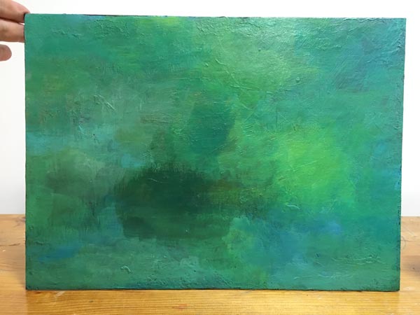
I found more old paintings (see this post!) to paint over, but this time I added gesso on the top of the old “masterpiece”, and then painted it with turquoise and green tones.
Then I painted some rectangles which helped me to invent more shapes.

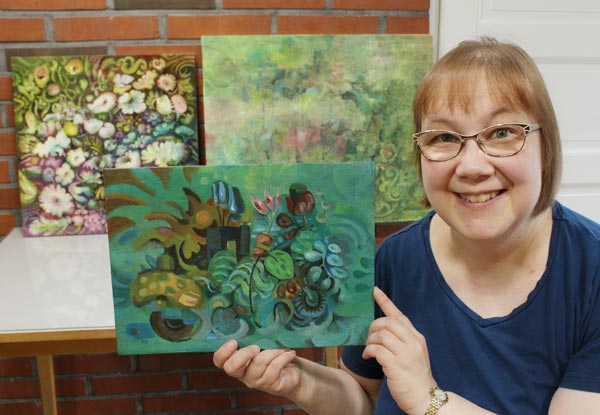
My word for this summer is Refreshing. In the photo below, I am holding “Back to Nature”. The other paintings are still in progress, but I try to make them as refreshing as I can, and also, feel as refreshed as possible after every painting session.
Green seems to be the color now! Is there a word or a color that you particularly love nowadays?
Imaginary People – How to Paint Their Soul?
This week, the theme is painting imaginary people and how to find their soul. There’s plenty of examples in this blog post!
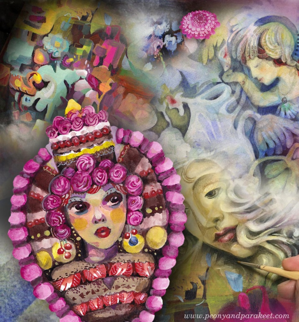
One of the wonders of painting and drawing is that we can give birth to an imaginary person – that we can create someone who breathes, talks, and has a life of her own. However, many times the doll that I have on paper hasn’t come alive. Or she has taken just a few breaths, and after the creative spark has gone, she just stares with empty eyes. So no wonder that I have had a love-hate relationship for painting imaginary people. I want to experience the miracle, but it can also be too much of a struggle.
References – Working with a Soul that Breathes Already
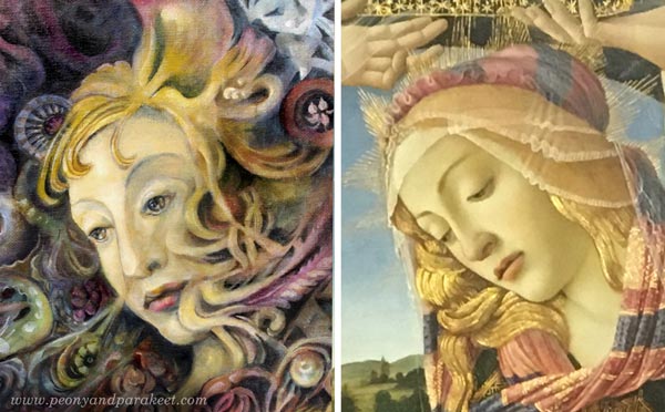
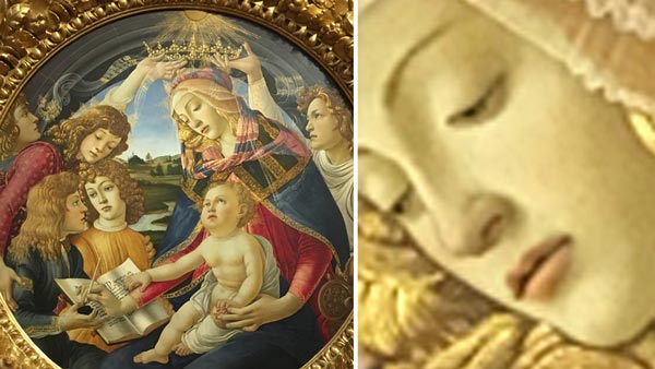
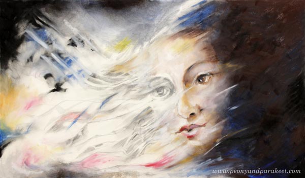
Using a reference may be the least innovative solution but if you find an image that really speaks to you, it can be a good one. Tiny changes in facial features lead to a whole new person so if you don’t follow the reference in the smallest detail, yours is like distant relative to the original – familiar features but still unique. For this oil painting called “Heaven and Earth“, I used a detail of Sandro Botticelli’s painting “Madonna of the Magnificat” (1483) as a reference.
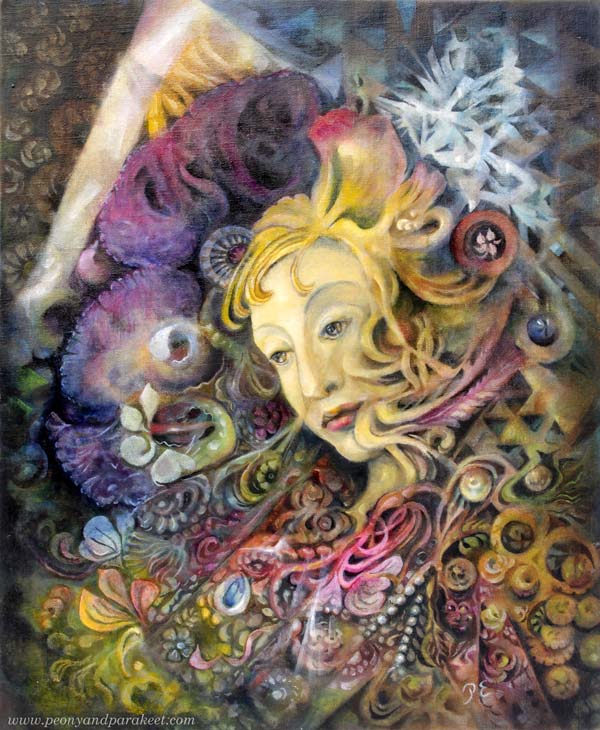
Here’s a close-up of the faces. I changed the angle of the face, opened the eyes more, and made the mouth look more determined.
Sounds easy, but I often struggle with finding the soul when using references. With this painting, I tried to slowly work towards an individual personality, but creating a connection took a lot of time. Botticelli painted his soul, and it’s not the same as mine.
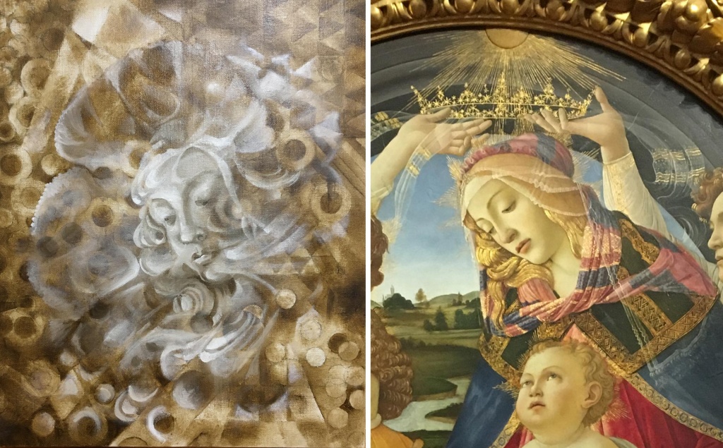
Here the work was in the early stage so that you can see how she has changed.
From the struggles of this painting and many others, I have learned this:
Working on the face alone never brings up the soul.
With the Madonna, as soon as I figured out the purpose and the style of the surroundings, I was able to finish the face.
The Soul Spreads Over the Painting
Even if a person is usually the focal point of the painting, the soul is not focused but spread.
The soul is in the setting, in the things, in the atmosphere. Even Botticelli’s Madonna can look just like a bored person without the crown, the light, the child, the book, etc.
So no matter if you paint intuitively without pre-defined ideas, sketches, or references, or more intentionally with a clear idea of how you want your imaginary people to look like, seek for the soul in everything you paint.
Flowers have soul.

Pots have soul.

Hair and hats have soul.

Inanimate and organic things also give the soul to the imaginary people.
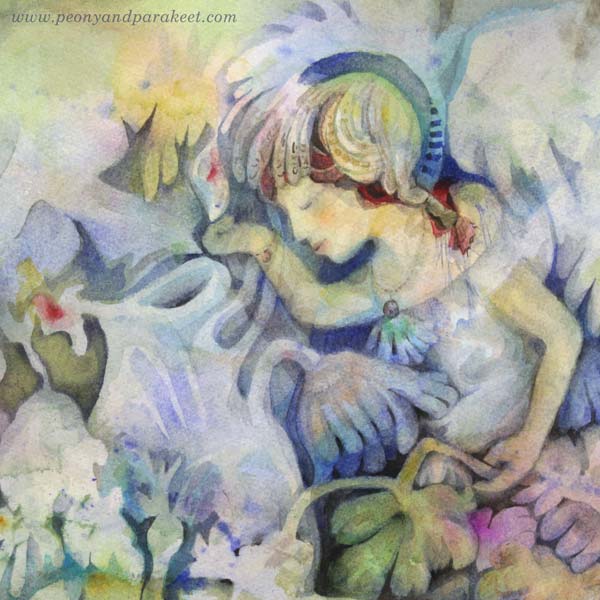
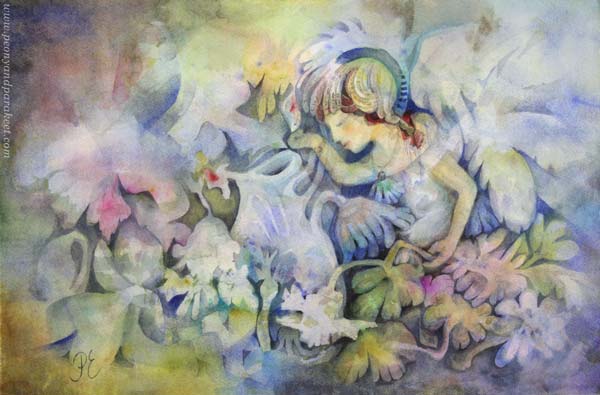
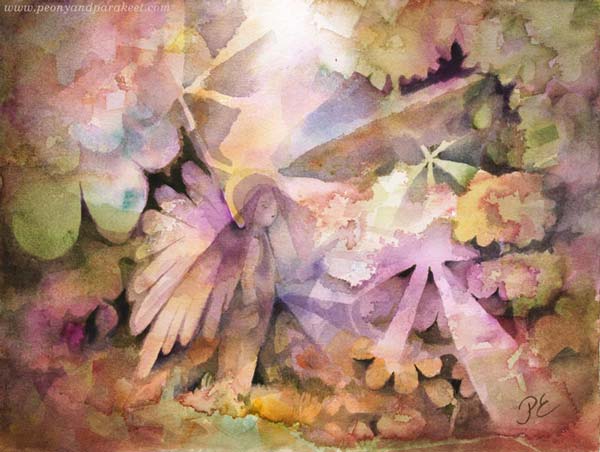
In this watercolor painting called “Mirimer“, the fairy is the focal point, but her soul is spread all over the paper.
Imaginary People Exist in Shapes and Colors As Well
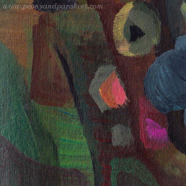
The painting doesn’t even need to have a face. Your imaginary people can be abstract, like in this small acrylic painting that I recently painted on a sketchbook.
Shapes and colors have soul.
Imaginary People – First or Last?
The idea for this post came from the question that I received a couple of days ago:
“I like your little people peeking out from within your art. I would like to learn more about that. Do you draw them first and paint around them or paint and then save a spot for them?”
I have many approaches.
In Innovative Portraits, we use references and make a sketch. The soul begins with the plan.
In Magical Forest, we lure fairies to appear intuitively from the watercolor background. The soul begins with the feeling.
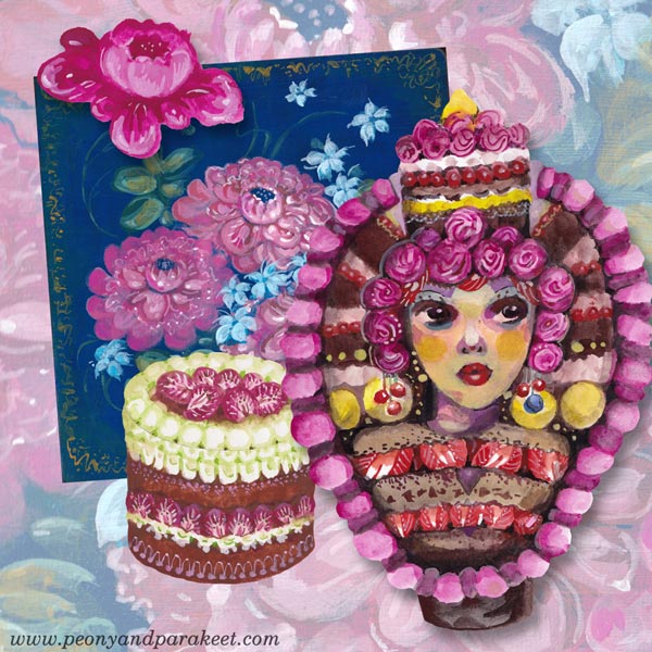
In the new class, Decodashery, we start by building a visual world and then make the dollies to fit with it. So the soul is first just a small flower, then it expands to floral paintings, cakes, lace, and finally, the imaginary people are born. By gradually setting the style and the spirit is the best intentional way to add soul to your work.
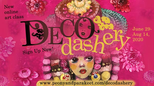
Decodashery will begin on June 29, 2020. >> Sign up now!
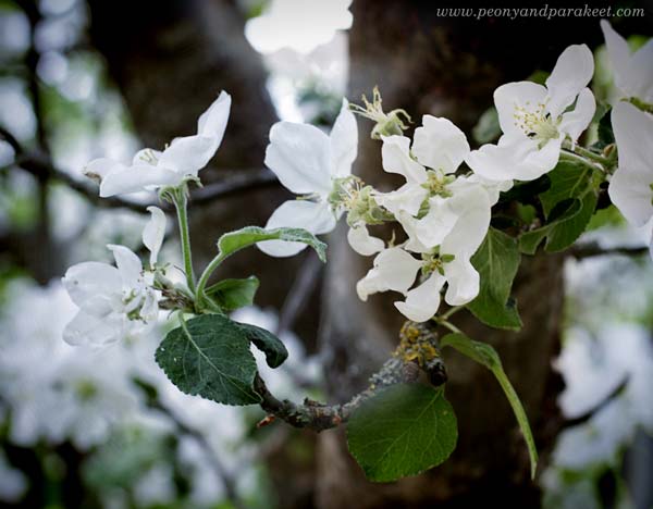
Art Inspiration from Flowering Trees
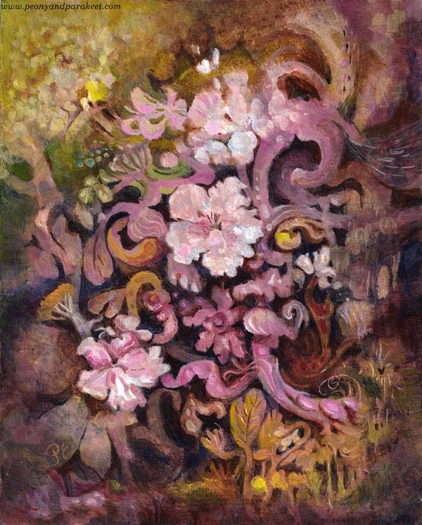
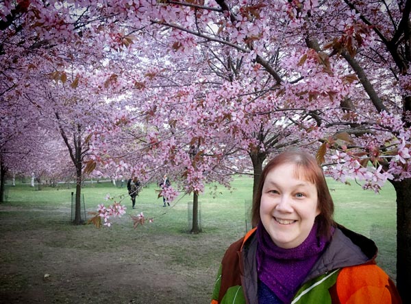
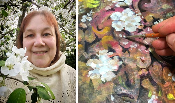
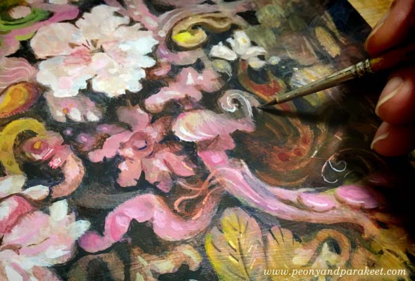
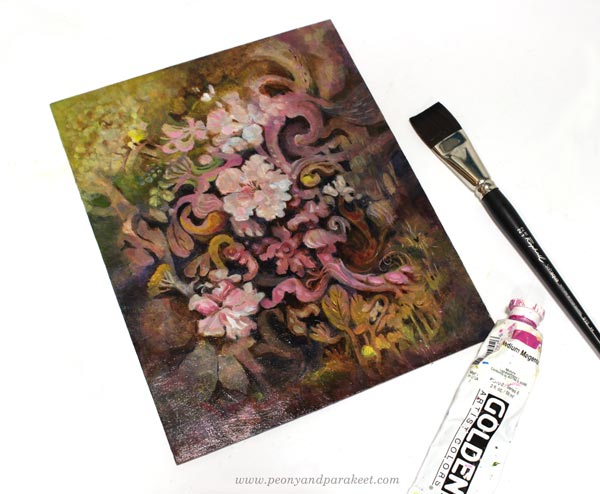
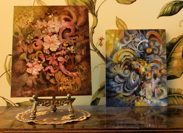
Here’s my latest painting, “Dulciana.” It’s inspired by flowering trees and their power to bloom year after year. This spring was special because I got to see blossoming cherry trees in a park that was filled with them.
Embracing the Decorative Side of Art
This spring has also been different concerning my artistic endeavors. I have been building a new class, but a little slowlier than what I usually do. I have been really intentional about what I include in the class and how the class is structured. It’s has felt like it’s my life’s work even if it’s still a very light-hearted and fun class.

The class is called Decodashery, and it dives deep into the decorative side of art. The projects that I have made for the class have given me new skills and ideas about including decorative elements in my intuitive paintings too.
Light Paints the Flowering Trees
Now when summer has come to Finland, I have also spent more time in the garden. I wouldn’t really have to because my husband is crazy about gardening. He has found his passion, and I am so happy for him.
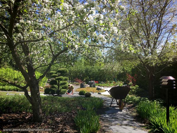
But when I look out of the window, and the sun is shining, I can’t help going there, walking and weeding, taking photos, and admiring how light paints the view.
And when I start a painting, I can’t help thinking about light, and how essential it is for the magical atmosphere.
So most times, when I paint freely, I start with random strokes expressing light and shadows.
Art, Cembalos, and Flowering Trees
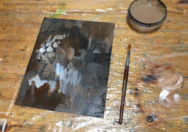
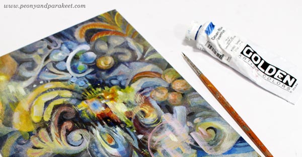
To make the painting shine softly, I like to add washes whether I paint with acrylics, watercolors, or oils. Washes have just a small amount of pigment and plenty of painting medium. For washes, I use water in watercolors, water and glazing gloss in acrylic paints, and the mixture of dammar varnish, french turpentine, and linseed oil in oils. This one is an acrylic painting.
When I paint without any assignment, I usually do it late at night. I listen to cembalo music when I start digging out the elements from the mess. Cembalos sound like the light I want to capture in my paintings. The sound is pompous and full of energy, and still, there’s something so delicate and vulnerable that it almost shatters.
The vulnerability is also in the flowering trees. They seem sturdy and unapologetic, but they know how bypassing the blossoming is. It looks like they miss the flowers already, and the dark trunks feel heavy and burdened by the upcoming work of making fruits of them.
I try not to make one painting at one go but take several sessions. Like trees, the painting also has seasons. It needs time to grow, and time to rest.
Often it feels that when I am not painting, the painting progresses best. Ideas come when I get out of the studio and talk to the trees.
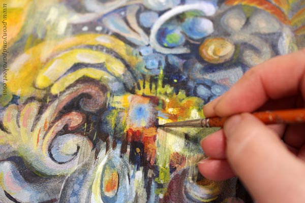
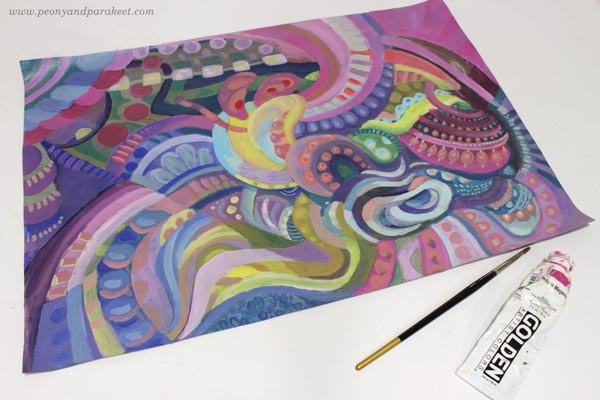
Endless Flow of Swirls and Ruffles
After making the projects for the new class, Decodashery, I have enjoyed painting decorative shapes than ever before. I especially like swirls and ruffles.
Similarly than old cembalo music sounds like a melody that never ends, all kinds of little curves can make even a small painting feel like it’s a world of its own. The eye travels from one place to another so that there seems always to be something to discover.
Here’s “Dulciana” with the last week’s painting “Ceruleana.”
Decodashery – Registration Will Open Next Week!
The registration for the new class Decodashery will open next week, and the class begins on June 29.
In Decodashery, we will create a beautiful and comforting world that has some jazz too. We will enjoy painting flowers, lace, cakes, dollies, and break the border between vintage and modern art. When building it, I have been inspired by Jane Austen movies, old jazz clubs, Russian handpainted floral plates, and skillful crocheters and cake makers around the world. I hope you will join us! Until next week!
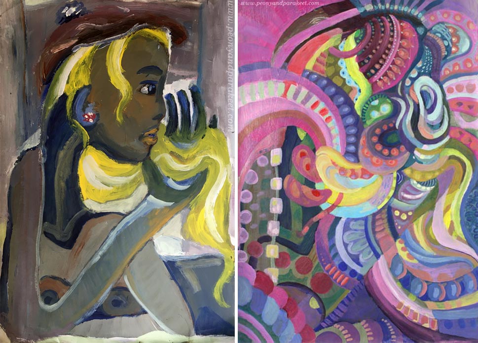
Art Makeover – Revamp Your Old Paintings!
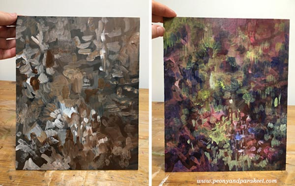
Let’s give an art makeover for an old painting! The idea for this blog post came last month when I was running out of paper. Instead of traveling to an art supply store, I stayed home as was advised, and found another solution: reusing old paintings!
My starting point was practical, but the benefits were spiritual – the journey that had ended, started again. I picked pieces that were made about 30 years ago – when I was in my 20s. At that time, I studied software engineering but still felt partly an artist.
Makeover Tip #1 – Change the Subject
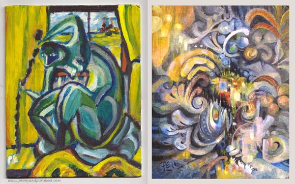
The paintings from the 1990s look very different from my current work, but after examining old paint strokes, I did recognize myself. Although the strokes were rougher and the shapes simpler, they were still very much the same. The subject has changed, but my love for playing with shapes never went away.
Makeover Tip #2 – Save Something Old
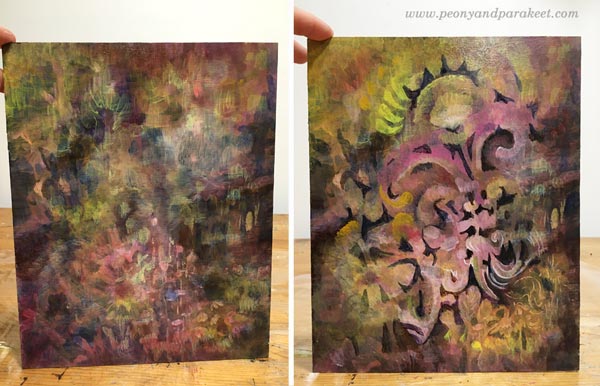
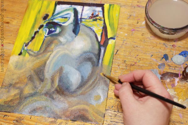
When revamping the painting, I like to save something from the original one. So here, I kept a part of the yellow curtain but altered its color with a thin layer of paint so that it fits with the new color scheme. Old curtain, new home.
Makeover Tip #3 – Change the Colors
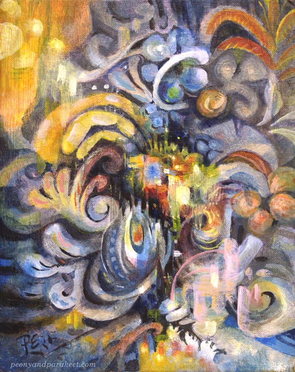
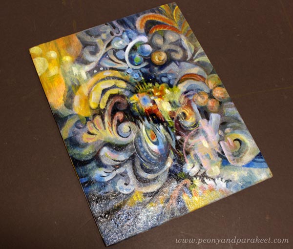
The old painting has screaming colors, but I wanted something more sophisticated for the revamped version, called “Ceruleana.” As the name suggests, the new painting is a tribute to Cerulean Blue.
Cerulean Blue is an expensive but lovely color, especially when mixed with white. It makes every engineer a romantic and looks heavenly with ochre and yellow tones.
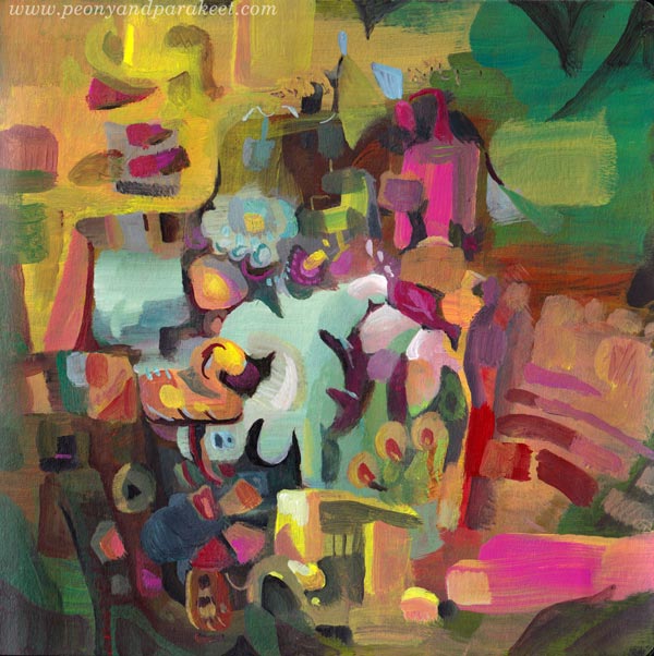
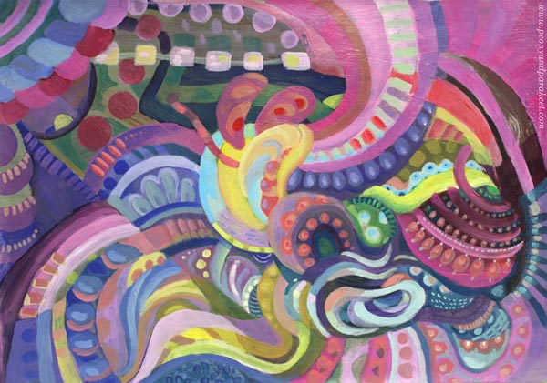
But this post is not only about blues and its hues, I have another example too! This one has a lot of Magenta (“Medium Magenta” of Golden Acrylics), and the colors are very different from the original muddy version.
Art Makeover Tip #4 – Change the Orientation
The original was an artistic self-portrait like the first one. I did those a lot back then, and in every picture, I tried to look a bit different. But my imagination never got this far! The revamped version is horizontal but here they are side by side so that you can compare.
I like how the original version is still present in the new one!
Makeover Tip #5 – Use the Old Painting as a Foundation
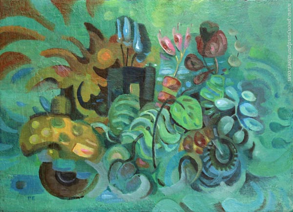
This magenta abstract was so much fun to make. The old painting was like a map that had roads and towns, and when trusting them to lead me to one place to another, I didn’t have to worry about composition or such. I picked the easy abstract painting style from my class Planet Color. The whole process was relaxing, and the painting is called “Cosytopia.” A place to escape the big bad world.
Extreme Art Makeover – Polish and Varnish!
Like in any makeover, why not do it to the very end! Take care that the brushstrokes are smooth where they need to be, and shapes stylish enough for a party.
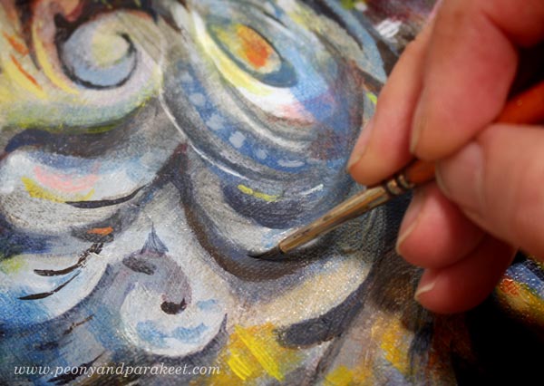
If the painting has a sturdy background, varnish it too! Ceruleana was painted on a cardboard canvas, so I used a polymer varnish on it. Before the varnish, I added a layer of glossy gel medium. (A detailed post about varnishing)
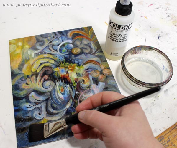
Glossy varnish makes colors glow beautifully. Even if this is an old revamped acrylic painting on cardboard, it may happen that someone someday says: “Oo-oh, it’s an oil painting, isn’t it?”
I hope this post inspired you to make the most of your supplies and past artistic endeavors!
Planet Color – Weekend Sale!
My beginner painting class Planet Color is for sale between May 28th to 31st! The normal price is 35 EUR, now only 25 EUR. >> Buy here!