Rebuilding Art – Using Reference Images for Self-Expression
This blog post is about composing new art by using reference images. At the moment, I have a couple of paintings in progress that are based on reference images, and I also show other examples as well.
Why Don’t Artists Always Tell About Using Reference Images?
While painting my first oil painting at The National Museum of Finland, the visitors of the museum were able to visit the studio and watch us paint. Many people asked why we paint copies of the old paintings. The teacher Emmi Mustonen replied that it’s a good way to learn the old painting techniques and develop the understanding of formal elements. But I got the feeling that some of the people didn’t get it. Their facial expressions were imprinted on my mind, and it made me ponder why using reference images raises conflicting feelings.
Even if most artists who create realistic art or include realistic elements in their art, use reference images, many are not very open about it. I think that one reason is that many artists believe that people know that already and another reason that the process is not interesting. My experience is that there are surprisingly many people who assume that artists don’t take photos or use other than live models. And to me, the process of composing a new image from old ones is fascinating. I always stop to see an article where an artist shows how the reference images were used. I am especially interested if it’s about choosing the photos and combining several reference images into one piece.
Strawberry Madonna – Combining Several Reference Images to Tell a Story
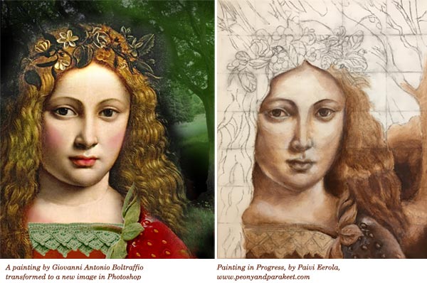
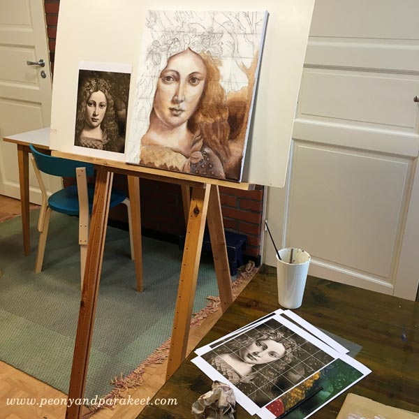
I am currently painting an acrylic painting on canvas that I call “Strawberry Madonna.” It’s my first using old masters’ painting techniques with acrylics instead of oil paints. The idea for the painting started differently than usually. I invented the title first and then started to think how Strawberry Madonna would look. I wanted to find a young woman who would have lips like she had just eaten a strawberry. By googling Renaissance paintings, I found Giovanni Antonio Boltraffio‘s painting. After that, I moved to building a story around the original idea.
Strawberry Madonnas are young girls who enjoy life without worries, have long summer holidays, eat strawberries, learn to crochet and read books like Emily of the New Moon or Anne of Green Gables. I have been one of them, and I feel quite nostalgic about it. I wanted the painting to include surrealistic elements. It has a big strawberry that is placed so that it could be a sleeve of the madonna’s dress. I am also going to change the flowers in the hair wreath to strawberry flowers and play with green and red paint. It will happen when I move on from underpainting to adding colors. In the background, there’s a photo that I took last summer. I am going to make it a little less detailed.
I used Photoshop to compose the reference image and made the sketch on canvas with charcoal. I drew a grid to make the sketching quicker.
Girl with a Ferret – Changing the Meaning with a Simple Trick
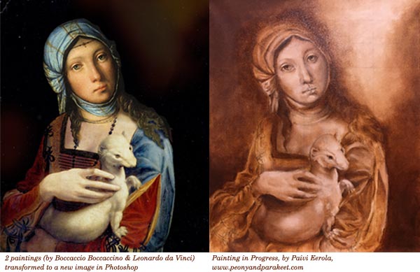
I have also started a new oil painting under the guidance of Emmi Mustonen. I got to pick the reference image freely. I wanted to pick an old Renessaince painting, but I couldn’t find any that would have a couple of my favorite features when painting with old masters’ techniques. I love to paint fur and fabric, and I wanted to find a face that would include openness. I fell in love with Boccaccio Boccaccino‘s portrait of a gypsy girl, but it didn’t have any fur. So I remembered Leonardo da Vinci’s “Lady with an Ermine” and created a new image by combining the two in Photoshop. I have several stories about this one.
The first one is about today’s society and how the pets have become more human in our eyes. I want to show the similarities in the wild gypsy girl and the tame ferret. Another story is about young girls and their love for taking care of animals. They might not know the wildlife, but they help to rescue animals and are ready to work hard when taking care of them. They are against fur clothing and not afraid to show it. The third story goes back to the 16th century. I imagine that the gypsy girl was hired to dress up and hold the ermine because the lady didn’t have the patience to pose for the artist. In the end, she never showed. The artist became frustrated and painted the girl instead. I can imagine the magical moment when the girl realized that she would be in the final painting instead of a lady.
I would like to talk with Boccaccio Boccaccino about my version. I also wonder, how he was able to paint the portrait of the gypsy girl when the artists mostly painted for churches and aristocrats back then.
At Monet’s Garden – Including All the Good Stuff to the Same Image
Last spring, I published a mini-course called Strokes of Energy as a part of the Imagine Monthly Spring series. I asked my students to name their favorite artists, and Claude Monet was among most popular ones. But when I thought about Claude Monet, I didn’t want just to serve those who love the garden or those who adore his way to paint the sky or those who want to express the windy scenes. I wanted to have all the good stuff in one image and then some more.
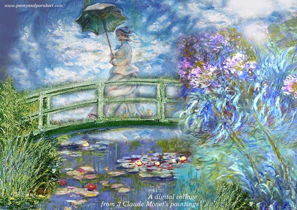
So I created a reference image in Photoshop combining three of Claude Monet’s paintings: “Woman with a Parasol” and a couple of paintings from the water lily series. Then I invented a technique where you can paint some of the elements as collage pieces so that you can adjust the overall composition before making the final decisions. This way it is possible to add more details one by one and improve the image during the actual creative process.
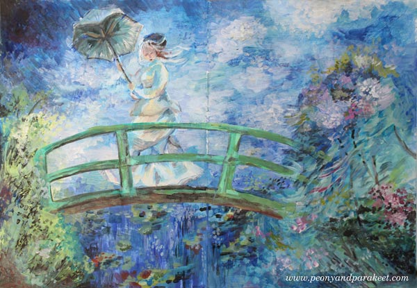
So this painting is about a woman who is experiencing strong wind. She doesn’t mind wind catching her parasol. She enjoys the fresh air and the beautiful scene around her.
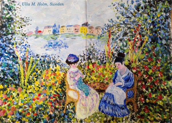
Ulla’s Take
One of the students, Ulla M. Holm, made a Photoshop sketch from another set of Monet’s paintings and then painted the image with short impressionistic strokes. I love how the result also reminds me of her home country, Sweden!
Using Reference Images More Intuitively – From a Story to an Experience
I admit having mixed feelings about following the reference images carefully. With my art, I want to express freedom, and I don’t think that following reference images too closely helps with that. On the other hand, I don’t want to restrict myself doing abstracts only or creating similar paintings one after another. Many artists create the same again and again and become better and better with that. To me, art is about exploring and the hook there is to widen my perspective continuously.
So even if you would prefer abstract art, it doesn’t mean you can’t have reference images. Instead of connecting with the actual story, you can connect with an emotional experience.

I picked colors and ideas from Emile Vernon’s painting and imagined what it would be like wearing that soft dress. The dress felt like a dream, so I wrote: “Muisto unelmasta” – “a memory of a dream” in the image.
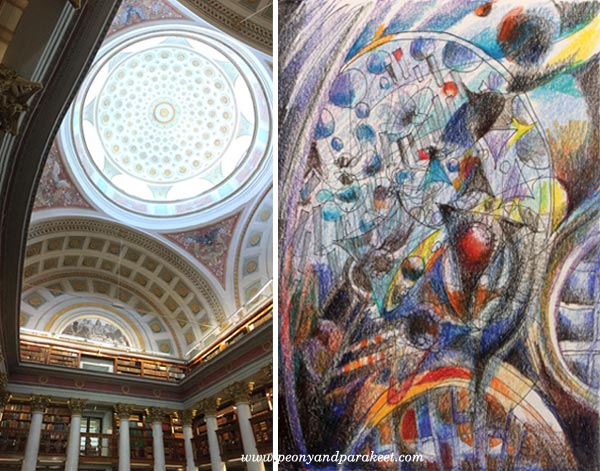
Here’s another example from my class Inspirational Drawing 2.0: a photo from The National Library of Finland and my interpretation, “The Power of Knowledge.”
Do yo want to experiment with this approach using your personal reference images? >> Sign up for Inspirational Drawing 2.0!
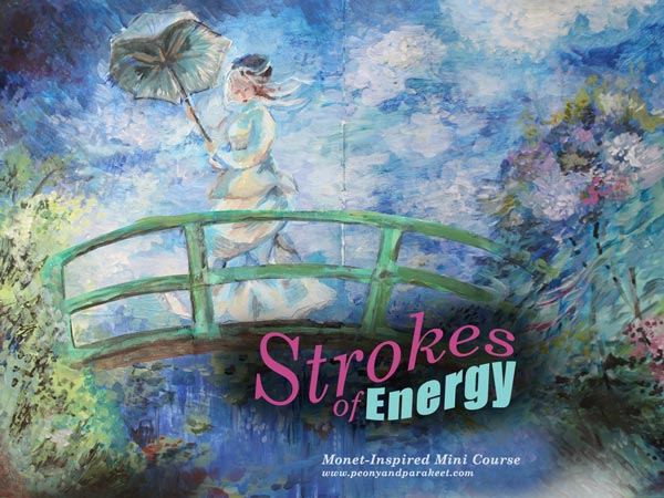
For the Fans of Monet – Strokes of Energy
My Monet-inspired mini-course Strokes of Energy is now available as an individual self-study course. >> Buy Strokes of Energy!
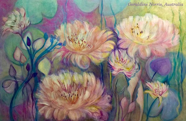
Geraldine’s Take
I want to end this blog post with a skilled artist Geraldine Norris from Australia who created her version of Monet in my class. She had just seen an art exhibition showing Monet’s work, and I think it shows how deeply she connected with the experience.
But wait, there is more beautiful Monet-inspired art from my students, see the presentation page of Strokes of Energy!
Until next time!
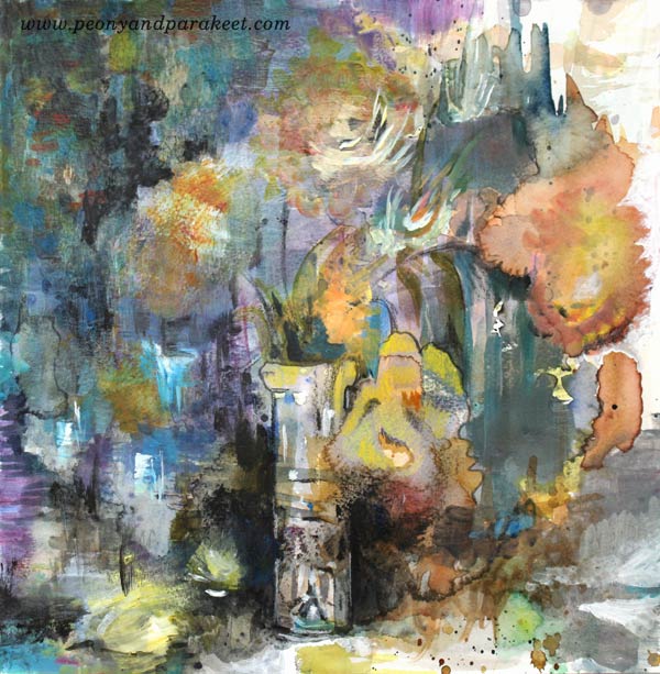
Intuitive Still Life with Gelli Plates and Golden Open Acrylics
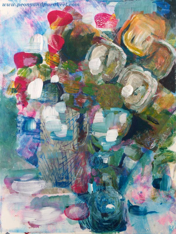
Here’s my latest painting, an intuitive still life with tulips. Last week, I had a short visit to an art supply store in Helsinki. I was surprised that they had a collection of Gelli plates for sale. When I got my first one several years ago, it wasn’t as accessible. I had to contact a shop in Italy which was the only retailer in Europe at that time. It’s great that Gelli plates have become more widely known. I have noticed that on my blog too. Month after month, the post “Self-Expression with Gelli Plate” is at top ten!
So I couldn’t help myself at the art supply store and bought another Gelli plate. My old one is 8 by 10 inches. The new one is a smaller, only 3 by 5 inches. It’s easier to handle and clean but mono printing with the big one is quicker.
Could Gelli Plates Be The Cure for Blank Paper Syndrome?

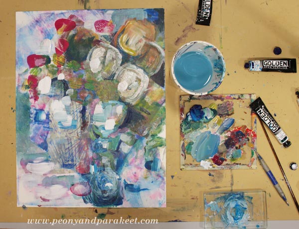
I wanted to have an experiment using both of the plates. Without any pre-planned idea about what my painting should represent, I would get over the blank paper syndrome using random monoprints. Then I would move on using brushes and working more intentionally. As always with mono printing, I used Golden Open Acrylics as paints because they don’t dry as quickly as regular ones.
Here’s my painting after I had some fun with Gelli plates.

And here’s the finished piece.
Intuitive Equals Subconscious!
After I had finished painting, I realized that it’s a combination of recent events: I got a lot of tulips for my birthday, made a strawberry birthday cake and enjoyed the winter sun with Stella.

Intuitive Still Life – Watch the Video!
Here’s a video about creating the intuitive still life. There you can see how adventurous my process was.
Enjoy creating more intuitively: Sign up for Inspirational Drawing 2.0!
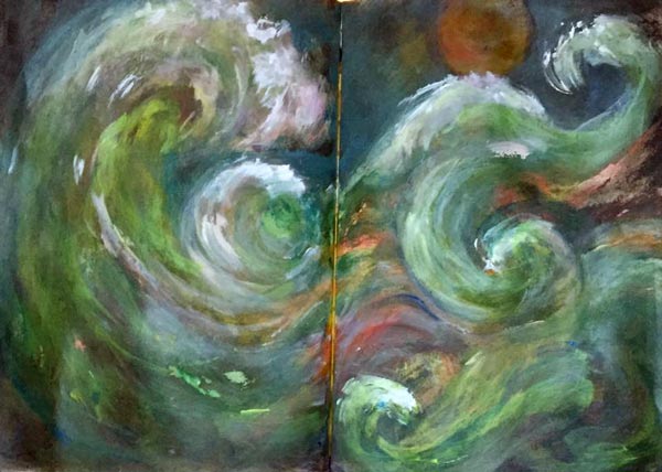
Mixed Media Seascapes – 5 Tips for Expressive Art
Notice the new, useful categories for the blog posts, see the sidebar “Posts by Theme” or if you are in mobile, see the end of the page!
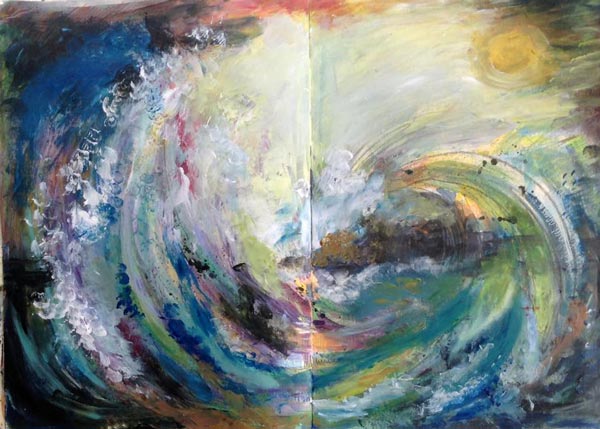
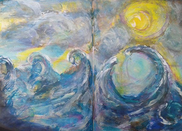
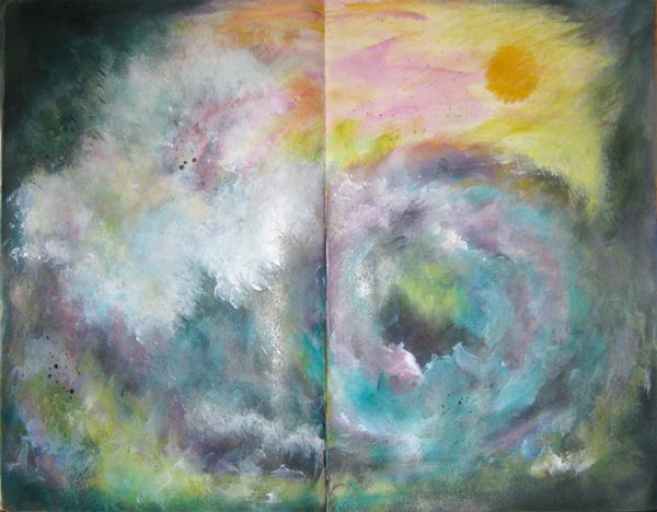
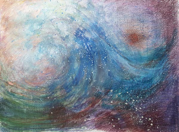
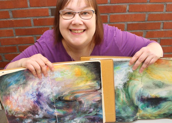
Sometimes I regret creating my art on the journals. When I created these mixed media seascapes for the mini-course Stormy Scenery, I wanted to keep the journals open and visible for days just to get back with the process and look at all the colors. And when I saw what my students had created, I secretly wished the same – that not so many weren’t in journals but frames. I want to share some art made from the mini-course and share some tips for expressive seascapes.
1) Play with Colors!
When creating the waves, show how the water reflects the colors of its surroundings. When there’s a storm, there will be a lot that’s moving, and it will affect the colors too. You can show your current state of mind as the sea and bring out the variety of thoughts and feelings. See how Claudia Watkins has made a row of waves with various colors.
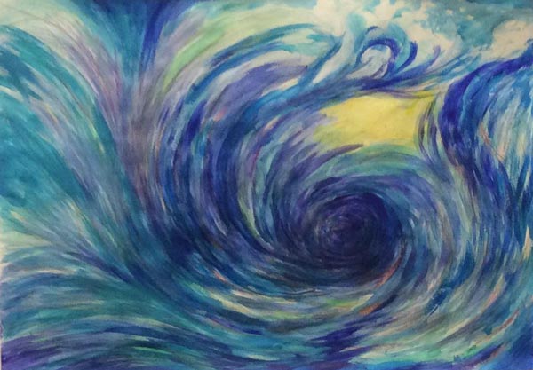
2) Create a Connection Between The Sky and The Sea!
If the sea represents you and the sky represents the outside world, how do they interact? Susan Rajkumar has expressed the connection in a brilliant way. It looks like the sea is willing to hug the sun and the overall feeling of the piece is warm and happy.
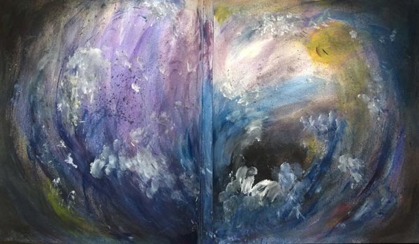
Sheila McGruer’s sun has left the sea, and it has caused an explosion of energy.
Sheila’s piece also has the softness which takes us to the next tip …
3) Express the Softness of Water
Cheryl Rayner shows the softness with both long strokes and splashes of water. With softness, you can practice gentleness towards yourself and others.
4) Show The Movement of The Waves
Enjoy the transformation that happens when you focus on creating art! Strokes and lines express the movement. Lorraine Cline’s green sea is captivating because it’s wonderfully dynamic!
Terttu Laitinen has the great eye of the storm.
5) Make The Scene Look 3-Dimensional!
In any scene and any mind, some things are closer, and some things are further away. Add more 3-dimensional look to make some elements more blurry and some sharper than others. Satu Kontuvuori has a striking focal point where sharp white waves are on the top of the blurry black eye of the storm.
Mackie d’Arge also has a clear focal point and lots of less defined splashes around it.
Internal Seascapes – Connect with Your Internal Energy!
The mixed media seascapes shown in this blog posts are made from the mini-course Stormy Scenery which was part of my Imagine Monthly Spring series last year. You can now purchase it individually too. When creating Stormy Scenery, I was inspired by the long chain of seascape painters, especially by J.M.W. Turner and Ivan Aivazovski. I also have a Pinterest board called Internal Seascapes where I have collected inspirational sea paintings.
But in Stormy Scenery, more than just to paint the sea, I coach you through the process of opening up and bringing out your expression. With the mini-course, you are not so much mimicking the sea outside but expressing the power inside. I believe that every artist has a unique power as well as every day has a unique energy.
Create Mixed Media Seascapes!
Use colored pencils, watercolors, and acrylic paints to create expressive mixed media art!
>> Click here to buy Stormy Scenery!

Year 2016 in Review – In Terms of Art Supplies
I am not usually so keen on “year in reviews,” but I thought it would be interesting to look back regarding art supplies used in 2016. When people ask me what supplies do I use, my quick response is: “Acrylic paints, watercolors, and colored pencils.” If I get detailed questions, I often refer to these blog posts: What Art Supplies Do I need? and What Acrylic Colors to Buy?
But it hit me that I have used a more diverse selection of supplies in 2016. And then, there are all kinds of necessary stuff that we don’t often mention but still use all the time. So, I dedicate this blog post to supplies. It’s not so much about the single pieces created in 2016. If you want to have a look at those, go to 2016 Gallery!
Must-Haves for Collage Art
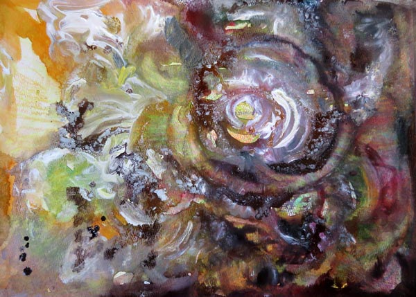
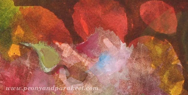
The image that is at the beginning of this post is a collage made for January’s lesson at Inspirational Drawing 2.0 while teaching how to create unique collage pieces and enjoy freehand drawing. I have been blown away by the beautiful art created by my students, and I am more certain than ever that introducing the ideas for drawing piece by piece makes freehand drawing and the use of imagination easier than trying to build a bigger illustration in one piece. (You can still sign up for the class and get the first lesson immediately after the purchase!)
I like to create collage art to my biggest art journals. I have two of large Dylusions Creative Journals. The first one is almost full, so I hope I can fill it in 2017 and make a flip-through video of it. I purchased the second one last year because I love the quality of the paper. It’s perfectly smooth for colored pencils and sturdy enough for collage art.
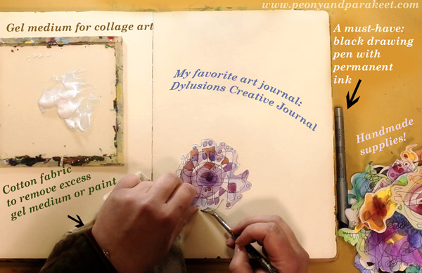
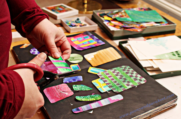
Like in the previous years, I have used “Golden Soft Gel Gloss” gel medium for attaching the collage pieces and Tim Holtz’s non-stick scissors for cutting the pieces.
A new discovery is to use a piece of cotton cloth to remove excess gel medium. First, I started using old t-shirts for finger painting. But when learning old masters painting techniques at a class, we used old linens for cleaning the brushes and realized that they work well for wiping off too. Since then, I have been a collector of old cotton fabric pieces. A fellow artist told me that she has several plastic bags filled with waste cotton fabric for art making!
Speaking of collecting, I am still a collector of the best handmade supplies: hand drawn and hand painted paper pieces! If you have never tried creating collage pieces, see Step by Step page for basic instructions! I also have a mini-course called Doodled Luxury, that shows how to combine doodling with collage techniques.
Colored Pencils – Not for Art-Making Only!
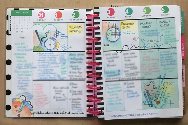
Because I create a lot with colored pencils, I often get questions about which colored pencils to buy. Many contemplate between regular and water-soluble pencils. I love regular colored pencils because they are easy to carry and easy to use when you only have a minute or two. I use regular colored pencils also outside my art-making. I love to use them to make written notes more visual and add visual ideas to my notebooks and planners.
It’s why I always have colored pencils in my reach, and I think it’s also why I find it so easy to create with them. If I have to create something quickly that isn’t very big in size, it feels natural to choose them. I use Prismacolor Soft Core pencils when I create art pieces and a selection of old pencils for more mundane purposes. My e-book Coloring Freely focuses on regular colored pencils and shows easy techniques for creative coloring.
I also have a mixed selection of watercolor pencils, and I enjoy using them too, especially in the beginning of coloring. Using water makes it quicker to fill a paper with a soft mix of colors. It is the technique I use a lot at Inspirational Drawing 2.0: starting the coloring with watercolor pencils, inks or watercolors and then moving on to dry supplies like colored pencils and felt-tipped pens.
Using Watercolor Paper – and Not!
This is a supply that makes my heart sing – I only have to touch it: a good quality watercolor paper! My absolute favorite: St Cuthberts Mill’s Saunders Waterford HP watercolor paper. It’s smooth and thick (300 gm2/140 lbs), and it’s perfect for both watercolors and colored pencils. I especially enjoy creating intuitive still lifes on the thick paper. I often cut the paper to a square to enable easy changes in orientation. See this blog post to watch me creating the intuitive mixed media painting below on a watercolor paper!
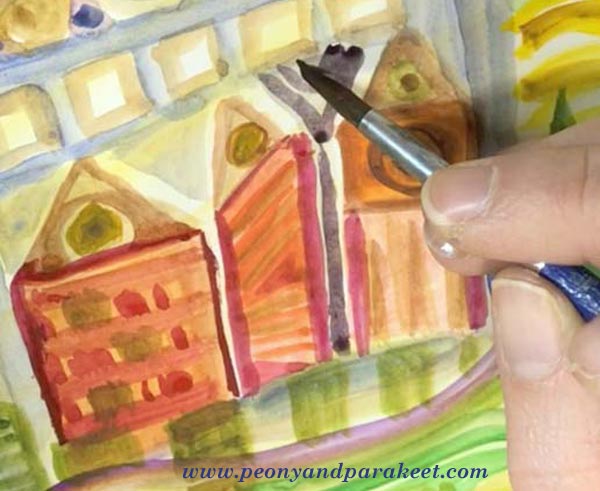
Even if I love smooth watercolor paper, I don’t want to limit the use of watercolors. I use watercolors constantly and often with paper that is not designed for it. I like to carelessly splash watercolors on any paper because there are a lot more opportunities to use watercolors than to use watercolor paper. For example, watercolor paper is not good for collage pieces because it’s too thick. I like to use sketching paper instead.
The best exploration with watercolors so far happened in 2016. I studied Friedensreich Hundertwasser’s way of using watercolors and created a mini-course about imaginative painting style. This painting style uses only a little water, and it’s easy to apply on almost any paper. See the mini-course Painter’s Ecstasy!
The Year of Canvas
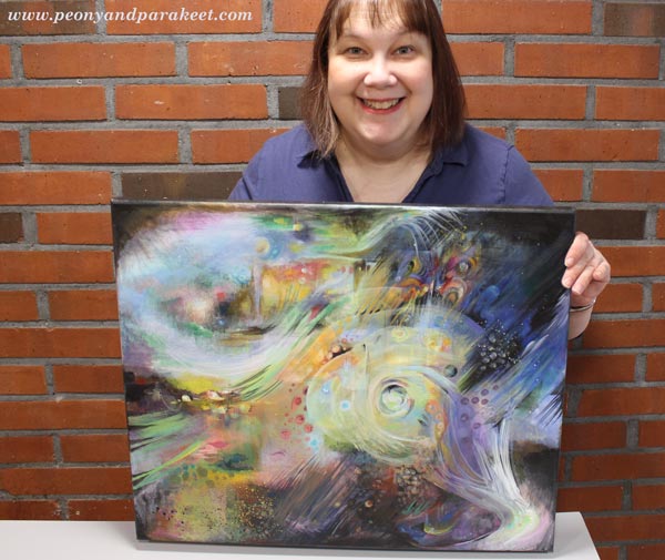
If I had to name one supply that marks 2016, it would be canvas. I have created more canvas pieces than ever before. I have painted five small acrylic paintings and two medium-sized paintings. “Human Nature” was not a wall-sized, but so far the biggest that I have painted. See this blog post: 5 Lessons Learned When Painting on Big Canvas
I always take the canvas more seriously than if I create a painting on a watercolor paper or an art journal. A blank paper syndrome is nothing compared to a blank canvas syndrome! But I enjoy larger projects between smaller ones, and I have two blank canvases waiting for 2017 creations.
Experiments with New Supplies
Oil paints
I would have never guessed that I would be 47 years old before trying out oil paints for the first time, but that was how it went. I started painting as a young teenager and my parents purchased acrylic paints to me. They explained that using oil paints would require all kinds of liquids that would not be safe and acrylic paints were better in that way. They were so right! Not to mention all the smells! I live in a house built in the 1960s, and the smell stays there for some time. It would be impossible to me to use oil paints daily just because of that.
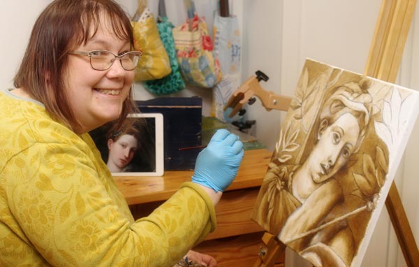
But I have signed up for an art class and will start my second oil painting next week using the old masters’ techniques. (See this blog post to read what any artist can learn from old masters!) I love the pigment and gloss of good quality oil paints. We are using Schminke’s Mussini oil paints, and they are the best quality paints that I have ever experimented with.
Soft Pastels
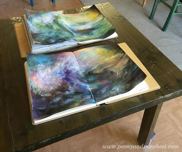
During 2016, I saw quite a lot of art that was created with soft pastels. I almost bought Unison soft pastels to treat myself but then realized that I already had a small set of Rembrandt soft pastels. I had purchased them many years ago for industrial design studies, but we had been using them very differently than how people use them usually. We scraped them to get powder and used the powder to create soft shadows.
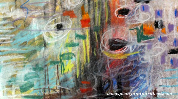
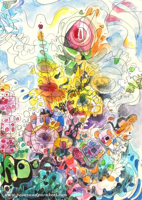
I created an art journal page (see the full image in the middle of this blog post) to try them out. Now I just grabbed the sticks and drew with them, but it felt like there was powder everywhere. And then, in the end, I had to use fixative, of course. It felt tedious even if it was not. I had no desire for new pastels anymore, but afterward, I have wondered if I gave up too easily. Maybe I should try the soft pastels again sometimes in 2017.
Liquid Watercolors and Watercolor Markers
In the late fall, I got a couple of surprise packages from one of my students! I got to use liquid watercolors and watercolor markers for the first time, and I liked both of them.
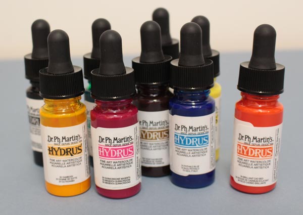
I like the intensity of color in liquid watercolors. Mine are Dr. Ph. Martins’s Hydrus watercolors.
Watercolor markers seem to be very versatile because you can use them with or without water. I also received a set of gouache paints, and they encouraged me to dig out my old gouache tubes as well. To see what I created with the new supplies, watch this video blog post!
Going Digital?
Based on 2016, my answer is both yes and no. Yes, I have created digital art, see this blog post especially! I have used Adobe Photoshop CS5 for so many years that it feels very intuitive and I don’t have to think about the commands and such, I can just focus on the fun stuff.

But when I create digital art, I like to use my hand-drawn and hand-painted pieces as building blocks. I know that many buy stock photos, but it feels much more exciting to me to use my art as a starting point. Sometimes when I don’t work I buy a digital kit and have fun with it, but that’s just playing in my spare time (Sometimes I do wonder, how much do I have to create, to stop creating …)
I have a student at Inspirational Drawing 2.0 who is adapting the exercises to work with her iPad mostly. I look forward to seeing more of this happening because I see a potential of more people going into creating art. However, I don’t want to spend all of my time with devices, so I enjoy creating pieces by hand and as long as I can do it, I think I will, also in 2017!
What about you? What supplies were new to you in 2016, and what supplies are you going to continue using in 2017?