The Child and The Adult – Finding Clarity for Your Art
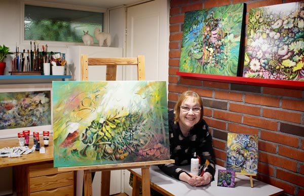
This week I show a new painting “Call of the Sun” and talk about finding clarity in art. This week’s post is especially for you who feels that your art is all over the place and you have no artistic direction.

Auringon kutsu – Call of the Sun, acrylics, 50 x 70 cm. Click the image to see it bigger!
The Child and The Adult – Who Do You Serve?
I used to think there are two kinds of artists – those who like to play and dream, and those who are more ambitious and aim to express their deepest emotions. Just recently, when I started this new painting, I asked myself: “What do you want to paint, Paivi?” And the answer was: “Horses!”
– You can’t paint horses only!
– Why?
– Because there’s more that needs to come out.
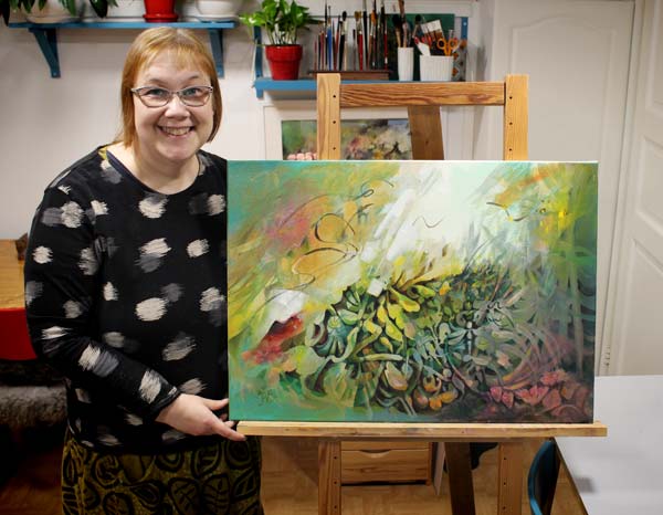
There was. There is. My inner child wants me to paint horses, but I am an adult too. If all my art is playful illustrations, I am desperately missing the adult in me.
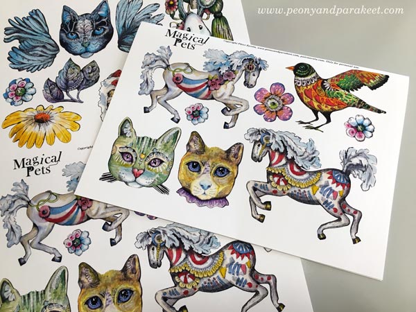
The Magical Pets image sheet is now available in my art shop. Or make your own in the classes Animal Inkdom and Magical Inkdom!
Concrete vs. Abstract
The adult in me wants to work in a way that does not appeal to the child. The expression is more intuitive and abstract and thoughts less concrete. I feel free when painting like this. It’s like life travels through me, and it heals my soul. It makes me feel that this is the best that art can offer.
But I also feel free when I grab a more childish painting. I imagine talking to the horse and how it responses with gentleness.
This, too, is the best that art can offer – the connection to childhood, to the person who didn’t want much more than a pet of her own.
The Child and the Adult – Don’t Lose Either One
Nowadays, my studio is both the playroom and the space for meditation. The inner adult needs to paint with the inner child and vice versa.
If the child gets neglected, other people’s expectations step in, and I lose myself. If the adult is away, I focus too much on the tangible things. Then the invisible side of the experience doesn’t come through. This realization has helped me in finding clarity for my art.
What are Invisible and Intangible Things?
Examples of intangible things that we can visualize in art:
- communicating the atmosphere with nature’s elements like light, air, and wind
- expressing emotions that contain mixed feelings, for example, the combination of love and melancholy
- inventing creative concepts like seeing similarities in the structure of plants and bridges
- focusing on experiences like flying instead of painting a bird
When we omit these kinds of intangible things, we are in danger of only creating shells rather than expressing a spirit.
Viewers Have Child and Adult Too
As viewers, we also have both sides: the child and the adult.
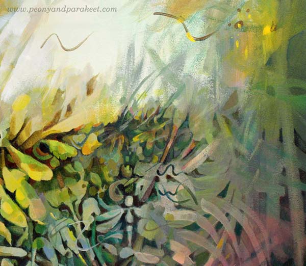
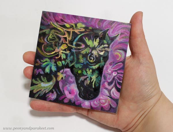
I painted a dragonfly for your inner child to play with while the adult can ponder about the more abstract strokes.
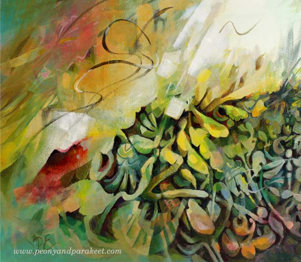
Sometimes simple lines and colors can express more than realistic objects.
Finding Clarity and Balance for Art-Making
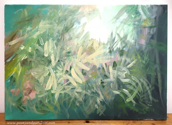
For a long time, I haven’t been happy about my art. Especially this fall, it has changed. I have found what my child needs to be satisfied with the result, and what pleases the adult in me. Surprisingly, being able to satisfy the child has been crucial for me to getting forward in abstract painting. This one is in progress, and you will get more pics and stories about it when it’s finished.
What do you think? Are you in the journey of finding clarity for your art? What would need to change in your art so that both the child and the adult are happy? Tell me, I am interested to know!
Expressive Abstract Style Tutorial – Paint a Beautiful Mess!
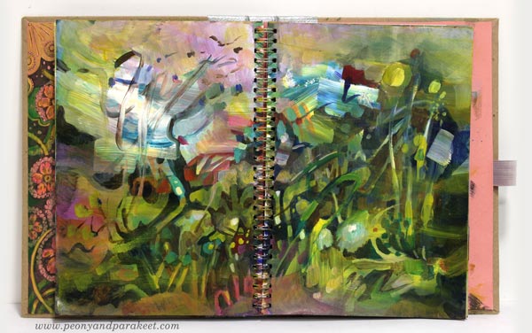
This week I have a video about painting in an expressive abstract style. It’s a very contemporary style which many artists have nowadays. It’s based on loose strokes, and I guess it’s the style that many who are not so much into art say that even a child can do it, but it’s not quite like that! Watch the video!
Are you interested in creating abstract art? Do you wish to learn more about abstract art in my blog and in my classes? Leave a comment!
3 Tips for Improving Busy Mixed Media Pieces
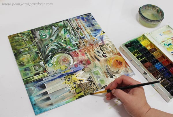
This week, I have a revamped old piece, and share three tips about making busy mixed media pieces more attractive for the viewer.
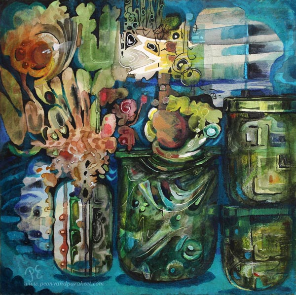
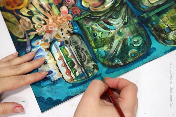
The image above is a revamped version of the busy mixed media piece below. It’s 12 by 12 inches, and I originally made it back in 2014 for a blog post about how to paint glass.
I visited the Finnish Glass Museum a couple of weeks ago, so this piece felt really inspiring again! Let’s dive deeper into how I changed it.
Tip #1 – Cure the White Spot Fever
Back in 2014, I had fallen in love with all kinds of white pens, paints, and correction fluids. A little dot here, another there, and the element looked prettier. But adding dots and spots also make the piece busier. For the viewer, it’s like trying to find its way through crowded streets where everyone is trying to get the attention: “Hey, hey, hey, you there, look at me!”
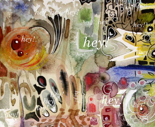
When you are a doctor for the white spot fever, start by toning down all the spots that are located near the edges. We want to steer the eye to the middle first, so the edges don’t have to be so eye-catching. If this is the first time you work on this job, watercolors can be a good choice. Even if the pigment wouldn’t stick on all the surfaces, you get the impression of how the piece looks if you make the edges less noticeable. Turn the piece upside down, so that it’s easier to focus on the task, and not look at the big picture.
Of course, your pieces can have fever, even if it’s not the white spot fever. The general advice for any fever is to remove all the eye-catching small elements that are located near the edges.
Tip #2 – Form Friendships between Elements
Often when we don’t feel connected with the image, the image itself doesn’t express connection. When the elements are floating separately, there can be a lonely undertone in the whole piece. On the other hand, if there is no contrast between the elements, the image can look busy no matter how connected the elements are.
Here are my two versions side by side. In the old version, there are big glass jars, but the contrast between them is not very clear. There are a lot of small shapes that are floating lonely.
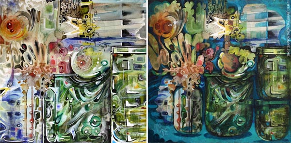
At best, adding connections make the image to deliver a message. When I looked at my piece, it was unclear to me what it was about. In the old blog post, I had written: “It’s about parents trying to protect their children. The parents have good intentions, and they do their best, but in the end, they have to let the child step into the world. I have painted two glass vases to represent the parents. The child sees the world through the parents, and even if they want to protect the child, they are fragile too.”
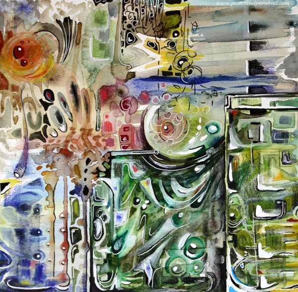
But now, I found the element that looked like jaws most intriguing. It seemed to be a rising spirit, a small but powerful baby dragon, which only needed a neck to become a central element.
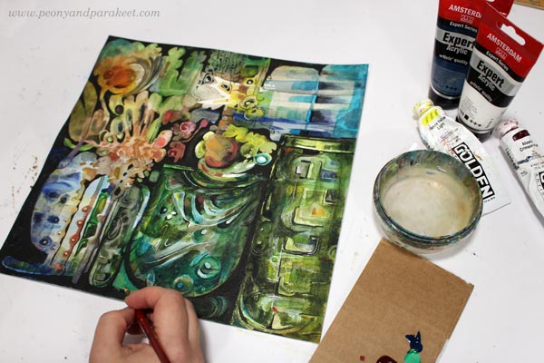
I used dark india inks and black pen to quickly sketch how I would connect the elements, and then continued the work with acrylics and lighter colors. I broke the biggest jar near the edge to two jars so that they won’t compete with the focal point so much.
Tip #3 – Make a Highway for the Viewer
Busy pieces often have so many paths for the eye that it’s not clear where to start and how to continue. The best thing is to be clear and make a highway that goes around the image. The viewer can then take smaller scenic routes around the details, but there’s always the big safe road to return to that leads to the main attractions.
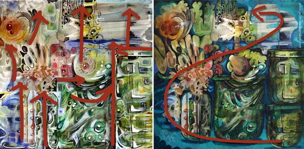
Building a highway requires that you know what your main elements are. After finding the spirit of the jar, I made the red circle communicate with it. Now I added a couple of white spots so that it looks like there’s a voice or a reflection flying between the two. So there’s use for those white dots, just use them sparingly and near the places where you want to lead the eye!
With turquoise tones, I painted a route from the right bottom corner to the two central elements. I also added more depth to the image by painting shadows. Shadows would be my fourth tip, but it’s worth a separate post, so I will get back to it sometimes later.
No More Busy Mixed Media!
I named the revamped version as “Song of Glass” because it’s now about finding the singing spirit of the silent jars.
I hope you found this post helpful for busy mixed media pieces. See my classes for more handy tips and advice!
Painting an Intuitive Fantasy
This week, I have a new fantasy painting, and I also share tips about selecting colors.
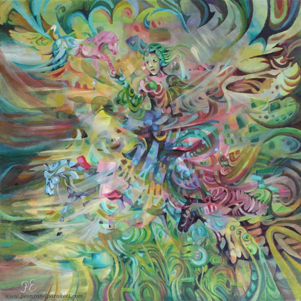
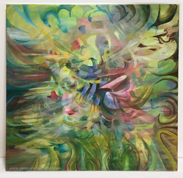
This painting is called “Arotuuli,” which is “Steppe Wind” in English. “Aro” must be one of the few words that are shorter in Finnish than in English, as Finnish words are often very long. We write compound words without space, so it makes words look even longer.
Intuitive Fantasy Painting – Two Tips for the Beginning
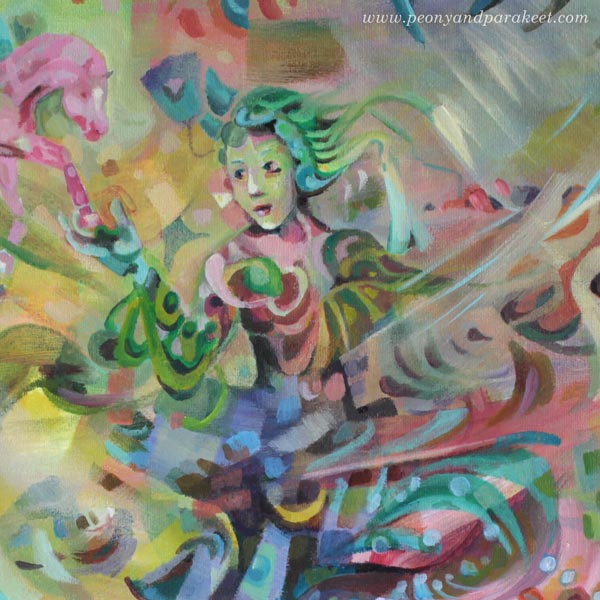
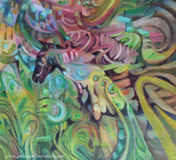
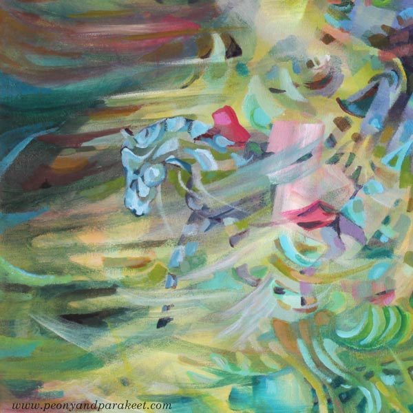
I like to paint intuitively, and even if this painting has horses and a woman, it started with random strokes and abstract blocks, and I had no other idea than a secret wish to be able to include a horse at some point.
Tip 1 – Dark and Light
When filling the canvas with color, I like to make dark and light color mixes so that the 3-dimensional effect tickles my imagination.
Tip 2 – Less Can Be More
I also like to pick a narrow selection of colors so that the elements look like they are exposed to the same light. In this painting, I mostly used Phthalo Turquoise, Alizarin Crimson, Yellowish Green, and Titanium White. When mixing colors, less can be more!
A Couple of My Favorite Colors
I am especially fond of Yellowish Green and Alizarin Crimson, and I recommend them warmly. Let’s talk about them a bit more.
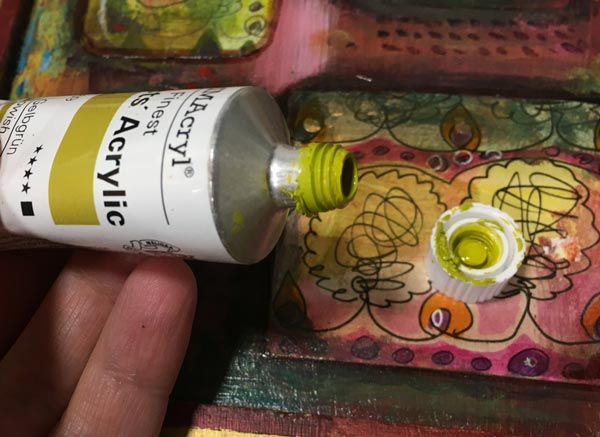
Color 1 – Yellowish Green
Yellowish Green is a color mix manufactured by Schminke Primacryl. I bought this tube because I love Daniel Smith’s Rich Green Gold in watercolors, and I wanted to have a similar tone in acrylics. I like colors that remind me of lemons and lime fruits – one of the most beautiful things in the world – and I always find use for yellows. This color is like two colors in one tube: it works very well with the mixes that require yellow, but it also produces beautiful greens with blues.
Color 2 – Alizarin Crimson
Alizarin Crimson is an ugly red. I don’t think you would buy it if you didn’t know more about it. It looks like dried blood but works very well with color mixes. White reveals its gentler side, and when mixed with blues, you can get beautiful blacks, browns, and dark purples. It produces a pleasant and quite sunny orange with yellows, and in general, it’s a workhorse, always willing to step in.
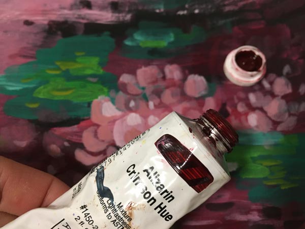
Alizarin Crimson was originally manufactured from madder, but these old organic dyes faded or changed within time, so nowadays we use synthetic substitutes. I found this color in oils first. Schminke’s oil paint is called “Alizarin Madder Lake”. My tube, manufactured by Golden, is “Alizarin Crimson Hue”. Alizarin Crimson is sometimes called “Madder Lake” or “Alizarin Red,” and the tone may vary. Pick the darkest and ugliest one!
If you are a color nerd, Bright Earth by Philip Ball is a comprehensive book about pigments and their origin.
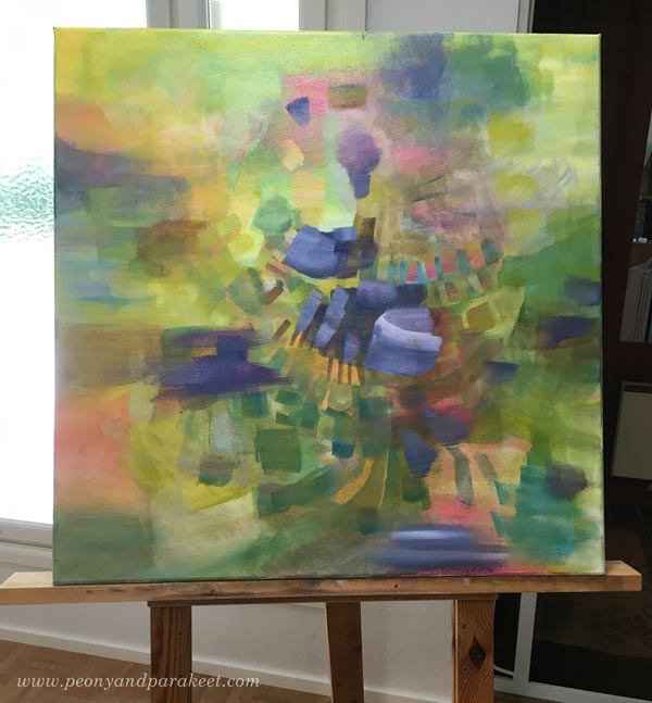
Here’s the painting before I started adding the figures. The image shows well how Yellowish Green and Alizarin Crimson work in color mixes.
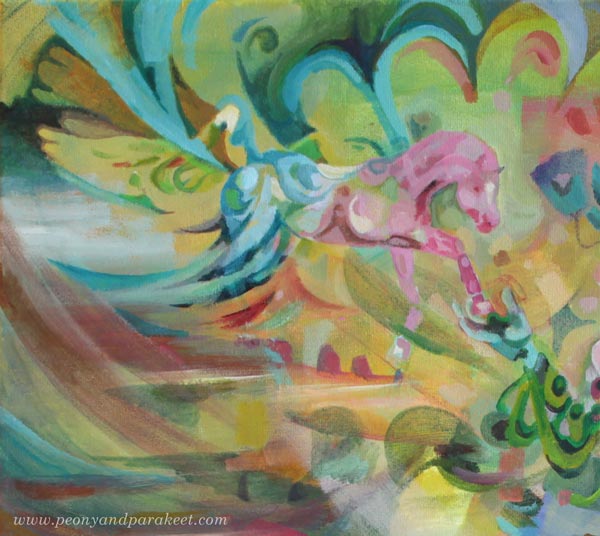
Intuitive Fantasy Shape by Shape
I painted the woman and the horses so that they are partly abstract and partly realistic. Some shapes exist just because they look beautiful, others because they are building blocks for the figures.
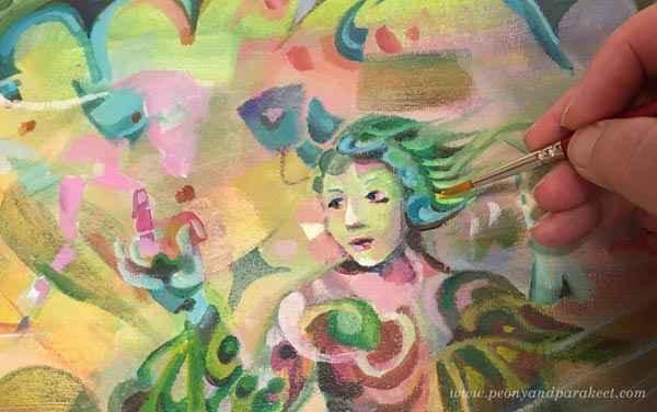
Here are some details of the finished painting. The more you zoom in, the more abstract the painting looks.
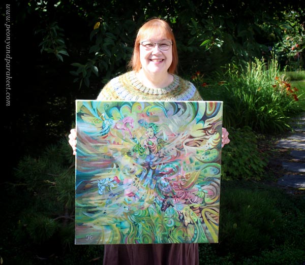
Here’s the whole painting again.
I wanted to keep the colors light and bright to create an airy impression.
Intuitive Fantasy Painting – Big or Small?
“Arotuuli” is one of my biggest paintings. It’s 60 x 60 cm (about 23,5 x 23,5 inches) and painted on a stretched, fairly thick canvas. I like painting on smooth surfaces. My style is detailed, and the coarse structure doesn’t go well with it. The painting was started about a month ago, and I took few-hour sessions now and then. It’s not as slow as you would think, because the small strokes aren’t as tiny as with small pieces. Sometimes we produce clumsy just because we select a small size. For me, the bigger size has helped to create dynamic scenes rather than static portraits. “Arotuuli” continues the previous bigger painting “Paratiisi / Paradise.”
But next week, something much smaller, even if I do have a new big canvas waiting!