Art Deco Journal Covers
My sisters will get empty handmade journals from me for Christmas. They both like writing and literature so I hope they will put the journals in use. My idea is to include some photos, decorative papers, scrap pictures and such – so that the journal is like a handmade version of Smash book more than a basic blank book. I have also chosen the themes for the journals. The older sister will get an art deco themed book and the younger sister will get flowers and fairies. Here’s a snapshot of the latter.
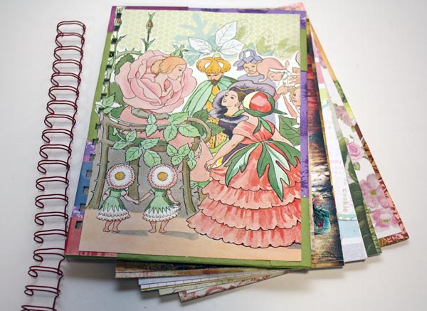
I had an old Elsa Beskow’s children’s book which I used for the cover image. There are plenty of pretty papers too! My other sister would not have this, it is much too cute for her. She likes something more artistic.
I chose art deco as I have been thinking a lot about that style lately. I love the muted, sliding color transitions combined with black and white. And I have been more and more into using graphic, sharp shapes.
Art Deco Journal Covers
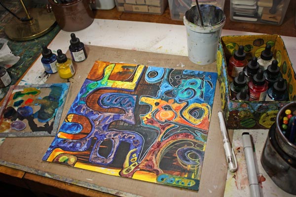
I will show you how I made the covers for the art deco themed journal. First, I picked some Sticky Canvas by Claudine Helmuth Studio. It is a canvas sheet that is like a huge sticker. You can attach it without glue after you have finished it. You do not need sticky canvas for this project. You can use a drawing paper or thin fabric instead.
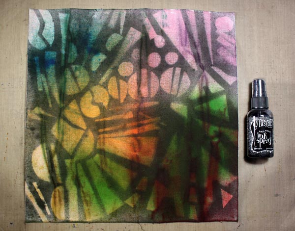
1) Background Colors
I started with watercolors, then used some Dylusions ink sprays. As the canvas got all wet, it got wrinkled. I emphasized the wrinkles by brushing Distress ink pads against the canvas.
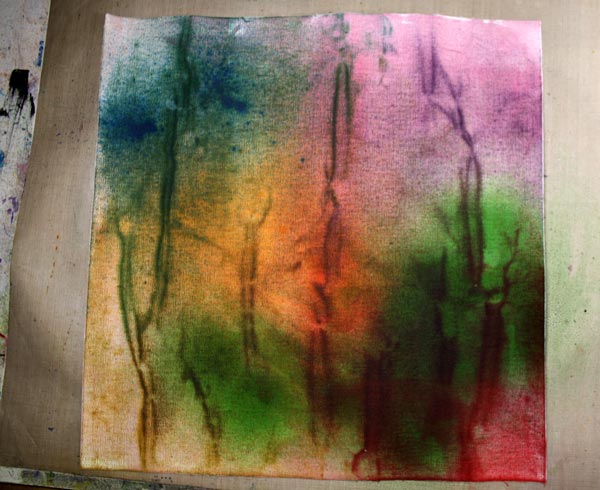
Now I got the muted, soft color transitions. Next task was to add contrasts and sharpness to it.
2) Background Motifs
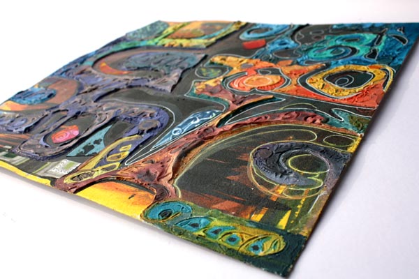
I cut art deco styled shapes from old cardboard boxes and arranged them on the canvas.
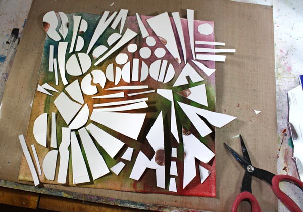
Then I sprayed with the black Dylusions ink spray over the shapes.
3) Finishing the Covers
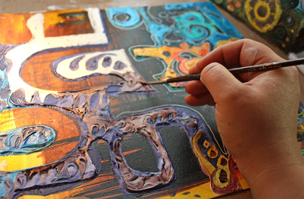
I cut two thick cardboard pieces for covers. Then I covered them with the sticky canvas. I had a couple of handmade decorated papers which I wanted to use too.
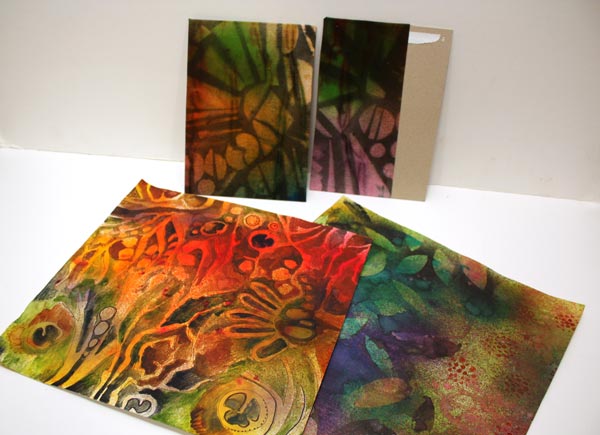
I added decorated papers to the covers. Colored pencils were used to highlight the muted tones. The holes were punched with Zutter Bind-It-All. It is amazing how thick it can cut!
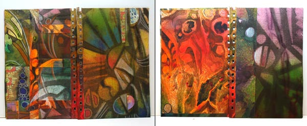
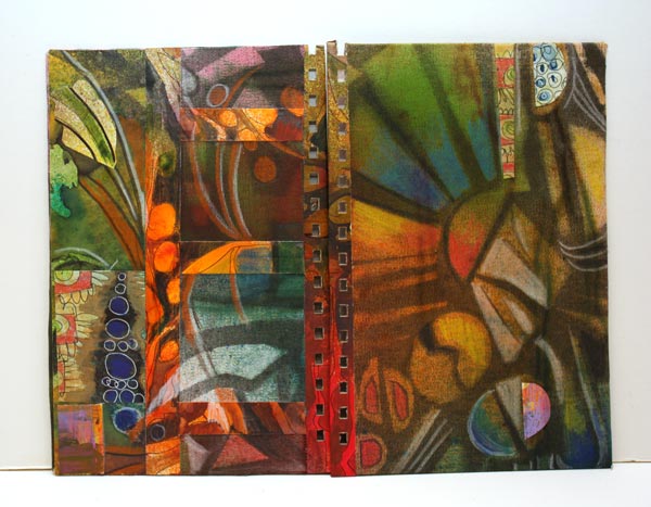
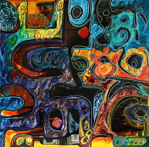
The front and back covers are shown on the left, and the inside covers on the right.
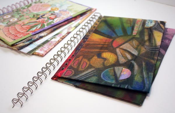
Now I just have to add pages, draw some art deco style ornaments to them and find a photo of my sister where she looks a bit like a beauty of that era!
Art Deco appeared first time in 1920-40s, just after Art Nouveau.
Leave a comment, what do you like in Art Deco or have you noticed it at all? Have you ever made anything Art Deco?
5 Ways Music Can Improve Your Art
This mixed media collage is called “Opera”. For me, visual images have always been more important than sounds, but I still think that there’s a lot in common and a lot to learn from music.
Tip 1: Let Music Challenge You!
How would jazz look like as a collage? Paint the voice of your favorite artist! Create a rhythm to your artwork!
A week ago was my first time in opera. I had bought the tickets as a birthday present for my husband who is a very cultured person. I was a bit worried about how I would endure the experience as I had disliked opera for all my life. At least the play was one of the easiest pieces, The Marriage of Figaro. While listening to the beautiful sopranos, I saw strong colors and lines in my mind. I began to think how powerful and intellectual music can be. I felt I was challenged! Could I ever express visually what I was experiencing?
However, when I began to create the collage, I did not think of opera. I knew that it would come out someday or another. Like many times, I just had a compelling idea of the technique I was going to use. I was going to create strong shapes with a molding paste.

But before opening the paste jar, I grabbed a sheet of heavy-weight watercolor paper and the box of india inks. Painting the background was fast with a thick brush.
Tip 2: Think Your Artwork as a Space for Music!
I read an interesting interview from the newspaper Helsingin Sanomat. They had interviewed a famous Finnish painter Marika Mäkelä. She quoted another Finnish artist, Leena Luostarinen. She had said that you should imagine a lighting inside the painting. Even the colors of the painting should be considered through the lighting. I think it is ingeniously said. It made me think about the space I would create inside my artwork and how the lights, shadows and color contrasts should flow there. My addition to this thinking is: if the music was played in that space, think about how it would sound. Pick the shapes and lines to express that!
With these deep thoughts, I cut both heavy and light cardboard into pieces. They were attached to the background with a masking tape.

See how irregular the handcut shapes are! I love the uniqueness that only handcuts can give! I can’t understand the popularity of machine-cut stencils.

After placing the masks on the background, I added the molding paste, a lot of it! Some swirls were doodled on the paste, so that the surface would look lively.

I removed the masks carefully before the paste was dry. Drying time was really long, almost a day, even if I used a heat gun to fasten the process. I usually like to take breaks from creating, so this extra waiting time did not frustrate me at all. While I was waiting, I was thinking about how I was going to paint the artwork. How would the light flow around these dramatic shapes?
Tip 3: Pick the Colors from the Music
I like to think music as colors. The lower the notes, the darker the colors are. A melancholic song is also darker than the cheerful one. Red and orange are for deep, rich voices. You do not need to overanalyze it: just get into the feeling of the music and pick the colors that come to your mind! The Marriage of Figaro has both bright and dark sounds. I also wanted to express the dramatic nature of the music with colors.
Tip 4: Move to the Rhythm of the Music While Creating
When the painting gets near the end, I often stand up. I need to see my work properly to find the essence of it. This is the stage where I usually put the music on if I have not done it before. I wave my hands and take steps to the rhytm of the music. I try to get as close as possible to the feeling that I want to express. I also try to be as focused as possible.
White gel pen and black markers were in use as I dived into the melodies of the opera.
Tip 5: Focus Your Energy with the Help of Music
It is important not to change the music too much when you want to focus. If you listen to the variety of songs just when you make the final touches, it might not do good for your work. I often play the same song repeatedly when I am finishing the work.

On the other hand, when I am in the earlier stages of the work, I am not that careful. I listen to this and that as long as it gives me the energy to continue. I like to listen to the music that gives me confidence and which doesn’t feel too themed. Here are my recent favorites for boosting the creative process: A Sky Full of Stars (Coldplay), Viva La Vida (Coldplay), This Years Love (David Grey), Change (Tracy Chapman), September (Earth, Wind & Fire), Flower (Kylie Minogue), Thorn in My Side (Eurythmics), I Say a Little Prayer (Aretha Franklin).
I love how dimensional my artwork became. I am also happy how finished it looks. Hand decorated papers were helpful while finishing the work. With them, it is easy to add details that are interesting and different. Just do not use the same paper too much!
Sometimes I aim for flying lines and relaxed touch, but this time – it was all about opera! My computer was playing The Marriage of Figaro in high volume and I was pushing my boundaries to express the quality of the music. Then finally, after placing the two red pieces, I felt that I have solved it, the riddle of opera music!

What music do you listen to while creating? Try changing the music if you want to fine-tune your art or expand to new areas!
Subscribe to my weekly emails – Get a free mini-course!
A Decorated Box Using Mixed Media
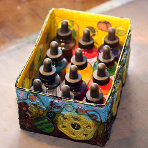 Trash can become a treasure
It was only a small cardboard box but I wanted to take it to the extreme. There’s something extremely satisfying in taking trash and treating it like a treasure. Many times when I draw I miss working with 3-dimensional objects. This time I wanted to enjoy playing with the box and use all its’ sides. Mixed media was the driving factor here too.
Preparation
First removed all the extra tapes from the box surface. Then I covered the box with white gesso. It would give colors better background than brown cardboard.
Inside
I painted the inside panels yellow. It is one of my favorite colors and I often use it when I want to add light but do not want to do that with white. As you may know, I am not a big fan of white!
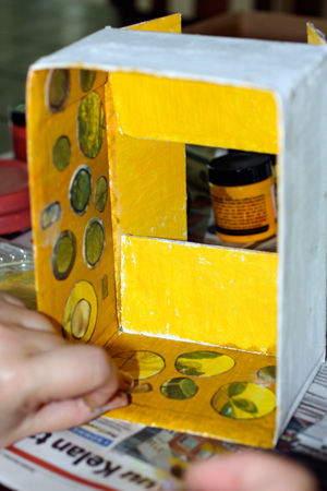
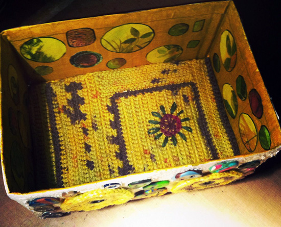
Plain yellow surface looked little bare so I added some collage elements. These were made by coloring pages from children’s books with color pencils and then randomly cutting circles from the colored areas. I glued the circles with gel medium.
The bottom of the box needed something different. I decided to crochet a piece that would fit inside the box. I began with a small square and crocheted around it using a couple of colors. Finally I finished the pice by embroidering a flower.
At this phase the box reminded me about the sunflowers in the end of the summer. Then I began to decorate the outside of the box.

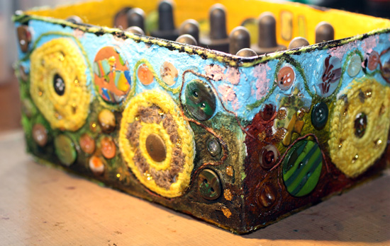
Outside
I continued with crochet. I made flowers and a long chain which I used in the outside bottom. It feels great to lay the box onto the table when there’s soft wool in the edges!
The I wondered how to attach the decorations like the crocheted flowers and various buttons to the outside edges. They were pretty heavy. Golden Fiber Paste was the perfect stuff! It created the textured surface and attached all the little pieces securely.
The end result is unusual looking but perfect for my indian ink bottles!
Inspired by Mark Rothko
I have some close friends and relatives who have their birthday in May. I came with this idea of Mark Rothko inspired greeting cards when I thought: What would I give them if I had all the money in the world. And I immediately knew the answer: Mark Rothko paintings! Not as genious as the originals of course but still I think this is a fun idea.
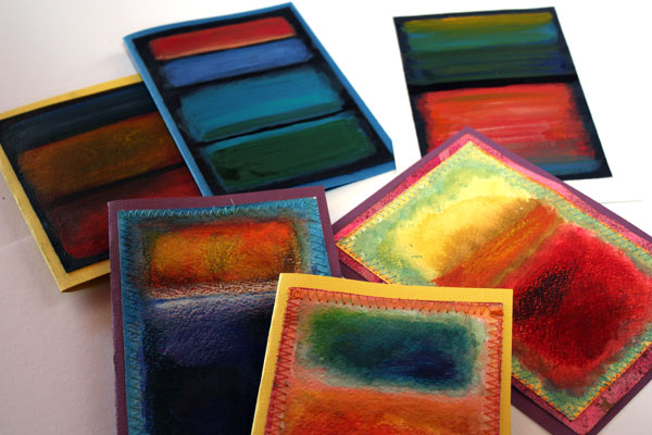
Make your own Mark Rothko inspired card!
1) Paint the borders of the cardstock with acrylic paint.
2) Fill the center with watercolors. Paint rectangular areas using multiple shades.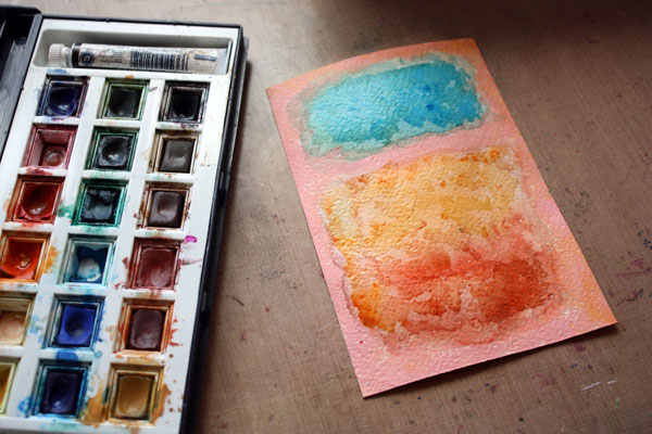
3) Strengthen the watercolors and create layers with color pencils.
4) Attach your artwork to the card base. If you like you can sew zigzag around the edges to add detailing.
You can also use acrylic paints only. In the first row you can see my all-acrylic creations and in the second row are the cards that combine acrylics, watercolors and color pencils.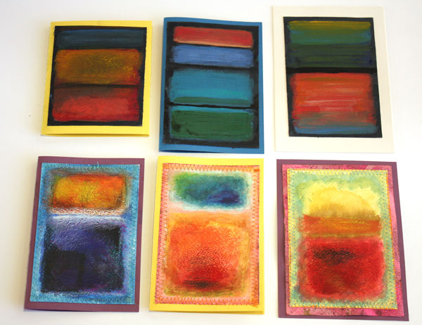
Mark Rothko & abstracts with colored pencils: Buy the e-book Coloring Freely!