How to Mix Colors?
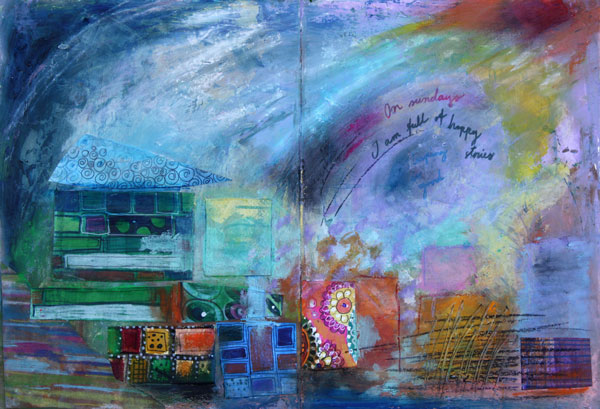
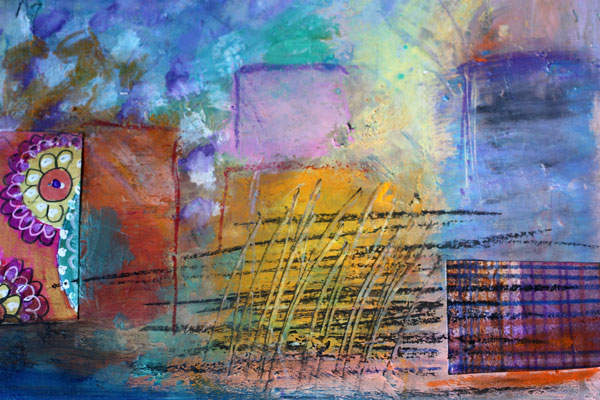
Here’s an art journaling page that I made to show you the gentleness of pastels and the strength of muted, darker shades. I often see art journaling pages that have a potential to be awesome, only if the color palette would be more unified! Meaning: only if the artist would have mixed the colors instead of using them straight from the tubes.
Choosing Color Combinations
Here’s the problem: we are pampered with many great colors by the art supply manufacturers. Like the colors of my Faber & Castell Gelatos, they look so pretty!
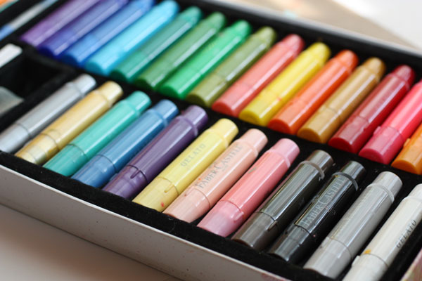
Still, you can pick colors there that won’t look so great together. Those colors have no common base color. Like the bright red, blue purple and mint green shown below. They have nothing in common. The bright red is a primary red; blue-purple is muted with black and mint green is muted with white. If you take out the mint green and mix the red and blue- purple, you can get a better combination. The brown, which is the mix of purple and red, ties the two colors together.
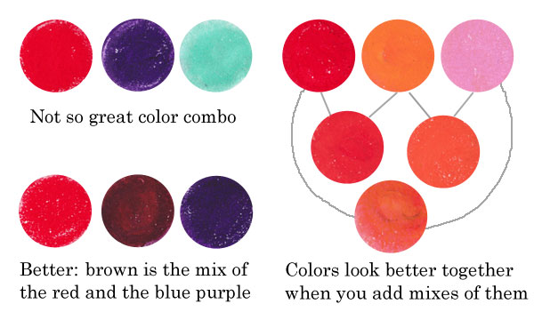
Similarly, if you use only red, orange and pink straight from the box, they look more separate than if you also use the colors that are mixes of them. Like parents and children, they form a unified color family.
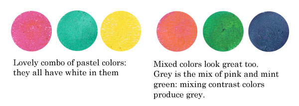
Another example: the colors that have a common base color, like the pastels below, suit well together. You can also mix them without fear: they produce lovely combinations. If you don’t want grays or muddy browns, avoid mixing contrast colors together. The contrast color pairs are red and green, blue and orange, yellow and blue-purple.
Sometimes people are afraid of getting grays and browns, and so they avoid mixing any colors. But those muddy colors make the brighter colors pop. See how muddy colors support the other colors in the art journal page that I made.
Playing with Tints and Shades
 One reason to mix colors is to get more natural, lively look. If you look at any photo, you can see a lot of colors there. The variation of light causes the huge amount of colors.
In the late 19th century, there was a genre of artists called impressionists. They were inspired by the daylight. They wanted to focus on the light, not on the objects themselves. If you are afraid of mixing the colors, look closely at Claude Monet’s Cliffs at Etretat and count the various tones there!
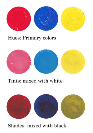
Instead of using primary colors like basic bright reds, blues and yellows and mixes of them, I encourage you to play with tints and shades: mix white or black to the primaries and get softer colors!
Using Faber & Castell Gelatos
When I began creating the art journal page, I chose to use gelato sticks with acrylics and hand decorated papers. I decided to use the background that I had made weeks ago, as its pastel colors reflected the cheerful mood I was having.

I like to create backgrounds when I am tired or uninspired. Then, when I start creating, I feel that I am already half done. When using various supplies in each layer of a page, I will get more variation in color without extra effort.

Faber & Castell Gelatos look like lipsticks, and they have similar kind of waxy feel. You can dilute them with water, but I think the greatest way is to mix them with a paper towel or soft sponge.
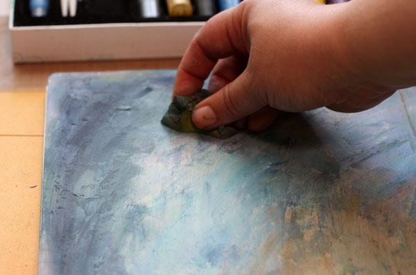
Gelatos work great on a painted surface. Notice that I created color mixes with slight variation in darkness. I used both tinted colors (mixed with white) and shaded tones (mixed with black).

Repeating Colors
One more thing to consider: color repeats. I am very careful of not repeating the same color too much. In general, when the color is used only once, it represents an individual. If it’s used twice or three times and the areas are closely located, they represent a group. But if the same color is here and there or evenly spread, it is often just a mess. The rational side of us wants to create color repeats. But once the work is finished it does not look rational at all! One more reason to mix those readymade tones!
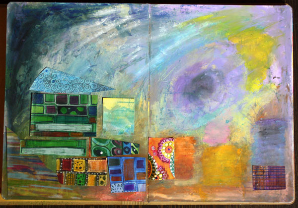
When I began to add hand decorated papers, I followed the same rule of controlling the number of repeats: not too much of the same paper.
Using hand decorated papers is a great way to add thin lines to a page. The gelatos have a waxy surface that can be difficult to handle with thin markers. For the journaling, I used Faber & Castell PITT brush pens.
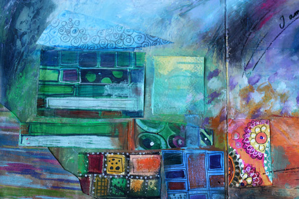
To make the collage look more integrated to the page, I added color with Gelatos on the papers.
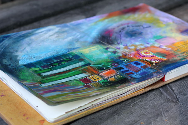
If I had to define art shortly, the definition would be: creating great color mixes and communicating with them. At least that is the step to take when you feel that the page you made does not represent what you wanted to create!
Read more about colors: Yellow, 5 Tips to Choosing Colors
Let me be your art teacher: Subscribe to my weekly emails!
Surface Patterns for Hot Summer Days

This July has been wonderful in Finland. I have enjoyed gardening and photographing and it shows in my art journal too.
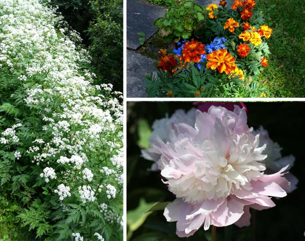
Both the wildflowers and flowers in the garden look great with a dark background. So when I made the drawing with colored pencils, I added some shadows too. Great way to express sunshine is to combine black with yellow!
But my main focus was on summer fabrics. It is so much fun to design prints for summer dresses.
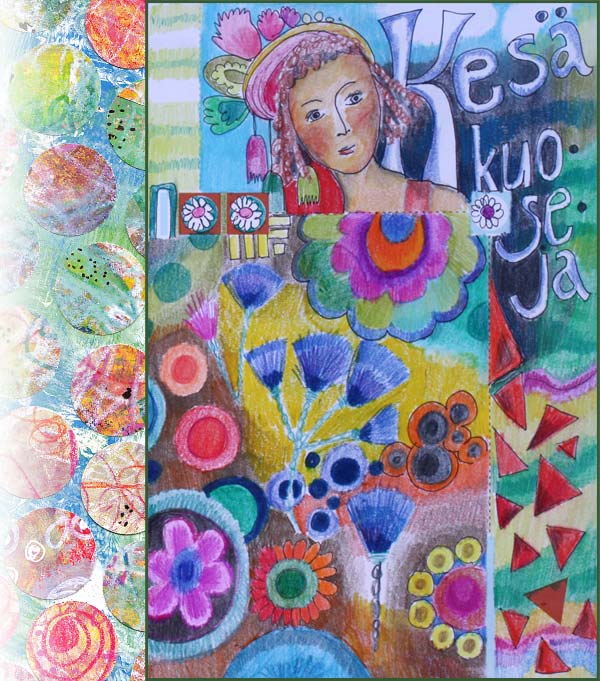
The collage of the left is an old one. A sketch for a surface pattern made in 2011. It was made by cutting circles from handdecorated papers. This time I replicated the design by cutting circles from stamped papers.
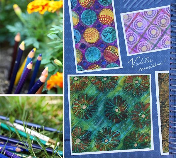
The summery prints are mostly made by stamping here. Paper scraps like old scrapbooking papers can be altered easily with markers, colored pencils and stamps. I always try to add subtle color variation in the background to keep the result interesting. Thinking about shadows help here too.
As you can see, my colored pencils are always with me! Hopefully your summer has been as wonderful as mine!
The Art of Finishing

This collage is called Dawn of Change. It is inspired by the history of art. There was a time when I preferred modern art. If I went to an exhibition showing older than 20th century’s art, I used to yawn and think how pretentious it was. But the more I have examined art, the more I see in the old art. I see colors and concepts that can be reproduced in many different angles. Also, seeing good art makes me think of finishing – how much it affects the experience of the viewer.
The Creative Process
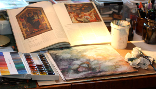
When I began to create Dawn of Change, I kept the painting of Giotto di Bondone visible on the table. I did not copy the image; I just kept it as a reminder of what to aim for.
The first layers were painted with watercolors. Then I added some Copic Opaque White to create lighter areas. The white layers were rubbed so that they shined vaguely on the watercolored surface. I also sprayed some Dylusions mists to make the background even foggier.
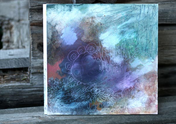
After a little bit of doodling with colored pencils, black marker, and white gel pen, the background started to show the guidelines for collage pieces.
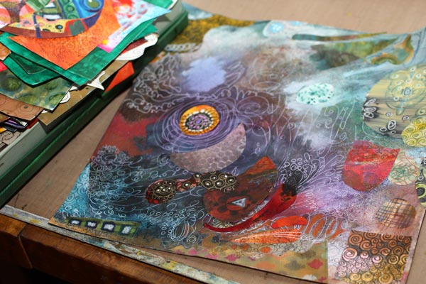
Then I picked up the box of hand decorated papers and began to attach the paper pieces. In this phase, I always get surprised how well the papers fit the artwork even if they are all different. Creating your own papers will bring you that happiness! Try to avoid using same papers many times in the same artwork. That way the result looks more interesting.
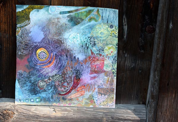
After a little bit of doodling, I was getting tired and decided to end my session. Even if the composition was accomplished and nothing major decisions left to make, I felt that the work was incomplete. I needed to ponder how I was going to finish it. Over the years I have noticed that finishing does make a difference. In arts and crafts, the finishing rarely alters either the message or the use of the work, but still has a high impact on how appealing we will find it. Sometimes that extra addition of quality will change entirely what we think about it.
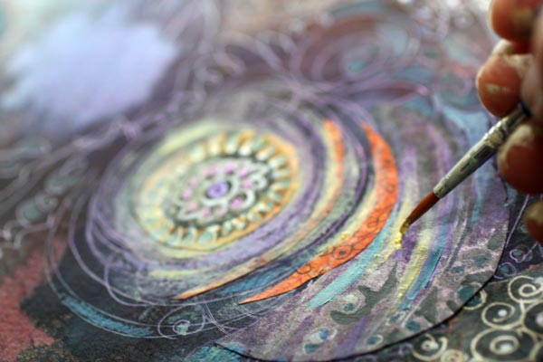
So, if you want to improve your results, get into the habit of taking breaks. I like to have a good night sleep, walk the dogs or work in the garden. Especially physical activities make the subconscious work best. Then, when I grab the thin brush I know exactly what I want to achieve and how to do it.
Finishing Art – Making Subtle Changes
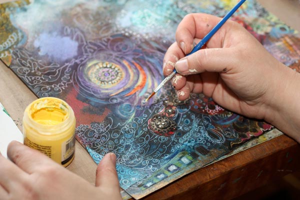
In this piece, I wanted to increase the impression of the colors fading together. The acrylic paints were the best to accomplish that. I added small strokes of various shades of grays to create a more muted look. Then I also added some pale yellow and off-white to create the fading in lighter areas.

The difference between before and after is not big. When placing the two pictures side by side, you have to search for the differences. But I claim that the overall experience of the quality is better after finishing.
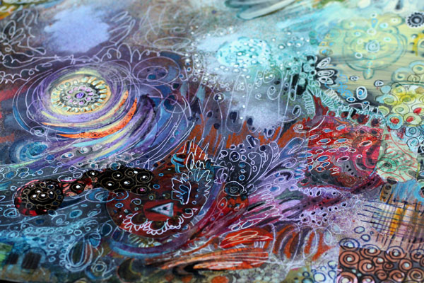
So I challenge you to finish your work – even if it already feels finished!
Let me be your mentor in art: Subscribe to my weekly emails!
Find Where You Belong to

It took just a few seconds looking at the pictures of folk dresses to become almost overwhelmingly inspired. I hurried to my fashion themed Smash book and created this art journal spread.
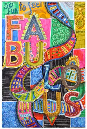 And then I had to make even one more page. Folklore and folk art always make me feel like this: fabulous! They give me both the sense of belonging and the sense of freedom. I feel that I am one part of the long chain of all the women, of Finnish women, of my mother and grandmothers. At the same time I am not defined by them, just empowered by them. With folk style, I can express my roots and origin without constraints.
They say that one of the basic needs is to belong to someone, to somewhere. I think that creating art can greatly enforce that feeling.
What kind of art makes you feel like that you are included? Maybe enjoying creating is not so much about finding one’s personal style but finding ways to feel belonged.
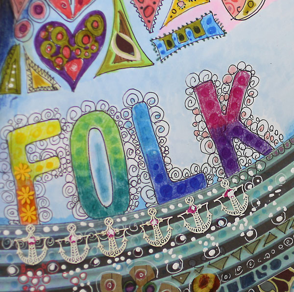
If you want to develop, it will be insufficient to create art that touches only you. You will want to get connected to other people as well. I claim that the deeper you go in your own self-expression, the more you will also touch others. Our mothers and grandmothers may have very little in common but we can share the goal to create something new and original from our heritage.
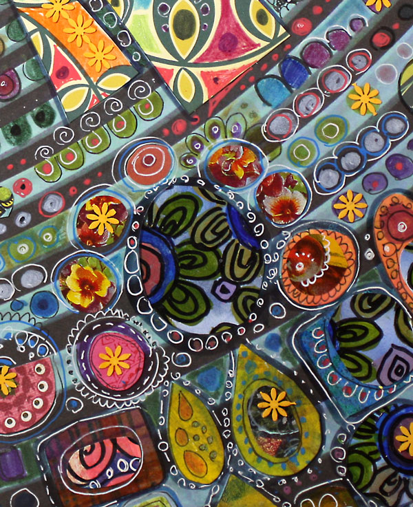
We do not have to think shapes or lines. It is often enough to dive into the colors. For me, colors represent the feeling. Shapes and lines are just to support them.

Find the colors from your origin and mix them with the colors of your present life. You are free to create any combinations! The best colors give you the sense of belonging. They will also inspire you to create art that is filled with meaning.
See this journal fully finished! >> Watch the flip-through video!