The Essence of Your Art
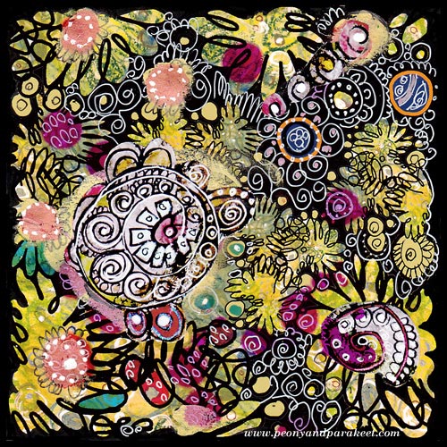
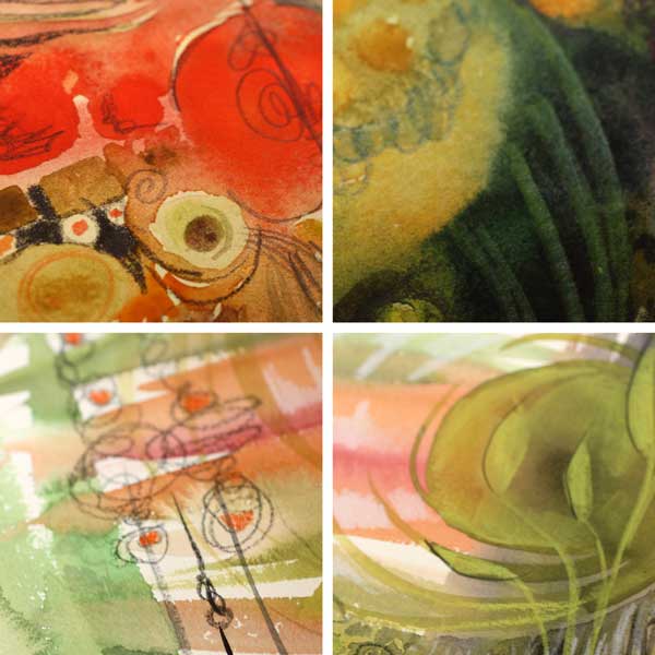
I found this old collage piece when I organized my archives. It is a design that I have used as a part of the fabric called Flow. As art journaling cute little girls with lovely little animals, is so popular nowadays, this made me think: what’s the essence of art is for me. And also, I would love to hear what it is for you!
For me, it’s not the play, even if I love playing. It’s not the colors even if I am totally for them. It’s not even the circles, my favorite shapes. I might aim for the certain styles, I love art nouveau and expressionism, for sure. But the essence of everything is that I want to create “everyday icons”, the images that make me stop, drop everything mundane and get in touch with my the inner thoughts.
Technically compositions, colors, shapes, styles, etc. create that. But when I am happy with the result, I do not think about those anymore. I think about what I feel and think right now and where it can take me.
The best thing is that everybody can create their personal icons, sacred images, mandalas, whatever you want to call them. They don’t need to be connected to any religion. They can just be connected to experiences, moments or beauty which uplift your spirit.
This is what I thought when I saw this old artwork. And now I wonder, what can I do better. How can I make this blog be the place for anyone to stop, then start creating – the essence of their art!
Subscribe to my weekly emails – Get a free mini-course!
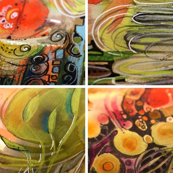
From Movie Posters to Art Journal Pages
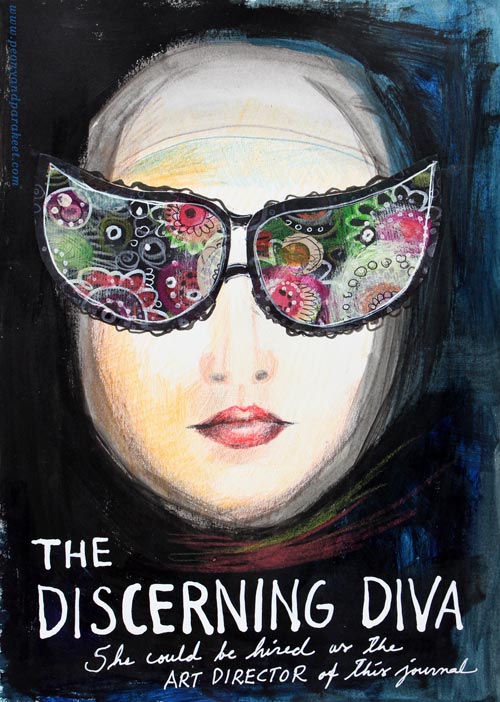
“The Discerning Diva – She could be hired as the art director of this journal.”
This page is my version of the poster for the movie “The Big Lebowski”. I have borrowed the concept of weird glasses and the composition from the poster, but it is still a separate artwork, not an exact copy.
The Discovery of Movie Posters
After learning that I like to use alphabet stamps in the art journal pages, I had been thinking about the next step in journaling. Last week I watched the poster artist James Victore‘s course Bold & Fearless Poster Design on Creative Live. His style has very little to do with mine, but I became fascinated by the visual concept of posters.
Last weekend I found a book about 1990’s movie posters at the local library. I became fascinated by the compositions used in the posters. Then it hit me: maybe I could replace the main elements with my own and apply the visual concept of the poster to my personal stories!
How to pick ideas from movie posters?
I will show you how to make your own “Discerning Diva” (very easy) but before that, I want to show you another poster-inspired page.

The page on the left is inspired by the poster for the movie “The Matrix”. I picked few main elements and the general atmosphere from the poster. The page on the right is made a long time ago, but I like how the two pages tell the story about being inside someone’s brain.
Four tips for picking ideas from the movie posters:
1) Composition: Examine the placement of the title, the grouping of the main elements and the most noticeable color contrasts.
2) Subject: Think about how your life could be applied to the movie.
3) Process: Examine the poster carefully but when you start creating, focus on your page and make it your own.
4) Imagine: Remember that you can replace the elements of the poster with whatever you like. For example, a person can be replaced with a vase of flowers.
Create Your Discerning Diva!
1) Paint the background of the page.
I used acrylic paints to make the background strong and heavy-looking. Leave an unpainted area for the face. Add water to the paint and gently brush the area around the face. Wet strokes create the impression of a thin scarf and add dimension.

2) Color the face.
I used colored pencils to maintain the big contrast between the background and the face. Add some color to the skin. Draw a mouth and a nose.

3) Add glasses.
Go to your box of hand drawn papers. Cut two lenses. Attach with glue or gel medium. Add frames with pens. Make the glasses as decorative as you like!

4) Add text.
Pick a color that has a high contrast with the background and journal on the bottom of the page. I have used a correction pen for the title and a white gel pen (Uni-Ball Signo) for the text below the title.

5) Add finishing strokes.
With colored pencils, add some strokes below the face to represent a scarf.
Add few strokes to outline the scarf near the forehead.
More Ideas for Compositions

Believe or not, this page is inspired by Austin Powers movie poster and hand embroidery! I think that hand embroidery has a lot in common with hand drawing.
Learn to draw from imagination and inspiration!
>> Buy Inspirational Drawing 2.0
The Power of Positive Self-Criticism in Art
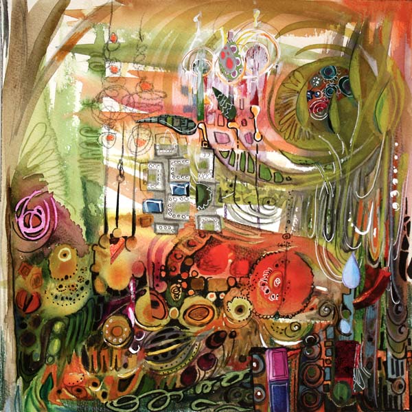
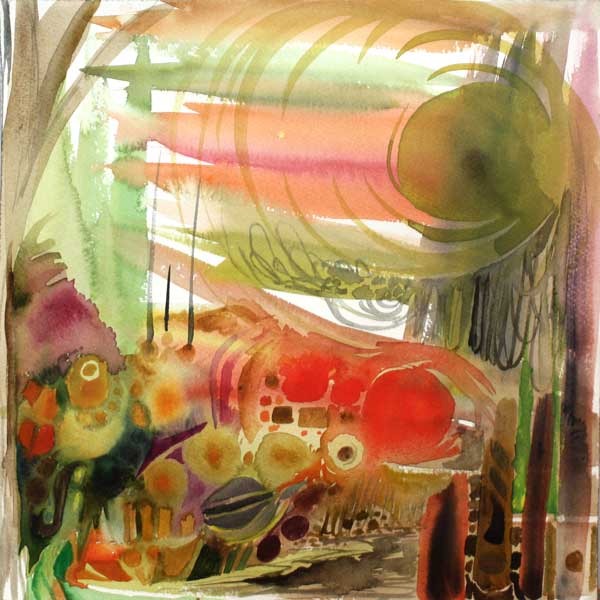
My latest mixed media artwork is called “Positivity Grows”. It is dedicated to all of you who have a strong inner critic. If you want to improve, it is essential to evaluate your own work. But sometimes the self-criticism can have too negative tone. Have you experienced any of these?
1) Big Picture Panic
The artwork gets evaluated as a whole in a too early stage. It is like making a meal and after tasting the raw potatoes, you’d decide that it’s not going to succeed. “I must have done something wrong when peeling those potatoes!”
2) Overclean Obsession
You take the safe way: you don’t mix colors, don’t let anything intersect, draw sloo-owly, keep everything plain, simple and controlled. This reminds me of a tadpole (a baby frog) which I got from my friend when I was a child. The tadpole lived in a jar filled with muddy water. I picked a clean vase, poured plenty of tap water and put the little frog there. It did not live long. I did my best to take care of it but did not understand that for the tadpole, there was nothing to eat, nowhere to hide. So – Mix those colors! Add diversity! Give some nourishment to the growing artist in you!
3) Mistake Hunt
If you focus on the things that “went wrong” instead of those which “went right”, you are playing the wrong game. Art is in small nuances, it requires sensitivity and openness. If your self-evaluation is too negative, you do not notice the beautiful little details that appear in your art. They are often lucky accidents if you take care of the diversity. When enhanced, those details can take over and bring your end result to the new level.
Positive Self-Criticism
You can get cured of any of those diseases with a healthy dose of positive self-criticism. From the moment you make the first brush stroke, focus on the details and look for beautiful and interesting areas. I will show you how I did that while creating the artwork of this post.
Phase 1 – Watercolors
When I began the artwork of this post, I just made a mess with watercolors. I kind of made the muddy jar for tadpoles to prosper!
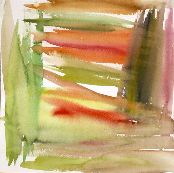
After painting this, I could have just quitted and called it ruined. Or I could have tried to make that dark muddy area brighter. But instead, I began to investigate the painting closely.
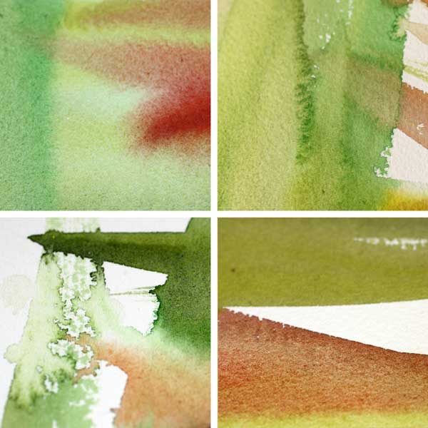
My inner critic pointed the little details with so much beauty that I began to feel confident and excited. The whole process of making this artwork began to feel like an adventure. Instead of mistakes, I was hunting treasures!
Phase 2 – Watercolors
Next, I continued with watercolors and created new layers of elements. I took care of the diversity: there’s a lot of various hues and shapes. And even more important: the layers intersect so that they create new happy accidents.
After painting this, I enjoyed this tiny detail: a yellow spot. It was like a little star! I felt I was lucky and genius at the same time.
I spent some time searching for more beautiful areas and enjoying them. With watercolors, the edges of brush strokes are often really beautiful.

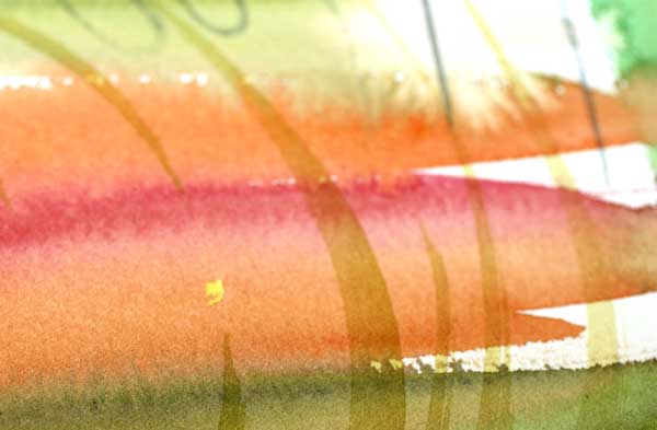
Phase 3 – Colored Pencils
To keep the diversity level high, I changed watercolors to colored pencils. I also changed the music I was listening to. Working from a small area to another, I enlarged the beautiful details found after another.
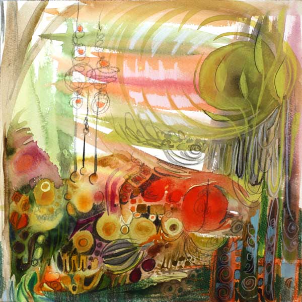
In this phase I realized that the main theme of the artwork would be growth. I searched for the details that would express the theme. I found several and they made me happy!
Phase 4 – Pens
New music and new supplies! This time I picked a black PITT Artist Brush Pen and a white gel pen (Uni-Ball Signo). I was encouraging myself to create strong contrasts. They would make the pretty details really pop. Again, I was not worrying about hiding the not-so-pretty details but enhancing the good ones.

In this phase I began to look the artwork as a whole. However, instead of correcting the poor composition, I analyzed which of the details looked most appealing and how they were located.
Phase 5 – Finishing
When finishing, I like to listen to the rhythmic music which gives me the confidence to carefully adjust the balance of the work. I picked a white correction pen and a box of hand decorated papers. By doodling and cutting papers, I changed the composition so that the eye would find all the pretty little details one by one.
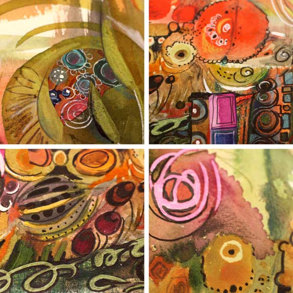
The Summary
You can be analytical and critical when making art. You can also be strict: mix the colors, change the tempo, keep the image alive! But maintaining the gentleness and sensitivity is crucial too. Let the little details that appeal to you be the foundation for your self-expression!

Blank Page Syndrome before Big Picture Panic?
Buy the video “Watercolor 101 for Intuitive Painting” where I will show you how you can get a fast start and keep going! Click here for the preview!
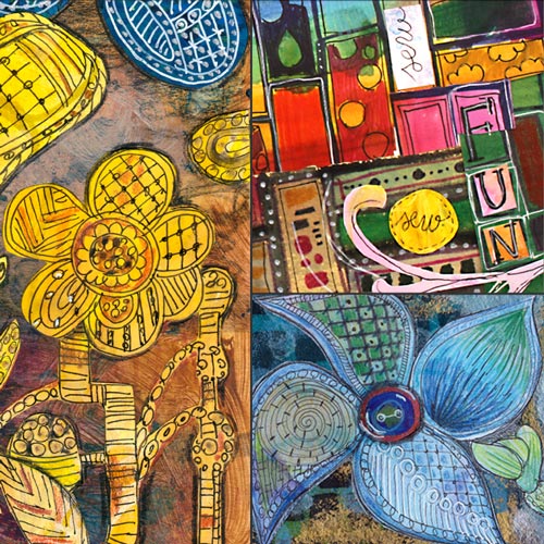
Artistic Embroidery with Pens and Paper
I am so excited!

I will be teaching an online class as a part of 21 SECRETS Spring 2015! The class is called Artistic Embroidery with Pens and Paper.
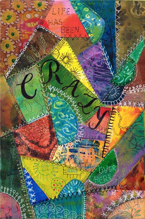
Class Description
Let the long history of textiles show up in your art journal! For hundreds of years people have created textile art to express themselves. In the workshop we will discover ways to imitate embroidery and quilting using paint, pen and paper! No actual sewing needed!
We will find inspiration from various stitches and techniques like crazy quilting, silk ribbon embroidery and modern patchwork. These art journal pages don’t only make you feel warm and welcomed, but also let you express the luxury only handmade can offer. After the workshop you will look at the family heirlooms in a new way!
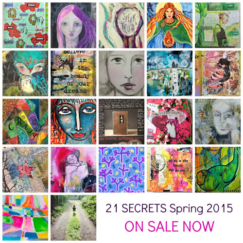
21 SECRETS – 21 teachers!
By purchasing the class you will not only get that but also 20 other online classes from 20 other great artists!
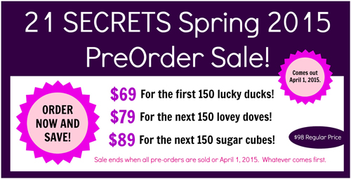
Starts in April – Now available for preorder!
21 SECRETS Spring 2014 starts at 1st April and it is now available for preorder. Once the workshop starts in April, you will get a downloadable PDF including all 21 classes. It is packed with videos, full color photos, printouts and instructional content. You will get unlimited access to all 21 classes and a membership to the private Facebook community where you can discuss with me and the other teachers and participants. If you want to learn or boost your art journaling, this is the workshop to choose!
Why preorder now?
I am a big believer of looking further ahead than to the next month. When you will see the spring light and start to wait for the summer, April is the perfect time to get something new for your journals and your skills.
And here’s another good reason to pre-order! The regular price for the 21 classes is 98 USD, if you preorder now it is only 69 USD! But be quick, the lowest price is available for the first 150 participants only!
I hope to see you at Artistic Embroidery with Pens and Paper! Click here to read more and preorder!