A Decorative Pattern for Art Journals and Beyond
A couple of months ago, I made a flip-through video of a full art journal. Many noticed a spread that was made from decorative papers mostly. I remembered that I took some photos while making the papers and I will share step-by-step instructions here. This pattern is good practice for motoric skills and drawing, but it can also go beyond! I used it for a more expressive purpose, for a collage art piece.
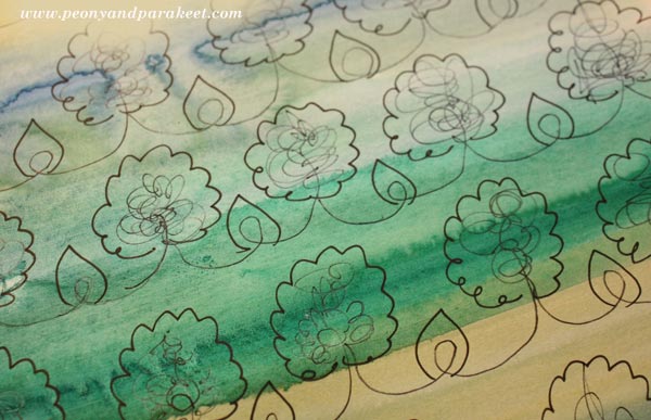
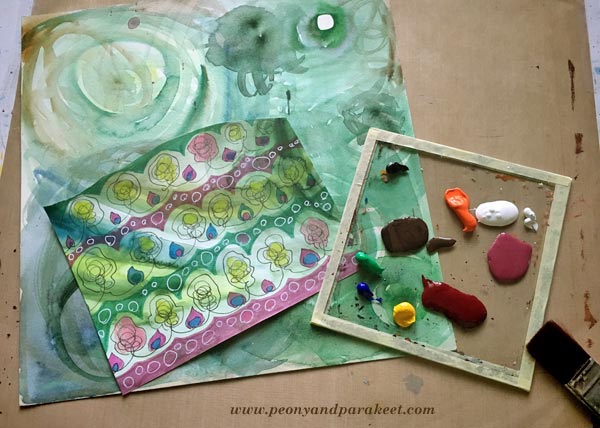
1) Paint Stripes with Watercolors
Use a fairly thin paper and paint it with watercolors. Use a selection of colors to create stripes or curves.
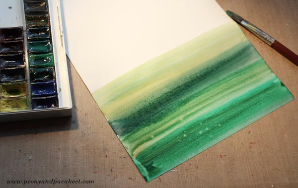
You can add drops of water if you want to make the background more interesting with bleeds.
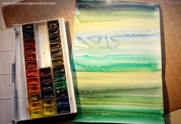
Let the paper dry properly.
2) Decorate the Stripes with a Simple Loop Pattern
Using a thin-tipped black drawing pen, draw a simple loop and end it with a curve upwards. Without lifting the pen off the paper, add a bunch of loops on the top of the curve. Then continued by drawing a curved line downwards. Repeat and draw the whole row on the same go. Work fast and don’t worry too much about the symmetry or similarity of the loops.
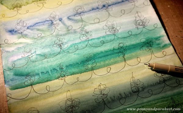
After drawing the rows, frame the loops to make them more distinct. I used simple shapes to create flowers and leaves.
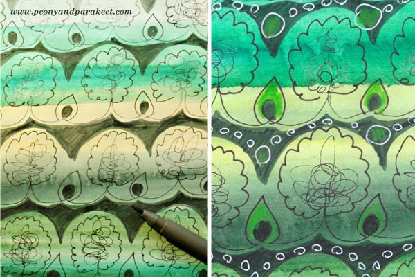
3) Color the Background and Add More Decoration
To make the watercolored layer look more lively, use felt-tipped pens (marker pens) and color the background around the doodled shapes. You can also add more color to doodled details and use a white gel pen to add more decoration to colored areas.
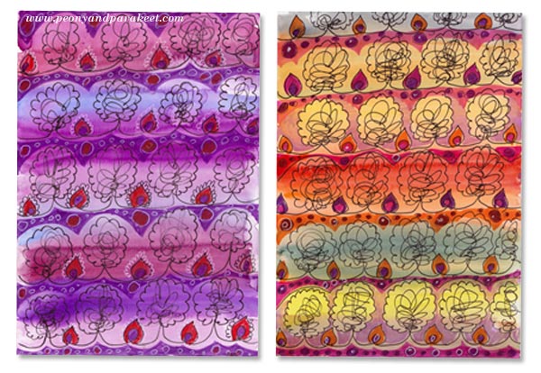
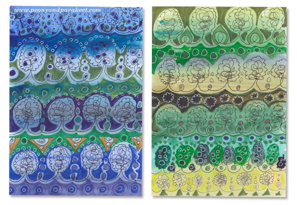
Decorative Pattern in Many Colors
This pattern looks luxurious when you make many papers in many colors with slightly different decorations.

Here are some that I made!
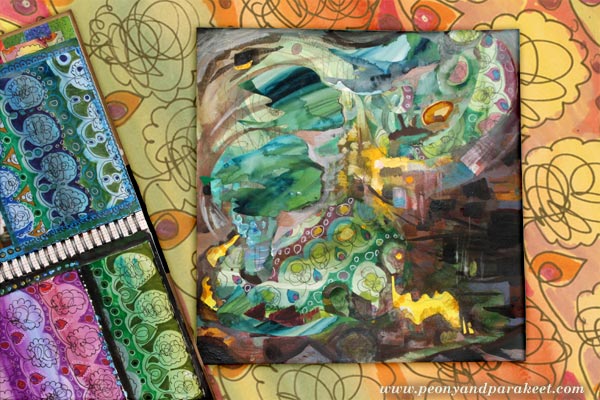
Decorative Pattern in Collage Art
I am fascinated by the interface between art, design, and crafts. The idea for the pattern came from knitting. I wanted to find a similar relaxing circular motion using a pen instead of a knitting needle. So that’s how a craft transformed into a design. But design can also be a part of a more expressive piece.

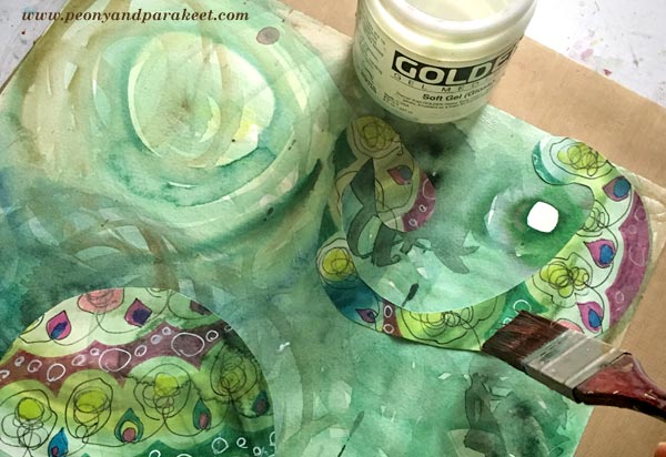
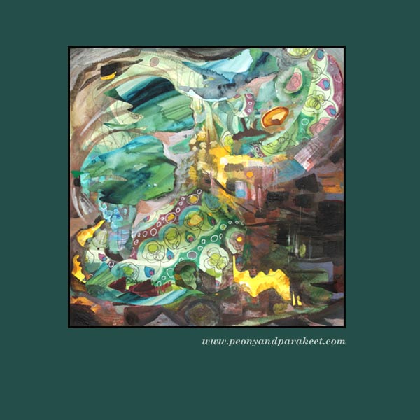
In this collage, I use decorative paper pieces with paint. My starting point was a watercolor background, acrylic paint, and a piece of decorative paper.
I cut a couple of decorative shapes and glued them on the background with gel medium.
Then I continued with painting using acrylic paints. In the finishing phase, I also used some more paper pieces and few colored pencils. A week or two ago, I heard the geese flying over our house. They were leaving Finland, going to a warmer place for a winter. Their sounds made me think how limited we people are, not being able to fly so freely, not always being able to stick so tightly together. The screams of the geese felt bright yellow and for a short moment, I wanted to join them and not stay in Finland, waiting for snow …
Get step-by-step instructions for doodled collage art – Buy Doodled Luxury!
9 Collage Ideas from the Students of Peony and Parakeet
This spring, I have seen gorgeous pieces of art made from the mini-course Doodled Luxury and I want to share some of them with you. There were so many great pieces that choosing was difficult but this time I thought to share pieces that are very idea-driven. You can never have too many collage ideas, especially if you process several at the same time!
1) Many Variations of One Shape
Gina Meadows shows beautifully how hand-drawn elements are all like from the same family when created by the same person. I also love how it’s full of feather-like shapes. They repeat the idea of a free, observing bird.

2) Solid Ground
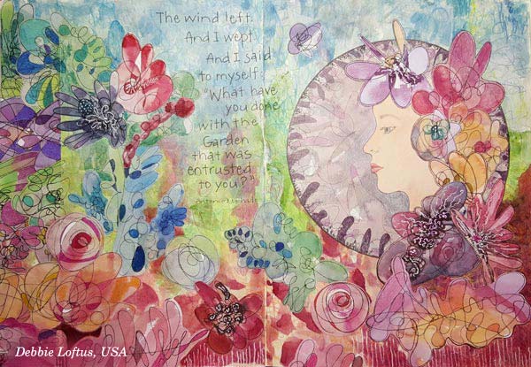
The second art journal spread that I want to show you is by Debbie Loftus. Her work is a wonderful illustration of the quote she has picked. This piece also reminds me of how we can create very free-flowing, beautiful mess that still speaks harmony. This can be done by simply making the bottom of the page strong and solid. This piece communicates how we as humans see nature. It’s full of weeds and still so beautiful!
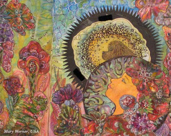
3) Mystery That Can Be Revealed
Mary Werner’s lady looks a bit mysterious here – but wait until you see the second picture!
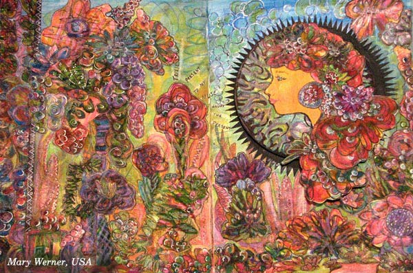
The lady has a secret, a dog who is her muse, making her to relax and take in much more than when walking outside alone. Mary has used velcro to attach the lady above the muse. Isn’t it a great idea to include a hidden mystery!
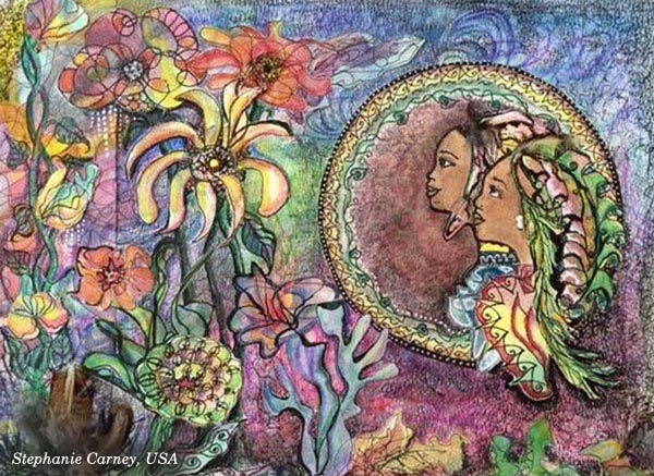
4) Spiritual Softness
Speaking of true friends, Stephanie Carney has illustrated two sisters. I love the way they look at the flowers, sharing the same experience. Examine how softly the round frame has been decorated and compare it to others! These kinds of little nuances can communicate a lot visually!
5) Real Person in a Fantasy
Terry Whyte made her granddaughter the central person. Isn’t this spread a treasure? Combine your hand drawing with the photos and start building your own fantasies!

6) Many Sides of One Personality
Satu Kontuvuori included her cat who is a very wild character. Even if she stays still in the image, it’s like the wildly flying bird is one of her many lives. If you are expressing a personality or any subject that has many sides, you can scatter it into various elements of the same piece. That way you will focus on one theme but still express it in a free-flowing and rich manner.

7) Focal Point Balances Richness
Speaking of focus … Christie Juhasz has a trick for creating a clear focal point. See how her mermaid is sitting on a white frame! Even if the work has full of details, white circle makes sure that the main character gets noticed.

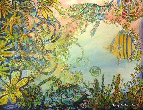
8) Movement + Space to Breathe
Another great example of using circles: look at Betsy Eaton’s fish and how there’s a circular space around it. Brilliant! Another thing which makes this so appealing is the movement of elements. That dynamic feel has been created by adding swirly shapes.
9) Rainbow Softness
Kathy Lewis (a.k.a KjAllison) made a gorgeous spread full of multicolored elements, like mini-rainbows. This makes me think about macro photography and dew drops! Soft transitions of colors – why not use them in your next art journal page?

Doodled Luxury
This mini-course, Doodled Luxury, was published as a part of Imagine Monthly Spring 2016 art journaling class. It’s now available individually as a self-study class – Buy here!
You can also buy all the 6 monthly classes as a bundle. I will also release the other 5 classes individually one by one later this summer, and show more ideas on how to apply them.
Start doodling and collaging, right now!
Find Your Art Journaling Inspiration!

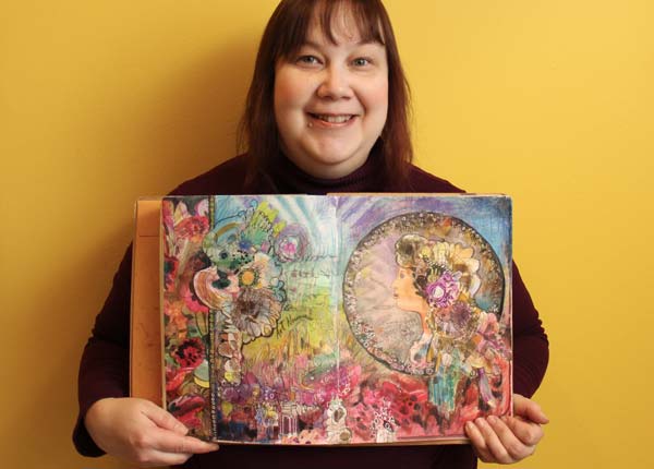
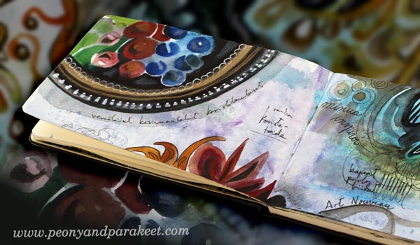
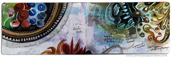
After stretching my limits at the last blog post, I felt the need to go back to basics. I picked my Moleskine Watercolor Notebook and made three spreads by just answering the question: what does continually inspire me?
The short answer is: I am constantly inspired by the history of decorative art. I believe that it’s important to respond to the question on a general level like this. If you only list specific artworks and other artists, there may be less room for personal interpretation. If you define yourself too tightly through others, you can find it hard to figure out what to create next and how to find your personal style.
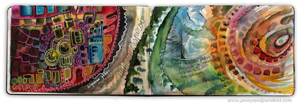
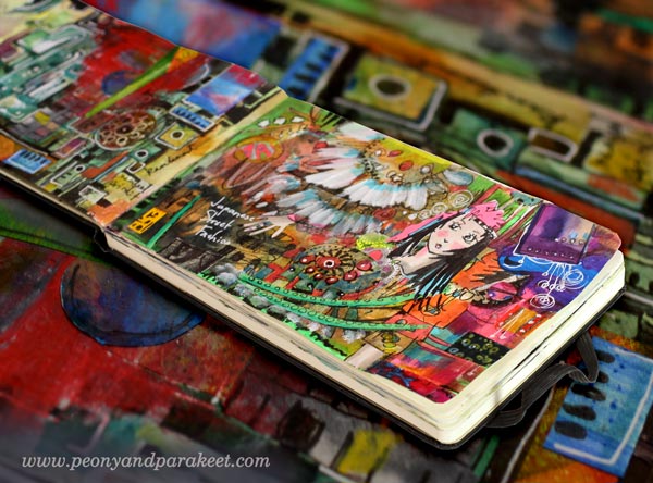
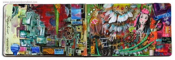
My Art Journaling Inspiration Sources
I am constantly inspired by embroidered fabrics and wool rugs from the first half of the 20th century.
I am constantly inspired by art glass, fabric prints, and the way these characteristics are seen in today’s street fashion, especially Japanese street fashion.
I am constantly inspired by Russian decorative plates, European Art Nouveau and the way they combine drama with natural colors and shapes.
Even if I don’t have the ability to paint decorative plates or the looks to wear Japanese street fashion, I can use them as a constant source of inspiration. I can let them show in art journals and other artworks, often in a way that is less literal but still obvious for myself.
The history of decorative art fills my mind with values that I can resonate with. They are understanding nuances, focusing on details, telling stories that last time, uplifting people with beauty and spirituality and integrating production with technology. It may not be the whole big picture of the subject, but it is how I look at it. That in turn, inspires me to create art, to blog and to deliver new techniques and workshops.
Let art journaling make you happy – fill your pages with subjects that truly inspire you!
Monthly art journaling inspiration: Sign up for Imagine Monthly!
Let Unconventional Inspire You

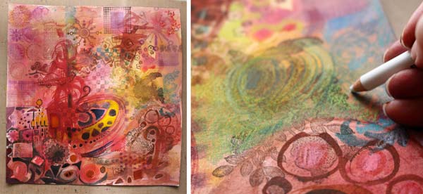
You know I love beautiful and decorative things. But the more I create, the more I feel that creating art should be expression first, aesthetics second. This watercolor collage is called “Leftright Wrongright” and it is about how sometimes the old wrong and unconventional can be the new right.
Rubber Stamp Art
If you think of experimental and avant-garde, would you ever consider using rubber stamps? In that context, they are the most boring thing. They are the absolutely wrong choice when you want to create unique and advanced art. But as my mission was to express how wrong can be right, I just could not resist taking the risk and using them! I painted the background with watercolors and then started stamping.
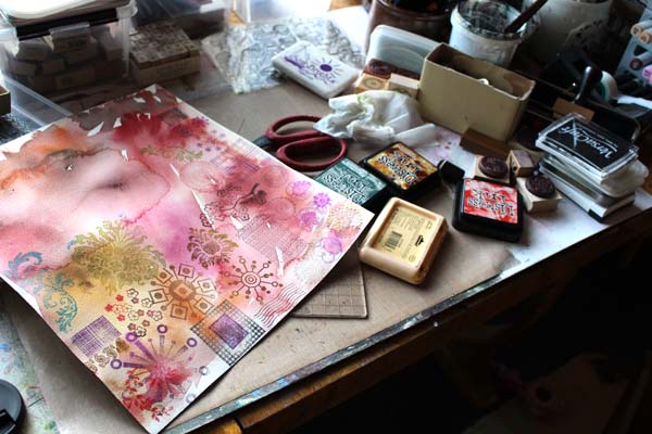
I only stamped once with each of the stamps. That way they were seen as individuals, not as a bunch of clones. I have used this principal before too, see Can Rubber Stamping be Art and Make Samplers to Save Bits and Pieces.
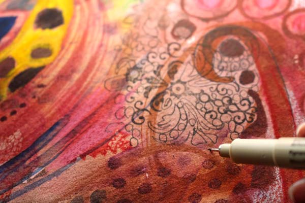
Watercolors
Watercolors are my trusted friend. They make the best backgrounds but also, they make rubber stamps look much more interesting. After the whole background was covered with stamped images, all different from each other, I added water and brushed the water-based ink to blend with watercolors.

With the big brush, I doodled this and that thinking fierce fully about destruction and bravery.
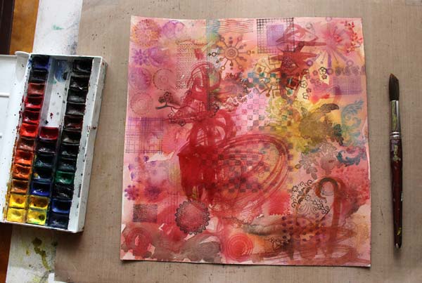
With a smaller brush, I added details and enhanced them with colored pencils.
Imitating Rubber Stamps
To make the stamped images even more individual, I added hand drawing to make few of them bigger and more handmade. A thin drawing pen is great for imitating rubber stamps that have delicate details.
Finishing
When I worked with this artwork, it became clear to me that the final touches are crucial here. I should not only do what I usually do but add something that is against the rules, disrespectful even. First, I doodled with a white gel pen and let the doodling look a bit dreadful. Then, I grabbed a piece of paper, painted red and yellow with heavy acrylic paint. The unsophisticated color and the clumsiness of the shapes when I cut it made it look so wrong.
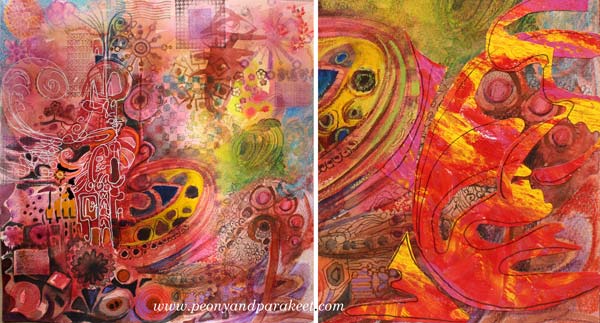
But I finished this artwork with a new attitude. As I wanted to express that sometimes we need to do things that make us feel uncomfortable, I needed to break my ordinary rules. I added few rough elements without over-decorating them. They are the wrong that makes the right spin. They make me ask: do right and wrong exist at all when creating art? If we think that unconventional is wrong, are we denying the true power of art and where it can take us?

Hopefully, this inspires you to add something wrong to your art, and make it right!
Let me be your art teacher: Subscribe to my weekly emails!