How to Make Your Art More Captivating
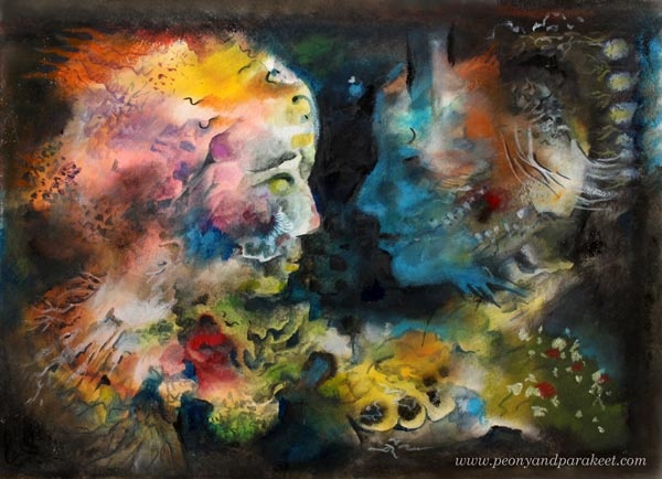
Captivating is a big word, but I like to explore it from many angles. In this blog post, I give you six tips with examples. The first two are more related to the process of creating art than to the result. I believe that if the process itself doesn’t captivate, it’s less likely that the final piece will! The last four tips are about finishing your art so that it will be compelling.
1) Captivating Supplies – Choose What Gets You Going!
Using too many art supplies can cause overwhelm and unnecessary distraction. I choose the supplies based on how many hours I want to work on the project.
- Under an hour: Black drawing pen and colored pencils. They are quick to grab and work on any paper.
- Few hours: Water-soluble media like watercolors or inks. They cover big areas quickly, but they also allow detailed work, especially when combined with colored pencils.
- Tens of hours: Acrylic or oil paints. The result lasts time and can include tens of layers.
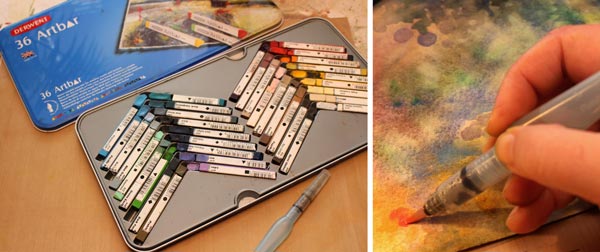
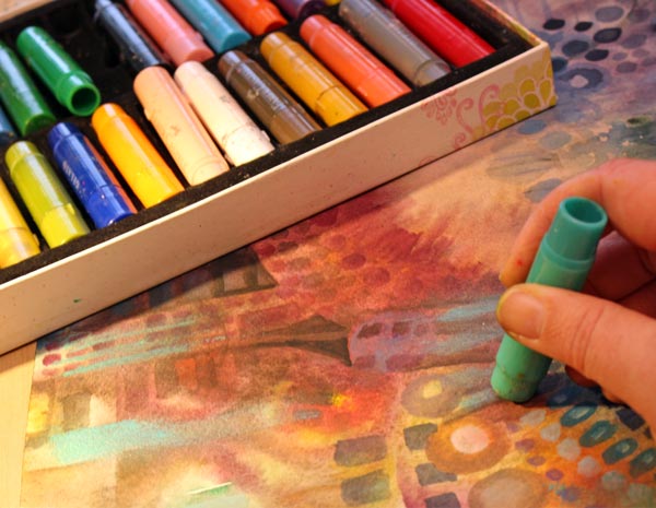
The projects shown in this blog post have taken 2-4 hours. These are all created with water-soluble media but this time, not with watercolors or inks. Namely, while organizing my supplies, I found Faber-Castell Gelatos and Derwent Artbars from my stash. I bought them many years ago when I was obsessed with having all the mixed media artist’s stuff. I purchased this and that, tried everything for few times, and then got disappointed because they didn’t improve my art. My solution back then was to reduce the number of art supplies and learn more about the basics of visual communication. It worked much better than hoping for the miracle with the new supplies!
But now when I opened the boxes, I was looking at Fabel-Castell Gelatos and Derwent Artbars with the new perspective. They could be quick and handy for sketchbooks and art journals. Because both of them are water-soluble, they could watercolors and inks once in a while.
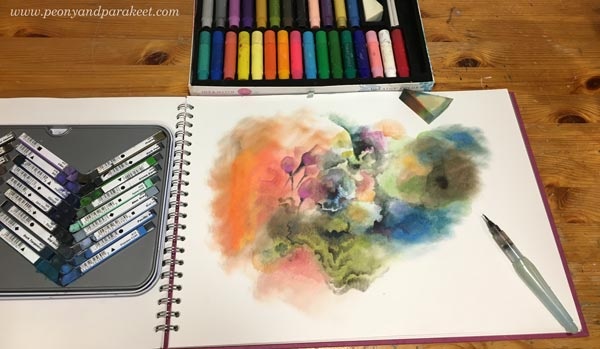
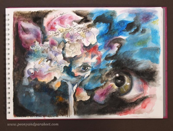
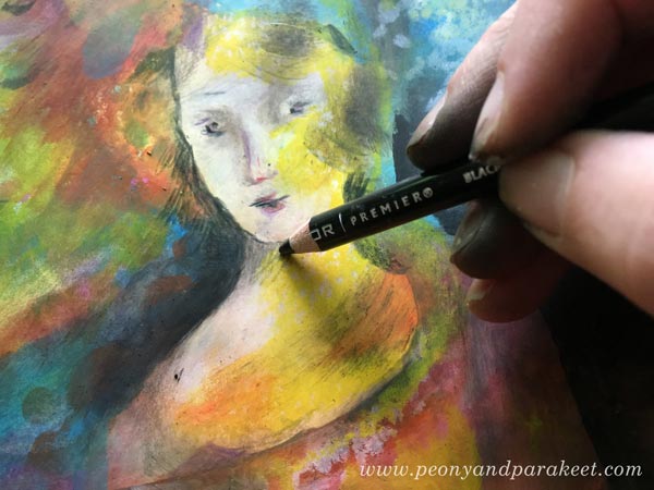
I have now used Derwent Artbars and Faber-Castell Gelatos for my big sketchbook. I use Artbars for detailed brushwork and Gelatos for big and blurry areas.It has been quick and fun. The downside is that the result is quite waxy and I don’t think it will endure time very well. Furthermore, I can’t cover the opposite page because the staining would ruin it. However, the old and neglected supplies have managed to inspire me, and I think it shows in my recent work as well. The image above shows how I started the piece that you can find at the beginning of this blog post.
2) Captivating Looseness – Start without Intention!
The second captivating thing is related to the process of creating as well. I like to start most of my pieces, whether they are small sketches, bigger art journal pages, or big paintings intuitively without accurate planning. Sometimes I have an image, a word or a style in mind. It inspires me to start, but as soon as I have sat down and made the first strokes, I try to let go of it and just enjoy creating freely from the imagination. In this short video, you see me working with Derwent Artbars and Faber-Castell Gelatos.
More videos: I have explained my adventurous creative process shortly in a mini-course called Loosed Up! It’s free for the subscribers of my weekly emails. If you haven’t a subscriber yet, subscribe here!
3) Captivating Story – Make Fantasy Portraits!
Artists often talk about communicating a story through art. Usually, referring to the story doesn’t mean so much what’s in the image, but how the image can deliver a handle to the viewer’s personal stories. One of the easiest ways to embark stories is to make a portrait that is relatable.
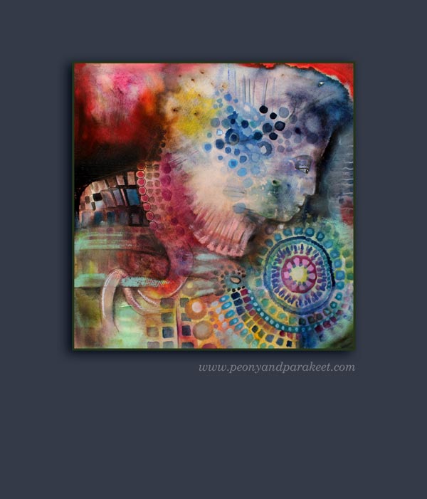
Even if you have started freely and intuitively, you can turn almost any blotch to a face, especially a side profile, by adding a color area that defines it. In my piece, I realized that with black, I could bring up two persons. I was intrigued by showing the connection between the two fantasy figures. To me, they express the two sides of me, when I am creating. One side is more feminine, full of emotion and ideas, and the other more masculine, trying to figure out how to put the ideas into subsequent steps. At best, these two sides work together and enter the same flow.
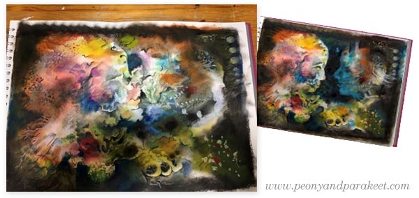
In the enlargement, you can see that the dark areas also include subtle details so that they are not monotone and so that they communicate the connection. The colors also play a role here. Blue expresses the connection that the two share together.
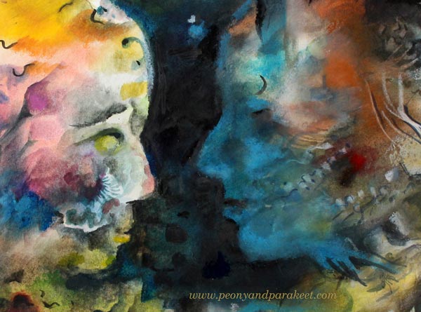
The story that you see in this piece doesn’t have to be the same than what I have told. For you, the image can bring a romantic moment to mind. Or it can take you to a fantasy movie. In the same way, the art that you make can have several meanings and when creating, focusing on the general message makes it more captivating. In this case, the message is the shared connection, and I have tried to adjust the details so that they all support this message.
4) Captivating Richness – Build a System!
Usually, the longer we work with one piece, the more valuable it will become. Not only that we get more attached to it ourselves, or that it has a higher monetary value, but also that time brings the richness of the details. This is especially the case if you don’t try to get the piece finished in one sitting but let it captivate your mind between the sessions.
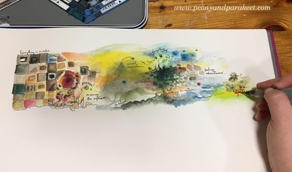
Many artists are afraid of “overworking,” but to my experience, “underworking” is more common. Also, only creating tiny pieces can be one form of underworking. See how a small art journal page, a modest scene, grew to a captivating system or a map when I continued the page!

When working with a detailed big picture, remember to leave some breathing space between crowded areas. Connected lines between the clusters make sure that your system is like a running machine with all the necessary pieces.

5) Captivating Clarity – Highlight a Direction!
Sometimes clarity can be more captivating than an overwhelming amount of details. My example is an orange that I drew one morning after a fruity breakfast.
I apologize for the low quality of the first image below. There you can see a shadow of me shooting the photo with my mobile phone. But actually, it brings up a good point about the clarity: when you are in doubt what to add, take a photo. It helps you to see your work with different eyes. You can zoom out to test if your image looks both clear and interesting when it’s small. You can also analyze, how your eye wanders around the work and where do you want to lead it. If your art looks like one big mess, adding a direction also brings more clarity.
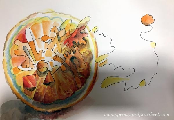
With the orange, I wanted to express the forward-thinking attitude that I usually have in the early mornings. I wanted to add more importance to the single juicy drop that leaves the orange with the bouncing energy. The idea behind the illustration was not just express a fruit that explodes but how a source of energy can keep you moving forward. It’s similar to the idea of my community Bloom and Fly – to keep you inspired to create and remove creative blocks that prevent you from that!
6) Captivating Contrast – Use Two Different Styles!
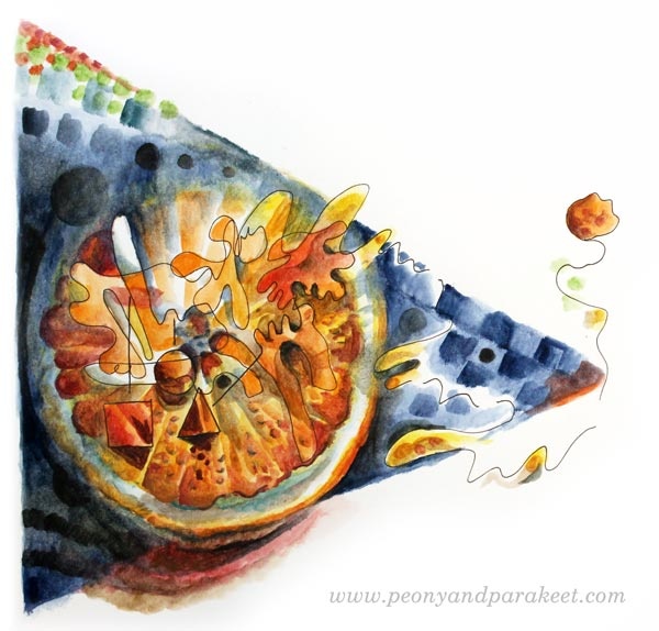
The last tip is about contrast. However, this time I don’t bring up the contrast in color, value, or size, but in style! Now you might say: “Paivi, I have been searching for a personal visual voice for so long. Are you talking about mixing different styles to one piece?” I certainly am! Don’t be a one-trick pony but go to see all kinds of art and practice all sorts of styles! Your technical skills will grow, and you will get ground-breaking ideas. Showing the versatility can also make your art more captivating. See how I combined abstract with realism how it makes the images more captivating and thought-provoking.

With a realistic pansy, I was able to communicate the contradiction that we all get when we envy someone: “When a jewel wants to feel free and be a pansy … And when the pansy secretly wishes to live forever and be the jewel.”

By adding the realistic eye, I was able to express the difference between two different worlds – the inner and the outer world. Paul Klee has said it so brilliantly: One eye sees, the other feels.”
Set Your Goals and Start Creating!
My community Bloom and Fly is for all who want to start and keep on creating. You can get help and encouragement for any art project, and we also have monthly themes.
January’s theme is “Mixed Media Sketchbook as a Tool for Setting Your Goals.” You will get ideas on how to use a sketchbook or an art journal for creative goals. Rather than feeling restricted, you will feel energized by the possibilities behind the goals. An art journal can be a playbook that keeps you moving forward!
With January’s theme, you will also get easy jumpstarts for stepping into the world of art journaling without feeling the pressure to buy more supplies. The money spent on staying inspired and connected with like-minded artists can be more useful than adding extra supplies to your stash.
Make sure that 2018 is your year of art – Join Bloom and Fly!
Lazy Art Journaler? – Try This Method!

Do you keep an art journal or a sketchbook? Are you struggling to find your motivation for filling it regularly? Try this method, geared for a lazy art journaler and for those who have big creative blocks!
“How to” for a Lazy Art Journaler
1) Create one small area at a time like you were slowly building a map.
2) Write down your thoughts. They can be roads from one area to another.
3) Accept that you are stiff and conventional when you begin. The beginning is the home base, and it should make you feel safe and grounded.
4) When you leave the home base and move to the next small area, just focus on creating different than what you have so far.
5) Don’t overthink. One area can be only one spot of color that you feel drawn to. Then add a small dot or line of another color to embark your imagination.
6) You can travel far in one sitting, or stay near the home base. One journey to your imagination can last weeks if that’s what it takes to fill the page.
7) If you want the page to be coherent, repeat some of the elements once in a while.
8) Artists are explorers. Never underestimate the meaning of this practice. Be open to what you can discover. When you are far away from your home base, take risks! In the end, it’s just paper and pigment, and any filled journal beats an empty one!

Get More Inspiration for Creating! – Join Bloom and Fly!
Bloom and Fly is a new community for everyone who wants to stay inspired and move forward in art.
We’ll start the new year with the theme “Mixed Media Sketchbooks for Setting Your Goals”. You will discover fun ways to get a grab on what you want to create in 2018!
In February, we’ll dive into the world of Rococo and Marie Antoinette and you’ll get ideas for any style of art. In March, you will get jumpstarts for adding abstract elements to your art. Whether you like realistic or fully abstract art, starting with abstract elements can boost your creative process.
Consistency and How to Get Inspired by It

When artists say that they need to focus and find their style, a big part of the problem is the lack of consistency. To me, “consistent” used to be a negative word meaning “boring,” “predictable,” and even “unimaginative.” But during the recent years, I have realized that there can be a lot of freedom in the consistency.
Here’s an example. Last Sunday, I wanted to do some art journal pages inspired by my recent trip to Italy. I was already heading towards my paints and brushes when something else came to my mind. It hit me that I have art supplies I haven’t used for a long time. One of them was Faber-Castell Gelatos. They weren’t very cheap, but I had only used a little of them. They were too clumsy and creating with them felt like painting with lipsticks. These were definitely a wrong choice when thinking about old master paintings and the era of Renaissance.
But now the challenge of using Gelatos started to intrigue me. The idea of bringing those crafty sticks to the past felt like turning on a time machine. For some artists, it would be a sign of inconsistency not to stick with particular art supplies only. But when my goals are to bring people with different skill levels together, reveal the treasures of art history, and regularly offer new ideas for creating art, it’s very consistent. So I didn’t unnaturally have to limit myself but was able to enthusiastically create the art journal pages and write this blog post.
Inspiration: Palazzo Doria Pamphilj, Rome

My favorite place in Rome was a private art museum Palazzo Doria Pamphilj. It was located in the busy center, but after entering there, I was in a peaceful and beautiful world. There were a lot of inspiring paintings, but Jan Brueghel was a new artist to me, and his landscapes were unbelievably detailed. These paintings could have been huge, and they would still look detailed. But they weren’t very big; the length was under 1 meter in the painting below.

Another interesting thing was that Jan Brueghel collaborated with another artist Hendrick van Balen, who was specialized in painting figures. No wonder, the quality of these paintings is amazing! The painting above belongs to the series of four allegorical paintings, expressing the elements of water, fire, earth, and air. What a great theme for today’s artists too! And speaking of consistency: painting a series can also enforce that.
Abstract Landscape with Faber-Castell-Gelatos
I usually create art journal pages when my ideas are not mature enough for bigger paintings. Documenting these ideas in an art journal keeps the creative process flowing and maintains one aspect of consistency: the regularity of creating.
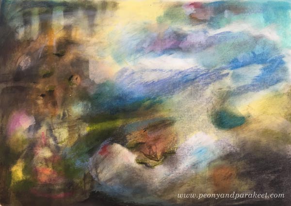
Experimenting with Gelatos was fun, and I especially enjoyed inventing ways to add details with those clumsy sticks. By building layers, I was also able to achieve a color scheme that brings old paintings in mind. The consistent inspiration from the many styles seen in the history of art sets me free. It goes so deep into what I ponder the most: how things change all the time and how timelessness can still be present.
3 Technique Tips for Art Journaling with Faber-Castell Gelatos
One way to be consistent is to develop techniques that are reusable. Often when I invent a technique for a specific media, it can also be applied to a variety of supplies. I will now show you some ideas for working with Faber-Castell Gelatos. You can adjust these for many other art supplies as well. I begin a second art journal page to demonstrate the techniques.
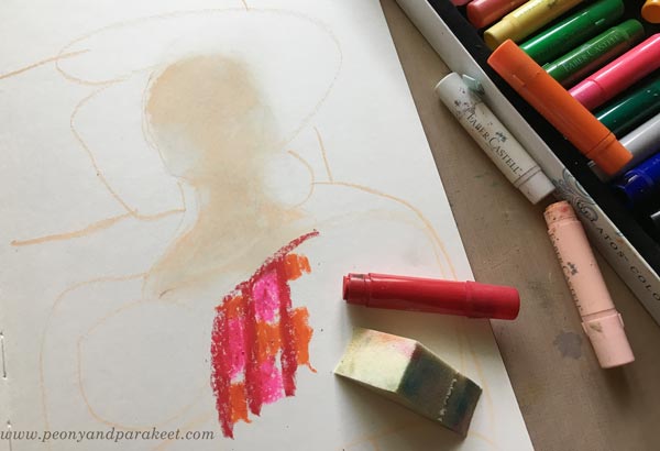
1) Blending and Softening
The more I have studied Renaissance art, the more I have been into creating soft color transitions and muted colors. When beginning a new painting, I like to blend and soften a lot. With Gelatos, the best way to mix the colors is to use a sponge. In the photo below, you see that I have mixed white and pale pink for the face but haven’t blended reds and oranges together yet.
2) Adding Details
Thick sticks don’t work very well for details. You can use the edge of the stick and get fairly thin lines, but to me, they weren’t thin enough!

However, I discovered that by using water, it’s possible to draw thinner lines with a brush. By adding water and rubbing gently, you can also remove some color and make tiny decorative spots that way.
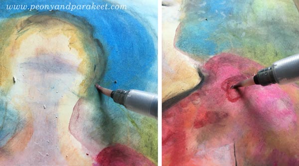
When painting with watercolors or acrylics, I like to work similarly: add a splotch of paint in one area and then quickly use it for details in other areas. It’s a fast and handy way to color details that need only a tiny portion of color each.
When finishing the face, I used colored pencils to draw the tiniest details. When keeping the Gelatos layers thin and smooth, it’s easy to add other media on the top.
3) Keep on Adding Layers!
When I started making the art journal page, I only had an idea of a lady or a Madonna because that would complement the landscape. I rarely use reference photos when creating art journal pages. To me, it’s more about getting in touch with vague ideas and then process them to express something that’s deeper and more defined. When I was in the middle of making the page, I was pretty clueless about what to express. But I kept on adding layers and slowly improving the image. One way to practice consistency is to keep on working with the same piece even if it looks like crap. See how much my page changed – examine the phase photos below!

In phase two, I remembered the atmosphere and the candles of Santa Maria Novella, a huge church in Florence. After finishing the page, I went to my photo archive and found an image that looks very similar to my page. It’s so surprising how many of its elements exist on the page even if I didn’t look at the photo at all!
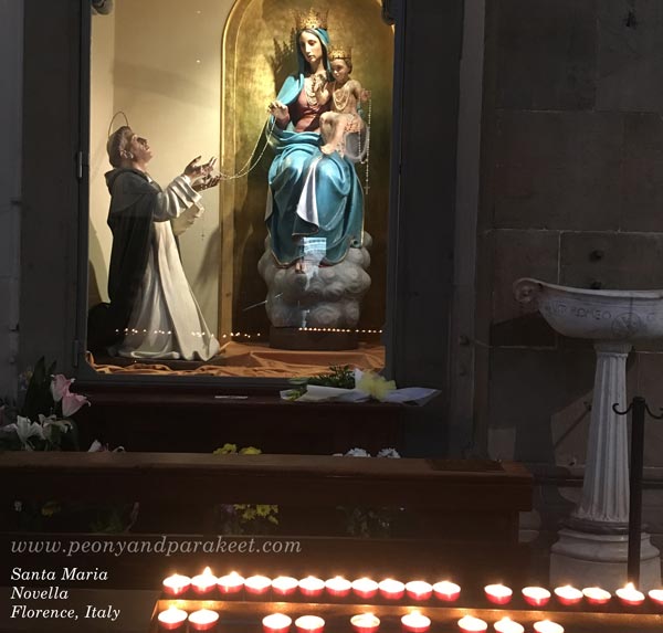
Regularly taking photos and browsing them is one way to add more consistency to the creative process.
Consistency is In the Way You Adjust the Nuances
After I had created the page, I felt that the opposite page should continue the same atmosphere. So I quickly made an abstract landscape there. Now when I open the spread of the journal, it feels more intense.

However, there are many things in these two pages that I don’t like. First and foremost, I don’t like the color scheme. It has too many bright colors and too few muted colors, and thus, it looks more modern that I would like it to look. I would like a color scheme that would be more like this:
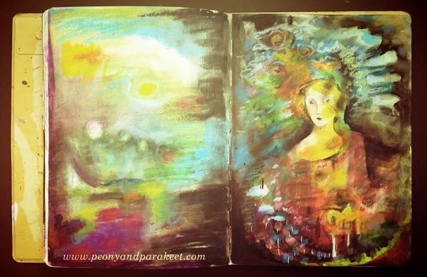
Also, if my art journal spread would be a big painting instead, I would make the face much more detailed. It’s simplicity, and the 2-dimensional look bothers me! By self-evaluating your work, you can also increase the awareness of the nuances you like. Adjusting the nuances, in turn, results in more consistency. Because many times consistency is more in the way you work with the nuances than how you select the themes and choose the supplies.
Let me be your mentor in art: Subscribe to my weekly emails!
From Decorative to Expressive Art
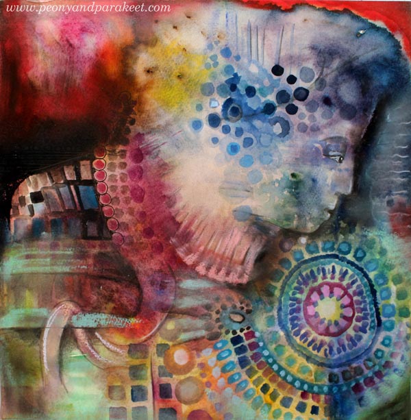
Last Friday, I traveled two hours by train to a yarn shop at Tampere. Not just to purchase new yarn, but to meet a famous knitting pattern designer Stephen West who had been invited to Finland. While I was attending his workshop, I was excited by the knits he showed and the stories he told. There were silent moments. We, Finnish women, counted stitches and pondered about what we heard. We Finnish can look very serious, quiet and occupied, even if we are about to burst with excitement. Stephen put it kindly: “Finnish carry themselves well.” That introvert attitude is also visible in this recent mixed media artwork, “Self-Portrait as a Knitter”. The person’s focus is so much on details that the inspiration, the yellow spot in the back of the head, doesn’t have room to show up.
From Over-Decorative to Expressive-Decorative
Sometimes similar kind of thing happens when we create art: the inspiration does not show in the result. There can be so much decoration going on, that not much room is left for the expression. We cover the background with little motifs and surface patterns, instead of enhancing what’s already there.

I admit it’s fun and fulfilling to work with thin brushes, pens, and pencils. Making a circle after a circle is like knitting a shawl, stitch by stitch.
However, it’s good to add a little more variety and contrasts so that the expression comes through. It’s like changing the yarn or needle size once in a while!
And like in handknits, just when you think your work is ruined, you need to calm down and do the finishing.

When knitting, you sew the seams, iron everything carefully and add the final balancing details.

When creating art, you bring up the most important details and connect the dots so that everything falls into its place.
You Can Create Both Expressive and Decorative Art
Sometimes there are debates whether decorative art can be expressive as well. But you can be both decorative and expressive. You can give meaning to your motifs. You can let motifs be pieces of a puzzle instead of covering everything evenly.
More decorative-expressive art with watercolors: Watercolor 101 for Intuitive Painting
If you are a knitter, check this out too: Folk Bag Workbook
