Bright and Decorative Art Style
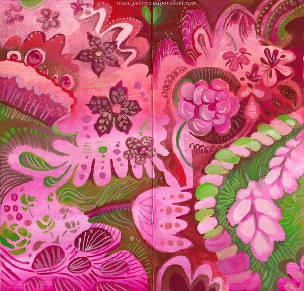
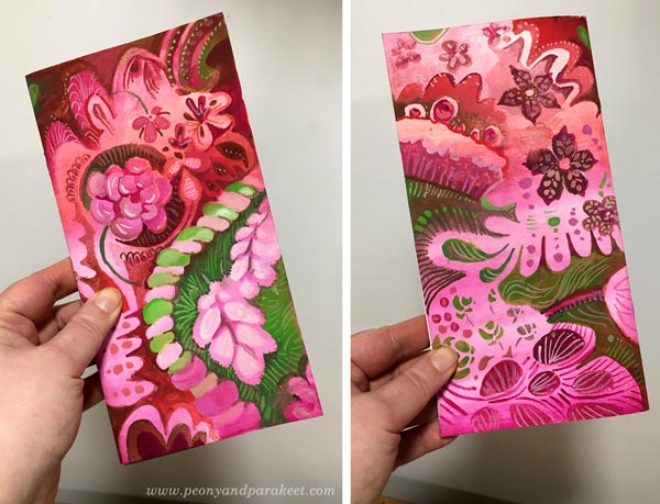
This week, I needed colors that are so sweet that they almost taste on the tongue! I found a little watercolor notebook from my paper stash and made a gouache painting on the covers.
Painting the Covers
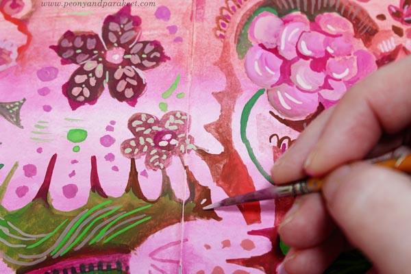
I used a limited palette of gouache paints – pinks, reds, and greens, and made pastel hues by mixing them with white.
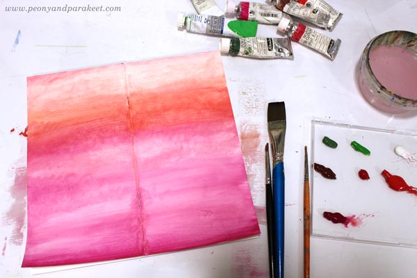
After painting the background, I filled the covers with decorations.
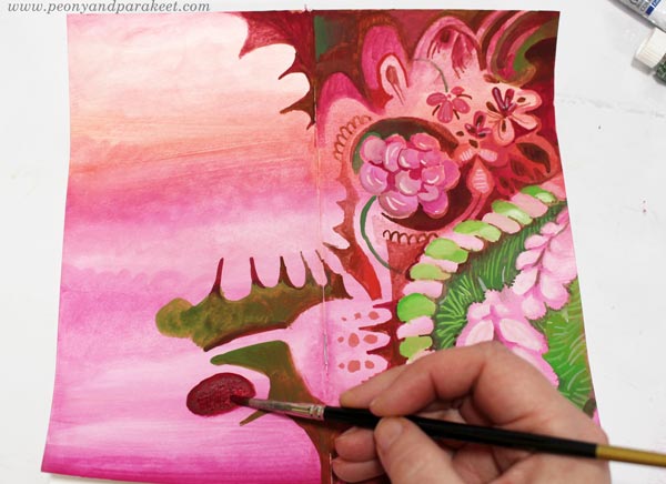
Making all the little dots and lines was both calming and refreshing. The darkness of the world faded away!
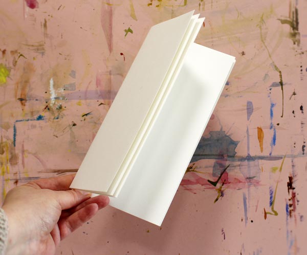
Here’s how the covers look when the journal is closed. Isn’t that sweet?!
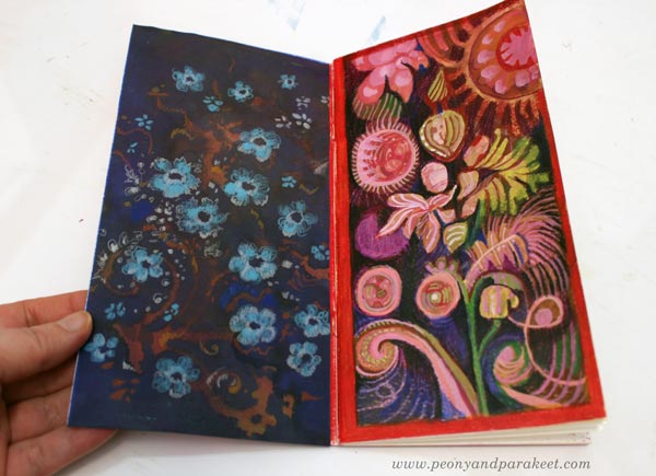
Inside: Decorated Papers and Flowery Shapes
I also decorated an inked paper and taped it on the inside of the cover. Flowers are easy to make with colored pencils!

I also combined gouache paints and colored pencils and made a mixed media drawing on the opposite page.
Inspiration from the Movie Emma
A couple of weeks ago, I watched the movie called Emma, and the beauty of it blew my mind. I love Jane Austen’s stories and had planned to go to a movie theatre to watch it, but they closed. Fortunately, it became available on iTunes, and within 48 hours of the renting period, I was able to watch it twice! I have always enjoyed examining decorative tapestries, furniture, clothing, and such, so I took my time, especially on the second time, stopping the movie now and then just to admire the beautiful sceneries, interiors, and dresses.
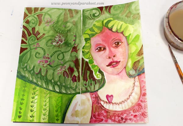
Here’s Emma’s friend Harriet and all kinds of decorative elements from my imagination.
Decorative Art Style – Fun to Design, Fun to Paint!
This year, I have been practicing pattern design, trying to make at least one pattern per month. I have used my watercolor paintings as an inspiration.
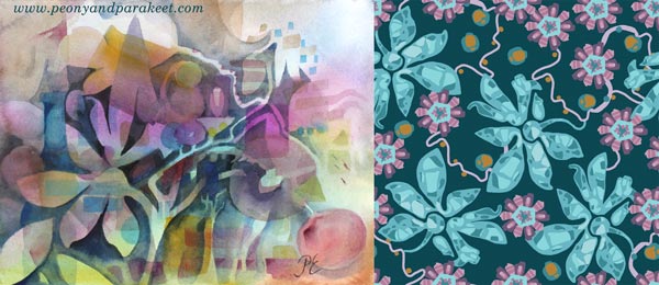
These design ideas go back to my paintings as well. I have really enjoyed making them more decorative now.
I feel like I am connecting the dots between the many styles that I am fond of. It’s like William Morris, Marimekko, and decorative Russian metal trays are coming together. My detailed style to draw and the intuitive style to paint seem to integrate, and it all feels so effortless and fun. I am going to do more of this kind of decorative art style projects – I hope they inspire you too!
Related Blog Posts
>> From Art Journaling to Pattern Design
>> Paint Your Mental Images – Love for Russian metal trays
>> 8 Style Tips from the Students of Peony and Parakeet – William Morris inspired art journal spreads
Bloom and Fly – Sign up for My Classes!
Sign up for any of my classes, and become a member of my active community for the rest of this year!
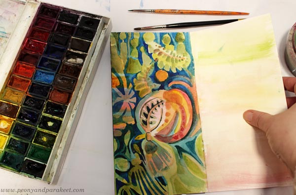
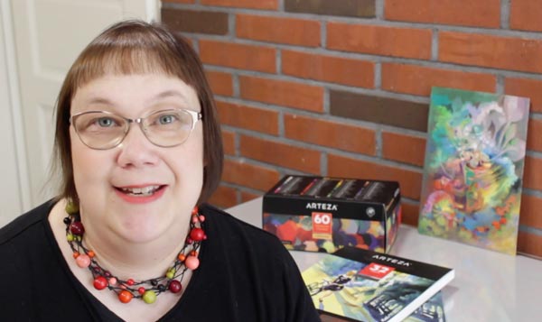
Intuitive Painting in 60 Colors of Arteza Gouache Set
Paint with me! This week, I have a video tutorial of making an intuitive gouache painting with Arteza Gouache set.
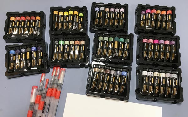
In addition to the gouache paints, I also use Arteza water brushes, Arteza watercolor paper (mine is A4 from Arteza’s UK store, but here’s the link to the similar paper in the US store), and Arteza Fineliner. These supplies are all donated to me by Arteza (US Store, UK store). You can get 10% off with coupon code peonyandparakeet1. This coupon is valid till Oct 25th, 2019.
Intuitive Gouache Painting – Watch the Video!
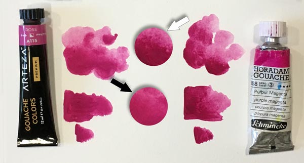
Gouache Comparison – Arteza vs. Schminke
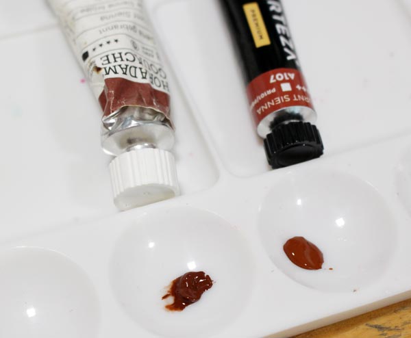
Arteza’s gouache paints are very affordable compared to artist quality paints. I have few tubes of Schminke Horadam Gouache paints, and with the price of 60 colors of Arteza, you can only get a few tubes of Schminke!
But of course, there are differences too. Schminke, manufactured in Germany, has a higher pigment level than Arteza, manufactured in China. These tubes are both Burnt Sienna, but Arteza’s color is much more pastel and creamy.
Most of Arteza’s colors have names that are not pigment names. They describe the tone very well and sound tempting, like “Blush Pink.” But if you have used to dealing with pigments and their individual qualities in transparency and archival quality, it can feel frustrating. If pigments are individual spices, Arteza’s gouache paints like spice mixes – easy to use for beginners, but a bit joyless for professional cooks.

The differences between these paints are small, and it requires an eye for nuances and experience on pigments to notice them.
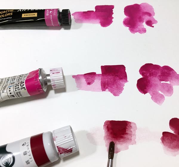
When painting, Arteza’s creamy paints are like family vehicles, easy to maneuver. Schminke’s gouache paints are more like sports cars, quick to react with water and more suitable for fine brushwork.
Traditional vs. Acryl Gouache – Reacting to Water
Some gouache paints are marked as acryl gouaches. It means that they are not opaque watercolors as gouaches normally are, but translucent acrylic paints. I had some Turner acryl gouaches (made in Japan), and you can see the difference below. Unfortunately, I didn’t have similar magenta tone, but the color doesn’t matter when testing how the dried layer reacts to water. Both Arteza gouache and Schminke Horadam bleed, Arteza a little more than Schminke. But acryl gouache doesn’t bleed at all!
Bleeding is not necessarily a bad thing. Actually, I prefer paints that bleed because I often like to remove color in later stages.
Bleeding wasn’t any problem when making this painting either. I used both thin and thick paint quite effortlessly.
I hope you enjoyed the video, and let’s keep creating!
Let’s share the passion of creating art!
Subscribe to my weekly emails | Welcome to my classes
Watercolor Panoramas to Express Travel Memories
I try to have a wide range of topics on this blog, but now I am posting watercolor sceneries again! (See the last week’s post). I have quickly become addicted to them! It all started with buying Daniel Smith watercolors and realizing that many members of my community Bloom and Fly love watercolors. I try to grow my skills in most of the media that the members use. Then I can give advice that’s not only great in theory but also works in practice.
Not So Traditional Landscape Painting
A lot of reasons were needed for landscape painting because so far, it has been one of the most boring genres of visual art to me. I haven’t ever been the kind of person who travels with a tiny watercolor kit and sits down near the sights to paint the surroundings. I do usually carry a camera – often just my phone – when traveling or walking in nature but never before have I understand the fascination of the traditional landscape painting.
But last week, I realized that because art is freedom, I can be as wild and expressive as I want. That made the landscape painting a fun game. It gives me the opportunity to re-live the travel memories, get lost in the process, and then come out with a piece that’s like a souvenir from that creative experience.
Watercolor Panoramas – Playing with Expression
This time, I was not painting just one piece like last week, but five small panoramas at one go. I carelessly chose the reference photos for the last part of the process. I will talk about the process later in this post, but let’s talk about the expressive ideas first.
A) How Would The Place Currently Look?
When painting watercolor panoramas, it was interesting to see what travel memories come to mind and how they got merged with the current life.
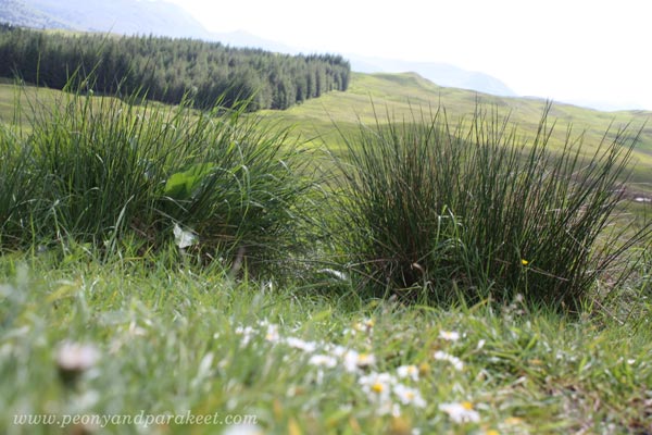
When we were in the Scottish countryside in 2014, it was a sunny day in June. The heat felt very similar to Finland’s summer. It was pleasant, not suffocating at all, and remembering it made me ponder how the spring would look there now – perhaps quite similar to Finland too.
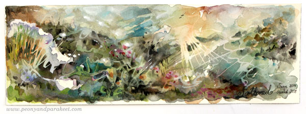
This was the photo that I used as inspiration when finishing the painting.
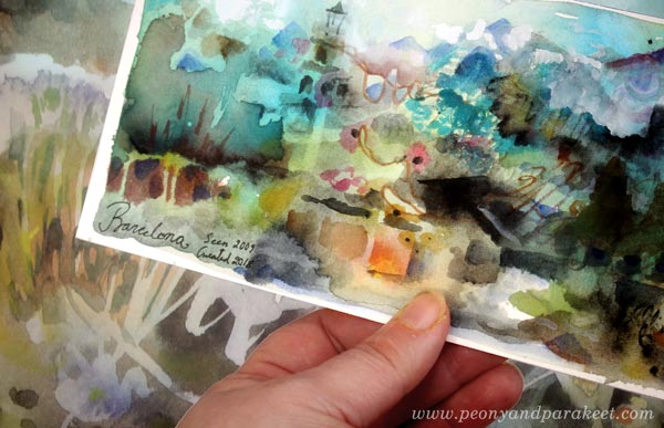
B) The Chain of Memories
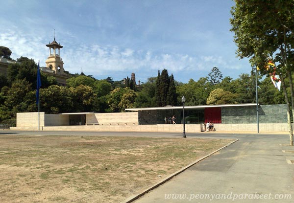
Barcelona was my husband’s suggestion in 2009. I wasn’t excited until I remembered Mies van der Rohe’s Barcelona Pavilion. And of course, the pavilion was also the first thing that came to my mind when I painted the panorama. But I also remembered Catalonia’s National Art Museum, Gaudi’s architecture, the mountains that surrounded the valley, the sea views, a lot!

The long chain of memories and locations started from this (not so artistic!) snapshot showing Barcelona Pavilion.
C) The Emotional Experience
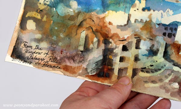
Last summer, we visited Palazzo Pitti in Florence, Italy. The place has inspired me ever since. I remember entering the museum and seeing the first room filled with chandeliers. It was a hot and relatively quiet evening in Florence, but my mind was buzzing. It’s like I was trying to get exposed to as much art and beauty as I could.
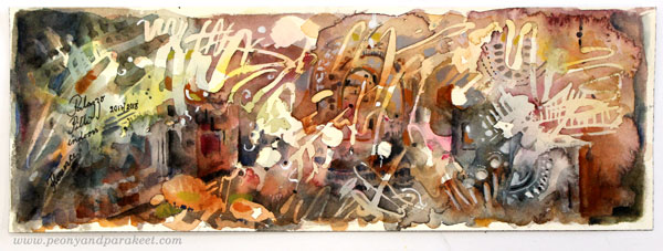
Here’s the photo that I had in hand when finishing the watercolor panorama above.

D) Being Far, Seeing Far
When being far away from home, it’s possible to see the life from a different perspective. It’s like rewriting some parts of the personal story. In the brilliant Palazzo Pitti, I had the same experience than when visiting Hermitage Museum in St. Petersburg, Russia: I should trust my points of view more, and not hold back. When I looked out of a window of Palazzo Pitti, it didn’t matter what other people saw there. I saw what I saw, and that’s true to me.
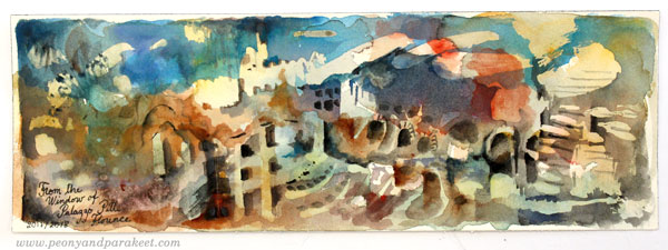
Here’s the reference photo that I almost deleted when I came back from the trip because it wasn’t so pretty. While painting, I realized that good reference photos are not only those which show the best scenes. The ones that remind from the best moments are also worth saving and painting.

E) Highlighting What Matters
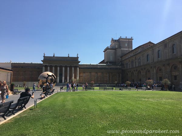
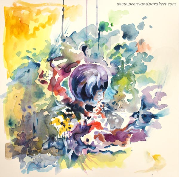
While traveling in Italy last summer, we visited Vatican Museums too. Some of the things that stuck in my mind were the huge maps on the walls and the incredible number of tourists. While painting, I thought how the old maps could be seen as symbols for the curiosity to know the globe.
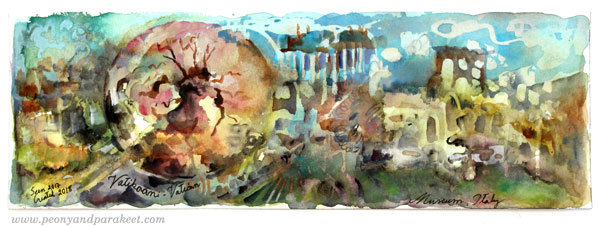
The statue of the reference photo (Arnaldo Pomodoro’s Sphere within a Sphere) expresses the complexity and fragility of the world. I made it dominate the scene in the watercolor panorama and made it look a bit like a round map. To me, it’s much more important than the buildings!
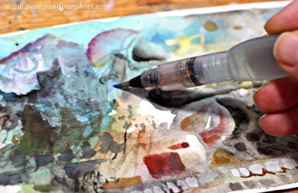
Watercolor Panoramas – My Process
The idea for panoramas was accidental. I happened to find oblong pieces when going through the watercolor papers. I often like to paint a square, so I had cut away the excess of a blocked paper. I don’t usually work in this small scale. However, using a thin water brush most of the time, made it quite easy.
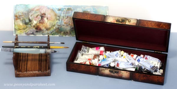
For the colors, I used a mixed collection of watercolor and gouache paints.
1) Background – Traveling to the Mind
The fact that I didn’t use any reference photos until in the end, made the painting fun. The first layers were splashing and blending. I had no idea about the scene or the location that would appear on paper!
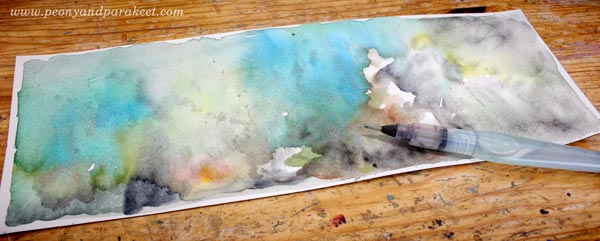
I took a photo of the backgrounds and then another one when the paintings were finished. Can you recognize which belongs to which?
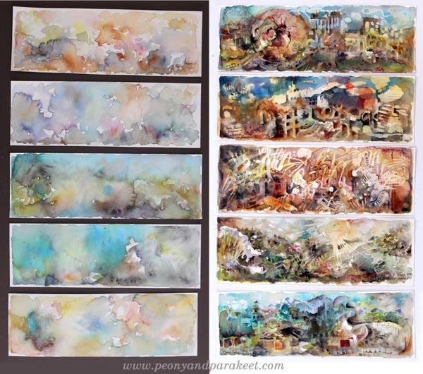
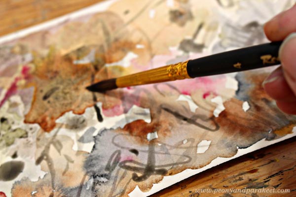
2) Doodling with Watercolor and Masking Fluid
After I had painted the background, I started doodling. Working with five watercolor panoramas at the same time was handy. I could work with one painting while others were drying. I used both pigments and masking fluid for doodling. Some backgrounds had watercolor doodles first. Others went straight to masking.
At this point, I started thinking about a reference photo that could suit the painting. For some panoramas, I found the picture quickly. But there were a couple that raised no memories at all, so I just doodled this and that!
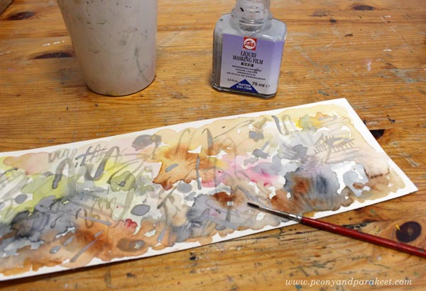
After the masking fluid had dried, I was having fun again. I splashed the paint and enjoyed the wonders of watercolor.
After the topmost layers had dried, I removed the masking fluid. Here’s “Scotland.”

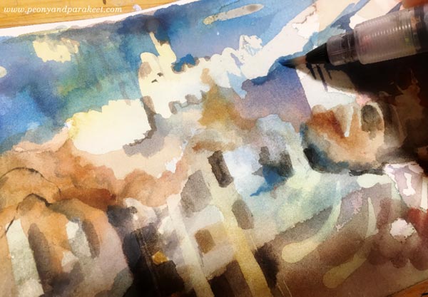
3) Finishing the Painting with a Reference Photo
When aiming for an expressive and loose image, the reference photo is more like an inspiration photo. I can glance at it, pick some ideas and elements from it but I don’t follow it to the detail. I let my associations and memories override the photo and build an inner vision of the place. (My class Inspirational Drawing guides you to master this process more in detail.)
Why I Have Never Learned Watercolor Painting from the Books
Some elements of the panoramas are more abstract, some more recognizable. It’s important to cherish the abstract nature of art when making room for expression.
I must confess that during the years that I have experimented with watercolors, I have found the books and videos difficult to comprehend and adapt. Watercolor tutorials usually follow the reference photos very carefully. To me, it doesn’t make sense. I need to know “the code” – the logic and the principles behind the image, not just the image. After you’ve got the code, you can express much more!
As an artist, I have always been more interested in what something expresses than how it looks. I have often felt disappointed by the lack of the expression part in tutorials, so I try my best to focus on the expression when teaching others.
The Magic of Finishing Touches
To me, the most challenging step in creating is finishing. The first two steps are usually just happy happy happy, but then there is a danger that the project becomes sad sad sad.
The watercolor panoramas were quite easy to finish, but if I have bigger struggles, I use the camera for the whole creative process. Then I take a photo of my work and look at it in several ways, enlarge it, make it smaller, etc. It’s fast and makes the finishing much easier than just staring at the actual piece. In May at Bloom and Fly, I will show how to use a camera and other digital tools to make the most out of your art, even if the actual creating would happen manually.
The Summer Season (July-August) of Bloom and Fly is Watercolor Journey
>> Sign up here!
Painting with Imagination – Watch the Video!
This week, I have made a special video for you! On the video, I paint with watercolors and talk about getting attention and growing imagination. They both are important for any artist. Honestly, it was quite exciting to talk and paint under two cameras, and I was afraid that I would just make a mess when I had so many things going on at the same time. But I tried to make the video so that it would feel like you would be visiting my studio and paint with me there. I hope you’ll enjoy it!
Painting with Imagination – Watch the Video!
Floral Fantasies in 3 Styles Begins Oct 16!

Let flowers make you an imaginative artist! Reserve Your Spot Now!