The Essence of Your Art
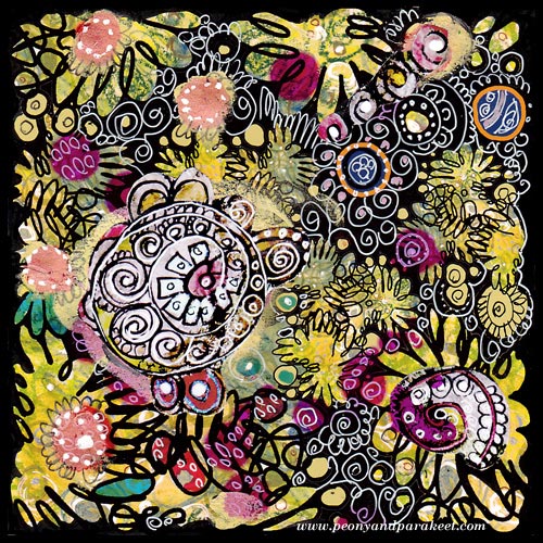
I found this old collage piece when I organized my archives. It is a design that I have used as a part of the fabric called Flow. As art journaling cute little girls with lovely little animals, is so popular nowadays, this made me think: what’s the essence of art is for me. And also, I would love to hear what it is for you!
For me, it’s not the play, even if I love playing. It’s not the colors even if I am totally for them. It’s not even the circles, my favorite shapes. I might aim for the certain styles, I love art nouveau and expressionism, for sure. But the essence of everything is that I want to create “everyday icons”, the images that make me stop, drop everything mundane and get in touch with my the inner thoughts.
Technically compositions, colors, shapes, styles, etc. create that. But when I am happy with the result, I do not think about those anymore. I think about what I feel and think right now and where it can take me.
The best thing is that everybody can create their personal icons, sacred images, mandalas, whatever you want to call them. They don’t need to be connected to any religion. They can just be connected to experiences, moments or beauty which uplift your spirit.
This is what I thought when I saw this old artwork. And now I wonder, what can I do better. How can I make this blog be the place for anyone to stop, then start creating – the essence of their art!
Subscribe to my weekly emails – Get a free mini-course!
Visual Chronicles and Fast Art Journaling
In the newsletter sent 5th November, I mistakenly sent a wrong link, here’s the link to the latest video
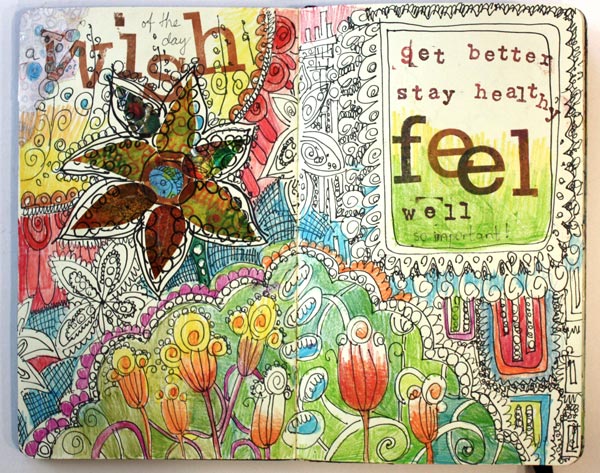
In Finland, the weather got colder last week and I got a terrible flu. It is so frustrating to be able to do nothing but sleep. Being healthy feels so important then!
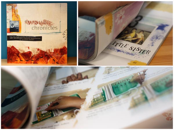
If there’s anything positive in lying down and doing nothing, it’s the creative break. It is weird how much processing time some things require. In 2006, I saw a new book in Amazon.com. It was called Visual Chronicles. It was nothing like I had seen before and I felt strangely drawn to it. I was mesmerized by the concept of creating relaxed pages combining text, paint, simple illustrations and photos. Art journaling was a new word in my vocabulary.
I took the book everywhere. While reading it, I tried to understand what it is actually about. I picked a blank book and tried to fill its pages. It was so disappointing to see how horrible my pages looked and furthermore, I did not have good time when I created them. I browsed the book over and over again. I could not get it!
But I did not give up. During the time I bought more books and made more experiments. I also noticed that there seemed to be other people doing the same thing. I took some online courses and finally… My first art journal was finished in 2010! (See the journal and my first blog post about art journaling)
Four years of agony! And now when I read Visual Chronicles, everything that I had learned stands there so clearly! However, there was still one thing that had been bothering me from 2006. The pages in the book are very simple and still I find most of them visually appealing. But if I tried to do the same, the end result was nothing alike.
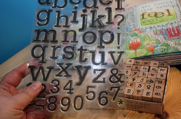
After sleeping two full nights and the day between, I finally figured it out! It is the stamped journaling that makes the pages stand out in the book! I had never tried to stamp the words as I have always hated handling the alphabet stamps. But I do own two sets and had many pages waiting for journaling!
Now I am hooked!
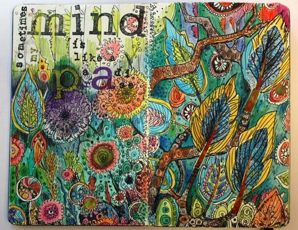
“Sometimes my mind is like a paradise”

“My life, my problems”
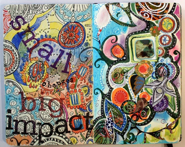
“Small changes, big impact”
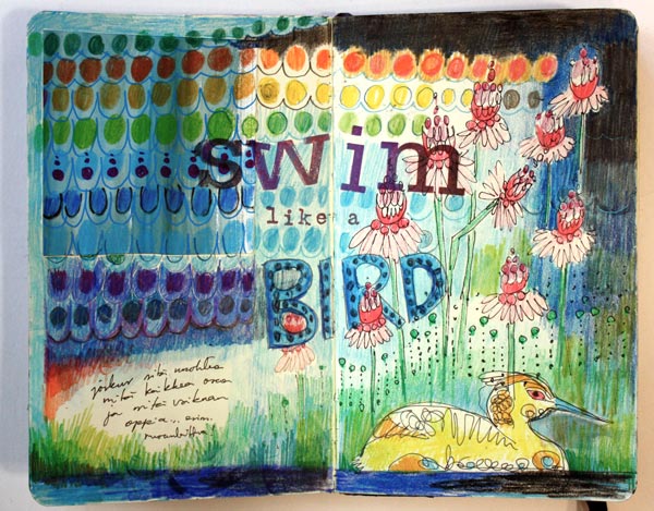
“Swim like a bird”
Visual Chronicles by Linda Woods and Karen Dinino is still one of my favorite art journaling books. It does not take art journaling too seriously. Linda and Karen also have a blog which is written with the same humorous attitude. “If you are alive you have succeeded” is one of their recent advices. While still recovering, it feels very relevant at the moment!
Tips for fast art journal pages:
1) Divide the making of the page into three phases: a) doodling with a black pen b) coloring the doodles c) adding the text
2) Use colored pencils for easy coloring. A Moleskine Notebook and the colored pencils work really well together.
3) Add the text by grouping stamped words with the doodles. Use big and small stamps to create contrasts.
4) Let your personal history of art journaling get recorded into your journals! If I could turn back time, I would not toss those first pages.
5) Buy the book: Visual Chronicles
Create Pastel Softness!

This time it’s all cute! I had the feeling that this blog is getting too serious. Don’t get me wrong! I want serious, I love serious and hope that you do too! Still, behind all good art, there’s a big portion of imagination. And the best way to embark that imagination is to play a little!
Pastel Colors in Teddy Bears

So I asked my teddy bears if they were willing to help me with this post. And they responded: “Yes, sure!” When I interviewed them, they reminded me that there are two big factors in cuteness: softness and pastel colors. “My friend is a black teddy and he does not get so many hugs as I do”, said Apple Blossom. Pink Princess continued: “It’s not just the color, but it’s the fluffy softness that’s important too!” And then they both agreed that the huge nose and strong eye contact make a teddy even more successful.
Pastel Colors in Old Scrap Pictures
Then I showed them the old scrap pictures that I had found from an antique flea market some years ago.

“Oh yes!”, they giggled. “If you want to create something cute, these sure are good examples! Round shapes make them look reaaaaally soft!”
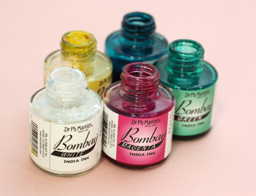
India Ink and Circles
I picked up my India ink bottles (used also in the video blog post last week) and tried to think about what kind of soft and cute to create with them.
Then I remembered the round shapes. That could be the start.
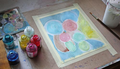
So I painted some round shapes with pastel colors on a thin watercolor paper. While painting, I noticed that to get beautiful pastels you need to use a lot of white. Sometimes adding a lot of white can create hues that lack softness if the base color is cold. You can fix that by adding some yellow or a tiny portion of black. Speaking of soft and white, meet another teddy of mine called Niamh …

I am not a big fan of white but who could not love the color after seeing her!
Clustered Shapes
Back to the painting: Small shapes were added near the large ones to create cute creatures. I made some large shapes form the part of the background. More shapes were painted to made creatures more interesting.
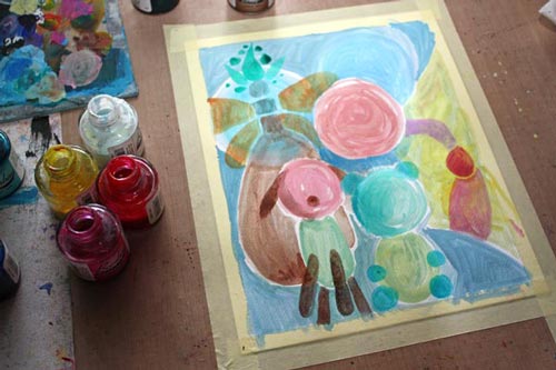
I made the shapes look dimensional and detailed with colored pencils.

Finishing
I finished the painting by adding more details and sharpening them with a white gel pen and a thin tip black marker. As a final touch, I added white acrylic paint on the face of the biggest creature. It lightens up the work and makes a great contrast with the black. Namely, if you look at the scrap pictures and the teddy bears, the black color makes pastels look so soft and bright. Small black dots here and there on a pastel colored circles can be enough to create a page that’s all soft and cute.

So, why not have a go: create a pastel colored art journal page to soften the hard world!
Let me be your mentor in art: Subscribe to my weekly emails!
Video Blog: Finding Inspiration from Plants
In this video blog post I am creating this art journal page and talk about finding inspiration from plants.
If you got interested in creating imaginative plant-inspired pages, see also the previous blog post mentioned on the video: Create Abstract Botanical Art!