The Inspiring World of Details – Ideas from Uffizi Gallery
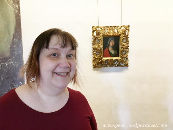
If you have followed my blog for some time, you know that this photo is very meaningful to me. It was a hot day in June when I visited Uffizi Gallery in Florence, Italy. The huge old building was filled with world-class art. But I wasn’t just going to look at the famous masterpieces like Botticelli’s Primavera or Birth of Venus. I was searching a small painting of Boccaccio Boccaccino.
Meeting Boccaccio Boccaccino at Uffizi
Boccaccino’s painting made my heart bounce when I saw it on Google at the beginning of this year. I made my version of it during the spring.
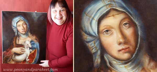
After finishing the painting, Boccaccino’s Gypsy Girl continued to fascinate me so that in June, I traveled to Italy with my husband to see the original painting. I tried to prepare myself for the situation that I wouldn’t see it. Sometimes museums lend paintings for other exhibitions or don’t have everything on display. But my journey wasn’t wasted: I got the chance to admire the painting, so tiny that I couldn’t believe my eyes. Namely, the whole spring I had tried to capture the gentle features for much bigger size, and it felt challenging!
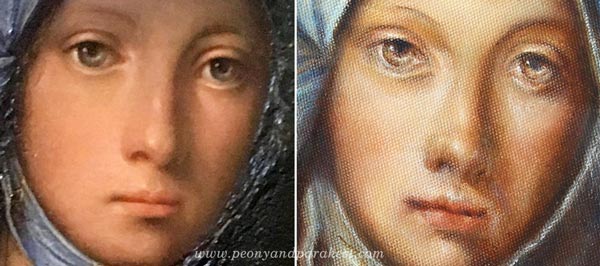
Now when I compare the details, I see many differences. My gypsy girl is not the same person than the original, but it’s ok. I feel that it resembles me and especially how I would like to be seen: gentle but observing, always protecting what’s precious.
Wouldn’t it be if I could tell my story to Boccaccio Boccaccino? I would tell him how I saw his painting on the Internet, in a big catalog that anyone can browse. I would tell him how I examined the images of the painting and painted a bigger version of it. He would probably wonder how I could afford for all the paints for the big version, and who had ordered such a large painting of a modest gypsy girl. “It’s just for me,” I would say, “this painting is so special that I don’t want to sell it.” “You must be a wealthy woman,” he would probably say and then continue: “Where did you say you come from?”. I would tell him about Finland, an area in the far north and show it on a map. Then I would tell him about airplanes. He wouldn’t probably believe anything!
But at the end, all I would like to say to him is this: “People from all over the world come to see your painting. They buy the ticket in advance. They queue. They sweat. They book the hotel based on its location. They take pictures of it. They examine them when they are back home.”
Isn’t that something any artist would like to hear?
More Uffizi – Some Ideas for Your Art Journals
1) Fresco Pages
Like any museum in Florence, Uffizi Gallery’s ceilings had a lot of frescos. The long hallways were full of illustrations.
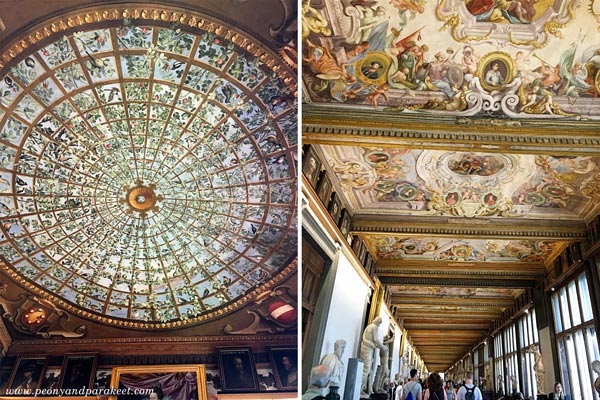
The round ceiling is so brilliant that I have to show you a close-up photo:
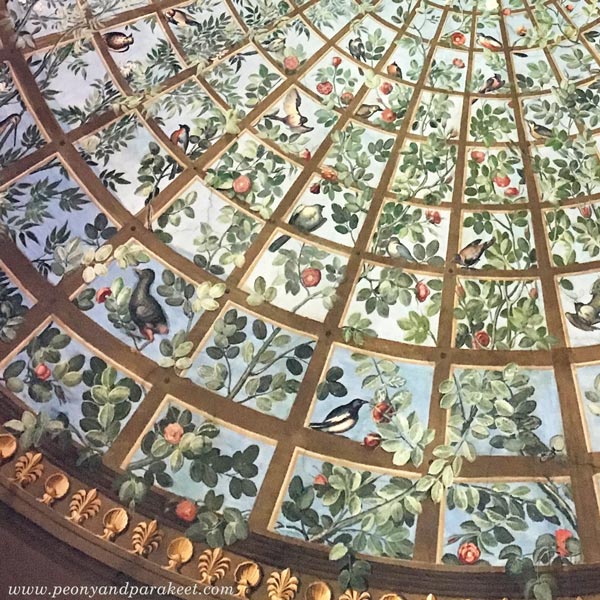
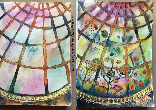
I love how the branches go to the back and to the front of the bars, and how the color changes in the background. It’s such a great idea that I also quickly recorded it onto my art journal!
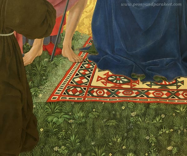
2) Delicate Patterns Filling Solid Areas
Another idea is to see the possibility of a solid or dull area. See how the grass can be more than just green color or green strokes. I saw quite a many paintings that had this:
3) Translucent Elements
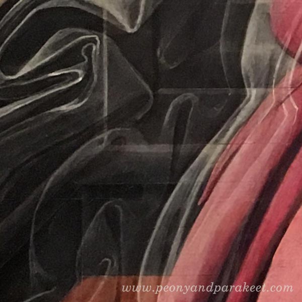
I am fascinated by the number of veils in Renaissance art, and especially how they are painted.
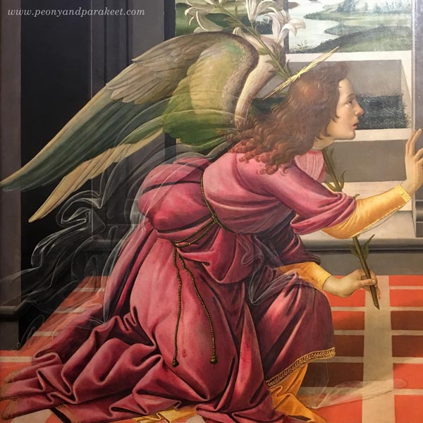
They are like abstract art if you look at them closer! See how the line changes in strength and how a little bright spot makes the fabric look shiny!
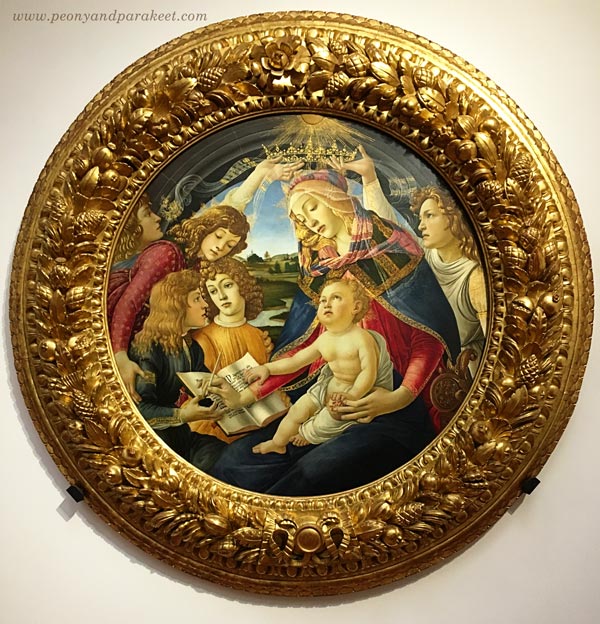
I also loved how the veil was painting in this painting:
Another idea: add stripes on those translucent elements!
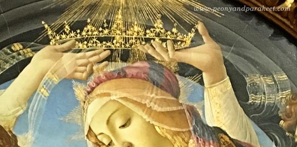
4) Light on the Center
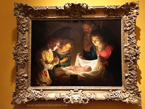
I end this blog post with the simple idea that came from a stunning painting. Create a very bright element in the center and then add dark shadows around the painting!
As you can guess, it was an inspiring visit, and I could easily write and show more. Hopefully these inspired you, and hopefully, I will see you in the classes this fall.
Coming Up!
Online classes
Aug/Sept Collageland – a self-study class (textile-inspired collages)
Aug/Sept Inspirational Drawing 2.0 – available as self-study (drawing from imagination)
Oct/Nov Flower-themed online workshop (not your regular flower art class!)
Local workshops in Finland
Sept 9-10 Draw Freely – Piirrä vapaasti 1-2 (Suomeksi! – in Finnish)
Other news
I am planning to offer a free live webinar in September if I can just fit that into my schedule. Many have asked about my coaching program The Exploring Artist. I will rerun that at the beginning of next year.
Stay tuned and if you haven’t subscribed my weekly emails yet, subscribe here!
Mixed Media Painting Idea – Revisiting Your Old Style
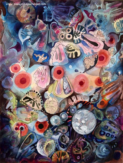
Between 2010-2014 I was enthusiastic about decorative art. I called myself as a “decorative artist” and saw myself more as a designer than as an artist who focuses on expression. My upcoming class Collageland (thank you, everyone, for the feedback you gave in the last blog post!), is a retrospective to that period in my life. While editing the videos, I have been pondering about what inspired me back then and how it’s different from what motivates me now.
Some themes and styles often feel too familiar to me. They don’t seem to challenge me anymore, so I have moved on. But now it hit me how harsh it sounds and how unnecessarily harsh it sometimes also is. So when creating the pieces shown in this blog post, I gave myself permission to take it easy and get decorative. I also became curious about comparing my past decorative work with the pieces that I would produce today.
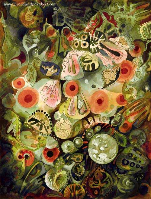
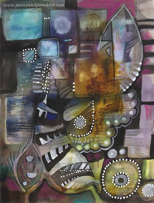
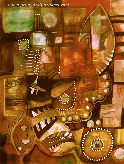
My comfort zone is getting inspired by design and translating that inspiration into art. So I made a mixed media painting that is inspired by the world of fashion, jewelry, lace, Renaissance murals, and botanical art. I call it “Lost and Found”. To embrace a designer’s approach to art, I also made two different color versions by processing the photo of the original artwork digitally in Photoshop.
Here’s Marine:

And here’s Botanical:
I don’t have many phase photos because I wanted to relax with that too but this is what I drew on my planner the previous day:

These quick sketches are the core of my creative process.
Another Painting with the Same Idea
I also made another design-inspired painting. The idea came from the ceramic art of the 1960s.
The photo below shows how the piece looked like before adding the decorative layers. Glowing watercolors remind me of the glazing used in ceramics. When this happens, I feel like I am a ceramic artist, playing with colors.
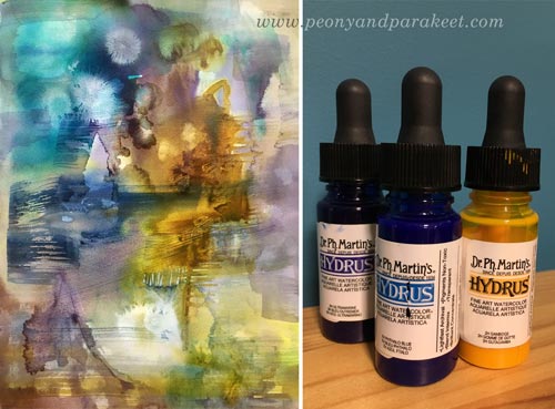
A student of mine kindly donated Dr. Ph. Martin’s Hydrus watercolors some time ago. First, I liked them, now I adore them. They are intensive and easy to use, and I especially love the coverage of white. I used Hydrus watercolors for “Lost and Found” too.
Here’s the finished painting called “Retro Living”. It is also a mixed media piece. I used colored pencils, PITT Artist Pens, and a correction pen for the last layers. I love these muted colors, so typical for the Finnish ceramics from the 60s. But then, I thought they might be too gloomy for many, so I made another version digitally that reminds me of furniture from that era:
Comparison
See my new gallery showing decorative art and designs from 2011 to this day. When I look at the newly-created pieces as a part of that collection, it looks to me like I have traveled a long journey in art. And I have – I just never thought that it would show in this decorative style as well. It makes me want to explore more of this and also, see exciting challenges in this direction too.
My challenge to you: Pick an old piece and make a new one using the similar techniques and style!
Let me be your mentor in art: Subscribe to my weekly emails!
Freedom and Fear of Drawing – with Students of Peony and Parakeet
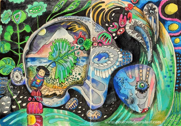
I dedicate this blog post for drawing, but I want to talk about cross stitching first. It’s one of my long-time hobbies, and I find it relaxing. I don’t have to make any decisions, use any imagination, just follow the chart, and the result will be just like I wanted it to be. Cross stitching is like a simple house plant. If you give a little bit of time for it fairly regularly, it will grow even if it doesn’t feel like so at first.
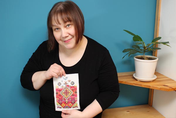
I can choose complicated charts or simple ones, and easily adjust the attention required for stitching. But there’s one problem that always remains: pixelation. Each image is made from single square-shaped stitches. No matter how complicated the design is or thick the fabric is, the pixelation is there.

Working with single stitches is not only a visual problem. It’s also a problem if we want to create more freely. Then we need a medium that allows faster and more flexible thinking. Like drawing. There are many kinds of drawing styles. When I want to experience creative freedom, I don’t do sketching using a pre-made model. (The photo shows a recent Renaissance-style painting in progress. I have designed it first in Photoshop.)

A Fear for Freedom – A Fear of Drawing
When I want to feel free, I don’t want models. Then it’s just a blank paper and a pen and a wish for a glimpse of imagination.
But freedom and fear are strangely connected. About three years ago, when I planned to leave my day job and start an art business, I warned myself. I told how I would no longer be anyone noticeable. I would have no office, no place to go every day, no colleagues to discuss with, no job title, no respect from others, no self-esteem. I would live in the darkest edge of the society and completely against the way of life I was taught. With these stories, I tried to prevent myself making the life change, and at the same time, I knew I had to try it. I had to turn the page and start a completely blank one.
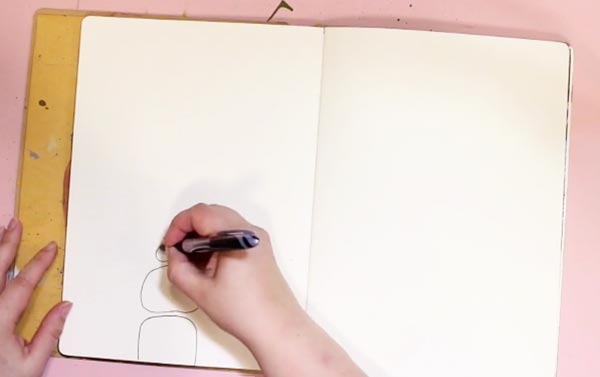
I often connect with the same fear when I start drawing. That I am no one, that I have no power, that it is overwhelming and I don’t know what to do. But then, it’s the same gate that leads to the most wonderful feeling: the feeling of freedom.
Before I left my day job, I started to follow other self-employed women online. I listened to podcasts where they told their stories, and they all had one thing in common. They had put what they already know into use and then learned more. It made me list all the skills that I had and be more content about the decision I had made.
Drawing Factory Teaches You to Draw from Stick Figures
Still, on this day, I find it both assuring and inspiring to acknowledge what is already there before starting something new. So last year, I wanted to create a mini-course about line drawing, using the same philosophy. That was how Drawing Factory was born. It teaches you to start from stick figures and then move on to flowing lines and more imaginative illustrations.
Student Artwork
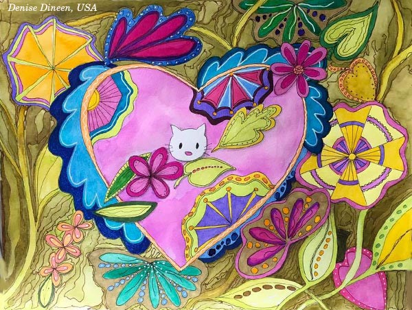
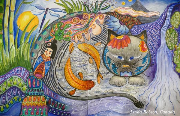
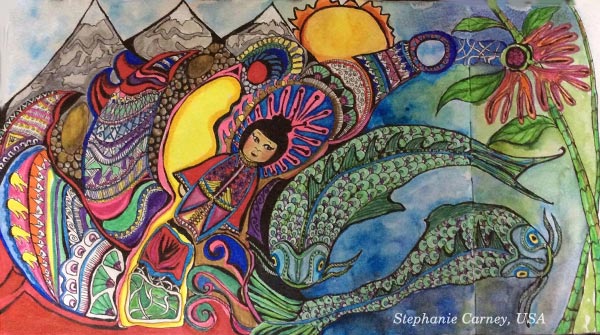
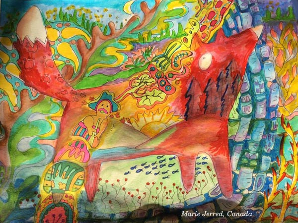
I offered Drawing Factory as a part of Imagine Monthly Fall 2016, the series of monthly mini-courses. See some of the gorgeous pieces that my students have made of the course! Another central theme in the course is Japan, the land of pretty details and high productivity and that has inspired Denise Dineen, Linda Robson, Christie Juhasz, Stepanie Carney, Marie Jerred, and Kathy Gallant, too.


Overcome Your Fears for Line Drawing – Buy Drawing Factory!
Drawing Factory is now available as a single self-study class. >> Click here to buy!
You can also buy the whole bundle of five art journaling classes, published last year as Imagine Monthly Fall 2016.

Thank you for supporting my journey now and during the last three years!
Year 2016 in Review – In Terms of Art Supplies
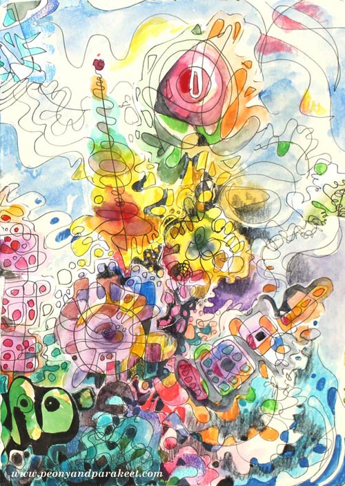
I am not usually so keen on “year in reviews,” but I thought it would be interesting to look back regarding art supplies used in 2016. When people ask me what supplies do I use, my quick response is: “Acrylic paints, watercolors, and colored pencils.” If I get detailed questions, I often refer to these blog posts: What Art Supplies Do I need? and What Acrylic Colors to Buy?
But it hit me that I have used a more diverse selection of supplies in 2016. And then, there are all kinds of necessary stuff that we don’t often mention but still use all the time. So, I dedicate this blog post to supplies. It’s not so much about the single pieces created in 2016. If you want to have a look at those, go to 2016 Gallery!
Must-Haves for Collage Art
The image that is at the beginning of this post is a collage made for January’s lesson at Inspirational Drawing 2.0 while teaching how to create unique collage pieces and enjoy freehand drawing. I have been blown away by the beautiful art created by my students, and I am more certain than ever that introducing the ideas for drawing piece by piece makes freehand drawing and the use of imagination easier than trying to build a bigger illustration in one piece. (You can still sign up for the class and get the first lesson immediately after the purchase!)
I like to create collage art to my biggest art journals. I have two of large Dylusions Creative Journals. The first one is almost full, so I hope I can fill it in 2017 and make a flip-through video of it. I purchased the second one last year because I love the quality of the paper. It’s perfectly smooth for colored pencils and sturdy enough for collage art.
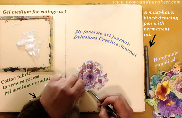
Like in the previous years, I have used “Golden Soft Gel Gloss” gel medium for attaching the collage pieces and Tim Holtz’s non-stick scissors for cutting the pieces.
A new discovery is to use a piece of cotton cloth to remove excess gel medium. First, I started using old t-shirts for finger painting. But when learning old masters painting techniques at a class, we used old linens for cleaning the brushes and realized that they work well for wiping off too. Since then, I have been a collector of old cotton fabric pieces. A fellow artist told me that she has several plastic bags filled with waste cotton fabric for art making!
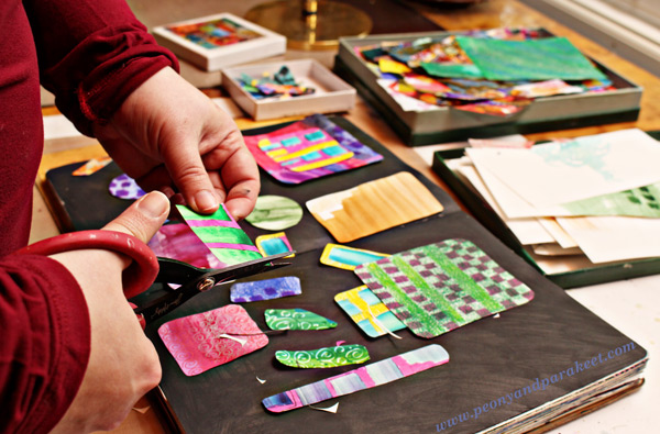
Speaking of collecting, I am still a collector of the best handmade supplies: hand drawn and hand painted paper pieces! If you have never tried creating collage pieces, see Step by Step page for basic instructions! I also have a mini-course called Doodled Luxury, that shows how to combine doodling with collage techniques.
Colored Pencils – Not for Art-Making Only!
Because I create a lot with colored pencils, I often get questions about which colored pencils to buy. Many contemplate between regular and water-soluble pencils. I love regular colored pencils because they are easy to carry and easy to use when you only have a minute or two. I use regular colored pencils also outside my art-making. I love to use them to make written notes more visual and add visual ideas to my notebooks and planners.
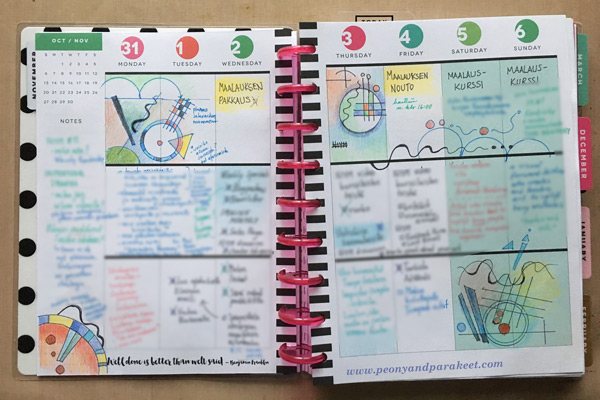
It’s why I always have colored pencils in my reach, and I think it’s also why I find it so easy to create with them. If I have to create something quickly that isn’t very big in size, it feels natural to choose them. I use Prismacolor Soft Core pencils when I create art pieces and a selection of old pencils for more mundane purposes. My e-book Coloring Freely focuses on regular colored pencils and shows easy techniques for creative coloring.
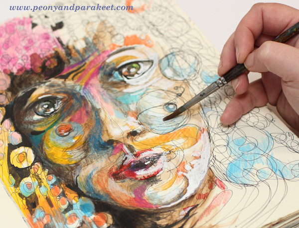
I also have a mixed selection of watercolor pencils, and I enjoy using them too, especially in the beginning of coloring. Using water makes it quicker to fill a paper with a soft mix of colors. It is the technique I use a lot at Inspirational Drawing 2.0: starting the coloring with watercolor pencils, inks or watercolors and then moving on to dry supplies like colored pencils and felt-tipped pens.
Using Watercolor Paper – and Not!
This is a supply that makes my heart sing – I only have to touch it: a good quality watercolor paper! My absolute favorite: St Cuthberts Mill’s Saunders Waterford HP watercolor paper. It’s smooth and thick (300 gm2/140 lbs), and it’s perfect for both watercolors and colored pencils. I especially enjoy creating intuitive still lifes on the thick paper. I often cut the paper to a square to enable easy changes in orientation. See this blog post to watch me creating the intuitive mixed media painting below on a watercolor paper!
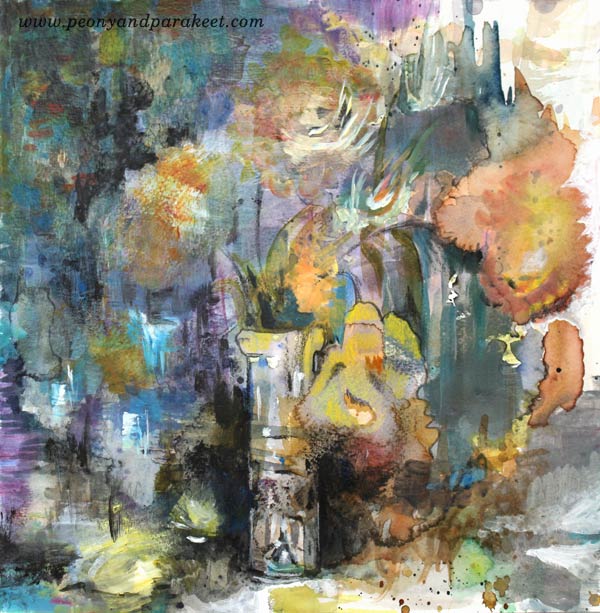
Even if I love smooth watercolor paper, I don’t want to limit the use of watercolors. I use watercolors constantly and often with paper that is not designed for it. I like to carelessly splash watercolors on any paper because there are a lot more opportunities to use watercolors than to use watercolor paper. For example, watercolor paper is not good for collage pieces because it’s too thick. I like to use sketching paper instead.
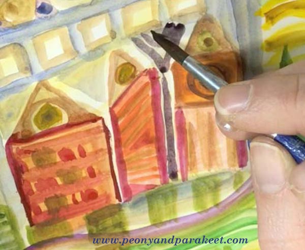
The best exploration with watercolors so far happened in 2016. I studied Friedensreich Hundertwasser’s way of using watercolors and created a mini-course about imaginative painting style. This painting style uses only a little water, and it’s easy to apply on almost any paper. See the mini-course Painter’s Ecstasy!
The Year of Canvas
If I had to name one supply that marks 2016, it would be canvas. I have created more canvas pieces than ever before. I have painted five small acrylic paintings and two medium-sized paintings. “Human Nature” was not a wall-sized, but so far the biggest that I have painted. See this blog post: 5 Lessons Learned When Painting on Big Canvas
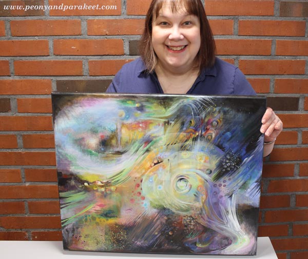
I always take the canvas more seriously than if I create a painting on a watercolor paper or an art journal. A blank paper syndrome is nothing compared to a blank canvas syndrome! But I enjoy larger projects between smaller ones, and I have two blank canvases waiting for 2017 creations.
Experiments with New Supplies
Oil paints
I would have never guessed that I would be 47 years old before trying out oil paints for the first time, but that was how it went. I started painting as a young teenager and my parents purchased acrylic paints to me. They explained that using oil paints would require all kinds of liquids that would not be safe and acrylic paints were better in that way. They were so right! Not to mention all the smells! I live in a house built in the 1960s, and the smell stays there for some time. It would be impossible to me to use oil paints daily just because of that.
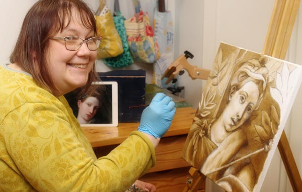
But I have signed up for an art class and will start my second oil painting next week using the old masters’ techniques. (See this blog post to read what any artist can learn from old masters!) I love the pigment and gloss of good quality oil paints. We are using Schminke’s Mussini oil paints, and they are the best quality paints that I have ever experimented with.
Soft Pastels
During 2016, I saw quite a lot of art that was created with soft pastels. I almost bought Unison soft pastels to treat myself but then realized that I already had a small set of Rembrandt soft pastels. I had purchased them many years ago for industrial design studies, but we had been using them very differently than how people use them usually. We scraped them to get powder and used the powder to create soft shadows.
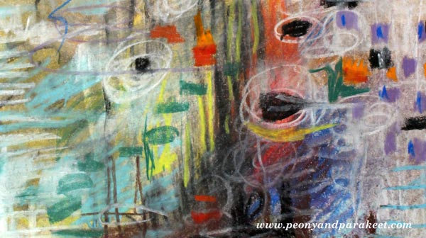
I created an art journal page (see the full image in the middle of this blog post) to try them out. Now I just grabbed the sticks and drew with them, but it felt like there was powder everywhere. And then, in the end, I had to use fixative, of course. It felt tedious even if it was not. I had no desire for new pastels anymore, but afterward, I have wondered if I gave up too easily. Maybe I should try the soft pastels again sometimes in 2017.
Liquid Watercolors and Watercolor Markers
In the late fall, I got a couple of surprise packages from one of my students! I got to use liquid watercolors and watercolor markers for the first time, and I liked both of them.
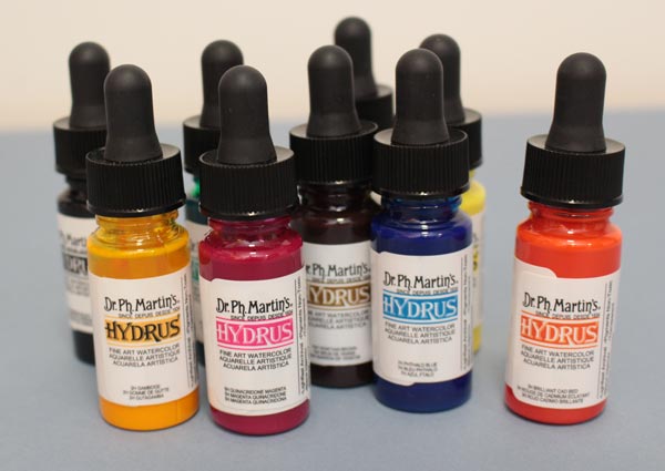
I like the intensity of color in liquid watercolors. Mine are Dr. Ph. Martins’s Hydrus watercolors.
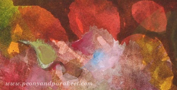
Watercolor markers seem to be very versatile because you can use them with or without water. I also received a set of gouache paints, and they encouraged me to dig out my old gouache tubes as well. To see what I created with the new supplies, watch this video blog post!
Going Digital?
Based on 2016, my answer is both yes and no. Yes, I have created digital art, see this blog post especially! I have used Adobe Photoshop CS5 for so many years that it feels very intuitive and I don’t have to think about the commands and such, I can just focus on the fun stuff.

But when I create digital art, I like to use my hand-drawn and hand-painted pieces as building blocks. I know that many buy stock photos, but it feels much more exciting to me to use my art as a starting point. Sometimes when I don’t work I buy a digital kit and have fun with it, but that’s just playing in my spare time (Sometimes I do wonder, how much do I have to create, to stop creating …)
I have a student at Inspirational Drawing 2.0 who is adapting the exercises to work with her iPad mostly. I look forward to seeing more of this happening because I see a potential of more people going into creating art. However, I don’t want to spend all of my time with devices, so I enjoy creating pieces by hand and as long as I can do it, I think I will, also in 2017!
What about you? What supplies were new to you in 2016, and what supplies are you going to continue using in 2017?
