Art Journal Video – Adding Text and Layers to Your Pages
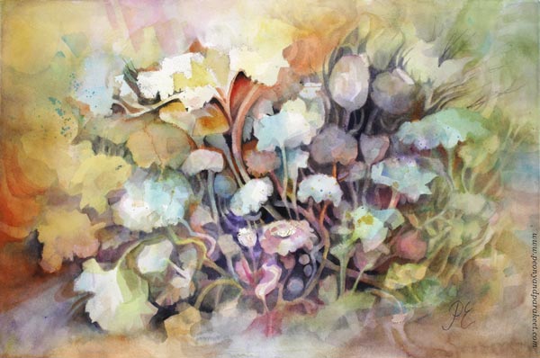
This week is all about art journal inspiration. You see more spreads from the art journal I started a couple of weeks ago, and there’s also a video of making the spread below.
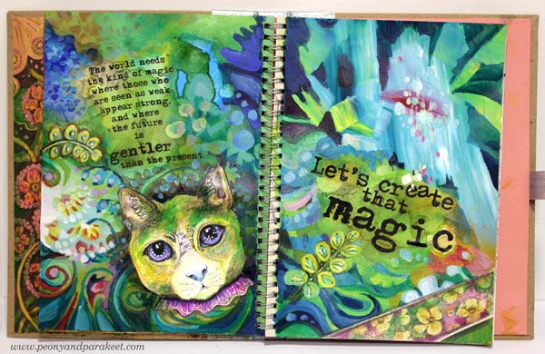
The world needs the kind of magic
where those who are seen as weak appear strong,
and where the future is gentler than the present.
Let’s create that magic!
Including Text in Art Journal Pages
I have a pile of these kinds of small stories about art and imagination. Or maybe I should say “a feed” instead of “a pile” because I post them regularly on Peony and Parakeet’s Facebook page. I have always liked writing, and I have a natural urge to share thoughts about my passion. So it hit me that I should write more in my art journals too. And why not use those stories that are born so effortlessly every week?
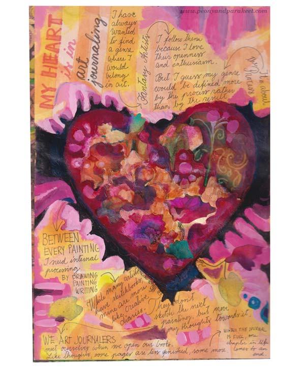
I have always wanted to find a genre where I would belong in art.
I follow fantasy artists closely because I love their openness and enthusiasm.
But I guess my genre would be defined more by the process rather than by the result.
Between every painting, I need internal processing by drawing, painting, and writing.
While many artists have sketchbooks, mine are more like creative diaries.
They don’t sketch the next painting but move my thoughts towards it.
We art journalers meet ourselves when we open our books.
Like thoughts, some pages are less finished, some more,
and when the journal is full, one chapter in life comes to an end.
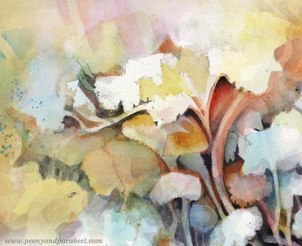
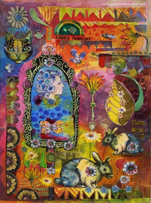
Art Journal Pages with Typed Text Blocks
After writing by hand, I decided to make the next page so that the text would be typed. Not that I hate my handwriting, vice versa, hand-written pages always look great. But when I was a child, I used to write a lot with an old Bijou, and I missed the typed look. I still have the old typewriter, but the possibility to play with the size and style of the letters, made me use a computer instead.
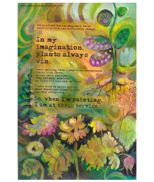
Every person has an imaginary world where priorities and hierarchies change.
In my imagination, plants always win.
Every morning when I look at my houseplants,
remove dried leaves, change their position,
they not only maneuver my hands but take over my mind.
I have tried to battle against these modest and silent spirits, but they always win.
So, when I’m painting, I am at their service!
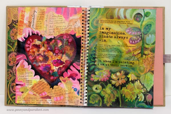
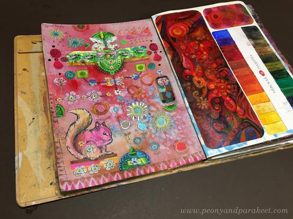
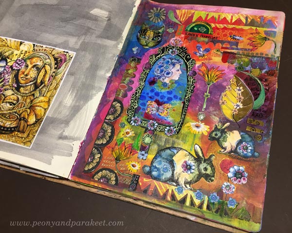
Here’s the spread with the two pages side by side.
In the second spread, I wanted to play with the orientation and the shape of the text blocks.
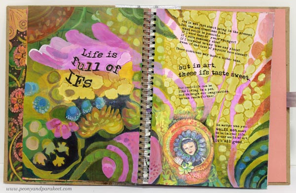
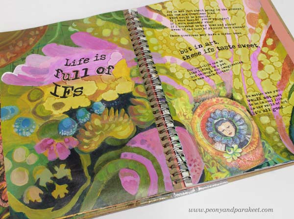
Art is not just about being in the present. You can ask questions like:
What would be possible if I were tens of years younger?
If I were somebody else?
If I traveled to any time and place?
Even: if the laws of physics were absent?
These questions may first have a bit bitter tone,
but in art, these ifs taste sweet.
Our real-life can be like living in a pot,
but through our imagination,
we can reach further.
No matter who you would not want to be in real life,
in the world of art, it’s all good.
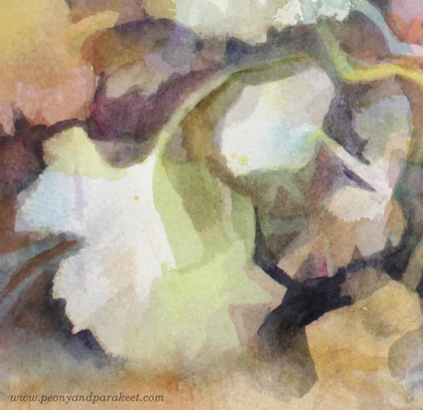
Mixed Media Art Journal Pages
For the second spread, I printed a gouache painting that I had made for the class Decodashery on a sticky canvas and adhered it on the page.
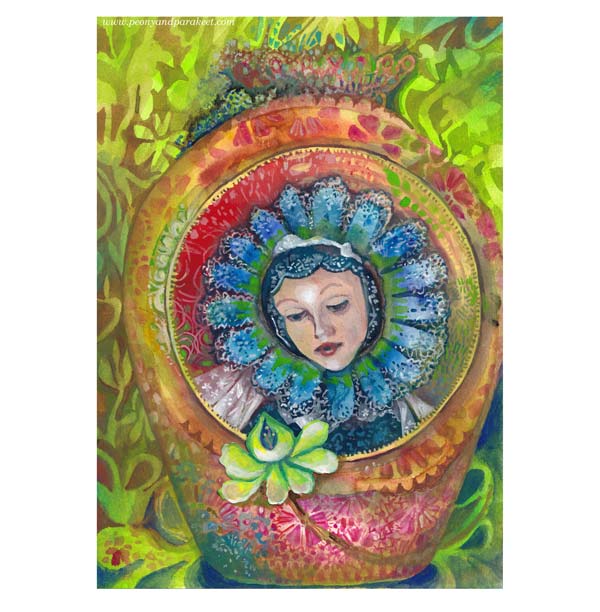
I really like the yellow-green circles, made with alcohol inks.
In this spread, I also used hand-drawn and hand-painted collage pieces made from the classes Magical Inkdom and Decodashery.
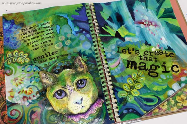
I added green to the cat so that it fits with the rest of the page.
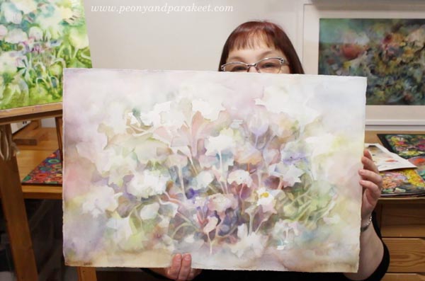
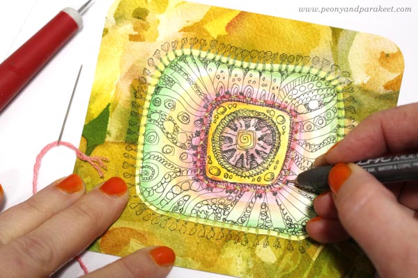
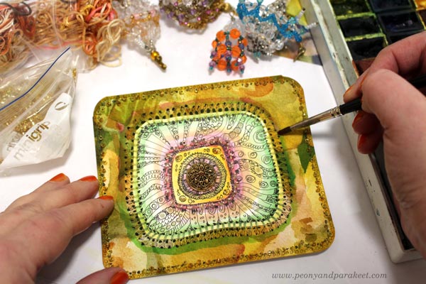
Art Journal Magic – Watch the Video!
See the process of attaching printed text, using alcohol inks, and painting with acrylics more in detail by watching the video below!
I hope the video inspired you to fill your journals!
Draw animals and more: Animal Inkdom, Magical Inkdom
Paint decorative flowers and more: Decodashery
Art Inspiration from Sanditon
This blog post is for us who love Jane Austen and Sanditon tv series. I watched the series last month, and it has inspired me a lot. I hope you enjoy this Sanditon inspiration overload!
Torchbearer – Esther and Lord Babington on the Beach
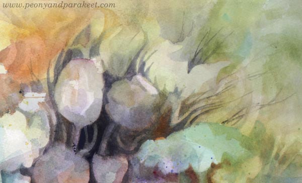
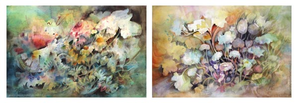
My newest watercolor painting called Torchbearer had a modest beginning and I had no clue how to finish it – until I saw episode 8 of Sanditon!
My favorite female character of Sanditon is Esther and the scene where she is in the carriage with Lord Babington was so romantic! The sudden change in her appearance, his gentle smile, black horses, empty shore – oh my! It hit me, that even if my painting has flowers, not people, I could express the emotion from the scene.
The tallest flower and the glow come from Esther’s powerful spirit.
The flower that bends down, expresses her sensitivity.
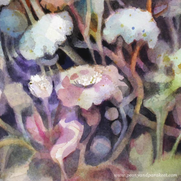
I tried to paint every flower so that they highlight the bubbling energy. Their stems are like the carriage where the couple sat.
The black background represents both the horses and the lord, supporting Esther’s joy.
In this painting, Esther is a torchbearer who leads us to better times.
Tin Box – A Souvenir from Sanditon
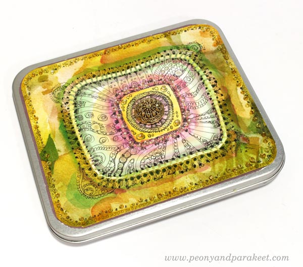
I like little boxes that can be used for storing hand-drawn pictures and papers. I wanted to decorate a small tin box so that it would have old-fashioned and luxurious feel. So that I could think of it as a souvenir from Sanditon!
I already had saved a hand-drawn piece that was quite perfect in size.
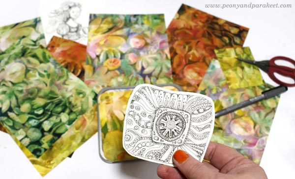
I also found some papers with a watercolor print. They were test runs of the surface pattern designed earlier this year. I mostly designed the pattern manually, so by painting a design on the center of the paper and then cutting the paper into four parts.
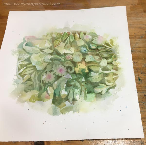
This way you get a continuous design.

Avoid painting edges, and re-arrange papers until they are all fully painted.
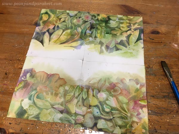
Then scan the papers, and clean the edges in an image processing software. Here’s a sample of my design.
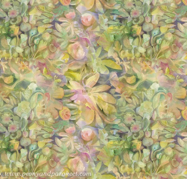
I made several variations in Photoshop. These papers go really well with hand-drawings, so they were perfect for the box.

The center motif was first colored with watercolors.
Then I hand-stitched it on a background paper and added more hand-stitching around the center. In the photo below, I highlight the surroundings of the stitches with a pen so that they look more 3-dimensional.
I also added beads, more colors and decorative marks.
The centerpiece is a button with a shank removed. I love this little box!
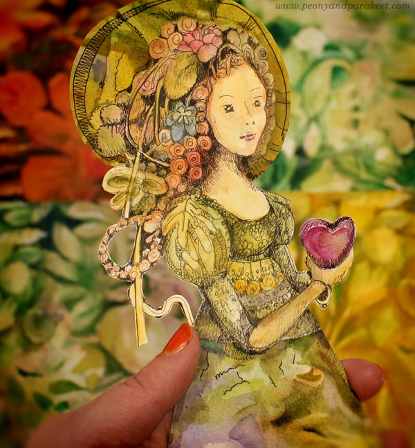
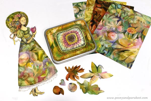
Esther Denham – Sanditon Paper Doll
I also wanted to create something for my ever-growing collection of collage figures. “Just an unknown habitat of Sanditon”, I decided first. I didn’t use any reference and drew the doll just freely, but when she was colored, she looked just like Esther!
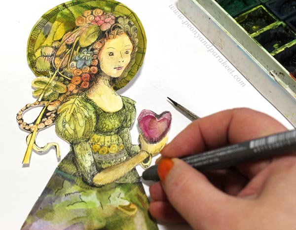
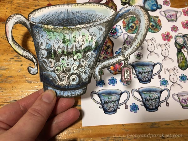
I played with her proportions so that she has overly long legs. That way I could make the dress more imaginative. The hem was cut from one of the watercolor papers. I couldn’t help playing with her right away, trying wings on her, filling the teacup with herbs from Sanditon. The wings and the teacup are from my fun class Magical Inkdom.
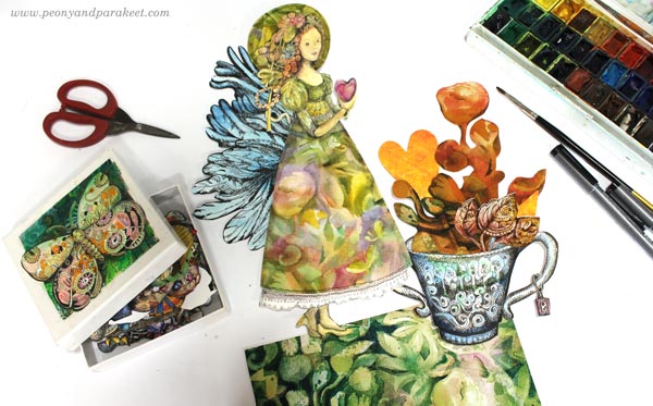
Her hat is also a collage piece cut from watercolor papers.
Souvenirs from Sanditon!
The Romance Continues
I am currently painting an oil painting that looks quite romantic already.
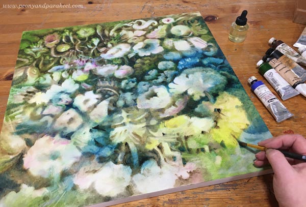
My vision is to make it the third in the series after Icebreaker and Torchbearer – and put it in the middle of them.
One Source of Inspiration – Many Interpretations
If you have been following my blog, you know that some of my projects are fine art, others more illustrational, and there can be a bit crafty things too. This blog post demonstrates well how the inspiration can be the same, but the interpretation is different. For me, the wide range of projects is a way to stay inspired and creative, and I hope that you have tolerance for all of them. I don’t believe in getting too serious or not getting serious at all. The humorous side of art allows us to get playful, and the playfulness feeds our ability to express the deeper side of our inspiration.
Esther can be the person who handed me a crafty gift box, or an innocent paper doll, or a mysterious flower in a painting that took tens of hours to create. The key to your artistic style is less in the looks and more in the inspiration. For me, it’s often old-fashioned romances, like Sanditon.
Welcome to my online classes!
– Paint watercolor fantasies – Sign up for Magical Forest!
– Draw the magic – Buy Magical Inkdom!
Hand-Drawn Collage Samplers
I have been browsing my art archives lately, and it has been surprisingly inspiring. I have lots of art journals and a big box of paintings and drawings from my teenage years. Even if I have experimented with many techniques and themes, it all looks very similar now. Everything fits together and gets my approval. Painting “Icebreaker” gave me a new kind of confidence, and with that confidence, I am now blogging about a playful idea that I got from cross-stitching – hand-drawn collage samplers!
These samplers are composed of hand-drawn paper pieces so that they look like cross-stitch samplers. They have ribbons, many identical ornaments, tiny floating elements, and some symmetry. There’s also stiffness and order so that it looks like the elements are on a grid.
Cross-stitching is one of my hobbies, and even if I try not to think about art when stitching, I just couldn’t resist this idea! Here’s how I applied cross-stitching to collage art.
Print Tiny Scans of Hand-Drawn Collage Pieces!
It’s essential to have tiny decorations to make the collage look ornamental. I solved the problem by making collage sheets of scanned hand-drawn pieces. These collage elements were drawn for the classes Animal Inkdom and Magical Inkdom, and there are some jeweled flowers from the free mini-course for subscribers too.
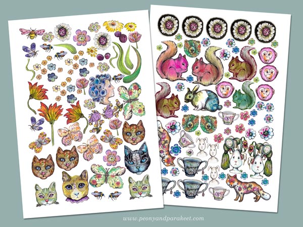
The original size of these pieces is much bigger than in the printed sheets.
Use All Kinds of Hand-Decorated Papers!
Samplers have a variety of designs, so every little doodle is a potential sampler piece. I have a box of hand-decorated and painted papers (mostly leftovers from Collageland) and two boxes of hand-drawn collage elements. I have also cut some old art created in the 1980s. All these are a good addition to small printed pieces.
Of course, you can also use store-bought die-cuts, pictures from magazines, etc. but if all the elements are handmade, they will all fit together much better because they are all YOU!
Perfect Project for Hand-Painted Background Pages
If you are an art journaler, I bet your journal has a lot of pages that are more like backgrounds rather than finished pages. You can use them for collage samplers!
The background of this sampler was busy and bright, but I just added brown over some of the areas and let the colors speak, or should I say shout!
I attached the pieces with paper glue and some larger elements with double-sided tape. I usually use gel medium, but it’s messier, and it’s too difficult to cut all those tiny pieces with sticky fingers.
Self-Expression with Hand-drawn Collage Samplers
Sticking paper pieces can be just a relaxing hobby, like cross-stitching. But samplers can also tell stories!
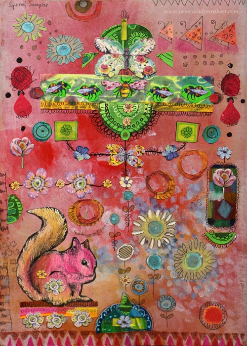
My first page is called Squirrel Sampler, and it has all kinds of little treasures that Paivi the Squirrel has collected.
The second page is called Rabbit Feeders. It refers to women’s status and importance in Virginia Woolf’s novel The Voyage Out. An isolated woman looks at herself from the mirror and questions her importance for the world. I read Voyage Out as a teenager, and this allegory, even if it’s just a few rows in the book, touched me deeply.
It often happens that creative play evokes feelings and stories that are too big to express in any other way. I hope you’ll enjoy making these samplers!
Start drawing your sampler pieces – Subscribe to my weekly emails and get a free mini-course!
From Photos to Art Nouveau – Doodling on Photos
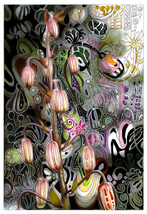
One of my favorite styles, art nouveau, thrives from natural forms. So, when I am walking in the garden, I see art nouveau everywhere. I often have a camera in my hand, and I snap photos while admiring the flowers.
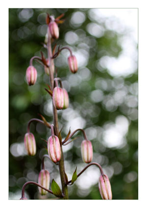 When checking photos after one of those walks, this snapshot of martagon’s flower buds caught my eye. It almost shouted art nouveau to me. Its shape reminded me of the Mackintosh lamp shades seen in Scotland a month ago.
Art Nouveau Martagon
I printed the photo on Canon matte photo paper. Simply using markers and gel pens, I doodled streamlined shapes to move the martagon to the era of renewal and decorative beauty.
In the original photo, the direction of the elements was downwards. I wanted to change the composition so that it would be upwards. The upward direction would refer to the spiritual renewal, a centric theme in art nouveau. I doodled several upward shapes like the flower seen in the upper right corner.

The colors of the plant were also a source of inspiration. I wanted to keep the narrow range of colors seen in the stem but also brighten the muted tones with splashes of bright green and pink.

Drawing on a photo was such a fun process that I will do it again. One idea would be to create art nouveau portraits. Art Nouveau style doodles would look great on portrait photos too. Actually, like in the best days of art nouveau, anything can be “beautified”!
Doodling on Photos
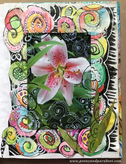
This was not the first time I used the technique of drawing on the photo.
In 2010, I combined doodles and a photo. This page was also very easy to do:
1) doodle with pens on the background paper
2) attach a photo and then doodle on the photo.
More projects with doodling on prints
These posts also combine printed images and doodling:
>> Subconscious Goals
>> Creating Wood
Let me be your mentor in art: Subscribe to my weekly emails!